Software
Houzz Logo Print
silamm

Need help for this church exterior design

12 years ago
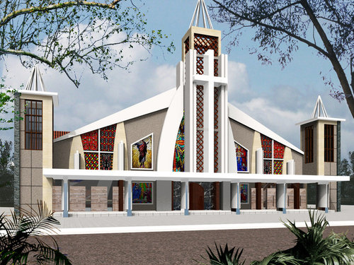
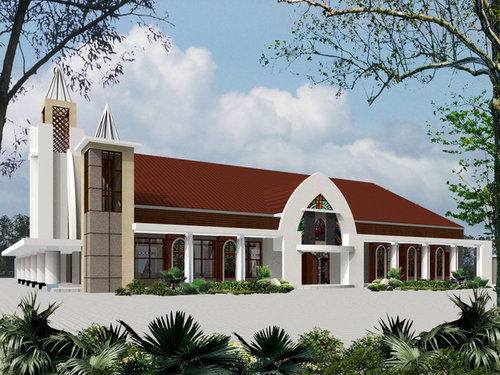
I am team of this project and need some ideas or critics about this exterior design, please. Thanks all

Comments (31)

  • PRO
    12 years ago
    last modified: 12 years ago
    What does your client think about the 2 designs? They are paying for the project so our opinions wouldn't matter.
  • 12 years ago
    I like the general design and structure. I think I would simplify the different textures and finishes to make only particular details stand out (i.e. the stained glass windows or cross motifs).

    Also, I would arch the open structure of the tower tops to tie in the arch theme.
  • PRO
    12 years ago
    I would elongate the steeple frame for proportionality--as is, they look like cheap add-ons. Otherwise, I agree that it is too busy. The windows in the gray wall area could be neutralized with a dark or gray frame.
  • 12 years ago
    Nice to see colour on street scapes. Repetition of same shapes pleases the eye in building
  • 12 years ago
    The two large stained glass Windows's the top of the overhangs I would change to reliefs in a Navajo color, instead of stained glass. I would change the white trim to Navajo.
  • 12 years ago
    Hubby says " and parcels by "
  • 12 years ago
    Sorry wrong thread
  • 12 years ago
    Churches can be, and often are, audacious in style. This one definitely is. If that's the goal, then I say "carry on!"

    If the goal, on the other hand, is to fit into a particular style or neighborhood, I'd have to say that I have no clue in which direction this facade is headed in. I see over a dozen different and contrasting patterns and surface materials. It's busy, busy, busy.
  • PRO
    12 years ago
    There are too many different styles, materials, and forms on the structure. The side elevation and the front look like two different buildings. Stick with 2 or 3 materials max and eliminate/ reduce the corner towers (almost resemble minarets on a mosque). Aligning the canopy heights on both sides and matching the column designs will also help the scale and proportions as well as bringing the two sides together. On the front elevation, the upper columns attached to the facade look a bit like buttresses and should align with the columns on the canopy so the upper structure/design align with the lower.
  • 12 years ago
    Whew! You do have a lot going on there. I like the second design better as it is so much less busy. I'd get rid of the spires and whatever that is on the left side of the building. Do the members know the maintenance costs associated with that much fru fru stuff?
    Marlins thanked User
  • PRO
    12 years ago
    I would defiantly simplify the trim colors on the front of the building. With color you can minimize how many distracting shapes are fighting each other, choosing to highlight the shapes that you want to be the most prominent.
  • 12 years ago
    I bet you are between a rock and a hard place trying get this project off the paper and onto the building site. Good luck!
  • 12 years ago
    last modified: 12 years ago
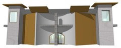
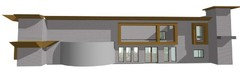
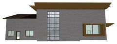
    Perhaps a couple of thoughts; What would Christ want his church to look like? As he was a carpenter by trade as am I, it seems to me he would be more interested in craftsmanship and quality of materials than overly ornate designs. My guess is he appreciates simplicity, form and function. As the spirit of God comes not in thunder and loud voices but in the still, small sweet voice of peace, I would simplify it so it would appear to praise him rather than shout to man. Just my perspectives for whatever they're worth. FYI to all of you...the two pictures are the same building, one is front elevation and the 2nd is side elevation.
    Marlins thanked Guy Stephenson
  • 12 years ago
    In light of his three years spent homeless and preaching under the open sky, Jesus would probably prefer to have such excessive time, money, and energy spent serving the less fortunate... So I would say a shelter and community garden. Don't recall any bible passages about stained glass.
    Marlins thanked luminae
  • 12 years ago
    Lose corner towers, lose latticework on central tower , lose repeating pattern stained glass. Have stained glass that tells a story. This was its original function in times of illiteracy and there is still a lot of that about today. Agree re shelter and community garden. Agree with comments above. The shorter angled windows should extend to level of others. Glorify God , don't make Him go cross-eyed.
  • 12 years ago
    Hubby says contrast the colour of the cross.
    Marlins thanked User
  • 12 years ago
    It's not about the building folks, it's about the message. BUT, Marlins has a church to build, within a budget and still satisfy the congregation. As the team leader of this project, Marlins needs concrete suggestions as well as our prayers. I'm going to do the praying because I can't seem to contribute much else, except to say I agree with chookchook about the stained glass windows and the lattice work. Those spires need to go away, too.
    Marlins thanked User
  • 12 years ago
    Email me at glstephenson60@gmail.com and I'll give you an idea of some revisions that might really help. Always happy to assist.
    Marlins thanked Guy Stephenson
  • 12 years ago
    Marlins, I hope we did not scare you away. I realize how large a project of this size is and how important it is that you please the church members. I'm confident there are some Houzzers that are very capable of meeting your needs. Give them time to find you!
    Marlins thanked User
  • 12 years ago
    Dytecture, i and some people in this team project are the client. I agree of you all that the front elevation is too busy..sorry for late responding for this all comment, and thank you all for your attention. I will bring this all comments and ideas into our next meeting next week
  • 12 years ago
    Dear Guy Stephenson, yes you are right, the first picture is front elevation and the second picture is side elevation. Both picture are the same building...thank you for explain to all people here.. Actually we have received interior design also from architect and his team, and i have some comment about that.i look that the interior looks busy too, same with the front elevation design, but i need also comment from all of you guys, because many ideas would be better than my ideas only...if you all dont mind, i will post the interior design here..the architect has two different design...can i post them here..? Thank you
  • 12 years ago
    Dear all, i appreciate all of your comments here, i will bring them all to my next meeting. This disscussing will be continue. God bless you all!
  • 12 years ago
    I agree it looks busy and feel it is because there are too many elements competing for attention that do not work well together. It looks like a conceptual design, meaning it has a ways to go before becoming a workable detailed solution. I question for example the constructibility of some elements. This is my two cents. The proportions and massing are pretty standard.
  • 12 years ago
    Most faith communities have a building style which helps people identify them. This one looks like it could be Roman Catholic, but the competing elements of the facade, stained glass and turrets make it difficult to discern. The theology of the congregation should be influencing the design choice.
    Marlins thanked condoquilter
  • 12 years ago
    how did you manage to put all materials and which software are you using. I designed a church and I also need critics as the client doesn't like the design. my email is asgatsheni@gmail.com
  • 12 years ago
    Put up a dilemma like this one, with pictures, ndiks17.
    Can we please have an update, Condoquilter?
  • 12 years ago
    was inspired by your design for the front towers nevertheless how can I improve on the exterior
  • 12 years ago
    First pic looks a bit monolithic.
  • PRO
    12 years ago
    First off visually, the cross needs to stand alone and not be mixed in, as it is, it appears to be a shadow box not a cross. The arches are just too much too much. Change the stain glass windows to a more traditional shape stain glass windows. Think Italy.
  • PRO
    12 years ago
    And remove the architectural hard straight line from the front of the church, it feels very unwelcoming, blocking actually, the entire front should be open, open, open= all are welcome.