Software
Houzz Logo Print
johannahaftel

Need help choosing a backsplash!!!

12 years ago
last modified: 12 years ago
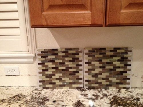
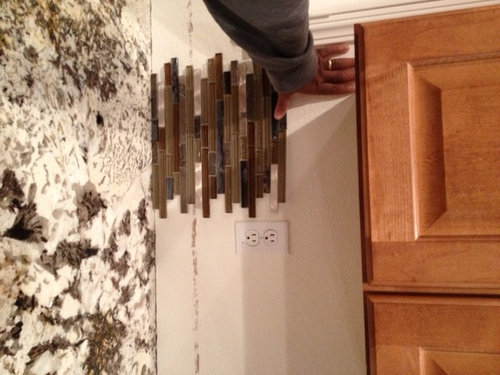
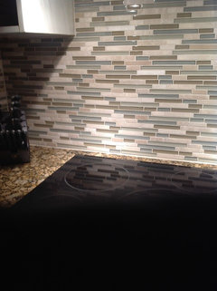
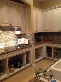
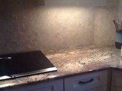
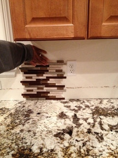
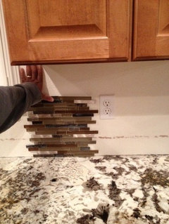
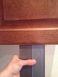
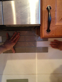
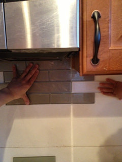
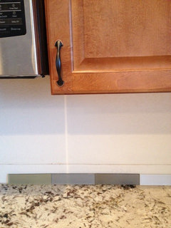
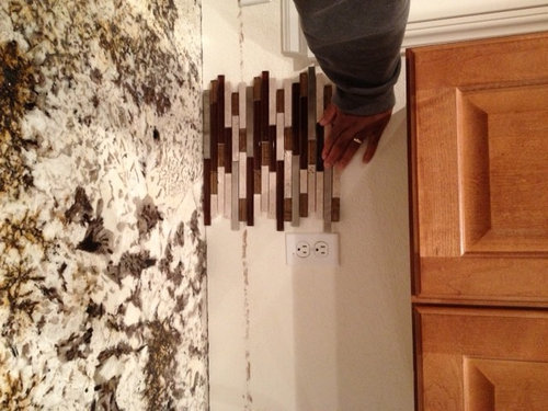
Please help me choose a back splash. I like the long skinny tiles but am trying not to make it too busy since my granite is a bit busy. I think i need something that will pop. These pics were taken last night but in the daytime i do get a lot of light in my kitchen. sorry about the sideways pictures...not sure how to fix.

Comments (45)

  • PRO
    12 years ago
    The first sample you have is way nicer! really blends with counters great choice! Throw the others away
  • 12 years ago
    Do I want it to blend with the counters or stand out?
  • 12 years ago
    I'm concerned the all glass will read too green when installed / hit by light. I like the first sideways pic that looks like it's thin stone.
  • 12 years ago
    I will take a picture of it in the sunlight. I definitely don't want the glass looking green. I will take another pic in the sunlight and posit it.
    Is the problem with thin stone that it will break easily?
  • 12 years ago
    Shouldn't be a problem with breakage...it's designed to be used this way :)
  • 12 years ago
    If you have your heart set on the linear tiles I would suggest something light and monochromatic - both of these feel too busy and dark to me. I love your granite but to me the first one especially takes away from it.
  • 12 years ago
    I agree with Kelli Richards Design and Sam0705 above; I would choose something with a little less colour variation in the tile.
  • PRO
    12 years ago
    The countertop is so beautiful but the backsplash is so busy.. Keep it simple with maybe just some marbelized lines running thru it.. if you want decorative tiles then get tiles with more texture not color pops Maybe More squarish tiles
  • 12 years ago
    I agree with some of the earlier comments. Your counter is nice with some dark colors. You wouldn't want to make it too busy with putting a backsplash with lots of colors. If your heart is set on the ones you posted, I would recommend the first one. Another option to consider is to add a solid color backsplash with a border.
  • 12 years ago
    i will go back and buy some monochromatic tile. What color suggestions. My cabinets are brownish red as you can see in the picture. Beige? light blue? gray?
  • 12 years ago
    Love counters, but would consider subway tiles or calm stone tiles (3 x 6) in a neutral color with a darker grout.
  • PRO
    12 years ago
    Great! Beige would be too boring, light blue would definitely work! I wouldn't go with grey...I think you need some colour. Go with either something green or blue :)
  • 12 years ago
    Go with the longer skinny ones with the mixture of light and dark. It is the best to complement the granite. If you do light larger tiles and dark grout, it will compete with your granite. Go with what you like. After all you are the one who will look at it every day, not us.
  • PRO
    12 years ago
    I think this is the perfect place for subway tiles in white. They come in lots of sizes but go for the larger ones so there are fewer grout lines and the look will be less busy. Your countertops are fabulous and don't need anything to embellish them. Let your backsplash be ultra quiet and purely functional as well as easily maintained. Your kitchen will look classically beautiful for years to come. The tiles you've shown are very trendy (and busy).
  • 12 years ago
    Your choices match but they're going to be very busy with the counters. I maybe the only person on the planet that thinks a backsplash isn't always necessary. Where will it end around the windows and at the edge of the cabinets when the counter stops but the wall extends on?--think about this before you start the project. Really love your granite don't do a BS that will fight with it.
  • PRO
    12 years ago
    Hi johannahaftel,

    A quick note about our experience: Brigitte and I consistently design between 70-90 kitchens/year (for over 34 years) and have designed thousands of kitchens.....We also design full structural including below-grade foundation plans.....We have 2 Chicagoland locations and a Michigan location which cover the Wisconsin to Indiana borders, N.W. Indiana and S.W. Michigan.....Anyway, way too much with the tops.....Don't want to look like we're in Disneyworld!!.....Take a look at our Pinterest Board ( http://www.pinterest.com/windycityjohn/kitchen-backsplashes/).....It shows about 40 kitchens, most of which we've used glass tiles on like you've pictured.....Some are full height and some are just 3 rows flanked by porcelain tiles of various sizes/patterns.....If you're spending the $$ for glass, be sure you have undercabinet lighting to really make them pop.....We only use LED's on dimmers.....Hafele has the best.....Hope this helps a bit.....John & Brigitte
  • 12 years ago
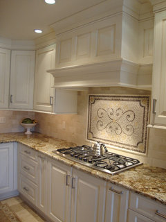
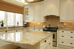
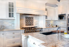
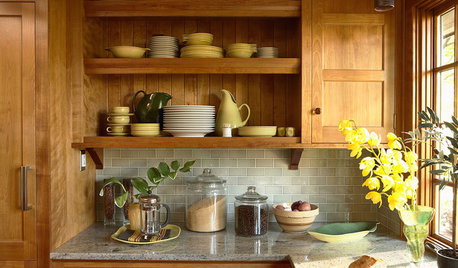
    Classic Mantle Hood Design · More Info

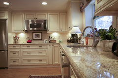
    Arlington · More Info
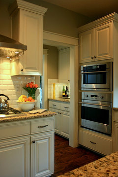
  • 12 years ago
    Jennifer Brouwer Design Inc · More Info

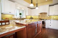
    Traditional Kitchen · More Info

    Arts and Crafts Kitchen · More Info
  • 12 years ago
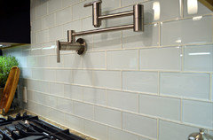
    I'm seeing a black backsplash. That first one is far to "busy", with the countertop being a busy pattern alresdy. Don't use both because they'll battling.
  • 12 years ago
    sorry. I meant to comment :) just some ideas while browsing on Houzz.
  • 12 years ago
    IMO, those are too busy for your granite. I would go with a 2 x 12 or 3 x 12 glass, white/ivory glass tile.

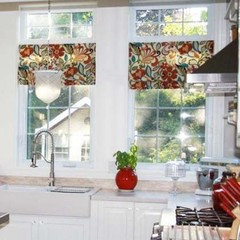
    A colorful roman shade would look nice too.
  • 12 years ago
    Either soothing non contrasting colors or something special, a fun shaped tile for example.
    Maple Kitchen Cabinets | Carlton Door Style | CliqStudios · More Info

    Capital Hill Residence · More Info

    Tali's kitchen · More Info

    San Anselmo Kitchen · More Info
  • 12 years ago
    I was leaning towards matching until I found this tile. It has blue tile in it and it really looks good with he granite . I was really nervous about it.
  • 12 years ago
    Asking for opinions? I think there is enough "movement" going on the the patterned countertop. Look for something with less pattern in this food prep area. I would be concerned that this tile will date your kitchen very quickly. It's your space--if you love the contrast and lots of it--go for it and enjoy it.
  • 12 years ago
    I like your second choice best
  • 12 years ago
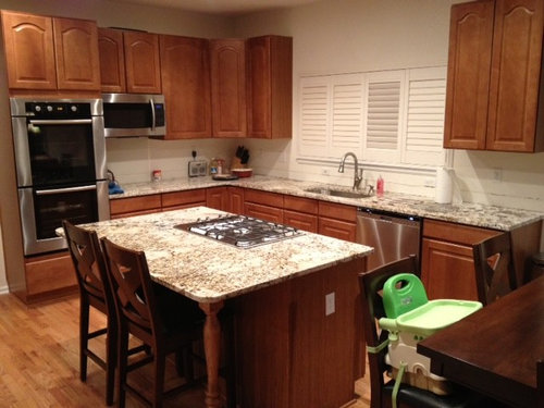
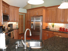
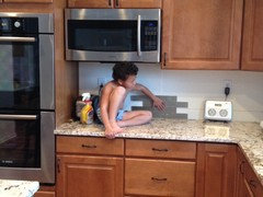
    Now that most of the cabinets are in here is the bigger picture
  • 12 years ago
    Too busy to me.
  • 12 years ago
    Pics are hard..it's about personal choice. I respect that . I have not painted yet
  • 12 years ago
    Lu, your cabinets are painted, so it's busy allright, but the cabinets are the calmer counterpart. I wouldn't do it myself, but it does look good.
  • 12 years ago
    I'm not a fan of busy back splashes. Let the granite do the talking here.
  • PRO
    12 years ago
    I like the one in picture #3. Of course this is just my opinion and it can be taken or ignored as needed. We did Colonial Gold granite and a mosaic backsplash and we like the look. Then again, it's our kitchen and your kitchen will be your kitchen. Read everybody's opinions and then do what you like best.
  • PRO
    12 years ago
    I like your second tile selection in the sideway photo tile with the lighter stone in it. The color pallet goes nicely with your cabinetry and countertop. Believe it or not, as long a it has the same colors as the countertop it wont look as busy when it is installed.
  • 12 years ago
    last modified: 12 years ago
    I tried to copy & turn your tiles . The one on the left looks the best to me . A nice blend & an amber/ dark brown glass with the limestone color blends without screaming . Adds a pop of color . I might suggest you buy another sheet of this & sue some tape on the backside & 2 small nails to nail between the sheets to see what it looks like over a longer area .
    The other tile looks like it has mother of pearl & that will give off wavy shimmer , too much movement .
  • 12 years ago
    #2. I think you might get tired of the first one.
  • PRO
    12 years ago
    Post after pictures as I cant wait to see which direction you choose to go. Best of luck to you,Paris
  • 12 years ago
    I find all the tiles are too busy and I'd get tired of them quickly. Mousemaker has given you some great options. .
  • 12 years ago
    Why not go cream or black subway tile. The one you have is busy. Your granite is nice. With movement. Let it shine by its self.
  • 12 years ago
    this is so funny. i actually have vetoed these and am looking at solid colored glass subway tile now.
  • 12 years ago
    oops...another one
  • PRO
    12 years ago
    Sorry I thought that other posters photos were yours...opps! I like the light green tiles the best, they blend better with the brown tones in your counters ;)
  • 12 years ago
    I agree with others. Go with something simple to highlight the granite, not compete with it.
  • 12 years ago
    Lu Cohen, the tile you posted is beautiful.
  • 12 years ago
    The child is adorable!
  • 12 years ago
    I like the dark gray solid glass subway tile..2nd from the right. I think it would give you more options if you wanted to change color scheme in the kitchen as it's more neutral but still matches well with your counters.