Software
Houzz Logo Print
gilley86

Is my artwork too large?

12 years ago
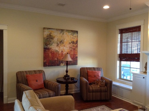
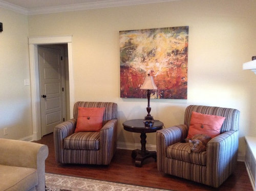
Advice please - is this piece too large for the wall?

Comments (82)

  • 12 years ago
    last modified: 12 years ago
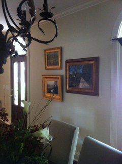
    It is not too large. Agree it needs to be rectangular to bring harmony to the wall shape. I recommend lowering it a tad and then framing a rectangle around it in wood molding to give it some depth and relate it to the wall shape. Example from http://www.remodelandolacasa.com/2012/04/wall-frame-moldings-ten-top-reasons-for.html

    The inside of the picture molding frame can be painted an accent color from the picture to further add interest and harmony.
    kngilley86 thanked adrimama
  • PRO
    12 years ago
    NO the art is great that size, havent read all the discussion here, however Try the pillows from the chairs on the sectional! might need to remove one or two of the sectional pillows
    All the color is on the one side of the room
    kngilley86 thanked GARY FINLEY
  • 12 years ago
    Trivia: Art can never be 'too big'.
  • PRO
    12 years ago
    easy with the blanket statements
  • 12 years ago
    Absolutely, incubus. It needs room to breathe :)
  • PRO
    12 years ago
    thank you MY NEW FRIEND
  • 12 years ago
    exactly incubus. I've had clients buy my art at 24x36 and some even 30x40 if they have the wall space. Art tends to look more impressive the larger it is.
    kngilley86 thanked diyher
  • 12 years ago
    I think the painting is lovely. I would not remove the pillows from the chairs because they tie in beautifully with the art. You can pick some colors from the painting and add some pillows onto the sofa in those colors. I do agree with Amy Cali and you could add a throw on one of the chairs as she has suggested to break up the symmetry a bit. I was going to post a lamp by Jonathan Adler because it would have been perfect until I saw the price, but will try to find something similar. I love the cabinetry and I like them the way you have them now but would be curious to see how some color would look on the back of them. I think the room is shaping up very nicely.
    kngilley86 thanked Mark
  • 12 years ago
    So funny you suggest color on the back of the cabinets. My husband and I were just discussing that same thing. Just anxious about the color. Any ideas?
  • 12 years ago
    Love the painting, beautiful room!! Cute kitty too! ;)
  • 12 years ago
    Can you bring the chairs around the corner? Move one closer to the fireplace and the table in the corner .
  • 12 years ago
    The easiest way to see if you would like to add color to the backs of the display cabinets is to get foam board or card board and paint them and lean them against the back and see if you like it. Or you could see a wallpaper that you may like and just tape it up to see as well. This way you are not ruining your cabinetry.
  • 12 years ago
    I would keep your art work, just change the lamp. See: a neutral lamp, in glass, to not compete with the artwork. The shade shall be below the lower frame...
    kngilley86 thanked triaquim
  • 12 years ago
    too bad you couldn't put the tv where the art is! then again, I suppose you need the chairs to watch the TV. IMO, the art work is just too blocky for that spot, and yes, the lamp has gotta go. If you can't put the art in another place in your home and find two pieces or one long, wide piece for that spot, then try a shorter, wider table with a shorter lamp that has a wider shade. Very nice room though, and nice placement of tough furniture and the compromising position do the tv!
    kngilley86 thanked kmkane123
  • 12 years ago
    last modified: 12 years ago
    Maybe try placement of a narrow table under the painting and only one chair? Perhaps that would open up access to the window seat, as well. Also, the painting doesn't necessarily need to be centered on the wall. And move the "matching" chair to another location. I think a less balanced look, currently with the 2 chairs and a small table on the same wall, might work better. Then, when you replace the lamp you can use a reading lamp next to the single chair. I know how it is to work with a room that limits furniture placement. Our family room is sunroom with French doors on one end to a screened in porch - and 10 windows!
    kngilley86 thanked mrp55
  • 12 years ago
    last modified: 12 years ago
    I really like your room as is with the simple addition of a throw, incorporating a bit of your accent color with pillows on the sectional and a new lamp. Very nice already!
    kngilley86 thanked Amy Cali
  • PRO
    12 years ago
    Just what I was thinking re the lamp, groveraxle.
    kngilley86 thanked Barnhart Gallery
  • PRO
    12 years ago
    I think I would drop the painting down several inches to tie the three pieces together and add a half round table against the wall underneath it. Then accessorize.
    kngilley86 thanked Beth Covert Studio of Painted Design
  • PRO
    12 years ago
    last modified: 12 years ago
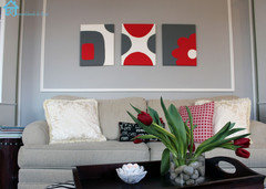
    Nice painting and furniture, there are too many square shapes; the painting, chairs, pillows. Everything is symmetrical, need to mix it up a little.

    The floor lamp to one side should take care of reading needs for the seating area plus moving the chairs forward will make them not look like they are hugging the wall and part of the sofa seating.

    Prints and paintings that are subtle like line drawings without a lot of contrast and design, wall plaques or wood/metal plates can be added as in the pictures. Pottery Barn has some nice wood plaques.
    kngilley86 thanked Suzanne Powers
  • PRO
    12 years ago
    No, I like it :)
    kngilley86 thanked Article
  • 12 years ago
    I agree....looks great
    kngilley86 thanked rubbericons
  • 12 years ago
    I think that it looks great but not with that lamp.
    kngilley86 thanked Geneviève
  • PRO
    12 years ago
    last modified: 12 years ago
    Consider changing the table to glass and metal topped off with low accent lamps. The guests and artwork can benefit from the indirect illumination without the lamp interfering with the artwork "space" and conversation between the people seated in the chairs. A glass table is visually minimal and complements the artwork...does not compete with it.
    kngilley86 thanked Scott Design, Inc.
  • 12 years ago
    Like your art, but I think it's too big for this wall with the set up you have. There's too much empty space underneath it. Can you pull your chairs closer together and change out the round table for some small and rectangular to go on one side of the chairs. The black table competes with the art.
    kngilley86 thanked User
  • PRO
    12 years ago
    Is there another wall it could move to? It is rather imposing.
  • PRO
    12 years ago
    for those that dont like to art where it is ......likely dont like the art....its perfect where it is in my opinion. If it is lower it wll start to over lap the back of the chairs....
    kngilley86 thanked GARY FINLEY
  • 12 years ago
    Nasiri Carpets
    The Nasiri family’s passion for rugs has gained them accolades in the rug collectors’ market – an extensive network of rug production, and they bring the best of these rugs to their New York showroom.
    For more info:>> http://www.nasiricarpets.com
  • 12 years ago
    love the picture...just find a lamp with a lower profile.
    kngilley86 thanked Vicky Laflamme
  • 12 years ago
    last modified: 12 years ago
    Thanks everyone for your honest assessments, but most particularly those who liked it! Lol
  • 12 years ago
    Artwork looks great!
  • 12 years ago
    I agree with groveraxle. The art looks large because it is standing alone. Make an arrangement and it will have a more cohesive feel. You can so this either asymmetrically like the picture groveraxle posted or symmetrically depending on the rooms features. If everything is already very symmetrical I would mix it up and do something like groveraxle posted. Maybe even a couple of round mirrors....or architectural pieces.
  • PRO
    12 years ago
    GOOD DESIGN IS KNOWING WHEN TO S T O P.....please enjoy the art was it is....its contemporary, it has no frame, it is striking and bold....that is its intended impact. LET IT BE.............................arrangements have their place but not here....I'm out !
  • 12 years ago
    Just my opinion but the art needs to be on the wall alone. It's a beautiful piece of art and to me anything next to it will just detract.
  • PRO
    12 years ago
    Good man!
  • 12 years ago
    Depends on the size of the wall compared to the art. The wall in your picture can support a grouping.....personal preference.
  • 12 years ago
    Your art works great, it's the wall color that I would change- and just THAT wall, as an accent. The rest of the room looks great in that color. I'd go with the rust or peach tone that's on the bottom of the picture to pull out a good wall color and make that art, and the beige-y sectional, really pop. Don't be afraid of color, pull it right out from the painting. Shorter, wider, more blocky lamp will work well, or use a floor lamp to the side of one of the chairs and add a decorative grouping on your table. I think the art is hung perfectly, not too high (I hate art hung way high, a common mistake.) I'm a big fan of ONE large piece, like what you have, than a whole bunch of art. Your room is beautiful.
  • PRO
    12 years ago
    last modified: 12 years ago
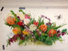
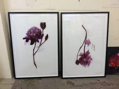
    Your piece of art (by being square) is too tall and not wide enough for your area over the chairs. A horizontal piece of art that covers the inside half of each chair, with a height considerably less than the width is ideal. The addition of the two prints as shown above achieves the same results. For future reference.
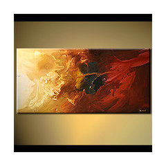
    horizontal red and gold abstract painting - Abstract and Modern Art Painting · More Info
  • 12 years ago
    I love these lamps. The (Fullered Impressions.). I'd like to see one tall floor lamp behind the chair on the left and another one of the same design on the right, on the bench with maybe some books stacked next to it. The picture is very nice...I like it. I've been looking at art work I could afford, purchased four, and sent them all back. So for me picking out the right piece takes time and patience. I like the idea of throwing a "throw" on one of the chairs and a pillow in the opposite chair. I think the table in the middle is the perfect height, however you may want to change it out with a lighter brown square table or with a flat top trunk, add some simple ivory candles or pale yellow, some that match the yellow in the painting. Hope I haven't overloaded you on ideas. Please post a picture when you're done...love to see how it came out.
  • 12 years ago
    whatever piece of art you add to what you have up there now, I would stick with canvas wrap like the large one looks to be. Too many replies and can't read them all, but another arrangement could be push the 2 chairs closer together with no table between them. Then put the one table and lamp to the left near the end of the entry way, and another on the seating bench against the wall since it's almost like a built in table?
  • PRO
    12 years ago
    The artwork is wonderful and you have one a nice job thus far. I would love to see a solid colored ottoman infront of the chairs,just one large ottoman to share the seating. remove the table between the chairs. Lay a tray or mirror on the ottoman and a throw to soften your room and maybe a floor lamp flanking one of the chairs. Best of luck with your profject.Looking forward to seeing your finished project pictures.please share! Paris.
  • 12 years ago
    The room in the original pic looks fine and so does the art.
  • PRO
    12 years ago
    Karen Paul Interiors is spot on. Sunday 12:27
  • 12 years ago
    I like the art and the size of it but, as a few others have mentioned, I think it needs to lowered a bit - I'd try 3" lower.
  • 12 years ago
    I also really prefer the idea of a floor lamp to a table lamp - as in grover's picture, but I don't think I'd add additional art. Nice home!
  • 12 years ago
    I just read that you don't want the swivel chairs to hit the art if it's a bit lower. Can you pull the chairs out just a tiny bit to avoid that. Just a few inches lower would really make the art a better part of the overall arrangement on that wall. The colors of the art are perfect and once again I think the grover floor lamp idea is brilliant. That idea keeps the area from looking overly symmetrical.
  • 12 years ago
    I love the painting. I agree about a throw on the chair. Them you could add the throw pillows to the seating under the window for color and interest. When you get rid of the lamp, maybe a floor lamp behind the hair closest to the window will work. It won't block your pretty painting AND will give you lighting options if you need it.
  • PRO
    12 years ago
    It is a beautiful painting but the wrong shape, move it to one side and add two small works beside it salon style or place another larger or horizontal painting.
  • 12 years ago
    I think it is too large, but the size isn't as problematic as the shape. Your wall seems to be a repetitive amalgamation of squares (the wall, the art work, the pillows.) I like the painting, and the colors really tie that corner together. If you're married to the painting, perhaps try placing it in a frame with curved or scalloped sides. The optimal solution would be to replace it with two or three pieces of artwork that form a longer, rectangular outline.
  • 12 years ago
    Your tv is to high