Software
Houzz Logo Print
nikkiw78

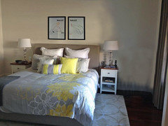
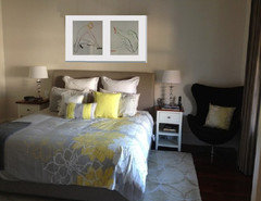
What am I still missing from this master bedroom?

12 years ago
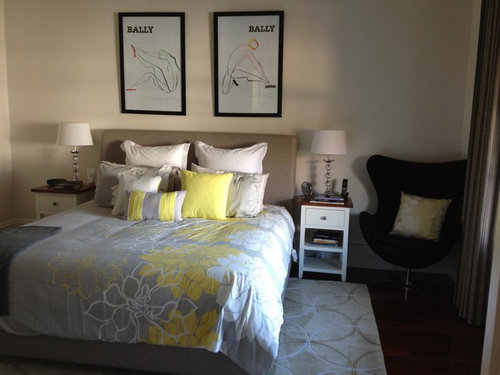
Hi. Not sure if / what is missing from here. Would love feedback. Thanks!

Comments (59)

  • 12 years ago
    Yes black chair
  • 12 years ago
    Your room looks fine, but the chair doesn't belong. I would replace chair with a plant. We have a potted plant the size of a small tree. It's doing good although natural light coming thru window is at a minimal. Alas, we do not know the name of it.
  • 12 years ago
    mariaed, that's a crazy looking clock pic above (the numbers shout out!!!!). I'm loving it. Where do i get one ?
  • PRO
    12 years ago
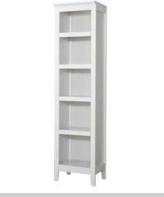
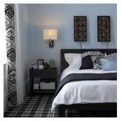
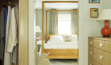
    You have infact done a nice job of matching all the bedding, the rug and the frames. I would just add a few little changes, yellow tulips in clear vase (good quality fakes would also look nice to add some life) and the black chair is overpowering, i would change that with a thin long open concept shelf, see image:) or switch to a kaki chair to match headboard.
  • PRO
    12 years ago
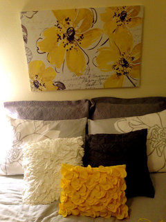
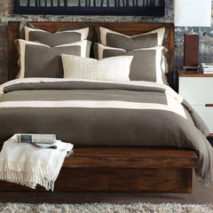
    It's off to a great start. We have the same bedding in our staging inventory and we use it with different pillows than what came in the set - in the back we substituted gray pillows, used the stock pillows next, then added a deeply textured white pillow, another darker gray pillow and a yellow pillow in the front. The attached photo is just from our warehouse set-up (not in a property) but when we use it in staging we add a gray headboard, a gray or white throw at the foot of the bed, darker (with simple lines) side tables with very little decor and a side chair in a light shade, kind of a neutral beige to avoid everything looking too "matchy". We added the art that we thought complimented it (although we had one client who does not like the painting with it at all, and in that case we used another piece of art.) Good luck! Love the rug with it btw.
  • PRO
    12 years ago
    last modified: 12 years ago
    …must have missed something when I tried to add the photo…trying again…(we're using this on the exact same bedspread you have btw)
  • 12 years ago
    where did you get your duvet cover? It's lovely!
  • 12 years ago
    Hi Jasmine. I bought it from overstock.com. Yes I love it too!! Thanks.
  • 12 years ago
    Slightly bigger lamps, smaller art, chair moved somewhere else.
  • 12 years ago
    last modified: 12 years ago
    curt--I just googled unusual clock. Not sure where it's from.

    could the chair go on the opposite side? Is there space.
  • 12 years ago
    The black seems out of place in the room to me. I would tone down the black frames and if you need to keep the chair lighten the color of the fabric. Either that or add black elsewhere in the room (however I think the bed would looked washed out then).
  • 12 years ago
    I think a huge pop of color, something simple like a pillow or a solid color of reddish orange for a foot of bed throw, I have a quilt folded up width wise at the foot of the bed..
  • 12 years ago
    Or a great pop of color would be to paint the walls .. I have santa fe brick color on my walls, it's kind of light in the daylight but beautiful at night.. and then everything else you have in the room would blend into it
  • 12 years ago
    Also what I did because I love books, never enough.. I put two sets of bookcases staggered from AFW.. on each side of the bed.. put the lamps on the cases.. wish i knew how to upload a pic from my camera..
  • 12 years ago
    I'm wondering if you have too much symmetry to suit your own taste. If so, you need to work something asymetrical (sp?) into the room. I see two pictures, two identical tables with lamps, and two white pillows on the bed. Can you trade out some artwork and pillows to break up the pattern. You have beautiful items in this room!
  • PRO
    12 years ago
    Art work above bed could have more colour
  • 12 years ago
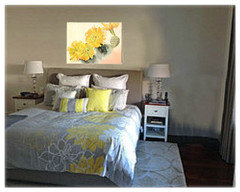
    I think you need bigger, bolder art that ties into the color in the room, such as this print by Georgia O'Keefe:
  • 12 years ago
    Thanks again. I think you're right about the lamps and artwork. I have moved the chair and its much better. I've also a added an extra large pillow to break up the symmetry (much to hubby's horror 'not another pillow!!'). I love the artwork so I'm going to try and work with these. I also agree I need to use some red accessories so will give pillow/throw a go and see how it looks. How exciting!!
  • 12 years ago
    I know that you like the art but don't think that it does anything for the room, bedding. It seems out of place over the bed.
  • 12 years ago
    Yes, like it belongs in an exercise room...
  • 12 years ago
    Different over the bed picture. Accent colors in the pillows maybe. Definitely need a chair to really sit in or throw stuff on (;
  • 12 years ago
    Took the words out of my mouth Nancy.
  • 12 years ago
    What would you like to say?
    I absolutely love your color scheme! I also agree with those who noticed the scale of the lamps and the end tables. The first thing my eyes went to were what seemed to be itty bitty (weak) lamps which, if bigger & possibly bolder might well bring it all together. Excellent job so far!
  • 12 years ago
    Also agree that you need bigger night tables & lamps. I love the duvet cover.
  • 12 years ago
    Like the room. But not the night stands. Should be bigger. Cover wall with furn. Move chair to another area. Maybe try a bigger base on lamps. A mercury glass would work gray drum style shades.
  • 12 years ago
    Large wood bedside tables, not white, larger lamps.
  • PRO
    12 years ago
    Good advice so far, so I won't repeat.

    I was going to suggest other artwork for the bedroom, since the advertising seems cold, but for all I know it's the place you met and fell in love, in which case, how sweet.

    Since in your last post you said you wanted to work with it, I've cropped and mounted the figures as a single art piece, and also reversed their positions so that they are facing each other instead of away from one another.
  • PRO
    12 years ago
    Oops -- photo:
  • 12 years ago
    You could even mount them with a yellow mat, with an inner mat of the red.
  • 12 years ago
    Nice room. Agree with changing out nightstands/lamps also want a real POP? Color block. Take the yellow pillow to the paint store and match up paint (or close compliment) and paint a yellow square in the middle of the existing wall- keep the beige color as a (significant sized) border and perhaps replace existing art with Nancy Walton's suggestion of the Georgia O'Keefe painting. If you plan on keeping the chair also include HomeScapes San Diego's pillow ideas-including a black accent. What's missing I think is relegating all the color to one (relatively) small spot on the bed. Take the chair out of the corner too. Here are a few ideas for your further consideration.... Also since you have so much wall space you could use wall sconces for lighting and free up space on your nightstand top.
  • 12 years ago
    Love what you have done with the art work Barnhart Gallery. Lovely bedroom Nikki. Yes reframing the art and even a throw with some red in it for the chair would work wonders and cost very little.
  • 12 years ago
    I don't think anyone has mentioned this yet....I think you should swap places with the two art peices, so that the figures face inwards instead of outwards. I believed there was an art Ideabook recently that recommended this practice.
  • 12 years ago
    Ha! Just noticed that Barnhart Gallery already commented on this! :-)
  • 12 years ago
    That was going to be my comment too, wyndyacre and Barnhart! There isn't enough contrast between the bedding and rug, not enough visual heft to the night stands and lamps. Bet the swivel chair would work great in the TV room!
  • 12 years ago
    I love the art as is and the black chair--don't change that!
  • PRO
    12 years ago
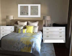
    Regarding the side tables, there's a bit of wasted space along that wall that you could put to great use with a pair of small bureaus instead...
  • PRO
    12 years ago
    Ancient paint at your bed wall to create a little more interest, possibly add some more colorful mattes to your photos to enlarge them and draw the eye to them a bit more.
  • 12 years ago
    I agree with different nightstands and lamps, bringing some yellow to the sides of the bed. I also think a nice round mirror on the right side would add some needed curves to things and mimic the rug's patterns. And more color in the artwork over the bed, maybe new mats. Red would spice things up nicely.
  • PRO
    12 years ago
    I think move pics a bit closer together, remove chair, add throw blanket and get silver lamps.
  • 12 years ago
    Venus de Milo from the Connetticut Milos. She's armless enough.
  • 12 years ago
    Geez chook, i have so many comments about armless gals, but i "feel" none are not appropiate here, :)))))))
  • 12 years ago
    A simple touch that would make a difference is to make the euro pillow in the back darker. A grey shade maybe.

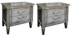
    Then for me the bedside tables do not work very well because of the style
  • 12 years ago
    I would add a bright throw over the chair and put one large art work on wall rather than two pics. It would be nice if you could put up lighter curtains too.
  • 12 years ago
    i would suggest completely changing the pale colored bedsheets , pillow and throw pillow covers into something (very) dark. the white pillows against the beige headboard sets a washed out tone. for example, since there is a hint of red or orange in the artwork, you can choose a bed cover that has red in it or plaid colors to add more colors in the room or even monochromes just to emphasize contrasting colors:

    Seville Duvet Cover/Comforter Cover · More Info


    Tahoe Plaid Duvet Cover · More Info


    Breeze Mitered Linen Clay With Pearl Duvet Cover · More Info
  • PRO
    12 years ago
    ...if you go with a larger pair of bureaus for storage, look at this little print practically made for your bedding:
    http://www.etsy.com/listing/41074599/yellow-rabbit-art-print-bunny-art?ref=shop_home_active
  • 12 years ago
    I think the 2 posters don't go with the room. Nightstand too narrow. Lamp is fine. The rug has large circles which give off mod vibes. The size of the pattern clashes and competes for attention with the big floral print.

    The thing to really correct in this room is to reduce the number of styles. On the surface, the colors are all neutral and blending but the lack of harmony is apparent in the style of modern exercise posters, floral bed, glam/ feminine lamp, country narrow nightstand and mod rug.
  • 12 years ago
    Maybe taller lamps on the night tables. Darker bedspread to contrast the rug. And tons of books. But yours looks nice and serene. I'm more jumbly and bold
  • 12 years ago
    A little dark gray in the front wall and the side walls a cream color
  • 8 years ago

    I would also say switch the art so they are facing in and see if it changes the entire look of the pieces. Art is what you like so I don't think there is a particular type that works. Sometimes the element of surprise is best.