Software
Houzz Logo Print
brjichardson

Bedroom Wall Color

12 years ago
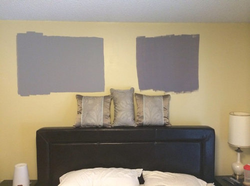
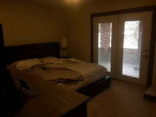
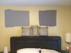
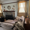
Please share your thoughts. We would like help choosing a paint color for our master bedroom. The photo attached shows two sample colors that we chose. The pillows give an idea of our bedding and you can also see our headboard, which is wrapped in dark leather. Side tables are also dark. We have a large dresser that is weathered gray, no windows, but French doors that let in natural light. We are thinking of going dark on the walls and painting the trim white to keep things from being too dark, but we like the idea of saturated color to give the room a moody feel. Any suggestions?

Comments (34)

  • 12 years ago
    I prefer the color on the left, it's still quite saturated and will seem plenty dark when the entire room is painted.
  • 12 years ago
    I'm with sunnydrew - the one on the left gives great contrast, but is softer. Don't think you have to paint your trim color bright white to make up for the color. Choose a white that has gray tones to set off the blue!
  • PRO
    12 years ago
    last modified: 12 years ago
    The color on the left will work just fine. Since your furniture appears to be dark in color and fairly bold in presence, a lighter wall color will lend itself well to the space and make it feel less overwhelming.

    Dark paint colors on walls are fun, and create a statement if done right. If you're really attached to the darker color, consider have a dark accent wall, preferably a wall that won't host any of the dark-colored furniture.

    Some photos of the entire space would be helpful in giving advice.

    Good luck in your redecorating project!
  • 12 years ago
    Too dark and gloomy.
  • PRO
    12 years ago
    I like the contrast painted on the left. Will all the walls be painted this color or just the wall behind the bed?
  • PRO
    12 years ago
    The one on the left is better. The one on the right is too dark.
  • 12 years ago
    last modified: 12 years ago
    On my monitor, the undertones of the two paint choices are off. The pillows have a green undertone you need to be working with. With so many dark features in the room, I would like to see you choose a lighter gray, perhaps BM Edgecomb Gray, with a green undertone.

    Edgecomb Gray HC-173 · More Info
  • 12 years ago
    If your bedroom is smaller, I would go with a lighter color. Otherwise a darker color will make your room look even smaller. I love the color on the left though!
  • 12 years ago
    I also like the left sample. Goes well with gray in the pillows shown.
  • 12 years ago
    Thank you all for the feedback. We are planning to paint all walls the same color and would also like to add crown moulding.
  • PRO
    12 years ago
    I like the one on the left as well. How is the lighting in the room? If you go with a darker color and there isn't good lighting the room will feel smaller. Good luck:)
  • PRO
    12 years ago
    Left. All reports confirm left.
  • 12 years ago
    Like the color on the left much better with the dark headboard. Good luck.
  • 12 years ago
    Well, I hope you never are in a bad mood because this room with those dark grays would add doom to the gloom. sorry
  • 12 years ago
    I thought the color was dusty plum...
  • 12 years ago
    Odd man out - I prefer the one on the right. It seems a bit warmer. But it think that is missing from both colors. I kind of like the dark idea, but only a warm dark if that makes any sense...
  • PRO
    12 years ago
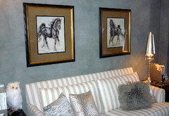
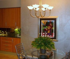
    Dark walls can be very dramatic, romantic, and elegant. I suggest using a paint with either a metallic or textured finish. It adds character. I used a dark gray with a suede finish in a guest room that was very effective. In a kitchen, I used a dark gray with a metallic finish that shimmers in the evening. It's also very important to have sufficient lighting. Two lamps won't be enough. You need layered lighting. A chandelier in the bedroom adds sparkle. Attach art lights above any artwork. A mirror adds reflective light. Add some colored toss pillows with shimmery beading and crystals. Add LED strips under shelving for atmosphere.
  • PRO
    12 years ago
    Can you do an even closer photo of the pillows? Also, what are the two samples you have on the wall?
  • 12 years ago
    the one on the left , yet for me - too dark
  • PRO
    12 years ago
    last modified: 12 years ago
    I suggest that the wall behind the leather headboard be wallpapered. I think it needs more of a back drop than what paint alone will do. Then choose a complimentary color for the other walls.
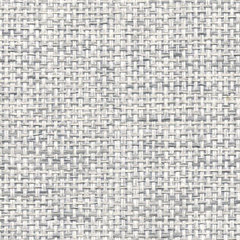
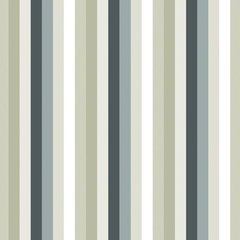
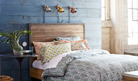
    Metallic Paper Weaves · More Info

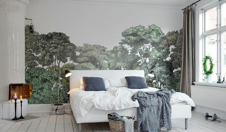
    Wallcandy Arts | French Bull Izzy Gray Removable WallPaper · More Info

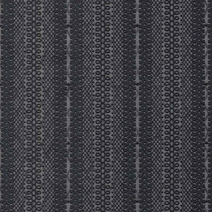
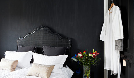
    Astek Shadows on the Wall Black Dark Gray Boudoir Wallpaper · More Info
  • PRO
    12 years ago
    Go with the lighter one on the left !
  • 12 years ago
    The one on the left or maybe a "greige". The headboard seems to be dark brown leather. Not suggesting beige but something that has a tiny bit of a brown undertone to the gray.
  • PRO
    12 years ago
    last modified: 12 years ago
    I'd go with the one on the left, but a shade lighter -- closer to the shade in the pillows.
    Christi for ThosBaker
  • PRO
    12 years ago
    last modified: 12 years ago
    You all know that blue can really throw a room for a loop if it's not a dead ringer for the specific family you're working with. I can't depend on my monitor for anything...sadly! However, I'm seeing a warmer hue in the lightest (center) of the pillows and I'm also thinking the background blue in the pillows may be coming in at a value that is a little too close for comfort with the one on the left? Just sayin'. So if she wants depth, does proper lighting, yadiyadiyada, then something like the one on the right might be dark enough to mask any mistake in hue and should also bridge the gap between the pillow blue and the depth of the headboard. I may be all wet, but that was what first came to mind. That's why I wanted to have a closer look at the pillows. :)
  • PRO
    12 years ago
    I'll tell you, Judy G. has a great point with the wallcovering AND it can roam around between families of blue and make it look as though you really found your way. Ha, ha!
  • PRO
    12 years ago
    The one on the left, the right is too dark.
  • PRO
    12 years ago
    I think they are both too dark, they will make the room feel small and gloomy.
  • 12 years ago
    I vote for the one on the left too! But I also like JudeG's idea for wallpaper.
  • 12 years ago
    The colour one the left goes well with the pillows. If they are what you like, go for it. If it doesn't work change it. Its only a pot of paint at the end of the day, not like spending thousands on a place of furniture that doesn't work. Have fun with it.
  • 12 years ago
    Agree with trebinje's post above on the BM Edgecomb Gray.
  • PRO
    12 years ago
    The one on the left will contrast your bed more and keep things cool and bright with all your darker furniture.
  • 12 years ago
    I prefer the one on the left. I think you could go at least one shade lighter and still have a beautiful gray that co-ordinates with your pillows. Stay with that silvery hue :)
  • 10 years ago
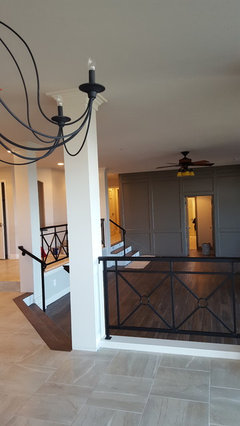
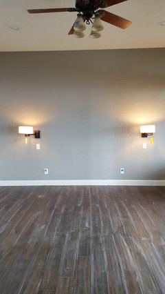
    We are finishing up a complete renovation of our home in about 2 weeks. We used two different darker gray walls in our home. The wall in the living room is a SW paint called Annonymous . The dark wall in the bedroom is Intellectual Gray and is lighter than the first picture. The other walls in these rooms are SW Wordly Gray . It was a huge leap of faith for us to do this and we love the results. We had some help with a SW paint consultant and she was spot on. We'll bring In some lighter elements into the rooms. Note that the lighting looks more yellow than it is in person. Good luck with your choice.!!
Sponsored
Bella Casa LLC
Average rating: 5 out of 5 stars17 Reviews
The Leading Interior Design Studio in Franklin County