Software
Houzz Logo Print
lpjohnso

What color should we paint our kitchen cabinets?

12 years ago
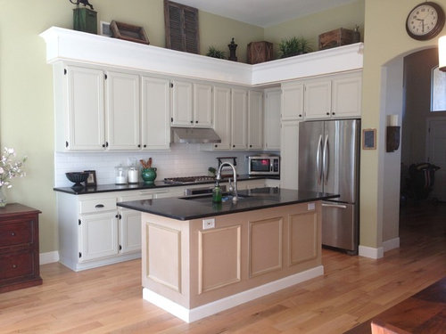
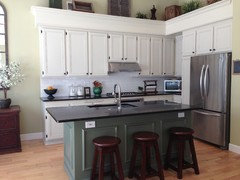
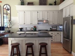
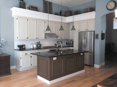
Hello! So, we recently covered up an ugly soffit above our kitchen cabinets and our 1/2 dry walled kitchen island with new wood moldings (Please see before and after pics). So, now I am at a cross road: Should we painted the new moldings the existing cabinet (BM Tapestry Beige) paint, or just go with something completely different? The new molding up top is white, but not painted yet, and the island is still the unfinished wood.
I really like the light taupe we have on the cabinets now, but I have always felt something was off, perhaps it is because the subway tile backsplash is so white, or maybe it's because the green wall color in the kitchen is not very complimentary. Maybe keep the taupe color cabinets, but change the backsplash and/or wall color? Please help!
PS- I will also be adding pendant lights and 3 new stools. :)

Comments (90)

  • 12 years ago
    LOVE that look, azhomes! We will definitely paint the trim under the island the same color as the island cabinets, and the same goes for painting the soffit the same color as the cabinets. we are definitely wanting to achieve a furniture type of look and I agree those things will greatly help. Thanks so much!
  • 12 years ago
    I think after you do that the the white backsplash will go perfect! Good luck!
    The Vintage Bean thanked azhomes
  • 12 years ago
    I would paint all the trim, soffit and cabinets Benjamin Moore White and leave the wall color and backsplash. We had that combo in our house & loved it. white dove is a beautiful white for cabinets! Good luck.
    The Vintage Bean thanked ckg12171
  • 12 years ago
    I meant Benjamin Moore White Dove...not just white
    The Vintage Bean thanked ckg12171
  • 12 years ago
    Thanks, azhomes!
    Ckg12171, thanks for your advice! White Dove has been at the top of my list if I repaint the cabinets to be lighter. Such a perfect soft white! :)
  • 12 years ago
    You should paint what you like.
    The Vintage Bean thanked sadesoe
  • 12 years ago
    Think contrast. You have black counters. Stay in same color tones, just go one shade up or down on color chip. It the easiest in picking colors for one room.
    The Vintage Bean thanked Nancy Travisinteriors
  • 12 years ago
    last modified: 12 years ago
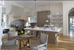
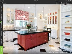
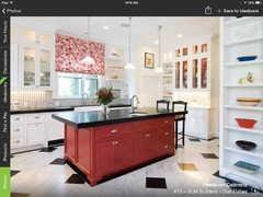
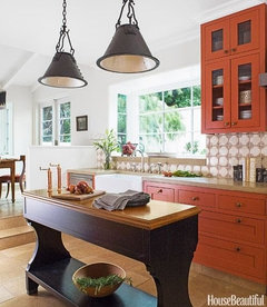
    Here's my favorite kitchen color scheme of all time on Houzz. You have fabulous bones in your kitchen, and the ceiling height and scale to justify the sizing re: your molding. Just imagine these colors - enjoy..
    The Vintage Bean thanked Mrsobbs
  • 12 years ago
    Gosh the commenters are making a lot of work for you. Your kitchen is excellent. Now for what is wrong. You seem like a collector of vintage finds but putting them above soffit only attracts the eye to what everyone thinks is a proplem area. You need to make the others areas of the room friends with the kitchen, I am betting that is your real problem not the backsplash or paint colors. I picture graphic rugs. I am a fan of indoor outdoor rugs in the kitchen, dining....see Ballard design. The new lighting and bar stools will make a big difference. The island reads a odd color. I would consider chalk paint in soft color, maybe grey/blue.
    The Vintage Bean thanked Kathleen Jamison
  • 12 years ago
    Beautiful kitchen, mrsobbs! Thank you for sharing! Kathleen, thanks for your suggestions! The island is still actually the unfinished wood of the new panels. I have often struggled with keeping or removing the vintage items above the soffit!
  • 12 years ago
    The vintage ideas are to evenly placed, to end to end to the same size. Play with them some more. You have good taste but need softer yet bolder touch. Soften the table , oversize bowl on top, cushion on bench , an odd painted chair, fabric.
    The Vintage Bean thanked Kathleen Jamison
  • 12 years ago
    last modified: 12 years ago
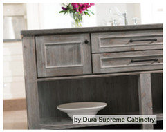
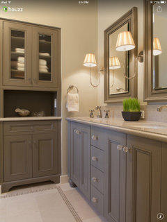
    Perhaps as a single first step you might paint the island as KJ suggested, but rather than introduce yet another color, I'd suggest the attached. That would tie in with the colors of your vintage pieces, be a neutral influence to the counter-tops, compliment the walls and anchor the room. The effect would be neutral enough for further steps should you decide to take them on.

    You can thank Dura Supreme for this example - snatched off Houzz.
    The Vintage Bean thanked Mrsobbs
  • 12 years ago
    Love all of those ideas mrsobbs and Kathleen! Thank you!
  • PRO
    12 years ago
    Chocolate.
    The Vintage Bean thanked Dana Decals
  • 12 years ago
    What ever you decide.....please don't paint island black...that moment has passed.
    The Vintage Bean thanked Kathleen Jamison
  • 12 years ago
    Please @The Vintage Bean, DO post photos when you've engaged. We'll all be excited to see the process. Best to you.
    The Vintage Bean thanked Mrsobbs
  • 12 years ago
    One small change is to swap out the hardware for something that blends better - maybe stainless. The black seems like little dots of color all over -especially the hinges.
    The Vintage Bean thanked cfollowell
  • 12 years ago
    Mrsobbs, I most definitely will! :)
  • 12 years ago
    Changing the hardware is not that easy. The hinges are mounted the old way on the outside. I thought I thy gave a vintage vipe.
    Silly me thought the wall cabinets where painted a soft grey...perfect...and only the island needed painted
    The Vintage Bean thanked Kathleen Jamison
  • 12 years ago
    Thanks, Kathleen! I'm playing with so many colors at the moment and with all of the wonderful advice, I still can't make up my mind! Also, still trying to decide on pendant lights and stools! I love schoolhouse lights, but wonder if they would be too predictable??
  • 12 years ago
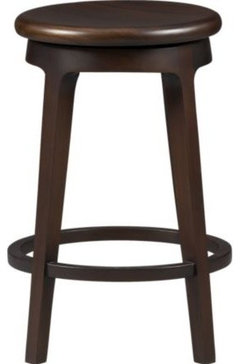
    Thinking about these stools from Crate and Barrel...
  • 12 years ago
    I agree that school house lights predictBle. Here's the thing ..15 years ago they were a new concept that open up a world of decorating because of that there are wonderful expanded options of loft/industrial looks. All in all the right direction for your ascetic and collections.
    The Vintage Bean thanked Kathleen Jamison
  • 12 years ago
    Are the stools mahogany? I see you like wood? Not school lights and mahogany. Gotta pick out lights first. Then u will have a direction. Guess you know the number one color trend in kitchen cabinets is gray
    The Vintage Bean thanked Kathleen Jamison
  • 12 years ago
    How about a wood back splash to match the wood furniture. Everything else the same.
    The Vintage Bean thanked Christalyn
  • 12 years ago
    Thanks, Kathleen! Yes, stool are mahogany. :) Christalyn, I love the idea of a wood back splash! It sounds very beautiful and unique. Thanks for your comment!
  • PRO
    12 years ago
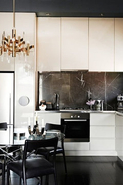
    I would choose a darker color to create contrast, make those cabinets pop.... like so...

    Just a thought... Good Luck!
    The Vintage Bean thanked Article
  • 12 years ago
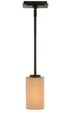
    Wondering if you would like these pendants - a grouping of these might compliment the existing light over your table. Is that light part of a collection?

    I ask because of something Kathleen Jamison said earlier; some sage advice re: your kitchen needing to make friends with the other areas in proximity. A non-contrasting trio of pendant lights might help in accomplishing that.

    Kathleen Jamison is also right in suggesting you find your light fixtures first, then other decisions will more naturally follow. I think you've got some great guidance in KJ.
    The Vintage Bean thanked Mrsobbs
  • 12 years ago
    I really like the etsy light, but i can't tell if there's a rod. I bought fixtures with rods for my kitchen. Had to buy all the fixtures for this house and went through trying to decide. I hadn't found houzz yet. Nice to have a forum to ask!
    The Vintage Bean thanked karelina
  • 12 years ago
    last modified: 12 years ago
    Just realized - no maker name for light was shared. It's a Murray Feiss - Preston Collection #K5091, and includes 42" of rod (one 6" & three-12") for around 100.00. Speaking of hovering, to get the full view of the light, cursor must hover over photo (for the uninitiated). This I found on Lamps Plus but it's available at many online outlets.
    The Vintage Bean thanked Mrsobbs
  • 12 years ago
    Now the ideas are flowing. Bringing stained wood into the kitchen
    Brilliant. I saw TV designer Sarah Richardson use flooring on back splash and another application reclaimed wood for random casual look.
    The Vintage Bean thanked Kathleen Jamison
  • 12 years ago
    Ohhhh, I have been trying to see your view and now want to ask you can you amp it up and be BOLD. You need some fabric, COLOR, art in your house.
    The Vintage Bean thanked Kathleen Jamison
  • 12 years ago
    You're getting a lot of good input, and before I step out I hope you remember going forward that the eye WANTS to know where to go upon entering a space. There's a little anxious internal dance as we try to find those touchstones at entry. It's key to being at ease in a space, and if too much is introduced, it can derail us - confuse even where to go physically. It's a mental stammer.

    So having that clear and simple/never more than two conflicting items/elements drawing attention helps create calm. The repeat of elements versus introduction of 'more' lends continuity and spares confusion. Again, KJ comes up with a good example.
    The Vintage Bean thanked Mrsobbs
  • 12 years ago
    Thank you so much everyone! Special thanks to Kathleen Jamison and mrsobbs for taking so much time to help me make everything look its best! :) I can not wait to make our final decisions and see the room completed! I will definitely update with pics once it is ready. :)
  • 12 years ago
    Thank you for the thank you. Will check back in for your decisions
  • 12 years ago
    Maybe painting your cabinets similar to these would bring out those beautiful subway tiles. Your kitchen is very nice. Excellent improvement on the soffit.
    The Vintage Bean thanked marilyn3780
  • 12 years ago
    Mmmm, I love that color of cabinets! Thanks you so much for your suggestion and compliments, Marilyn! :)
  • 12 years ago
    I would go with lighter pewter cabinets and play with the rest of it! Your island could go a nice deep sea blue, and the tiles could go a dull mustard yellow.
  • 12 years ago
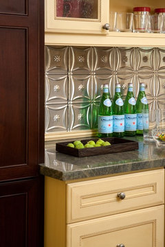
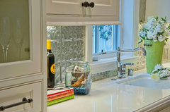
    I like what have done to your island and that was a good way to make a soffit tie into your cabinets. I feel the white back splash does not look so great with your lovely cabinet color. A simple suggestion to consider is to use those faux punched tin sheets you can buy at the box stores and install right over the existing tiles. Painting kitchen cabinets is much work and yours look great!
    San Roque Residence · More Info
  • 12 years ago
    Lovely kitchen, I agree that the moulding should be the same colour as the cabinets, but to make it look contemporary I would use shades of white, check out farrow and ball, (wimborne white,strong white,skimming stone and elephant's breath) together they can make a room look very luxurious, good luck x
  • 12 years ago
    Brentwood Traditional 1 · More Info
    Another pic of the tin sheet backsplash idea.........
  • 12 years ago
    V.Bean, Nice job with the crown molding on the soffit.

    The frame molding of the island and the frame molding on the cabinets are mismatched and not at all complimentary. I'd eliminate the frame moulding of the island (which is too pronounced) or find a match to the cabinets.

    The subway tile works best in a pre-WWII kitchen design; it doesn't fit the scheme of a contemporary kitchen w/ stainless steel appliances.
  • 12 years ago
    I love the tin backsplash. I'm going to be using the traditional one myself very soon. It would look nice with your antiques but still be current.
  • 11 years ago
    I love your idea of an all white kitchen! Clean and spacious. I would leave the cabinet color and paint the sofit the same color. Paint the walls white to match subway tiles, stain the island same shade as your nook table to give it some contrast to the light wood floors. Hang your beautiful lights above the island accent with colorful piece of art and there you go!! Beautiful kitchen!
  • 11 years ago
    last modified: 11 years ago
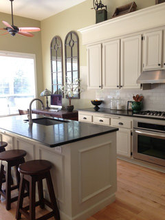
    Thank you so much, okibujp! This is what the kitchen looks like now. :) I am currently in the market for some pendant lights above the island, and I think I am going to change the stools and repaint the island a dark grey, but I always love to hear what others have to say!
  • 11 years ago
    Much improvement. Since it is open concept, what are you drawing on for your color cues?
  • 11 years ago
    last modified: 11 years ago
    Thanks, decoenthusiaste! Repainting the island grey would be drawing from the wall mirrors, the shutters above the cabinets, and a gray rug under the dining table. You can kind of see these things better in this pic, and you can also see how the island looked when it was the same color as the cabinets. :)
  • 11 years ago
    Oh, please hang a chandelier to be doubled by those mirrors rather than a fan!
  • 11 years ago
    Love the idea, decoenthusiaste! Thank you!
  • 10 years ago
    last modified: 10 years ago

    Here is an option I feel would work well to keep the backsplash and reduce the stark contrast between your taupe cabinetry, since you are pairing warm and cold tones next to one another. A soft medium blue meets these two in middle since your green is fighting with the tile still. Accenting the room with a complimentary tone of brown on the island neutralizes the space and doesn't clash with the red tone in the floor. It also unifies the walnut and aged wood pieces in your accessories and furniture. I tried an antique nickle style set of pendents to draw to your stainless features and black iron tones in your cabinet hardware – metal would lend itself well in this space. Keeping the soffit and crown white helps the tile seem justified and makes the weight of the soffit appear less bulky. I see you've been working with different colors since the original post but I figured I'd add my two cents since it's such a nice space. Best of Luck!

    The Vintage Bean thanked Korey Downey
  • 8 years ago

    It has been over 4 years since my original post and I’m revisiting out of a continued interest in what is a fresh color scheme for 2018 and beyond. Thinking of finally removing the items up on the soffit. Dreaming of a white fridge. Perhaps change the hood, or remove the cabinets above it to allow a larger hood. Change the backsplash. Paint the walls white or cream. I’d love some exciting color ideas. I’m very inspired by this color scheme, but could I pull it off in this space?