


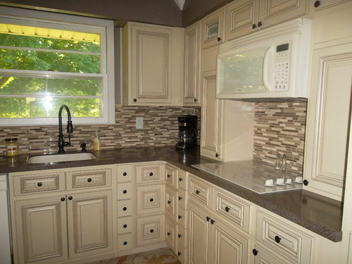
tell me what you think?
shanareed4
10 years ago


Featured Answer
Sort by:Oldest
Comments (144)

Laila Campbell
9 years agoLaila Campbell
9 years ago
pm2014
9 years ago PRO
PROLB Interiors
9 years agotraceyh1958
9 years ago
Lucaci Loredana
9 years ago
Kurt Bledsoe
9 years agosuejones
9 years ago PRO
PRORebecca Mitchell Interiors
9 years agolast modified: 9 years ago
Cheryl Lunetta
9 years agoRobin
9 years agolast modified: 9 years ago
Peggianne
9 years agoUser
9 years ago
dreaw80
9 years ago
Janis Kennedy
9 years ago
Susan Little
9 years agosoto01
9 years agoLinda Canham
9 years ago
Julie Morrell
9 years agowatts1943
9 years ago PRO
PROStamps Design Services
9 years agolast modified: 9 years ago PRO
PROAltra Home Decor
9 years agofredm51
9 years agofredm51
9 years ago
shars55
9 years agofredm51
9 years ago- PRO
LB Interiors
9 years agolast modified: 9 years ago 
Elizabeth Brown
9 years ago PRO
PROCustom Design & Construction
9 years ago PRO
PROCast Glass Images Inc.
9 years ago PRO
PROTalianko Design Group, LLC
8 years ago
alwaysdesigning
8 years ago PRO
PROflair lighting
8 years agoJulie Church
8 years ago PRO
PROOTM Designs & Remodeling Inc.
8 years ago
Barbara Brown
8 years agoElizabeth Brown
8 years ago
Jessica Nelson
8 years ago PRO
PROVRA Interiors, LLC
8 years ago
Trisha Hagen
8 years agoUser
8 years ago
Bryan Lip
8 years agoUser
8 years ago PRO
PRODesign Directives, LLC
8 years ago PRO
PROSoCal Contractor
8 years ago PRO
PROBy Design Kitchen and Bath Solutions
8 years agohenrylexi
8 years agosyd01
8 years agosyd01
8 years ago PRO
PROLimitless Walls
8 years ago


Related Stories

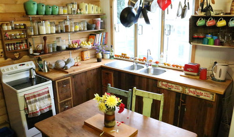
RUSTIC STYLEA Quirky Country Kitchen With a Story to Tell
Creative thinking goes a long way in this kitchen packed with love for family and old treasures
Full Story
KITCHEN DESIGNHouzz Call: Tell Us About Your First Kitchen
Great or godforsaken? Ragtag or refined? We want to hear about your younger self’s cooking space
Full Story
LIFEGive Your Home a History by Telling Your Story
Share your family's epic saga — or even just kiddie doodles — for a home that's personal, meaningful and inspiring
Full Story
LIFETell Us: Do You Know How to Live With Your Parents?
If you've tried multigenerational living under one roof, we'd love to hear the details
Full Story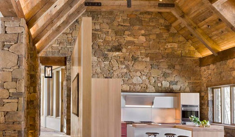
ARCHITECTUREDesign Workshop: Materials That Tell a Story
See how wood, concrete and stone convey ideas about history, personal taste and much more
Full Story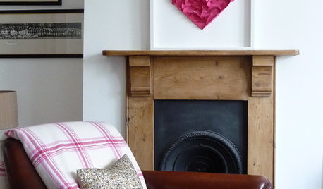
VALENTINE’S DAYTell Us: Why Did You Fall in Love With Your House?
What was it about your house that made your heart flutter? Share your photo, and it could make the Houzz homepage
Full Story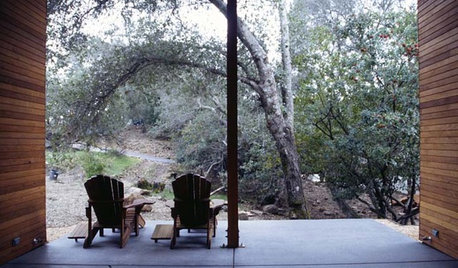
ARCHITECTURETell a Story With Design for a More Meaningful Home
Go beyond a home's bones to find the narrative at its heart, for a more rewarding experience
Full Story
HOUZZ TOURSMy Houzz: Curiosities Tell a Story
An interiors stylist uses her house as a 3D timeline of her tales and travels
Full Story
REMODELING GUIDESContractor's Tips: 10 Things Your Contractor Might Not Tell You
Climbing through your closets and fielding design issues galore, your contractor might stay mum. Here's what you're missing
Full Story


Wish