Software
Houzz Logo Print
capeonthecape

Color Scheme Dilemma

12 years ago
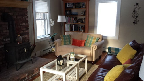
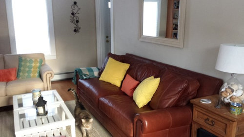
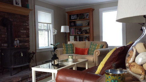
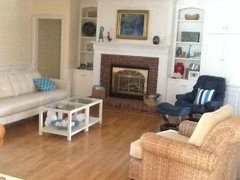
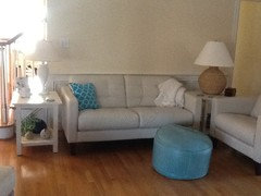
I recently purchased these cube coffee tables and realized after I placed them on the rug it changed the feel of the space. It gave it the beachy feel, which I didnt realize I was going for. This is a Cape Cod home so maybe it happens naturally. Now I need a color scheme to go along with this. I don't like the decor pillows with starfish etc. on them. I prefer thin stripes or solids. And as you can see I have incorporated turquoise already but am open to other ideas. The yellow pillows were a bust.

I feel this space needs something to help tie everything together whether it be the pillows or chaning the color of the mantel...

I need some professional help or someone with decor experience!!

Thanks!

Phillip

Comments (38)

  • 12 years ago
    I see sheer, flowy draperies on the windows and a cozy white throw on the burgundy couch to lighten things up a bit.
    Phillip thanked maiabear
  • 12 years ago
    Thanks for the comment! I like the draperies idea. This space is certainly missing that element.
  • 12 years ago
    Hmmm....I don't like the curtain idea because you have a very eclectic clean look and sheers would set you back to a garden new age look and take away from the beautiful molding. If you do go with a curtain I would try a neutral beige with the tricolored horizontal stripes. You have a welcoming feel to the room already. I think accessorizing better would complete it. The pieces you have seem a bit small and don't make a statement. The tables work and even the yellow pillows seem to work....unless they are brighter than the photo. Maybe drape a woven runner over the two white tables with a bowl of something with color. Just ideas....good luck!
    Phillip thanked sugarmonster
  • 12 years ago
    Great advice! I like the bowl idea. That was one of my concerns about draperies. I'd hate to cover the molding, which is why i've yet to put anything on them.
  • 12 years ago
    Wonderful advice! i'm glad you mentioned bringing in the blues. i'm also very open to the painting these tables. Its what first came to me when I put them in the room. Just couldn't pinpoint the color.
  • 12 years ago
    Love your room. The new tables are a good staring point. I'd get rid of all those pillows and work with a navy and cream color. Keep the windows simple with bamboo roll-up shades or maybe wood shutters. After the stage is set you could pick another accent color for a blanket throw or some different pillows, a lamp. Take you time and get pieces that inspire you until it all comes together. Decorating should be fun. No pressure. Glad you are not going for the fish restaurant look!
    Phillip thanked User
  • PRO
    12 years ago
    How do YOU want the room to look and FEEL like? What are the features you like best about the room? Are you willing to paint the walls?
    Phillip thanked User
  • 12 years ago
    I like the ideas of Hampton Redesign! The tables will look great painted - if you like the pillows with circles, match one of those blues. Remove the two orange pillows and think of much larger chunkier accents for the bottom shelf of the coffee tables and the hearth. I don't think the yellow is hurting anything, but the orange is no help at all.
    Phillip thanked Ann
  • 12 years ago
    Carol, I am always changing my mind but am naturally drawn to coastal decor and rustic country feel. I like simple and clean looks. Modern but not too modern. I like the built in bookcase and the fireplace. I also like how the sunlight enters the room in the morning. I recently tore down the wallpaper in this room and painted it the neatral color, so would like to avoid painting.
  • 12 years ago
    I'm picturing a big piece of driftwood on the glass tables.
    Phillip thanked User
  • PRO
    12 years ago
    Ok..So I don't know how much space is between the light sofa and the book case but if you can , I'd move it toward the bookcase about 6 inches. That will give you a little more openness. Color scheme...neutral walls.as you have, medium teal, darker blue (cobalt,maybe) and maybe a cranberry. All prints -perhaps geometric with tan background in the fabric. I like the bright white moulding around the window so maybe the pillows should have white rather than tan in the print. Have fun!
    Phillip thanked User
  • PRO
    12 years ago
    The colors are for pillows...didn't include that1
  • 12 years ago
    Lots of great ideas. Thank you! Interesting Cranberry color idea. Cranberry bogs are all over Cape Cod so it'd be fitting.
  • 12 years ago
    Navy, cranberry and cream! Classic. I wonder if you'd consider painting that bookcase a deep navy. Of course if it's good wood, my husband would consider painting it to be a mortal sin!
  • PRO
    12 years ago
    Hi! Love your coastal feel. Here are a few throw pillow that may work for you(note: they are all different types of pillows, so i am not suggesting combining them, haha):

    http://deciture.com/shop/decor/world-market/floral-palampore-throw-pillow/

    http://deciture.com/shop/decor/world-market/blue-sprouts-throw-pillow/

    http://deciture.com/shop/decor/pier-1-imports/layered-floral-applique-pillow/
  • 12 years ago
    Your TV armoire has a very heavy Spanish hacienda feeling to it and it gobbles up the space. Its angled placement just emphasizes that. You could capture the same counterbalance by placing the bookcase opposite the FP. Depends on how TV focused this room must be for you. Often people don't watch TV except for the news. If you are unwilling to change the armoire, it might look less intrusive, and more part of your new Cape/Beach theme if whitewashed, distressed or painted, much as suggested for the white cube tables.
    Phillip thanked decoenthusiaste
  • PRO
    12 years ago
    last modified: 12 years ago
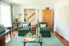
    Sunny Days · More Info


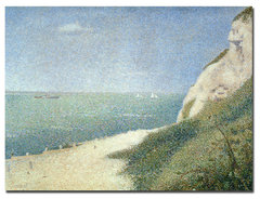
    Georges Seurat 'Beach at Bas Butin, Honfleur, 1886' Canvas Art · More Info

    Hi from Orleans.
    I am also going to suggest painting your walls white, adding window treatments, and just using one color (turquoise) for everything else. The room is small and I don’t think you need to add lots of stuff. I think minimizing the colors will give your pine armoire a nice surround. Can the piece go flat on the wall?

    How about painting the mantel white and adding a great canvas over it?
    Phillip thanked JudyG Designs
  • 12 years ago
    last modified: 12 years ago
    Nice JudyG - that "Sunny Days" room is a great example. That same color would work nicely with her existing furniture and circle pillows. I like the idea of painting the coffee table that color and having all the accents that color. I also like the idea of a white mantel to match the trim. But, I'm wondering if the current wall color would be just fine as it is. She just painted recently and it's a nice neutral color.
  • PRO
    12 years ago
    Sure, it looks like Cape Cod sand, Ann.
    Phillip thanked JudyG Designs
  • 12 years ago
    I like the idea for the Armoire. Whitewash. Maybe I can finally use this briwax liming wax to give the whitewash look. It is very large and can't be put anywhere else due the bookcase being built-in. The floor heaters make it protrude from the wall too.

    It would be a big step for me to paint the bookcase...

    The space above the mantel doesn't feel large enough to place a canvas. Love that look though. There's also a large railroad tie beam on the ceiling that splits the room in half. Decorative. I just realized i didn't capture that in the pictures!
  • 12 years ago
    Oh my gosh, you'll always get differing opinions, but I wouldn't dream of painting those bricks white. I love them as they are!!
    Phillip thanked Ann
  • 12 years ago
    You can use the Attach images to add more complete pix.
  • PRO
    12 years ago
    Just curious...what are the "poles?"on each side of the fireplace?
  • 12 years ago
    I think a whitewash armoire would look nice. I'd also try changing the pillows. Love the coffee tables. Can I ask where you got them?
    Phillip thanked shanhouse
  • 12 years ago
    last modified: 12 years ago
    Carol, the poles are actually copper pipes that run upstairs to the hot water baseboard heaters. When I bought the home they were wrapped in wallpaper. I like the look of copper so I left them as is, but they can be a bit distracting.
  • 12 years ago
    Shanhouse, The tables are ethan allen. I'm an avid "craigslister", so I was able to buy two tables for the price of one!

    http://ethanallen.com/en_US/388521.html?start=45
  • 12 years ago
    I HAVE those tables! I love the light, airy, coastal look. I'm in KY, so my decor really deviates from the norm. I suggest white, 2" blinds fitted inside the window woodwork to match; paint bookcase and brick white; paint armoire white, or pale blue or pale turquoise, or replace it with a lighter, less massive TV stand. Bring in soft or saturated coastal colors in pillows, decor on table shelves, ... I had a very dark, massive, quality (Hooker) bookcase in another room. I debated over a year whether to have it painted or sell it; either seemed sacrilege, but they looked oppressive to me. Sold it last week, and I LOVE the way their absence opens that room! Less is more.
    Phillip thanked Joy Haynes
  • 12 years ago
    Joy, cool! I see we have similar taste. Is that a matching end table? I like the blinds idea. The armoire is massive... I had to take it apart and rebuild it just to fit it in the room!

    I can't say im going to paint the brick. I'm sort of drawn to it. It has a bit of staggering white wash in it already. Perhaps a way to counterbalance the darkness of the brick?

    After much feedback regarding the bookcase I am considering painting now. Lots of great advice.
  • 12 years ago
    I wouldn't paint the brick either but maybe consider painting the mantle. Others are suggesting an ethereal look of aqua blues. I think a navy blue would better balance out the leather and brick and not be too girly. Masculine elements in a room give it a more natural feel. A little white and pastel go a long way. Stark white takes the eye away from other features so that's why I prefer cream in the mix.
    Phillip thanked User
  • 12 years ago
    Yes, the end tables are coordinating pieces, also from Ethan Allen, however, their tops are wood rather than glass.
  • 12 years ago
    I've been thinking about color for your room. The reason I would stay away from those aqua and orangey and stark whites is because they are more like the Caribbean beaches. Cape Cod homes I think should reflect the moodiness of the north Atlantic . Look at Edward Hopper seascapes. He got the colors and the feel of the place right. I'll end with a pun: navy will anchor your room!
    Phillip thanked User
  • 12 years ago
    Some of Edward Hopper's other work I'm listing here may give you inspiration to create the mood you want in your lovely Cape Cod home: People in the Sun; Light at Two Lights; Lighthouse Hill; Rooms By the Sea.
    Phillip thanked User
  • 12 years ago
    the window treatments in the inspiration would pick up the natural wood tone furniture you have in yr very nice space
    A darker area rug in the blue tone would give you added colour and help to anchor the room https://www.houzz.com/photos/cape-cod-beach-style-living-room-los-angeles-phvw-vp~2993582
    Phillip thanked anne dee
  • 12 years ago
    I agree w/ all the suggestions Joy Haynes made. My first thought was to paint the brick!.
  • 12 years ago
    Rainy, Beautiful painting by Edward Hopper too. I'm originally from Maine and would often go to two lights state park w/ my family to picnic and watch the waves crash.

    I'm intrigued by your suggestions! I will be sure to post pictures of my progress.
  • 12 years ago
    Thanks, Phillip. I keep putting in my 2 cents because I love Cape Code and New England although stuck in these Midwest parts. I am enjoying your project vicariously.
  • 12 years ago
    In this Mary Cassatt painting I think you may find colors that will work in your room. I won't comment further for now.
    Phillip thanked User