Software
Houzz Logo Print
webuser_9924418

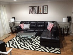
Is this picture small for the space?

12 years ago
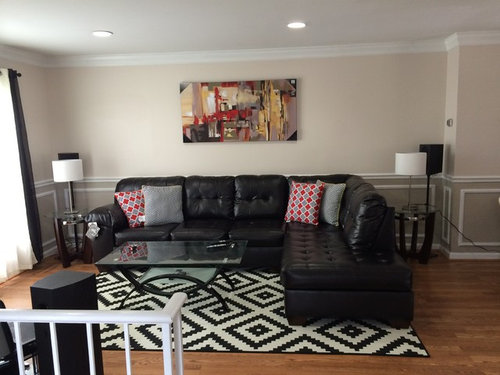
Hello,

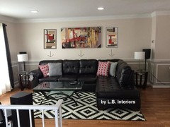
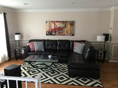
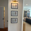
I had a topic for my rug and everyone agreed the rug was fine but I need a larger wall art and I need to lower it about 6" above the sofa. I found this art today and want everyone's opinions. The art is 55x28. Is it still small for the space? Thanks.

Comments (46)

  • 12 years ago
    I had these arts before.
  • 12 years ago
    I like the 4 pictures. I would space them a few inches (3-5) apart and lower them. I think that would look great.
  • 12 years ago
    Love the new art!! I agree with Abbyjean to lower it. Good job!!!
  • 12 years ago
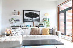
    I just measured the back of the couch and it's 117". If 2/3 of 117 is 78 so the art is small for the space. I also see some ideas on houzz that I can put shelves on the 2 sides like this.
    West Coast Retreat · More Info
    what do you think?
  • 12 years ago
    last modified: 12 years ago
    Your picture is closer to half then. The shelves like above would need to be awfully short to keep the proportion going, too.

    I was trying to figure out if there was a way for the sectional to move out from the wall and then the lamps go on a long, narrow console table behind it, on either side of the art.....actually a table just like the one behind in that same picture you just showed for inspiration.
  • 12 years ago
    What would be your other idea if I want to keep this art? It's hard to find a big wall art within the budget. :)
  • 12 years ago
    last modified: 12 years ago
    New picture looks great! Have it framed in a large, thick black or white frame to set it off and make it look larger.

    Lower it 6".

    Very nice space! Great rug!
  • PRO
    12 years ago
    last modified: 12 years ago
    I Love the new Art! I would add one more piece on each side of the new art. Maybe you can find something that will work with this in an abstract design. The same size as one of the 4 piece set. The size of the leaf original prints. That would balance the space nicely. And agree with you to lower it.
  • 12 years ago
    last modified: 12 years ago
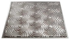
    Black shelving units would make the space a bit more filled out. I would also recommend lowering the picture down, right now it looks a bit too high. The overall look in this room is great. Our Fasade 2'x2' Cyclone glue up tiles in Crosshatch Silver would look great on the ceiling in this room with its décor! We also have customers frame our 4'x8' wall tiles and use them in an area like you are behind the sofa!
  • 12 years ago
    Yes, I agree awesome rug. Maybe you could add more art to the wall with your main piece of art. perhaps a gallery wall. ??
  • 12 years ago
    Should I put the art 12" above the couch?
  • 12 years ago
    12" is still too high......if you feel 6" is too close to the couch, 8" will work, but nothing higher.
  • 12 years ago
    Each individual piece looks great on their own. I can see why you acquired the art furniture and accessories. From the main photo alone, I see competition between four points: art, two red pattern pillows, and the active pattern in the rug. When the wall is bi-symmetrically defined with two matching lamps the eye rotates around between those four points. I think there is a call for flow and focal point. By removing the red pattern pillows, placing the gray pillows together at the corner, lose the art piece, and keep the lamps lit, there will be flow and the eye will naturally rotate around the space, pausing at the bold rug pattern as the focal point. Additionally, consider bringing the sofa away from the wall enough to line up a soft and rhythmic natural element such as bamboo, tall grass, or reed which is uplit with floor cans. It will give an upscale lounge feel and give balance with the dominating sofa.
  • PRO
    12 years ago
    Too small
  • PRO
    12 years ago
    Something like this that I mentioned.
  • 12 years ago
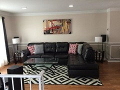
    Thanks everyone. I have lowered the art. Is this ok?
  • 12 years ago
    Picture
  • PRO
    12 years ago
    It is rather small. I looks better with multiple paintings, it adds more balance.
  • 12 years ago
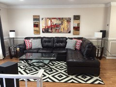
    Looks much better lowered.

    1. Frame it in a white mat with a thick black frame.
    2. Get larger table lamps to help fill the space and provide balance.
  • 12 years ago
    last modified: 12 years ago
    Changes the whole look once it gets lowered. You could paint a rectangle around it that could act as a frame and that would elongate it.
  • 12 years ago
    maybe a couple smaller ones on the ends
  • PRO
    12 years ago
    last modified: 12 years ago
    I like it lowered but feel it could go 3" lower. MO
  • 12 years ago
    Does this work at all? I was able to found the side arts at a local store. Please tell me how would I put them too?
  • PRO
    12 years ago
    I love the two vertical pieces. My first view of the arrangement made my eye confused in the room as a whole. I think shorter ones would work better. Darn, I really like how they work together though. I think it is because of their height being taller than the main focus.
  • PRO
    12 years ago
    You have some great advisors on this forum. Just thought I'd weigh in and say I like the first painting best - definitely would have also advised you to lower it. Is it possible to frame it so that it is bigger? I kind of like it on its own - the graphic rug works great with this painting. Good luck from Montreal!
  • 12 years ago
    I went to couple stores and couldn't find anything except these too. I wasn't going to buy them because of their height also. But I just want to see how they look like when I put them up. So they are not working for me?
  • PRO
    12 years ago
    I would find something as the same height as the large art. Maybe even something that has a few of the same colors but become secondary to the large art. Something downplayed with the larger piece. I think the height would be most important here.
  • PRO
    12 years ago
    Can you use the other two pieces in the rooms that are open to this space? That would be a nice relationship.
  • 12 years ago
    I like the large art on its own. The other smaller pieces distract and reduce the impact.
  • PRO
    12 years ago
    last modified: 12 years ago
    Another option is two black iron sculptures, one on each side of the art.
  • 12 years ago
    Thanks for all the advices!!!
  • PRO
    12 years ago
    You're Welcome!
  • 12 years ago
    LB........the distance the new pieces are from the couch.....make that the goal for this large piece???
  • 12 years ago
    LOVE both suggestions......black iron sculptures on each side and keeping the two new pieces to hang in another place in the same room.
  • PRO
    12 years ago
    Yes, Abby you are right. The distance of the vertical art bottom point seems to be the position spot that I also agree, for the large piece to be moved down to.
  • 12 years ago
    How about moving the art off centre, more to the left and putting shelves to the right?
  • PRO
    12 years ago
    last modified: 12 years ago
    You should check out local artists or even our affordable art on our site here at HOUZZ. The piece you have will be fine when lowered and you can always anchor it with a set of other pieces that compliment it one placed on either side. We like to see the same height with a thinner (in this case, much thinner say 1/4 the size of the original piece) width.
    We could also talk about stretching an interesting fabric to make a flanking pair.
  • 12 years ago
    raise the table lamps by stacking hard cover books under them. They will have more presence.
  • PRO
    12 years ago
    IDK something about the rug is not doing it for me. It doesn't go well with the wall art.
  • PRO
    12 years ago
    last modified: 12 years ago
    Hello, in order to really liven up your living room, I would consider painting that wall a brighter color. I don't know what your preferences are but I'd recommend a rich orange that is on the dark coral side. This would help a lot in making this large, dark couch not feel so dense in the space. It will also make this piece of art pop better. If that is not an option for you, I would add larger lighter colored pillows and get rid of the red polka dots.
  • 12 years ago
    last modified: 12 years ago
    Something is off,I agree with SJ Janis
    not sure what ,maybe wall color
  • PRO
    12 years ago
    last modified: 12 years ago
    I think I would change out the red diamond pillows for solid red and gold ones. Try adding some red items on the coffee table. Red binder books, a vase, a bowl ?
  • 12 years ago
    last modified: 12 years ago
    If anything feels off to me, it is the side table and lamp to the right of the sectional as it just seems out of place at that part of the furniture. Maybe an arc lamp in that corner and that will balance the art, too, and then the table could go near the chaise somehow.

    I would love to see more red in your space......perfect accent color!
  • 12 years ago
    Maybe even a large plant instead of the side table and lamps on the right.
  • 12 years ago
    Plant