
Search results for "Large open space ideas" in Home Design Ideas
 The Brooklyn Studio
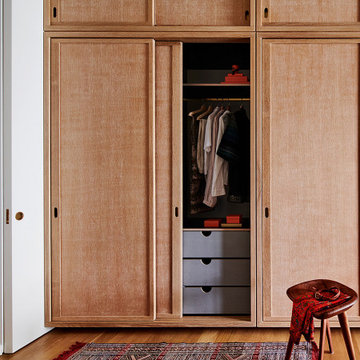
This residence was a complete gut renovation of a 4-story row house in Park Slope, and included a new rear extension and penthouse addition. The owners wished to create a warm, family home using a modern language that would act as a clean canvas to feature rich textiles and items from their world travels. As with most Brooklyn row houses, the existing house suffered from a lack of natural light and connection to exterior spaces, an issue that Principal Brendan Coburn is acutely aware of from his experience re-imagining historic structures in the New York area. The resulting architecture is designed around moments featuring natural light and views to the exterior, of both the private garden and the sky, throughout the house, and a stripped-down language of detailing and finishes allows for the concept of the modern-natural to shine.
Upon entering the home, the kitchen and dining space draw you in with views beyond through the large glazed opening at the rear of the house. An extension was built to allow for a large sunken living room that provides a family gathering space connected to the kitchen and dining room, but remains distinctly separate, with a strong visual connection to the rear garden. The open sculptural stair tower was designed to function like that of a traditional row house stair, but with a smaller footprint. By extending it up past the original roof level into the new penthouse, the stair becomes an atmospheric shaft for the spaces surrounding the core. All types of weather – sunshine, rain, lightning, can be sensed throughout the home through this unifying vertical environment. The stair space also strives to foster family communication, making open living spaces visible between floors. At the upper-most level, a free-form bench sits suspended over the stair, just by the new roof deck, which provides at-ease entertaining. Oak was used throughout the home as a unifying material element. As one travels upwards within the house, the oak finishes are bleached to further degrees as a nod to how light enters the home.
The owners worked with CWB to add their own personality to the project. The meter of a white oak and blackened steel stair screen was designed by the family to read “I love you” in Morse Code, and tile was selected throughout to reference places that hold special significance to the family. To support the owners’ comfort, the architectural design engages passive house technologies to reduce energy use, while increasing air quality within the home – a strategy which aims to respect the environment while providing a refuge from the harsh elements of urban living.
This project was published by Wendy Goodman as her Space of the Week, part of New York Magazine’s Design Hunting on The Cut.
Photography by Kevin Kunstadt
 K2 Interior Designs
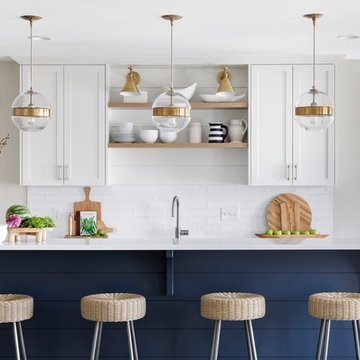
This project was featured in Midwest Home magazine as the winner of ASID Life in Color. The addition of a kitchen with custom shaker-style cabinetry and a large shiplap island is perfect for entertaining and hosting events for family and friends. Quartz counters that mimic the look of marble were chosen for their durability and ease of maintenance. Open shelving with brass sconces above the sink create a focal point for the large open space.
Putting a modern spin on the traditional nautical/coastal theme was a goal. We took the quintessential palette of navy and white and added pops of green, stylish patterns, and unexpected artwork to create a fresh bright space. Grasscloth on the back of the built in bookshelves and console table along with rattan and the bentwood side table add warm texture. Finishes and furnishings were selected with a practicality to fit their lifestyle and the connection to the outdoors. A large sectional along with the custom cocktail table in the living room area provide ample room for game night or a quiet evening watching movies with the kids.
To learn more visit https://k2interiordesigns.com
To view article in Midwest Home visit https://midwesthome.com/interior-spaces/life-in-color-2019/
Photography - Spacecrafting
 place architecture:design
Photo Credit: ©Tom Holdsworth,
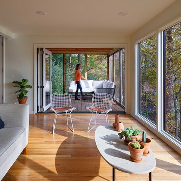
A screen porch was added to the side of the interior sitting room, enabling the two spaces to become one. A unique three-panel bi-fold door, separates the indoor-outdoor space; on nice days, plenty of natural ventilation flows through the house. Opening the sunroom, living room and kitchen spaces enables a free dialog between rooms. The kitchen level sits above the sunroom and living room giving it a perch as the heart of the home. Dressed in maple and white, the cabinet color palette is in sync with the subtle value and warmth of nature. The cooktop wall was designed as a piece of furniture; the maple cabinets frame the inserted white cabinet wall. The subtle mosaic backsplash with a hint of green, represents a delicate leaf.
Find the right local pro for your project
 Adrienne DeRosa
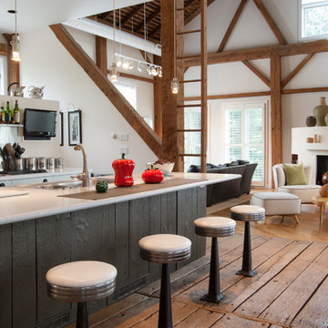
Tucked neatly into an existing bay of the barn, the open kitchen is a comfortable hub of the home. Rather than create a solid division between the kitchen and the children's TV area, Franklin finished only the lower portion of the post-and-beam supports.
The ladder is one of the original features of the barn that Franklin could not imagine ever removing. Cleverly integrated into the support post, its original function allowed workers to climb above large haystacks and pick and toss hay down a chute to the feeding area below. Franklin's children, 10 and 14, also enjoy this aspect of their home. "The kids and their friends run, slide, climb up the ladder and have a ton of fun," he explains, "It’s a barn! It is a place to share with friends and family."
Adrienne DeRosa Photography
 TEW Design Studio
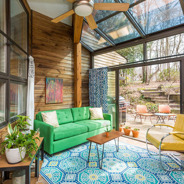
This home is a true gem in the heart of MacGregor Downs community in Cary, NC. Built in the 1980's in true Modernist design and architecture, the new owners wanted to keep the integrity of the original design. We redesigned the Half Bath, created floor plan layouts for new furniture, spec'd out furniture, accessories, flooring material, lighting, and artwork, as well as worked on brightening the wall and ceiling paint colors. One challenge we faced during the design process were the very tall ceilings, the very wide walls, and unusual angles. We chose interesting , engaging, and minimalistic artwork for the walls, which proved a successful solution. Another challenge was having a large open angled living room space; we created the perfect layout with separate functional gathering areas and eliminated unused corners.
Photo credit: Bob Fortner
 Gilmans Kitchens and Baths
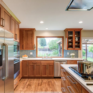
The original kitchen was tight and cramped, offering little storage and function. the clients wanted more countertop space and more storage solutions. They also wanted an open space plan, with views into their backyard, and to allow more natural light into the space.
The wall separating the kitchen and living space was removed and a large picturesque window was installed above the sink, creating a large and open space. A large island with open cubbies housed much of the homeowner's pots and pans, and other countertop appliances.
Treve Johnson Photography
 TKS Design Group
Download our free ebook, Creating the Ideal Kitchen. DOWNLOAD NOW
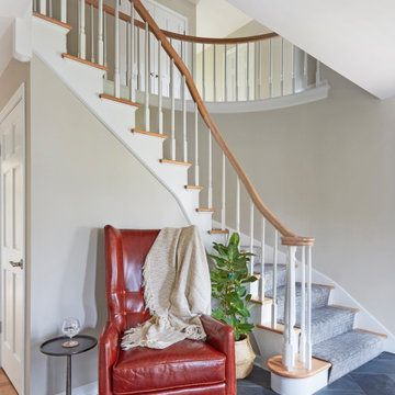
Lakefront property in the northwest suburbs of Chicago is hard to come by, so when we were hired by this young family with exactly that, we were immediately inspired by not just the unusually large footprint of this 1950’s colonial revival but also the lovely views of the manmade lake it was sited on. The large 5-bedroom home was solidly stuck in the 1980’s, but we saw tons of potential. We started out by updating the existing staircase with a fresh coat of paint and adding new herringbone slate to the entry hall.
The powder room off the entryway also got a refresh - new flooring, new cabinets and fixtures. We ran the new slate right through into this space for some consistency. A fun wallpaper and shiplap trim add a welcoming feel and set the tone for the home.
Next, we tackled the kitchen. Located away from the rest of the first floor, the kitchen felt a little isolated, so we immediately began planning for how to better connect it to the rest of the first floor. We landed on removing the wall between the kitchen and dining room and designed a modified galley style space with separate cooking and clean up zones. The cooking zone consists of the refrigerator, prep sink and cooktop, along with a nice long run of prep space at the island. The cleanup side of the kitchen consists of the main sink and dishwasher. Both areas are situated so that the user can view the lake during prep work and cleanup!
One of the home’s main puzzles was how to incorporate the mudroom and area in front of the patio doors at the back of the house. We already had a breakfast table area, so the space by the patio doors was a bit of a no man’s land. We decided to separate the kitchen proper from what became the new mudroom with a large set of barn doors. That way you can quickly hide any mudroom messes but have easy access to the light coming in through the patio doors as well as the outdoor grilling station. We also love the impact the barn doors add to the overall space.
The homeowners’ first words to us were “it’s time to ditch the brown,” so we did! We chose a lovely blue pallet that reflects the home’s location on the lake which is also vibrant yet easy on the eye. Countertops are white quartz, and the natural oak floor works well with the other honey accents. The breakfast table was given a refresh with new chairs, chandelier and window treatments that frame the gorgeous views of the lake out the back.
We coordinated the slate mudroom flooring with that used in the home’s main entrance for a consistent feel. The storage area consists of open and closed storage to allow for some clutter control as needed.
Next on our “to do” list was revamping the dated brown bar area in the neighboring dining room. We eliminated the clutter by adding some closed cabinets and did some easy updates to help the space feel more current. One snag we ran into here was the discovery of a beam above the existing open shelving that had to be modified with a smaller structural beam to allow for our new design to work. This was an unexpected surprise, but in the end we think it was well worth it!
We kept the colors here a bit more muted to blend with the homeowner’s existing furnishings. Open shelving and polished nickel hardware add some simple detail to the new entertainment zone which also looks out onto the lake!
Next we tackled the upstairs starting with the homeowner’s son’s bath. The bath originally had both a tub shower and a separate shower, so we decided to swap out the shower for a new laundry area. This freed up some space downstairs in what used to be the mudroom/laundry room and is much more convenient for daily laundry needs.
We continued the blue palette here with navy cabinetry and the navy tile in the shower. Porcelain floor tile and chrome fixtures keep maintenance to a minimum while matte black mirrors and lighting add some depth the design. A low maintenance runner adds some warmth underfoot and ties the whole space together.
We added a pocket door to the bathroom to minimize interference with the door swings. The left door of the laundry closet is on a 180 degree hinge to allow for easy full access to the machines. Next we tackled the master bath which is an en suite arrangement. The original was typical of the 1980’s with the vanity outside of the bathroom, situated near the master closet. And the brown theme continued here with multiple shades of brown.
Our first move was to segment off the bath and the closet from the master bedroom. We created a short hall from the bedroom to the bathroom with his and hers walk-in closets on the left and right as well as a separate toilet closet outside of the main bathroom for privacy and flexibility.
The original bathroom had a giant soaking tub with steps (dangerous!) as well as a small shower that did not work well for our homeowner who is 6’3”. With other bathtubs in the home, they decided to eliminate the tub and create an oversized shower which takes up the space where the old tub was located. The double vanity is on the opposite wall and a bench is located under the window for morning conversations and a place to set a couple of towels.
The pallet in here is light and airy with a mix of blond wood, creamy porcelain and marble tile, and brass accents. A simple roman shade adds some texture and it’s top-down mechanism allows for light and privacy.
This large whole house remodel gave our homeowners not only the ability to maximize the potential of their home but also created a lovely new frame from which to view their fabulous lake views.
Designed by: Susan Klimala, CKD, CBD
Photography by: Michael Kaskel
For more information on kitchen and bath design ideas go to: www.kitchenstudio-ge.com

Sponsored
Columbus, OH

Structural Remodeling
Franklin County's Heavy Timber Specialists | Best of Houzz 2020!
 Christopher's Kitchen & Bath
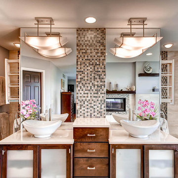
A large, less restrictive space can sometimes be a challenge to remodel as the possibilities are truly unlimited. The goal was to create a functional and warm space that still felt open, clean and utilized the large space well.
Custom glass panel cabinetry with sliding doors and a central drawer bank features ample storage and even multiple standard outlets inside. Vessel sinks sit atop the custom quartz counters that compliment the stone resin free standing bath.
On the back side of the central wall is a walk in, from both sides, his and hers shower. Custom tile through out ties both sides of this large bath together. The shower features multiple niches.
 Klopf Architecture
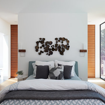
Klopf Architecture and Outer space Landscape Architects designed a new warm, modern, open, indoor-outdoor home in Los Altos, California. Inspired by mid-century modern homes but looking for something completely new and custom, the owners, a couple with two children, bought an older ranch style home with the intention of replacing it.
Created on a grid, the house is designed to be at rest with differentiated spaces for activities; living, playing, cooking, dining and a piano space. The low-sloping gable roof over the great room brings a grand feeling to the space. The clerestory windows at the high sloping roof make the grand space light and airy.
Upon entering the house, an open atrium entry in the middle of the house provides light and nature to the great room. The Heath tile wall at the back of the atrium blocks direct view of the rear yard from the entry door for privacy.
The bedrooms, bathrooms, play room and the sitting room are under flat wing-like roofs that balance on either side of the low sloping gable roof of the main space. Large sliding glass panels and pocketing glass doors foster openness to the front and back yards. In the front there is a fenced-in play space connected to the play room, creating an indoor-outdoor play space that could change in use over the years. The play room can also be closed off from the great room with a large pocketing door. In the rear, everything opens up to a deck overlooking a pool where the family can come together outdoors.
Wood siding travels from exterior to interior, accentuating the indoor-outdoor nature of the house. Where the exterior siding doesn’t come inside, a palette of white oak floors, white walls, walnut cabinetry, and dark window frames ties all the spaces together to create a uniform feeling and flow throughout the house. The custom cabinetry matches the minimal joinery of the rest of the house, a trim-less, minimal appearance. Wood siding was mitered in the corners, including where siding meets the interior drywall. Wall materials were held up off the floor with a minimal reveal. This tight detailing gives a sense of cleanliness to the house.
The garage door of the house is completely flush and of the same material as the garage wall, de-emphasizing the garage door and making the street presentation of the house kinder to the neighborhood.
The house is akin to a custom, modern-day Eichler home in many ways. Inspired by mid-century modern homes with today’s materials, approaches, standards, and technologies. The goals were to create an indoor-outdoor home that was energy-efficient, light and flexible for young children to grow. This 3,000 square foot, 3 bedroom, 2.5 bathroom new house is located in Los Altos in the heart of the Silicon Valley.
Klopf Architecture Project Team: John Klopf, AIA, and Chuang-Ming Liu
Landscape Architect: Outer space Landscape Architects
Structural Engineer: ZFA Structural Engineers
Staging: Da Lusso Design
Photography ©2018 Mariko Reed
Location: Los Altos, CA
Year completed: 2017
 M.T.N Design
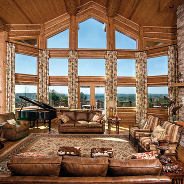
This large, open great room serves as an excellent space to entertain. On nice nights, open up the french doors and take the party to the deck.
Produced By: PrecisionCraft Log & Timber Homes.
Photo Credit: Hilliard Photographics
 Haile Kitchen & Bath LLC
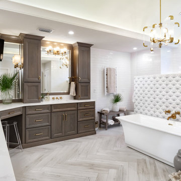
This stunning Gainesville bathroom design is a spa style retreat with a large vanity, freestanding tub, and spacious open shower. The Shiloh Cabinetry vanity with a Windsor door style in a Stonehenge finish on Alder gives the space a warm, luxurious feel, accessorized with Top Knobs honey bronze finish hardware. The large L-shaped vanity space has ample storage including tower cabinets with a make up vanity in the center. Large beveled framed mirrors to match the vanity fit neatly between each tower cabinet and Savoy House light fixtures are a practical addition that also enhances the style of the space. An engineered quartz countertop, plus Kohler Archer sinks and Kohler Purist faucets complete the vanity area. A gorgeous Strom freestanding tub add an architectural appeal to the room, paired with a Kohler bath faucet, and set against the backdrop of a Stone Impressions Lotus Shadow Thassos Marble tiled accent wall with a chandelier overhead. Adjacent to the tub is the spacious open shower style featuring Soci 3x12 textured white tile, gold finish Kohler showerheads, and recessed storage niches. A large, arched window offers natural light to the space, and towel hooks plus a radiator towel warmer sit just outside the shower. Happy Floors Northwind white 6 x 36 wood look porcelain floor tile in a herringbone pattern complete the look of this space.
 TKS Design Group
Free ebook, Creating the Ideal Kitchen. DOWNLOAD NOW
This young family of four came in right after closing on their house and with a new baby on the way. Our goal was to complete the project prior to baby’s arrival so this project went on the expedite track. The beautiful 1920’s era brick home sits on a hill in a very picturesque neighborhood, so we were eager to give it the kitchen it deserves. The clients’ dream kitchen included pro-style appliances, a large island with seating for five and a kitchen that feels appropriate to the home’s era but that also is fresh and modern. They explicitly stated they did not want a “cookie cutter” design, so we took that to heart.
The key challenge was to fit in all of the items on their wish given the room’s constraints. We eliminated an existing breakfast area and bay window and incorporated that area into the kitchen. The bay window was bricked in, and to compensate for the loss of seating, we widened the opening between the kitchen and formal dining room for more of an open concept plan.
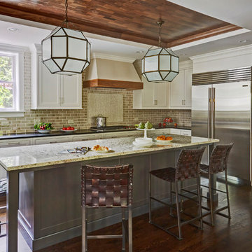
The ceiling in the original kitchen is about a foot lower than the rest of the house, and once it was determined that it was to hide pipes and other mechanicals, we reframed a large tray over the island and left the rest of the ceiling as is. Clad in walnut planks, the tray provides an interesting feature and ties in with the custom walnut and plaster hood.
The space feels modern yet appropriate to its Tudor roots. The room boasts large family friendly appliances, including a beverage center and cooktop/double oven combination. Soft white inset cabinets paired with a slate gray island provide a gentle backdrop to the multi-toned island top, a color echoed in the backsplash tile. The handmade subway tile has a textured pattern at the cooktop, and large pendant lights add more than a bit of drama to the room.
Designed by: Susan Klimala, CKD, CBD
Photography by: Mike Kaskel
For more information on kitchen and bath design ideas go to: www.kitchenstudio-ge.com
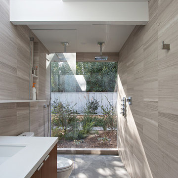 Klopf Architecture
Klopf Architecture, Arterra Landscape Architects, and Flegels Construction updated a classic Eichler open, indoor-outdoor home. Expanding on the original walls of glass and connection to nature that is common in mid-century modern homes. The completely openable walls allow the homeowners to truly open up the living space of the house, transforming it into an open air pavilion, extending the living area outdoors to the private side yards, and taking maximum advantage of indoor-outdoor living opportunities. Taking the concept of borrowed landscape from traditional Japanese architecture, the fountain, concrete bench wall, and natural landscaping bound the indoor-outdoor space. The Truly Open Eichler is a remodeled single-family house in Palo Alto. This 1,712 square foot, 3 bedroom, 2.5 bathroom is located in the heart of the Silicon Valley.
Klopf Architecture Project Team: John Klopf, AIA, Geoff Campen, and Angela Todorova
Landscape Architect: Arterra Landscape Architects
Structural Engineer: Brian Dotson Consulting Engineers
Contractor: Flegels Construction
Photography ©2014 Mariko Reed
Location: Palo Alto, CA
Year completed: 2014
Sponsored
Fredericksburg, OH

High Point Cabinets
Columbus' Experienced Custom Cabinet Builder | 4x Best of Houzz Winner
 Thomas Roszak Architecture, LLC
Photo credit: Scott McDonald @ Hedrich Blessing
7RR-Ecohome:
The design objective was to build a house for a couple recently married who both had kids from previous marriages. How to bridge two families together?
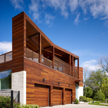
The design looks forward in terms of how people live today. The home is an experiment in transparency and solid form; removing borders and edges from outside to inside the house, and to really depict “flowing and endless space”. The house floor plan is derived by pushing and pulling the house’s form to maximize the backyard and minimize the public front yard while welcoming the sun in key rooms by rotating the house 45-degrees to true north. The angular form of the house is a result of the family’s program, the zoning rules, the lot’s attributes, and the sun’s path. We wanted to construct a house that is smart and efficient in terms of construction and energy, both in terms of the building and the user. We could tell a story of how the house is built in terms of the constructability, structure and enclosure, with a nod to Japanese wood construction in the method in which the siding is installed and the exposed interior beams are placed in the double height space. We engineered the house to be smart which not only looks modern but acts modern; every aspect of user control is simplified to a digital touch button, whether lights, shades, blinds, HVAC, communication, audio, video, or security. We developed a planning module based on a 6-foot square room size and a 6-foot wide connector called an interstitial space for hallways, bathrooms, stairs and mechanical, which keeps the rooms pure and uncluttered. The house is 6,200 SF of livable space, plus garage and basement gallery for a total of 9,200 SF. A large formal foyer celebrates the entry and opens up to the living, dining, kitchen and family rooms all focused on the rear garden. The east side of the second floor is the Master wing and a center bridge connects it to the kid’s wing on the west. Second floor terraces and sunscreens provide views and shade in this suburban setting. The playful mathematical grid of the house in the x, y and z axis also extends into the layout of the trees and hard-scapes, all centered on a suburban one-acre lot.
Many green attributes were designed into the home; Ipe wood sunscreens and window shades block out unwanted solar gain in summer, but allow winter sun in. Patio door and operable windows provide ample opportunity for natural ventilation throughout the open floor plan. Minimal windows on east and west sides to reduce heat loss in winter and unwanted gains in summer. Open floor plan and large window expanse reduces lighting demands and maximizes available daylight. Skylights provide natural light to the basement rooms. Durable, low-maintenance exterior materials include stone, ipe wood siding and decking, and concrete roof pavers. Design is based on a 2' planning grid to minimize construction waste. Basement foundation walls and slab are highly insulated. FSC-certified walnut wood flooring was used. Light colored concrete roof pavers to reduce cooling loads by as much as 15%. 2x6 framing allows for more insulation and energy savings. Super efficient windows have low-E argon gas filled units, and thermally insulated aluminum frames. Permeable brick and stone pavers reduce the site’s storm-water runoff. Countertops use recycled composite materials. Energy-Star rated furnaces and smart thermostats are located throughout the house to minimize duct runs and avoid energy loss. Energy-Star rated boiler that heats up both radiant floors and domestic hot water. Low-flow toilets and plumbing fixtures are used to conserve water usage. No VOC finish options and direct venting fireplaces maintain a high interior air quality. Smart home system controls lighting, HVAC, and shades to better manage energy use. Plumbing runs through interior walls reducing possibilities of heat loss and freezing problems. A large food pantry was placed next to kitchen to reduce trips to the grocery store. Home office reduces need for automobile transit and associated CO2 footprint. Plan allows for aging in place, with guest suite than can become the master suite, with no need to move as family members mature.
 Cummings Architecture + Interiors
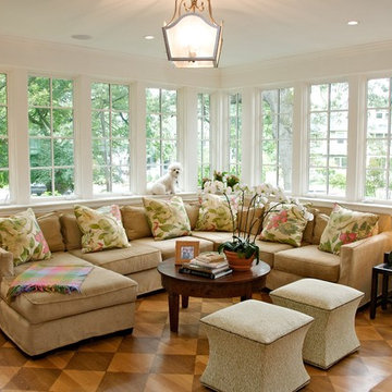
Designing additions for Victorian homes is a challenging task. The architects and builders who designed and built these homes were masters in their craft. No detail of design or proportion went unattended. Cummings Architects is often approached to work on these types of projects because of their unwavering dedication to ensure structural and aesthetic continuity both inside and out.
Upon meeting the owner of this stately home in Winchester, Massachusetts, Mathew immediately began sketching a beautifully detail drawing of a design for a family room with an upstairs master suite. Though the initial ideas were just rough concepts, the client could already see that Mathew’s vision for the house would blend the new space seamlessly into the fabric of the turn of the century home.
In the finished design, expanses of glass stretch along the lines of the living room, letting in an expansive amount of light and creating a sense of openness. The exterior walls and interior trims were designed to create an environment that merged the indoors and outdoors into a single comfortable space. The family enjoys this new room so much, that is has become their primary living space, making the original sitting rooms in the home a bit jealous.
Photo Credit: Cydney Ambrose
 J Design Group - Interior Designers Miami - Modern
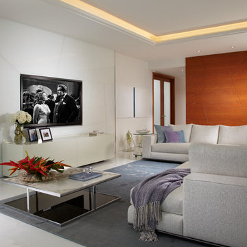
Modern Family Room, Miami Beach.
Ocean front, Luxury home in Miami Beach - Living Room.
Projects by J Design Group, Your friendly Interior designers firm in Miami, FL. at your service.
AVENTURA MAGAZINE selected our client’s luxury 5000 Sf ocean front apartment in Miami Beach, to publish it in their issue and they Said:
Story by Linda Marx, Photography by Daniel Newcomb
Light & Bright
New York snowbirds redesigned their Miami Beach apartment to take advantage of the tropical lifestyle.
New York snowbirds redesigned their Miami Beach apartment to take advantage of the tropical lifestyle.
WHEN INTERIOR DESIGNER JENNIFER CORREDOR was asked to recreate a four-bedroom, six-bath condominium at The Bath Club in Miami Beach, she seized the opportunity to open the rooms and better utilize the vast ocean views.
In five months last year, the designer transformed a dark and closed 5,000-square-foot unit located on a high floor into a series of sweeping waterfront spaces and updated the well located apartment into a light and airy retreat for a sports-loving family of five.
“They come down from New York every other weekend and wanted to make their waterfront home a series of grand open spaces,” says Jennifer Corrredor, of the J. Design Group in Miami, a firm specializing in modern and contemporary interiors. “Since many of the rooms face the ocean, it made sense to open and lighten up the home, taking advantage of the awesome views of the sea and the bay.”
The designer used 40 x 40 all white tile throughout the apartment as a clean base. This way, her sophisticated use of color would stand out and bring the outdoors in.
The close-knit family members—two parents and three boys in college—like to do things together. But there were situations to overcome in the process of modernizing and opening the space. When Jennifer Corredor was briefed on their desires, nothing seemed too daunting. The confident designer was ready to delve in. For example, she fixed an area at the front door
that was curved. “The wood was concave so I straightened it out,” she explains of a request from the clients. “It was an obstacle that I overcame as part of what I do in a redesign. I don’t consider it a difficult challenge. Improving what I see is part of the process.”
She also tackled the kitchen with gusto by demolishing a wall. The kitchen had formerly been enclosed, which was a waste of space and poor use of available waterfront ambience. To create a grand space linking the kitchen to the living room and dining room area, something had to go. Once the wall was yesterday’s news, she relocated the refrigerator and freezer (two separate appliances) to the other side of the room. This change was a natural functionality in the new open space. “By tearing out the wall, the family has a better view of the kitchen from the living and dining rooms,” says Jennifer Corredor, who also made it easier to walk in and out of one area and into the other. “The views of the larger public space and the surrounding water are breathtaking.
Opening it up changed everything.”
They clients can now see the kitchen from the living and dining areas, and at the same time, dwell in an airy and open space instead of feeling stuck in a dark enclosed series of rooms. In fact, the high-top bar stools that Jennifer Corredor selected for the kitchen can be twirled around to use for watching TV in the living room.
In keeping with the theme of moving seamlessly from one room to the other, Corredor designed a subtle wall of glass in the living room along with lots of comfortable seating. This way, all family members feel at ease while relaxing, talking, or watching sporting events on the large flat screen television. “For this room, I wanted more open space, light and a supreme airy feeling,” she says. “With the glass design making a statement, it quickly became the star of the show.”…….
….. To add texture and depth, Jennifer Corredor custom created wood doors here, and in other areas of the home. They provide a nice contrast to the open Florida tropical feel. “I added character to the openness by using exotic cherry wood,” she says. “I repeated this throughout the home and it works well.”
Known for capturing the client’s vision while adding her own innovative twists, Jennifer Corredor lightened the family room, giving it a contemporary and modern edge with colorful art and matching throw pillows on the sofas. She added a large beige leather ottoman as the center coffee table in the room. This round piece was punctuated with a bold-toned flowering plant atop. It effortlessly matches the pillows and colors of the contemporary canvas.
Jennifer Corredor also gutted all of the bathrooms, resulting in a major redesign of the master. She jettisoned the whirlpool and created the dazzling illusion of a floating tub. From an area where there were two toilets, she eliminated one to make a grand rectangular shower, which became an overall showpiece. The master bath went from being just a functional water closet to a sophisticated spa-like space. “The client said I was ‘delicious’ after seeing the change,” laughed Jennifer Corredor, who emphasized that her clients love their part-time life in South Florida more each time they come down. Even when the husband has to work from their Miami Beach digs, he is surrounded by tropical beauty. For instance, there are times when the master bedroom must double as the husband’s home office.
The room had to be large enough to accommodate a working space for this purpose. So Jennifer Corredor placed an appropriate table near the window and across from the king-size bed. “No blocking of the amazing water view was necessary,” she says. “I kept an open space with a lot of white so It functions well and the work space fits right in.” She repeated the bold modern art in the room as well as in the guest bedroom, which also has a workspace for the sons when they are home from school and need to study.
The designer is still happy and glowing with the results of her toil in this apartment. She gets a “spiritual feeling” when she walks inside. “It is so peaceful and serene, with subtle hints of explosive statements,” she says. “The entire space is open, yet anchored by the warmth of the exotic woods.” The client wrote Jennifer Corredor a letter at the end of the project congratulating her on a
job well done. She revealed that owning a Miami Beach home was her husband’s dream 30 years ago. “Now we have a quality perfect yet practical home,” she wrote to the designer. “You solved the challenges, and the end
result far exceeds our expectations. We love it.”
Thanks for your interest in our Contemporary Interior Design projects and if you have any question please do not hesitate to ask us.
http://www.JDesignGroup.com
305.444.4611
Modern Interior designer Miami. Contemporary
Miami
Miami Interior Designers
Miami Interior Designer
Interior Designers Miami
Interior Designer Miami
Modern Interior Designers
Modern Interior Designer
Modern interior decorators
Modern interior decorator
Contemporary Interior Designers
Contemporary Interior Designer
Interior design decorators
Interior design decorator
Interior Decoration and Design
Black Interior Designers
Black Interior Designer
Interior designer
Interior designers
Interior design decorators
Interior design decorator
Home interior designers
Home interior designer
Interior design companies
Interior decorators
Interior decorator
Decorators
Decorator
Miami Decorators
Miami Decorator
Decorators Miami
Decorator Miami
Interior Design Firm
Interior Design Firms
Interior Designer Firm
Interior Designer Firms
Interior design
Interior designs
home decorators
Interior decorating Miami
Best Interior Designers.
225 Malaga Ave.
Coral Gable, FL 33134
http://www.JDesignGroup.com
305.444.4611
 BK Interior Design
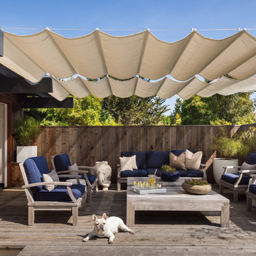
This space is perfect for entertaining! When the owners originally moved in, this deck was not here. There were several steps down from the kitchen door, and the stone slabs were a toe-stubbing minefield.
We added the deck and designed it perfectly for entertaining. Since we had several large pine trees removed from the property, we increased sun exposure creating a need for more shade. We had this awning custom made by PJ Canvas in Santa Rosa, CA. The awning tucks neatly under the roof of the house during the rainy months.

 Klopf Architecture
Klopf Architecture and Outer space Landscape Architects designed a new warm, modern, open, indoor-outdoor home in Los Altos, California. Inspired by mid-century modern homes but looking for something completely new and custom, the owners, a couple with two children, bought an older ranch style home with the intention of replacing it.
Created on a grid, the house is designed to be at rest with differentiated spaces for activities; living, playing, cooking, dining and a piano space. The low-sloping gable roof over the great room brings a grand feeling to the space. The clerestory windows at the high sloping roof make the grand space light and airy.
Upon entering the house, an open atrium entry in the middle of the house provides light and nature to the great room. The Heath tile wall at the back of the atrium blocks direct view of the rear yard from the entry door for privacy.
The bedrooms, bathrooms, play room and the sitting room are under flat wing-like roofs that balance on either side of the low sloping gable roof of the main space. Large sliding glass panels and pocketing glass doors foster openness to the front and back yards. In the front there is a fenced-in play space connected to the play room, creating an indoor-outdoor play space that could change in use over the years. The play room can also be closed off from the great room with a large pocketing door. In the rear, everything opens up to a deck overlooking a pool where the family can come together outdoors.
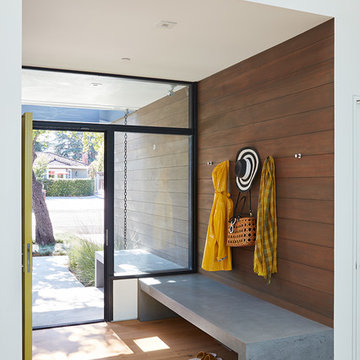
Wood siding travels from exterior to interior, accentuating the indoor-outdoor nature of the house. Where the exterior siding doesn’t come inside, a palette of white oak floors, white walls, walnut cabinetry, and dark window frames ties all the spaces together to create a uniform feeling and flow throughout the house. The custom cabinetry matches the minimal joinery of the rest of the house, a trim-less, minimal appearance. Wood siding was mitered in the corners, including where siding meets the interior drywall. Wall materials were held up off the floor with a minimal reveal. This tight detailing gives a sense of cleanliness to the house.
The garage door of the house is completely flush and of the same material as the garage wall, de-emphasizing the garage door and making the street presentation of the house kinder to the neighborhood.
The house is akin to a custom, modern-day Eichler home in many ways. Inspired by mid-century modern homes with today’s materials, approaches, standards, and technologies. The goals were to create an indoor-outdoor home that was energy-efficient, light and flexible for young children to grow. This 3,000 square foot, 3 bedroom, 2.5 bathroom new house is located in Los Altos in the heart of the Silicon Valley.
Klopf Architecture Project Team: John Klopf, AIA, and Chuang-Ming Liu
Landscape Architect: Outer space Landscape Architects
Structural Engineer: ZFA Structural Engineers
Staging: Da Lusso Design
Photography ©2018 Mariko Reed
Location: Los Altos, CA
Year completed: 2017
 Studio Sage Interiors
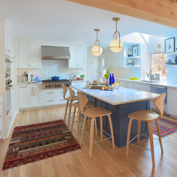
The original kitchen, although generous in size, was out of touch with our clients personal style. When a plumbing mishap caused significant damage to the space, the homeowners seized the opportunity to create the culinary workspace of their dreams.
At the top of their wish list was a well designed kitchen, both aesthetically and functionally. State of the art appliances were selected based on the client's functional requirements and the optimal layout was tailored to family dinners and occasional entertaining. At the heart of the existing kitchen was a large and highly utilized island, keeping this was a high priority. An unused audio cabinet with outdated components was removed to create a much needed dry bar. The large refrigerator, and beverage fridge drawers were concealed behind custom made cabinetry panels and were positioned adjacent to the family seating area for easy access. Attributes such as spice storage, silver dividers and a tall pantry storage ensured everything had its place.
Sherwin Williams, indigo batik (as seen on the island) was carried through the home allowing a visual connection throughout the home while the bright white perimeter cabinets created lightness and dramatic contrast. Brass hardware and decorative lighting gave the space a hint of understated glamour while pulling the warm tones found in the lattice of veining in the cambria quartz countertop.
It is hard not to notice, however, the dramatic impact of the large ceramic, three dimensional, hexagon tiles that highlight the range wall. Companion subway tiles created continuity throughout the expansive kitchen, adorning the backsplash through the rest of the space.
 Thomas Roszak Architecture, LLC
Photo credit: Scott McDonald @ Hedrich Blessing
7RR-Ecohome:
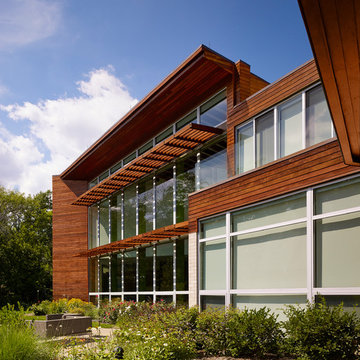
The design objective was to build a house for a couple recently married who both had kids from previous marriages. How to bridge two families together?
The design looks forward in terms of how people live today. The home is an experiment in transparency and solid form; removing borders and edges from outside to inside the house, and to really depict “flowing and endless space”. The house floor plan is derived by pushing and pulling the house’s form to maximize the backyard and minimize the public front yard while welcoming the sun in key rooms by rotating the house 45-degrees to true north. The angular form of the house is a result of the family’s program, the zoning rules, the lot’s attributes, and the sun’s path. We wanted to construct a house that is smart and efficient in terms of construction and energy, both in terms of the building and the user. We could tell a story of how the house is built in terms of the constructability, structure and enclosure, with a nod to Japanese wood construction in the method in which the siding is installed and the exposed interior beams are placed in the double height space. We engineered the house to be smart which not only looks modern but acts modern; every aspect of user control is simplified to a digital touch button, whether lights, shades, blinds, HVAC, communication, audio, video, or security. We developed a planning module based on a 6-foot square room size and a 6-foot wide connector called an interstitial space for hallways, bathrooms, stairs and mechanical, which keeps the rooms pure and uncluttered. The house is 6,200 SF of livable space, plus garage and basement gallery for a total of 9,200 SF. A large formal foyer celebrates the entry and opens up to the living, dining, kitchen and family rooms all focused on the rear garden. The east side of the second floor is the Master wing and a center bridge connects it to the kid’s wing on the west. Second floor terraces and sunscreens provide views and shade in this suburban setting. The playful mathematical grid of the house in the x, y and z axis also extends into the layout of the trees and hard-scapes, all centered on a suburban one-acre lot.
Many green attributes were designed into the home; Ipe wood sunscreens and window shades block out unwanted solar gain in summer, but allow winter sun in. Patio door and operable windows provide ample opportunity for natural ventilation throughout the open floor plan. Minimal windows on east and west sides to reduce heat loss in winter and unwanted gains in summer. Open floor plan and large window expanse reduces lighting demands and maximizes available daylight. Skylights provide natural light to the basement rooms. Durable, low-maintenance exterior materials include stone, ipe wood siding and decking, and concrete roof pavers. Design is based on a 2' planning grid to minimize construction waste. Basement foundation walls and slab are highly insulated. FSC-certified walnut wood flooring was used. Light colored concrete roof pavers to reduce cooling loads by as much as 15%. 2x6 framing allows for more insulation and energy savings. Super efficient windows have low-E argon gas filled units, and thermally insulated aluminum frames. Permeable brick and stone pavers reduce the site’s storm-water runoff. Countertops use recycled composite materials. Energy-Star rated furnaces and smart thermostats are located throughout the house to minimize duct runs and avoid energy loss. Energy-Star rated boiler that heats up both radiant floors and domestic hot water. Low-flow toilets and plumbing fixtures are used to conserve water usage. No VOC finish options and direct venting fireplaces maintain a high interior air quality. Smart home system controls lighting, HVAC, and shades to better manage energy use. Plumbing runs through interior walls reducing possibilities of heat loss and freezing problems. A large food pantry was placed next to kitchen to reduce trips to the grocery store. Home office reduces need for automobile transit and associated CO2 footprint. Plan allows for aging in place, with guest suite than can become the master suite, with no need to move as family members mature.
1