
Search results for "Oriental style decorating" in Home Design Ideas
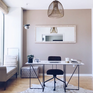
 Paintzen, Inc.
When it comes to finding inspiration for your house or apartment design, there are a variety of routes you can take. For some, it is important to dive into the latest trends in fashion and art, using only the most popular decor pieces and embracing the color palettes seen on runways or in home and garden magazines. But for others, it’s simply about discovering what feels most like “home.”
Ashley Steele, the creator of A Styled Affair, was part of the latter group. “Since my husband and I were moving into a space that was previously owned, I needed a way to make it feel like it was truly ours, and unique to us,” she told our team.
A Styled Affair sprang from Ashley’s passion for fashion, and need for a creative outlet. But it soon became more than that. She developed a following, and it quickly became a place where she could share her personal style, travel adventures, and lifestyle tips. “While the blogging industry has become overwhelmed with people sharing their favorite home decor or make-up tips, I think what sets A Styled Affair apart is my commitment to stay true to my unique taste. I have always marched to the beat of my own drum – and that carries through in the clothes I wear, the decor I select for our home, and the travels I plan.”
Paintzen connected with Ashley as she was settling into her new home in Boston’s Seaport District. Although she and her husband have lived in Boston for almost 8 years, they were used to smaller, more traditional spaces. Their new home is much bigger, and more modern, than any place they lived before. “I wanted to select colors of comfort, simplicity, and sophistication so we could elevate the space and make it feel more like a home.” Ashley also accurately pointed out that new construction can sometimes feel a little cold and sterile, almost industrial. “I wanted our home to feel like a peaceful oasis after coming in from the bustling city.”
Ashley chose soft white paint for her walls to bring a sense of comfort and zen. With lots of wall decor, art work and carefully selected furniture, the walls serve as a clean and comfortable palette, and allowed her more freedom when making her other design decisions throughout the space. Ashley kept the overall palette fairly neutral, and incorporated “modern bohemian” inspired decor throughout the home; the final product was clean and simple, and catered to her style.
We asked Ashley what she was most excited for now. “I’m most excited to continue to find new decor pieces to compliment the paint colors and decor we’ve already found for the space. We have been really patient with decorating and selected each piece really careful to make sure it is cohesive and flows from room to room. I’m looking forward to enjoying the space with my husband and dog, and entertaining friends and family in the spring and summer!”
A few final questions for Ashley on her experience with Paintzen:
“I would highly recommend Paintzen to anyone, especially those that live in the city. There are so many different paint companies and contractors to choose from but going through Paintzen simplified the process and made me feel comfortable that we had the right team working on our space. Their platform for booking services and choosing paint colors made the process seamless and was a great way to keep track of what we booked and chose for colors. Most importantly, the customer service team was outstanding whenever we had a question or needed to make an adjustment.”
And advice she would give someone repainting their home:
“Patience. I would recommend taking your time and doing your research before selecting paint colors. Lighting changes every color so make sure to bring paint swatches and samples into the space and look at it throughout the day to see the different tones that the light will pick up. I would also recommend researching color trends and recommendations for colors in the family you are looking for. We found our living room color through a blog post listing top-used colors by interior designers and it looks amazing.”
 Epic Development
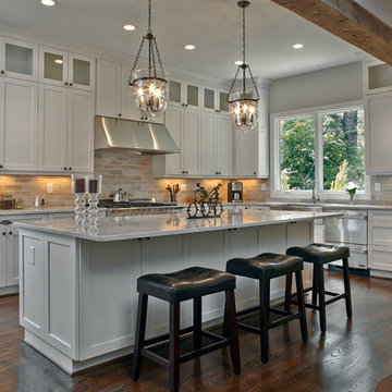
The kitchen of a new Mediterranean/Transitional style home in Atlanta. Features include custom wood cabinetry (Sherwin Williams Elder White) to the ceiling with soft close feature, quartz countertops (Quartzite Calacatta), stone backsplash (3x6 Valentino White Tile), under cabinet lighting, stainless steel farm sink, and DCS stainless steel appliances including 48" gas range, double drawer dishwasher and double door refrigerator. The huge island overlooks the family room and houses the Sharp Microwave Drawer. The wall color is Popular Gray Flat (SW 6071). Designed by Price Residential Design; Built by Epic Development; Interior Design by Mike Horton; Photo by Brian Gassel

Find the right local pro for your project
 Advance Design Studio, Ltd.
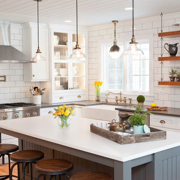
When this suburban family decided to renovate their kitchen, they knew that they wanted a little more space. Advance Design worked together with the homeowner to design a kitchen that would work for a large family who loved to gather regularly and always ended up in the kitchen! So the project began with extending out an exterior wall to accommodate a larger island and more moving-around space between the island and the perimeter cabinetry.
Style was important to the cook, who began collecting accessories and photos of the look she loved for months prior to the project design. She was drawn to the brightness of whites and grays, and the design accentuated this color palette brilliantly with the incorporation of a warm shade of brown woods that originated from a dining room table that was a family favorite. Classic gray and white cabinetry from Dura Supreme hits the mark creating a perfect balance between bright and subdued. Hints of gray appear in the bead board detail peeking just behind glass doors, and in the application of the handsome floating wood shelves between cabinets. White subway tile is made extra interesting with the application of dark gray grout lines causing it to be a subtle but noticeable detail worthy of attention.
Suede quartz Silestone graces the countertops with a soft matte hint of color that contrasts nicely with the presence of white painted cabinetry finished smartly with the brightness of a milky white farm sink. Old melds nicely with new, as antique bronze accents are sprinkled throughout hardware and fixtures, and work together unassumingly with the sleekness of stainless steel appliances.
The grace and timelessness of this sparkling new kitchen maintains the charm and character of a space that has seen generations past. And now this family will enjoy this new space for many more generations to come in the future with the help of the team at Advance Design Studio.
Photographer: Joe Nowak
Dura Supreme Cabinetry
 Lark Interiors
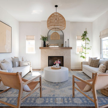
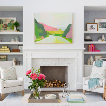
Living room design in Dallas featuring a fireplace with built-in shelving, layered decor, and balanced seating, creating a bright, cohesive space with thoughtful styling and everyday functionality.

 Elizabeth Lawson Design
Photography by Jennifer Hughes
Transitional medium tone wood floor kitchen photo in Baltimore with a farmhouse sink, shaker cabinets, black cabinets, marble countertops, stainless steel appliances, marble backsplash and white countertops
Transitional medium tone wood floor kitchen photo in Baltimore with a farmhouse sink, shaker cabinets, black cabinets, marble countertops, stainless steel appliances, marble backsplash and white countertops

 Twelve Stones Designs, LLC
The owners of this kitchen had spent the money to upgrade the finishes in their kitchen upon building the home 12 years ago, but after living in the space for several years they realized how nonfunctional the layout really was. The (then) two preschool aged children had grown into busy, hungry teenagers with many friends who also liked to hang out at the house. So the family needed a more functional kitchen with better traffic flow, space for daily activities revolving around the kitchen at different times of day, and a kitchen that could accommodate cooking for and serving large groups. Furthermore, the dark, traditional finishes no longer reflected the homeowners’ style. They requested a brighter, more relaxed, coastal style that reflected their love of the seaside cities they like to visit.
Originally, the kitchen was U-shaped with a narrow island in the middle. The island created narrow aisles that bottle-necked at the dishwasher, refrigerator, and cooktop areas. There was a pass-through from the foyer into the kitchen, but the owners never liked that the pass-through was also located so close to the powder room. The awkward proximity was unappealing and made guests feel uncomfortable.
The kitchen’s storage was made up of lots of narrow cabinets, apothecary drawers, clipped corner units, and very few drawers. It lacked useful storage for the larger items the family used on a daily basis. And the kitchen’s only pantry was small closet that had only builder-grade, narrow shelving with no illumination to be able to see the contents inside.
Overall, the kitchen’s lighting plan was poorly executed. Only six recessed cans illuminated the entire kitchen and nook areas. The under cabinet lighting was not evenly distributed either. In fact, the builder had mis-placed the under cabinet lighting around the decorative pilasters which made for choppy, dark cubbies. Further, the builder didn’t include any lighting over the sink or the bar area, which meant whoever was doing the dishes was always in their own shadow. That, coupled with the steep overhang of the game room above made the bar area feel like a dim, cavernous space that wasn’t inviting or task oriented. The kitchen looked out into the main living space, but the raised bar and a narrow wall (which held the only large cabinet in the kitchen) created more of a barrier than a relationship to the living room or breakfast nook. In fact, one couldn’t even see the breakfast nook from the cooktop or sink areas due to its orientation. The raised bar top was too narrow to comfortably sit to either dine at or chat from due to the lack of knee space. The the homeowners confided that the kitchen felt more like a dark, dirty prison than place where the family, or their guests, wanted to gather and commune.
The clients' needs and desires were:
➢ to create a kitchen that would be a space the family loved to be in; to relate to the adjacent spaces all around, and to have better flow for entertaining large groups
➢ to remove the walls between the breakfast nook and living area and to be able to utilize the natural light from the windows in both those areas
➢ to incorporate a functional chopping block for prepping fresh food for home cooked meals, an island with a large sink and drain board, 2 pull out trash cans, and seating for at least the 2 teens to eat or do homework
➢ to design a kitchen and breakfast nook with an airy, coastal, relaxed vibe that blended with the rest of the house's coastal theme
➢ to integrate a layered lighting plan which would include ample general illumination, specific task lighting, decorative lighting, and lots of illuminated storage
➢ to design a kitchen with not only more storage for all the husband’s kitchen gadgets and collection of oils and spices, but smart storage, including a coffee/breakfast bar and a place to store and conceal the toaster oven and microwave
➢ to find a way to utilize the large open space between the kitchen, pantry area, and breakfast nook
Twelve Stones Designs achieved the owner's goals by:
➢ removing the walls between the kitchen and living room to allow the natural light to filter in from the adjacent rooms and to create a connection between the kitchen, nook, and living spaces for a sense of unity and communion
➢ removing the existing pantry and designing 3 large pantry style cabinets with LED tape lights and rollout drawers to house lots of kitchen appliances, gadgets, and tons of groceries. We also took the cabinets all the way up to the 9’ ceiling for additional storage for seasonal items and bulk storage.
➢ designing 2 islands - 1 with a gorgeous black walnut chopping block that houses a drawer for chopping and carving knives and a custom double pull out trash unit for point of use utilization - and 1 that houses the dishwasher, a large Blanco Gourmet sink with integrated drain board, woven baskets for fresh root vegetables and kitchen towels, plenty of drawer storage for kitchen items, and bar seating for up to 4 diners.
➢ closing off the space between the kitchen and the powder room to create a beautiful new private alcove for the powder room as well as adding some decorative storage. This also gave us space to include more tall storage near the new range for precision placement of the husband’s extensive oil and spice collection as well as a location for a combo-steam oven the wife wanted for baking and cooking healthy meals.
The project is enhanced functionally by:
➢ incorporated USB and standard receptacles for the kids’ laptops and phone charging in the large island
➢ designing the small island to include additional open shelving for items used on a daily basis such as a variety of bowls, plates, and colanders. This set up also works well for the husband who prefers to “plate” his dinners in restaurant-style fashion before presenting them to the table.
➢ the integration of specific storage units, such as double stacked cutlery drawers, a custom spice pull-out, a Kuerig coffee and tea pod drawer, and custom double stacked utensil drawers
➢ moving the refrigerator to the old oven location - this eliminated the bottle neck as well as created a better relationship to the eating table. It also utilizes the floor space between the pantry, nook, and kitchen
➢ creating a banquet style breakfast nook - this banquette seating not only doubles the amount of seating for large gatherings but it better utilizes the odd space between the kitchen and the previous nook area. It also helps to create a distinct pathway from the mudroom room through the pantry area, kitchen, nook, and living room.
➢ the coffee/breakfast bar area which includes the perfect location for the concealed microwave and toaster oven, convenient storage for the coffee pods and tea accoutrements. Roll-out drawers below also house the smoothie maker, hot water kettle, and a plethora of smoothie-making ingredients such as protein powders, smoothie additives, etc. Furthermore, the drawers below the Keurig house measuring utensil, cutlery, baking supplies and tupperware storage.
➢ incorporating lots of wide drawers and pullouts to accommodate large cookware.
➢ utilizing as much vertical space as possible by building storage to the ceiling which accommodates the family’s abundant amount of serving platters, baking sheets, bakeware, casserole dishes, and additional cutting boards.
The project is enhanced aesthetically by:
➢ new 5-piece Versailles pattern porcelain tile that now seamlessly joins the entire down stairs area together creating a bright, cohesiveness feeling instead of choppy separated spaces - it also adds a coastal feeling
➢ designing a cabinet to conceal the microwave and toaster oven
➢ the coastal influenced light fixtures over the nook table and island
➢ the sandy colors of the Langdon Cambria countertops. The swirling pattern and sparkling quartz pieces remind the homeowner of black-and-tan sandy beaches
➢ the striped banquet seating whose creamy white background and blue-green stripes were the inspiration for the cabinet and wall colors.
➢ All the interior doors were painted black to coordinate with the blacks and grays in the backsplash tile and countertop. This also adds a hint of tailored formality to an otherwise casual space.
➢ the use of WAC's Oculux small aperture LED units for the overhead lighting complimented with Diode LED strips for task lighting under the cabinets and inside the pantry and glass wall cabinets. All of the lighting applications are on separate dimmer switches.
Innovative uses of materials or construction methods by Realty Restoration LLC:
➢ Each 1-1/2” x 3” block of reclaimed end-grain black walnut that makes up the center island chopping block was hand milled and built in the shop. It was designed to look substantial and proportional to the surrounding elements, executed by creating the 4 inch tall top with a solid wood chamfered edge band.
➢ The metal doors on either side of the vent hood were also custom designed for this project and built in the Realty Restoration LLC shop. They are made 1x2, 11-gauge mild steel with ribbed glass. Weighing 60 lbs a piece, heavy duty cabinet hinges were added to support the weight of the door and keep them from sagging.
➢ Under-cabinet receptacles were added along the range wall in order to have a clean, uninterrupted backsplash.
Design obstacles to overcome:
➢ Because we were removing the demising walls between the kitchen and living room, we had to find a way to plumb and vent the new island. We did this by tunneling through the slab (the slab had post tension cables which prevented us from just trenching) to run a new wet vent through a nearby structural wall. We pulled the existing hot and cold lines between upper floor joists and ran them down the structural wall as well and up through a conduit in the tunnel.
➢ Since we were converting from wall overs to a gas range it allowed us to utilize the 220 feed for the wall ovens to provide a new sub panel for all the new kitchen circuits
➢ Due to framing deficiencies inherited from the original build there was a 1-1/2” differential in the floor-to-ceiling height over a 20 foot span; by utilizing the process of cutting and furring coupled with the crown moulding details on the cabinet elevations we were able to mask the problem and provide seamless transitions between the cabinet components.
Evidence of superior craftsmanship:
➢ uniquely designed, one-of-a-kind metal “X” end panels on the large island. The end panels were custom made in the Realty Restoration LLC shop and fitted to the exact dimensions of the island. The welding seams are completely indistinguishable - the posts look like they are cut from a single sheet of metal
➢ square metal posts on the small island were also custom made and designed to compliment and carry through the metal element s throughout the kitchen
➢ the beautiful, oversized end panels on the pantry cabinets which give the breakfast nook a tailored look
➢ integrating a large format 5 piece Versailles tile pattern to seamlessly flow from the existing spaces into the new kitchen space
➢ By constructing a custom cabinet that jogged around a corner we could not remodel (housing the entry way coat closet) we were able to camouflage the adjacent wall offset within the upper and lower cabinets. By designing around the existing jog in the structural walls we accomplished a few things: we were able to find the space to house, and hide, the microwave and toaster oven yet still have a clean cohesive appearance from the kitchen side. Additionally, the owners were able to keep their much needed coat closet and we didn’t have to increase the budget with unnecessary structural work.
Sponsored
Columbus, OH

Hope Restoration & General Contracting
Columbus Design-Build, Kitchen & Bath Remodeling, Historic Renovations
 Décor Aid
New Yorkers are always on the prowl for innovative ways to make the most of the space they have. An upper east side couple, challenged with a slightly narrow L shaped apartment sought out Decor Aid’s help to make the most of their Manhattan condo. Paired with one of our senior designer, Kimberly P., we learned that the clients wanted a space that looked beautiful, comfortable and also packed with functionality for everyday living.
“Immediately upon seeing the space, I knew that we needed to create a narrative that allowed the design to control how you moved through the space,” reports Kimberly, senior interior designer.
After surveying each room and learning a bit more about their personal style, we started with the living room remodel. It was clear that the couple wanted to infuse mid-century modern into the design plan. Sourcing the Room & Board Jasper Sofa with its narrow arms and tapered legs, it offered the mid-century look, with the modern comfort the clients are used to. Velvet accent pillows from West Elm and Crate & Barrel add pops of colors but also a subtle touch of luxury, while framed pictures from the couple’s honeymoon personalize the space.
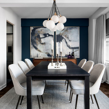
Moving to the dining room next, Kimberly decided to add a blue accent wall to emphasize the Horchow two piece Percussion framed art that was to be the focal point of the dining area. The Seno sideboard from Article perfectly accentuated the mid-century style the clients loved while providing much-needed storage space. The palette used throughout both rooms were very New York style, grays, blues, beiges, and whites, to add depth, Kimberly sourced decorative pieces in a mixture of different metals.
“The artwork above their bureau in the bedroom is photographs that her father took,”
Moving into the bedroom renovation, our designer made sure to continue to stick to the client’s style preference while once again creating a personalized, warm and comforting space by including the photographs taken by the client’s father. The Avery bed added texture and complimented the other colors in the room, while a hidden drawer at the foot pulls out for attached storage, which thrilled the clients. A deco-inspired Faceted mirror from West Elm was a perfect addition to the bedroom due to the illusion of space it provides. The result was a bedroom that was full of mid-century design, personality, and area so they can freely move around.
The project resulted in the form of a layered mid-century modern design with touches of luxury but a space that can not only be lived in but serves as an extension of the people who live there. Our designer was able to take a very narrowly shaped Manhattan apartment and revamp it into a spacious home that is great for sophisticated entertaining or comfortably lazy nights in.
 Happy Place Interiors
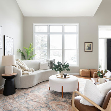
Prior to moving into their "new" home, they decided to enlist the help of a designer to set and style the house right from the beginning. They reached out to Happy Place Interiors. Shortly after moving in, Melanie met them at their home. They had already purchased all the furniture and decor, could wasn't sure what worked where or how to create a good flow. This is where Melanie came in. Using only what they had already purchased, she styled their home and put it all together for them. Not only did their home look amazing right away, it removed the stress of trying to figure out it on their own. They loved it and had said it was styled in a way they never would have thought of and looked better than they could have dreamed.
 Studio Sage Interiors
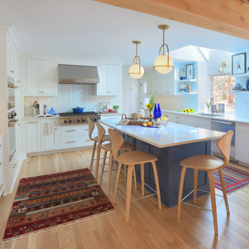
The original kitchen, although generous in size, was out of touch with our clients personal style. When a plumbing mishap caused significant damage to the space, the homeowners seized the opportunity to create the culinary workspace of their dreams.
At the top of their wish list was a well designed kitchen, both aesthetically and functionally. State of the art appliances were selected based on the client's functional requirements and the optimal layout was tailored to family dinners and occasional entertaining. At the heart of the existing kitchen was a large and highly utilized island, keeping this was a high priority. An unused audio cabinet with outdated components was removed to create a much needed dry bar. The large refrigerator, and beverage fridge drawers were concealed behind custom made cabinetry panels and were positioned adjacent to the family seating area for easy access. Attributes such as spice storage, silver dividers and a tall pantry storage ensured everything had its place.
Sherwin Williams, indigo batik (as seen on the island) was carried through the home allowing a visual connection throughout the home while the bright white perimeter cabinets created lightness and dramatic contrast. Brass hardware and decorative lighting gave the space a hint of understated glamour while pulling the warm tones found in the lattice of veining in the cambria quartz countertop.
It is hard not to notice, however, the dramatic impact of the large ceramic, three dimensional, hexagon tiles that highlight the range wall. Companion subway tiles created continuity throughout the expansive kitchen, adorning the backsplash through the rest of the space.
 Drury Design
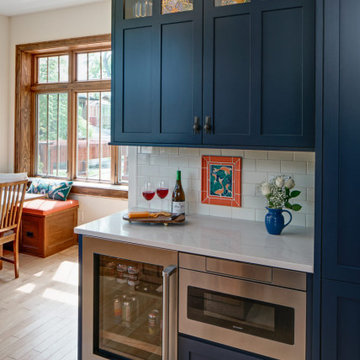
The 100-year old home’s kitchen was old and just didn’t function well. A peninsula in the middle of the main part of the kitchen blocked the path from the back door. This forced the homeowners to mostly use an odd, U-shaped corner of the kitchen.
Design objectives:
-Add an island
-Wow-factor design
-Incorporate arts and crafts with a touch of Mid-century modern style
-Allow for a better work triangle when cooking
-Create a seamless path coming into the home from the backdoor
-Make all the countertops in the space 36” high (the old kitchen had different base cabinet heights)
Design challenges to be solved:
-Island design
-Where to place the sink and dishwasher
-The family’s main entrance into the home is a back door located within the kitchen space. Samantha needed to find a way to make an unobstructed path through the kitchen to the outside
-A large eating area connected to the kitchen felt slightly misplaced – Samantha wanted to bring the kitchen and materials more into this area
-The client does not like appliance garages/cabinets to the counter. The more countertop space, the better!
Design solutions:
-Adding the right island made all the difference! Now the family has a couple of seats within the kitchen space. -Multiple walkways facilitate traffic flow.
-Multiple pantry cabinets (both shallow and deep) are placed throughout the space. A couple of pantry cabinets were even added to the back door wall and wrap around into the breakfast nook to give the kitchen a feel of extending into the adjoining eating area.
-Upper wall cabinets with clear glass offer extra lighting and the opportunity for the client to display her beautiful vases and plates. They add and an airy feel to the space.
-The kitchen had two large existing windows that were ideal for a sink placement. The window closest to the back door made the most sense due to the fact that the other window was in the corner. Now that the sink had a place, we needed to worry about the dishwasher. Samantha didn’t want the dishwasher to be in the way of people coming in the back door – it’s now in the island right across from the sink.
-The homeowners love Motawi Tile. Some fantastic pieces are placed within the backsplash throughout the kitchen. -Larger tiles with borders make for nice accent pieces over the rangetop and by the bar/beverage area.
-The adjacent area for eating is a gorgeous nook with massive windows. We added a built-in furniture-style banquette with additional lower storage cabinets in the same finish. It’s a great way to connect and blend the two areas into what now feels like one big space!
 Décor Aid
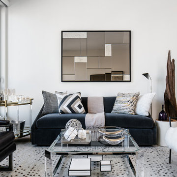
Million Dollar Listing’s celebrity broker Ryan Serhant reached out to Decor Aid to stage a luxurious Brooklyn condo development. The only caveat was that our interior designers had 48 hours to come up with the design, concept, and source all the furniture. Always up for a challenge, we partnered with Mitchell Gold & Bob Williams to create this contemporary gem.
Staying true to their contemporary vision, our interior decorators sourced all pieces through MGBW. Starting in the living room, we placed the Gunner Sofa, a piece that offers clean-lined living. The thin arms and slanted profile emphasize the modern elegance of the home. Through the use of various contemporary patterns and textures we were able to avoid the one-dimensional ambiance, and instead, the apartment’s living room feels detailed and thought out, without making anyone who enters overcrowded with home decor.
The Melrose cocktail table was sourced for its sleek, stainless steel and glass design that contrasts with more substantial pieces in the space, while also complementing the contemporary style. The glass design gives the illusion that this table takes up less space, giving the living room design a light and airy feel all around. The living space transformed into something out of a decor catalog with just the right amount of personality, creating a room that follows through with our starting design, yet functional for everyday use.
After the living room area, we set our eyes on designing the master bedroom. Our interior decorators were immediately drawn to the Celina Floating Rail Bed, it’s opulent nailhead trim, and dramatic design brings fresh sophistication to the bedroom design, while also standing out as a timeless piece that can complement various trends or styles that might be added later on to the bedroom decoration. We sourced the Roland Table Lamp to add texture, with its elaborate ribbed design, that compliments the air of masculinity the Carmen Leather Ottoman add while contrasting with the light, sleeker pieces. This difference in weight left us with a bedroom decoration that lives up to the trending modern standards, yet a space that is timeless and stylish no matter the decor trends.
Once we finished and the project was completed, our senior designers took a step back and took in all of their hard labor. Decor Aid was able to make this newly built blank space and design it into a modern wonder small brooklyn apartment. The MGBW furnishings were all hand-picked to keep an even balance of complementing and contrasting contemporary pieces, which was one of our more critical apartment decorating ideas. The apartment home decor brings to life this modern concept in a way that isn’t overbearing and shows off their style making the space in every sense an accurate reflection of a chic contemporary style.
 Dona Rosene Interiors
Photos by Michael Hunter
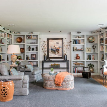
Mid-sized elegant enclosed medium tone wood floor living room library photo in Dallas with white walls, no fireplace and no tv
Mid-sized elegant enclosed medium tone wood floor living room library photo in Dallas with white walls, no fireplace and no tv

 Joanne Palmisano Design
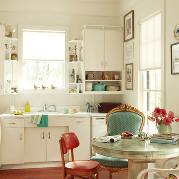
A visually sumptuous idea book, showcasing an eclectic array of interior design possibilities using salvaged goods.
Following up on her celebrated first Salvage Secrets book, which Fine Homebuilding called “An invaluable first step in the salvage-for-design journey,” here salvage design guru Joanne Palmisano takes readers further, exploring a wealth of smaller-scale interior design and decor concepts.
Bottle caps turned into a kitchen backsplash, old bed springs reinvented as candle holders, and a recycled shipping container-turned-guesthouse are just a few examples of the innovative repurposing of second-hand items that readers will discover. From retro and modern to classic, “cottage,” and urban chic, Palmisano takes readers on a sumptuous visual journey featuring unique salvage ideas in an eclectic array of styles, for every room in the house—kitchens and dining rooms, bedrooms and bathrooms, living rooms and dens, and entryways and outdoor areas.
The journey continues with a sampling of cutting-edge retail spaces, hotels, cafes, and boutiques across the country that incorporate salvage into their designs, such as Industrie Denim in San Francisco, Stowe Mountain Lodge in Stowe, Vermont, and Rejuvenation in Portland. Profiles of thirteen “salvage success stories” are also included, showcasing the imaginative designs of creative homeowners. And lastly, fourteen easy, do-it-yourself projects are included at the back of the book (with step-by-step instructions), not to mention a comprehensive “Where to Find Salvage” resource section.
Packed with over 350 color photos, Salvage Secrets Design & Decor offers a trove of salvage ideas to inspire, proving that you need look no further than your local rebuild center, architectural salvage shop, or flea market to transform your living space.
Susan Teare Photography
Book: Salvage Secrets Design & Décor
Kitchen Design: Jane Coslick
 Décor Aid
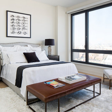
Million Dollar Listing’s celebrity broker Ryan Serhant reached out to Decor Aid to stage a luxurious Brooklyn condo development. The only caveat was that our interior designers had 48 hours to come up with the design, concept, and source all the furniture. Always up for a challenge, we partnered with Mitchell Gold & Bob Williams to create this contemporary gem.
Staying true to their contemporary vision, our interior decorators sourced all pieces through MGBW. Starting in the living room, we placed the Gunner Sofa, a piece that offers clean-lined living. The thin arms and slanted profile emphasize the modern elegance of the home. Through the use of various contemporary patterns and textures we were able to avoid the one-dimensional ambiance, and instead, the apartment’s living room feels detailed and thought out, without making anyone who enters overcrowded with home decor.
The Melrose cocktail table was sourced for its sleek, stainless steel and glass design that contrasts with more substantial pieces in the space, while also complementing the contemporary style. The glass design gives the illusion that this table takes up less space, giving the living room design a light and airy feel all around. The living space transformed into something out of a decor catalog with just the right amount of personality, creating a room that follows through with our starting design, yet functional for everyday use.
After the living room area, we set our eyes on designing the master bedroom. Our interior decorators were immediately drawn to the Celina Floating Rail Bed, it’s opulent nailhead trim, and dramatic design brings fresh sophistication to the bedroom design, while also standing out as a timeless piece that can complement various trends or styles that might be added later on to the bedroom decoration. We sourced the Roland Table Lamp to add texture, with its elaborate ribbed design, that compliments the air of masculinity the Carmen Leather Ottoman add while contrasting with the light, sleeker pieces. This difference in weight left us with a bedroom decoration that lives up to the trending modern standards, yet a space that is timeless and stylish no matter the decor trends.
Once we finished and the project was completed, our senior designers took a step back and took in all of their hard labor. Decor Aid was able to make this newly built blank space and design it into a modern wonder small brooklyn apartment. The MGBW furnishings were all hand-picked to keep an even balance of complementing and contrasting contemporary pieces, which was one of our more critical apartment decorating ideas. The apartment home decor brings to life this modern concept in a way that isn’t overbearing and shows off their style making the space in every sense an accurate reflection of a chic contemporary style.
 Meredith Ericksen
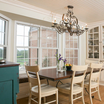
Tuscan Blue Design was brought into this project (house addition) when the client realized she needed a creative-functional-layout for her new kitchen. The first thing the client said to us was that she wanted to see the view out the bay window as she cooked in her kitchen...that led to the idea of two functional islands instead of perimeter cabinetry. She was drawn to farmhouse style kitchens but didn't want her space to feel 'country'. We took classic farmhouse style elements...bead board + painted cabinetry...updated the color palette using warm gray + warm white, custom storage options, and accent lighting to create a fresh take on the farmhouse style.
.Mary Kate McKenna Photography
 Robeson Design
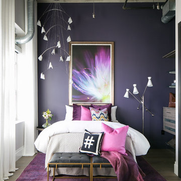
Small Bedroom decorating ideas! Interior Designer Rebecca Robeson began this Bedroom remodel with Benjamin Moore's 2017 color of the year… “Shadow” 2117-30
Rebecca wanted a bold statement color for this small Bedroom. Something that would say WOW. Her next step was to find a bold statement piece of art to create the color palette for the rest of the room. From the art piece came bedding choices, a fabulous over-died antique area rug (Aja Rugs) randomly collected throw pillows and furniture pieces that would provide a comfortable Bedroom but not fill the space unnecessarily. Rebecca had white linen, custom window treatments made and chose white bedding to ground the space, keeping it light and airy. Playing up the 13' concrete ceilings, Rebecca used modern light fixtures with white shades to pop off the purple wall creating an exciting first... and lasting, impression!
Black Whale Lighting
Photos by Ryan Garvin Photography
Sponsored
Westerville, OH

Custom Home Works
Franklin County's Award-Winning Design, Build and Remodeling Expert
 OLSON LEWIS + Architects
Major gut renovation of this coastal estate preserved its basic layout while expanding the kitchen. A veranda and a pair of gazebos were also added to the home to maximize outdoor living and the water views. The interior merged the homeowners eclectic style with the traditional style of the home.
Photographer: James R. Salomon
Contractor: Carl Anderson, Anderson Contracting Services
 Silver Birch Design
housebeautiful.com, google.com, marthastewart.com, HGTV.com
Example of an eclectic formal painted wood floor living room design in Toronto with white walls
Example of an eclectic formal painted wood floor living room design in Toronto with white walls
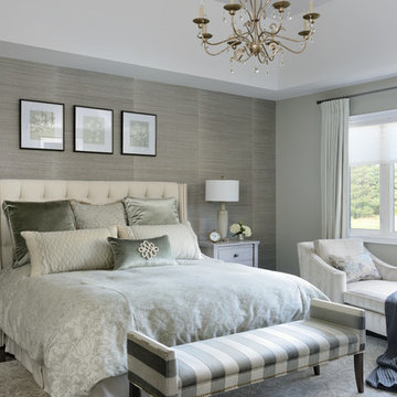
 Lumar Interiors
A combination of gray and beige, the master bedrooms features a textured silver leaf wallpaper, striped end-bench and chaise lounge, and subtle floral printed bedding. The bedroom is light and refreshing yet sophisticated and timeless. The small touches of gold (through the chandelier lighting) add an extra ounce of intrigue and color.
Project by Richmond Hill interior design firm Lumar Interiors. Also serving Aurora, Newmarket, King City, Markham, Thornhill, Vaughan, York Region, and the Greater Toronto Area.
For more about Lumar Interiors, click here: https://www.lumarinteriors.com/
To learn more about this project, click here: https://www.lumarinteriors.com/portfolio/stouffville-project/
1