
Search results for "Posting updates" in Home Design Ideas
 Innovative Design Build
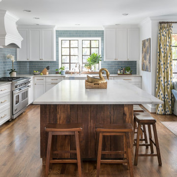
We feel this is a great example of a beautiful kitchen remodel that did not require down-to-the-studs renovation. The changes to the cabinetry, countertops, backsplash, lighting and hardware completely transformed the look of the room. It’s now a relaxing space our clients love to use and look at from other rooms.Beautiful new cabinetry made the biggest impact on updating the kitchen. The new cabinet doors and drawer fronts are flat panel with beaded Shaker style. Brass hardware and lighting adds warmth to the space. The beautiful new blue backsplash added a relaxing touch to the room. And the custom vent hood and quartzite countertops are also stunners.
We were also able to keep elements that the homeowners loved, including their new refinished hardwood floors and wood wrapped kitchen island. Treating this renovation as a refacing saved our clients a lot of money. It was also more sustainable than a full remodel because refacing limited the amount of construction waste generated from the project.
 Flavin Architects
New Additions to Hoover + Hill
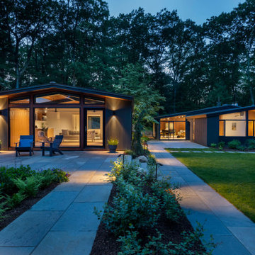
This project is a continuation of the renovation and updating work Flavin Architects had previously completed at the 1958 Wales house, designed by architect Henry Hoover and Walter Hill. Our clients, a young family, desired more space for guests, a home office, a yoga studio, and covered car parking. The challenge was to respect the architects’ original vision and not to interfere with the perfect cruciform plan of the house. To accomplish these goals, we converted the existing garage/workshop structure into a guest house and then designed a new, separate carport/storage building.
The new carport building shares the low-slope gable of the original Hoover structure. The post and beam structure characteristic of Hoover’s design is updated through the use of galvanized steel posts and I beams. The galvanized beams cantilever to support a sheltered walkway leading from the parking to a guest house terrace defined in relationship to the three structures surrounding it. The terrace is paved in slate with a central rain garden. Wood lattice clads the carport, providing good ventilation and letting the building glow like a lantern at night. Our guest house renovation celebrates the unique structural timber ceiling of the original garage. We replaced opaque plywood trusses with a slender cable truss structurally engineered by Webb Structural Services. This cable truss allows for a view of the timber ceiling. A wall of glass facing the courtyard replaced the original garage door. A murphy bed in the rear room enables quick conversion from guest quarters to weight room.
 Faye Crowe
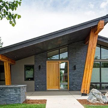
Example of a large mid-century modern gray one-story mixed siding house exterior design in Denver with a shed roof
Find the right local pro for your project
 Amy Carman Design
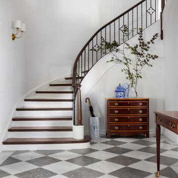
The beautiful reclaimed marble floor at our Lake Drive renovation is newly installed but it feels like it is has always been there. We love enhancing a home's character with authentic materials.
 Ammirato Construction, Inc.
Virtual Imagery 360 Photography
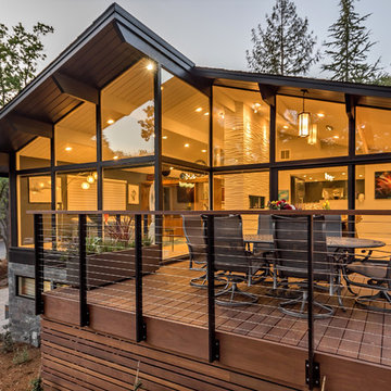
Example of a trendy deck design in San Francisco with no cover
Example of a trendy deck design in San Francisco with no cover
 ArchitecTor, PC
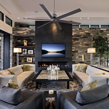
Nestled in its own private and gated 10 acre hidden canyon this spectacular home offers serenity and tranquility with million dollar views of the valley beyond. Walls of glass bring the beautiful desert surroundings into every room of this 7500 SF luxurious retreat. Thompson photographic
 Richard Leggin Architects
Kenneth M. Wyner Photography
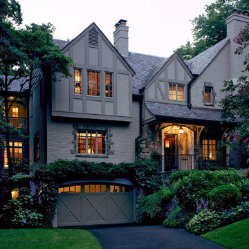
Inspiration for a large timeless two-story mixed siding exterior home remodel in DC Metro
Inspiration for a large timeless two-story mixed siding exterior home remodel in DC Metro


 NB Design Group, Inc
Photo by: Haris Kenjar
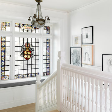
Staircase - scandinavian wooden u-shaped wood railing staircase idea in Seattle
Staircase - scandinavian wooden u-shaped wood railing staircase idea in Seattle
 River Valley Landscapes
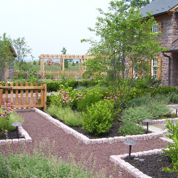
 This project presented unique opportunities that are not often found in residential landscaping. The homeowners were not only restoring their 1840's era farmhouse, a piece of their family’s history, but also enlarging and updating the home for modern living. The landscape designers continued this idea by creating a space that is a modern day interpretation of an 1840s era farm rather then a strict recreation. The resulting design combines elements of farm living from that time, as well as acknowledging the property’s history as a horse farm, with staples of 21st century landscapes such as space for outdoor living, lighting, and newer plant varieties.
Guests approach from the main driveway which winds through the property and ends at the main barn. There is secondary gated driveway just for the homeowners. Connected to this main driveway is a narrower gravel lane which leads directly to the residence. The lane passes near fruit trees planted in broken rows to give the illusion that they are the remains of an orchard that once existed on the site. The lane widens at the entrance to the gardens where there is a hitching post built into the fence that surrounds the gardens and a watering trough. The widened section is intended as a place to park a golf cart or, in a nod to the home’s past, tie up horses before entering. The gravel lane passes between two stone pillars and then ends at a square gravel court edged in cobblestones. The gravel court transitions into a wide flagstone walk bordered with yew hedges and lavender leading to the front door.
Directly to the right, upon entering the gravel court, is located a gravel and cobblestone edged walk leading to a secondary entrance into the residence. The walk is gated where it connects with the gravel court to close it off so as not to confuse visitors and guests to the main residence and to emphasize the primary entrance. An area for a bench is provided along this walk to encourage stopping to view and enjoy the gardens.
On either side of the front door, gravel and cobblestone walks branch off into the garden spaces. The one on the right leads to a flagstone with cobblestone border patio space. Since the home has no designated backyard like most modern suburban homes the outdoor living space had to be placed in what would traditionally be thought of as the front of the house. The patio is separated from the entrance walk by the yew hedge and further enclosed by three Amelanchiers and a variety of plantings including modern cultivars of old fashioned plants such as Itea and Hydrangea. A third entrance, the original front door to the 1840’s era section, connects to the patio from the home’s kitchen, making the space ideal for outdoor dining.
The gravel and cobblestone walk branching off to the left of the front door leads to the vegetable and perennial gardens. The idea for the vegetable garden was to recreate the tradition of a kitchen garden which would have been planted close to the residence for easy access. The vegetable garden is surrounded by mixed perennial beds along the inside of the wood picket fence which surrounds the entire garden space. Another area designated for a bench is provided here to encourage stopping and viewing. The home’s original smokehouse, completely restored and used as a garden shed, provides a strong architectural focal point to the vegetable garden. Behind the smokehouse is planted lilacs and other plants to give mass and balance to the corner and help screen the garden from the neighboring subdivision. At the rear corner of the garden a wood arbor was constructed to provide a structure on which to grow grapes or other vines should the homeowners choose to.
The landscape and gardens for this restored farmhouse and property are a thoughtfully designed and planned recreation of a historic landscape reinterpreted for modern living. The idea was to give a sense of timelessness when walking through the gardens as if they had been there for years but had possibly been updated and rejuvenated as lifestyles changed. The attention to materials and craftsmanship blend seamlessly with the residence and insure the gardens and landscape remain an integral part of the property. The farm has been in the homeowner’s family for many years and they are thrilled at the results and happy to see respect given to the home’s history and to its meticulous restoration.
 Craftsman Design and Renovation
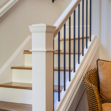
Craftsman style house opens up for better connection and more contemporary living. Removing a wall between the kitchen and dinning room and reconfiguring the stair layout allowed for more usable space and better circulation through the home. The double dormer addition upstairs allowed for a true Master Suite, complete with steam shower!
Photo: Pete Eckert
 Bartelt. The Remodeling Resource
Photo Credit - David Bader
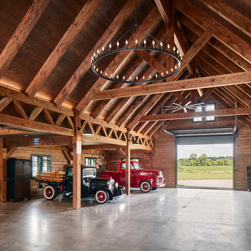
Garage - farmhouse four-car garage idea in Milwaukee
Garage - farmhouse four-car garage idea in Milwaukee
 Catherine Renae Thomas Design Co.
Photo: Brian Barkley © 2015 Houzz
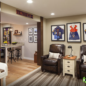
Family room - traditional multicolored floor family room idea in Other with beige walls
Family room - traditional multicolored floor family room idea in Other with beige walls
 The Design Gallery
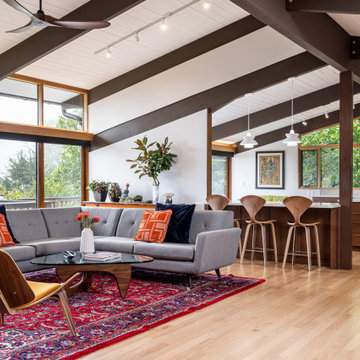
Our remodeled 1994 Deck House was a stunning hit with our clients. All original moulding, trim, truss systems, exposed posts and beams and mahogany windows were kept in tact and refinished as requested. All wood ceilings in each room were painted white to brighten and lift the interiors. This is the view looking from the living room toward the kitchen. Our mid-century design is timeless and remains true to the modernism movement.
Sponsored
Columbus, OH

Snider & Metcalf Interior Design, LTD
Leading Interior Designers in Columbus, Ohio & Ponte Vedra, Florida

 Klopf Architecture
From Mid-Century Classic to the Present
An iconic design updated with comfort, function, and flow for today.
A Remodel That Balances Past and Present
What started as a desire to update a classic Eichler soon became an exploration of how Mid-Century Modern design can successfully evolve for today. The client, a tech professional with a passion for scuba diving and underwater photography, wanted a home that would both honor its original character and feel tailored to his daily life. A lifelong technology enthusiast, he still owns the very first Mac desktop he saved up for as a teenager working at Radio Shack, a detail that underscores his appreciation for design that melds function and form.
Honoring Separation While Expanding Possibility
Unlike many contemporary remodels where walls are opened up to create expansive living spaces, this project took a more restrained approach. The client valued the defined rooms of the original plan and wanted to preserve as much wall space as possible for displaying his large-format underwater photography. The emphasis was not on dramatic spatial reinvention, but on thoughtful refinements. Klopf Architecture shaped a gallery-like backdrop while also expanding the primary suite, modernizing materials and fixtures throughout the home, and improving the functionality and layout of the kitchen. The finished home feels at once timeless and renewed, an Eichler that continues to inspire while fully supporting the lifestyle of its present-day owner.
A major turning point came mid-design. The original project brief had not included an addition, but as the reconfiguration of the primary bedroom and bath unfolded, it became clear that an expansion was the best approach to achieve the client’s vision of a more spacious suite. Fortunately, the adjustment came at a stage when revisions were still manageable and was integrated seamlessly, showing how thoughtful course corrections can strengthen a project rather than hinder it.
Navigating Challenges With Precision
The design development included multiple conceptual rounds, balancing preservation with subtle expansion. During construction, an existing post previously thought to be load-bearing turned out not to be. The structural engineer was able to pivot quickly, and both the post and the cross beam that had been intended to replace it could be omitted, allowing the original rhythm of the Eichler beam bays to be preserved.
Sustainability was not just a checklist item, but a way to align the home with the client’s values of simplicity, efficiency, and long-term functionality. R-38 roof insulation reduced energy usage, solar panels with battery storage provided independence and resilience, and passive comfort strategies eliminated the need forenergy-intensive air conditioning. An electric vehicle charger and an on-demand hot water recirculation system (with call buttons as opposed to having constant circulation) add to the home’s long-term efficiency factors. Together, these moves created a home that is quieter, more comfortable, and better equipped for the future, qualities that supported the client’s pragmatic approach to design and living lightly.
Details That Respect the Eichler DNA
The remodel carries forward the Eichler’s original spirit while introducing new layers of modern livability. Originally, the house was approached along a deep, narrow walk, with the garage on one side and the house on the other, leaving the front door tucked far back within this chasm-like space. By pulling the entry forward, the design reshaped the arrival experience, creating a clearer threshold and a natural drop-off zone for bags, shoes, and keys. This shift also made room for a custom bench at the entry that extends seamlessly through the glass sidelight. The bench and drop-off zone now work together as a single, integrated sequence that supports everyday living while offering a tactile reminder of Eichler’s philosophy of connectedness.
At the client’s request, Klopf reintroduced a classic Eichler gesture by extending the exterior siding into the entry and living room. The detail reinforces a sense of indoor/outdoor continuity while providing a subtle architectural surface that allows the client’s photography to take visual precedence.
The signature concrete masonry wall at the front was reconstructed using blocks sourced to match the originals, now strengthened with rebar for seismic resilience while maintaining a private outdoor courtyard, visually extending the kitchen outward. A decorative trellis element, a detail borrowed from a neighboring Eichler, restores a familiar mid-century modern architectural motif. At the courtyard entry door, a custom etched glass sidelight with an ocean-themed design featuring kelp and jellyfish serves as a subtle homage to the client’s passion for deep-sea diving.
Landscaping became an integral part of the overall transformation. The homeowner engaged landscape architect Randi Johnsen of Third Nature Studio to shape a series of calm, inviting outdoor rooms that read as a natural extension of the interiors. While technically outside of the core construction scope, the landscape design proved central to achieving a sense of completeness and connectedness across the property. Such whole-property considerations often emerge as design ideas take shape, underscoring the importance of flexibility in planning and budgeting, as well as close collaboration among the design team starting early in the process.
The Value of Evolving Scope
As with many custom residential projects, the scope evolved during the design process. What began as a targeted remodel grew to include a new/expanded primary suite, a rebuilt CMU patio wall for strength and longevity, and a solar panel array and battery storage for energy resilience and carbon-reduction. Each thoughtful decision represented a conscious investment in the home’s performance and character, rather than a cost overrun.
The result was a project delivered on schedule, tailored precisely to the client’s lifestyle, and positioned to add long-term value both functionally and aesthetically. By embracing scope evolution as an opportunity rather than a challenge, and relying on good design paired with transparent communication, this remodel demonstrates how Eichler homes can be adapted for contemporary living without erasing their DNA.
Klopf Architecture project team: John Klopf, AIA, and Klara Kevane, Elise Webb and Nicholas LaNasa.
Contractor: Golden Cove Construction
Landscape Design: Third Nature Studio
Structural Engineer: Daniel Bastiao Design
Photography: ©2025 Mariko Reed
Year Completed: 2024
Location: Sunnyvale, CA
 Design Loves Detail
Jessica White
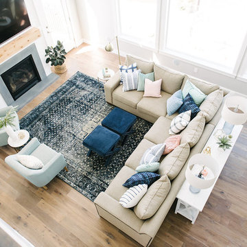
Inspiration for a large transitional medium tone wood floor family room remodel in Salt Lake City with gray walls, a standard fireplace and a wall-mounted tv
Inspiration for a large transitional medium tone wood floor family room remodel in Salt Lake City with gray walls, a standard fireplace and a wall-mounted tv
 Robin's Nest Interiors
Updated Spec Home: Foyer and Great Room
In our last post, we introduced you to my mom and sister’s Updated Spec Home; the Foyer and Great Room will be featured in this post.
Foyer
As you enter their home, to the right is a hall closet and a french door which leads to the Basement. To the left is a long wall which was perfect for an extra long console table in a rustic finish that served as a sofa table in their previous home. I love repositioning furniture, and by using this table in the entry, it makes it feel new.
Additionally, we placed a vibrant piece of art previously used in my sister’s Bedroom above the table. This piece not only sets the tone for our color palette, it also makes the kind of statement you want in your Foyer – Wow! We added accessories and an unique lamp to complete the space.
Great Room
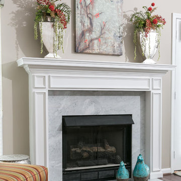
In the Great Room which is open to the Foyer, we installed our inspiration artwork in the place of honor over the mantel. Since the piece was vertical, it did not take up enough space. I do not like a “fussy” mantel with lots of accessories so we found these two vases in a silver leaf finish. They were perfect because they were large enough, but not too deep. Accessorizing mantels can be tricky because the majority of them are not deep. We went to Jan’s Floral Design to add vibrant color and interesting textures to the vases.
The original mantel was too small and uninspired. Therefore, we had our contractor Brad Anderson built a new one based on a photo of a mantel we liked. The new mantel has lots of great detail and is the appropriate proportion for the fireplace. We replaced beige 12×12 ceramic tiles with gorgeous large pieces of smoked carrara marble for a striking fireplace surround. Check out this other mantel that we updated.
For furniture, we purchased a shorter sofa in a gray tweed fabric. Typically, two throw pillows come with a sofa.We added a fun fringe to the pillows that came with the sofa. I recommend ordering pillows that match your sofa fabric and layering with custom pillows that support your color palette. We added a patterned custom pillow and a striped throw.
Next, we got a small scale recliner in a yummy gray leather for my mom and a chair and ottoman in a small scale mint and gray geometric pattern for my sister. We added an accent chair in a fun small scale stripe to fill a corner and add additional seating – which is always a good thing.
Remember that this was a Spec Home so there were no built-ins. As a result, we needed a media cabinet for the television and some bookcases to display my mom’s decorative box collection and my sister’s collection of blown colored glass. This set from Ballard Designs fit the bill perfectly. The back is open and airy with nice detail. The wood finish also adds a richness to the space.
My mom needed a space for her computer, and this small writing desk fit the space perfectly.
Finally, for finishing touches, we added a patterned rug, cornice boards in a mint leaf fabric, and great lamps for ambient lighting. These two rooms are stunning, vibrant and livable. Can’t wait to show you more in our next post! Enjoy!
Photo by Tim Furlong Jr.

Sponsored
Columbus, OH
Free consultation for landscape design!

Peabody Landscape Group
Franklin County's Reliable Landscape Design & Contracting
 Open Door Architecture
Photo credit: Denise Retallack Photography
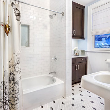
Inspiration for a mid-sized transitional subway tile and white tile mosaic tile floor bathroom remodel in Other with a pedestal sink, shaker cabinets, dark wood cabinets, marble countertops and blue walls
Inspiration for a mid-sized transitional subway tile and white tile mosaic tile floor bathroom remodel in Other with a pedestal sink, shaker cabinets, dark wood cabinets, marble countertops and blue walls
 Flavin Architects
New Additions to Hoover + Hill
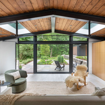
This project is a continuation of the renovation and updating work Flavin Architects had previously completed at the 1958 Wales house, designed by architect Henry Hoover and Walter Hill. Our clients, a young family, desired more space for guests, a home office, a yoga studio, and covered car parking. The challenge was to respect the architects’ original vision and not to interfere with the perfect cruciform plan of the house. To accomplish these goals, we converted the existing garage/workshop structure into a guest house and then designed a new, separate carport/storage building.
The new carport building shares the low-slope gable of the original Hoover structure. The post and beam structure characteristic of Hoover’s design is updated through the use of galvanized steel posts and I beams. The galvanized beams cantilever to support a sheltered walkway leading from the parking to a guest house terrace defined in relationship to the three structures surrounding it. The terrace is paved in slate with a central rain garden. Wood lattice clads the carport, providing good ventilation and letting the building glow like a lantern at night. Our guest house renovation celebrates the unique structural timber ceiling of the original garage. We replaced opaque plywood trusses with a slender cable truss structurally engineered by Webb Structural Services. This cable truss allows for a view of the timber ceiling. A wall of glass facing the courtyard replaced the original garage door. A murphy bed in the rear room enables quick conversion from guest quarters to weight room.

 Dan Nelson, Designs Northwest Architects
Photography by Lucas Henning.
Garage - craftsman garage idea in Seattle
Garage - craftsman garage idea in Seattle
1