
Search results for "Absorbed" in Home Design Ideas

 Daniel Scerri Periti
We were approached with a request to design the furnishings for an existing ‘finished’ apartment. The intention was to move in relatively fast, and the property already had an existing marble floor, kitchen and bathrooms which had to be kept. The property also boasted a fantastic 270 degree view, seen from most of the apartment. The clients had a very important role in the completion of the project. They were very involved during the design process and through various decoration choices. The final design was kept as a rigid guideline when faced with picking out all the different elements.
Once clear of all previous furniture, the space felt cold and bare; so we immediately felt the need for warmth, and raw, natural elements and textures to complement the cold marble floor while visually tying in the design of the whole apartment together.
Since the existing kitchen had a touch of dark walnut stain, we felt this material was one we should add to the palette of materials to contest the stark materials. A raw cement finish was another material we felt would add an interesting contrast and could be used in a variety of ways, from cabinets to walls and ceilings, to tie up the design of various areas of the apartment.
To warm up the living/dining area, keeping the existing marble floor but visually creating zones within the large living/dining area without hindering the flow, a dark timber custom-made soffit, continuous with a floor-to-ceiling drinks cabinet zones the dining area, giving it a degree of much-needed warmth.
The various windows with a stupendous 270 degree view needed to be visually tied together. This was done by introducing a continuous sheer [drape] which also doubled up as a sound-absorbing material along 2 of the 4 walls of the space.
A very large sofa was required to fill up the space correctly, also required for the size of the young family.
Services were integrated within the units and soffits, while a customized design in the corner between the kitchen and the living room took into consideration the viewpoints from the main areas to create a pantry without hindering the flow or views. A strategically placed floor-to-ceiling mirror doubles up the space and extends the view to the inner parts of the apartment.
The daughter’s bedroom was a small challenge in itself, and a fun task, where we wanted to achieve the perception of a cozy niche with its own enclosed reading nook [for reading fairy tales], behind see-through curtains and a custom-ordered wall print sporting the girl’s favorite colors.
The sons’ bedroom had double the requirements in terms of space needed: more wardrobe, more homework desk space, a tv/play station area… “We combined a raised platform area between the boys’ beds to become an area with cushions where the kids can lay down and play, and face a hidden screen behind the homework desk’s sliding back panel for their play station”. The color of the homework desk was chosen in relation to the boys’ ages. A more masculine material palette was chosen for this room, in contrast to the light pastel palette of the girl’s bedroom. Again, this colour can easily be changed over time for a more mature look.
PROJECT DATA:
St. Paul’s Bay, Malta
DESIGN TEAM:
Perit Rebecca Zammit, Perit Daniel Scerri, Elyse Tonna
OTHER CREDITS:
Photography: Tonio Lombardi
Styling : TKS
 Pennsylvania Landscape & Nursery Association
Terren Landscapes http://www.terrenlandscapes.com
2014 PLNA Awards for Landscape Excellence Winner
Category: Residential $120,000 & Over
Award Level: Silver
Project Description:
The goal of the Vaccaro project was to change the existing non-functional landscape into multiple entertainment spaces while working within the tight confines of impervious coverage requirements. The project consisted of removing, redesigning and re-installing existing hardscaping, front and rear, reconfiguring the driveway to accommodate more parking, handling storm water on-site, and increasing the aesthetic appeal of the property.
The client was remodeling the home in the theme of a rustic French country estate and in our design we endeavored to adhere to this chosen theme. The existing driveway was a circular driveway located off of the main axis of the front door. Reconfiguring the driveway improved vehicular flow, provided additional parking, and reduced impervious space. By consolidating the parking to the side of the house where the garage is located, we maintained the French theme in encouraging arriving cars to pull up closer to the home's entry. We also worked with the architect in the renovation of the home to position the garage windows so that they were placed in the voids of the arbor we constructed over the parking spaces by the garage. The rustic arbor creates a vertical element and delineates the pedestrian walkway from vehicular traffic. The main walkway spans the front of the home so that it extends down to the parking area to guide visitors to the main entrance.
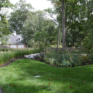
To handle the storm water generated by the driveway, we installed a rain garden, which was placed in the front right side yard. The rain garden area was excavated, the soil in the planting areas was heavily amended with compost, sand, and diatomaceous earth, and mostly native plant material was installed to help absorb excess water. In the bottom-most area of the basin filter fabric was laid to help prevent migration of the stone into the soil and decorative stone was spread to slow the flow of water. Storm water is held until it successfully infiltrates the soil, and the plant material provides a natural habitat that supports butterflies, birds, and beneficial insects.
The existing front patio was removed and the size increased to make the space more functional. To increase function and circulation we worked with the architect to create a dining room that extends to the out-of-doors by adding French doors to the front of the home, which open to the new gravel front terrace. The homeowner desired a planting scheme that would create delineation between the front yard and the gravel terrace without blocking the morning sunlight. To achieve this we chose standardized Physocarpus 'Diablo' to compliment the warm cream-colored stucco of the home and provide structure to the patio space.
In the rear of the property we removed the existing brick patio and installed a dry-laid quartzite patio that nicely compliments the cream-colored stucco. We redesigned the rear patio space using 45 degree angles to represent the old French design theory of bisecting spaces with diagonals. Utilizing this design theory created more interesting patio spaces and allowed us to soften the sharp angles by planting the negative spaces between the house and patio. Seat walls were also designed and installed to create more seating without sacrificing impervious space.
Per the homeowner's wishes, we also designed a separate area in the rear of the yard for a natural boulder fire pit, which is located along the axis of the kitchen window. Half of the ring utilizes boulders for seating for a small gathering while the other half
allowed the homeowner's addition of colorful Adirondack chairs to finish the fire circle.
Incorporating the French theme throughout, we also designed and installed a small vegetable garden in the side yard so the homeowner could grow her own vegetables and herbs.
Photo Credit:
Terren Landscapes
 Daniel Scerri Periti
We were approached with a request to design the furnishings for an existing ‘finished’ apartment. The intention was to move in relatively fast, and the property already had an existing marble floor, kitchen and bathrooms which had to be kept. The property also boasted a fantastic 270 degree view, seen from most of the apartment. The clients had a very important role in the completion of the project. They were very involved during the design process and through various decoration choices. The final design was kept as a rigid guideline when faced with picking out all the different elements.
Once clear of all previous furniture, the space felt cold and bare; so we immediately felt the need for warmth, and raw, natural elements and textures to complement the cold marble floor while visually tying in the design of the whole apartment together.
Since the existing kitchen had a touch of dark walnut stain, we felt this material was one we should add to the palette of materials to contest the stark materials. A raw cement finish was another material we felt would add an interesting contrast and could be used in a variety of ways, from cabinets to walls and ceilings, to tie up the design of various areas of the apartment.
To warm up the living/dining area, keeping the existing marble floor but visually creating zones within the large living/dining area without hindering the flow, a dark timber custom-made soffit, continuous with a floor-to-ceiling drinks cabinet zones the dining area, giving it a degree of much-needed warmth.
The various windows with a stupendous 270 degree view needed to be visually tied together. This was done by introducing a continuous sheer [drape] which also doubled up as a sound-absorbing material along 2 of the 4 walls of the space.
A very large sofa was required to fill up the space correctly, also required for the size of the young family.
Services were integrated within the units and soffits, while a customized design in the corner between the kitchen and the living room took into consideration the viewpoints from the main areas to create a pantry without hindering the flow or views. A strategically placed floor-to-ceiling mirror doubles up the space and extends the view to the inner parts of the apartment.
The daughter’s bedroom was a small challenge in itself, and a fun task, where we wanted to achieve the perception of a cozy niche with its own enclosed reading nook [for reading fairy tales], behind see-through curtains and a custom-ordered wall print sporting the girl’s favorite colors.
The sons’ bedroom had double the requirements in terms of space needed: more wardrobe, more homework desk space, a tv/play station area… “We combined a raised platform area between the boys’ beds to become an area with cushions where the kids can lay down and play, and face a hidden screen behind the homework desk’s sliding back panel for their play station”. The color of the homework desk was chosen in relation to the boys’ ages. A more masculine material palette was chosen for this room, in contrast to the light pastel palette of the girl’s bedroom. Again, this colour can easily be changed over time for a more mature look.
PROJECT DATA:
St. Paul’s Bay, Malta
DESIGN TEAM:
Perit Rebecca Zammit, Perit Daniel Scerri, Elyse Tonna
OTHER CREDITS:
Photography: Tonio Lombardi
Styling : TKS
Find the right local pro for your project
 Daniel Scerri Periti
We were approached with a request to design the furnishings for an existing ‘finished’ apartment. The intention was to move in relatively fast, and the property already had an existing marble floor, kitchen and bathrooms which had to be kept. The property also boasted a fantastic 270 degree view, seen from most of the apartment. The clients had a very important role in the completion of the project. They were very involved during the design process and through various decoration choices. The final design was kept as a rigid guideline when faced with picking out all the different elements.
Once clear of all previous furniture, the space felt cold and bare; so we immediately felt the need for warmth, and raw, natural elements and textures to complement the cold marble floor while visually tying in the design of the whole apartment together.
Since the existing kitchen had a touch of dark walnut stain, we felt this material was one we should add to the palette of materials to contest the stark materials. A raw cement finish was another material we felt would add an interesting contrast and could be used in a variety of ways, from cabinets to walls and ceilings, to tie up the design of various areas of the apartment.
To warm up the living/dining area, keeping the existing marble floor but visually creating zones within the large living/dining area without hindering the flow, a dark timber custom-made soffit, continuous with a floor-to-ceiling drinks cabinet zones the dining area, giving it a degree of much-needed warmth.
The various windows with a stupendous 270 degree view needed to be visually tied together. This was done by introducing a continuous sheer [drape] which also doubled up as a sound-absorbing material along 2 of the 4 walls of the space.
A very large sofa was required to fill up the space correctly, also required for the size of the young family.
Services were integrated within the units and soffits, while a customized design in the corner between the kitchen and the living room took into consideration the viewpoints from the main areas to create a pantry without hindering the flow or views. A strategically placed floor-to-ceiling mirror doubles up the space and extends the view to the inner parts of the apartment.
The daughter’s bedroom was a small challenge in itself, and a fun task, where we wanted to achieve the perception of a cozy niche with its own enclosed reading nook [for reading fairy tales], behind see-through curtains and a custom-ordered wall print sporting the girl’s favorite colors.
The sons’ bedroom had double the requirements in terms of space needed: more wardrobe, more homework desk space, a tv/play station area… “We combined a raised platform area between the boys’ beds to become an area with cushions where the kids can lay down and play, and face a hidden screen behind the homework desk’s sliding back panel for their play station”. The color of the homework desk was chosen in relation to the boys’ ages. A more masculine material palette was chosen for this room, in contrast to the light pastel palette of the girl’s bedroom. Again, this colour can easily be changed over time for a more mature look.
PROJECT DATA:
St. Paul’s Bay, Malta
DESIGN TEAM:
Perit Rebecca Zammit, Perit Daniel Scerri, Elyse Tonna
OTHER CREDITS:
Photography: Tonio Lombardi
Styling : TKS

 Bridgewater
The new owners were looking forward to living in their new home with an open floor plan, tall vaulted ceilings, and great views. It featured a large Great Room with two big French Doors separating the Dining Room from the Master Bedroom.
But after only a few months they identified a major design flaw: Each of the French Doors had ten glass windows with two large windows above each door. (Check out our before and after designs, traffic flow diagrams and photos of this project.) Glass windows and doors allowed sound and light from guests or the TV in the great room to easily sneak into the bedroom. With unique work and sleep schedules (he’s a pilot, she’s a registered nurse) this design wasn’t working.
Then there was a traffic flow design flaw: The Master Bedroom had a second entrance from a hallway. To get into the bedroom from the hallway you needed to walk down another claustrophobic hallway.
To get from the Master Bedroom to the Master Bath begin at the most remote corner of the bedroom and down a hallway between two closets. Once inside the bath, a huge triangular Jacuzzi dominating the space.
So, from a privacy and traffic flow perspective, this home had some major design issues.
When Craig Weber first met with the owners, he listened to their ideas and concerns. The owners trusted Craig to come up with the most efficient and most effective solution to this design dilemma. He offered a solution that resolved the bed-bath traffic flow problem, offered some bedroom room privacy, and updated the bath.
First, the two French Doors and windows were removed. A new wall was built with sound-absorbing materials, making the Great Room and Dining Room more comfortable spaces for entertaining while creating the bedroom privacy the owners craved.
Solving the Bedroom/Bath traffic flow problem began with removing the two existing closets. The bath door was relocated next to the hall entrance, and then a new walk-in closet was added adjacent to the hallway entrance. The solution offered easy access to and from the bath, closet and hallway without a hint of claustrophobia.
The Master Bath underwent a major transformation designed for convenience and comfort – especially during long, cold Minnesota winters.
Most everything from the former bath was torn out, beginning with the giant Jacuzzi.
A new bathtub that is wider and deeper than the standard size was installed with brushed Nickel fixtures. It’s the perfect place to relax with a glass of wine and candles.
Warm floors are a Minnesota “must have.” The bath’s new ceramic floor features in-floor electric heat. Getting in and out of the tub is easy and comfortable.
The new walk-in shower again features in-floor heating and a place to sit. The most interesting feature of this shower may the custom ceramic tile installed with unique patterns.
A new vanity Cambria Bradshaw countertops features two under-hung ceramic sinks with matching brushed Nickel fixtures.
Tall ceilings and three glass windows near the ceiling flood the room with natural light. A new energy-efficient window frames an ornamental stained glass window created by the owner’s father – a great personal touch.
A quiet place to sleep. A private dining room for entertaining. A Master Bath to die for. And easy traffic flow. The owners couldn’t have been more delighted with the outcome. And Lilly, their cat, loves it too.
 Daniel Scerri Periti
We were approached with a request to design the furnishings for an existing ‘finished’ apartment. The intention was to move in relatively fast, and the property already had an existing marble floor, kitchen and bathrooms which had to be kept. The property also boasted a fantastic 270 degree view, seen from most of the apartment. The clients had a very important role in the completion of the project. They were very involved during the design process and through various decoration choices. The final design was kept as a rigid guideline when faced with picking out all the different elements.
Once clear of all previous furniture, the space felt cold and bare; so we immediately felt the need for warmth, and raw, natural elements and textures to complement the cold marble floor while visually tying in the design of the whole apartment together.
Since the existing kitchen had a touch of dark walnut stain, we felt this material was one we should add to the palette of materials to contest the stark materials. A raw cement finish was another material we felt would add an interesting contrast and could be used in a variety of ways, from cabinets to walls and ceilings, to tie up the design of various areas of the apartment.
To warm up the living/dining area, keeping the existing marble floor but visually creating zones within the large living/dining area without hindering the flow, a dark timber custom-made soffit, continuous with a floor-to-ceiling drinks cabinet zones the dining area, giving it a degree of much-needed warmth.
The various windows with a stupendous 270 degree view needed to be visually tied together. This was done by introducing a continuous sheer [drape] which also doubled up as a sound-absorbing material along 2 of the 4 walls of the space.
A very large sofa was required to fill up the space correctly, also required for the size of the young family.
Services were integrated within the units and soffits, while a customized design in the corner between the kitchen and the living room took into consideration the viewpoints from the main areas to create a pantry without hindering the flow or views. A strategically placed floor-to-ceiling mirror doubles up the space and extends the view to the inner parts of the apartment.
The daughter’s bedroom was a small challenge in itself, and a fun task, where we wanted to achieve the perception of a cozy niche with its own enclosed reading nook [for reading fairy tales], behind see-through curtains and a custom-ordered wall print sporting the girl’s favorite colors.
The sons’ bedroom had double the requirements in terms of space needed: more wardrobe, more homework desk space, a tv/play station area… “We combined a raised platform area between the boys’ beds to become an area with cushions where the kids can lay down and play, and face a hidden screen behind the homework desk’s sliding back panel for their play station”. The color of the homework desk was chosen in relation to the boys’ ages. A more masculine material palette was chosen for this room, in contrast to the light pastel palette of the girl’s bedroom. Again, this colour can easily be changed over time for a more mature look.
PROJECT DATA:
St. Paul’s Bay, Malta
DESIGN TEAM:
Perit Rebecca Zammit, Perit Daniel Scerri, Elyse Tonna
OTHER CREDITS:
Photography: Tonio Lombardi
Styling : TKS
 Daniel Scerri Periti
We were approached with a request to design the furnishings for an existing ‘finished’ apartment. The intention was to move in relatively fast, and the property already had an existing marble floor, kitchen and bathrooms which had to be kept. The property also boasted a fantastic 270 degree view, seen from most of the apartment. The clients had a very important role in the completion of the project. They were very involved during the design process and through various decoration choices. The final design was kept as a rigid guideline when faced with picking out all the different elements.
Once clear of all previous furniture, the space felt cold and bare; so we immediately felt the need for warmth, and raw, natural elements and textures to complement the cold marble floor while visually tying in the design of the whole apartment together.
Since the existing kitchen had a touch of dark walnut stain, we felt this material was one we should add to the palette of materials to contest the stark materials. A raw cement finish was another material we felt would add an interesting contrast and could be used in a variety of ways, from cabinets to walls and ceilings, to tie up the design of various areas of the apartment.
To warm up the living/dining area, keeping the existing marble floor but visually creating zones within the large living/dining area without hindering the flow, a dark timber custom-made soffit, continuous with a floor-to-ceiling drinks cabinet zones the dining area, giving it a degree of much-needed warmth.
The various windows with a stupendous 270 degree view needed to be visually tied together. This was done by introducing a continuous sheer [drape] which also doubled up as a sound-absorbing material along 2 of the 4 walls of the space.
A very large sofa was required to fill up the space correctly, also required for the size of the young family.
Services were integrated within the units and soffits, while a customized design in the corner between the kitchen and the living room took into consideration the viewpoints from the main areas to create a pantry without hindering the flow or views. A strategically placed floor-to-ceiling mirror doubles up the space and extends the view to the inner parts of the apartment.
The daughter’s bedroom was a small challenge in itself, and a fun task, where we wanted to achieve the perception of a cozy niche with its own enclosed reading nook [for reading fairy tales], behind see-through curtains and a custom-ordered wall print sporting the girl’s favorite colors.
The sons’ bedroom had double the requirements in terms of space needed: more wardrobe, more homework desk space, a tv/play station area… “We combined a raised platform area between the boys’ beds to become an area with cushions where the kids can lay down and play, and face a hidden screen behind the homework desk’s sliding back panel for their play station”. The color of the homework desk was chosen in relation to the boys’ ages. A more masculine material palette was chosen for this room, in contrast to the light pastel palette of the girl’s bedroom. Again, this colour can easily be changed over time for a more mature look.
PROJECT DATA:
St. Paul’s Bay, Malta
DESIGN TEAM:
Perit Rebecca Zammit, Perit Daniel Scerri, Elyse Tonna
OTHER CREDITS:
Photography: Tonio Lombardi
Styling : TKS
 Daniel Scerri Periti
We were approached with a request to design the furnishings for an existing ‘finished’ apartment. The intention was to move in relatively fast, and the property already had an existing marble floor, kitchen and bathrooms which had to be kept. The property also boasted a fantastic 270 degree view, seen from most of the apartment. The clients had a very important role in the completion of the project. They were very involved during the design process and through various decoration choices. The final design was kept as a rigid guideline when faced with picking out all the different elements.
Once clear of all previous furniture, the space felt cold and bare; so we immediately felt the need for warmth, and raw, natural elements and textures to complement the cold marble floor while visually tying in the design of the whole apartment together.
Since the existing kitchen had a touch of dark walnut stain, we felt this material was one we should add to the palette of materials to contest the stark materials. A raw cement finish was another material we felt would add an interesting contrast and could be used in a variety of ways, from cabinets to walls and ceilings, to tie up the design of various areas of the apartment.
To warm up the living/dining area, keeping the existing marble floor but visually creating zones within the large living/dining area without hindering the flow, a dark timber custom-made soffit, continuous with a floor-to-ceiling drinks cabinet zones the dining area, giving it a degree of much-needed warmth.
The various windows with a stupendous 270 degree view needed to be visually tied together. This was done by introducing a continuous sheer [drape] which also doubled up as a sound-absorbing material along 2 of the 4 walls of the space.
A very large sofa was required to fill up the space correctly, also required for the size of the young family.
Services were integrated within the units and soffits, while a customized design in the corner between the kitchen and the living room took into consideration the viewpoints from the main areas to create a pantry without hindering the flow or views. A strategically placed floor-to-ceiling mirror doubles up the space and extends the view to the inner parts of the apartment.
The daughter’s bedroom was a small challenge in itself, and a fun task, where we wanted to achieve the perception of a cozy niche with its own enclosed reading nook [for reading fairy tales], behind see-through curtains and a custom-ordered wall print sporting the girl’s favorite colors.
The sons’ bedroom had double the requirements in terms of space needed: more wardrobe, more homework desk space, a tv/play station area… “We combined a raised platform area between the boys’ beds to become an area with cushions where the kids can lay down and play, and face a hidden screen behind the homework desk’s sliding back panel for their play station”. The color of the homework desk was chosen in relation to the boys’ ages. A more masculine material palette was chosen for this room, in contrast to the light pastel palette of the girl’s bedroom. Again, this colour can easily be changed over time for a more mature look.
PROJECT DATA:
St. Paul’s Bay, Malta
DESIGN TEAM:
Perit Rebecca Zammit, Perit Daniel Scerri, Elyse Tonna
OTHER CREDITS:
Photography: Tonio Lombardi
Styling : TKS

 SUPERIOR CHIMNEY SERVICES CORPORATION
Do you know what ends our time of enjoying the wonderful Fall colors? Rain. The other day when it rained, it took most of those bright yellow leaves and brought them to the ground. It saddened me not only because the colors were gone, but now the leaves have to be cleaned up. And with the trees being larger, those leaves went everywhere. All over the ground, in the tall bushes, stuck on the window sills, lodged in the gutters and up at the chimney. Nature’s going to happen so, what are the effects of Fall rain and the Chimney? Let’s take a further look.
Fall Rain and the Chimney
The Fall leaves are gorgeous and fall is many homeowners favorite time of year. But as with all seasons, it comes to an end. The Fall rain combined with wind takes those colorful leaves and distributes them…everywhere. Especially on the roof where your chimney is located. By having an annual chimney inspection, we’ll take a look to ensure the safety of your chimney stays intact for the upcoming harsher season: Winter.
The Exterior Chimney
With Fall, we have two of the elements to be concerned about and that’s the leaves and rain. Here are a few areas we check and the effects of fall rain and the chimney. Let’s start at the top:
Chimney Cap: The chimney cap is vital for protecting the opening of your chimney which leads to the interior of your home. We inspect the chimney cap ensuring it is tightly secured to the exterior chimney termination. The chimney is typically the tallest part of your home and gets exposed to the harshest winds, rain, snow, animals and blowing debris. All of that hits the chimney cap trying to find that weak spot so it can get inside the chimney. If it does, that debris is easily ignited and can cause harm to your home.
Chimney Crown: This is the slab of concrete that covers the chimney and extends beyond the bricks or materials that make up the chimney. This is to provide protection from the elements. But remember the chimney crown can also develop cracks over time. This is where crown coat can extend the life of the chimney crown ensuring the elements stay where they should… outside.
Brick, Stone and Mortar: The structure of the chimney can be made of brick, stone or other materials. If it is made of brick or stone, then mortar is involved. All of these materials are porous, meaning that it can absorb water and snow melt, which breaks down over time. As a result, this needs to be checked looking for loose bricks, missing mortar, cracks in either one of these materials and more. Tuckpointing is a good solution to ensure the elements stay out. The use of Chimney Saver is a great way to preserve the bricks, stones and mortar as it waterproofs and protects the materials for about 8 – 10 years and slows down the aging process.
Flashing: This is the material that protects the connection of the roof to the chimney. A critical and common area for leaks. The flashing moves the water away from the chimney and down the roof. The flashing adheres to the chimney with a seal, which dries out over time. This area needs to be checked to ensure the seal is strong and doesn’t allow water to get in.
Before the cold sets in and you want to turn on or fire up the fireplace, be sure to take into consideration the effects of fall rain and the chimney. Contact us today at 877-244-6349 to set up an appointment.


 Adobe Interiors
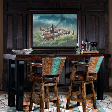
Add a pop of turquoise to your home with The Chisum Nile Croc Barstool! It is crafted to be either bar or counter height. This fine rustic barstool will make a statement in any home dining room or living area. Solid hardwood framing provides the perfect motif for this accent piece. The armrests' gentle sloping feature is a juxtaposition to the sturdily squared hard lines of the base of the barstool. All handcrafted and designed, providing a uniquely authentic experience and rustic elegant charm to any space. If beauty and charm along with a stand alone character are what you seek, dive into the experience with this Chisum barstool and bring color and life to your home. Best as a dynamic set, these barstools are hand-made classics for you. 100% Top Grain Tufted Leather with embossed croc on the arms & back. Solid Hardwood Frame with High Quality Ball Bearing Swivel Mechanism. Glued, Screwed, and Doweled at the Joints. Premium High Density Foam Cushion Cores. 100% Texas Made!
Overall Barstool Dimensions: 43" H x 26" W x 22" D
Seat Height: 30"
Top of Arm Height: 40"
Overall Counter Stool Dimension: 38" H x 26" W x 22" D
Seat Height: 25"
Top of Arm Height: 35"
Leather Description: A fully drum dyed top grain cowhide on European raw material. This leather is lightly ironed and then milled extensively for a unique distressed appearance. This is a natural full grain leather. The hides have not been altered in any way during the tanning process. Shade variation is normal and areas of hides absorb dyes differently, so natural dye lot variations will occur. Remember that a swatch is a general representation of the leather's color and texture, not an exact match. Scars, marks, and branding are not flaws but rather are proof of authenticity, what we call "hallmarks of the trail". Leathers will fade if exposed to direct sunlight. This is a pull up leather which means color diffusion and "burst" will occur when worked by hand. If any of these characteristics is a problem please consider a "painted" leather. One that has been corrected and heavily pigmented.
Embossed Leather Description: A leather used to accent many of today's home interiors. The leather hide is first embossed with a large crocodile grain and then colored by applying two base color coats of micro pigments. The leather is then wiped-off to give it a contrast of colors utilizing the base color combination. This color contrast is further accented by two additional top coat colors that are wiped-on by hand to give the leather a beautiful antique look. The last step is to slightly protect the hand work of the leather hide with a lacquer topcoat that provides great depth and warmth to the finished product. 100% top grain cowhide leather is characterized by variations in shade, texture, color and grain. Healed marks and scars are to be expected and enhance the natural beauty of the hides. These variations should not be considered defects as they are normal and unique features of genuine 100% top grain cowhide leather.
Frame Construction: Made with American Alder Wood, our frames are glued, screwed and dowelled at the joints. Two coats of high quality stain is hand rubbed on the wood finish and then sealed with industrial grade clear coat.
 SUPERIOR CHIMNEY SERVICES CORPORATION
Winter is always tough on your home. This past winter was no picnic with the snow and cold. By the time spring (really) arrives, your chimney has put up with months of freezing temperatures, snow, ice, and the constant freeze-thaw cycle that quietly does damage you can't always see from the outside. That's why a spring chimney inspection isn't just a good idea, it’s essential to have your chimney checked before storm season begins. Here’s why:
Water Is Your Chimney's Worst Enemy
Here's something that most homeowners don’t know: chimney leaks cause more damage to masonry chimneys than fire does. Think about that a moment. While everyone worries about creosote and chimney fires — and rightfully so — water is silently doing just as much, if not more, damage.
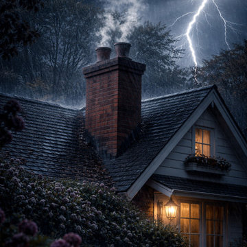
Unlike the rest of your home, which is sheltered by your roof and eaves, your chimney stands fully exposed above the roofline. It takes on rain, wind, snow, and every freeze-thaw cycle winter throws at it, all while absorbing moisture into its porous masonry materials. That water expands and contracts, causing cracks, structural stress, and integrity loss that accumulates over time. The worst part? Chimney leaks are often subtle and slow-moving. By the time you notice water damage inside your home, the problem has usually become more serious, and expensive.
What a Spring Inspection Actually Catches
A professional spring chimney inspection, such as Superior Chimney’s, goes well beyond a quick visual check. A CSIA Certified Chimney Sweep technician will evaluate your entire system — inside and out — looking for the most common sources of chimney leaks and damage, including cracked chimney crowns, deteriorated brick and mortar joints, damaged or missing chimney caps, faulty chimney flashing and roof leaks, chimney slab gaps, and flue gas condensation from improperly sized chimney liners.
Any one of these issues left without a proper inspection, heads into spring storm season is an open invitation for water damage. And as Superior Chimney has discussed, masonry water damage is a progressive problem — the longer it goes unrepaired, the costlier the fix becomes.
What You Can Do Right Now
The good news is that most chimney water damage is preventable. The key steps are:
• have a professional-grade chimney cap installed if you don't already have one
• repair or replace a damaged chimney crown
• address any deteriorated brick and mortar
• fix leaky flashing and
• consider having your chimney professionally waterproofed. Waterproofing alone can save you significantly on future repair costs.
What’s Next?
Superior Chimney always includes a free 14-Point Certified Written Inspection with photo documentation via email with every chimney sweep. This helps you to know exactly what condition your chimney is in and what, if anything, needs attention.
Don't wait, have your chimney checked before storm season begins to reveal a problem that's been building all winter.
Schedule your inspection today at 877-244-6349.
 Daniel Scerri Periti
We were approached with a request to design the furnishings for an existing ‘finished’ apartment. The intention was to move in relatively fast, and the property already had an existing marble floor, kitchen and bathrooms which had to be kept. The property also boasted a fantastic 270 degree view, seen from most of the apartment. The clients had a very important role in the completion of the project. They were very involved during the design process and through various decoration choices. The final design was kept as a rigid guideline when faced with picking out all the different elements.
Once clear of all previous furniture, the space felt cold and bare; so we immediately felt the need for warmth, and raw, natural elements and textures to complement the cold marble floor while visually tying in the design of the whole apartment together.
Since the existing kitchen had a touch of dark walnut stain, we felt this material was one we should add to the palette of materials to contest the stark materials. A raw cement finish was another material we felt would add an interesting contrast and could be used in a variety of ways, from cabinets to walls and ceilings, to tie up the design of various areas of the apartment.
To warm up the living/dining area, keeping the existing marble floor but visually creating zones within the large living/dining area without hindering the flow, a dark timber custom-made soffit, continuous with a floor-to-ceiling drinks cabinet zones the dining area, giving it a degree of much-needed warmth.
The various windows with a stupendous 270 degree view needed to be visually tied together. This was done by introducing a continuous sheer [drape] which also doubled up as a sound-absorbing material along 2 of the 4 walls of the space.
A very large sofa was required to fill up the space correctly, also required for the size of the young family.
Services were integrated within the units and soffits, while a customized design in the corner between the kitchen and the living room took into consideration the viewpoints from the main areas to create a pantry without hindering the flow or views. A strategically placed floor-to-ceiling mirror doubles up the space and extends the view to the inner parts of the apartment.
The daughter’s bedroom was a small challenge in itself, and a fun task, where we wanted to achieve the perception of a cozy niche with its own enclosed reading nook [for reading fairy tales], behind see-through curtains and a custom-ordered wall print sporting the girl’s favorite colors.
The sons’ bedroom had double the requirements in terms of space needed: more wardrobe, more homework desk space, a tv/play station area… “We combined a raised platform area between the boys’ beds to become an area with cushions where the kids can lay down and play, and face a hidden screen behind the homework desk’s sliding back panel for their play station”. The color of the homework desk was chosen in relation to the boys’ ages. A more masculine material palette was chosen for this room, in contrast to the light pastel palette of the girl’s bedroom. Again, this colour can easily be changed over time for a more mature look.
PROJECT DATA:
St. Paul’s Bay, Malta
DESIGN TEAM:
Perit Rebecca Zammit, Perit Daniel Scerri, Elyse Tonna
OTHER CREDITS:
Photography: Tonio Lombardi
Styling : TKS
 EK ARCHITECTURE, PLLC
Today’s skyscrapers do not accommodate ever-changing uses, health, and energy crisis.
onE.GLobe proposes organically grown, flexible, and scalable live-work-play structures which can adapt to any condition.
Stress increases the risk of chronic diseases, the leading cause of death and disability with around 75% (Source 1a, 1b).
Improving human health through a thoughtfully designed environment is as important as energy conservation and carbon sequestration. We can also address all three goals with similar solutions, such as allocating large green areas, water features, and diverse uses in proximity. Nature makes people happier and healthier, and it also absorbs stormwater and can be used for renewable energy production. Therefore, we can achieve resiliency for both environment and society easily together.
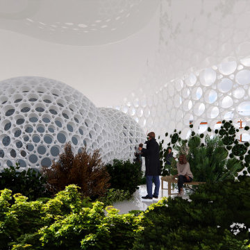
Amoeba Fusion aims to empower societies by providing a space for decentralized, innovative start-up communities. onE.GLobe considers the built environment a living, breathing, multiplying organism, evolving in nature with harmony. The structure can grow horizontally and vertically by adding new cores in different directions per each site condition. It creates public plazas shaded and shielded by the building as it grows. Fully self-sufficient structure houses flexible 3D printed dwellings and workspaces surrounded by semi-open garden spaces and atrium. Thirty feet deep floor plates receive daylight from the exterior and atrium and can conveniently be used as open-plan office space. Electrical, plumbing, and HVAC systems are distributed through modular floor plates, on which 3D printed modules are flexibly plugged in. 3D printed inflatable shells with indoor air cleaning plants house a plug-in kitchen, bedroom, workspace, and bathroom modules. The bridge-connected clusters have decentralized systems with the off-grid micro-grid integrating renewable energy sources and excess energy storage.
Compact layouts provide space for an increasing number of entrepreneurs, making them socialize and inspire near their accommodation. Eliminating corridors in dwelling units with an efficient design and replacing them with the garden space surrounding units achieve this endeavor.
Amoeba Fusion New York is located at a General Commercial Zoning district in NYC with residential and commercial uses. The site currently accommodates six towers. This project explores a more resilient design solution for an innovative, diverse community for the post-pandemic world. Located in the Lincoln Square neighborhood in Manhattan, bordering Hell’s Kitchen with countless restaurants, the site is close to various public transportation, universities, cultural spaces, and businesses, making it ideal for an innovative, creative crowd. Mixed-use commercial and residential buildings are allowed with a floor area bonus of 20% with a public plaza. With tower regulation, there is no minimum lot coverage requirement, and no rule regarding the distribution of floor area allows the tallest buildings in the city.
There are plenty of luxury residential buildings in New York City, but they don’t serve innovative young people and entrepreneurs. Co-living buildings do not provide proper workspaces within the facility. For these reasons, onE.GLobe aims to investigate ways to design long-term live-work-play environments for innovative young people and ease the effects of the future pandemics with its efficient, flexible dwelling units and workspaces surrounded by semi-open garden spaces, atrium, rooftops, public plazas, and wet ponds.
 Daniel Scerri Periti
We were approached with a request to design the furnishings for an existing ‘finished’ apartment. The intention was to move in relatively fast, and the property already had an existing marble floor, kitchen and bathrooms which had to be kept. The property also boasted a fantastic 270 degree view, seen from most of the apartment. The clients had a very important role in the completion of the project. They were very involved during the design process and through various decoration choices. The final design was kept as a rigid guideline when faced with picking out all the different elements.
Once clear of all previous furniture, the space felt cold and bare; so we immediately felt the need for warmth, and raw, natural elements and textures to complement the cold marble floor while visually tying in the design of the whole apartment together.
Since the existing kitchen had a touch of dark walnut stain, we felt this material was one we should add to the palette of materials to contest the stark materials. A raw cement finish was another material we felt would add an interesting contrast and could be used in a variety of ways, from cabinets to walls and ceilings, to tie up the design of various areas of the apartment.
To warm up the living/dining area, keeping the existing marble floor but visually creating zones within the large living/dining area without hindering the flow, a dark timber custom-made soffit, continuous with a floor-to-ceiling drinks cabinet zones the dining area, giving it a degree of much-needed warmth.
The various windows with a stupendous 270 degree view needed to be visually tied together. This was done by introducing a continuous sheer [drape] which also doubled up as a sound-absorbing material along 2 of the 4 walls of the space.
A very large sofa was required to fill up the space correctly, also required for the size of the young family.
Services were integrated within the units and soffits, while a customized design in the corner between the kitchen and the living room took into consideration the viewpoints from the main areas to create a pantry without hindering the flow or views. A strategically placed floor-to-ceiling mirror doubles up the space and extends the view to the inner parts of the apartment.
The daughter’s bedroom was a small challenge in itself, and a fun task, where we wanted to achieve the perception of a cozy niche with its own enclosed reading nook [for reading fairy tales], behind see-through curtains and a custom-ordered wall print sporting the girl’s favorite colors.
The sons’ bedroom had double the requirements in terms of space needed: more wardrobe, more homework desk space, a tv/play station area… “We combined a raised platform area between the boys’ beds to become an area with cushions where the kids can lay down and play, and face a hidden screen behind the homework desk’s sliding back panel for their play station”. The color of the homework desk was chosen in relation to the boys’ ages. A more masculine material palette was chosen for this room, in contrast to the light pastel palette of the girl’s bedroom. Again, this colour can easily be changed over time for a more mature look.
PROJECT DATA:
St. Paul’s Bay, Malta
DESIGN TEAM:
Perit Rebecca Zammit, Perit Daniel Scerri, Elyse Tonna
OTHER CREDITS:
Photography: Tonio Lombardi
Styling : TKS


 Daniel Scerri Periti
We were approached with a request to design the furnishings for an existing ‘finished’ apartment. The intention was to move in relatively fast, and the property already had an existing marble floor, kitchen and bathrooms which had to be kept. The property also boasted a fantastic 270 degree view, seen from most of the apartment. The clients had a very important role in the completion of the project. They were very involved during the design process and through various decoration choices. The final design was kept as a rigid guideline when faced with picking out all the different elements.
Once clear of all previous furniture, the space felt cold and bare; so we immediately felt the need for warmth, and raw, natural elements and textures to complement the cold marble floor while visually tying in the design of the whole apartment together.
Since the existing kitchen had a touch of dark walnut stain, we felt this material was one we should add to the palette of materials to contest the stark materials. A raw cement finish was another material we felt would add an interesting contrast and could be used in a variety of ways, from cabinets to walls and ceilings, to tie up the design of various areas of the apartment.
To warm up the living/dining area, keeping the existing marble floor but visually creating zones within the large living/dining area without hindering the flow, a dark timber custom-made soffit, continuous with a floor-to-ceiling drinks cabinet zones the dining area, giving it a degree of much-needed warmth.
The various windows with a stupendous 270 degree view needed to be visually tied together. This was done by introducing a continuous sheer [drape] which also doubled up as a sound-absorbing material along 2 of the 4 walls of the space.
A very large sofa was required to fill up the space correctly, also required for the size of the young family.
Services were integrated within the units and soffits, while a customized design in the corner between the kitchen and the living room took into consideration the viewpoints from the main areas to create a pantry without hindering the flow or views. A strategically placed floor-to-ceiling mirror doubles up the space and extends the view to the inner parts of the apartment.
The daughter’s bedroom was a small challenge in itself, and a fun task, where we wanted to achieve the perception of a cozy niche with its own enclosed reading nook [for reading fairy tales], behind see-through curtains and a custom-ordered wall print sporting the girl’s favorite colors.
The sons’ bedroom had double the requirements in terms of space needed: more wardrobe, more homework desk space, a tv/play station area… “We combined a raised platform area between the boys’ beds to become an area with cushions where the kids can lay down and play, and face a hidden screen behind the homework desk’s sliding back panel for their play station”. The color of the homework desk was chosen in relation to the boys’ ages. A more masculine material palette was chosen for this room, in contrast to the light pastel palette of the girl’s bedroom. Again, this colour can easily be changed over time for a more mature look.
PROJECT DATA:
St. Paul’s Bay, Malta
DESIGN TEAM:
Perit Rebecca Zammit, Perit Daniel Scerri, Elyse Tonna
OTHER CREDITS:
Photography: Tonio Lombardi
Styling : TKS
 Daniel Scerri Periti
We were approached with a request to design the furnishings for an existing ‘finished’ apartment. The intention was to move in relatively fast, and the property already had an existing marble floor, kitchen and bathrooms which had to be kept. The property also boasted a fantastic 270 degree view, seen from most of the apartment. The clients had a very important role in the completion of the project. They were very involved during the design process and through various decoration choices. The final design was kept as a rigid guideline when faced with picking out all the different elements.
Once clear of all previous furniture, the space felt cold and bare; so we immediately felt the need for warmth, and raw, natural elements and textures to complement the cold marble floor while visually tying in the design of the whole apartment together.
Since the existing kitchen had a touch of dark walnut stain, we felt this material was one we should add to the palette of materials to contest the stark materials. A raw cement finish was another material we felt would add an interesting contrast and could be used in a variety of ways, from cabinets to walls and ceilings, to tie up the design of various areas of the apartment.
To warm up the living/dining area, keeping the existing marble floor but visually creating zones within the large living/dining area without hindering the flow, a dark timber custom-made soffit, continuous with a floor-to-ceiling drinks cabinet zones the dining area, giving it a degree of much-needed warmth.
The various windows with a stupendous 270 degree view needed to be visually tied together. This was done by introducing a continuous sheer [drape] which also doubled up as a sound-absorbing material along 2 of the 4 walls of the space.
A very large sofa was required to fill up the space correctly, also required for the size of the young family.
Services were integrated within the units and soffits, while a customized design in the corner between the kitchen and the living room took into consideration the viewpoints from the main areas to create a pantry without hindering the flow or views. A strategically placed floor-to-ceiling mirror doubles up the space and extends the view to the inner parts of the apartment.
The daughter’s bedroom was a small challenge in itself, and a fun task, where we wanted to achieve the perception of a cozy niche with its own enclosed reading nook [for reading fairy tales], behind see-through curtains and a custom-ordered wall print sporting the girl’s favorite colors.
The sons’ bedroom had double the requirements in terms of space needed: more wardrobe, more homework desk space, a tv/play station area… “We combined a raised platform area between the boys’ beds to become an area with cushions where the kids can lay down and play, and face a hidden screen behind the homework desk’s sliding back panel for their play station”. The color of the homework desk was chosen in relation to the boys’ ages. A more masculine material palette was chosen for this room, in contrast to the light pastel palette of the girl’s bedroom. Again, this colour can easily be changed over time for a more mature look.
PROJECT DATA:
St. Paul’s Bay, Malta
DESIGN TEAM:
Perit Rebecca Zammit, Perit Daniel Scerri, Elyse Tonna
OTHER CREDITS:
Photography: Tonio Lombardi
Styling : TKS

 Custom Surface Solutions
 (www.css-tile.com) - Owner Craig Thompson (512) 430-1215. This project shows the remodel of a small 1950's vintage home master bathroom. 8"" x 18" Calcutta gold marble tile was used on the shower walls and floor wall base and ceramic gray penny tile on the floor. Shower includes curbless pan / floor, dual shower boxes, frameless glass slider, trough duel fixture sink and chrome fixtures.
 Daniel Scerri Periti
We were approached with a request to design the furnishings for an existing ‘finished’ apartment. The intention was to move in relatively fast, and the property already had an existing marble floor, kitchen and bathrooms which had to be kept. The property also boasted a fantastic 270 degree view, seen from most of the apartment. The clients had a very important role in the completion of the project. They were very involved during the design process and through various decoration choices. The final design was kept as a rigid guideline when faced with picking out all the different elements.
Once clear of all previous furniture, the space felt cold and bare; so we immediately felt the need for warmth, and raw, natural elements and textures to complement the cold marble floor while visually tying in the design of the whole apartment together.
Since the existing kitchen had a touch of dark walnut stain, we felt this material was one we should add to the palette of materials to contest the stark materials. A raw cement finish was another material we felt would add an interesting contrast and could be used in a variety of ways, from cabinets to walls and ceilings, to tie up the design of various areas of the apartment.
To warm up the living/dining area, keeping the existing marble floor but visually creating zones within the large living/dining area without hindering the flow, a dark timber custom-made soffit, continuous with a floor-to-ceiling drinks cabinet zones the dining area, giving it a degree of much-needed warmth.
The various windows with a stupendous 270 degree view needed to be visually tied together. This was done by introducing a continuous sheer [drape] which also doubled up as a sound-absorbing material along 2 of the 4 walls of the space.
A very large sofa was required to fill up the space correctly, also required for the size of the young family.
Services were integrated within the units and soffits, while a customized design in the corner between the kitchen and the living room took into consideration the viewpoints from the main areas to create a pantry without hindering the flow or views. A strategically placed floor-to-ceiling mirror doubles up the space and extends the view to the inner parts of the apartment.
The daughter’s bedroom was a small challenge in itself, and a fun task, where we wanted to achieve the perception of a cozy niche with its own enclosed reading nook [for reading fairy tales], behind see-through curtains and a custom-ordered wall print sporting the girl’s favorite colors.
The sons’ bedroom had double the requirements in terms of space needed: more wardrobe, more homework desk space, a tv/play station area… “We combined a raised platform area between the boys’ beds to become an area with cushions where the kids can lay down and play, and face a hidden screen behind the homework desk’s sliding back panel for their play station”. The color of the homework desk was chosen in relation to the boys’ ages. A more masculine material palette was chosen for this room, in contrast to the light pastel palette of the girl’s bedroom. Again, this colour can easily be changed over time for a more mature look.
PROJECT DATA:
St. Paul’s Bay, Malta
DESIGN TEAM:
Perit Rebecca Zammit, Perit Daniel Scerri, Elyse Tonna
OTHER CREDITS:
Photography: Tonio Lombardi
Styling : TKS
124