
Search results for "Absorbed" in Home Design Ideas

 threshold interiors
Location: New York, NY, United States
This Loft was tastefully renovated back in the '90s, but was due for an update and an expansion of the kitchen and dining areas to accommodate the client's cooking skills and entertaining needs. EnlargIing the island and adding cabinetry to delineate the office, bar and dining areas was a priority. The bathroom was updated to feel like a tranquil spa with beautiful new tile, plumbing fixtures and cabinets. Our biggest challenge was coordinating the entire renovation while our client was out of town for the Summer!
Photographed by: James Salomon

 Daniel Scerri Periti
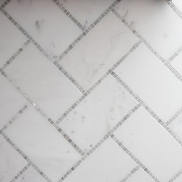
We were approached with a request to design the furnishings for an existing ‘finished’ apartment. The intention was to move in relatively fast, and the property already had an existing marble floor, kitchen and bathrooms which had to be kept. The property also boasted a fantastic 270 degree view, seen from most of the apartment. The clients had a very important role in the completion of the project. They were very involved during the design process and through various decoration choices. The final design was kept as a rigid guideline when faced with picking out all the different elements.
Once clear of all previous furniture, the space felt cold and bare; so we immediately felt the need for warmth, and raw, natural elements and textures to complement the cold marble floor while visually tying in the design of the whole apartment together.
Since the existing kitchen had a touch of dark walnut stain, we felt this material was one we should add to the palette of materials to contest the stark materials. A raw cement finish was another material we felt would add an interesting contrast and could be used in a variety of ways, from cabinets to walls and ceilings, to tie up the design of various areas of the apartment.
To warm up the living/dining area, keeping the existing marble floor but visually creating zones within the large living/dining area without hindering the flow, a dark timber custom-made soffit, continuous with a floor-to-ceiling drinks cabinet zones the dining area, giving it a degree of much-needed warmth.
The various windows with a stupendous 270 degree view needed to be visually tied together. This was done by introducing a continuous sheer [drape] which also doubled up as a sound-absorbing material along 2 of the 4 walls of the space.
A very large sofa was required to fill up the space correctly, also required for the size of the young family.
Services were integrated within the units and soffits, while a customized design in the corner between the kitchen and the living room took into consideration the viewpoints from the main areas to create a pantry without hindering the flow or views. A strategically placed floor-to-ceiling mirror doubles up the space and extends the view to the inner parts of the apartment.
The daughter’s bedroom was a small challenge in itself, and a fun task, where we wanted to achieve the perception of a cozy niche with its own enclosed reading nook [for reading fairy tales], behind see-through curtains and a custom-ordered wall print sporting the girl’s favorite colors.
The sons’ bedroom had double the requirements in terms of space needed: more wardrobe, more homework desk space, a tv/play station area… “We combined a raised platform area between the boys’ beds to become an area with cushions where the kids can lay down and play, and face a hidden screen behind the homework desk’s sliding back panel for their play station”. The color of the homework desk was chosen in relation to the boys’ ages. A more masculine material palette was chosen for this room, in contrast to the light pastel palette of the girl’s bedroom. Again, this colour can easily be changed over time for a more mature look.
PROJECT DATA:
St. Paul’s Bay, Malta
DESIGN TEAM:
Perit Rebecca Zammit, Perit Daniel Scerri, Elyse Tonna
OTHER CREDITS:
Photography: Tonio Lombardi
Styling : TKS
 TreHus Architects+Interior Designers+Builders
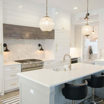
Example of a large classic u-shaped dark wood floor eat-in kitchen design in Minneapolis with a double-bowl sink, recessed-panel cabinets, white cabinets, white backsplash, stainless steel appliances, an island and black countertops
Find the right local pro for your project
 B.R.G. interior design limited
灣仔廈門街(286呎)
‘麻雀雖小,但五臟俱全’
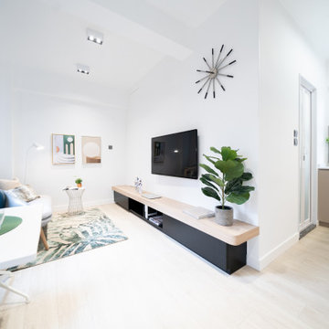
今次設計是為一個超過40年樓齡的唐樓單位進行翻新,按照業主的要求,將原來的廚房及廁所擴大。由於地方有限,設計師將單位拆掉大部分的牆身,並用人體工學去計算每個空間。
利用電視櫃連接主人房升高地台,大幅提升儲物量。此外利用全高衣櫃代替磚牆區分睡房及客廳,節省空間和成本同時也有具有一定隔音的效果 (櫃內的被鋪及衣服作吸音)。
為了令細單位視覺上感覺更寬敞,中心點是客飯廳與電視之間的通道。同時設計師刻意在用色及物料上加強其連貫性。白色,米色水磨石,兩種楓木色及黏土色作基礎,並用深灰及黑色突顯大自然色的鮮明度。
緊記在安排空間時,除每個空間的燈光佈局外,窗也是主要考量之一。善用自然光,除了節省能源外,用家也能夠在享受每個早上的晨光
更多設計細節照片已在官網:
https://www.brginterior.com/amoystreet
Amoy St., WanChai (286 sq feet)
‘small but complete in every detail’
The design is to renovate a tenement building unit over 40 years old. Expanding the original kitchen and toilet in accordance with the owner's requirements. In order to make good use of 286 square feet, our designer had locked down most of walls in unit and calculated each space in ergonomic way.
The TV cabinet is connected to the raising platform in master room, which greatly increases the storage capacity. Meanwhile, a full-height wardrobe is used instead of a brick wall to distinguish bedrooms and living rooms. It is not only saving space and cost but also providing a certain sound insulation effect (Don’t forget the bedding and clothes in wardrobe are sound-absorbing too!).
In order to make small units visually more spacious, the focal point is the passage between dining area and TV. Meanwhile, our design deliberately strengthens their coherence in color and material. Using white, terrazzo in beige, two types of maple and clay color as the foundation (natural color), and highlighting its vividness by using color or material in dark gray, chrome and black.
And keep in mind that when arranging lighting layout of each space, windows are also one of the main considerations. Making good balance in use of natural light is not only helping to save energy and most importantly users also enjoy sunlight coming every morning.
More details photos have been on the official website:
https://www.brginterior.com/amoystreet



 Publisher
The kitchen, often considered the heart of the home, is a space where functionality and aesthetics coalesce. Among the myriad choices homeowners face when designing or renovating their kitchens, selecting a suitable kitchen splashback is crucial. In recent years, glass splashbacks have emerged as a versatile and universally appealing option. This article delves into the reasons why a glass kitchen splashback is suitable for everyone, blending seamlessly with diverse preferences, lifestyles, and design aesthetics.
Versatility in Design
One of the key factors that make glass kitchen splashbacks universally suitable is their versatility in design. Glass offers a neutral and timeless aesthetic, effortlessly complementing various interior styles, from modern and minimalist to classic and eclectic. Whether your kitchen embodies a sleek, contemporary vibe or a rustic, traditional charm, a glass splashback seamlessly integrates into the design landscape.
Furthermore, the transparency of glass allows it to adapt to any colour scheme or pattern in the surrounding space. Whether you prefer bold and vibrant hues or a more subdued palette, a glass splashback can be customised to match your preferences, making it an ideal choice for homeowners seeking design flexibility.
Enhanced Perception of Space
Glass has a unique ability to create an illusion of space and openness in a room. This quality is particularly beneficial for smaller kitchens or those with limited natural light. A glass kitchen splashback reflects sunlight, making the space brighter and more expansive. By enhancing the perception of the room, glass splashbacks contribute to an overall sense of airiness and openness, creating an inviting atmosphere that suits various home sizes and layouts.
Easy Maintenance and Hygiene
Practicality is a paramount consideration in kitchen design, and glass splashbacks excel in ease of maintenance and hygiene. Unlike porous materials such as tiles or grout, glass provides a smooth, non-absorbent surface that is easy to clean and maintain. Spills and splatters can be effortlessly wiped away with a damp cloth, ensuring a hygienic and sanitary kitchen environment.
The non-porous nature of glass also prevents mould and bacteria growth, making it a suitable choice for families with young children or individuals with allergies. The low-maintenance aspect of glass makes it a universally appealing option for those who value a clean and sanitary kitchen without the hassle of extensive upkeep.
Durability and Longevity
Glass kitchen splashbacks are known for their durability and longevity. The tempered glass commonly used in splashbacks is heat-resistant, ensuring it can withstand the rigours of a busy kitchen without compromising its integrity. This durability makes glass splashbacks suitable for households with avid home cooks who frequently use high-temperature cooking techniques.
Moreover, the longevity of glass ensures that it remains a sustainable and cost-effective choice over the long term. Unlike some materials that may wear out or become dated, a well-maintained glass splashback retains its aesthetic appeal and functionality for years, making it an investment that stands the test of time.
Customisation Options
Personalisation is a crucial aspect of home design, and glass kitchen splashbacks offer various customisation options. From selecting the colour and pattern to incorporating personalised designs or digitally printed images, homeowners can tailor their glass splashbacks to reflect their style and preferences.
The ability to customise glass splashbacks makes them suitable for everyone, allowing individuals to express their creativity and personality in the heart of their homes. Whether you opt for a bold, statement-making design or a subtle, elegant finish, the customisation options inherent in glass splashbacks ensure a perfect fit for diverse tastes.
Conclusion
In conclusion, the universality of glass kitchen splashbacks lies in their ability to seamlessly integrate into various design styles, enhance the perception of space, offer easy maintenance and hygiene, exhibit durability, and provide many customisation options. As a versatile and timeless choice, glass splashbacks cater to homeowners' preferences and practical needs across different demographics.
Whether you reside in a compact urban apartment or a spacious suburban home, whether your aesthetic leans towards modern minimalism or classic elegance, a glass kitchen splashback is a fitting and universal solution. Its adaptability to different lifestyles and design preferences positions it as a versatile and enduring element in the ever-evolving kitchen design landscape.


 China Marmoglass Co.,Limited
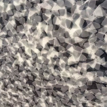
Solid Marmoglass Glass2 Slab
Glass2 is an environmentally friendly product constructed from 99% recycled glass, containing no chemicals or glue. The flexibility of glass2 allows for its application in kitchen and bathroom countertops, bartops, tables, and fireplace surroundings. Glass2 is stain-resistant, bacteria-free, and requires virtually no maintenance. Glass2 is both easy to sustain and elegant in its appearance, meeting the needs of many customers and fabricators.
Here you can find detail of Solid Marmoglass Glass2, we are the factory for Solid Marmoglass Glass2, we have Solid Marmoglass Glass2 Slabs 3000 x 1400 x 20mm.
Crystallized Glass2,Crystallized stone2,Crystallized glass panel Glass2
Application:
1). Interior & external wall cladding
2). Flooring Tile, Stair, Column cladding
3). Basin, Countertop, Table, Bar
4). bath, Kitchen, any tops, round pillar and furniture decoration etc.
You can get best 3D Glassos Panels Glass2 here, You can get the Glass 2 Panel here,we are 3D Glassos Panels slabs,tiles,countertops manufacturer
glass2 is a high grade, inorganic material produced by high temperature forging; it is an environmentally friendly material for countertops, bar tops, vanities, shower doors, flooring, interior and exterior wall cladding and paneling. It can be used for both indoor and outdoor applications. glass2 is resistant to weathering from wind, rain, and sunlight. glass2 is produced from 99% fused recycled glass and is resin free. This material is easy to clean and 100% non-porous. glass2 is available three (3) slab thickness: 16mm, 20mm, and 30mm. glass2 is now produced with an epoxy/nylon mesh backing to improve its ability to withstand abuse during transportation and to give extra strength for cut-outs (sinks, stove tops etc.).
Slab Model: 2400 x 1200 , 3000 x 1400
Thickness: 16mm, 20mm, 30mm
What is glass2?
Glass2is 99% recycled glass. Glass2 contains no resin or epoxy; it is pure glass.
What thickness range is available for glass2 ?
Glass2 standard thicknesses are 20mm yet 16mm is available upon request ... changed is for customize.
Can glass2 be used for countertops?
Yes. Glass2 can be used for countertops, as well as for wall cladding, flooring, and fascia of buildings.
Will glass2 stain?
Glass2 will not stain. Glass2 will not absorb anything, including acid and wine.
How easy can glass2 be fabricated?
Glass2 can be fabricated by both stone and glass fabricators using industry standard tools and equipment. Glass2 can be cut in most shapes by following simple guidelines.
Can glass2 be used for columns?
Yes, glass2 can be bent to shape in production and can be used for columns. (Custom orders only)
Can glass2 be repaired if scratched?
Glass2 can be repaired if scratched, using standard glass industry tools, supplies, and principles to achieve a repolished surface very close to the factory finish.
Is glass2tempered?
No, glass2 is not a tempered product.
China Marmoglass Co.,Limited offer all kinds of Glassos, 3D Marmoglass, Glass2 exporter, supplier, factory. You can buy Glassos, 3D Marmoglass, Glass2 exporter, supplier, factory from China Marmoglass Co.,Limited at Chinamarmoglass.com
You can get best 3D Glassos Panels here, we are 3D Glassos Glass2 Panels slabs,tiles,countertops manufacturer.
 Neumann & Rudy Architecture
**I. Spatial Composition & Architectural Volume**
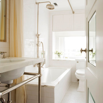
This is an exercise in the disciplined choreography of a constrained footprint — a narrow, rectilinear bathroom whose length is exploited rather than disguised. The composition unfolds along a single axis, the viewer's eye drawn from the foreground console lavatory, past the drop-in tub, to the terminal glazed aperture that anchors the far wall and releases the volume outward. The photograph's vantage, taken through a partially opened multi-paneled door with its cushioned rail-and-stile profile and beveled glazing, establishes a layered threshold condition: the room is framed, glimpsed, and entered simultaneously. Ceiling height is generous relative to plan dimension, and the architect has resisted the temptation to lower it; instead, a slender crown profile and a delicate picture-rail cornice terminate the field tile at a consistent datum, reinforcing the vertical proportion. Above the tub, a bank of recessed-panel cabinetry is set flush into the reveal of a soffit, borrowing the depth of the wall assembly to gain storage without protrusion — a deft piece of joinery logic. The window is treated as an architectural niche, its deep jambs and marble sill establishing a plinth that reads as inhabited rather than merely functional. Overhead, an exposed nickel-plated curtain rod traverses the ceiling plane in a single diagonal gesture, its cantilevered support rendering the drapery a movable spatial partition rather than a fixed enclosure.
**II. Materiality, Color & Texture**
The palette is a study in monochromatic gradation, calibrated almost entirely within the white spectrum yet richly differentiated by surface behavior. Hand-glazed subway tile in a running-bond pattern clads the wet walls, its subtle undulation and pooled glaze catching light unevenly to produce a soft, ceramic luminosity that no machine-pressed tile could replicate. Underfoot, a penny-round mosaic in matte porcelain introduces fine-grain granularity and a faintly warm grout line, its curvilinear tessellation providing tactile counterpoint to the orthogonal wall coursing. Marble — likely a Calacatta or lightly veined Carrara — appears strategically at the lavatory deck, the tub apron cap, and the window sill, its ochre-gold and cool grey veining supplying the room's only true figuration and its principal chromatic warmth. Polished nickel is the unifying metal, deployed with unusual generosity: the exposed console legs and cross-braced towel bar, the exposed riser and telephone-style handshower, the cross-handle fittings, and the rose-mounted door knob with its knurled backplate. Its cool, silvery reflectivity absorbs and redistributes ambient light, dissolving the hardware into the field. The single yielding material is the shower curtain — an unlined linen or cotton voile in pale butter-yellow — whose slubby weave, gravity-drawn folds, and warm undertone break the room's cool register and introduce the necessary note of domestic softness.
**III. Lighting, Atmosphere & Style Profile**
Illumination is overwhelmingly diurnal and unapologetically singular in source: the window at the terminus floods the space with diffuse, high-key daylight that blows toward pure white at the aperture and falls off gradually along the tile, modeling the wall's minute irregularities into a low-relief texture. The absence of visible decorative fixtures — save a discreet ceiling-recessed vent or downlight above the shower — is deliberate; artificial lighting is subordinated so that the material palette performs under natural light. The resulting atmosphere is serene, hygienic without sterility, and quietly luxurious: light behaves as a material in its own right, and the white-on-white scheme functions as a reflector rather than a void. Stylistically, the room synthesizes early-twentieth-century Anglo-American sanitary vernacular — the exposed-plumbing console lavatory, the exposed-riser shower, the metro tile and penny mosaic — with a contemporary editorial restraint that strips out ornament and pattern in favor of proportion and craft. It might be characterized as Refined Classicism, or more precisely, a Transitional Pre-War Revival: historically literate in its detailing, resolutely modern in its spatial economy and tonal discipline. The single pale-yellow textile is the design's signature move, a calibrated warm accent that prevents the achromatic scheme from tipping into clinical austerity and confirms the project's essential thesis — that restraint, correctly executed, reads as generosity.
 Almesedoors
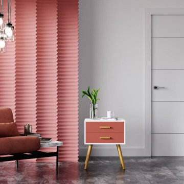
THE DOOR NAME ORIGIN - "ALLUMINIO ELIVIA PAINT 4HS"
One feature of this interior door model stands out among all others, to wit, the fact that here at Almese Doors we can work with pretty much any kind of budget. Allow me another intriguing observation: this one (this interior door, that is) is best suited to bulk orders. Which isn’t to say this one does not fall into the category of affordable luxury (just something we specialize in here at Almese Doors). It certainly does. It has most of the wonderful features characteristic of the brand to recommend it. It was lovingly and imaginatively designed. The name, should you be wondering, is a variation of that of the lovable, honest and faithful Shakespearean heroine (the play, of course, would be The Twelfth Night, one of the happiest and light-hearted comedies the bright British wordsmith ever composed, and arguably the most popular). Only natural wood is used to put it together, which is both aesthetically pleasant and env... Show more!
FINISH: WHITE
This is a bit tricky. Isn’t White the default finish that would look great on any interior door? Well, not quite.
W. is the color most often associated with perfection, honesty, cleanliness, newness, neutrality, and exactitude. The pigment has been known and used by humans since prehistoric times. In ancient Egypt, W. symbolized purity. Roman patricians paraded around in W. togas to distinguish themselves from the common folk. It was the color of choice of French monarchs. Architects of all epochs used W., with considerable enthusiasm, in various projects and for various reasons. In the United States, architects favored it when designing churches, capitols, and municipal buildings – which is, in fact, a tradition they inherited from classical and Renaissance architecture. According to some experts, most of the buildings in the celebrated Forum were either made of, or clad in, W. marble. In Taoism, it represents the yang or masculine energy, one of the two complementary natures of the universe. Many authors, both classical and contemporary, have referred to W. as a sign of purity, either physical (like William Shakespeare, whose treacherous usurper monarch wishes a heavenly rain would cleanse his blood-stained hand, washing it “white as snow”) or spiritual (like Tennessee Williams, who named his lead character Blanche (derived, incidentally, from the Germanic word blanc)) as a symbol of her innocent child-like spirit, perceptible from the moment she makes her first entrance (through the interior door stage-left).
Back in the Seventeenth Century, Sir Isaac Newton discovered that sunlight is composed of light with wavelengths across the visible spectrum which the human eye perceives as W. It is the lightest of the spectrum, and achromatic (hue-less) to boot, because it fully reflects and scatters all visible wavelengths of light, absorbing none. W. objects stand out in the dark. Depending on the surroundings, an interior door with W. finish might come off as emphatic or tactful, dominant or complementary. It blends seamlessly into most types of decor and, once the owner’s needs and disposition are taken into account, can symbolize - oh, so many different things, while bringing back a myriad memories: from those glorious snowy Alpine slopes and peaks to the fluffy tops of the wayward herd of cumulus cloud heap over the horizon on a balmy afternoon in the Caribbean. Tropical sand beaches are W. due to the high quantity of calcium carbonate they get from tiny bits of seashells ground to powder by the waves. In a number of cultures W. can also symbolize festivity, and be used lavishly to brighten up weddings, birthdays, and anniversaries. It is beautiful. Make sure it goes well with your interior door model, though.
 China Marmoglass Co.,Limited
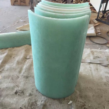
Solid Marmoglass Glass2 Slab
Here you can find detail of Solid Marmoglass Glass2, we are the factory for Solid Marmoglass Glass2, we have Solid Marmoglass Glass2 Slabs 3000 x 1400 x 20mm.
Crystallized Glass2,Crystallized stone2,Crystallized glass panel Glass2
Application:
1). Interior & external wall cladding
2). Flooring Tile, Stair, Column cladding
3). Basin, Countertop, Table, Bar
4). bath, Kitchen, any tops, round pillar and furniture decoration etc.
You can get best 3D Glassos Panels Glass2 here, You can get the Glass 2 Panel here,we are 3D Glassos Panels slabs,tiles,countertops manufacturer
glass2 is a high grade, inorganic material produced by high temperature forging; it is an environmentally friendly material for countertops, bar tops, vanities, shower doors, flooring, interior and exterior wall cladding and paneling. It can be used for both indoor and outdoor applications. glass2 is resistant to weathering from wind, rain, and sunlight. glass2 is produced from 99% fused recycled glass and is resin free. This material is easy to clean and 100% non-porous. glass2 is available three (3) slab thickness: 16mm, 20mm, and 30mm. glass2 is now produced with an epoxy/nylon mesh backing to improve its ability to withstand abuse during transportation and to give extra strength for cut-outs (sinks, stove tops etc.).
Slab Model: 2400 x 1200 , 3000 x 1400
Thickness: 16mm, 20mm, 30mm
What is glass2?
Glass2is 99% recycled glass. Glass2 contains no resin or epoxy; it is pure glass.
What thickness range is available for glass2 ?
Glass2 standard thicknesses are 20mm yet 16mm is available upon request ... changed is for customize.
Can glass2 be used for countertops?
Yes. Glass2 can be used for countertops, as well as for wall cladding, flooring, and fascia of buildings.
Will glass2 stain?
Glass2 will not stain. Glass2 will not absorb anything, including acid and wine.
How easy can glass2 be fabricated?
Glass2 can be fabricated by both stone and glass fabricators using industry standard tools and equipment. Glass2 can be cut in most shapes by following simple guidelines.
Can glass2 be used for columns?
Yes, glass2 can be bent to shape in production and can be used for columns. (Custom orders only)
Can glass2 be repaired if scratched?
Glass2 can be repaired if scratched, using standard glass industry tools, supplies, and principles to achieve a repolished surface very close to the factory finish.
Is glass2tempered?
No, glass2 is not a tempered product.
China Marmoglass Co.,Limited offer all kinds of Glassos, 3D Marmoglass, Glass2 exporter, supplier, factory. You can buy Glassos, 3D Marmoglass, Glass2 exporter, supplier, factory from China Marmoglass Co.,Limited at Chinamarmoglass.com
You can get best 3D Glassos Panels here, we are 3D Glassos Glass2 Panels slabs,tiles,countertops manufacturer.

 Wine Cellar Specialists
The California wine cabinets pictured here are made of Knotty Alder, with a rustic stain and clear lacquer.
They seal the wine bottles in the ideal wine storage conditions, allowing them to age safely and securely.
Wine Cellar Specialists
858 W Armitage Ave #385 Chicago, IL 60614
(773) 234-0112
winecellarspec.com
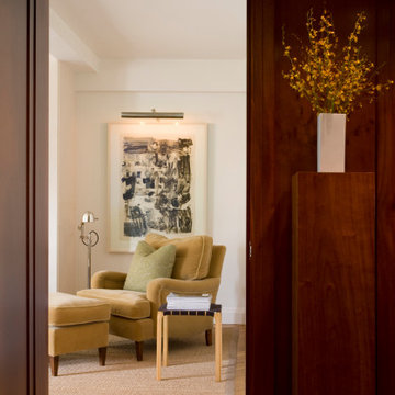 Neumann & Rudy Architecture
The photograph is constructed as a deliberate act of framing — an enfilade view captured through a threshold, in which the aperture of a doorway becomes both proscenium and compositional device. The image is organized around a strong vertical tripartite division: a dark stile of paneled millwork at the left edge, the luminous rectangle of the adjacent sitting room at center, and a substantial pier of figured hardwood joinery at right, terminating in a plinth-like pedestal. This asymmetrical clamping of the bright volume between two dark masses produces a pronounced sense of compression and release, a Wrightian sequencing in which the constricted, wood-lined passage funnels the eye toward the softer, higher-key room beyond. The architectural vocabulary within that inner volume is restrained and orthogonal: crisp painted plaster planes, a shallow soffit or dropped beam crossing the ceiling to modulate the overhead datum, and a simple flat-stock baseboard that reads as a quiet ground line rather than an ornamental flourish. The sightline is layered and telescopic — foreground jamb, mid-ground seating group, background artwork on the far wall — establishing depth through overlapping planes rather than perspectival theatrics. Underfoot, a herringbone-laid oak parquet in the passage gives way to a large-format sisal rug bound in linen tape, its rectilinear geometry reinforcing the axis while softening the transition between circulation and repose.
The material argument here is one of calibrated opposition: dense, saturated hardwood against pale, absorptive plaster and textile. The framing joinery — most plausibly a rich mahogany or stained cherry, its cathedral grain and ribbon figure fully legible under raking light — carries a deep oxblood-to-umber tonality and a satin, hand-rubbed sheen that lends the passage a library-like gravity. Against this, the interior room is rendered in a warm off-white with distinctly yellow-ochre undertones, avoiding the clinical chill of a true cool white and instead reading as parchment or unbleached linen. The upholstery — a rolled-arm wing chair and matching ottoman in a camel or buff-toned cotton velvet — supplies the tactile fulcrum of the composition: a napped, light-absorbing pile that contrasts against the coarse, tightly woven boucle of the sisal below and the smooth lacquer of the vertical joinery. Accent notes are sparing and precise: a pale celadon embroidered cushion introduces the only cool chromatic interruption; a rectilinear bench in blond ash with a woven black leather strap deck delivers a graphic, near-Nordic counterpoint; and a monolithic white ceramic vessel atop the pedestal provides a hard, matte punctuation. The abstract work on paper — a gestural monochrome in charcoal, ink and Payne's grey, generously matted behind glass — functions as the room's tonal anchor, its cool achromatics preventing the warm palette from tipping into sentimentality. Sprays of yellow oncidium orchid supply the single high-chroma gesture, echoing the ochre undertone of the walls.
The lighting strategy is layered, low-lumen and unapologetically warm, eschewing ambient wash in favor of discrete pools of illumination. A slim linear picture light, bronze-finished and cantilevered from the wall, grazes the artwork with a scalloped throw that reveals the tooth of the paper and establishes the far wall as the room's luminous terminus. A chrome-shaded articulating floor lamp — a modernist task fixture with a distinctly mid-century pedigree — provides a secondary, reflective glint and introduces the only cool metallic in the palette. Daylight enters obliquely and unseen from the left, softly modeling the plaster and the velvet nap without ever flattening the composition; the foreground joinery, meanwhile, sits in deep shadow, its grain caught only in a slow, specular gradient. The cumulative atmosphere is one of hushed, crepuscular intimacy — a room calibrated for reading and retreat rather than reception. Stylistically, the project resolves into a form of Transitional Warm Modernism: the classical proportioning, paneled millwork and rolled-arm seating are drawn from a traditional American vocabulary, yet they are stripped of applied ornament, edited to essentials, and disciplined by the graphic austerity of the abstract art and the blond-and-black bench. It is a sensibility best characterized as quiet luxury — tonal, textural, and materially honest, deriving its authority from the resonance of grain, nap and light rather than from any declarative gesture.
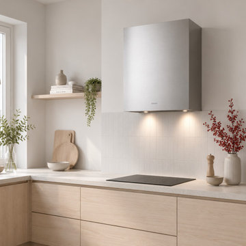
 Futuro Futuro Kitchen Range Hoods
Futuro Futuro 36-Inch Amalfi Wall Range Hood – Modern Italian Design with Powerful Ventilation
The Futuro Futuro 36-Inch Amalfi Wall Range Hood combines contemporary Italian design, premium materials, and advanced ventilation technology to create a statement piece for modern kitchens. Featuring a sleek cubist-inspired design, this luxury wall-mounted range hood delivers both exceptional performance and timeless style.
Premium Italian Craftsmanship and Durable Stainless Steel Construction
Designed and handcrafted in Italy, the Amalfi Series is built with high-quality AISI 304 stainless steel, a material known for its outstanding resistance to rust, corrosion, and everyday wear. This durable construction ensures long-lasting performance while maintaining its elegant appearance for years to come.
The Amalfi’s refined geometric design adds a sophisticated modern touch to any kitchen while providing the reliability expected from premium Italian craftsmanship.
Powerful and Quiet 940 CFM Ventilation System
The Futuro Futuro Amalfi Wall Range Hood features a high-performance 940 CFM internal Whisper tangential blower designed to efficiently remove smoke, grease, steam, and cooking odors from your kitchen.
Despite its powerful airflow, the hood operates quietly thanks to an advanced multi-layer sound-absorbing system. This innovative technology helps reduce operating noise, allowing you to enjoy a cleaner, fresher kitchen environment without unnecessary distractions.
Advanced Perimeter Suction Filtration Technology
The Amalfi Series uses a perimeter suction filtration system that creates an air curtain around your cooktop. This design improves capture efficiency by directing smoke, grease, and odors toward the edges of the hood for more effective filtration.
The hidden metal mesh grease filters maintain the hood’s clean, minimalist appearance while providing reliable grease collection. The filters are easy to remove and dishwasher safe for convenient maintenance.
Smart Controls and Energy-Efficient LED Lighting
The illuminated electronic control panel makes operating the Amalfi Wall Range Hood simple and intuitive. With the push of a button, you can adjust ventilation settings and access built-in features.
A convenient filter-cleaning reminder helps ensure your hood continues performing at its best. Two energy-efficient LED lights provide bright, focused illumination over your cooktop while enhancing visibility during food preparation.
Why Choose the Futuro Futuro Amalfi 36-Inch Wall Range Hood?
36-inch modern wall-mounted range hood design
Premium Italian craftsmanship
Durable AISI 304 stainless steel construction
Powerful 940 CFM internal blower
Quiet operation with advanced sound absorption technology
Perimeter suction filtration system for improved smoke and odor capture
Dishwasher-safe metal mesh grease filters
Energy-efficient LED cooktop lighting
Sleek cubist design for contemporary kitchens
What makes the Futuro Futuro Amalfi range hood different?
The Amalfi stands out with its combination of Italian craftsmanship, premium stainless steel construction, powerful ventilation, quiet operation, and modern architectural design.
How powerful is the Amalfi 36-Inch range hood?
This model features a 940 CFM internal blower designed to handle heavy cooking, smoke, grease, and odors effectively.
Is the Amalfi range hood easy to maintain?
Yes. The removable metal mesh grease filters are dishwasher safe, and the electronic controls include a cleaning reminder for easier upkeep.
What kitchen styles work best with the Amalfi Wall Range Hood?
Its sleek cubist design complements contemporary, modern, minimalist, and luxury kitchen designs.
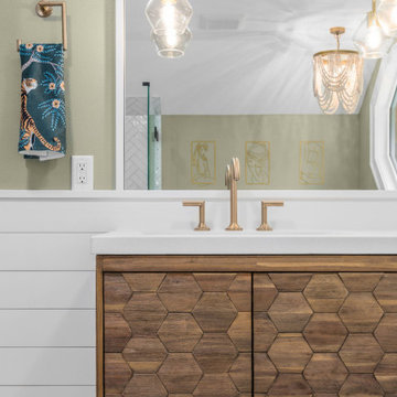
 THE Remodel Group
A luxurious en suite bath was created within this classic 1925 Portland bungalow by reconfiguring the second story’s original small bedrooms and tiny half bath. In this welcoming new urban boho space, eclectic finishes mingle harmoniously, integrated through subtle repetition of shapes and materials.
A furniture-style vanity sets the tone for this luxurious space, introducing materials, colors, shapes, and textures that repeat throughout. Individual walnut hexagons join to create distinctive vanity doors, offset beautifully by horizontal-grain drawers. Topping the cabinetry is a simple concrete countertop with integral sinks. An expansive framed mirror above enlarges and brightens the room. Within the mirror, sconces float, their globes a nod to the hexagons below. Champagne bronze fixtures reflect the warm walnut glow. Nestled into the back corner, a stunning shower features waterjet tiles in a double herringbone pattern, each precisely cut and laid to maintain design integrity at every surface transition. Teak floor tiles and a pebbled niche hint at the classic spa experience. Across from the shower, a large hexagonal window provides a treetop view from the free-standing tub below. The gentle oval of the tub and the beaded chandelier above provide a pleasing contrast to the strong lines surrounding it, as do the softly-shaded pebbles in the full-length niche. Shiplap wainscotting wraps the room, creating an illusion of height in the compact space. Subtle flooring and soft green walls create an understated backdrop for the bold mix of materials, unifying them into a serene oasis.
Asking a century-old home to accommodate a modern luxury bath is a tall order. Asbestos-laden plaster and flooring had to be abated. The subfloor had to be leveled and reinforced to increase strength and prevent deflection. Water lines and multiple electrical circuits had to be brought across and up without disturbing a beautifully-paneled ceiling, something we accomplished by firring out stair walls to hide the chases. Our client had visions of a leafy view from her tub, but the new layout eliminated existing windows. Placing a new window was complicated by deep eaves and flat soffits. By pushing the header into the roofline, however, we were able to accommodate a picture window. The flat soffit was replaced by an inverse hip lined with stained tongue and groove cedar, tying it to the bathroom finishes. Bringing materials up a narrow staircase became truly challenging when it was time to install the big items. However, strategic removal of drywall around the landing got the job done. Our attention to detail is showcased in the shower tile, where precise cuts were required at surface transitions to maintain the integrity of a complex double herringbone lay. The project was delivered on time.
Savvy layout choices minimized spending on structural changes. Because we were dealing with dormer space, head height was an issue. Raising the ceiling would have been complex and expensive so our design accommodated the constraints – tub on the low outside wall, shower on the full-height interior wall. The vanity spanned the spread, accommodating our petite client on the exterior side and her taller husband on the interior side. An under-eave closet was closed off to create room for both a freestanding tub and a separate shower. Rather than building replacement storage elsewhere, we simply added a new door into the closet from the primary bedroom. This was made possible by absorbing the short hallway separating the existing bed and bathroom into the primary bedroom. This new layout also created an en suite relationship between the primary bedroom and the new bath. We saved additional dollars by selecting a furniture-style vanity rather than using custom cabinetry, and the countertop with integral sinks provided a cost savings over a more traditional quartz countertop with undermount sinks. Affordable shower tiles allowed us to put more money into a dynamic tile layout. The project was delivered within budget.
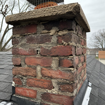
 SUPERIOR CHIMNEY SERVICES CORPORATION
As the temperatures continue to climb, and we finally get a chance to enjoy some warm weather, we start to walk around the neighborhood, or even our own homes, to find that lots of work needs to be done. Whether it be weed picking or changing bulbs in the light fixtures there’s always something that needs to be done. However, there’s one thing that can’t wait for your attention and that’s chimney tuckpointing. Why is it so important? Let’s take a look.
Weather and Tuckpointing, Not a Good Match
You might have guessed that Chicago and Chicagoland’s weather is brutal on masonry. The city and suburbs average around 35 freeze-thaw cycles every single winter. Every time the cycle occurs, it takes a toll on the chimney's mortar joints. When water gets in and temperatures drop, the water freezes & expands as ice with enough force to crack brick and stone. When Spring comes around, what once was a hairline crack, now gets bigger and allows rain to enter into your home.
This is why the yearly chimney inspection is not optional, according to the CSIA (Chimney Safety Institute of America).
A Little Chicago History
Most homes in neighborhoods like Beverly, Oak Park, Evanston and across the North Shore were built between the 1890s and 1950s. The mortar used in that era had a lifespan of roughly 25–30 years under normal conditions. Under Chicago and Chicagoland conditions? It is reduced. Homeowners buying older properties frequently inherit chimneys that haven't been maintained in a very long time.
When the chimney along with the flashing, bricks, chimney cap and chimney crown are not checked and maintained, loss of structural integrity begins. Water working its way through deteriorated joints reaches the interior of the chimney. This is where it can cause damage to the fire liner while it finds its way into the home. In some situations, compromised masonry near the fireplace can create fire safety concerns.
Getting a Chimney Inspection Early Makes All the Difference
The good news is that chimney tuckpointing, diagnosed early, is simply a repair. The bad news is that homeowners who wait too long can turn the issue into a partial rebuild, or a full chimney rebuild. By the time mortar is visibly crumbling from the street, the damage has already progressed deeper into the chimney structure.
A professional inspection every year is the most cost-effective way to keep the chimney and home heathy. It's often the difference between a few hundred dollars and several thousand.
Not All Tuckpointing Is Equal
One thing worth understanding is that proper tuckpointing requires removing the old mortar to a depth of approximately three-quarters of an inch before new mortar can be applied. Anything less and the new mortar won't bond with longevity / correctly. DIY or companies that just smear new mortar over old joints are doing what's sometimes called "skim coating," and it's essentially cosmetic work that won't hold up.
The type of mortar mix matters too. More modern cement mortars are actually harder than historic brick, which causes the brick itself to absorb, stress and crack rather than the mortar joint. A knowledgeable mason from Superior Chimney will match mortar composition to the brick, only something a real expert can get right.
Contact Superior Chimney today to get a chimney inspection which includes inspecting the exterior chimney today at 877-244-6349.
 Neumann & Rudy Architecture
**Spatial Composition & Architectural Volume**
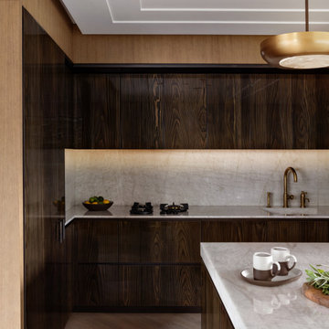
The kitchen is organized as a tightly disciplined L-configuration, with a perimeter run terminating against a full-height flanking volume of pale oak that functions less as cabinetry than as a piece of architecture — a plinth-like wall plane that crops the composition and establishes a deliberate foreground register. The photograph is constructed around this layered depth: a near-field vertical panel in figured, high-gloss timber, a middle ground of stone counter and backsplash, and a partial view of the island's marble slab entering from the right, its mitred waterfall edge implying a broader room beyond the frame. Overhead, a recessed coffer with a slender illuminated reveal introduces a subtractive geometry that lightens the ceiling plane and visually widens the volume, while a bronze-toned reveal band above the upper cabinetry acts as a horizontal datum, resolving the tall casework into a controlled cornice line. The millwork is resolutely frameless and handleless — grain-matched, push-latch or channel-pull, with a single elongated vertical bar as the sole legible hardware gesture — producing an unbroken rhythm of vertical joints that reads as continuous paneling rather than a sequence of doors. Sightlines are horizontal and calm, with the sink and cooktop absorbed into the counter plane so that no appliance disrupts the elevation's monolithic character.
**Materiality, Color & Texture**
The palette is a study in tonal wood contrast: a light, straight-grained rift-cut white oak with cool, slightly greyed undertones on the flanking wall and upper wall plane, set against a deeply fumed or shou-sugi-ban-inflected timber — likely charred cedar or ebonized ash — whose cathedral figuring erupts across the cabinet fronts in swirling, almost calligraphic pattern. The dark casework carries a lacquered or oiled sheen high enough to register soft specular reflection, an unexpected gloss that animates the grain and prevents the mass from reading as flat or inert. Countertops and the full-height backsplash are executed in a pale calcite or quartzite with a scratched, hairline-veined surface and a warm ivory-to-buff cast, honed rather than polished so that light diffuses rather than bounces. Metals are exclusively unlacquered brass in varying states of patina — the gooseneck faucet, cross-handle valves and pot-filler read as aged, almost archaeological, their warm amber oxidation echoed by the burnished spun-brass pendant. Accessory objects sustain the discipline: a dark turned-wood fruit bowl with citrus supplying the only chromatic accent, matte stoneware mugs in a two-tone glaze, and a raw olivewood board with sage — organic, low-saturation, tactile counterpoints to the machined precision of the joinery.
**Lighting, Atmosphere & Style Profile**
Illumination is almost entirely architectural and indirect. A concealed linear source beneath the upper cabinets grazes the stone backsplash, throwing a soft luminous gradient that dissolves upward and makes the slab appear internally lit — the room's principal light event and its emotional center. This is reinforced by the ceiling's perimeter reveal, which washes the plane without visible fixtures, and by the alabaster-diffused brass pendant, whose disc of translucent stone glows with a low-kelvin warmth entirely consonant with the metalwork below. Daylight appears to enter obliquely from beyond the frame, modelling the oak wall in a gentle falloff; the overall exposure is low-key and chiaroscuro-adjacent, with deep, velvety shadow permitted in the lower casework. The resulting atmosphere is hushed, cellar-cool yet materially warm — contemplative rather than performative. Stylistically, the project synthesizes into a refined **warm minimalism with distinct Japandi inheritance**: the reductive planarity and joint discipline of European modernist cabinetry married to a Japanese sensibility for charred timber, grain expression, and the elevation of patina and imperfection. It is a kitchen conceived as a quiet interior landscape — appliance-suppressed, ornament-free, and dependent for its richness entirely on the intrinsic character of its materials.
 THE Remodel Group
A luxurious en suite bath was created within this classic 1925 Portland bungalow by reconfiguring the second story’s original small bedrooms and tiny half bath. In this welcoming new urban boho space, eclectic finishes mingle harmoniously, integrated through subtle repetition of shapes and materials.
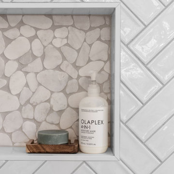
A furniture-style vanity sets the tone for this luxurious space, introducing materials, colors, shapes, and textures that repeat throughout. Individual walnut hexagons join to create distinctive vanity doors, offset beautifully by horizontal-grain drawers. Topping the cabinetry is a simple concrete countertop with integral sinks. An expansive framed mirror above enlarges and brightens the room. Within the mirror, sconces float, their globes a nod to the hexagons below. Champagne bronze fixtures reflect the warm walnut glow. Nestled into the back corner, a stunning shower features waterjet tiles in a double herringbone pattern, each precisely cut and laid to maintain design integrity at every surface transition. Teak floor tiles and a pebbled niche hint at the classic spa experience. Across from the shower, a large hexagonal window provides a treetop view from the free-standing tub below. The gentle oval of the tub and the beaded chandelier above provide a pleasing contrast to the strong lines surrounding it, as do the softly-shaded pebbles in the full-length niche. Shiplap wainscotting wraps the room, creating an illusion of height in the compact space. Subtle flooring and soft green walls create an understated backdrop for the bold mix of materials, unifying them into a serene oasis.
Asking a century-old home to accommodate a modern luxury bath is a tall order. Asbestos-laden plaster and flooring had to be abated. The subfloor had to be leveled and reinforced to increase strength and prevent deflection. Water lines and multiple electrical circuits had to be brought across and up without disturbing a beautifully-paneled ceiling, something we accomplished by firring out stair walls to hide the chases. Our client had visions of a leafy view from her tub, but the new layout eliminated existing windows. Placing a new window was complicated by deep eaves and flat soffits. By pushing the header into the roofline, however, we were able to accommodate a picture window. The flat soffit was replaced by an inverse hip lined with stained tongue and groove cedar, tying it to the bathroom finishes. Bringing materials up a narrow staircase became truly challenging when it was time to install the big items. However, strategic removal of drywall around the landing got the job done. Our attention to detail is showcased in the shower tile, where precise cuts were required at surface transitions to maintain the integrity of a complex double herringbone lay. The project was delivered on time.
Savvy layout choices minimized spending on structural changes. Because we were dealing with dormer space, head height was an issue. Raising the ceiling would have been complex and expensive so our design accommodated the constraints – tub on the low outside wall, shower on the full-height interior wall. The vanity spanned the spread, accommodating our petite client on the exterior side and her taller husband on the interior side. An under-eave closet was closed off to create room for both a freestanding tub and a separate shower. Rather than building replacement storage elsewhere, we simply added a new door into the closet from the primary bedroom. This was made possible by absorbing the short hallway separating the existing bed and bathroom into the primary bedroom. This new layout also created an en suite relationship between the primary bedroom and the new bath. We saved additional dollars by selecting a furniture-style vanity rather than using custom cabinetry, and the countertop with integral sinks provided a cost savings over a more traditional quartz countertop with undermount sinks. Affordable shower tiles allowed us to put more money into a dynamic tile layout. The project was delivered within budget.


125