
Search results for "Absorbed" in Home Design Ideas
 THE Remodel Group
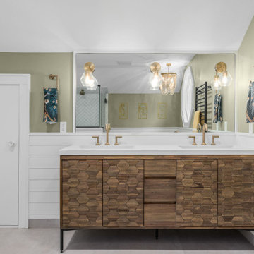
A luxurious en suite bath was created within this classic 1925 Portland bungalow by reconfiguring the second story’s original small bedrooms and tiny half bath. In this welcoming new urban boho space, eclectic finishes mingle harmoniously, integrated through subtle repetition of shapes and materials.
A furniture-style vanity sets the tone for this luxurious space, introducing materials, colors, shapes, and textures that repeat throughout. Individual walnut hexagons join to create distinctive vanity doors, offset beautifully by horizontal-grain drawers. Topping the cabinetry is a simple concrete countertop with integral sinks. An expansive framed mirror above enlarges and brightens the room. Within the mirror, sconces float, their globes a nod to the hexagons below. Champagne bronze fixtures reflect the warm walnut glow. Nestled into the back corner, a stunning shower features waterjet tiles in a double herringbone pattern, each precisely cut and laid to maintain design integrity at every surface transition. Teak floor tiles and a pebbled niche hint at the classic spa experience. Across from the shower, a large hexagonal window provides a treetop view from the free-standing tub below. The gentle oval of the tub and the beaded chandelier above provide a pleasing contrast to the strong lines surrounding it, as do the softly-shaded pebbles in the full-length niche. Shiplap wainscotting wraps the room, creating an illusion of height in the compact space. Subtle flooring and soft green walls create an understated backdrop for the bold mix of materials, unifying them into a serene oasis.
Asking a century-old home to accommodate a modern luxury bath is a tall order. Asbestos-laden plaster and flooring had to be abated. The subfloor had to be leveled and reinforced to increase strength and prevent deflection. Water lines and multiple electrical circuits had to be brought across and up without disturbing a beautifully-paneled ceiling, something we accomplished by firring out stair walls to hide the chases. Our client had visions of a leafy view from her tub, but the new layout eliminated existing windows. Placing a new window was complicated by deep eaves and flat soffits. By pushing the header into the roofline, however, we were able to accommodate a picture window. The flat soffit was replaced by an inverse hip lined with stained tongue and groove cedar, tying it to the bathroom finishes. Bringing materials up a narrow staircase became truly challenging when it was time to install the big items. However, strategic removal of drywall around the landing got the job done. Our attention to detail is showcased in the shower tile, where precise cuts were required at surface transitions to maintain the integrity of a complex double herringbone lay. The project was delivered on time.
Savvy layout choices minimized spending on structural changes. Because we were dealing with dormer space, head height was an issue. Raising the ceiling would have been complex and expensive so our design accommodated the constraints – tub on the low outside wall, shower on the full-height interior wall. The vanity spanned the spread, accommodating our petite client on the exterior side and her taller husband on the interior side. An under-eave closet was closed off to create room for both a freestanding tub and a separate shower. Rather than building replacement storage elsewhere, we simply added a new door into the closet from the primary bedroom. This was made possible by absorbing the short hallway separating the existing bed and bathroom into the primary bedroom. This new layout also created an en suite relationship between the primary bedroom and the new bath. We saved additional dollars by selecting a furniture-style vanity rather than using custom cabinetry, and the countertop with integral sinks provided a cost savings over a more traditional quartz countertop with undermount sinks. Affordable shower tiles allowed us to put more money into a dynamic tile layout. The project was delivered within budget.
 THE Remodel Group
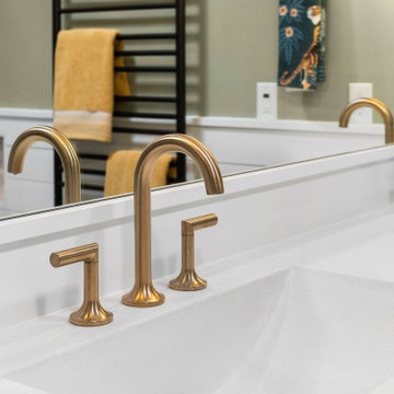
A luxurious en suite bath was created within this classic 1925 Portland bungalow by reconfiguring the second story’s original small bedrooms and tiny half bath. In this welcoming new urban boho space, eclectic finishes mingle harmoniously, integrated through subtle repetition of shapes and materials.
A furniture-style vanity sets the tone for this luxurious space, introducing materials, colors, shapes, and textures that repeat throughout. Individual walnut hexagons join to create distinctive vanity doors, offset beautifully by horizontal-grain drawers. Topping the cabinetry is a simple concrete countertop with integral sinks. An expansive framed mirror above enlarges and brightens the room. Within the mirror, sconces float, their globes a nod to the hexagons below. Champagne bronze fixtures reflect the warm walnut glow. Nestled into the back corner, a stunning shower features waterjet tiles in a double herringbone pattern, each precisely cut and laid to maintain design integrity at every surface transition. Teak floor tiles and a pebbled niche hint at the classic spa experience. Across from the shower, a large hexagonal window provides a treetop view from the free-standing tub below. The gentle oval of the tub and the beaded chandelier above provide a pleasing contrast to the strong lines surrounding it, as do the softly-shaded pebbles in the full-length niche. Shiplap wainscotting wraps the room, creating an illusion of height in the compact space. Subtle flooring and soft green walls create an understated backdrop for the bold mix of materials, unifying them into a serene oasis.
Asking a century-old home to accommodate a modern luxury bath is a tall order. Asbestos-laden plaster and flooring had to be abated. The subfloor had to be leveled and reinforced to increase strength and prevent deflection. Water lines and multiple electrical circuits had to be brought across and up without disturbing a beautifully-paneled ceiling, something we accomplished by firring out stair walls to hide the chases. Our client had visions of a leafy view from her tub, but the new layout eliminated existing windows. Placing a new window was complicated by deep eaves and flat soffits. By pushing the header into the roofline, however, we were able to accommodate a picture window. The flat soffit was replaced by an inverse hip lined with stained tongue and groove cedar, tying it to the bathroom finishes. Bringing materials up a narrow staircase became truly challenging when it was time to install the big items. However, strategic removal of drywall around the landing got the job done. Our attention to detail is showcased in the shower tile, where precise cuts were required at surface transitions to maintain the integrity of a complex double herringbone lay. The project was delivered on time.
Savvy layout choices minimized spending on structural changes. Because we were dealing with dormer space, head height was an issue. Raising the ceiling would have been complex and expensive so our design accommodated the constraints – tub on the low outside wall, shower on the full-height interior wall. The vanity spanned the spread, accommodating our petite client on the exterior side and her taller husband on the interior side. An under-eave closet was closed off to create room for both a freestanding tub and a separate shower. Rather than building replacement storage elsewhere, we simply added a new door into the closet from the primary bedroom. This was made possible by absorbing the short hallway separating the existing bed and bathroom into the primary bedroom. This new layout also created an en suite relationship between the primary bedroom and the new bath. We saved additional dollars by selecting a furniture-style vanity rather than using custom cabinetry, and the countertop with integral sinks provided a cost savings over a more traditional quartz countertop with undermount sinks. Affordable shower tiles allowed us to put more money into a dynamic tile layout. The project was delivered within budget.
 Neumann & Rudy Architecture
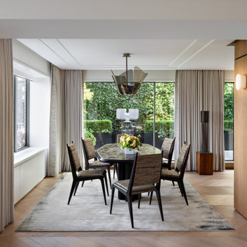
This dining room operates as a processional volume, choreographed along a deep axial sightline that terminates not in a wall but in a garden — an ivy-clad plane of green glimpsed through full-height glazing. The architecture is fundamentally additive rather than decorative: a coffered, stepped ceiling plane with recessed reveal channels floats above the seating zone, its subtle datum lines describing a rectangular "room within a room" that anchors the table without recourse to enclosing partitions. Flanking this central passage, two millwork pylons — one clad in pale limed oak on the right, one in a fine bone-toned wallcovering on the left — function as vestigial pilasters, compressing the entry threshold before releasing into the loftier dining volume. The floor reinforces this directionality through a wide-plank chevron parquet laid on the primary axis, its herringbone rhythm accelerating the eye toward the terrace. The furniture plan is deliberately non-orthogonal: an elongated oval table on twin cylindrical pedestals softens the room's rectilinear discipline, while the loosely arrayed chairs break parade-ground symmetry in favor of a more inhabited, gestural composition. Deep-set corner windows and a low banquette-height sill with integrated casework at left introduce a secondary spatial episode, a quieter alcove that relieves the room's axial insistence.
## II. Materiality, Color & Texture
The palette is a study in warm neutrality calibrated across a narrow tonal band, with contrast delivered through texture rather than hue. The foundational register is greige-to-oatmeal: floor-to-ceiling drapery in a heavy, densely gathered linen falls in pin-sharp cartridge pleats, its matte drape absorbing light and softening the glass wall's hard geometry. Against this, the dining chairs are upholstered in a slubbed, striated fabric — likely a raw silk or abaca-like bast fiber — whose horizontal grain reads almost as bark, and which is set in taut opposition to the ebonized, tapered hardwood frames in the Italian mid-century idiom of Gio Ponti or Ico Parisi. The tabletop, a mottled verdigris-and-bronze stone or fossilized surface, introduces the room's only earth-toned saturation, echoed by the burl-and-walnut plinth supporting a slender fluted bronze sculpture. The oak millwork is limed and open-grained, deliberately dry and tactile beside the high-polish patinated brass of the pendant. Underfoot, a hand-knotted silk rug in cloud-grey with charcoal ombré edges introduces atmospheric perspective — a painterly gradient that dematerializes the floor plane. Chromatic release arrives entirely from two sources: the framed abstract expressionist canvas at right, with its viridian, cobalt and violet gestural detonations, and the living wall of ivy beyond the glass. Both function as color events, not color schemes.
## III. Lighting, Atmosphere & Style Profile
Daylight is the primary luminaire here, entering as a broad, north-soft wash through the terrace glazing and diffused further by the ivy screen, which acts as a natural lambrequin filtering glare into a cool, even green-tinted light. Artificial sources are deployed sculpturally rather than functionally: the pendant — a folded, petal-form composition of smoked glass and patinated metal — reads as a suspended object of art, throwing a warm downward pool onto the table while its dark bronze silhouette provides essential visual weight against the white ceiling. Wall-mounted alabaster sconces bracket the room at both thresholds, their translucent stone glowing with a low-lumen, candle-adjacent warmth that establishes perimeter intimacy after dusk. The resulting atmosphere is serene, curated and quietly patrician — a room engineered for extended conversation rather than display. Stylistically, the project synthesizes a **contemporary Soft Minimalism** with a strongly collected **Mid-Century Italian** sensibility: the restraint of the architectural envelope and monochromatic textile program provides a gallery-like neutral ground, upon which a small number of high-character objects — the sculptural pendant, the Ponti-esque seating, the abstract canvas, the exterior stone sculpture — perform as museum-grade punctuation. It is an interior that achieves luxury through material integrity and negative space rather than ornament.
Find the right local pro for your project
 Neumann & Rudy Architecture
**I. Spatial Composition & Architectural Volume**
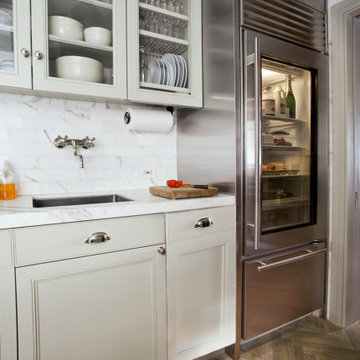
This is a galley-adjacent service zone — most likely a scullery or butler's pantry annexed to a primary kitchen — and its power derives from compression rather than expanse. The composition is organized along a single working wall that terminates abruptly in a full-height stainless volume, creating a deliberate collision of cabinetry rhythm and monolithic mass. The upper millwork establishes the governing geometry: a run of glazed-front wall cabinets with recessed shaker-profile stiles and rails, capped by a substantial crown assembly that reads as architectural cornice rather than applied trim. Within the second bay, the designer has inserted a period-correct plate rack with fluted vertical dividers and open glassware shelving, converting storage into ordered display and introducing a fine-grain vertical striation that counterpoints the broader panel field below. The base run answers with inset drawer fronts and applied-molding door panels, its cabinetry set on a shallow toe recess that lets the volume appear to float rather than plinth. The sightline is intentionally foreshortened: the eye travels the countertop plane eastward, is arrested by the refrigerator's tall stainless slab, then released through a sliver of hallway and door casing at the far right — a compressed reveal that implies circulation beyond and prevents the corridor from reading as a dead end. Ceiling height is inferred rather than shown, the cabinetry's soffit-scaled crown suggesting generous vertical proportion held in check by the room's narrow footprint.
**II. Materiality, Color & Texture**
The palette is a study in achromatic warmth, restrained to four principal materials and disciplined in its saturation. Cabinetry is finished in a soft greige-white — a putty-leaning off-white with faint green-grey undertone — applied in a low-sheen eggshell that absorbs rather than reflects, allowing the millwork profiles to be read through shadow rather than gloss. The backsplash is a honed marble subway field, laid in running bond with tight joints; its veining is delicate, feathered, and grey-toned, providing textural incident without pattern assertion. This continues seamlessly into the countertop, a thick marble slab with a squared eased edge and an integrated undermount trough sink, the material continuity from horizontal to vertical plane reinforcing the wall as a single stone-clad surface. Against this cool mineral field, the stainless steel refrigerator introduces an industrial register — brushed, directional, faintly grey-violet in its reflected light — while polished nickel hardware (bin pulls, cup pulls, knobs, and a wall-mounted bridge faucet with cross handles) supplies punctuating specular highlights at a consistent scale. The floor is the room's tonal anchor: white oak in a herringbone lay, fumed or grey-washed to a driftwood tone that reveals open grain and medullary ray figure. Small warm accents — a butcher-block cutting board with worn patina, amber glass bottles, a persimmon-toned bowl, the pale green of a champagne label — function as chromatic acupuncture within an otherwise desaturated field.
**III. Lighting, Atmosphere & Style Profile**
Illumination is layered and largely concealed. Ambient daylight enters obliquely from the left, raking across the marble backsplash at a low angle that mobilizes the honed surface's subtle relief and casts the cabinet door profiles into legible shadow. Undercabinet linear lighting washes the countertop and backsplash with a warm, low-kelvin pool, while the refrigerator's interior glazing performs as an unexpected internal lantern — a glowing vitrine that punctures the stainless slab and becomes the composition's focal luminance. This device is the image's most sophisticated gesture: it recasts a utilitarian appliance as an illuminated cabinet of curiosities, echoing the glass-front upper millwork on the opposite wall and completing a diagonal dialogue of lit transparency across the room. The resulting atmosphere is quiet, tempered, and quietly bourgeois — an interior of custodial calm rather than spectacle. Stylistically, the project synthesizes as a **contemporary Anglo-American scullery vernacular**: classical inset millwork and plate-rack joinery inherited from the pre-war service kitchen, reinterpreted through professional-grade stainless equipment, honed rather than polished stone, and a wire-brushed herringbone floor. Call it Refined Utilitarianism — a design position in which historical typology supplies the grammar, industrial hardware supplies the punctuation, and the near-monochrome palette allows craft, profile, and light to carry the entire expressive burden.
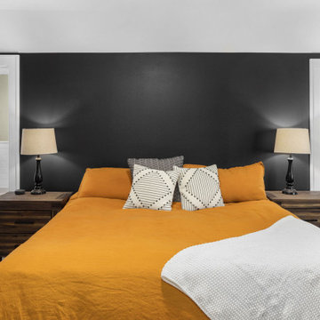 THE Remodel Group
A luxurious en suite bath was created within this classic 1925 Portland bungalow by reconfiguring the second story’s original small bedrooms and tiny half bath. In this welcoming new urban boho space, eclectic finishes mingle harmoniously, integrated through subtle repetition of shapes and materials.
A furniture-style vanity sets the tone for this luxurious space, introducing materials, colors, shapes, and textures that repeat throughout. Individual walnut hexagons join to create distinctive vanity doors, offset beautifully by horizontal-grain drawers. Topping the cabinetry is a simple concrete countertop with integral sinks. An expansive framed mirror above enlarges and brightens the room. Within the mirror, sconces float, their globes a nod to the hexagons below. Champagne bronze fixtures reflect the warm walnut glow. Nestled into the back corner, a stunning shower features waterjet tiles in a double herringbone pattern, each precisely cut and laid to maintain design integrity at every surface transition. Teak floor tiles and a pebbled niche hint at the classic spa experience. Across from the shower, a large hexagonal window provides a treetop view from the free-standing tub below. The gentle oval of the tub and the beaded chandelier above provide a pleasing contrast to the strong lines surrounding it, as do the softly-shaded pebbles in the full-length niche. Shiplap wainscotting wraps the room, creating an illusion of height in the compact space. Subtle flooring and soft green walls create an understated backdrop for the bold mix of materials, unifying them into a serene oasis.
Asking a century-old home to accommodate a modern luxury bath is a tall order. Asbestos-laden plaster and flooring had to be abated. The subfloor had to be leveled and reinforced to increase strength and prevent deflection. Water lines and multiple electrical circuits had to be brought across and up without disturbing a beautifully-paneled ceiling, something we accomplished by firring out stair walls to hide the chases. Our client had visions of a leafy view from her tub, but the new layout eliminated existing windows. Placing a new window was complicated by deep eaves and flat soffits. By pushing the header into the roofline, however, we were able to accommodate a picture window. The flat soffit was replaced by an inverse hip lined with stained tongue and groove cedar, tying it to the bathroom finishes. Bringing materials up a narrow staircase became truly challenging when it was time to install the big items. However, strategic removal of drywall around the landing got the job done. Our attention to detail is showcased in the shower tile, where precise cuts were required at surface transitions to maintain the integrity of a complex double herringbone lay. The project was delivered on time.
Savvy layout choices minimized spending on structural changes. Because we were dealing with dormer space, head height was an issue. Raising the ceiling would have been complex and expensive so our design accommodated the constraints – tub on the low outside wall, shower on the full-height interior wall. The vanity spanned the spread, accommodating our petite client on the exterior side and her taller husband on the interior side. An under-eave closet was closed off to create room for both a freestanding tub and a separate shower. Rather than building replacement storage elsewhere, we simply added a new door into the closet from the primary bedroom. This was made possible by absorbing the short hallway separating the existing bed and bathroom into the primary bedroom. This new layout also created an en suite relationship between the primary bedroom and the new bath. We saved additional dollars by selecting a furniture-style vanity rather than using custom cabinetry, and the countertop with integral sinks provided a cost savings over a more traditional quartz countertop with undermount sinks. Affordable shower tiles allowed us to put more money into a dynamic tile layout. The project was delivered within budget.
 Pennsylvania Landscape & Nursery Association
Terren Landscapes http://www.terrenlandscapes.com
2014 PLNA Awards for Landscape Excellence Winner
Category: Residential $60,000-$120,000
Award Level: Silver
Project Description:
We were contracted by the family to create a master plan for the property. They
were experiencing extreme drainage and erosion problems due to the surrounding properties’
drastic grade changes. Erosion had caused the rear lawn to sink in various areas and the existing
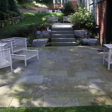
rear patio spaces were failing. The client wanted to rebuild their patios and walkways, repave
their driveway and give their home more visual appeal. Most importantly, they wanted an
environmentally friendly solution.
Our design solution was to create a rain garden that would slow storm water runoff, allow
for percolation, and promote infiltration, while permitting excess clean water to enter the storm
drain at the street with slower velocity. The rain garden acts as a temporary holding space that
allows the earth to slowly absorb water, rather than overwhelm the nearby storm drain. Our first
objective was to conduct a percolation test to determine the amount of clay soil that needed to be
removed before reaching the sandy loam layer. A percolation test and storm water calculations
were generated to accommodate a 1” rain event. Based on our calculations and the small size of
the property, we determined a depth of 18” was necessary for optimal holding capacity. We
removed 18” of clay soil until a layer of sandy loam was encountered. Next, the soil was amended
with compost and sand to create a highly porous planting media for the basin of the garden. We
piped the three existing rear downspouts to the rain garden area to capture for infiltration and
alleviate runoff throughout the rear lawn and patio space. We installed an 18” wide over-flow
standpipe at a 24” depth into the ground that outlets to a stone swale that carries the water to the
property edge. As an added means of holding the maximum amount of water, we designed the
standpipe to sit 14” above grade. The height of this standpipe allows this rain garden to capture
14” of water before reaching the overflow capacity. We placed geotextile fabric to help reduce
migration of the stones into the soil and aid in the prevention of weeds and erosion. We heavily
planted the rain garden to further aid in absorption and to attract local wildlife. A native plant
palette of butterfly weed, Panicum, Joe-Pye weed, and asters form a colorful backdrop while the
basin was filled with obligate wetland plants such as royal ferns, irises and cardinal flowers. The
upper edges in the foreground are planted with Echinacea, Rudbeckia and Monarda, satisfying
the local bird community and adding bright seasonal colors. This garden effectively collects and
cleanses rainwater while creating a habitat for birds, frogs, and butterflies.
Our next challenge was to redesign the existing patios and walkways without increasing
impervious surfaces. According to township regulations this property was currently at its
maximum capacity, therefore we designed the front and rear patios with a slightly smaller
footprint to decrease their existing impervious surfaces.
New planting beds were designed throughout the entire property. Plants were chosen that
were tolerant of specific site conditions. For the rear yard, we choose a backdrop of witch hazel
and hollies to provide an evergreen screen as well as early spring color. We placed hydrangea
throughout to add summer color. We planted ostrich fern under the existing spruce tree to create
a lush floor. This area became an additional backdrop for the rain garden as well as a screen for
the neighboring property. We choose a combination of ‘Blue Star’ juniper and creeping jenny to
soften the existing rear wall with creepers. Around the rear patio areas we choose a combination
of Liatris, Rudbeckia and ‘Lo and Behold’ butterfly bush. This combination of plants works in
harmony with the rain garden and attracts additional butterflies.
For the front of the property we worked with an existing Japanese maple that provided
dense shade. We choose a shade-tolerant combination of Heuchera, Astilbe, ferns and hostas for
this area. We added more hydrangeas to the front foundation of the house to provide lush
layering of plant material and visual interest with additional summer blooms.
Overall, we were able to exceed the client’s needs and expectations in transforming their
property into a colorful paradise that attracts wildlife from season to season. The plant palette
provides seasonal interest and the rain garden has successfully decreased storm water runoff.
The new hardscape surfaces were designed and built with a slightly smaller footprint to decrease
impervious surfaces. This project is a positive example of how all properties, regardless of size,
can make an ecological difference by decreasing impervious surfaces and maintaining proper
storm water management.
Photo Credit:
Terren Landscapes


 Pennsylvania Landscape & Nursery Association
Terren Landscapes http://www.terrenlandscapes.com
2014 PLNA Awards for Landscape Excellence Winner
Category: Residential $60,000-$120,000
Award Level: Silver
Project Description:
We were contracted by the family to create a master plan for the property. They
were experiencing extreme drainage and erosion problems due to the surrounding properties’
drastic grade changes. Erosion had caused the rear lawn to sink in various areas and the existing
rear patio spaces were failing. The client wanted to rebuild their patios and walkways, repave
their driveway and give their home more visual appeal. Most importantly, they wanted an
environmentally friendly solution.
Our design solution was to create a rain garden that would slow storm water runoff, allow
for percolation, and promote infiltration, while permitting excess clean water to enter the storm
drain at the street with slower velocity. The rain garden acts as a temporary holding space that
allows the earth to slowly absorb water, rather than overwhelm the nearby storm drain. Our first
objective was to conduct a percolation test to determine the amount of clay soil that needed to be
removed before reaching the sandy loam layer. A percolation test and storm water calculations
were generated to accommodate a 1” rain event. Based on our calculations and the small size of
the property, we determined a depth of 18” was necessary for optimal holding capacity. We
removed 18” of clay soil until a layer of sandy loam was encountered. Next, the soil was amended
with compost and sand to create a highly porous planting media for the basin of the garden. We
piped the three existing rear downspouts to the rain garden area to capture for infiltration and
alleviate runoff throughout the rear lawn and patio space. We installed an 18” wide over-flow
standpipe at a 24” depth into the ground that outlets to a stone swale that carries the water to the
property edge. As an added means of holding the maximum amount of water, we designed the
standpipe to sit 14” above grade. The height of this standpipe allows this rain garden to capture
14” of water before reaching the overflow capacity. We placed geotextile fabric to help reduce
migration of the stones into the soil and aid in the prevention of weeds and erosion. We heavily
planted the rain garden to further aid in absorption and to attract local wildlife. A native plant
palette of butterfly weed, Panicum, Joe-Pye weed, and asters form a colorful backdrop while the
basin was filled with obligate wetland plants such as royal ferns, irises and cardinal flowers. The
upper edges in the foreground are planted with Echinacea, Rudbeckia and Monarda, satisfying
the local bird community and adding bright seasonal colors. This garden effectively collects and
cleanses rainwater while creating a habitat for birds, frogs, and butterflies.
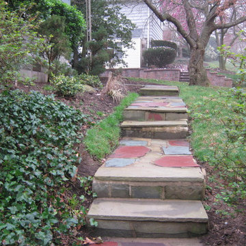
Our next challenge was to redesign the existing patios and walkways without increasing
impervious surfaces. According to township regulations this property was currently at its
maximum capacity, therefore we designed the front and rear patios with a slightly smaller
footprint to decrease their existing impervious surfaces.
New planting beds were designed throughout the entire property. Plants were chosen that
were tolerant of specific site conditions. For the rear yard, we choose a backdrop of witch hazel
and hollies to provide an evergreen screen as well as early spring color. We placed hydrangea
throughout to add summer color. We planted ostrich fern under the existing spruce tree to create
a lush floor. This area became an additional backdrop for the rain garden as well as a screen for
the neighboring property. We choose a combination of ‘Blue Star’ juniper and creeping jenny to
soften the existing rear wall with creepers. Around the rear patio areas we choose a combination
of Liatris, Rudbeckia and ‘Lo and Behold’ butterfly bush. This combination of plants works in
harmony with the rain garden and attracts additional butterflies.
For the front of the property we worked with an existing Japanese maple that provided
dense shade. We choose a shade-tolerant combination of Heuchera, Astilbe, ferns and hostas for
this area. We added more hydrangeas to the front foundation of the house to provide lush
layering of plant material and visual interest with additional summer blooms.
Overall, we were able to exceed the client’s needs and expectations in transforming their
property into a colorful paradise that attracts wildlife from season to season. The plant palette
provides seasonal interest and the rain garden has successfully decreased storm water runoff.
The new hardscape surfaces were designed and built with a slightly smaller footprint to decrease
impervious surfaces. This project is a positive example of how all properties, regardless of size,
can make an ecological difference by decreasing impervious surfaces and maintaining proper
storm water management.
Photo Credit:
Terren Landscapes


 Dream Home Construction
Excited to share with you a new bathroom project we’ve completed for a client in Kirkland featuring brand new shower glass, Carrara marble wall, patterned tile floor, new bathroom fixtures, new tub, and vanity. This is definitely a trend continuing into 2020, an emphasis on minimalism yet sophisticated design.

 JM Carpets
Example of a mid-sized transitional 3/4 mosaic tile floor bathroom design in Milwaukee with shaker cabinets, white cabinets and yellow walls

 BAUFORMAT
concrete looking luxury tile which looks like wallpapers. Perfect for urban style condo or loft or luxury house.
Bathroom - modern bathroom idea in Los Angeles
Bathroom - modern bathroom idea in Los Angeles

 David Morello Garden Enterprises, Inc.
David Morello
Design ideas for a traditional landscaping in Houston.
Design ideas for a traditional landscaping in Houston.

 Modern Fabrication
MCM Style with Perpindicular Glass Slivers
Inspiration for a modern front door remodel in Salt Lake City with a medium wood front door
Inspiration for a modern front door remodel in Salt Lake City with a medium wood front door

 Stone Action
The living room has our Crema Marfil coffee table.
The kitchen has a Typhoon Bordeaux granite that blends perfectly with the cherry cabinets and wooden floors.
See more crema marfil marble: http://stoneaction.net/website/?s=crema+marfil
See more Typhoon Bordeaux granite:
http://stoneaction.net/website/?s=typhoon+bordeaux
Project completed by Jcabido Remodeling! http://jcabidoremodeling.com/
 Neumann & Rudy Architecture
**Spatial Composition & Architectural Volume**
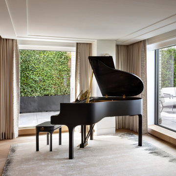
This is a room conceived as a stage for a single object, and the architecture obligingly recedes into the role of proscenium. The plan reads as a generous, laterally-oriented salon — likely a piano room carved from the corner of a metropolitan penthouse — organized around an L-shaped glazing sequence that turns the corner and dissolves two of the four enclosing planes. A dropped soffit tray, articulated as a crisply mitred perimeter reveal with an integrated cove, floats above the seating and instrument zone, its shadow-gap detailing lowering the apparent datum and conferring intimacy on an otherwise expansive volume. The plaster ceiling reads as a single continuous membrane, its recessed channels doubling as concealed curtain tracks and linear light slots, thereby suppressing any surface-mounted apparatus. On the left, a full-height run of hand-carved, ripple-textured oak millwork operates as both threshold and tectonic bookend — a vertical mass that anchors the composition against the weightlessness of the fenestration opposite. The pier between the two window bays is clad in pale ribbed limestone or fluted plaster, functioning as a quiet pilaster that structures the sightlines rather than interrupting them. Circulation is centrifugal: the herringbone-laid oak parquet establishes a diagonal grain that pulls the eye toward the terrace, while the rug's rectilinear footprint carves out a defined *piano nobile* island within the open field. The grand piano, positioned obliquely with its raised lid oriented back into the room, becomes the volume's sculptural fulcrum — its cabriole-derived silhouette and blade-thin tapered legs (a distinctly contemporary reinterpretation, likely a designer-authored instrument) providing curvilinear counterpoint to the room's orthogonal discipline.
**Materiality, Color & Texture**
The palette is a study in monochromatic warmth punctuated by a single decisive act of contrast. Nearly every surface resides within a narrow chromatic band of oatmeal, bone, greige and pale honey — undertones consistently warm-neutral, veering toward the sandy rather than the grey, which prevents the minimalism from reading as clinical. The floor's white-oak herringbone is finished with a matte, lightly limed patina that keeps the grain legible without gloss; the field rug in silk-and-viscose introduces a lustrous, cloud-like abraded pattern, its mineral-grey striations reading almost as sumi-e wash or weathered concrete, and providing the room's only tonal modulation at floor level. The drapery — a densely woven linen or linen-blend in a slubbed sand tone, hung with tightly gathered, full-height pinch pleats — carries a subtle vertical stripe or ribbed jacquard that catches raking light and animates the perimeter. Against this, the carved oak volume at left is the tactile protagonist: a low-relief, chiselled facetting that reads as adze-worked or gouged, generating a shifting moiré of micro-shadow and elevating a utilitarian storage wall into applied art. The piano's satin-black lacquer is the compositional anchor — deep, absorbent, and deliberately non-reflective on its exterior case while its interior lid reveals a mottled, patinated bronze-brown, a warm secret held within the black. Brass appears with real restraint: the lid hinges, the harp and action, the sabot-like disc on the bench flank. Nature supplies the only saturated chroma — the emerald ivy hedge framed in the left window and the topiary beyond the right — treated as living tapestry, effectively a curated *borrowed landscape*.
**Lighting, Atmosphere & Style Profile**
The lighting strategy is almost entirely subtractive: daylight is admitted in broad, low-glare sheets through minimal-sightline steel or slim-profile aluminium glazing, then softened and diffused by the sheer-adjacent linen and the pale, light-returning plaster envelope. The result is a high-key, shadowless luminosity with a distinctly diffuse northern quality, in which form is described by gradient rather than by hard contrast — note how the piano's black mass reads as silhouette against the terrace glare, while its curved bentwood rim catches a single soft specular highlight. Artificial illumination is entirely concealed within the ceiling reveals and coves, ensuring that after dark the room will be washed rather than punctured; the deliberate absence of decorative pendants or table lamps in this frame reinforces the reading of the instrument as the sole permitted ornament. Atmospherically the room is contemplative, acoustically soft, and tuned to a single activity — a *musica da camera* interior in the truest sense. Stylistically it synthesizes into what might best be termed **Soft Minimalism with a couture-craft inflection**: the rigour and reductive detailing of late-modernist practice, warmed by the tactile, hand-worked surfaces and neutral tonalities of Japandi and Belgian-inflected quiet luxury. The governing thesis is one of *sublimated luxury* — value expressed through millwork tolerance, drapery yardage, plaster craft and the confident emptiness of the plan, rather than through pattern, colour or accumulation.
 katherine
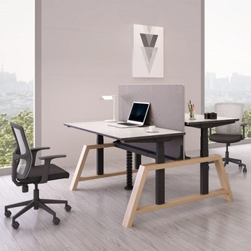
Office Workstations and Cubicles: The Unsung Heroes of Efficient Team Environments
In today's fast-paced business world, the hum of productivity is the sweetest sound an office can produce. But what fuels this symphony of efficiency?
While leadership and strategy are crucial, the physical environment in which a team operates plays a role that is just as vital. The debate between open-plan offices and traditional cubicles has raged for years, yet the truth is that a well-designed space incorporating both office workstations cubicles can be the key to unlocking a team's full potential. This isn't just about furniture; it's about creating a habitat for success.
The Evolution of the Workspace: Beyond the Beige Box
Gone are the days of monotonous rows of identical, soul-crushing cubicles. Modern office design has embraced a more nuanced understanding of worker needs. The contemporary workstation is a far cry from its predecessors, offering flexibility, ergonomic support, and a nod to aesthetic appeal. This evolution recognizes that a one-size-fits-all approach stifles creativity and productivity.
Fostering Focus in a Sea of Collaboration
While collaboration is a cornerstone of modern business, the need for individual, focused work remains paramount. This is where the modern cubicle shines. It provides a sanctuary from the constant distractions of a completely open office, allowing employees to delve deep into tasks that require concentration. This dedicated space minimizes interruptions, leading to higher quality work and reduced stress levels.
The Power of Personalization and Ownership
Giving employees a degree of control over their immediate environment can have a profound impact on morale and engagement. Modern workstations and cubicles that allow for personalization be it through adjustable shelving, pinboards for personal items, or even the choice of chair foster a sense of ownership. This small act of empowerment can translate into a greater sense of belonging and commitment to the organization.
Ergonomics: The Foundation of Employee Well-being and Productivity
A comfortable employee is a productive employee. Ergonomics is not a luxury; it's a fundamental necessity in any office environment. Poorly designed workstations can lead to a host of musculoskeletal issues, from back pain to carpal tunnel syndrome, resulting in increased absenteeism and decreased efficiency. Investing in ergonomic chairs, adjustable-height desks, and properly positioned monitors is an investment in the long-term health and performance of your team.
Designing for Synergy: The Strategic office layout design
The arrangement of workstations and cubicles is as important as the furniture itself. A strategic office layout design can facilitate seamless communication and collaboration while still providing pockets of privacy for focused work. This involves creating "neighborhoods" for different teams, placing collaborative zones in central, easily accessible areas, and ensuring that high-traffic pathways don't cut through quiet work zones.
Breaking Down Barriers with Hybrid Designs
The most effective office environments often feature a hybrid approach. This might involve clusters of cubicles for focused work, interspersed with open, collaborative "huddle spaces" equipped with whiteboards and comfortable seating. This variety allows employees to choose the environment that best suits the task at hand, offering the best of both worlds.
The Role of Acoustics in a Thriving Workplace
Noise is one of the biggest complaints in open-plan offices. Well-designed cubicles with sound-dampening panels can significantly mitigate this issue. Furthermore, incorporating acoustic solutions throughout the office, such as sound-absorbing materials on walls and ceilings, can create a more pleasant and productive auditory environment for everyone.
Integrating Technology for a Seamless Workflow
In the digital age, technology is the lifeblood of any business. Modern office workstations are designed with this in mind, featuring integrated power and data ports, cable management systems, and ample space for multiple monitors. This seamless integration of technology ensures that employees have the tools they need to work efficiently and without frustration.
Choosing the Right Partner for Your Office Environment
The task of outfitting an office can be daunting. Partnering with a knowledgeable and reputable Meet&Co commercial furniture supplier is crucial to creating an environment that is both functional and inspiring. A good supplier will not only offer a wide range of high-quality products but will also provide expert advice on space planning and ergonomic best practices, ensuring that your investment yields the best possible return.
The Future of the Office: Flexibility and Adaptability
The world of work is constantly evolving, and office design must evolve with it. The future lies in creating flexible and adaptable spaces that can be easily reconfigured to meet the changing needs of a business. Modular furniture and movable partitions are key components of this future-proof approach, allowing organizations to scale and adapt without the need for costly and disruptive renovations.
Conclusion: A Strategic Investment in Your Greatest Asset
Ultimately, the design of your office is a direct reflection of your company's culture and values. By investing in high-quality, ergonomic, and well-designed office workstations and cubicles, you are sending a clear message to your employees: their well-being and productivity matter. This strategic investment in your physical workspace is, in fact, an investment in your most valuable asset your people. The result is a more engaged, efficient, and innovative team, ready to tackle the challenges of tomorrow.

 gardenaar
Does your orange tree drop its fruit before it reaches full size, or worse, does it drop flowers before the fruit starts to form?
Trees photosynthesize to produce carbohydrates like sugar which they store as a source of energy. They can maintain a limited amount, which is used to drive the growth of new leaves, branches, roots and stem. Fruitfulness requires the tree to divert its limited energy sources away from these vital functions to the production of flowers, blossoms and fruits.
Fruit development involves maturity followed by fertilization, growth, maturity and maturity. This process takes between 6-7 months in warmer climates, which requires a large number of tree energy sources as a result.
Trees are able to manage their resources, and will also divert them to emergencies ...
Fruit Drop and Crop Depression
In regions where oranges produce one crop per year, they go through a series of growth stages as follows:
Sprout formation and flower launching (mid-winter)
Flowers and fruit set (early spring)
Fruit growth - cell division (late spring to early summer)
Fruit growth - cell proliferation (mid-summer to early autumn)
Fruit ripening (autumn to late winter)
The difference is in the regions where most citrus crops are produced year-round. In these cases, the different stages of development will take place simultaneously.
The orange tree can handle its plant load well, and it will bear as much fruit as we can support. It is natural for all citrus trees to produce too little fruit and too little flowers in early spring to prevent overproduction. There is no need to worry too much about flowering, as an orange tree needs only 1% to 2% of flowers to produce a good crop, and sometimes even less than 1% is enough.
If a tree is depressed because it does not get enough water in hot, dry weather, and if it dies of nitrogen starvation because it is not given enough fertilizer, fruit set will be very difficult in the spring. There may also be a small number of fruit losses in the summer under stressful conditions.
Solution: Provide enough water, and water often in hot weather and strong winds. Orange feed with moderate fertilizer in early spring (September in Southern hemisphere, March in the Northern Hemisphere)
Fruit Drop and Lack of Potassium Nutrient
When orange trees are heavy, the decline in fruit can be exacerbated by low potassium levels.
Potassium, also known as potash (represented by the chemical mark K on fertilizer labels meaning N-P-K or nitrogen-phosphorus-potassium ratio) is a major macronutrient needed for flowering and fruit formation. Next to nitrogen, plants absorb more potassium than any other nutrient. Without potassium, the trees stop flowering and fruiting, which is what happens if they are not fed regularly.
Before any smug horticulturist declares to you that potassium has no direct effect on flowering and fruit set, let me say that as a horticulturist and biochemist, plant chemistry, like the chemistry of all living things is complex, but some input it is necessary to produce certain results. , and the references I have made to the end of this article support what I am saying!
Entering science, Potassium (K) is essential for water, nutrients and the movement of carbohydrates in plant tissues. It also activates enzymes that facilitate the synthesis of complex chemicals within the plant - such as starch, protein and adenosine triphosphate (ATP) production. The role of ATP is to transport the energy needed for all cellular metabolic activities to all living things, and in plants ATP production can regulate the level of photosynthesis.
Potassium also helps regulate the opening and closing of stomata, holes or cavities under which oxygen and carbon dioxide are exchanged with the atmosphere, and respiratory losses are controlled. It increases root growth which increases the absorption of nutrients and improves drought resistance, and increases resistance to frost, pests and diseases. High potassium levels produce similar maturity and fruit growth rate, as well as better nutritional quality, taste and range.
Agricultural extension agencies suggest that large amounts of potash are needed in many crops, and that potassium deficiency or macronutrient deficiency leads to reduced crop growth and reduced yields, and that potassium levels not only affect yield, but fruit size, juice. quality and shelf life.
Since potassium plays an important role in water regulation, deficiency can clearly increase the pressures associated with the declining fruit mentioned in the previous section.
Solution: Make sure that the orange trees are fertilized with the right fertilizer as previously discussed. Extra potassium can be brought in using seaweed extract (which is not a fertilizer but contains a good amount of potassium), wood ash (used in small quantities only as it is very alkaline), or potash sulphate (potassium sulphate) - all this is guaranteed. as acceptable in a natural garden.
Never use potassium chloride as it can be harmful to plants, it is a very inexpensive alternative to fertilizer manufacturers to save money!
Even if there are sufficient levels of potassium in the soil, it may not be accessible to plants, unless we make some improvements.

 Window Quilt Muskoka
Window Quilt (Muskoka) Recommends Hunter Douglas
Hunter Douglas Advantage. The Art of Window Dressing...
Well-designed window fashions do more than simply cover a window. At Hunter Douglas, form and function are inseparable.
Great design is beautiful to live with, provides variable light control, insulates rooms against heat and cold while saving energy, protects your furnishings from damaging UV rays, and even absorbs sound, improving the acoustics in a room. And, our advanced operating systems make using our products a pleasure every day.
Now that’s artful window dressing. Lifetime guarantee.
Privacy and Light Control
Hunter Douglas window fashions are available in a wide variety of product designs with fabrics and materials that come in a range of opacities from sheer to opaque—offering varying degrees of privacy and light control options.
Energy Efficiency
Up to 50% of your home’s heating and cooling energy can be lost through your windows. At Hunter Douglas, we're an industry leader in making a big energy savings difference at the window.
Keep your home warmer in the winter and cooler in the summer
At Hunter Douglas, we're an industry leader in making a big energy savings difference at the window. In 1985, we invented the highly energy-efficient Duette® honeycomb shades in response to the energy crisis of the late 1970s. Our latest innovation is the Duette Architella® honeycomb shades featuring a honeycomb-within-a-honeycomb design for even greater energy efficiency. Today, we continue to think about the impact all of our window fashions can make. Without energy-efficient window treatments, as much as 50% of a home's heating and cooling energy can be lost through its windows.
Hunter Douglas products help conserve energy at the window in many important ways:
Insulation
In winter months, your home heating escapes to the outdoors through your windows while in the summertime, the outside heat flows into your home through these same windows. With window treatments that provide insulation, you can reduce energy consumption, save on heating and cooling costs, and create a more comfortable atmosphere.
At Hunter Douglas, we're an industry leader in making a big energy savings difference at the window. In 1985, we invented the highly energy-efficient Duette® honeycomb shades in response to the energy crisis of the late 1970s. Our latest innovation is the Duette Architella® honeycomb shades featuring a honeycomb-within-a-honeycomb design for even greater energy efficiency. Today, we continue to think about the impact all of our window fashions can make. Without energy-efficient window treatments, as much as 50% of a home's heating and cooling energy can be lost through its windows.
Hunter Douglas products help conserve energy at the window in many important ways:
The Duette Energy Efficiency Story Video Thumbnail
The Duette® Honeycomb Shades Energy Efficiency Story
Insulation Icon
Insulation
In winter months, your home heating escapes to the outdoors through your windows while in the summertime, the outside heat flows into your home through these same windows. With window treatments that provide insulation, you can reduce energy consumption, save on heating and cooling costs, and create a more comfortable atmosphere. Solar Heat Control Icon
Solar Heat Control
The warmth provided by the sun, its solar energy, may be desirable during the winter to help heat your home, but in the summer, it can make a room overly hot and uncomfortable—driving up air conditioning costs. Many Hunter Douglas window fashions help to control solar heat by allowing it into your home in the winter and minimizing the amount that comes in during the summer.
Daylighting
Daylighting is the practice of lighting rooms with natural light rather than artificial light.By drawing natural light into a room many of our window treatments reduce the need for other types of lighting, thereby reducing your energy use
5 Tips for Saving Energy at the Window:
1) Ensure your windows and doors are properly weather-stripped.
2) Caulk around basement and storm windows.
3) When heating or cooling, keep windows locked.
4) Open your window coverings during sunny winter days to catch free solar heat then close them at night to keep that heat in.
5) Close your window coverings during summer days to keep the heat out.
Innovation:
All of our window fashions are designed and custom-assembled in the U.S. Our longstanding commitment to quality and innovation means you’ll enjoy choices at Hunter Douglas that you won’t find anywhere else.
Child Safety:
From cordless manual and motorized operating systems, retractable lift cords, cord tensioners and wand controls, we offer a wide array of innovative lifting system options for enhanced child and pet safety as well as especially easy operation.
Advanced Operating Systems:
Power View Motorization-Intelligent Shades that Simply your Life:
Our brilliant new wireless operating system gives you the power to control and schedule your Hunter Douglas window treatments from your smartphone, tablet, or a remote control.

 Tile Doctor Ltd
I was contacted about a Georgian property in the Kent village of Leeds , to see if I could do anything to improve a Travertine tiled floor. The use of Travertine was extensive and had been installed throughout the ground floor including the kitchen, dining room, utility and bathroom WC. Travertine is probably my favourite stone, but it is acid sensitive and attracts dirt easily, due to its ‘holey’ composition.
Initially we discussed the floor over the phone where I got to know about the issues they were experiencing, and I detailed the renovation process I normally use to restore it including the products and timelines. Naturally they wanted to me to provide a quote for the work however its tricky to do that accurately without seeing the floor, so I arranged a date to pop over.
Upon arriving I could see the tiles and the wide grout joints had extensive, ingrained dirt indicating the previous sealer had long since worn away. This is a common issue with stone floors, and to re-assure myself and the client it could be resolved I cleaned a small area in the utility room with pleasing results!
This test clean helped me to understand which products and methods would work best on the floor and later that day I emailed over a detailed quote for the renovation. Happy with the quote I received a reply the same day asking when I could start.
My colleague and I arrived on the agreed date and work started with adding protection to all areas that required it. We use a lot of water during the cleaning process and some materials such as MDF can become damaged with water ingress, so it makes sense to do this.
To get the floor clean, a coarse Carbide Brush fitted to a rotary machine was run over the Travertine tiles to scrub in a strong solution of Tile Doctor Pro-Clean. This process generates a lot of slurry as the dirt was washed out of the stone and grout which is extracted with a wet vacuum as we progressed.
Next it was on hands and knees with more Tile Doctor Pro-Clean and handheld brushes run over stubborn areas and along the grout lines to take them from 80% up to 100%.
Happy with the results, the next step was to renovate the stone using a series of diamond encrusted burnishing pads. Using only water for lubrication this process starts with the application of a coarse 400-grit burnishing pad attached to the floor buffer. This produces a lot of slurry which again was removed with a wet vacuum.
This left the Travertine clean, but the pores of the stone had been opened giving the floor a matt finish and more absorbent than it was originally. To further refine the appearance of the stone the next two burnishing pads were applied which are 800 and 1500-grit. These pads polish the stone and close the pores, restoring the natural sheen in the process. After each pad was applied the slurry was rinsed off the floor with water and extracted with the wet vacuum. Once complete the floor was left to dry off fully overnight.
I arrived the next day and took several moisture readings from the floor to check that it had dried off sufficiently overnight. The results were good, so work moved onto sealing the Travertine with two coats of Tile Doctor Ultra Seal which is a natural look impregnating sealer. It works by soaking into the stone, occupying the pores and thereby preventing dirt from becoming ingrained there. This ensures dirt remains on the surface where it is easily cleaned away.
The final step in the floor’s renovation was to apply the last of the diamond polishing pads which is a very fine 3000-grit. This pad further improves the polished appearance of the stone resulting in a satisfying sheen.
The work made a massive difference to the floor, and I received an email the next day from one of the owners who was really pleased with the transformation:
”Floors look brilliant. Very pleased.”
For the care and maintenance of polished sealed floors I recommend the use of Tile Doctor’s Stone Soap which is a gentle but effective cleaning product that won’t impact the sealer and contains a patina enhancer. When it comes to sealed floors my mantra is:
“If you look after the sealer, the sealer will look after the floor!”
Graham Davis
North Kent Tile Doctor
127