
Search results for "Absorbent" in Home Design Ideas
 GOODFELLAS CONSTRUCTION
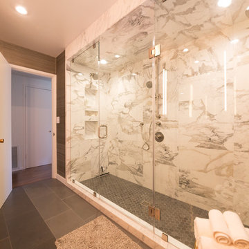
This massive walk in shower features not one, not two, but three shower heads and floor to ceiling tile of mixed mediums.
Inspiration for a large modern master gray tile and stone tile ceramic tile and gray floor double shower remodel in San Francisco with brown walls, flat-panel cabinets, light wood cabinets, a trough sink, marble countertops and a one-piece toilet
Inspiration for a large modern master gray tile and stone tile ceramic tile and gray floor double shower remodel in San Francisco with brown walls, flat-panel cabinets, light wood cabinets, a trough sink, marble countertops and a one-piece toilet
 Timberhomes LLC
Josh Jackson
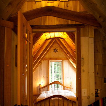
Inspiration for a rustic master light wood floor bedroom remodel in Burlington
Inspiration for a rustic master light wood floor bedroom remodel in Burlington
 THE Remodel Group
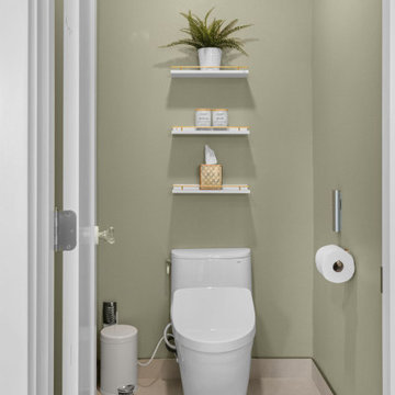
A luxurious en suite bath was created within this classic 1925 Portland bungalow by reconfiguring the second story’s original small bedrooms and tiny half bath. In this welcoming new urban boho space, eclectic finishes mingle harmoniously, integrated through subtle repetition of shapes and materials.
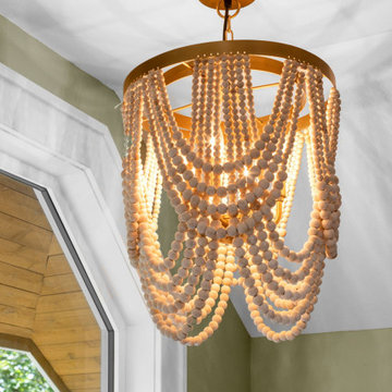
A furniture-style vanity sets the tone for this luxurious space, introducing materials, colors, shapes, and textures that repeat throughout. Individual walnut hexagons join to create distinctive vanity doors, offset beautifully by horizontal-grain drawers. Topping the cabinetry is a simple concrete countertop with integral sinks. An expansive framed mirror above enlarges and brightens the room. Within the mirror, sconces float, their globes a nod to the hexagons below. Champagne bronze fixtures reflect the warm walnut glow. Nestled into the back corner, a stunning shower features waterjet tiles in a double herringbone pattern, each precisely cut and laid to maintain design integrity at every surface transition. Teak floor tiles and a pebbled niche hint at the classic spa experience. Across from the shower, a large hexagonal window provides a treetop view from the free-standing tub below. The gentle oval of the tub and the beaded chandelier above provide a pleasing contrast to the strong lines surrounding it, as do the softly-shaded pebbles in the full-length niche. Shiplap wainscotting wraps the room, creating an illusion of height in the compact space. Subtle flooring and soft green walls create an understated backdrop for the bold mix of materials, unifying them into a serene oasis.
Asking a century-old home to accommodate a modern luxury bath is a tall order. Asbestos-laden plaster and flooring had to be abated. The subfloor had to be leveled and reinforced to increase strength and prevent deflection. Water lines and multiple electrical circuits had to be brought across and up without disturbing a beautifully-paneled ceiling, something we accomplished by firring out stair walls to hide the chases. Our client had visions of a leafy view from her tub, but the new layout eliminated existing windows. Placing a new window was complicated by deep eaves and flat soffits. By pushing the header into the roofline, however, we were able to accommodate a picture window. The flat soffit was replaced by an inverse hip lined with stained tongue and groove cedar, tying it to the bathroom finishes. Bringing materials up a narrow staircase became truly challenging when it was time to install the big items. However, strategic removal of drywall around the landing got the job done. Our attention to detail is showcased in the shower tile, where precise cuts were required at surface transitions to maintain the integrity of a complex double herringbone lay. The project was delivered on time.
Savvy layout choices minimized spending on structural changes. Because we were dealing with dormer space, head height was an issue. Raising the ceiling would have been complex and expensive so our design accommodated the constraints – tub on the low outside wall, shower on the full-height interior wall. The vanity spanned the spread, accommodating our petite client on the exterior side and her taller husband on the interior side. An under-eave closet was closed off to create room for both a freestanding tub and a separate shower. Rather than building replacement storage elsewhere, we simply added a new door into the closet from the primary bedroom. This was made possible by absorbing the short hallway separating the existing bed and bathroom into the primary bedroom. This new layout also created an en suite relationship between the primary bedroom and the new bath. We saved additional dollars by selecting a furniture-style vanity rather than using custom cabinetry, and the countertop with integral sinks provided a cost savings over a more traditional quartz countertop with undermount sinks. Affordable shower tiles allowed us to put more money into a dynamic tile layout. The project was delivered within budget.
Find the right local pro for your project
 FRONTGATE
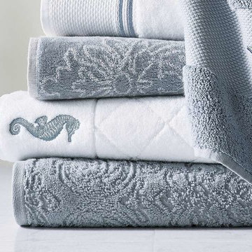
Our Resort Bath Towel now comes available with decorative Starfish or Seahorse icons. Softer and longer than towels found at many five-star hotels and spas, our Resort Cotton Towels are lofty, thick, and as luxurious as any in the world. These zero-twist towels are crafted from pure, 100% long-staple Turkish cotton woven to 700 gsm. The end result is luxuriant softness and absorbency that outperforms others.
 Matt Clark Tile & Stone
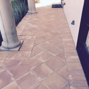
Spanish Terracotta . This ultra low absorbant natural finished pre sealed and high fired 3/4" thick. Imported tile is exclusivly available from Matt Clark TIle. www.mattclarktile.com by Matthias Clark
 Ellsworth Design Build
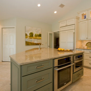
Extensive renovation to kitchen in 20 year old house facing the Marsh on Savannah's Wylly Island. Kitchen was pushed two feet into adjacent family room in order to expand the Island. We also absorbed an adjacent pool closet to add the hutch cabinet. A small existing window was enlarged into sliding doors matching those elsewhere. Layout by Matthew Hallett, Interior design by Kelly Waters of Ellsworth-Hallett. Cabinets by Medallion Cabinetry, counters are seagrass limestone, floors are porcelain 'travertine'. Refrigerator is subzero with custom cabinet panels.
Photos by Amy Greene of Creative Images & Marketing
 Bridgewater
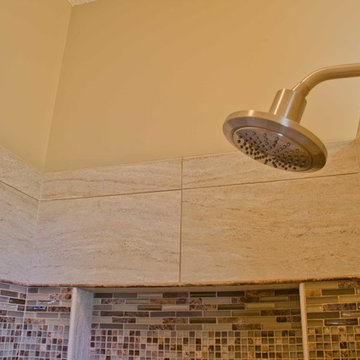
The new owners were looking forward to living in their new home with an open floor plan, tall vaulted ceilings, and great views. It featured a large Great Room with two big French Doors separating the Dining Room from the Master Bedroom.
But after only a few months they identified a major design flaw: Each of the French Doors had ten glass windows with two large windows above each door. (Check out our before and after designs, traffic flow diagrams and photos of this project.) Glass windows and doors allowed sound and light from guests or the TV in the great room to easily sneak into the bedroom. With unique work and sleep schedules (he’s a pilot, she’s a registered nurse) this design wasn’t working.
Then there was a traffic flow design flaw: The Master Bedroom had a second entrance from a hallway. To get into the bedroom from the hallway you needed to walk down another claustrophobic hallway.
To get from the Master Bedroom to the Master Bath begin at the most remote corner of the bedroom and down a hallway between two closets. Once inside the bath, a huge triangular Jacuzzi dominating the space.
So, from a privacy and traffic flow perspective, this home had some major design issues.
When Craig Weber first met with the owners, he listened to their ideas and concerns. The owners trusted Craig to come up with the most efficient and most effective solution to this design dilemma. He offered a solution that resolved the bed-bath traffic flow problem, offered some bedroom room privacy, and updated the bath.
First, the two French Doors and windows were removed. A new wall was built with sound-absorbing materials, making the Great Room and Dining Room more comfortable spaces for entertaining while creating the bedroom privacy the owners craved.
Solving the Bedroom/Bath traffic flow problem began with removing the two existing closets. The bath door was relocated next to the hall entrance, and then a new walk-in closet was added adjacent to the hallway entrance. The solution offered easy access to and from the bath, closet and hallway without a hint of claustrophobia.
The Master Bath underwent a major transformation designed for convenience and comfort – especially during long, cold Minnesota winters.
Most everything from the former bath was torn out, beginning with the giant Jacuzzi.
A new bathtub that is wider and deeper than the standard size was installed with brushed Nickel fixtures. It’s the perfect place to relax with a glass of wine and candles.
Warm floors are a Minnesota “must have.” The bath’s new ceramic floor features in-floor electric heat. Getting in and out of the tub is easy and comfortable.
The new walk-in shower again features in-floor heating and a place to sit. The most interesting feature of this shower may the custom ceramic tile installed with unique patterns.
A new vanity Cambria Bradshaw countertops features two under-hung ceramic sinks with matching brushed Nickel fixtures.
Tall ceilings and three glass windows near the ceiling flood the room with natural light. A new energy-efficient window frames an ornamental stained glass window created by the owner’s father – a great personal touch.
A quiet place to sleep. A private dining room for entertaining. A Master Bath to die for. And easy traffic flow. The owners couldn’t have been more delighted with the outcome. And Lilly, their cat, loves it too.
 Monarch & Maker
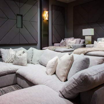
This home theatre is complete with plenty of plush seating for the most luxurious at-home movie experience. The acoustical walls not only add dimension and texture to the walls but also absorb sound to ensure your movie nights don’t keep the rest of the house wide awake.
 THE Remodel Group
A luxurious en suite bath was created within this classic 1925 Portland bungalow by reconfiguring the second story’s original small bedrooms and tiny half bath. In this welcoming new urban boho space, eclectic finishes mingle harmoniously, integrated through subtle repetition of shapes and materials.
A furniture-style vanity sets the tone for this luxurious space, introducing materials, colors, shapes, and textures that repeat throughout. Individual walnut hexagons join to create distinctive vanity doors, offset beautifully by horizontal-grain drawers. Topping the cabinetry is a simple concrete countertop with integral sinks. An expansive framed mirror above enlarges and brightens the room. Within the mirror, sconces float, their globes a nod to the hexagons below. Champagne bronze fixtures reflect the warm walnut glow. Nestled into the back corner, a stunning shower features waterjet tiles in a double herringbone pattern, each precisely cut and laid to maintain design integrity at every surface transition. Teak floor tiles and a pebbled niche hint at the classic spa experience. Across from the shower, a large hexagonal window provides a treetop view from the free-standing tub below. The gentle oval of the tub and the beaded chandelier above provide a pleasing contrast to the strong lines surrounding it, as do the softly-shaded pebbles in the full-length niche. Shiplap wainscotting wraps the room, creating an illusion of height in the compact space. Subtle flooring and soft green walls create an understated backdrop for the bold mix of materials, unifying them into a serene oasis.
Asking a century-old home to accommodate a modern luxury bath is a tall order. Asbestos-laden plaster and flooring had to be abated. The subfloor had to be leveled and reinforced to increase strength and prevent deflection. Water lines and multiple electrical circuits had to be brought across and up without disturbing a beautifully-paneled ceiling, something we accomplished by firring out stair walls to hide the chases. Our client had visions of a leafy view from her tub, but the new layout eliminated existing windows. Placing a new window was complicated by deep eaves and flat soffits. By pushing the header into the roofline, however, we were able to accommodate a picture window. The flat soffit was replaced by an inverse hip lined with stained tongue and groove cedar, tying it to the bathroom finishes. Bringing materials up a narrow staircase became truly challenging when it was time to install the big items. However, strategic removal of drywall around the landing got the job done. Our attention to detail is showcased in the shower tile, where precise cuts were required at surface transitions to maintain the integrity of a complex double herringbone lay. The project was delivered on time.
Savvy layout choices minimized spending on structural changes. Because we were dealing with dormer space, head height was an issue. Raising the ceiling would have been complex and expensive so our design accommodated the constraints – tub on the low outside wall, shower on the full-height interior wall. The vanity spanned the spread, accommodating our petite client on the exterior side and her taller husband on the interior side. An under-eave closet was closed off to create room for both a freestanding tub and a separate shower. Rather than building replacement storage elsewhere, we simply added a new door into the closet from the primary bedroom. This was made possible by absorbing the short hallway separating the existing bed and bathroom into the primary bedroom. This new layout also created an en suite relationship between the primary bedroom and the new bath. We saved additional dollars by selecting a furniture-style vanity rather than using custom cabinetry, and the countertop with integral sinks provided a cost savings over a more traditional quartz countertop with undermount sinks. Affordable shower tiles allowed us to put more money into a dynamic tile layout. The project was delivered within budget.
 Highdesign
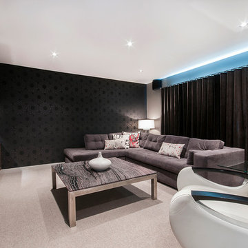
This home theater was allowed to be a dark and monochromatic environment. Rich with textured upholstery, geometric wall paper patterns, and velvet fabrics creating a warmth for this space - a perfect AV getaway, any time of day.
Luiza Matysiak Photographer
 User
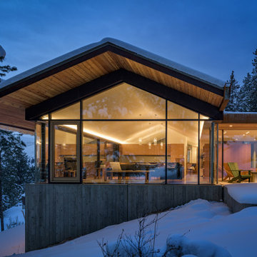
UserGlo European Windows A7 series was carefully selected for the Elk Ridge Passive House because of their High Solar Heat Gain Coefficient which allows the home to absorb free solar heat, and a low U-value to retain this heat once the sun sets. The A7 windows were an excellent choice for durability and the ability to remain resilient in the harsh winter climate. Glo’s European hardware ensures smooth operation for fresh air and ventilation. The A7 windows from Glo were an easy choice for the Elk Ridge Passive House project.
Gabe Border Photography
 Eileen Kollias Design
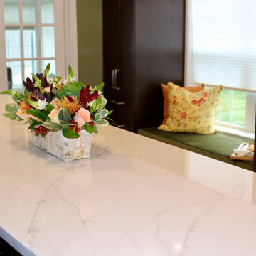
Engineered quartz countertops do not stain and have become the most popular product for countertops today.
Especially with the popularity of white marble which is highly absorbent, this product gives you the same look without the care.
 Climate Landscaping Ltd
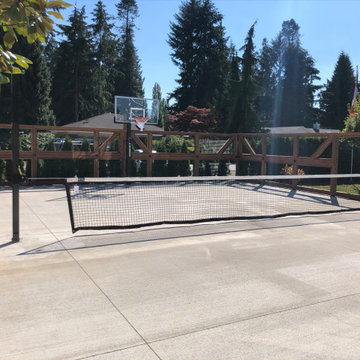
In progress photo of pickleball and basketball court with a unique folding fence engineers designed specifically for these clients to be able to meet local fence height regulations. Nearly finished: surface will be treated with a shock absorbing sand fortified sports material.
 K. Dakin Design Inc.
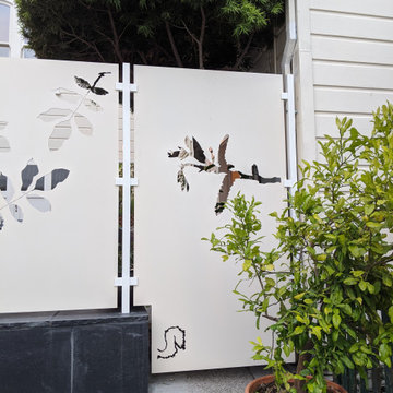
A small courtyard garden in San Francisco.
• Creative use of space in the dense, urban fabric of hilly SF.
• For the last several years the clients had carved out a make shift courtyard garden at the top of their driveway. It was one of the few flat spaces in their yard where they could sit in the sun and enjoy a cup of coffee. We turned the top of a steep driveway into a courtyard garden.
• The actual courtyard design was planned for the maximum dimensions possible to host a dining table and a seating area. The space is conveniently located outside their kitchen and home offices. However we needed to save driveway space for parking the cars and getting in and out.
• The design, fabrication and installation team was comprised of people we knew. I was an acquaintance to the clients having met them through good friends. The landscape contractor, Boaz Mor, http://www.boazmor.com/, is their neighbor and someone I worked with before. The metal fabricator is Murray Sandford of Moz Designs, https://mozdesigns.com/, https://www.instagram.com/moz_designs/ . Both contractors have long histories of working in the Bay Area on a variety of complex designs.
• The size of this garden belies the complexity of the design. We did not want to remove any of the concrete driveway which was 12” or more in thickness, except for the area where the large planter was going. The driveway sloped in two directions. In order to get a “level”, properly, draining patio, we had to start it at around 21” tall at the outside and end it flush by the garage doors.
• The fence is the artful element in the garden. It is made of power-coated aluminum. The panels match the house color; and posts match the house trim. The effect is quiet, blending into the overall property. The panels are dramatic. Each fence panel is a different size with a unique pattern.
• The exterior panels that you see from the street are an abstract riff on the seasons of the Persian walnut tree in their front yard. The cut-outs illustrate spring bloom when the walnut leafs out to autumn when the nuts drop to the ground and the squirrels eats them, leaving a mess of shells everywhere. Even the pesky squirrel appears on one of the panels.
• The interior panels, lining the entry into the courtyard, are an abstraction of the entire walnut tree.
• Although the panel design is made of perforations, the openings are designed to retain privacy when you are inside the courtyard.
• There is a large planter on one side of the courtyard, big enough for a tree to soften a harsh expanse of a neighboring wall. Light through the branches cast playful shadows on the wall behind.
• The lighting, mounted on the house is a nod to the client’s love of New Orleans gas lights.
• The paving is black stone from India, dark enough to absorb the warmth of the sun on a cool, summer San Francisco day.
 Ernesto Garcia Interior Design, LLC
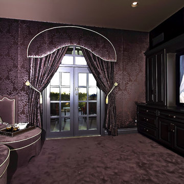
Scottsdale Elegance - Media Room - Dark chocolate tones absorb light, heavy velvet muffle sound and an ample sofa filled with pillows allows easy lounging for a complete theater experience.
 hengdecarpet
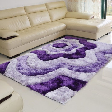
 Product Name: South Korean silk carpet
1. material: acrylic,or polyester, or polyester and silk, or multi-structure
2. patern: shaggy
3. design: many different fashonable design
4. pile height: 3cm--4cm
5. weight: 2000g--4000g
6. backing: white or grey canvas of backing with latex
7.color: various and can be made as buyer's requirement
8. size: 40cm*60cm, 50cm*80cm, 70cm*140cm, 120cm*170cm, 140cm*200cm, 160cm*230cm, 200cm*300cm.(Other size also could be customized,if you need other size,pls let us know.
9. payment: T/T, L/C
10.delivery time: within 30 days after order
Cleaning: After a wet towel to wipe clean as new, not washing machine washable. Dry cleaning is recommended!
Features: add soft encryption to static, lint-free, non-fading, anti-crushes, dirt does not stick disposable dust.
Pattern fashion rich, you can mix different home styles, imports of South Korean silk dyeing calcined at high temperature processing, color sparkling shiny, textured depth changes, can not afford silk does not fade, plus soft encryption processing, silky soft and smooth, moisture, non-slip, anti-static, sound-absorbing, every cool, wearable, comfortable, luxurious, elegant, beautiful, economical and easy to clean, cost-effective.
Company Information
Laiwu HengDe Carpet Co.,Ltd. Located in the beautiful green city - Laiwu, location, highway runs through the north and south, to the Jinan International Airport is only 50 minutes by car, and drove one hundred and fifty minutes to Qingdao Port, the transportation is very convenient. We have a complete and scientific quality management system, also has a professional R & D team, we can provide customers with a variety of quality products or in the country or abroad.
http://www.hengdecarpet.com/prodinfo.asp?pid=319
 Ancient Surfaces
Provided by 'Ancient Surfaces'
Product name: Antique Thick Limestone Countertops, AKA Foundation Slabs .
Phone: (212) 461-0245
Email: Sales@ancientsurfaces.com
Website: www.AncientSurfaces.com
Direct: www.AncientSurfaces.com/Foundation-Slabs.html
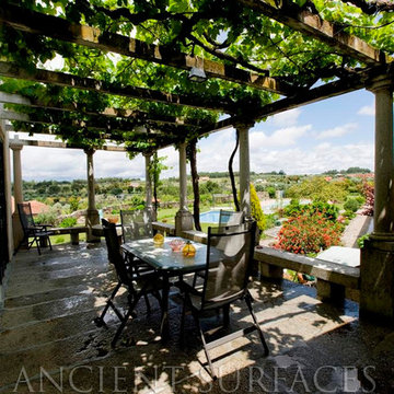
Those centuries old foundation Slabs were once the thick building blocks of old villas & farmhouses. Those blocks could be found at the bottom support base of many older reclaimed structures. We are passionate about milling them down to 2.5" in thickness so they could be used on counters and pool copings. Yes counters! Those thick & massive chucks of Limestone absorb virtually nothing and can stand up to anything you can throw at them.
Seemingly indestructible, they are ideal for anyone who is a great cook and who doesn’t want to worry about leaving wine rings, lime juice or oil stains on their counters while cooking or entertaining guests.
If you practically live in your kitchen which is true for many of us, you have no choice but to consider incorporating the foundation slabs as your kitchen counter tops.
Make your kitchen fun and enjoy the best counter tops available on earth by securing some of those slab cuts today.
Our thick Foundation Slabs are also ideal for any stepping stone design elements for your outdoors stairs, as stepping or landscaping stones, or as wall and pool copings able to withstand any weather pattern or condition.
 The Designers
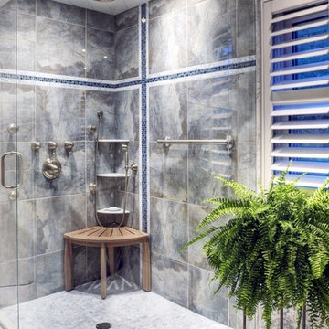
This beautiful shower displays a body shower and rain shower in a luxurious curved glass shower. The teal bench weathers to it's natural grey and the porcelain grey and white tile is a perfect compliment. The slate blue mosaic tile accents the room In a geometric design. Adding the Plantation Shutters and the Charleston Forge pedestal that supports a Boston fern that loves the humidity are the perfect touch.
Photographer Tom Kessler
 Klopf Architecture
Built for the Bluff, A Sea Ranch Home is Remade from the Inside Out
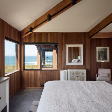
The house had always been grounded, on an ocean bluff at The Sea Ranch. It sits unencumbered, adjacent to one of the most dramatic stretches of the Sonoma coast with protected commons meadow to the east, uninterrupted Pacific views to the west, and a bluff trail running alongside. What it lacked was the feeling of home, one that could hold up its own against the natural landscape.
The owners are entrepreneurs with deep involvement across tech, real estate, and development and they know how things are built. The Sea Ranch house had been in their lives for years, a second residence and a place for family to gather. Built for a different time, it felt more compromising than comfortable. Sitting in a closed off nook, the kitchen fit one cook at a time and turned its back on the rest of the house. The entry was dim and compressed, divided by a structural column that presented itself at exactly the wrong moment. The primary suite was small relative to the view outside it. A large rear bedroom sat behind a lowered ceiling with a bathroom that had never been added. The house was certainly worth the trouble of doing it right.
What followed was not one project but four, each with its own design challenge, each addressed over a period of time.
Where the House Meets the Ocean
The most complex piece of the project, in both structural and spatial terms, was the kitchen expansion. The existing room was a single-person galley squeezed in as an afterthought with no meaningful connection to the dining room, the living space, or the deck outside. To make it useful for a family that cooks and gathers, it needed to grow outward into an existing patio and flow into the rooms around it.
A big challenge was the roofline. Several planes at different pitches and angles converged directly where additional volume was needed. A new form had to join that geometry without reading as a correction. The solution found the simplest possible connection between the existing angles, a roofline that from outside the structure, appears entirely original. From the bluff trail where the addition is visible, there is no discernible seam.
Inside, the kitchen is now open to the living and dining rooms without interruption. A large sliding glass door connects the space onto the rear deck. The deck itself was expanded and oriented so that the body of the house shields it from the coastal wind which is a common consideration that determines whether outdoor space at The Sea Ranch actually gets used. The result is a room that works for large family gatherings where no one feels cutoff, and one that makes the boundary between being inside and outside easy to ignore.
Welcoming Light
A structural column stood at the convergence of eight distinct roof planes in the entry. It was load-bearing, but it was also the reason the entry had always felt like a hallway rather than a welcoming arrival.
With the structural engineer, a custom steel connector was designed to receive beams from six separate directions, redistributing the load through a single new continuous beam. The column was surgically removed. Three triangular skylights were then cut into the roof above, their shapes drawn from the
existing geometry of the planes around them. The entry is now bright and open. The skylights feel native to the structure because they follow the logic already present in the roof.
Two Suites, Two Views
At opposite ends of the house, the two bedroom suites were each reconfigured, and each found a different way to introduce more of the landscape into the room.
An addition to the primary suite extended the structure outward to create a wraparound plan with a loop from the bedroom through bath and closet that had not been possible before. The expansion opened a slot view from the tub and shower toward the ocean. The view is precise and private. The ocean view is present and deliberate.
The rear bedroom absorbed an adjacent storage room to transform it into a full second suite with a vaulted ceiling, a large bathroom with a tub, a shower, and a sauna. A private fenced garden courtyard sits just beyond the glass bringing the outdoors inside. The tub was placed so that, looking past the courtyard and through the bedroom beyond, the ocean is visible at the far end. It is a long view and it makes the room feel larger and more settled than its footprint would suggest.
Glass on Four Sides, Fire at the Center
The main living and gathering room had always been caught between two competing facts: glass on four sides meant exceptional views but at The Sea Ranch, it also meant a cold room. A 360-degree cylindrical fireplace was added at the center on a raised stone base, providing radiant heat in every direction and giving the room a focal point around which a group naturally orients itself, whether that means two people at the end of the day or the whole family after dinner.
Owners Who Picked Up the Tools
The owner was not a passive client. they came with construction knowledge, specific ideas, and the desire to be an active part of the process, a dynamic that other architects may had found difficult, which Klopf Architecture accepted as an asset. They took it upon themselves to complete some of the work during construction, including the installation of a new radiant heating system beneath the floors.
The radiant system added to the older and less-desirable forced-air setup. At The Sea Ranch, that change matters as the house sits close enough to the ocean and moving air competes with the sound of it, where radiant heat does not. Solar panels were added to the roof as part of the new system. Insulation was upgraded throughout the walls, roof, and crawl space. The house that had always had the right setting now holds warmth the way a house on the bluff should.
They were also deeply involved in the design and selections throughout, and the finished house reflects both of them in ways that are specific rather than generic. The process took longer and moved through more iterations than a more arms-length relationship might have allowed. The result is more defined and personal because of it.
The Landscape Holds Priority
Every exterior decision was shaped by The Sea Ranch Design Standards, which require that buildings defer to the landscape around them rather than compete with it. Because this house sits on the bluff and is visible from the public trail, the additions faced a close review. Existing materials were matched. Geometries were resolved. The additions had to become indistinguishable from the original building.
From the trail, the house reads exactly as it always has — low, cedar-clad, secondary to the meadow and the water. The setting holds priority. Inside, the house has been remade.
Klopf Architecture Project Team: Geoff Campen and Trenton Jewett
Contractor: Shawn Bettega Construction
Photography: ©2025 Mariko Reed
Year Completed: 2023
Location: The Sea Ranch, CA
 EAG Studio
On a quiet street just steps from San Francisco’s beloved Dolores Park, a formerly modest urban structure has been transformed into a luminous vertical residence that quietly redefines contemporary city living. Through a comprehensive remodel and both vertical and horizontal expansion, the project turns a constrained urban footprint into a sequence of serene, art-forward living spaces that unfold upward toward expansive city views.
The architecture balances restraint and warmth: crisp contemporary geometry softened by natural materials, artful lighting, and carefully curated interiors. The result is a home that feels simultaneously grounded and elevated—deeply connected to its neighborhood yet remarkably private.
Reimagining the Urban Envelope
The original building has been almost entirely reconceived. The facade now reads as a disciplined composition of plaster volumes and precisely detailed window openings framed by subtle projecting bands. The geometry references San Francisco’s classic rhythm of bayed facades while stripping the language down to a refined modern expression.
Behind this quiet exterior lies a dramatically expanded interior volume. The redesign adds both additional floor area and new vertical circulation, transforming what was once a conventional city house into a multi-level architectural sequence organized around light, art, and views.
At the roofline, planted terraces soften the building’s silhouette and create a green crown visible from surrounding hillsides.
Interiors as a Sequence of Galleries
Inside, the home unfolds as a series of spatial moments connected by a sculptural stair and gallery-like corridors.
Wide plank oak floors run throughout, providing continuity and warmth against a palette of plaster walls, dark steel detailing, and natural stone. The hallways function almost as curated galleries, with layered artworks suspended in front of mesh panels that create depth and subtle shadow.
Light filters through carefully placed windows and stair openings, transforming circulation spaces into contemplative transitions rather than mere passageways.
A Living Room Anchored by Stone and Light
The primary living room occupies one of the home’s central floors, where a quiet interplay of texture and geometry defines the space.
A monumental fireplace wrapped in dark stone forms the room’s anchor, its mass contrasting with a recessed ceiling plane that seems to float above the seating area. Integrated perimeter lighting creates a soft architectural glow that washes the ceiling and walls.
Furniture is sculptural yet understated—rounded lounge chairs in warm ochre velvet, tailored sofas, and a striking marble cocktail table whose expressive veining becomes a focal artwork in itself. Deep blue carpeting grounds the seating arrangement and subtly absorbs light, enhancing the calm atmosphere.
Above the fireplace, a delicate projection artwork introduces a moment of visual poetry—an unexpected cinematic gesture that transforms the wall into a quietly animated canvas.
Kitchen as Architectural Furniture
The kitchen expresses a different register: crisp, tactile, and materially rich.
Custom walnut cabinetry spans the wall in a continuous plane, punctuated only by the sculpted hood and integrated appliances. The wood’s depth and warmth are balanced by expanses of pale marble that flow seamlessly from countertop to backsplash.
Three dome pendants hover above the island like industrial sculptures, casting pools of warm light onto the stone surface.
A row of vivid red stools introduces a controlled burst of color, a small but confident departure from the otherwise restrained palette.
Dining With a Living Backdrop
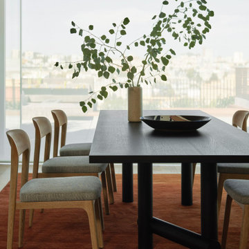
Adjacent to the kitchen, the dining room opens toward a glass wall overlooking a vertical garden of climbing ivy. The greenery becomes a constantly changing backdrop—lush and shadowy during the day, atmospheric and cinematic after sunset.
A dark wood table anchors the room, surrounded by pale oak chairs whose understated forms echo Scandinavian design traditions. The simplicity of the furniture allows the view and natural light to become the dominant experience.
Intimate Spaces and Material Contrast
Throughout the home, smaller rooms offer moments of intimacy and material experimentation.
The powder room pairs textured wall coverings with a dramatic black marble vanity whose bold veining feels almost geological. A suspended mirror and slender pendant create a sculptural composition against the tactile backdrop.
The primary bedroom, by contrast, feels serene and expansive. Floor-to-ceiling glazing frames sweeping views of the city, while soft textiles and warm wood paneling create a cocooning effect. Slender black columns subtly define a sitting area without interrupting the openness of the space.
Bathing Above the City
In the primary bathroom, a sculptural freestanding tub sits beside a panoramic window overlooking San Francisco’s hills and rooftops.
The room’s palette—light oak, grey stone, and matte metals—reinforces the spa-like atmosphere. Floating cabinetry and integrated lighting maintain a sense of visual lightness despite the richness of the materials.
Entertaining Above the Park
Higher in the house, a lounge and bar area becomes the social heart of the home. Here, dark stone slabs with dramatic veining wrap the bar wall like a piece of monumental art.
Open shelving displays glassware and spirits, while integrated wine storage hints at the home’s entertaining ambitions. A soft leather sectional and low glass table create a relaxed setting for conversation, framed by expansive views of the city skyline.
Cinema and Retreat
The lower level introduces yet another atmosphere: a dedicated media room designed for immersive viewing.
Dark walls, plush seating, and soft lighting create a cinematic environment that contrasts intentionally with the airy upper floors. It’s a retreat within the home—intimate, quiet, and removed from the brightness above.
Architecture That Balances Discipline and Warmth
What makes the project particularly compelling is its balance between architectural discipline and lived warmth.
Every element—from the carefully framed views to the restrained material palette—contributes to a cohesive spatial narrative. Yet the home never feels austere. Natural materials, curated art, and layered lighting create a sense of comfort and depth.
The result is a house that feels both architecturally rigorous and deeply human.
A Contemporary Interpretation of San Francisco Living
In a neighborhood defined by historic homes and iconic park views, this transformation offers a contemporary interpretation of San Francisco living.
It respects the city’s urban density while embracing openness, light, and vertical living. The home rises quietly above its surroundings, culminating in panoramic vistas that stretch across rooftops, hills, and sky.
What began as a conventional structure has become something far more nuanced: a modern urban sanctuary—part gallery, part retreat, and wholly connected to the vibrant city just beyond its walls.
63