
Search results for "Account required" in Home Design Ideas

 Stump's Decks and Porches
A lower level patio allows a lot of flexibility because railing is not required. When an HOA limits a deck size, it can be challenging to come up with a creative design. We fabricated custom benches and flowerboxes to add function and beauty while staying within the confines of the space allowed.
Our thanks to D & L Photography for the wonderful pictures.
 Pink Door Designs
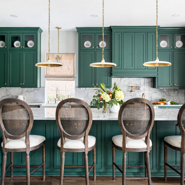
Rich, warm yet strikingly beautiful! This kitchen got a major overhaul with its oversized island housing a pre-sing, wine fridge, and tons of storage. Relocation of the refractor to make way for the gourmet range alongside the existing window framed sink. This kitchen is "L" shaped and has a hidden pantry built-in behind the fridge.

 TKS Design Group
Download our free ebook, Creating the Ideal Kitchen. DOWNLOAD NOW
For many, extra time at home during COVID left them wanting more from their homes. Whether you realized the shortcomings of your space or simply wanted to combat boredom, a well-designed and functional home was no longer a want, it became a need. Tina found herself wanting more from her Old Irving Park home and reached out to The Kitchen Studio about adding function to her kitchen to make the most of the available real estate.
At the end of the day, there is nothing better than returning home to a bright and happy space you love. And this kitchen wasn’t that for Tina. Dark and dated, with a palette from the past and features that didn’t make the most of the available square footage, this remodel required vision and a fresh approach to the space. Lead designer, Stephanie Cole’s main design goal was better flow, while adding greater functionality with organized storage, accessible open shelving, and an overall sense of cohesion with the adjoining family room.
The original kitchen featured a large pizza oven, which was rarely used, yet its footprint limited storage space. The nearby pantry had become a catch-all, lacking the organization needed in the home. The initial plan was to keep the pizza oven, but eventually Tina realized she preferred the design possibilities that came from removing this cumbersome feature, with the goal of adding function throughout the upgraded and elevated space. Eliminating the pantry added square footage and length to the kitchen for greater function and more storage. This redesigned space reflects how she lives and uses her home, as well as her love for entertaining.
The kitchen features a classic, clean, and timeless palette. White cabinetry, with brass and bronze finishes, contrasts with rich wood flooring, and lets the large, deep blue island in Woodland’s custom color Harbor – a neutral, yet statement color – draw your eye.
The kitchen was the main priority. In addition to updating and elevating this space, Tina wanted to maximize what her home had to offer. From moving the location of the patio door and eliminating a window to removing an existing closet in the mudroom and the cluttered pantry, the kitchen footprint grew. Once the floorplan was set, it was time to bring cohesion to her home, creating connection between the kitchen and surrounding spaces.
The color palette carries into the mudroom, where we added beautiful new cabinetry, practical bench seating, and accessible hooks, perfect for guests and everyday living. The nearby bar continues the aesthetic, with stunning Carrara marble subway tile, hints of brass and bronze, and a design that further captures the vibe of the kitchen.
Every home has its unique design challenges. But with a fresh perspective and a bit of creativity, there is always a way to give the client exactly what they want [and need]. In this particular kitchen, the existing soffits and high slanted ceilings added a layer of complexity to the lighting layout and upper perimeter cabinets.
While a space needs to look good, it also needs to function well. This meant making the most of the height of the room and accounting for the varied ceiling features, while also giving Tina everything she wanted and more. Pendants and task lighting paired with an abundance of natural light amplify the bright aesthetic. The cabinetry layout and design compliments the soffits with subtle profile details that bring everything together. The tile selections add visual interest, drawing the eye to the focal area above the range. Glass-doored cabinets further customize the space and give the illusion of even more height within the room.
While her family may be grown and out of the house, Tina was focused on adding function without sacrificing a stunning aesthetic and dreamy finishes that make the kitchen the gathering place of any home. It was time to love her kitchen again, and if you’re wondering what she loves most, it’s the niche with glass door cabinetry and open shelving for display paired with the marble mosaic backsplash over the range and complimenting hood. Each of these features is a stunning point of interest within the kitchen – both brag-worthy additions to a perimeter layout that previously felt limited and lacking.
Whether your remodel is the result of special needs in your home or simply the excitement of focusing your energy on creating a fun new aesthetic, we are here for it. We love a good challenge because there is always a way to make a space better – adding function and beauty simultaneously.
Find the right local pro for your project
 TKS Design Group
Download our free ebook, Creating the Ideal Kitchen. DOWNLOAD NOW
For many, extra time at home during COVID left them wanting more from their homes. Whether you realized the shortcomings of your space or simply wanted to combat boredom, a well-designed and functional home was no longer a want, it became a need. Tina found herself wanting more from her Old Irving Park home and reached out to The Kitchen Studio about adding function to her kitchen to make the most of the available real estate.
At the end of the day, there is nothing better than returning home to a bright and happy space you love. And this kitchen wasn’t that for Tina. Dark and dated, with a palette from the past and features that didn’t make the most of the available square footage, this remodel required vision and a fresh approach to the space. Lead designer, Stephanie Cole’s main design goal was better flow, while adding greater functionality with organized storage, accessible open shelving, and an overall sense of cohesion with the adjoining family room.
The original kitchen featured a large pizza oven, which was rarely used, yet its footprint limited storage space. The nearby pantry had become a catch-all, lacking the organization needed in the home. The initial plan was to keep the pizza oven, but eventually Tina realized she preferred the design possibilities that came from removing this cumbersome feature, with the goal of adding function throughout the upgraded and elevated space. Eliminating the pantry added square footage and length to the kitchen for greater function and more storage. This redesigned space reflects how she lives and uses her home, as well as her love for entertaining.
The kitchen features a classic, clean, and timeless palette. White cabinetry, with brass and bronze finishes, contrasts with rich wood flooring, and lets the large, deep blue island in Woodland’s custom color Harbor – a neutral, yet statement color – draw your eye.
The kitchen was the main priority. In addition to updating and elevating this space, Tina wanted to maximize what her home had to offer. From moving the location of the patio door and eliminating a window to removing an existing closet in the mudroom and the cluttered pantry, the kitchen footprint grew. Once the floorplan was set, it was time to bring cohesion to her home, creating connection between the kitchen and surrounding spaces.
The color palette carries into the mudroom, where we added beautiful new cabinetry, practical bench seating, and accessible hooks, perfect for guests and everyday living. The nearby bar continues the aesthetic, with stunning Carrara marble subway tile, hints of brass and bronze, and a design that further captures the vibe of the kitchen.
Every home has its unique design challenges. But with a fresh perspective and a bit of creativity, there is always a way to give the client exactly what they want [and need]. In this particular kitchen, the existing soffits and high slanted ceilings added a layer of complexity to the lighting layout and upper perimeter cabinets.
While a space needs to look good, it also needs to function well. This meant making the most of the height of the room and accounting for the varied ceiling features, while also giving Tina everything she wanted and more. Pendants and task lighting paired with an abundance of natural light amplify the bright aesthetic. The cabinetry layout and design compliments the soffits with subtle profile details that bring everything together. The tile selections add visual interest, drawing the eye to the focal area above the range. Glass-doored cabinets further customize the space and give the illusion of even more height within the room.
While her family may be grown and out of the house, Tina was focused on adding function without sacrificing a stunning aesthetic and dreamy finishes that make the kitchen the gathering place of any home. It was time to love her kitchen again, and if you’re wondering what she loves most, it’s the niche with glass door cabinetry and open shelving for display paired with the marble mosaic backsplash over the range and complimenting hood. Each of these features is a stunning point of interest within the kitchen – both brag-worthy additions to a perimeter layout that previously felt limited and lacking.
Whether your remodel is the result of special needs in your home or simply the excitement of focusing your energy on creating a fun new aesthetic, we are here for it. We love a good challenge because there is always a way to make a space better – adding function and beauty simultaneously.

 Fireclay Tile
Photos: Mckenzie France
Builder: Carolina Classic Builders
Transitional l-shaped eat-in kitchen photo in San Francisco with ceramic backsplash, recessed-panel cabinets, white cabinets and an island
Transitional l-shaped eat-in kitchen photo in San Francisco with ceramic backsplash, recessed-panel cabinets, white cabinets and an island

 Elizabeth Eason Architecture LLC
Bruce Cole Photography
Example of a small farmhouse white gable roof design with a shingle roof
Example of a small farmhouse white gable roof design with a shingle roof

 Valentini Kids Furniture Brooklyn NY
Modern Italian Wall Unit Velvet 903 by Artigian Mobili
Made in Italy
Velvet by ArtigianMobili is an ultra modern collection of wall unit and entertainment centers for your modern home. The Velvet line is modular, providing flexible solutions for your living room, taking into account your specific dimensions and functional requirements. All the units within this wall unit collection are made in Italy according high European quality standards and using the finest materials. The variety of units is presented in different sizes, making possible to customize any composition to fit your particular dimensions and match the design. Color is also flexible within the Velvet Wall Unit Collection. All the units can be ordered wood finished, wood open pore matt lacquered, or lacquered even in your custom RAL COLOR, either gloss or matt! Please select from our "as shown" wall unit compositions or implement your creativity building a unique one!
Base units are covered with extra clear white lacquered glass that can be optionally removed, making the wall unit composition cost less.
Contact our Office regarding customization of this wall unit - we are always ready to help!
MATERIAL/CONSTRUCTION:
Structure is made of 18 mm (0.7") thick wooden particles melamine panels
The lacquered structures and fronts are made of REAL LACQUERING, which is non toxic and non allergic product
Lights (if any) CE marked and comply with the directives 93/68/EEC and 92/31/EEC
The starting price is for the Wall Unit Composition Velvet 903 as shown in the main picture in Dark Oak Finish / Matt White Lacquer.
Dimensions:
Wall Unit: W141.7" x D14.6"/22.3" x H71"
TV Space: W53" x H43"
 HU-381719459
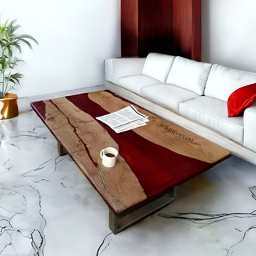
Making a living room that is both useful and well-balanced requires careful consideration of the centre table. Start by taking your room's dimensions into account. Bigger spaces may accommodate vibrant, eye-catching tables, while smaller spaces work best with compact, space-saving designs. The table's shape should match the arrangement of your seating area; round or oval tables provide softer, more intimate settings, while rectangular or square tables create more structured areas. The use of material greatly influences the mood; marble or stone conveys richness, glass and metal offer a contemporary edge, and wood adds warmth. Consider tables with built-in storage or multipurpose features if you require additional practicality because functionality is crucial.

 Doyle McCullar
Photo by Eric Rorer
Contemporary gray three-story mixed siding exterior home idea in San Francisco
Contemporary gray three-story mixed siding exterior home idea in San Francisco


 Connecticut Roofcrafters Llc
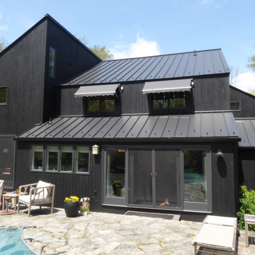
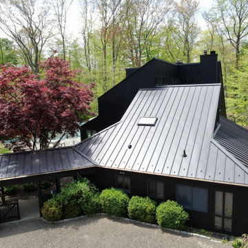
Rearview of a replacement metal roof on this expansive residence in Waccabuc, New York. The uncluttered and sleek lines of this mid-century modern residence combined with organic, geometric forms to create numerous ridges and valleys which had to be taken into account during the installation. Further, numerous protrusions had to be navigated and flashed. We specified and installed Englert 24 gauge steel in matte black to compliment the dark brown siding of this residence. All in, this installation required 6,300 square feet of standing seam steel.
 Connecticut Roofcrafters Llc
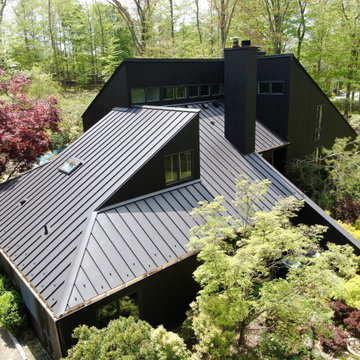
Replacement metal roof on the primary house, breezeway, and garage of this expansive residence in Waccabuc, New York. The uncluttered and sleek lines of this mid-century modern residence combined with organic, geometric forms to create numerous ridges and valleys which had to be taken into account during the installation. Further, numerous protrusions had to be navigated and flashed. We specified and installed Englert 24 gauge steel in matte black to compliment the dark brown siding of this residence. All in, this installation required 6,300 square feet of standing seam steel.
 Connecticut Roofcrafters Llc
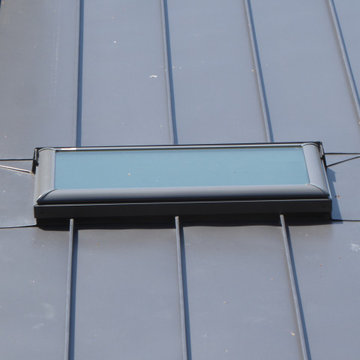
Side view of a replacement metal roof on the primary house and breezeway of this expansive residence in Waccabuc, New York. The uncluttered and sleek lines of this mid-century modern residence combined with organic, geometric forms to create numerous ridges and valleys which had to be taken into account during the installation. Further, numerous protrusions had to be navigated and flashed. We specified and installed Englert 24 gauge steel in matte black to compliment the dark brown siding of this residence. All in, this installation required 6,300 square feet of standing seam steel.
 Connecticut Roofcrafters Llc
Skylight flashing detail on a replacement metal roof of this expansive residence in Waccabuc, New York. The uncluttered and sleek lines of this mid-century modern residence combined with organic, geometric forms to create numerous ridges and valleys which had to be taken into account during the installation. Further, numerous protrusions had to be navigated and flashed. We specified and installed Englert 24 gauge steel in matte black to compliment the dark brown siding of this residence. All in, this installation required 6,300 square feet of standing seam steel.
 Connecticut Roofcrafters Llc
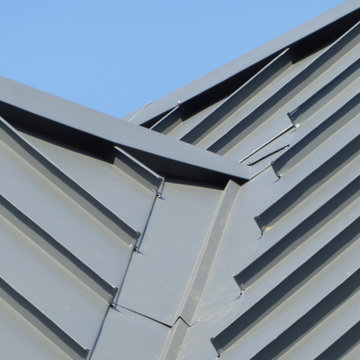
Valley detail on the replacement metal roof of the primary house of this expansive residence in Waccabuc, New York. The uncluttered and sleek lines of this mid-century modern residence combined with organic, geometric forms to create numerous ridges and valleys which had to be taken into account during the installation. Further, numerous protrusions had to be navigated and flashed. We specified and installed Englert 24 gauge steel in matte black to compliment the dark brown siding of this residence. All in, this installation required 6,300 square feet of standing seam steel.
 Connecticut Roofcrafters Llc
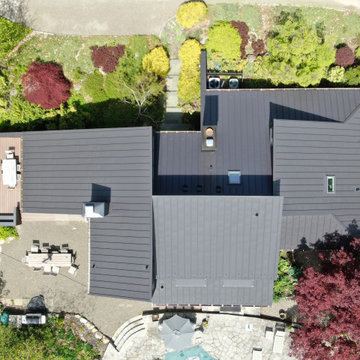
Overhead view of a replacement metal roof on the primary house of this expansive residence in Waccabuc, New York. The uncluttered and sleek lines of this mid-century modern residence combined with organic, geometric forms to create numerous ridges and valleys which had to be taken into account during the installation. Further, numerous protrusions had to be navigated and flashed. We specified and installed Englert 24 gauge steel in matte black to compliment the dark brown siding of this residence. All in, this installation required 6,300 square feet of standing seam steel.



 building Lab, inc.
Family/entertainment space with oak casework and matt charcoal concrete floor. Glass sliding doors open to the patio and garden. The concrete floor outside has the same hue as the interior one but the texture is more pronounced to prevent slipping.
Photos by Scott Hargis.
 Barrie Renovations
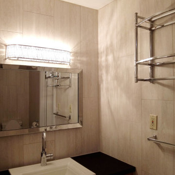
An older house requiring an upgraded small main bathroom, including accessories.
There was no redesign required, only demolition and replacement of wall panels, to stud, new drywall, tile, flooring, toilet, tub, and vanity all being placed in original locations. We did have to account for backing plates to add new wall shelves, safety hand holds, and mirror placement supports behind the wall.
But the result was a finished look that made the bathroom look larger and cleaner. A place to be proud of for homeowner, guests and friends.
2