
Search results for "Adding clutter" in Home Design Ideas
 TKS Design Group
Download our free ebook, Creating the Ideal Kitchen. DOWNLOAD NOW
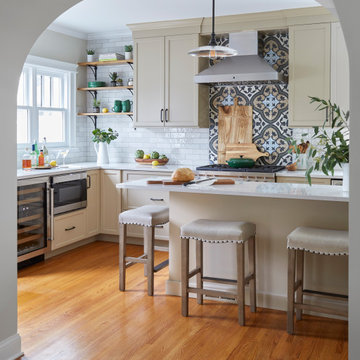
The homeowners came to us looking to update the kitchen in their historic 1897 home. The home had gone through an extensive renovation several years earlier that added a master bedroom suite and updates to the front façade. The kitchen however was not part of that update and a prior 1990’s update had left much to be desired. The client is an avid cook, and it was just not very functional for the family.
The original kitchen was very choppy and included a large eat in area that took up more than its fair share of the space. On the wish list was a place where the family could comfortably congregate, that was easy and to cook in, that feels lived in and in check with the rest of the home’s décor. They also wanted a space that was not cluttered and dark – a happy, light and airy room. A small powder room off the space also needed some attention so we set out to include that in the remodel as well.
See that arch in the neighboring dining room? The homeowner really wanted to make the opening to the dining room an arch to match, so we incorporated that into the design.
Another unfortunate eyesore was the state of the ceiling and soffits. Turns out it was just a series of shortcuts from the prior renovation, and we were surprised and delighted that we were easily able to flatten out almost the entire ceiling with a couple of little reworks.
Other changes we made were to add new windows that were appropriate to the new design, which included moving the sink window over slightly to give the work zone more breathing room. We also adjusted the height of the windows in what was previously the eat-in area that were too low for a countertop to work. We tried to keep an old island in the plan since it was a well-loved vintage find, but the tradeoff for the function of the new island was not worth it in the end. We hope the old found a new home, perhaps as a potting table.
Designed by: Susan Klimala, CKD, CBD
Photography by: Michael Kaskel
For more information on kitchen and bath design ideas go to: www.kitchenstudio-ge.com
 Sea Pointe Design & Remodel
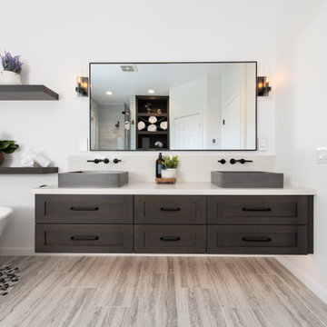
The sleek porcelain tile flooring elevates the look of this gorgeous bathroom remodel in Ladera Ranch. This vanity also features undercabinet lighting to brighten up the space and add a modern feature.
 L. Pearson Design
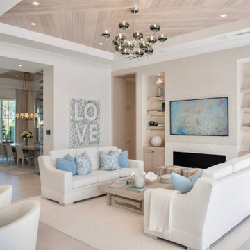
Design Style
The space blends:
modern coastal
transitional luxury
minimalist elegance
The palette is light and airy, with subtle blue accents that evoke a serene, beach-inspired atmosphere.Wood-paneled tray ceiling: The pale wood ceiling adds warmth and texture while drawing the eye upward, making the room feel spacious and sophisticated.
Statement chandelier: The sculptural multi-globe chandelier acts as a dramatic focal point, adding a contemporary artistic element.
Soft neutral furnishings: White upholstered sofas and light wood furniture create a clean, relaxed foundation.
Blue accent pillows and artwork: Pale blue textiles and abstract art introduce gentle color and reinforce the coastal vibe.
Minimalist fireplace wall: The sleek fireplace and integrated shelving give the room a streamlined, modern appearance.
Built-in shelving: The illuminated shelves add depth and provide subtle decorative styling without clutter.
Layered textures: Upholstery, woven fabrics, soft rugs, and natural wood finishes create warmth and visual softness.
Balanced symmetry: The room feels orderly and serene due to the thoughtful placement of furniture, art, and lighting.
Find the right local pro for your project
 M & J Star Construction, Inc.
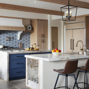
Step into a contemporary luxury kitchen that effortlessly blends modern design with timeless elegance. This space features sleek cabinetry and high-end appliances, complemented by a stunning natural wood ceiling adorned with exposed beams, adding warmth and character. The open layout encourages flow and interaction, making it perfect for both cooking and entertaining. A chic fireplace serves as a focal point, offering a cozy ambiance and enhancing the inviting atmosphere. With thoughtful details and high-quality finishes, this kitchen is a perfect harmony of style and functionality, creating an inviting retreat for culinary adventures and gatherings.
 KURV Architecture DPC (Alex Hughes Architects)
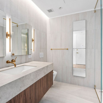
Located in the heart of Manhattan’s Lower East Side, the building was erected on a shallow commercial lot between two 120 year old masonry buildings and a new residential rental building. 330 Grand Street is a mix of 725 SF 1BRs and 1050 SF 2BR apartments. It also contains a 1100 SF two story duplex as well as private and public rooftop space, large private balconies for most units and two large private terraces for the ground floor units.
330 Grand Street was originally designed and approved at the NYC DOB as a prefabricated modular building. During the pandemic, as shipping costs skyrocketed putting the project at risk, we suggested redesigning the building as a reinforced cast-in-place concrete structure. Concrete was readily available and prices had not been affected by the demand increase that many other materials suffered in the pandemic. We took this opportunity to raise floor to ceiling heights, enlarge high performance windows and redistribute the buildings MEPFS and Structural Systems to create very open floor plans.
The challenge was to create a luxurious sensorial living experience with very limited means. In a city with very high construction costs, low cost residential buildings in the area are usually devoid of good quality, design and character. Our approach was to aim high for the end user, prioritizing natural light, open space with long visual perspectives, high ceilings and as always, rejecting the use of predefined building templates.
Our biggest challenge was to ensure that the small spaces feel as clean cut, large and bright as possible. Several unique design decisions were made to ensure low cost and high quality;
Floor plans were laid out so that spaces were wide open and free of clutter from mechanical or structural interruptions. Therefore all infrastructure was placed in lateral demising walls, which in turn act as the unit’s storage and kitchen. The apartments feel wide open, are super quiet and have more storage space than any other comparable apartment in the city.
To solve the problem of the site’s shallow commercial lot which is typically prone to dark interior spaces we focused our attention on the building’s envelope. Instead of the usual small punched window openings, oversized high performance windows were designed to ensure that light penetrated as far as possible into the units. In the smaller 1BR units, the full 50’ depth of the lot is perceived by partitioning spaces with sliding pocket doors that can be retracted to allow deep visual perspectives, making the sight lines in the space feel longer, larger, more ample than normal. In addition to the full height glazing, each unit above the 2nd floor receives a 7 foot covered balcony, adding 120 to 240 sf to each apartment, something unusual in New York City buildings. The space is large enough for a full size dining table, when the weather permits being outside.
We also worked hard to ensure modularity. For example, all kitchen units are all identical throughout the building. The idea of modularity and the economy of the repetitive unit is exercised to the maximum through the building.
Hardware, appliances, flooring, wall coverings and material finishes are all carefully selected to feel bespoke, high quality and unique.
It was important to KURV that the result of this work manifest into something that would deeply connect with the end user and sustain relationships with the consumers of this space.
All images by KURV Architecture ©

 PIEKNO Studio
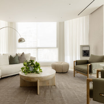
The heart of the home - the Livingroom - features a sculptural, custom-made curved white sofa paired with two deep green armchairs - an inviting composition that blends softness with structure. Behind, subtle wall paneling evokes a cozy Japanese ambiance, adding texture and rhythm while gently defining the space. A perfect balance of minimalism and warmth.

Sponsored
Columbus, OH

Hope Restoration & General Contracting
Columbus Design-Build, Kitchen & Bath Remodeling, Historic Renovations
 Crisp Architects
Our clients loved their old home but were ready for some updates. Based on the foundation and other historical clues, they believe it was built around 1890. The house was well-built and full of character. While it had a charming front porch, it was far from the kitchen and faced the driveway. We added a spacious side porch just off the kitchen, creating the perfect spot for outdoor dining. By connecting it to the original porch, we created a natural flow from the front door through the rest of the home. Inside, we redesigned the kitchen and dining area to open up the space and views. The homeowners chose retro appliances that complement the home’s vintage charm.
 Tara Fust Design
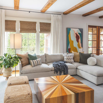
This remodeled family room balances architectural presence with soft, livable comfort. Exposed wood ceiling beams introduce warmth and character overhead, while a streamlined fireplace wall creates a clean, modern focal point. The fireplace surround pairs textured paneling above with a smooth, tailored lower finish, adding depth without visual clutter.
Furnishings were selected for both comfort and refinement — a generous sectional anchors the space, layered with a mix of neutral textiles and subtle pattern. Sculptural accent tables and woven ottomans bring in organic texture, while oversized artwork adds color and movement without overwhelming the palette.
Large windows flood the room with natural light, enhancing the warm woods and soft neutrals throughout. The result is a family room that feels elevated yet relaxed — designed for everyday living, gathering, and long evenings by the fire.
 KraftMaster Renovations
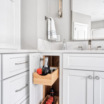
On "his" side of the vanity we installed two roll out drawers for storage and added an electrical outlet on the top one so that items can charge while put away.
Photography by Chris Veith
 Urban Purpose Design
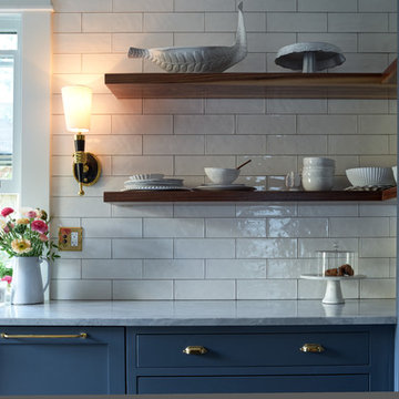
Enclosed kitchen - small traditional galley medium tone wood floor enclosed kitchen idea in Atlanta with a farmhouse sink, shaker cabinets, blue cabinets, white backsplash, subway tile backsplash, stainless steel appliances and no island
 Kowalske Kitchen & Bath
This 1933 Wauwatosa basement was dark, dingy and lacked functionality. The basement was unfinished with concrete walls and floors. A small office was enclosed but the rest of the space was open and cluttered.
The homeowners wanted a warm, organized space for their family. A recent job change meant they needed a dedicated home office. They also wanted a place where their kids could hang out with friends.
Their wish list for this basement remodel included: a home office where the couple could both work, a full bathroom, a cozy living room and a dedicated storage room.
This basement renovation resulted in a warm and bright space that is used by the whole family.
Highlights of this basement:
- Home Office: A new office gives the couple a dedicated space for work. There’s plenty of desk space, storage cabinets, under-shelf lighting and storage for their home library.
- Living Room: An old office area was expanded into a cozy living room. It’s the perfect place for their kids to hang out when they host friends and family.
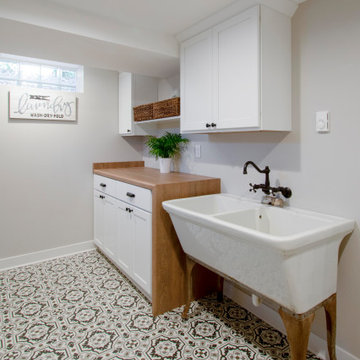
- Laundry Room: The new laundry room is a total upgrade. It now includes fun laminate flooring, storage cabinets and counter space for folding laundry.
- Full Bathroom: A new bathroom gives the family an additional shower in the home. Highlights of the bathroom include a navy vanity, quartz counters, brass finishes, a Dreamline shower door and Kohler Choreograph wall panels.
- Staircase: We spruced up the staircase leading down to the lower level with patterned vinyl flooring and a matching trim color.
- Storage: We gave them a separate storage space, with custom shelving for organizing their camping gear, sports equipment and holiday decorations.
CUSTOMER REVIEW
“We had been talking about remodeling our basement for a long time, but decided to make it happen when my husband was offered a job working remotely. It felt like the right time for us to have a real home office where we could separate our work lives from our home lives.
We wanted the area to feel open, light-filled, and modern – not an easy task for a previously dark and cold basement! One of our favorite parts was when our designer took us on a 3D computer design tour of our basement. I remember thinking, ‘Oh my gosh, this could be our basement!?!’ It was so fun to see how our designer was able to take our wish list and ideas from my Pinterest board, and turn it into a practical design.
We were sold after seeing the design, and were pleasantly surprised to see that Kowalske was less costly than another estimate.” – Stephanie, homeowner
 Karly Kristina Design
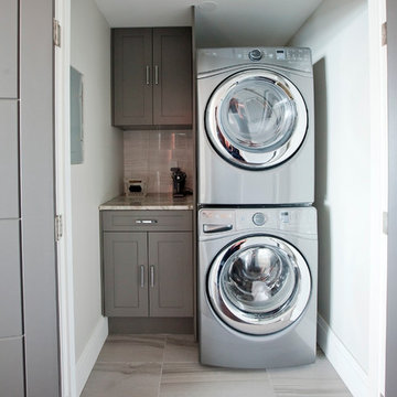
This Laundry Room closet was transitioned to feel more like an actual Laundry Room by giving the space built in cabinetry and adding a functioning countertop. By having the built in storage, it helps hide the clutter of misc. storage items.
Photographer: Janis Nicolay

Sponsored
Delaware, OH

Buckeye Basements, Inc.
Central Ohio's Basement Finishing ExpertsBest Of Houzz '13-'21
 Paradise Tiny Homes LLC
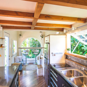
A beautiful mix of clean stainless steel and warm mango wood creates a stylish and practical kitchen space.
This coastal, contemporary Tiny Home features a warm yet industrial style kitchen with stainless steel counters and husky tool drawers with black cabinets. the silver metal counters are complimented by grey subway tiling as a backsplash against the warmth of the locally sourced curly mango wood windowsill ledge. I mango wood windowsill also acts as a pass-through window to an outdoor bar and seating area on the deck. Entertaining guests right from the kitchen essentially makes this a wet-bar. LED track lighting adds the right amount of accent lighting and brightness to the area. The window is actually a french door that is mirrored on the opposite side of the kitchen. This kitchen has 7-foot long stainless steel counters on either end. There are stainless steel outlet covers to match the industrial look. There are stained exposed beams adding a cozy and stylish feeling to the room. To the back end of the kitchen is a frosted glass pocket door leading to the bathroom. All shelving is made of Hawaiian locally sourced curly mango wood. A stainless steel fridge matches the rest of the style and is built-in to the staircase of this tiny home. Dish drying racks are hung on the wall to conserve space and reduce clutter.
 TKS Design Group
Download our free ebook, Creating the Ideal Kitchen. DOWNLOAD NOW
The homeowners came to us looking to update the kitchen in their historic 1897 home. The home had gone through an extensive renovation several years earlier that added a master bedroom suite and updates to the front façade. The kitchen however was not part of that update and a prior 1990’s update had left much to be desired. The client is an avid cook, and it was just not very functional for the family.
The original kitchen was very choppy and included a large eat in area that took up more than its fair share of the space. On the wish list was a place where the family could comfortably congregate, that was easy and to cook in, that feels lived in and in check with the rest of the home’s décor. They also wanted a space that was not cluttered and dark – a happy, light and airy room. A small powder room off the space also needed some attention so we set out to include that in the remodel as well.
See that arch in the neighboring dining room? The homeowner really wanted to make the opening to the dining room an arch to match, so we incorporated that into the design.
Another unfortunate eyesore was the state of the ceiling and soffits. Turns out it was just a series of shortcuts from the prior renovation, and we were surprised and delighted that we were easily able to flatten out almost the entire ceiling with a couple of little reworks.
Other changes we made were to add new windows that were appropriate to the new design, which included moving the sink window over slightly to give the work zone more breathing room. We also adjusted the height of the windows in what was previously the eat-in area that were too low for a countertop to work. We tried to keep an old island in the plan since it was a well-loved vintage find, but the tradeoff for the function of the new island was not worth it in the end. We hope the old found a new home, perhaps as a potting table.
Designed by: Susan Klimala, CKD, CBD
Photography by: Michael Kaskel
For more information on kitchen and bath design ideas go to: www.kitchenstudio-ge.com
 Dura Supreme Cabinetry
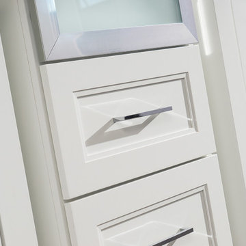
Add some class and cleanse the clutter in your bathroom by selecting a coordinated collection of bath furniture with spare sensibility. These two individual bathroom vanities are separated by the tall, free-standing linen cabinet provide each spouse their own divided space to organize their personal bath supplies, while the linen cabinet provides universal storage for items the couple with both uses.
This master bathroom features Dura Supreme’s “Style Six” furniture series. This style is designed to create sleek, minimalist appeal. Bookended on both sides and across the top, a set of doors and/or drawers are suspended beneath the countertop. If preferred, a floating shelf can be added (like shown on these two vanities) for additional and attractive storage underneath.
Style Six offers 10 different configurations (for single sink vanities, double sink vanities, or offset sinks), and an optional floating shelf (vanity floor). Any combination of Dura Supreme’s many door styles, wood species, and finishes can be selected to create a one-of-a-kind bath furniture collection.
This white on white transitional styled bathroom showcases a beautiful Chrome framed cabinet door from Dura Supreme, sleek solid surface vanity countertops, polished chrome Kohler faucets, round under-mount sinks, 2 Dura Supreme mirrors that match the vanities, polished chrome hardware, gray painted walls, and classic wood floors. The combination of all of these design elements come together to create one incredible master bath!
The bathroom has evolved from its purist utilitarian roots to a more intimate and reflective sanctuary in which to relax and reconnect. A refreshing spa-like environment offers a brisk welcome at the dawning of a new day or a soothing interlude as your day concludes.
Our busy and hectic lifestyles leave us yearning for a private place where we can truly relax and indulge. With amenities that pamper the senses and design elements inspired by luxury spas, bathroom environments are being transformed from the mundane and utilitarian to the extravagant and luxurious.
Bath cabinetry from Dura Supreme offers myriad design directions to create the personal harmony and beauty that are a hallmark of the bath sanctuary. Immerse yourself in our expansive palette of finishes and wood species to discover the look that calms your senses and soothes your soul. Your Dura Supreme designer will guide you through the selections and transform your bath into a beautiful retreat.
Request a FREE Dura Supreme Brochure Packet:
http://www.durasupreme.com/request-brochure
Find a Dura Supreme Showroom near you today:
http://www.durasupreme.com/dealer-locator

Sponsored
Columbus, OH
Hope Restoration & General Contracting
Columbus Design-Build, Kitchen & Bath Remodeling, Historic Renovations
 TOC design & construction inc.
DESIGNED BY TOC design
CONSTRUCTION BY TOC design & Construction inc.
PHOTOS BY : Tania Scardellato
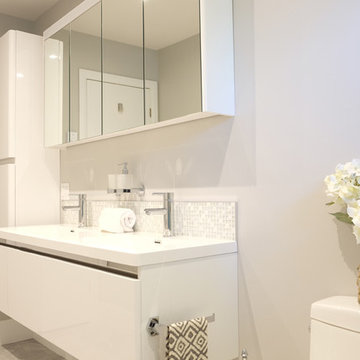
I was fortunate to have a young family approach me in desperate need to renovate there only 3 piece bathroom. This space was In dire need of a remodel, with old brown wall to wall tiles and a dated bulky yellow brown single sink vanity.
Storage was a must, lighting a necessity, and proper accessibility to the shower bath area.
We had a tight budget to respect, but a full gut of this bathroom was required. And a good thing too, once we started doing the demolition we noticed that mildew and rotting floors and walls had accumulated throughout the years. Doing it right the first time is no joke when dealing with water and electrical issues.
We discarded all reminisce of old and built from scratch, new walls, new plumbing, new electrical ,new insulation and a new window, a new fan that actually exhausted outside ( I say this laughing as you would be amazed at how many fans are installed but don’t exhaust outside, and you the client would never know unless you go inside the attic space.
Once all the hard stuff was done, the rest is just a matter of smart design. If you have a small bathroom here are some tips to guide you.
10 tips for making a small bathroom feel larger
Is your tiny bathroom cramping your functionality and style, leaving you longing for the enormous bathrooms gracing the pages of design magazines? Even if your bathroom is a fraction of the size, all it takes is some design savvy to make the most of the space you have. Consider these 10 smart tips that will help your bathroom look, feel and function like those larger contenders.
1-Get creative with corners
Space is at a premium in small bathrooms, so it's important to maximize every inch. Corners, for example, provide extra space for shelving, storage units and even hooks. Get creative and install unique design solutions that are not only functional, but also eye-catching. If you love the airiness of floating cabinets, add baskets or decorative boxes under for extra storage. If you are installing floating cabinets insure that they are installed securely to studs or plywood at wall.
2- Let solid colors shine
Busy patterns have a shrinking effect and make small bathrooms seem even smaller. Conversely, light natural hues make a space feel more open. If you're itching to get creative with design, experiment with textures but keep overpowering patterns to a minimum. Tone on tone is the best to achieve this.
3 - Maximize your bathtub
A bathtub takes up a significant portion of the room, but modern, compact options with curved basins, can make the tub feel larger when in use, all while conserving space.
4 - Select a smaller faucet
A faucet is jewelry for the bathroom. And just as accessories can overpower an outfit, a big bulky faucet isn't flattering in a small bath. Single-handle designs conserve counter space, while a wall-mount installation frees it up all together and can create quite the wow-factor, if the budget can accommodate the required changes to plumbing behind the wall.
5 - Make vanity storage simple
If you're in a storage war with your small bathroom, you're not alone in the battle. Toiletries and personal supplies without a place to call home only add clutter and chaos. Store smart with a space-saving vanity, the dual sink vanity shown here, looks quite simple, but in reality it has 4 sets of full extension drawers, and the vanity tower adds extra storage without overpowering the use of space.
6 - Show off the shower
Shower curtains may be pretty, but they interrupt the visual flow of a bathing space and make it feel significantly smaller. In bathrooms with small footprints, opt for a clear glass sliding shower door that doesn't require the clearance of one with a hinged design. Or as shown in this design and for fraction less expensive a half hinged panel installed on a fixed tempered glass panel. If you're embarking on a big remodel, create the illusion of more space by using same tile in the shower that's used throughout; instead of seeing them as two separate zones, the eye will read them as one.
7 - Discover the treasure of hidden storage
Work with a contractor, and you just might find some serious storage potential hidden behind your walls. Whether it's utilizing space between the studs for shallow shelving or a creating a small linen closet by annexing space from an adjacent room, even small additions can make a big difference.
8 - Focal Point
Tile is a beautiful, durable addition to any bathroom. For dainty spaces, consider installing tile at a diagonal to accentuate the focal point or as in this bathroom I used an oversized textured pattern to bring depth to the space at the window wall.
9 - Choose the right lights
Strategically install light to reflect and brighten a small bathroom to make it appear larger. Recessed lighting is an affordable solution for tiny rooms, offering ample light while taking up little space. Wall sconces alongside a mirror also reflect off the walls and make a room feel bright and airy. I always recommend going with LED lighting at 2800 to 3000K.
10 – Accessorize
This is your time to shine in your decorating skills, have fun with your towels, you can change the color scheme daily just by adding pops of color in your accessories, make sure to get items that serve a dual purpose, like baskets, boxes they can always be used as hampers, storing of towels and even a nice display for your guest.
 Rochelle Lynne Design
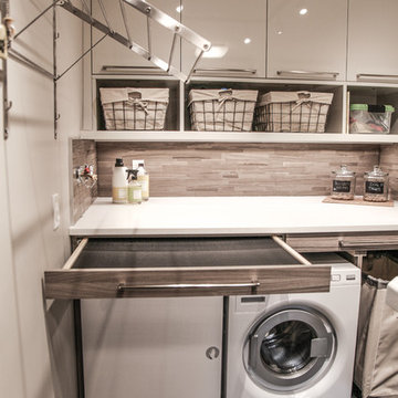
Karen was an existing client of ours who was tired of the crowded and cluttered laundry/mudroom that did not work well for her young family. The washer and dryer were right in the line of traffic when you stepped in her back entry from the garage and there was a lack of a bench for changing shoes/boots.
Planning began… then along came a twist! A new puppy that will grow to become a fair sized dog would become part of the family. Could the design accommodate dog grooming and a daytime “kennel” for when the family is away?
Having two young boys, Karen wanted to have custom features that would make housekeeping easier so custom drawer drying racks and ironing board were included in the design. All slab-style cabinet and drawer fronts are sturdy and easy to clean and the family’s coats and necessities are hidden from view while close at hand.
The selected quartz countertops, slate flooring and honed marble wall tiles will provide a long life for this hard working space. The enameled cast iron sink which fits puppy to full-sized dog (given a boost) was outfitted with a faucet conducive to dog washing, as well as, general clean up. And the piece de resistance is the glass, Dutch pocket door which makes the family dog feel safe yet secure with a view into the rest of the house. Karen and her family enjoy the organized, tidy space and how it works for them.
 TKS Design Group
Download our free ebook, Creating the Ideal Kitchen. DOWNLOAD NOW
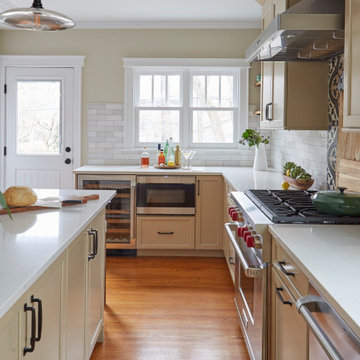
The homeowners came to us looking to update the kitchen in their historic 1897 home. The home had gone through an extensive renovation several years earlier that added a master bedroom suite and updates to the front façade. The kitchen however was not part of that update and a prior 1990’s update had left much to be desired. The client is an avid cook, and it was just not very functional for the family.
The original kitchen was very choppy and included a large eat in area that took up more than its fair share of the space. On the wish list was a place where the family could comfortably congregate, that was easy and to cook in, that feels lived in and in check with the rest of the home’s décor. They also wanted a space that was not cluttered and dark – a happy, light and airy room. A small powder room off the space also needed some attention so we set out to include that in the remodel as well.
See that arch in the neighboring dining room? The homeowner really wanted to make the opening to the dining room an arch to match, so we incorporated that into the design.
Another unfortunate eyesore was the state of the ceiling and soffits. Turns out it was just a series of shortcuts from the prior renovation, and we were surprised and delighted that we were easily able to flatten out almost the entire ceiling with a couple of little reworks.
Other changes we made were to add new windows that were appropriate to the new design, which included moving the sink window over slightly to give the work zone more breathing room. We also adjusted the height of the windows in what was previously the eat-in area that were too low for a countertop to work. We tried to keep an old island in the plan since it was a well-loved vintage find, but the tradeoff for the function of the new island was not worth it in the end. We hope the old found a new home, perhaps as a potting table.
Designed by: Susan Klimala, CKD, CBD
Photography by: Michael Kaskel
For more information on kitchen and bath design ideas go to: www.kitchenstudio-ge.com
38