
Search results for "Additional children" in Home Design Ideas

 StoneUnlimited Kitchen and Bath Remodeling
When deciding to either keep a tub and shower or take out the tub and expand the shower in the master bathroom is solely dependent on a homeowner's preference. Although having a tub in the master bathroom is still a desired feature for home buyer's, especially for those who have or are excepting children, there's no definitive proof that having a tub is going to guarantee a higher rate of return on the investment.
This chic and modern shower is easily accessible. The expanded room provides the ability to move around freely without constraint and makes showering more welcoming and relaxing. This shower is a great addition and can be highly beneficial in the future to any individuals who are elderly, wheelchair bound or have mobility impairments. Fixtures and furnishings such as the grab bar, a bench and hand shower also makes the shower more user friendly.
The decision to take out the tub and make the shower larger has visually transformed this master bathroom and created a spacious feel. The shower is a wonderful upgrade and has added value and style to our client's beautiful home.
Check out the before and after photographs as well as the video!
Here are some of the materials that were used for this transformation:
12x24 Porcelain Lara Dark Grey
6" Shower band of Keystone Interlocking Mosaic Tile
Delta fixtures throughout
Ranier Quartz vanity countertops

 Michael Nash Design, Build & Homes
2011 CAPITAL COTY AWARD GRAND AWARD WINNER
Having just purchased this new home, the owners did not like the disconnection between kitchen and breakfast area. The garden window over the sink was in disrepair, the cabinetry was dark and the room’s flow had no rhyme or reason.
The kitchen, however, had a lot of potential. A new design was put together which involved reframing the garden window to create panoramic viewing. Two skylights were added which really brightened up the space. All of the previous bulkheads were removed to allow stacked cabinetry and upper display cupboards.
A new larger cooking island with angular wings and seating space around it is now the focal point of this kitchen. An additional countertop built on decorative columns offers space for the couple’s children to do their homework or have a snack.
Entire kitchen and breakfast area now has a larger porcelain tile floor laid in a pattern to make the place even larger. Honey-colored maple cabinetry with a slightly rubbed chocolate glaze finish gives a classic but sophisticated look to this kitchen. The marriage of faux painting and brick fascia introduced a unique look into the space.
The homeowners are so thrilled with the outcome, they are considering remodeling the rest of the home.

 Roeser Home Remodeling
Older homes are filled with charm, but often the kitchen has been overlooked. Originally, it was a work area– not made for public view. Today it truly is the center of all that goes on in the family. Today’s active homeowners are no different. Although their children may be grown, cooking and baking are still considered top priorities. Storage and counter space were issues that needed to be addressed and being aware of the aging process of the kitchen, lighting also needed to be considered. Although the kitchen is only a 13’ X 13’ space, it had other challenges. A back staircase, three doorways, and a large window took away from the wall space, however the 9’ ceilings were an unused potential for storage. Choosing Wellborn’s Select Series Cabinets in a Maple with a sandstone slate finish brightened the space immediately. Stacking the cabinets and taking them all the way to the ceiling gave this homeowner more storage than ever imagined for items of occasional use. Under counter LED Tape lighting brightened the task areas of the kitchen without causing additional heat from too many lights. A new table light on a dimmer sets the right mood for dining and provides just enough additional lighting. Installing a Sharp, stainless steel, 24” microwave drawer freed up some counter space for prep work near the cooktop (a GE, stainless steel 30” gas cooktop with four burners) and next to the sink (a new Elkay Gourmet Double Bowl with aqua DVD). Also, adding a new Kohler Sensate kitchen faucet which is hands free, a Kohler contemporary soap/lotion dispenser and a new ISE 3/4 horsepower disposal– helps to make clean-up a breeze. A new GE dishwasher, a new Broan stainless steel 30” hood, and a new GE 30” double oven both standard oven sizes, not only allows our homeowner to cook dinner and dessert, but the stainless steel reflects light while adding a design element tying the cabinet hardware and light fixture into the overall look. The countertop is Caesarstone’s Dreamy Marfil and is always a bold statement for any size Kitchen. Mixing the backsplash tile up without appearing busy came together with the beautiful combination of Sandlewood polished Amafi 30cm from countertops to base cabinets and Jinsen Coffee Bone in a diamond pattern framed in the Sandlewood polish and a Amafi Pencil liner above the cooktop. The soft addition of a new six panel Pine door stained and finished to match the other doors within the home added to the overall beauty of this stunning kitchen.
Find the right local pro for your project

 User
This 7,500 square feet home, situated on a waterfront site in Sag Harbor, New York, was designed as a shared vacation home for four brothers and their families. A collaborative effort between the clients and Cecil Baker + Partners yielded a contemporary home that pays homage to the Eastern Long Island vernacular.
The home is composed of three distinct volumes that step back from one another to optimize both the water view and privacy. The two outer wings take on familiar cedar-clad, pitched roof geometry while the central three-story glass box links them together and anchors the home. The two car garage, with a private living space above, projects from the main house via a breezeway, defining a private garden.
The interior of the home integrates warm, tactile materials and clean modern lines. The use of full-height windows, floor-to-ceiling glass curtain wall, and an operable overhead glass door creates an indoor-outdoor living experience and floods the home with natural light. The subtle choreography of the interior space lends flexibility to the Client for both social and private uses of the home.
The first floor contains an open plan for the kitchen, living room, dining area and sunroom, and the second floor includes two full master suites facing the bay, a guest room with spectacular water views, and a children's room that overlooks the garden. The fully finished basement holds a large playroom, a gym, a full spa bath and a wine cellar. In addition, views in all directions are unobstructed from a third floor roof terrace.
Michael Grimm Photography

 Revealing Redesign
This farmhouse, with it's original foundation dating back to 1778, had a lot of charm--but with its bad carpeting, dark paint colors, and confusing layout, it was hard to see at first just how welcoming, charming, and cozy it could be.
The first focus of our renovation was creating a master bedroom suite--since there wasn't one, and one was needed for the modern family that was living here day-in and day-out.
To do this, a collection of small rooms (some of them previously without heat or electrical outlets) were combined to create a gorgeous, serene space in the eaves of the oldest part of the house, complete with master bath containing a double vanity, and spacious shower. Even though these rooms are new, it is hard to see that they weren't original to the farmhouse from day one.
In the rest of the house we removed walls that were added in the 1970's that made spaces seem smaller and more choppy, added a second upstairs bathroom for the family's two children, reconfigured the kitchen using existing cabinets to cut costs ( & making sure to keep the old sink with all of its character & charm) and create a more workable layout with dedicated eating area.
Also added was an outdoor living space with a deck sheltered by a pergola--a spot that the family spends tons of time enjoying during the warmer months.
A family room addition had been added to the house by the previous owner in the 80's, so to make this space feel less like it was tacked on, we installed historically accurate new windows to tie it in visually with the original house, and replaced carpeting with hardwood floors to make a more seamless transition from the historic to the new.
To complete the project, we refinished the original hardwoods throughout the rest of the house, and brightened the outlook of the whole home with a fresh, bright, updated color scheme.
Photos by Laura Kicey

 TKS Design Group
Free ebook, Creating the Ideal Kitchen. DOWNLOAD NOW
Sometimes it take a few tries to get a space to work how you want it to and that’s exactly what happened with this Hinsdale client. Their desire for a family friendly, open floor plan had them reworking an opening between the kitchen and family room and relocating some pantry cabinets in an attempt to make their home’s flow more suitable to their lifestyle. After living with this small change for a few years, they decided that a full kitchen remodel was really what was needed to make their home function the way they desired.
They came in with the stereotypical “sketch on a napkin” done by an architect friend, and we proceeded to make that design come to life with a few tweaks along the way. The space was quite unique and also a bit challenging because of its multiple angled walls. While interesting, angles can be a challenge when trying make a space functional.
The new kitchen has a great lineup of large appliances, including a large built-in fridge, steam oven and Galley workstation, which is a large prep sink that utilizes several inserts such as strainers and cutting boards and acts as a very large prep space. The new induction cooktop is easy to keep clean and a microwave drawer in the island is located away from the main prep space for convenient access.
The main perimeter has tons of countertop space, with additional prep space available at the island and a slightly raised peninsula for casual meals and nice homework spot for the couple’s teenaged children. The kitchen also included a large shallow depth pantry and a large counter height desk area for keeping track of paperwork.
The weathered finish on the cabinets and custom metal hood are a nice juxtaposition to the more sleek glass mosaic backsplash and waterfall countertops. The pendants and cabinet hardware provide modern details that provide an overall casual yet sophisticated feel in this transitional design.
Designed by: Susan Klimala, CKD, CBD
Photography by: Mike Kaskel
For more information on kitchen and bath design ideas go to: www.kitchenstudio-ge.com
 User
For this vacation home, a complete gut job was needed in order to fit the lifestyle and needs of this young family of four and their guests. The narrow floor plan created unique challenges, but we maximized its full potential. The result was a warm but modern design with plenty of storage and seating.
One of the biggest challenges was making sure everyone had a place to sit in the kitchen. The space between the kitchen and staircase was limiting, but with sleek modern chairs that tuck away, we were able to allow for traffic patterns and seat all of the children.
To accommodate any vacation extras, an extra wide space near the kitchen and bathroom was transformed into additional shelving. We installed floor-to-ceiling cabinets that offer plenty of space for everyone’s belongings.
A clean design was a must, so we opted for a more modern look. We used Benjamin Moore's "Simply White" as the foundation, putting it on the walls and cabinets, and coordinating the countertops and backsplash. To make the home more welcoming, we used natural wood on the island and floating shelves. The wood was coordinated with the floor, creating a cohesive interior.
Project designed by Star Valley, Wyoming interior design firm Tawna Allred Interiors. They also serve Alpine, Auburn, Bedford, Etna, Freedom, Freedom, Grover, Thayne, Turnerville, Swan Valley, and Jackson Hole, Wyoming
Sponsored
Columbus, OH

Structural Remodeling
Franklin County's Heavy Timber Specialists | Best of Houzz 2020!
 Michael Nash Design, Build & Homes
2011 NARI CAPITAL COTY FINALIST AWARD WINNER
This family of four has recently purchased this home and their life style is involved with kids and outdoor activities. They disliked their current kitchen and the existing breakfast area was too small. The old wooden deck was small and falling apart, and they wanted to replace it with an area in which they could entertain and have a place for the kids to play.
The first step in the renovation was to tear down the back wall of the existing kitchen and breakfast room. A major load bearing wall holding up part of the second floor, major structural beams had to be put in place. Once installed, a 10’ x 24’ addition was added to extend the kitchen and breakfast room.
An interior laundry entrance was relocated to allow for pantry and bigger refrigerator to be installed. A large bay window was placed over the sink to bring more natural light into the workspace.
The new kitchen layout offers a lot more storage and counter space. A large island offers a prep sink and significant counter space for cooking, having a buffet, doing homework or having a quick meal. The maple cabinetry with slight glaze of mocha, granite counters, a stone accented backsplash and stainless steel appliances give this kitchen remodel a real spark.
Large double windows and transoms offer mom and dad full view of the built-in sandbox just outside so they can watch the children. New French doors lead onto the 20’ x 28’ flagstone patio. A short stone wall provides privacy and embedded lights make the space usable after sunset.
The outcome has been a delight for this family and achieved their goals. They can entertain indoors or outdoors and the kids have a great place to play.
 TKS Design Group
Download our free ebook, Creating the Ideal Kitchen. DOWNLOAD NOW
Like many families with older children, this local Glen Ellyn couple wanted to expand the size of their kitchen while also creating a more open, airy feel for their main level. The home had plenty of space that included a formal living room, formal dining room, family room with eat-in area and kitchen with butler’s pantry. What it didn’t have, was an effortless flow between the areas used daily for cooking, eating and gathering.
Additionally, the kitchen had become outdated, feeling dark and dismal, despite the abundance of natural light. Our clients wanted a bright, cheerful interior that would inspire the family to congregate in this part of the house. No easy feat with teenagers.
An open floor plan design solved the issues with functionality and circulation, removing the walls that restricted flow and opening up the entry to the dining room. We also eliminated the rarely used butler’s pantry allowing us to expand the kitchen and add a large island for food prep and gathering. To create a sense of symmetry and consistency in the space, a clerestory window was added below the header and framed to match the existing adjacent entry from the living room.
Inspired by the owner’s Scottish ancestry, the island cabinetry boasts a beautiful blue hue, paired with stools upholstered in a sprightly plaid. The built-in buffet area provides additional storage, topped with a beautiful wooden top stained to coordinate with the stunning tones of the flooring.
The owner’s opted for stainless steel appliances, inspiring the selection of brushed silver light fixtures and polished chrome hardware. Marble-look quartz offered a durable, lightly colored surface to reflect sunlight and enhance the cheer factor. According to this happy family, this uplifting space is now everyone’s favorite place to gather.
Designed by: Susan Klimala, CKBD
Photography by: Michael Kaskel
For more design inspiration go to: www.kitchenstudio-ge.com
 User
This 7,500 square feet home, situated on a waterfront site in Sag Harbor, New York, was designed as a shared vacation home for four brothers and their families. A collaborative effort between the clients and Cecil Baker + Partners yielded a contemporary home that pays homage to the Eastern Long Island vernacular.
The home is composed of three distinct volumes that step back from one another to optimize both the water view and privacy. The two outer wings take on familiar cedar-clad, pitched roof geometry while the central three-story glass box links them together and anchors the home. The two car garage, with a private living space above, projects from the main house via a breezeway, defining a private garden.
The interior of the home integrates warm, tactile materials and clean modern lines. The use of full-height windows, floor-to-ceiling glass curtain wall, and an operable overhead glass door creates an indoor-outdoor living experience and floods the home with natural light. The subtle choreography of the interior space lends flexibility to the Client for both social and private uses of the home.
The first floor contains an open plan for the kitchen, living room, dining area and sunroom, and the second floor includes two full master suites facing the bay, a guest room with spectacular water views, and a children's room that overlooks the garden. The fully finished basement holds a large playroom, a gym, a full spa bath and a wine cellar. In addition, views in all directions are unobstructed from a third floor roof terrace.
Michael Grimm Photography
 TKS Design Group
Download our free ebook, Creating the Ideal Kitchen. DOWNLOAD NOW
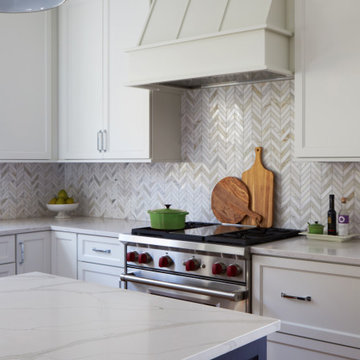
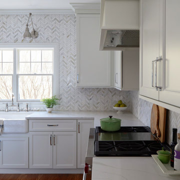
Like many families with older children, this local Glen Ellyn couple wanted to expand the size of their kitchen while also creating a more open, airy feel for their main level. The home had plenty of space that included a formal living room, formal dining room, family room with eat-in area and kitchen with butler’s pantry. What it didn’t have, was an effortless flow between the areas used daily for cooking, eating and gathering.
Additionally, the kitchen had become outdated, feeling dark and dismal, despite the abundance of natural light. Our clients wanted a bright, cheerful interior that would inspire the family to congregate in this part of the house. No easy feat with teenagers.
An open floor plan design solved the issues with functionality and circulation, removing the walls that restricted flow and opening up the entry to the dining room. We also eliminated the rarely used butler’s pantry allowing us to expand the kitchen and add a large island for food prep and gathering. To create a sense of symmetry and consistency in the space, a clerestory window was added below the header and framed to match the existing adjacent entry from the living room.
Inspired by the owner’s Scottish ancestry, the island cabinetry boasts a beautiful blue hue, paired with stools upholstered in a sprightly plaid. The built-in buffet area provides additional storage, topped with a beautiful wooden top stained to coordinate with the stunning tones of the flooring.
The owner’s opted for stainless steel appliances, inspiring the selection of brushed silver light fixtures and polished chrome hardware. Marble-look quartz offered a durable, lightly colored surface to reflect sunlight and enhance the cheer factor. According to this happy family, this uplifting space is now everyone’s favorite place to gather.
Designed by: Susan Klimala, CKBD
Photography by: Michael Kaskel
For more design inspiration go to: www.kitchenstudio-ge.com

 Schumacher Homes
Built by Schumacher Homes, America's Largest Custom Home Builder, this stunning Charleston American Tradition showcase home highlights premium custom home building in Akron, Ohio. Featuring a thoughtfully designed 2,400 square-foot floor plan, this layout offers 4 bedrooms and 2.5 bathrooms, perfectly balancing spacious open-concept living with private family areas. As one of our most popular and versatile home designs, the Charleston is celebrated for offering the latest in modern architectural design alongside clever, abundant storage solutions tailored for growing families.The heart of this custom home centers around a gourmet kitchen equipped with expansive counter space, a massive central kitchen island built for family gatherings, and a giant walk-in pantry that ensures everything has its place. Just off the main living area, a dedicated pocket office provides the perfect quiet space to organize household bills or work from home. This functional workspace transitions effortlessly into a luxurious owner's retreat, featuring an expansive master bedroom, two large walk-in closets, and a deluxe owner's bath complete with a custom tile shower. On the opposite side of the home, the additional bedrooms are intentionally zoned to give children or guests their own private, quiet spaces.The home’s unique interior and exterior architectural features elevate everyday living into a true luxury experience. Inside the open-concept great room, a dramatic double tray ceiling adds a unique, high-end design detail that emphasizes the height and airiness of the main living space. Extending your living area outdoors, a spacious rear covered porch offers a fantastic spot for seamless outdoor living, backyard dining, and weekend entertaining. From the elegant master suite to the welcoming layout, this Charleston American Tradition design is the ultimate reflection of quality Ohio craftsmanship and timeless style.
 StoneUnlimited Kitchen and Bath Remodeling
When deciding to either keep a tub and shower or take out the tub and expand the shower in the master bathroom is solely dependent on a homeowner's preference. Although having a tub in the master bathroom is still a desired feature for home buyer's, especially for those who have or are excepting children, there's no definitive proof that having a tub is going to guarantee a higher rate of return on the investment.
This chic and modern shower is easily accessible. The expanded room provides the ability to move around freely without constraint and makes showering more welcoming and relaxing. This shower is a great addition and can be highly beneficial in the future to any individuals who are elderly, wheelchair bound or have mobility impairments. Fixtures and furnishings such as the grab bar, a bench and hand shower also makes the shower more user friendly.
The decision to take out the tub and make the shower larger has visually transformed this master bathroom and created a spacious feel. The shower is a wonderful upgrade and has added value and style to our client's beautiful home.
Check out the before and after photographs as well as the video!
Here are some of the materials that were used for this transformation:
12x24 Porcelain Lara Dark Grey
6" Shower band of Keystone Interlocking Mosaic Tile
Delta fixtures throughout
Ranier Quartz vanity countertops


 Saikley Architects
Our busy Silicon Valley clients asked us to convert their tight-quartered 1960’s ranch house to a gracious family home that would meet their long term needs. Ease of living was paramount, both in functionality and in ordered design.
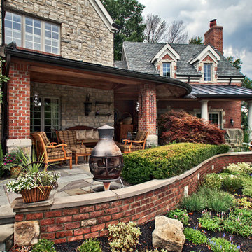
The project was completed on a moderate budget.While retaining most of the structure of the existing house to avoid costly structural changes, we opened walls to improve the sight lines and flow of the house and bring in more light. We made small additions at the front and back bedrooms to gain space for the family and relatives. An existing underused patio area was improved with a simple outdoor kitchen and overhang to extend the living space to the outside. Costs were kept down with choices of modest materials.
Everything was made to be functional. Ample storage has been built into the right places. The details of the kitchen were carefully worked out to accommodate all the wishes of the various cooks in the family. The house is set up to be easy to keep clean. Acoustic walls separate living from bedroom spaces so adults can enjoy time together while children sleep. The outdoor kitchen has easy access to the indoor kitchen and the garage, and its setup promotes socializing while cooking outdoors.
A large part of the narrow back yard was previously unusable space due to a steep slope up to a neighbor’s higher fence. With a new retaining wall and some re-grading we took back more of the yard for the patio and play space on a new lawn.
The remodeled house is a mix of contemporary and traditional elements. Cool colors have a calming effect. Traditional items such as prairie style windows, trellis, mosaic tiles, and Shaker style cabinets, break down the scale in an otherwise streamlined, contemporary design. A new gabled roof with a broad arch at the front of the house marks the entry and resolves a challenging form where the central entry is set back from walls on both sides.
Photography: Kurt Manley
https://saikleyarchitects.com/portfolio/modern-ranch/

 JRP Design & Remodel
Our client came to us with a desire to take an overgrown, neglected space and transform it into a clean contemporary backyard for the family to enjoy. Having had less than stellar experiences with other contractors, they wanted to find a trustworthy company; One that would complement their style and provide excellent communication. They saw a JRP banner at their son's baseball game at Westlake High School and decided to call. After meeting with the team, they knew JRP was the firm they needed to give their backyard a complete overhaul.
With a focus on sleek, clean lines, this contemporary backyard is captivating. The outdoor family room is a perfect blend of beauty, form, and function. JRP reworked the courtyard and dining area to create a space for the family to enjoy together. An outdoor pergola houses a media center and lounge. Restoration Hardware low profile furniture provides comfortable seating while maintaining a polished look. The adjacent barbecue is perfect for crafting up family dinners to enjoy amidst a Southern California sunset.
Before renovating, the landscaping was an unkempt mess that felt overwhelming. Synthetic grass and concrete decking was installed to give the backyard a fresh feel while offering easy maintenance. Gorgeous hardscaping takes the outdoor area to a whole new level. The resurfaced free-form pool joins to a lounge area that's perfect for soaking up the sun while watching the kids swim. Hedges and outdoor shrubs now maintain a clean, uniformed look.
A tucked-away area taken over by plants provided an opportunity to create an intimate outdoor dining space. JRP added wooden containers to accommodate touches of greenery that weren't overwhelming. Bold patterned statement flooring contrasts beautifully against a neutral palette. Additionally, our team incorporated a fireplace for a feel of coziness.
Once an overlooked space, the clients and their children are now eager to spend time outdoors together. This clean contemporary backyard renovation transformed what the client called "an overgrown jungle" into a space that allows for functional outdoor living and serene luxury.
Photographer: Andrew - OpenHouse VC
 User
For this vacation home, a complete gut job was needed in order to fit the lifestyle and needs of this young family of four and their guests. The narrow floor plan created unique challenges, but we maximized its full potential. The result was a warm but modern design with plenty of storage and seating.
One of the biggest challenges was making sure everyone had a place to sit in the kitchen. The space between the kitchen and staircase was limiting, but with sleek modern chairs that tuck away, we were able to allow for traffic patterns and seat all of the children.
To accommodate any vacation extras, an extra wide space near the kitchen and bathroom was transformed into additional shelving. We installed floor-to-ceiling cabinets that offer plenty of space for everyone’s belongings.
A clean design was a must, so we opted for a more modern look. We used Benjamin Moore's "Simply White" as the foundation, putting it on the walls and cabinets, and coordinating the countertops and backsplash. To make the home more welcoming, we used natural wood on the island and floating shelves. The wood was coordinated with the floor, creating a cohesive interior.
Project designed by Star Valley, Wyoming interior design firm Tawna Allred Interiors. They also serve Alpine, Auburn, Bedford, Etna, Freedom, Freedom, Grover, Thayne, Turnerville, Swan Valley, and Jackson Hole, Wyoming
 TKS Design Group
Typical of bungalows and city lots, the footprint of this home was narrow with living spaces in front, bedrooms in back and kitchen centrally located. However, unlike most bungalows, the hall running from front to back have been closed off to, presumably, accommodate a walk-in pantry. Couple that with the fact that this circa 1925 bungalow had seen a lot of living – read boisterous children and remodeling trends like z-brick, soffits, and fluorescent overhead lighting – the kitchen was due for a major overhaul.
Truly the hub of this house, the modest 11’ x 12’ kitchen was most in need of additional countertop space, convenient garbage/recycle bin, counter-depth refrigerator, storage aids, informal dining for two, and sound-proofing to enable this musically adept family to coexist despite varied schedules.
Gone are the wall soffits, boxy overhead lighting, six-foot baseboard heat unit, extra deep refrigerator, refurbished cabinets, laminate countertops, z-brick wall covering, and makeshift door swags. Enter rich mahogany cabinets, roll and pull-out storage units, endcap spice storage, gorgeous granite tops, marble backsplash, LED lighting, acoustic insulation and solid-wood doors.
Under the guise of such a handsome room, provisions such as a period style sink allow for more efficient use of corners with pull-out half-moon trays for storage. Redirecting the baseboard heat to a compact, toekick unit, means more cabinet and counter space – perfect for a baking and/or entertaining area removed from the basic work triangle. The eating area, also, doubles as a work station with drawers for office supplies and dedicated outlet for cable tv. Functional yet beautiful, this kitchen is at the ready as its owners look forward to their golden years.
Designed by: The Kitchen Studio of Glen Ellyn
Photography by: Dawn Jackman
For more information on kitchen and bath design ideas go to: www.kitchenstudio-ge.com
URL http://www.kitchenstudio-ge.com
Sponsored
Columbus, OH

Hope Restoration & General Contracting
Columbus Design-Build, Kitchen & Bath Remodeling, Historic Renovations
 Roeser Home Remodeling
Older homes are filled with charm, but often the kitchen has been overlooked. Originally, it was a work area– not made for public view. Today it truly is the center of all that goes on in the family. Today’s active homeowners are no different. Although their children may be grown, cooking and baking are still considered top priorities. Storage and counter space were issues that needed to be addressed and being aware of the aging process of the kitchen, lighting also needed to be considered. Although the kitchen is only a 13’ X 13’ space, it had other challenges. A back staircase, three doorways, and a large window took away from the wall space, however the 9’ ceilings were an unused potential for storage. Choosing Wellborn’s Select Series Cabinets in a Maple with a sandstone slate finish brightened the space immediately. Stacking the cabinets and taking them all the way to the ceiling gave this homeowner more storage than ever imagined for items of occasional use. Under counter LED Tape lighting brightened the task areas of the kitchen without causing additional heat from too many lights. A new table light on a dimmer sets the right mood for dining and provides just enough additional lighting. Installing a Sharp, stainless steel, 24” microwave drawer freed up some counter space for prep work near the cooktop (a GE, stainless steel 30” gas cooktop with four burners) and next to the sink (a new Elkay Gourmet Double Bowl with aqua DVD). Also, adding a new Kohler Sensate kitchen faucet which is hands free, a Kohler contemporary soap/lotion dispenser and a new ISE 3/4 horsepower disposal– helps to make clean-up a breeze. A new GE dishwasher, a new Broan stainless steel 30” hood, and a new GE 30” double oven both standard oven sizes, not only allows our homeowner to cook dinner and dessert, but the stainless steel reflects light while adding a design element tying the cabinet hardware and light fixture into the overall look. The countertop is Caesarstone’s Dreamy Marfil and is always a bold statement for any size Kitchen. Mixing the backsplash tile up without appearing busy came together with the beautiful combination of Sandlewood polished Amafi 30cm from countertops to base cabinets and Jinsen Coffee Bone in a diamond pattern framed in the Sandlewood polish and a Amafi Pencil liner above the cooktop. The soft addition of a new six panel Pine door stained and finished to match the other doors within the home added to the overall beauty of this stunning kitchen.
 User
This 7,500 square feet home, situated on a waterfront site in Sag Harbor, New York, was designed as a shared vacation home for four brothers and their families. A collaborative effort between the clients and Cecil Baker + Partners yielded a contemporary home that pays homage to the Eastern Long Island vernacular.
The home is composed of three distinct volumes that step back from one another to optimize both the water view and privacy. The two outer wings take on familiar cedar-clad, pitched roof geometry while the central three-story glass box links them together and anchors the home. The two car garage, with a private living space above, projects from the main house via a breezeway, defining a private garden.
The interior of the home integrates warm, tactile materials and clean modern lines. The use of full-height windows, floor-to-ceiling glass curtain wall, and an operable overhead glass door creates an indoor-outdoor living experience and floods the home with natural light. The subtle choreography of the interior space lends flexibility to the Client for both social and private uses of the home.
The first floor contains an open plan for the kitchen, living room, dining area and sunroom, and the second floor includes two full master suites facing the bay, a guest room with spectacular water views, and a children's room that overlooks the garden. The fully finished basement holds a large playroom, a gym, a full spa bath and a wine cellar. In addition, views in all directions are unobstructed from a third floor roof terrace.
Michael Grimm Photography

 Design Connection, Inc.
Attached to the kitchen area sits a small room where the children watched TV over a fireplace with 2 chairs facing in. Our clients did not like the old style of wood mantel and surround in golden oak. They also wanted more people to be able to converse in the small area.
Arlene Ladegaard principle designer of Design Connection, Inc. found a new solution to the problem without completely rebuilding the fireplace. Painting the wood white form the dated maple worked to bring this wood framed surround into this century. A new tile selection that worked well with the colors from the kitchen tied the two areas together.
After careful planning a sectional with a chaise was the perfect solution and a small ottoman for drinks helped delineate the space and add additional seating for four people to watch TV and gather.
Custom artwork was created to work with the colors and size of the wall space. A cabinet to house the TV equipment was the right solution for the wall space.
It all blends beautifully with the kitchen and Mom can see what the kids are doing while she prepares the family meals.
Design Connection, Inc. provided space plans, tile, painting, furniture, accessories, hard wood floors and installation of all materials and project management
161