
Search results for "Additional costs" in Home Design Ideas

 TVL Creative Ltd.
Our clients, two NYC transplants, were excited to have a large yard and ample square footage, but their 1959 ranch featured an en-suite bathroom that was more big-apple-tiny and certainly not fit for two. The original goal was to build a master suite addition on to the south side of the house, but the combination of contractor availability and Denver building costs made the project cost prohibitive. So we turned our attention to how we could maximize the existing square footage to create a true master with walk-in closet, soaking tub, commode room, and large vanity with lots of storage. The south side of the house was converted from two bedrooms, one with the small en-suite bathroom, to a master suite fit for our client’s lifestyle. We used the existing bathroom footprint to place a large shower which hidden niches, a window, and a built-in bench. The commode room took the place of the old shower. The original ‘master’ bedroom was divided in half to provide space for the walk-in closet and their new master bathroom. The clients have, what we dubbed, a classy eclectic aesthetic and we wanted to embrace that with the materials. The 3 x 12 ceramic tile is Fireclay’s Tidewater glaze. The soft variation of a handmade tile plus the herringbone pattern installation makes for a real show stopper. We chose a 3 x 6 marble subway with blue and green veining to compliment the feature tile. The chrome and oil-rubbed bronze metal mix was carefully planned based on where we wanted to add brightness and where we wanted contrast. Chrome was a no-brainer for the shower because we wanted to let the Fireclay tile shine. Over at the vanity, we wanted the fixtures to pop so we opted for oil-rubbed bronze. Final details include a series of robe hook- which is a real option with our dry climate in Colorado. No smelly, damp towels!- a magazine rack ladder and a few pops of wood for warmth and texture.
 TVL Creative Ltd.
Our clients, two NYC transplants, were excited to have a large yard and ample square footage, but their 1959 ranch featured an en-suite bathroom that was more big-apple-tiny and certainly not fit for two. The original goal was to build a master suite addition on to the south side of the house, but the combination of contractor availability and Denver building costs made the project cost prohibitive. So we turned our attention to how we could maximize the existing square footage to create a true master with walk-in closet, soaking tub, commode room, and large vanity with lots of storage. The south side of the house was converted from two bedrooms, one with the small en-suite bathroom, to a master suite fit for our client’s lifestyle. We used the existing bathroom footprint to place a large shower which hidden niches, a window, and a built-in bench. The commode room took the place of the old shower. The original ‘master’ bedroom was divided in half to provide space for the walk-in closet and their new master bathroom. The clients have, what we dubbed, a classy eclectic aesthetic and we wanted to embrace that with the materials. The 3 x 12 ceramic tile is Fireclay’s Tidewater glaze. The soft variation of a handmade tile plus the herringbone pattern installation makes for a real show stopper. We chose a 3 x 6 marble subway with blue and green veining to compliment the feature tile. The chrome and oil-rubbed bronze metal mix was carefully planned based on where we wanted to add brightness and where we wanted contrast. Chrome was a no-brainer for the shower because we wanted to let the Fireclay tile shine. Over at the vanity, we wanted the fixtures to pop so we opted for oil-rubbed bronze. Final details include a series of robe hook- which is a real option with our dry climate in Colorado. No smelly, damp towels!- a magazine rack ladder and a few pops of wood for warmth and texture.
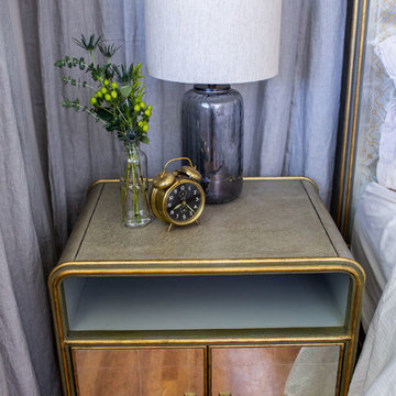 TVL Creative Ltd.
Our clients, two NYC transplants, were excited to have a large yard and ample square footage, but their 1959 ranch featured an en-suite bathroom that was more big-apple-tiny and certainly not fit for two. The original goal was to build a master suite addition on to the south side of the house, but the combination of contractor availability and Denver building costs made the project cost prohibitive. So we turned our attention to how we could maximize the existing square footage to create a true master with walk-in closet, soaking tub, commode room, and large vanity with lots of storage. The south side of the house was converted from two bedrooms, one with the small en-suite bathroom, to a master suite fit for our client’s lifestyle. We used the existing bathroom footprint to place a large shower which hidden niches, a window, and a built-in bench. The commode room took the place of the old shower. The original ‘master’ bedroom was divided in half to provide space for the walk-in closet and their new master bathroom. The clients have, what we dubbed, a classy eclectic aesthetic and we wanted to embrace that with the materials. The 3 x 12 ceramic tile is Fireclay’s Tidewater glaze. The soft variation of a handmade tile plus the herringbone pattern installation makes for a real show stopper. We chose a 3 x 6 marble subway with blue and green veining to compliment the feature tile. The chrome and oil-rubbed bronze metal mix was carefully planned based on where we wanted to add brightness and where we wanted contrast. Chrome was a no-brainer for the shower because we wanted to let the Fireclay tile shine. Over at the vanity, we wanted the fixtures to pop so we opted for oil-rubbed bronze. Final details include a series of robe hook- which is a real option with our dry climate in Colorado. No smelly, damp towels!- a magazine rack ladder and a few pops of wood for warmth and texture.
Find the right local pro for your project
 TVL Creative Ltd.
Our clients, two NYC transplants, were excited to have a large yard and ample square footage, but their 1959 ranch featured an en-suite bathroom that was more big-apple-tiny and certainly not fit for two. The original goal was to build a master suite addition on to the south side of the house, but the combination of contractor availability and Denver building costs made the project cost prohibitive. So we turned our attention to how we could maximize the existing square footage to create a true master with walk-in closet, soaking tub, commode room, and large vanity with lots of storage. The south side of the house was converted from two bedrooms, one with the small en-suite bathroom, to a master suite fit for our client’s lifestyle. We used the existing bathroom footprint to place a large shower which hidden niches, a window, and a built-in bench. The commode room took the place of the old shower. The original ‘master’ bedroom was divided in half to provide space for the walk-in closet and their new master bathroom. The clients have, what we dubbed, a classy eclectic aesthetic and we wanted to embrace that with the materials. The 3 x 12 ceramic tile is Fireclay’s Tidewater glaze. The soft variation of a handmade tile plus the herringbone pattern installation makes for a real show stopper. We chose a 3 x 6 marble subway with blue and green veining to compliment the feature tile. The chrome and oil-rubbed bronze metal mix was carefully planned based on where we wanted to add brightness and where we wanted contrast. Chrome was a no-brainer for the shower because we wanted to let the Fireclay tile shine. Over at the vanity, we wanted the fixtures to pop so we opted for oil-rubbed bronze. Final details include a series of robe hook- which is a real option with our dry climate in Colorado. No smelly, damp towels!- a magazine rack ladder and a few pops of wood for warmth and texture.
 KURV Architecture DPC (Alex Hughes Architects)
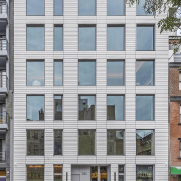
Located in the heart of Manhattan’s Lower East Side, the building was erected on a shallow commercial lot between two 120 year old masonry buildings and a new residential rental building. 330 Grand Street is a mix of 725 SF 1BRs and 1050 SF 2BR apartments. It also contains a 1100 SF two story duplex as well as private and public rooftop space, large private balconies for most units and two large private terraces for the ground floor units.
330 Grand Street was originally designed and approved at the NYC DOB as a prefabricated modular building. During the pandemic, as shipping costs skyrocketed putting the project at risk, we suggested redesigning the building as a reinforced cast-in-place concrete structure. Concrete was readily available and prices had not been affected by the demand increase that many other materials suffered in the pandemic. We took this opportunity to raise floor to ceiling heights, enlarge high performance windows and redistribute the buildings MEPFS and Structural Systems to create very open floor plans.
The challenge was to create a luxurious sensorial living experience with very limited means. In a city with very high construction costs, low cost residential buildings in the area are usually devoid of good quality, design and character. Our approach was to aim high for the end user, prioritizing natural light, open space with long visual perspectives, high ceilings and as always, rejecting the use of predefined building templates.
Our biggest challenge was to ensure that the small spaces feel as clean cut, large and bright as possible. Several unique design decisions were made to ensure low cost and high quality;
Floor plans were laid out so that spaces were wide open and free of clutter from mechanical or structural interruptions. Therefore all infrastructure was placed in lateral demising walls, which in turn act as the unit’s storage and kitchen. The apartments feel wide open, are super quiet and have more storage space than any other comparable apartment in the city.
To solve the problem of the site’s shallow commercial lot which is typically prone to dark interior spaces we focused our attention on the building’s envelope. Instead of the usual small punched window openings, oversized high performance windows were designed to ensure that light penetrated as far as possible into the units. In the smaller 1BR units, the full 50’ depth of the lot is perceived by partitioning spaces with sliding pocket doors that can be retracted to allow deep visual perspectives, making the sight lines in the space feel longer, larger, more ample than normal. In addition to the full height glazing, each unit above the 2nd floor receives a 7 foot covered balcony, adding 120 to 240 sf to each apartment, something unusual in New York City buildings. The space is large enough for a full size dining table, when the weather permits being outside.
We also worked hard to ensure modularity. For example, all kitchen units are all identical throughout the building. The idea of modularity and the economy of the repetitive unit is exercised to the maximum through the building.
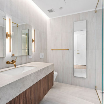
Hardware, appliances, flooring, wall coverings and material finishes are all carefully selected to feel bespoke, high quality and unique.
It was important to KURV that the result of this work manifest into something that would deeply connect with the end user and sustain relationships with the consumers of this space.
All images by KURV Architecture ©
 KURV Architecture DPC (Alex Hughes Architects)
Located in the heart of Manhattan’s Lower East Side, the building was erected on a shallow commercial lot between two 120 year old masonry buildings and a new residential rental building. 330 Grand Street is a mix of 725 SF 1BRs and 1050 SF 2BR apartments. It also contains a 1100 SF two story duplex as well as private and public rooftop space, large private balconies for most units and two large private terraces for the ground floor units.
330 Grand Street was originally designed and approved at the NYC DOB as a prefabricated modular building. During the pandemic, as shipping costs skyrocketed putting the project at risk, we suggested redesigning the building as a reinforced cast-in-place concrete structure. Concrete was readily available and prices had not been affected by the demand increase that many other materials suffered in the pandemic. We took this opportunity to raise floor to ceiling heights, enlarge high performance windows and redistribute the buildings MEPFS and Structural Systems to create very open floor plans.
The challenge was to create a luxurious sensorial living experience with very limited means. In a city with very high construction costs, low cost residential buildings in the area are usually devoid of good quality, design and character. Our approach was to aim high for the end user, prioritizing natural light, open space with long visual perspectives, high ceilings and as always, rejecting the use of predefined building templates.
Our biggest challenge was to ensure that the small spaces feel as clean cut, large and bright as possible. Several unique design decisions were made to ensure low cost and high quality;
Floor plans were laid out so that spaces were wide open and free of clutter from mechanical or structural interruptions. Therefore all infrastructure was placed in lateral demising walls, which in turn act as the unit’s storage and kitchen. The apartments feel wide open, are super quiet and have more storage space than any other comparable apartment in the city.
To solve the problem of the site’s shallow commercial lot which is typically prone to dark interior spaces we focused our attention on the building’s envelope. Instead of the usual small punched window openings, oversized high performance windows were designed to ensure that light penetrated as far as possible into the units. In the smaller 1BR units, the full 50’ depth of the lot is perceived by partitioning spaces with sliding pocket doors that can be retracted to allow deep visual perspectives, making the sight lines in the space feel longer, larger, more ample than normal. In addition to the full height glazing, each unit above the 2nd floor receives a 7 foot covered balcony, adding 120 to 240 sf to each apartment, something unusual in New York City buildings. The space is large enough for a full size dining table, when the weather permits being outside.
We also worked hard to ensure modularity. For example, all kitchen units are all identical throughout the building. The idea of modularity and the economy of the repetitive unit is exercised to the maximum through the building.
Hardware, appliances, flooring, wall coverings and material finishes are all carefully selected to feel bespoke, high quality and unique.
It was important to KURV that the result of this work manifest into something that would deeply connect with the end user and sustain relationships with the consumers of this space.
All images by KURV Architecture ©
 TVL Creative Ltd.
Our clients, two NYC transplants, were excited to have a large yard and ample square footage, but their 1959 ranch featured an en-suite bathroom that was more big-apple-tiny and certainly not fit for two. The original goal was to build a master suite addition on to the south side of the house, but the combination of contractor availability and Denver building costs made the project cost prohibitive. So we turned our attention to how we could maximize the existing square footage to create a true master with walk-in closet, soaking tub, commode room, and large vanity with lots of storage. The south side of the house was converted from two bedrooms, one with the small en-suite bathroom, to a master suite fit for our client’s lifestyle. We used the existing bathroom footprint to place a large shower which hidden niches, a window, and a built-in bench. The commode room took the place of the old shower. The original ‘master’ bedroom was divided in half to provide space for the walk-in closet and their new master bathroom. The clients have, what we dubbed, a classy eclectic aesthetic and we wanted to embrace that with the materials. The 3 x 12 ceramic tile is Fireclay’s Tidewater glaze. The soft variation of a handmade tile plus the herringbone pattern installation makes for a real show stopper. We chose a 3 x 6 marble subway with blue and green veining to compliment the feature tile. The chrome and oil-rubbed bronze metal mix was carefully planned based on where we wanted to add brightness and where we wanted contrast. Chrome was a no-brainer for the shower because we wanted to let the Fireclay tile shine. Over at the vanity, we wanted the fixtures to pop so we opted for oil-rubbed bronze. Final details include a series of robe hook- which is a real option with our dry climate in Colorado. No smelly, damp towels!- a magazine rack ladder and a few pops of wood for warmth and texture.
Sponsored
Columbus, OH

Structural Remodeling
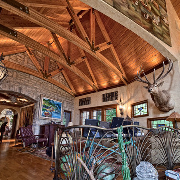
Franklin County's Heavy Timber Specialists | Best of Houzz 2020!
 TVL Creative Ltd.
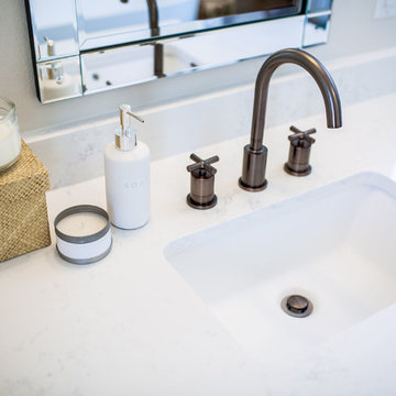
Our clients, two NYC transplants, were excited to have a large yard and ample square footage, but their 1959 ranch featured an en-suite bathroom that was more big-apple-tiny and certainly not fit for two. The original goal was to build a master suite addition on to the south side of the house, but the combination of contractor availability and Denver building costs made the project cost prohibitive. So we turned our attention to how we could maximize the existing square footage to create a true master with walk-in closet, soaking tub, commode room, and large vanity with lots of storage. The south side of the house was converted from two bedrooms, one with the small en-suite bathroom, to a master suite fit for our client’s lifestyle. We used the existing bathroom footprint to place a large shower which hidden niches, a window, and a built-in bench. The commode room took the place of the old shower. The original ‘master’ bedroom was divided in half to provide space for the walk-in closet and their new master bathroom. The clients have, what we dubbed, a classy eclectic aesthetic and we wanted to embrace that with the materials. The 3 x 12 ceramic tile is Fireclay’s Tidewater glaze. The soft variation of a handmade tile plus the herringbone pattern installation makes for a real show stopper. We chose a 3 x 6 marble subway with blue and green veining to compliment the feature tile. The chrome and oil-rubbed bronze metal mix was carefully planned based on where we wanted to add brightness and where we wanted contrast. Chrome was a no-brainer for the shower because we wanted to let the Fireclay tile shine. Over at the vanity, we wanted the fixtures to pop so we opted for oil-rubbed bronze. Final details include a series of robe hook- which is a real option with our dry climate in Colorado. No smelly, damp towels!- a magazine rack ladder and a few pops of wood for warmth and texture.
 TVL Creative Ltd.
Our clients, two NYC transplants, were excited to have a large yard and ample square footage, but their 1959 ranch featured an en-suite bathroom that was more big-apple-tiny and certainly not fit for two. The original goal was to build a master suite addition on to the south side of the house, but the combination of contractor availability and Denver building costs made the project cost prohibitive. So we turned our attention to how we could maximize the existing square footage to create a true master with walk-in closet, soaking tub, commode room, and large vanity with lots of storage. The south side of the house was converted from two bedrooms, one with the small en-suite bathroom, to a master suite fit for our client’s lifestyle. We used the existing bathroom footprint to place a large shower which hidden niches, a window, and a built-in bench. The commode room took the place of the old shower. The original ‘master’ bedroom was divided in half to provide space for the walk-in closet and their new master bathroom. The clients have, what we dubbed, a classy eclectic aesthetic and we wanted to embrace that with the materials. The 3 x 12 ceramic tile is Fireclay’s Tidewater glaze. The soft variation of a handmade tile plus the herringbone pattern installation makes for a real show stopper. We chose a 3 x 6 marble subway with blue and green veining to compliment the feature tile. The chrome and oil-rubbed bronze metal mix was carefully planned based on where we wanted to add brightness and where we wanted contrast. Chrome was a no-brainer for the shower because we wanted to let the Fireclay tile shine. Over at the vanity, we wanted the fixtures to pop so we opted for oil-rubbed bronze. Final details include a series of robe hook- which is a real option with our dry climate in Colorado. No smelly, damp towels!- a magazine rack ladder and a few pops of wood for warmth and texture.
 TVL Creative Ltd.
Our clients, two NYC transplants, were excited to have a large yard and ample square footage, but their 1959 ranch featured an en-suite bathroom that was more big-apple-tiny and certainly not fit for two. The original goal was to build a master suite addition on to the south side of the house, but the combination of contractor availability and Denver building costs made the project cost prohibitive. So we turned our attention to how we could maximize the existing square footage to create a true master with walk-in closet, soaking tub, commode room, and large vanity with lots of storage. The south side of the house was converted from two bedrooms, one with the small en-suite bathroom, to a master suite fit for our client’s lifestyle. We used the existing bathroom footprint to place a large shower which hidden niches, a window, and a built-in bench. The commode room took the place of the old shower. The original ‘master’ bedroom was divided in half to provide space for the walk-in closet and their new master bathroom. The clients have, what we dubbed, a classy eclectic aesthetic and we wanted to embrace that with the materials. The 3 x 12 ceramic tile is Fireclay’s Tidewater glaze. The soft variation of a handmade tile plus the herringbone pattern installation makes for a real show stopper. We chose a 3 x 6 marble subway with blue and green veining to compliment the feature tile. The chrome and oil-rubbed bronze metal mix was carefully planned based on where we wanted to add brightness and where we wanted contrast. Chrome was a no-brainer for the shower because we wanted to let the Fireclay tile shine. Over at the vanity, we wanted the fixtures to pop so we opted for oil-rubbed bronze. Final details include a series of robe hook- which is a real option with our dry climate in Colorado. No smelly, damp towels!- a magazine rack ladder and a few pops of wood for warmth and texture.
 TVL Creative Ltd.
Our clients, two NYC transplants, were excited to have a large yard and ample square footage, but their 1959 ranch featured an en-suite bathroom that was more big-apple-tiny and certainly not fit for two. The original goal was to build a master suite addition on to the south side of the house, but the combination of contractor availability and Denver building costs made the project cost prohibitive. So we turned our attention to how we could maximize the existing square footage to create a true master with walk-in closet, soaking tub, commode room, and large vanity with lots of storage. The south side of the house was converted from two bedrooms, one with the small en-suite bathroom, to a master suite fit for our client’s lifestyle. We used the existing bathroom footprint to place a large shower which hidden niches, a window, and a built-in bench. The commode room took the place of the old shower. The original ‘master’ bedroom was divided in half to provide space for the walk-in closet and their new master bathroom. The clients have, what we dubbed, a classy eclectic aesthetic and we wanted to embrace that with the materials. The 3 x 12 ceramic tile is Fireclay’s Tidewater glaze. The soft variation of a handmade tile plus the herringbone pattern installation makes for a real show stopper. We chose a 3 x 6 marble subway with blue and green veining to compliment the feature tile. The chrome and oil-rubbed bronze metal mix was carefully planned based on where we wanted to add brightness and where we wanted contrast. Chrome was a no-brainer for the shower because we wanted to let the Fireclay tile shine. Over at the vanity, we wanted the fixtures to pop so we opted for oil-rubbed bronze. Final details include a series of robe hook- which is a real option with our dry climate in Colorado. No smelly, damp towels!- a magazine rack ladder and a few pops of wood for warmth and texture.
 TVL Creative Ltd.
Our clients, two NYC transplants, were excited to have a large yard and ample square footage, but their 1959 ranch featured an en-suite bathroom that was more big-apple-tiny and certainly not fit for two. The original goal was to build a master suite addition on to the south side of the house, but the combination of contractor availability and Denver building costs made the project cost prohibitive. So we turned our attention to how we could maximize the existing square footage to create a true master with walk-in closet, soaking tub, commode room, and large vanity with lots of storage. The south side of the house was converted from two bedrooms, one with the small en-suite bathroom, to a master suite fit for our client’s lifestyle. We used the existing bathroom footprint to place a large shower which hidden niches, a window, and a built-in bench. The commode room took the place of the old shower. The original ‘master’ bedroom was divided in half to provide space for the walk-in closet and their new master bathroom. The clients have, what we dubbed, a classy eclectic aesthetic and we wanted to embrace that with the materials. The 3 x 12 ceramic tile is Fireclay’s Tidewater glaze. The soft variation of a handmade tile plus the herringbone pattern installation makes for a real show stopper. We chose a 3 x 6 marble subway with blue and green veining to compliment the feature tile. The chrome and oil-rubbed bronze metal mix was carefully planned based on where we wanted to add brightness and where we wanted contrast. Chrome was a no-brainer for the shower because we wanted to let the Fireclay tile shine. Over at the vanity, we wanted the fixtures to pop so we opted for oil-rubbed bronze. Final details include a series of robe hook- which is a real option with our dry climate in Colorado. No smelly, damp towels!- a magazine rack ladder and a few pops of wood for warmth and texture.
 TVL Creative Ltd.
Our clients, two NYC transplants, were excited to have a large yard and ample square footage, but their 1959 ranch featured an en-suite bathroom that was more big-apple-tiny and certainly not fit for two. The original goal was to build a master suite addition on to the south side of the house, but the combination of contractor availability and Denver building costs made the project cost prohibitive. So we turned our attention to how we could maximize the existing square footage to create a true master with walk-in closet, soaking tub, commode room, and large vanity with lots of storage. The south side of the house was converted from two bedrooms, one with the small en-suite bathroom, to a master suite fit for our client’s lifestyle. We used the existing bathroom footprint to place a large shower which hidden niches, a window, and a built-in bench. The commode room took the place of the old shower. The original ‘master’ bedroom was divided in half to provide space for the walk-in closet and their new master bathroom. The clients have, what we dubbed, a classy eclectic aesthetic and we wanted to embrace that with the materials. The 3 x 12 ceramic tile is Fireclay’s Tidewater glaze. The soft variation of a handmade tile plus the herringbone pattern installation makes for a real show stopper. We chose a 3 x 6 marble subway with blue and green veining to compliment the feature tile. The chrome and oil-rubbed bronze metal mix was carefully planned based on where we wanted to add brightness and where we wanted contrast. Chrome was a no-brainer for the shower because we wanted to let the Fireclay tile shine. Over at the vanity, we wanted the fixtures to pop so we opted for oil-rubbed bronze. Final details include a series of robe hook- which is a real option with our dry climate in Colorado. No smelly, damp towels!- a magazine rack ladder and a few pops of wood for warmth and texture.
Sponsored
Columbus, OH
Structural Remodeling
Franklin County's Heavy Timber Specialists | Best of Houzz 2020!

 Visbeen Architects
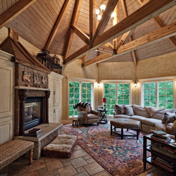
Inspired by the surrounding landscape, the Craftsman/Prairie style is one of the few truly American architectural styles. It was developed around the turn of the century by a group of Midwestern architects and continues to be among the most comfortable of all American-designed architecture more than a century later, one of the main reasons it continues to attract architects and homeowners today. Oxbridge builds on that solid reputation, drawing from Craftsman/Prairie and classic Farmhouse styles. Its handsome Shingle-clad exterior includes interesting pitched rooflines, alternating rows of cedar shake siding, stone accents in the foundation and chimney and distinctive decorative brackets. Repeating triple windows add interest to the exterior while keeping interior spaces open and bright. Inside, the floor plan is equally impressive. Columns on the porch and a custom entry door with sidelights and decorative glass leads into a spacious 2,900-square-foot main floor, including a 19 by 24-foot living room with a period-inspired built-ins and a natural fireplace. While inspired by the past, the home lives for the present, with open rooms and plenty of storage throughout. Also included is a 27-foot-wide family-style kitchen with a large island and eat-in dining and a nearby dining room with a beadboard ceiling that leads out onto a relaxing 240-square-foot screen porch that takes full advantage of the nearby outdoors and a private 16 by 20-foot master suite with a sloped ceiling and relaxing personal sitting area. The first floor also includes a large walk-in closet, a home management area and pantry to help you stay organized and a first-floor laundry area. Upstairs, another 1,500 square feet awaits, with a built-ins and a window seat at the top of the stairs that nod to the home’s historic inspiration. Opt for three family bedrooms or use one of the three as a yoga room; the upper level also includes attic access, which offers another 500 square feet, perfect for crafts or a playroom. More space awaits in the lower level, where another 1,500 square feet (and an additional 1,000) include a recreation/family room with nine-foot ceilings, a wine cellar and home office.
Photographer: Jeff Garland
 KURV Architecture DPC (Alex Hughes Architects)
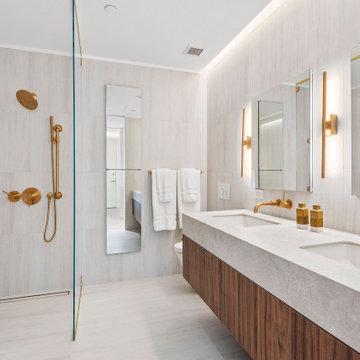
Located in the heart of Manhattan’s Lower East Side, the building was erected on a shallow commercial lot between two 120 year old masonry buildings and a new residential rental building. 330 Grand Street is a mix of 725 SF 1BRs and 1050 SF 2BR apartments. It also contains a 1100 SF two story duplex as well as private and public rooftop space, large private balconies for most units and two large private terraces for the ground floor units.
330 Grand Street was originally designed and approved at the NYC DOB as a prefabricated modular building. During the pandemic, as shipping costs skyrocketed putting the project at risk, we suggested redesigning the building as a reinforced cast-in-place concrete structure. Concrete was readily available and prices had not been affected by the demand increase that many other materials suffered in the pandemic. We took this opportunity to raise floor to ceiling heights, enlarge high performance windows and redistribute the buildings MEPFS and Structural Systems to create very open floor plans.
The challenge was to create a luxurious sensorial living experience with very limited means. In a city with very high construction costs, low cost residential buildings in the area are usually devoid of good quality, design and character. Our approach was to aim high for the end user, prioritizing natural light, open space with long visual perspectives, high ceilings and as always, rejecting the use of predefined building templates.
Our biggest challenge was to ensure that the small spaces feel as clean cut, large and bright as possible. Several unique design decisions were made to ensure low cost and high quality;
Floor plans were laid out so that spaces were wide open and free of clutter from mechanical or structural interruptions. Therefore all infrastructure was placed in lateral demising walls, which in turn act as the unit’s storage and kitchen. The apartments feel wide open, are super quiet and have more storage space than any other comparable apartment in the city.
To solve the problem of the site’s shallow commercial lot which is typically prone to dark interior spaces we focused our attention on the building’s envelope. Instead of the usual small punched window openings, oversized high performance windows were designed to ensure that light penetrated as far as possible into the units. In the smaller 1BR units, the full 50’ depth of the lot is perceived by partitioning spaces with sliding pocket doors that can be retracted to allow deep visual perspectives, making the sight lines in the space feel longer, larger, more ample than normal. In addition to the full height glazing, each unit above the 2nd floor receives a 7 foot covered balcony, adding 120 to 240 sf to each apartment, something unusual in New York City buildings. The space is large enough for a full size dining table, when the weather permits being outside.
We also worked hard to ensure modularity. For example, all kitchen units are all identical throughout the building. The idea of modularity and the economy of the repetitive unit is exercised to the maximum through the building.
Hardware, appliances, flooring, wall coverings and material finishes are all carefully selected to feel bespoke, high quality and unique.
It was important to KURV that the result of this work manifest into something that would deeply connect with the end user and sustain relationships with the consumers of this space.
All images by KURV Architecture ©
 KURV Architecture DPC (Alex Hughes Architects)
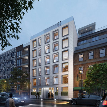
Located in the heart of Manhattan’s Lower East Side, the building was erected on a shallow commercial lot between two 120 year old masonry buildings and a new residential rental building. 330 Grand Street is a mix of 725 SF 1BRs and 1050 SF 2BR apartments. It also contains a 1100 SF two story duplex as well as private and public rooftop space, large private balconies for most units and two large private terraces for the ground floor units.
330 Grand Street was originally designed and approved at the NYC DOB as a prefabricated modular building. During the pandemic, as shipping costs skyrocketed putting the project at risk, we suggested redesigning the building as a reinforced cast-in-place concrete structure. Concrete was readily available and prices had not been affected by the demand increase that many other materials suffered in the pandemic. We took this opportunity to raise floor to ceiling heights, enlarge high performance windows and redistribute the buildings MEPFS and Structural Systems to create very open floor plans.
The challenge was to create a luxurious sensorial living experience with very limited means. In a city with very high construction costs, low cost residential buildings in the area are usually devoid of good quality, design and character. Our approach was to aim high for the end user, prioritizing natural light, open space with long visual perspectives, high ceilings and as always, rejecting the use of predefined building templates.
Our biggest challenge was to ensure that the small spaces feel as clean cut, large and bright as possible. Several unique design decisions were made to ensure low cost and high quality;
Floor plans were laid out so that spaces were wide open and free of clutter from mechanical or structural interruptions. Therefore all infrastructure was placed in lateral demising walls, which in turn act as the unit’s storage and kitchen. The apartments feel wide open, are super quiet and have more storage space than any other comparable apartment in the city.
To solve the problem of the site’s shallow commercial lot which is typically prone to dark interior spaces we focused our attention on the building’s envelope. Instead of the usual small punched window openings, oversized high performance windows were designed to ensure that light penetrated as far as possible into the units. In the smaller 1BR units, the full 50’ depth of the lot is perceived by partitioning spaces with sliding pocket doors that can be retracted to allow deep visual perspectives, making the sight lines in the space feel longer, larger, more ample than normal. In addition to the full height glazing, each unit above the 2nd floor receives a 7 foot covered balcony, adding 120 to 240 sf to each apartment, something unusual in New York City buildings. The space is large enough for a full size dining table, when the weather permits being outside.
We also worked hard to ensure modularity. For example, all kitchen units are all identical throughout the building. The idea of modularity and the economy of the repetitive unit is exercised to the maximum through the building.
Hardware, appliances, flooring, wall coverings and material finishes are all carefully selected to feel bespoke, high quality and unique.
It was important to KURV that the result of this work manifest into something that would deeply connect with the end user and sustain relationships with the consumers of this space.
All images by KURV Architecture ©
 KURV Architecture DPC (Alex Hughes Architects)
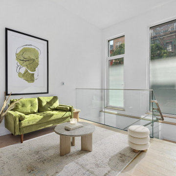
Located in the heart of Manhattan’s Lower East Side, the building was erected on a shallow commercial lot between two 120 year old masonry buildings and a new residential rental building. 330 Grand Street is a mix of 725 SF 1BRs and 1050 SF 2BR apartments. It also contains a 1100 SF two story duplex as well as private and public rooftop space, large private balconies for most units and two large private terraces for the ground floor units.
330 Grand Street was originally designed and approved at the NYC DOB as a prefabricated modular building. During the pandemic, as shipping costs skyrocketed putting the project at risk, we suggested redesigning the building as a reinforced cast-in-place concrete structure. Concrete was readily available and prices had not been affected by the demand increase that many other materials suffered in the pandemic. We took this opportunity to raise floor to ceiling heights, enlarge high performance windows and redistribute the buildings MEPFS and Structural Systems to create very open floor plans.
The challenge was to create a luxurious sensorial living experience with very limited means. In a city with very high construction costs, low cost residential buildings in the area are usually devoid of good quality, design and character. Our approach was to aim high for the end user, prioritizing natural light, open space with long visual perspectives, high ceilings and as always, rejecting the use of predefined building templates.
Our biggest challenge was to ensure that the small spaces feel as clean cut, large and bright as possible. Several unique design decisions were made to ensure low cost and high quality;
Floor plans were laid out so that spaces were wide open and free of clutter from mechanical or structural interruptions. Therefore all infrastructure was placed in lateral demising walls, which in turn act as the unit’s storage and kitchen. The apartments feel wide open, are super quiet and have more storage space than any other comparable apartment in the city.
To solve the problem of the site’s shallow commercial lot which is typically prone to dark interior spaces we focused our attention on the building’s envelope. Instead of the usual small punched window openings, oversized high performance windows were designed to ensure that light penetrated as far as possible into the units. In the smaller 1BR units, the full 50’ depth of the lot is perceived by partitioning spaces with sliding pocket doors that can be retracted to allow deep visual perspectives, making the sight lines in the space feel longer, larger, more ample than normal. In addition to the full height glazing, each unit above the 2nd floor receives a 7 foot covered balcony, adding 120 to 240 sf to each apartment, something unusual in New York City buildings. The space is large enough for a full size dining table, when the weather permits being outside.
We also worked hard to ensure modularity. For example, all kitchen units are all identical throughout the building. The idea of modularity and the economy of the repetitive unit is exercised to the maximum through the building.
Hardware, appliances, flooring, wall coverings and material finishes are all carefully selected to feel bespoke, high quality and unique.
It was important to KURV that the result of this work manifest into something that would deeply connect with the end user and sustain relationships with the consumers of this space.
All images by KURV Architecture ©
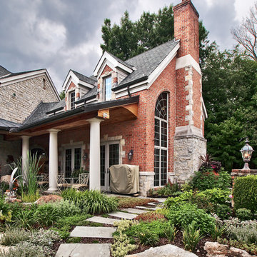
Sponsored
Columbus, OH
Structural Remodeling
Franklin County's Heavy Timber Specialists | Best of Houzz 2020!
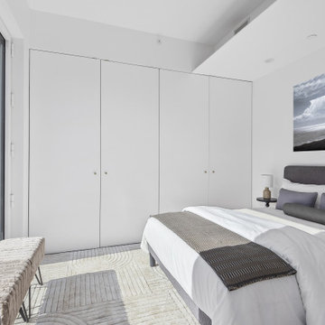 KURV Architecture DPC (Alex Hughes Architects)
Located in the heart of Manhattan’s Lower East Side, the building was erected on a shallow commercial lot between two 120 year old masonry buildings and a new residential rental building. 330 Grand Street is a mix of 725 SF 1BRs and 1050 SF 2BR apartments. It also contains a 1100 SF two story duplex as well as private and public rooftop space, large private balconies for most units and two large private terraces for the ground floor units.
330 Grand Street was originally designed and approved at the NYC DOB as a prefabricated modular building. During the pandemic, as shipping costs skyrocketed putting the project at risk, we suggested redesigning the building as a reinforced cast-in-place concrete structure. Concrete was readily available and prices had not been affected by the demand increase that many other materials suffered in the pandemic. We took this opportunity to raise floor to ceiling heights, enlarge high performance windows and redistribute the buildings MEPFS and Structural Systems to create very open floor plans.
The challenge was to create a luxurious sensorial living experience with very limited means. In a city with very high construction costs, low cost residential buildings in the area are usually devoid of good quality, design and character. Our approach was to aim high for the end user, prioritizing natural light, open space with long visual perspectives, high ceilings and as always, rejecting the use of predefined building templates.
Our biggest challenge was to ensure that the small spaces feel as clean cut, large and bright as possible. Several unique design decisions were made to ensure low cost and high quality;
Floor plans were laid out so that spaces were wide open and free of clutter from mechanical or structural interruptions. Therefore all infrastructure was placed in lateral demising walls, which in turn act as the unit’s storage and kitchen. The apartments feel wide open, are super quiet and have more storage space than any other comparable apartment in the city.
To solve the problem of the site’s shallow commercial lot which is typically prone to dark interior spaces we focused our attention on the building’s envelope. Instead of the usual small punched window openings, oversized high performance windows were designed to ensure that light penetrated as far as possible into the units. In the smaller 1BR units, the full 50’ depth of the lot is perceived by partitioning spaces with sliding pocket doors that can be retracted to allow deep visual perspectives, making the sight lines in the space feel longer, larger, more ample than normal. In addition to the full height glazing, each unit above the 2nd floor receives a 7 foot covered balcony, adding 120 to 240 sf to each apartment, something unusual in New York City buildings. The space is large enough for a full size dining table, when the weather permits being outside.
We also worked hard to ensure modularity. For example, all kitchen units are all identical throughout the building. The idea of modularity and the economy of the repetitive unit is exercised to the maximum through the building.
Hardware, appliances, flooring, wall coverings and material finishes are all carefully selected to feel bespoke, high quality and unique.
It was important to KURV that the result of this work manifest into something that would deeply connect with the end user and sustain relationships with the consumers of this space.
All images by KURV Architecture ©
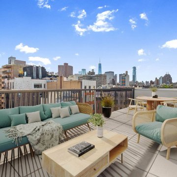 KURV Architecture DPC (Alex Hughes Architects)
Located in the heart of Manhattan’s Lower East Side, the building was erected on a shallow commercial lot between two 120 year old masonry buildings and a new residential rental building. 330 Grand Street is a mix of 725 SF 1BRs and 1050 SF 2BR apartments. It also contains a 1100 SF two story duplex as well as private and public rooftop space, large private balconies for most units and two large private terraces for the ground floor units.
330 Grand Street was originally designed and approved at the NYC DOB as a prefabricated modular building. During the pandemic, as shipping costs skyrocketed putting the project at risk, we suggested redesigning the building as a reinforced cast-in-place concrete structure. Concrete was readily available and prices had not been affected by the demand increase that many other materials suffered in the pandemic. We took this opportunity to raise floor to ceiling heights, enlarge high performance windows and redistribute the buildings MEPFS and Structural Systems to create very open floor plans.
The challenge was to create a luxurious sensorial living experience with very limited means. In a city with very high construction costs, low cost residential buildings in the area are usually devoid of good quality, design and character. Our approach was to aim high for the end user, prioritizing natural light, open space with long visual perspectives, high ceilings and as always, rejecting the use of predefined building templates.
Our biggest challenge was to ensure that the small spaces feel as clean cut, large and bright as possible. Several unique design decisions were made to ensure low cost and high quality;
Floor plans were laid out so that spaces were wide open and free of clutter from mechanical or structural interruptions. Therefore all infrastructure was placed in lateral demising walls, which in turn act as the unit’s storage and kitchen. The apartments feel wide open, are super quiet and have more storage space than any other comparable apartment in the city.
To solve the problem of the site’s shallow commercial lot which is typically prone to dark interior spaces we focused our attention on the building’s envelope. Instead of the usual small punched window openings, oversized high performance windows were designed to ensure that light penetrated as far as possible into the units. In the smaller 1BR units, the full 50’ depth of the lot is perceived by partitioning spaces with sliding pocket doors that can be retracted to allow deep visual perspectives, making the sight lines in the space feel longer, larger, more ample than normal. In addition to the full height glazing, each unit above the 2nd floor receives a 7 foot covered balcony, adding 120 to 240 sf to each apartment, something unusual in New York City buildings. The space is large enough for a full size dining table, when the weather permits being outside.
We also worked hard to ensure modularity. For example, all kitchen units are all identical throughout the building. The idea of modularity and the economy of the repetitive unit is exercised to the maximum through the building.
Hardware, appliances, flooring, wall coverings and material finishes are all carefully selected to feel bespoke, high quality and unique.
It was important to KURV that the result of this work manifest into something that would deeply connect with the end user and sustain relationships with the consumers of this space.
All images by KURV Architecture ©

 MARK IV Builders, Inc
The interesting light pole in front of this Bethesda, MD rambler is a visitor's first indication that eclectic art plays a prominent role in this home's design. The newly opened floor plan showcases the family's modern art collection beautifully.
165