
Search results for "Additional functionalities" in Home Design Ideas
 Black Knight Group
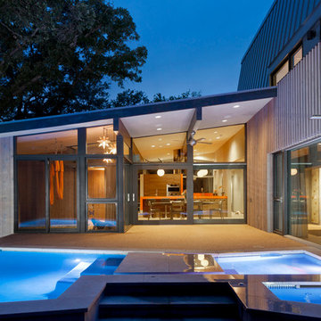
This 1966 contemporary home was completely renovated into a beautiful, functional home with an up-to-date floor plan more fitting for the way families live today. Removing all of the existing kitchen walls created the open concept floor plan. Adding an addition to the back of the house extended the family room. The first floor was also reconfigured to add a mudroom/laundry room and the first floor powder room was transformed into a full bath. A true master suite with spa inspired bath and walk-in closet was made possible by reconfiguring the existing space and adding an addition to the front of the house.

Find the right local pro for your project
 Edmond Kitchen & Bath LLC
This creative transitional space was transformed from a very dated layout that did not function well for our homeowners - who enjoy cooking for both their family and friends. They found themselves cooking on a 30" by 36" tiny island in an area that had much more potential. A completely new floor plan was in order. An unnecessary hallway was removed to create additional space and a new traffic pattern. New doorways were created for access from the garage and to the laundry. Just a couple of highlights in this all Thermador appliance professional kitchen are the 10 ft island with two dishwashers (also note the heated tile area on the functional side of the island), double floor to ceiling pull-out pantries flanking the refrigerator, stylish soffited area at the range complete with burnished steel, niches and shelving for storage. Contemporary organic pendants add another unique texture to this beautiful, welcoming, one of a kind kitchen! Photos by David Cobb Photography.
 Crown Point Cabinetry
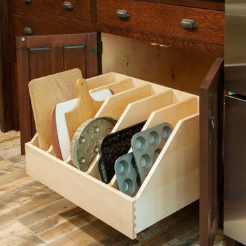
This custom Arts & Crafts Crown Point Cabinetry kitchen and bar area features, Quartersawn White Oak with a Washington Cherry stained finish. The Island and custom Range Hood both feature, Bee’s Wax over Eco Brown stain and Burnished over Maple. The kitchen and bar area cabinetry have a Craftsman style door with Black Walnut pegs, while the island presents an Old Cupboard door style that blends seamlessly. Additionally, the doors and drawers also feature a soft close element. Photo by Crown Point Cabinetry


 Design Harmony
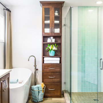
Two different accent tiles make a statement and add a pop of color against the large white wall tiles in the custom shower. Frameless glass creates a custom and modern feel to the space.
This small powder bath lacked interest and was quite dark despite having a window.
We added white horizontal tongue & groove on the lower portion of the room with a warm graphic wallpaper above.
A custom white cabinet with a waterfall grey and white granite counter gave the vanity some personality.
New crown molding, window casings, taller baseboards and white wood blinds made impact to the small room.
We also installed a modern pendant light and a rustic oval mirror which adds character to the space.
BEFORE
Though this bathroom had a good layout, everything was just really outdated. We added tile from floor to ceiling for a spa like feel. We kept the color palette neutral and timeless. The dark cheery cabinet was elegantly finished with crystal knobs and a cararra marble countertop.
AFTER
AFTER
BEFORE
There was an underutilized corner between the vanity and the shower that was basically wasted space.
To give the corner a purpose, we added a make-up vanity in white with a custom made stool.
Oversized subway tiles were added to the shower, along with a rain shower head, for a clean and timeless look. We also added a new frosted glass door to the walk-in closet to let the light in.
BEFORE
These beautiful oval pivot mirrors are not only functional but also showcase the cararra marble on the wall. Unique glass pendants are a dramatic addition to the space as is the ikat wallpaper in the WC. To finish out the vanity space we added a shallow white upper cabinet for additional storage.
BEFORE
AFTER
AFTER
The best part of this remodel? Tearing out the awful, dated carpet! We chose porcelain tile with the look of hardwoods for a more functional and modern space.
Curtains soften the corner while creating privacy and framing the soaking tub.
Photo Credit: Holland Photography - Cory Holland - HollandPhotography.biz
Sponsored
Columbus, OH

Structural Remodeling
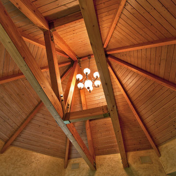
Franklin County's Heavy Timber Specialists | Best of Houzz 2020!
 Alan Clark Architects, LLC
Jeff Herr Photography
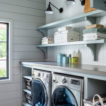
Example of a farmhouse gray floor laundry room design in Atlanta with open cabinets, blue cabinets, gray walls, a side-by-side washer/dryer and gray countertops
Example of a farmhouse gray floor laundry room design in Atlanta with open cabinets, blue cabinets, gray walls, a side-by-side washer/dryer and gray countertops
 PB Kitchen Design
The key to this project was to create a kitchen fitting of a residence with strong Industrial aesthetics. The PB Kitchen Design team managed to preserve the warmth and organic feel of the home’s architecture. The sturdy materials used to enrich the integrity of the design, never take away from the fact that this space is meant for hospitality. Functionally, the kitchen works equally well for quick family meals or large gatherings. But take a closer look at the use of texture and height. The vaulted ceiling and exposed trusses bring an additional element of awe to this already stunning kitchen.
Project specs: Cabinets by Quality Custom Cabinetry. 48" Wolf range. Sub Zero integrated refrigerator in stainless steel.
Project Accolades: First Place honors in the National Kitchen and Bath Association’s 2014 Design Competition
 ADU Specialist Bay Area
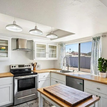
This Atherton home addition project involved a beautiful addition of a kitchen to include a dining area too, blending modern style with functionality. We opened the space with shaker-style cabinets, sleek stainless steel appliances, and warm butcher block countertops. We added large windows and sliding glass doors to enhance natural light, seamlessly connecting the indoor and outdoor areas. The durable tile flooring and movable island cart provide flexibility and convenience. Our dedicated Atherton home addition contractors ensured every detail of the design and build process was crafted to meet your vision perfectly.
Atherton Home Addition - https://www.aduspecialistbayarea.com/home-addition/atherton/
 Adrienne DeRosa
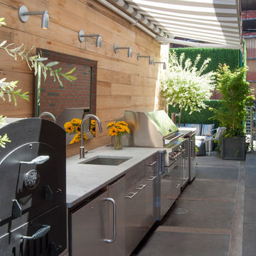
The addition of the kitchenette on the rooftop transformed the patio into a fully-functioning entertainment space. The retractable awning provides shade on the hottest days, or it can be opened up to party under the stars.
Welcoming guests into their home is a way of life for the Novogratzes, and in turn was the primary focus of this renovation.
"We like to have a lot people over on the day-to-day as well as holiday family gatherings and parties with our friends", Cortney explains. With both Robert and Cortney hailing from the South; Virginia and Georgia respectively, the couple have it in their blood to open their home those around them. "We always believe that the most important thing in your home is those you share it with", she says, "so we love to keep up our southern hospitality and are constantly welcoming guests into our home."
Photo: Adrienne DeRosa Photography © 2014 Houzz
Design: Cortney and Robert Novogratz

 IS Architecture
The kitchen, breakfast room and family room are all open to one another. The kitchen has a large twelve foot island topped with Calacatta marble and features a roll-out kneading table, and room to seat the whole family. The sunlight breakfast room opens onto the patio which has a built-in barbeque, and both bar top seating and a built in bench for outdoor dining. The large family room features a cozy fireplace, TV media, and a large built-in bookcase. The adjoining craft room is separated by a set of pocket french doors; where the kids can be visible from the family room as they do their homework.
 Webber + Studio, Architects
Paul Bardagjy Photography
1950s gender-neutral playroom photo in Austin with beige walls
1950s gender-neutral playroom photo in Austin with beige walls

Sponsored
Columbus, OH
Structural Remodeling
Franklin County's Heavy Timber Specialists | Best of Houzz 2020!
 Anchor Builders
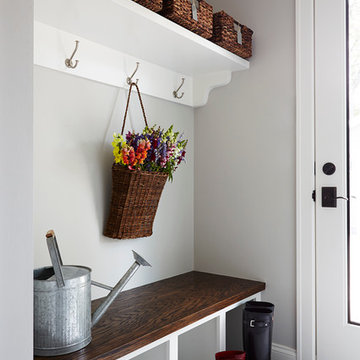
This remodel went from a tiny story-and-a-half Cape Cod, to a charming full two-story home. The mudroom features a bench with cubbies underneath, and a shelf with hooks for additional storage. The full glass back door provides natural light while opening to the backyard for quick access to the detached garage. The wall color in this room is Benjamin Moore HC-170 Stonington Gray. The cabinets are also Ben Moore, in Simply White OC-117.
Space Plans, Building Design, Interior & Exterior Finishes by Anchor Builders. Photography by Alyssa Lee Photography.
 LLG Residential Design LLC
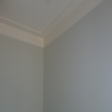
Looking for a nice clean crown molding, but what something different? These homeowners did just that with a simple clean flat molding applied to the wall and ceiling to create this look.

 John Johnstone
Joshua Johnstone
Example of a transitional built-in desk home office design in New York
Example of a transitional built-in desk home office design in New York
 Amsted Design-Build
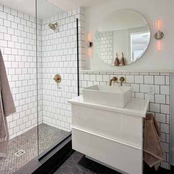
Previously renovated with a two-story addition in the 80’s, the home’s square footage had been increased, but the current homeowners struggled to integrate the old with the new.
An oversized fireplace and awkward jogged walls added to the challenges on the main floor, along with dated finishes. While on the second floor, a poorly configured layout was not functional for this expanding family.
From the front entrance, we can see the fireplace was removed between the living room and dining rooms, creating greater sight lines and allowing for more traditional archways between rooms.
At the back of the home, we created a new mudroom area, and updated the kitchen with custom two-tone millwork, countertops and finishes. These main floor changes work together to create a home more reflective of the homeowners’ tastes.
On the second floor, the master suite was relocated and now features a beautiful custom ensuite, walk-in closet and convenient adjacency to the new laundry room.
Gordon King Photography

 J.P. Hoffman Design Build
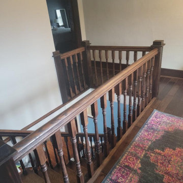
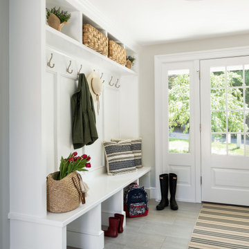
As seen in this photo, the front to back view offers homeowners and guests alike a direct view and access to the deck off the back of the house. In addition to holding access to the garage, this space holds two closets. One, the homeowners are using as a coat closest and the other, a pantry closet. You also see a custom built in unit with a bench and storage. There is also access to a powder room, a bathroom that was relocated from middle of the 1st floor layout. Relocating the bathroom allowed us to open up the floor plan, offering a view directly into and out of the playroom and dining room.
 Amazing Spaces
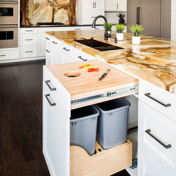
The stainless steel double oven and range hood compliment the white cabinetry and metal hardware. Warm tones in the stonewood granite backsplash and island countertop add interest and depth. Dark hardwood floors ground the space. The island features an integrated cutting board and trash bins creating a functional workspace.
Ilir Rizaj
 Smith & Ragsdale Interior Design
While this new home had an architecturally striking exterior, the home’s interior fell short in terms of true functionality and overall style. The most critical element in this renovation was the kitchen and dining area, which needed careful attention to bring it to the level that suited the home and the homeowners.
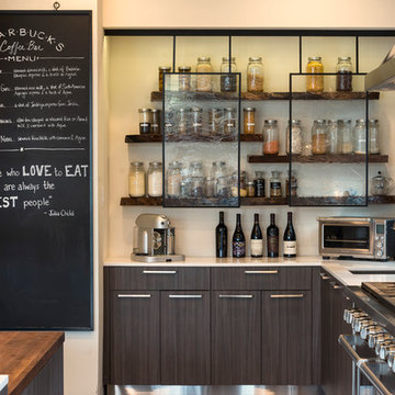
As a graduate of Culinary Institute of America, our client wanted a kitchen that “feels like a restaurant, with the warmth of a home kitchen,” where guests can gather over great food, great wine, and truly feel comfortable in the open concept home. Although it follows a typical chef’s galley layout, the unique design solutions and unusual materials set it apart from the typical kitchen design.
Polished countertops, laminated and stainless cabinets fronts, and professional appliances are complemented by the introduction of wood, glass, and blackened metal – materials introduced in the overall design of the house. Unique features include a wall clad in walnut for dangling heavy pots and utensils; a floating, sculptural walnut countertop piece housing an herb garden; an open pantry that serves as a coffee bar and wine station; and a hanging chalkboard that hides a water heater closet and features different coffee offerings available to guests.
The dining area addition, enclosed by windows, continues to vivify the organic elements and brings in ample natural light, enhancing the darker finishes and creating additional warmth.
Photography by Ira Montgomery
2