Search results for "Additionally" in Home Design Ideas
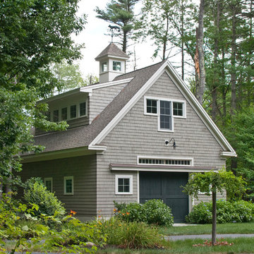
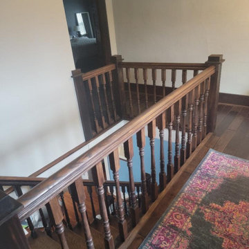
This minute addition reimagined the entry of a St. Martins home into a gracious gesture, motivated by acute space constraints that rendered moving furniture to the second floor impossible. A focal aspect of the 221 square-foot addition is its stairway. Beyond its newel post, the railing ribbons up to the second floor, bridging over the doorway. The resulting open space, canopied above the foyer contributes to an airy atmosphere, allowing natural light to sprawl throughout the entry space and to the private second-floor family area. The new windows further add buoyancy and sunlight. The addition also provided an opportunity to move the powder room to a more discreet location adjacent to the dining room. On the outside of the home, the entry addition introduces a gambrel form, drawing from and repurposing the design of the original structure. Despite its modest size, the addition transformed the entry of the home and its first impression, communicating openness and warmth within first acquainting steps.
Find the right local pro for your project
Photo Credits: Aaron Leitz
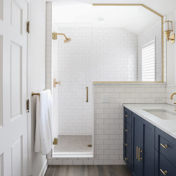
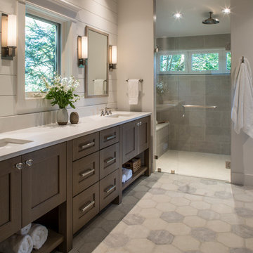
Example of a large trendy master white tile and ceramic tile gray floor and porcelain tile corner shower design in Portland with a hinged shower door, flat-panel cabinets, an undermount tub, white walls, an undermount sink, white countertops and quartz countertops

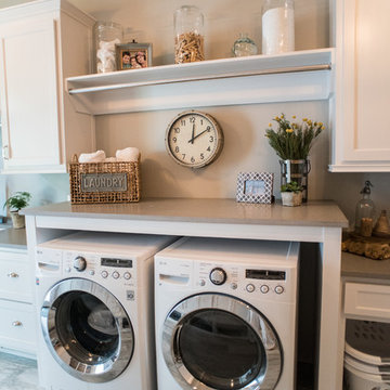
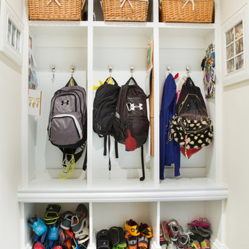
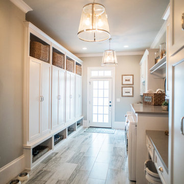
On April 22, 2013, MainStreet Design Build began a 6-month construction project that ended November 1, 2013 with a beautiful 655 square foot addition off the rear of this client's home. The addition included this gorgeous custom kitchen, a large mudroom with a locker for everyone in the house, a brand new laundry room and 3rd car garage. As part of the renovation, a 2nd floor closet was also converted into a full bathroom, attached to a child’s bedroom; the formal living room and dining room were opened up to one another with custom columns that coordinated with existing columns in the family room and kitchen; and the front entry stairwell received a complete re-design.
KateBenjamin Photography

Nantucket Architectural Photography
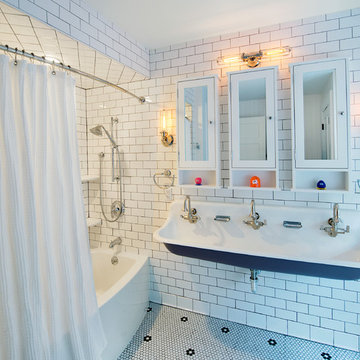
Bathroom - large coastal master white tile and ceramic tile light wood floor bathroom idea in Boston with white walls

Sponsored
Columbus, OH
Structural Remodeling
Franklin County's Heavy Timber Specialists | Best of Houzz 2020!
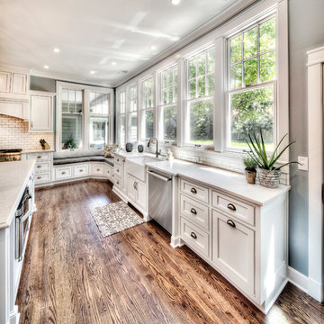
Tatum Brown Custom Homes {Architect: Stocker Hoesterey Montenegro} {Photography: Nathan Schroder}
Inspiration for a contemporary gender-neutral light wood floor kids' room remodel in Dallas with white walls

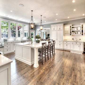
This beautiful Birmingham, MI home had been renovated prior to our clients purchase, but the style and overall design was not a fit for their family. They really wanted to have a kitchen with a large “eat-in” island where their three growing children could gather, eat meals and enjoy time together. Additionally, they needed storage, lots of storage! We decided to create a completely new space.
The original kitchen was a small “L” shaped workspace with the nook visible from the front entry. It was completely closed off to the large vaulted family room. Our team at MSDB re-designed and gutted the entire space. We removed the wall between the kitchen and family room and eliminated existing closet spaces and then added a small cantilevered addition toward the backyard. With the expanded open space, we were able to flip the kitchen into the old nook area and add an extra-large island. The new kitchen includes oversized built in Subzero refrigeration, a 48” Wolf dual fuel double oven range along with a large apron front sink overlooking the patio and a 2nd prep sink in the island.
Additionally, we used hallway and closet storage to create a gorgeous walk-in pantry with beautiful frosted glass barn doors. As you slide the doors open the lights go on and you enter a completely new space with butcher block countertops for baking preparation and a coffee bar, subway tile backsplash and room for any kind of storage needed. The homeowners love the ability to display some of the wine they’ve purchased during their travels to Italy!
We did not stop with the kitchen; a small bar was added in the new nook area with additional refrigeration. A brand-new mud room was created between the nook and garage with 12” x 24”, easy to clean, porcelain gray tile floor. The finishing touches were the new custom living room fireplace with marble mosaic tile surround and marble hearth and stunning extra wide plank hand scraped oak flooring throughout the entire first floor.

Angle Eye Photography
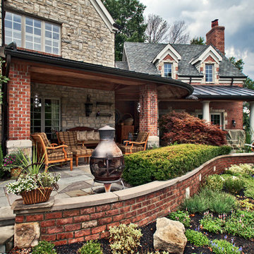
Inspiration for a mid-sized timeless backyard stone patio remodel in Philadelphia with no cover

Inspiration for a large cottage detached studio / workshop shed remodel in Manchester

For this project, the customer envisioned enhancing their kitchen, creating a seamless connection to the living and dining areas, which had been raised. We presented options for the addition, showcasing designs that married simplicity with elegance. The first options featured straightforward roofing solutions, while the final design embraced the home's curves, incorporating the graceful rounded windows, entryway, and chimney.
We crafted the addition with a stunning barrel ceiling adorned with rich walnut wood paneling and accent lighting, creating an inviting atmosphere. After careful consideration, the clients chose the more intricate design, perfectly complementing their home's aesthetic. To elevate the space, we added a round window and an arched window in the kitchen, enhancing its character.
In the living area, they selected a Nana Wall door, allowing for a harmonious flow between indoors and the outdoor entertainment space. The kitchen showcases exquisite walnut cabinets, accented with white painted cabinets in a sleek shallow shaker style. The 2cm Dekton countertops & backsplash were designed with an island height of 2 1/4 inches, creating a more dynamic space.
As passionate cooks and bakers, the clients chose Wolf and SubZero appliances, panel-ready to harmonize beautifully with their kitchen design. This project turned out breathtakingly, and the clients are overjoyed to possess a kitchen that embodies beauty and functionality, exceeding their dreams and aspirations.

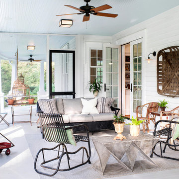
Mid-sized elegant screened-in back porch photo in St Louis with a roof extension

Our clients wanted to add on to their 1950's ranch house, but weren't sure whether to go up or out. We convinced them to go out, adding a Primary Suite addition with bathroom, walk-in closet, and spacious Bedroom with vaulted ceiling. To connect the addition with the main house, we provided plenty of light and a built-in bookshelf with detailed pendant at the end of the hall. The clients' style was decidedly peaceful, so we created a wet-room with green glass tile, a door to a small private garden, and a large fir slider door from the bedroom to a spacious deck. We also used Yakisugi siding on the exterior, adding depth and warmth to the addition. Our clients love using the tub while looking out on their private paradise!

Bathroom - 1950s master gray tile and porcelain tile double-sink bathroom idea in Phoenix with flat-panel cabinets, dark wood cabinets, quartz countertops, white countertops and a floating vanity

Sponsored
Columbus, OH
Structural Remodeling
Franklin County's Heavy Timber Specialists | Best of Houzz 2020!
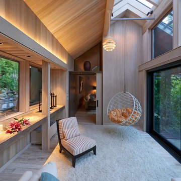
Originally designed by one of the most notable landscape architects in town, this once impressive project had faltered in recent years. The pool and spa still functioned well, and the client wanted to keep it intact. In addition, they wanted to keep as much of the existing landscaping as possible. The surrounding decks, walls, and steps were fair game. At first glance, one might think that our changes were simple material changes. Upon closer inspection, however, one can see the subtle, yet transformative changes that come together to update this classic pool in a tasteful, timeless manner, and improve the flow and usability of the deck areas, while softening the feel of the massive hardscape.
The subtle changes begin as soon as you walk out the back door of the house. The existing decking had a lot of what we call “tweeners”; areas that are overly generous walkways, yet not large enough to house furniture. The awkwardly small bluestone patio was expanded to accommodate a generous seating area, by pushing the step-down closer to the pool. Our talented stone mason carefully married the new bluestone into the existing, resulting in an imperceptible difference between the two. As you descend the new bluestone steps to the pool level, your bare feet will be thankful for the new smooth-finished limestone colored concrete, with a hand cut pattern carefully etched into its surface. The old red brick decking was so hot that the owners could not walk around the pool in bare feet. The brick coping was also replaced with an eased edge Pennsylvania Premier Stone which matches the new step treads throughout the project. Between the house and the pool, a large raised planter was reconfigured, giving additional space to the pool deck for a shaded lounge chair area.
Across the pool, a bank of rather tall painted brick retaining walls were cut down, shortened, and moved. This lessened the visual impact of the walls, which were rather overwhelming in the space, as well as opening up a new seating area, nestled under the arms of the massive pecan at the back of the property. Rather than continuing solid decking around the entire pool, the area near these walls has been transformed to large stone stepper pads set in a sea of beautiful St. Augustine lawn. This creates a visually softened area that is still suited to setting tables and chairs when the guest list calls for additional seating.
The spa area is quite possibly the most dramatic change on this project. Yet more raised planter walls divided this area into awkward spaces, unsuited to proper furniture placement. The planters were removed, new stone decks, once again expertly married into the existing, opening the area to house a large dining table and new built in bbq area. The spa itself was re-imagined with the bluestone coping, and painted brick veneer. The most impressive addition though is the new handmade glazed tiles that surround the existing cast stone water feature. This water feature was almost unnoticeable against the painted brick wall, but now the dramatic arch and pop of color draw the eye to this quaint little corner of the property.

Bruce Damonte
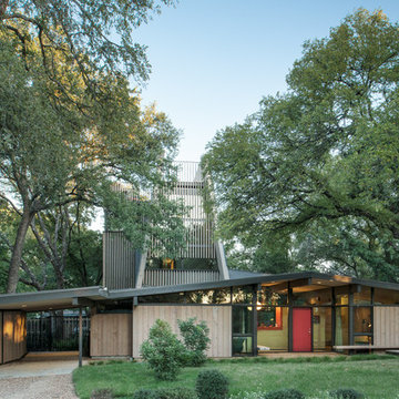
Example of a trendy three-story townhouse exterior design in San Francisco

Hillside Modernism In Context.
The owners of this modern hillside home sought to have a home in a nice Los Angeles neighborhood wherein they could raise their burgeoning family. The owners purchased a 1948 2000sf, single story, 2 bedroom English Cottage styled home (believed to have been originally owned by Yul Brynner) on a ½ acre hillside site in the exclusive Brentwood area of Los Angeles. The property slopes downward away from the street and overlooks a mini eucalyptus arroyo. The owners love their new location but are now faced-with having to raise their new and growing family on a hillside with extremely limited yard spaces for children to play and in a location where nature is very close – deer as well as coyotes wander the arroyo.
In 2000 the owners commissioned architect Richard Best to add 2500sf to the cottage and transform it into a home more fitting to their growing family’s needs. Subsequently, in 2014/15, the owners again commissioned Richard to create a 2-story master suite addition. Living in or visiting the completed project - the original 1948 home remodeled + the 2000 addition + the 2014/15 addition, one goes through an unexpected and delightful experience as the spaces of the home “unfold” to reveal intimacy and environmental immersion.
It was important to Richard and to the owners that their remodels and additions be appropriately designed to fit into the neighborhood and have the feel, scale, and soul of the original cottage. With this in-mind, Richard has interpreted the design intentions of the original cottage - “modernizing” the architectural vocabulary and creating open-plan, 2-story additions which promote site “engagement” at various floor levels and openness to the outdoors in a manner clearly inspired by the original cottage, yet modern.
At the front door of the original (still remains as it was) 1948 structure, one is presented with a quaint a low-slung entry which establishes a very comfortable sense of scale. Inside, the remodeled spaces of the original cottage exude comfort and a cozy sensibility evoked by the reuse of the original home’s exposed timber framing structure, open-plan circulation, and an inventive two-sided steel fireplace which acts as a room divider between the living room and a home office. Accordion wood doors connect these rooms to a newly formed outdoor rear patio. At this point one also gets ones first hint that something very interesting is happening just beyond – a glimpse of the 2000 & 2014/15 additions.
Moving from the original 1948 structure into the 2-story 2000 addition, one is greeted by a modern and open linear floor plan arrangement – a kitchen, casual dining and family room extend perpendicularly from the 1948 structure into the rear yard and down the hillside. The open framed cathedral ceiling and wood roof trusses establish a lofty feeling and a rhythm discretely separating the open rooms one from the other. Extensive use of windows and French doors connect the indoors to the outdoors and provide abundant natural lighting. This new appendage ends with a symmetrical family room which has no corners – it is a geometry composed of two overlapped squares - one rotated 45 degrees atop the other to create double opportunities for bay windows. The design not only connects the home to the desired exterior flat yards spaces, but it also takes full advantage of the sloping terrain by adding a floor below the original level so as to maintain a scale appropriate to the neighborhood. The exterior materials were chosen taking “hints” from the original 1948 structure – natural redwood siding, reused brick veneer and wood doors/windows all serving to aesthetically connect the addition back-to the spirit of the original structure.
By 2014/15 the owners’ family has fully blossomed - the children are now teenagers and there is a need for additional space. However, the owners are very content with their remodeled cottage and Richard’s 2000 addition – unsure how to add to a home which they feel is quite perfect as it is … wanting whatever changes are to be made to be sympathetic to it. They are also concerned about potential additions blocking-out their views of the eucalyptus arroyo. The owners approached Richard with trepidation – we love our perfect house but we need it to be a bit bigger and we don’t want to block-out the arroyo views or create a hemmed-in feeling – how can we add but still see the arroyo.
In response Richard created a private yet connected 2-story master suite, which by its positioning, dynamic geometries and extensive glazing create the fourth side of the former rear patio, making it into exterior courtyard with views around and through the new addition into the arroyo. A dynamic angularity in the new master addition (inspired by the 2000 addition) simultaneously reduces the apparent size/presence of the master suite addition on the edge of the eucalyptus arroyo while creating framed views into the arroyo from the newly formed courtyard. The new master suite - a master bathroom, master closet and a master sleeping loft each having exterior decks and/or patios, is connected back to the 2000 addition via a glazed hallway which provides a sense of connectedness and privacy. A modern rustic aesthetic of exposed board-formed concrete, natural finished Corten steel exterior cladding, frameless metal windows, and clear finished Douglas Fir planks serve to “extend” the soul of the original cottage into the master suite.
The project is a highly sustainable design as well. Energy use is reduced by employing a high efficiency heat pump heating and cooling system, dual paned/gasketed metal window/door systems, natural lighting through a Kalwall skylight and generous exterior glazing with extensive eaves for shading, rigid roof insulation, and earthen backing – the lower floor is up-against the hillside which tends to even-out the day/night temperature differential.
Credits:
Architecture & Interior Design: Richard Best Architect Inc.
Structural Engineering: Dan Echeto & David Choi Associates
Interior Decor: Noelle Schoop
Landscape: Connie Heitzman
Photos: Carmel McFayden and Adriano Sarmento / James Porschen
2