
Search results for "Address challenges" in Home Design Ideas

 Verner Architects
Paul Dyer Photography
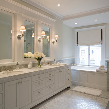
Inspiration for a timeless gray tile and glass tile mosaic tile floor corner shower remodel in San Francisco with an undermount sink, white cabinets, an undermount tub, gray walls and recessed-panel cabinets
Inspiration for a timeless gray tile and glass tile mosaic tile floor corner shower remodel in San Francisco with an undermount sink, white cabinets, an undermount tub, gray walls and recessed-panel cabinets


Find the right local pro for your project
 Liquid Design & Architecture Inc.
Liquid Design & Architecture Inc.
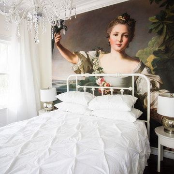
Example of a cottage chic dark wood floor bedroom design in Miami with multicolored walls
Example of a cottage chic dark wood floor bedroom design in Miami with multicolored walls
 Klopf Architecture
Built for the Bluff, A Sea Ranch Home is Remade from the Inside Out
The house had always been grounded, on an ocean bluff at The Sea Ranch. It sits unencumbered, adjacent to one of the most dramatic stretches of the Sonoma coast with protected commons meadow to the east, uninterrupted Pacific views to the west, and a bluff trail running alongside. What it lacked was the feeling of home, one that could hold up its own against the natural landscape.
The owners are entrepreneurs with deep involvement across tech, real estate, and development and they know how things are built. The Sea Ranch house had been in their lives for years, a second residence and a place for family to gather. Built for a different time, it felt more compromising than comfortable. Sitting in a closed off nook, the kitchen fit one cook at a time and turned its back on the rest of the house. The entry was dim and compressed, divided by a structural column that presented itself at exactly the wrong moment. The primary suite was small relative to the view outside it. A large rear bedroom sat behind a lowered ceiling with a bathroom that had never been added. The house was certainly worth the trouble of doing it right.
What followed was not one project but four, each with its own design challenge, each addressed over a period of time.
Where the House Meets the Ocean
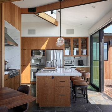
The most complex piece of the project, in both structural and spatial terms, was the kitchen expansion. The existing room was a single-person galley squeezed in as an afterthought with no meaningful connection to the dining room, the living space, or the deck outside. To make it useful for a family that cooks and gathers, it needed to grow outward into an existing patio and flow into the rooms around it.
A big challenge was the roofline. Several planes at different pitches and angles converged directly where additional volume was needed. A new form had to join that geometry without reading as a correction. The solution found the simplest possible connection between the existing angles, a roofline that from outside the structure, appears entirely original. From the bluff trail where the addition is visible, there is no discernible seam.
Inside, the kitchen is now open to the living and dining rooms without interruption. A large sliding glass door connects the space onto the rear deck. The deck itself was expanded and oriented so that the body of the house shields it from the coastal wind which is a common consideration that determines whether outdoor space at The Sea Ranch actually gets used. The result is a room that works for large family gatherings where no one feels cutoff, and one that makes the boundary between being inside and outside easy to ignore.
Welcoming Light
A structural column stood at the convergence of eight distinct roof planes in the entry. It was load-bearing, but it was also the reason the entry had always felt like a hallway rather than a welcoming arrival.
With the structural engineer, a custom steel connector was designed to receive beams from six separate directions, redistributing the load through a single new continuous beam. The column was surgically removed. Three triangular skylights were then cut into the roof above, their shapes drawn from the
existing geometry of the planes around them. The entry is now bright and open. The skylights feel native to the structure because they follow the logic already present in the roof.
Two Suites, Two Views
At opposite ends of the house, the two bedroom suites were each reconfigured, and each found a different way to introduce more of the landscape into the room.
An addition to the primary suite extended the structure outward to create a wraparound plan with a loop from the bedroom through bath and closet that had not been possible before. The expansion opened a slot view from the tub and shower toward the ocean. The view is precise and private. The ocean view is present and deliberate.
The rear bedroom absorbed an adjacent storage room to transform it into a full second suite with a vaulted ceiling, a large bathroom with a tub, a shower, and a sauna. A private fenced garden courtyard sits just beyond the glass bringing the outdoors inside. The tub was placed so that, looking past the courtyard and through the bedroom beyond, the ocean is visible at the far end. It is a long view and it makes the room feel larger and more settled than its footprint would suggest.
Glass on Four Sides, Fire at the Center
The main living and gathering room had always been caught between two competing facts: glass on four sides meant exceptional views but at The Sea Ranch, it also meant a cold room. A 360-degree cylindrical fireplace was added at the center on a raised stone base, providing radiant heat in every direction and giving the room a focal point around which a group naturally orients itself, whether that means two people at the end of the day or the whole family after dinner.
Owners Who Picked Up the Tools
The owner was not a passive client. they came with construction knowledge, specific ideas, and the desire to be an active part of the process, a dynamic that other architects may had found difficult, which Klopf Architecture accepted as an asset. They took it upon themselves to complete some of the work during construction, including the installation of a new radiant heating system beneath the floors.
The radiant system added to the older and less-desirable forced-air setup. At The Sea Ranch, that change matters as the house sits close enough to the ocean and moving air competes with the sound of it, where radiant heat does not. Solar panels were added to the roof as part of the new system. Insulation was upgraded throughout the walls, roof, and crawl space. The house that had always had the right setting now holds warmth the way a house on the bluff should.
They were also deeply involved in the design and selections throughout, and the finished house reflects both of them in ways that are specific rather than generic. The process took longer and moved through more iterations than a more arms-length relationship might have allowed. The result is more defined and personal because of it.
The Landscape Holds Priority
Every exterior decision was shaped by The Sea Ranch Design Standards, which require that buildings defer to the landscape around them rather than compete with it. Because this house sits on the bluff and is visible from the public trail, the additions faced a close review. Existing materials were matched. Geometries were resolved. The additions had to become indistinguishable from the original building.
From the trail, the house reads exactly as it always has — low, cedar-clad, secondary to the meadow and the water. The setting holds priority. Inside, the house has been remade.
Klopf Architecture Project Team: Geoff Campen and Trenton Jewett
Contractor: Shawn Bettega Construction
Photography: ©2025 Mariko Reed
Year Completed: 2023
Location: The Sea Ranch, CA
 Flegel's Construction Co., Inc.
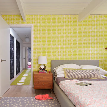
All new doors, trims and baseboards. New du chateau, heated flooring. A real makeover.
Bruce Damonte Photography
1960s girl kids' room photo in San Francisco with multicolored walls
1960s girl kids' room photo in San Francisco with multicolored walls
 Klopf Architecture
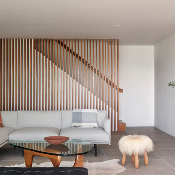
Set on a narrow hillside lot overlooking the San Francisco Bay in Point Richmond, California, Bay Heirloom is a Mid-Century Modern family home restored, modernized and adapted for contemporary living. Oriented south-southwest toward the Marin Headlands, with views of the Golden Gate Bridge, the residence captures shifting Bay light throughout the day, from fog-muted mornings to vivid, glowing sunsets.
The home was built by Karlyn Neel’s grandfather, the owner of the construction company Flo-Crete, one of the Bay Area’s early concrete pumping firms. Flo-Crete completed the foundation and structural concrete work, with family photographs documenting the original cinderblock walls and pours. The firm also contributed to major regional infrastructure projects, including the Transbay BART tube and Candlestick Park, situating the house within a broader legacy of Bay Area construction. Growing up, Neel spent considerable time in the home, developing an early appreciation for mid-century modern principles. Instead of parting with this family heirloom, she purchased the home from her grandfather’s estate.
While her grandfather continued to live in the Point Richmond house, Neel purchased a Mid-Century Modern residence in Palm Desert. In contrast to the Bay Area’s cool temperatures, salt air, and persistent winds, the desert home is shaped by heat and sun and requires a different material response. A substantial renovation she led there emphasized thermal performance, filtered light, and restrained detailing. The experience later informed the restoration of her Bay Area family home.
What began as a modest Mid-Century Modern update expanded when decades of exposure to marine conditions revealed leaks and significant structural and seismic deficiencies. Neel was determined to honor her grandfather’s perseverance and without hesitation pivoted to a much more intensive project. Addressing these challenges required close coordination between Neel, Klopf Architecture and Kasten Builders, with architectural restraint and construction precision guiding each intervention. Rather than alter the home’s defining features, the project focused on reinforcing the structure from within. Discreet beams were embedded along the rear facade and in an upstairs wall, strengthening the building while maximizing the wall of glass facing the Bay and opening the wall between the kitchen and the living space. These structural interventions allowed the space to open fully to the Bay without visual interruption, with the kitchen repositioned as the social and functional core of an open, continuous living space. The building envelope was updated using weather- and corrosion-resistant materials appropriate to the marine environment.
The house unfolds vertically from the street, beginning with a modest garage level and workshop, with the main living spaces located below. Original slate flooring at the entry was preserved, along with select furnishings and artwork collected by Neel’s grandfather, anchoring the restored interior in its past. A restrained palette of black accents and pale, natural finishes replaces darker wood tones, reinforcing openness and calm. A naturally illuminated stair connects to the lowest level, where a former basement was transformed into a guest suite and family room opening onto a deck. From there, steps lead directly to a small concrete boat ramp at the water’s edge.
Throughout the project, decisions were guided by continuity rather than transformation for its own sake. Lessons drawn from both desert and coastal climates informed a material strategy rooted in performance and restraint. Bay Heirloom stands as a measured evolution of a family house, structurally renewed and carefully modernized, grounded in the discipline and care that first shaped it.
Klopf Architecture Project Team: John Klopf, AIA, Angela Todorova and Fernanda Bernardes
Landscape Architect: Huettl Landscape Architecture
General Contractor: Kasten Builders
Photography: ©2025 Mariko Reed
Year Completed: 2022
Location: Point Richmond, CA


 Gast Architects
Ed Ritger Photography
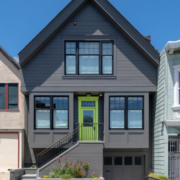
Example of a transitional gray three-story exterior home design in San Francisco
Example of a transitional gray three-story exterior home design in San Francisco
 Western DuPage Landscaping, Inc.
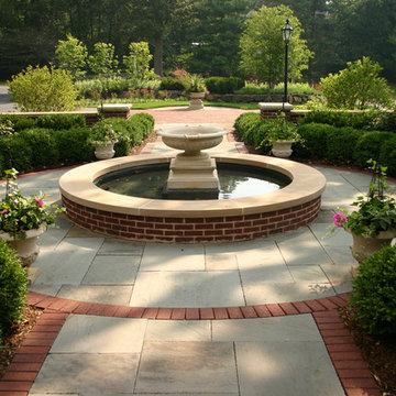
This partially wooded, acre and a half lot in West Dundee presented many challenges.
The clients began working with a Landscape Architect in the early spring, but after not getting the innovative ideas they were seeking, the home builder and Architect suggested the client contact our landscape design/build firm. We immediately hit it off with the charismatic clients. They had a tall order for us: complete the design and implement the construction within a three month period. For many projects this would be a reasonable time frame. However construction delays and the coordination of multiple trades left a very short window to complete the work.
Beyond the tight time frame the site required specific care in preserving the many mature surrounding trees, as well as addressing a vast grade change. Over fifteen feet of grade change occurs from one end of this woodland property to the other.
All of these constraints proved to be an enormous challenge as we worked to include and coordinate the following elements: the drive layout, a dramatic front entry, various gardens, landscape lighting, irrigation, and a plan for a backyard pool and entertainment space that already had been started without a clear plan.
Fortunately, the client loved our design ideas and attention to detail and we were able to mobilize and begin construction. With the seamless coordination between our firm and the builder we implemented all the elements of this grand project. In total eight different crews and five separate trades worked together to complete the landscape.
The completed project resulted in a rewarding experience for our firm, the builder and architect, as well as the client. Together we were able to create and construct a perfect oasis for the client that suited the beautiful property and the architecture of this dream home.
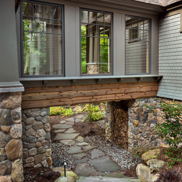
 CM Ragusa Builders
This breezeway is a unique architectural detail that connects the garage to the main house.
Inspiration for a transitional partial sun stone garden path in Other.
Inspiration for a transitional partial sun stone garden path in Other.
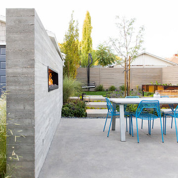
 Landform Design Group
Grey Giraffe
Example of a trendy side yard concrete patio design in Salt Lake City with a fireplace and no cover
Example of a trendy side yard concrete patio design in Salt Lake City with a fireplace and no cover
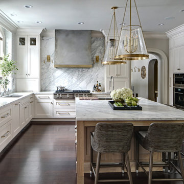
 Drury Design
THE SETUP
Once these empty nest homeowners decided to stay put, they knew a new kitchen was in order. Passionate about cooking, entertaining, and hosting holiday gatherings, they found their existing kitchen inadequate. The space, with its traditional style and outdated layout, was far from ideal. They longed for an elegant, timeless kitchen that was not only show-stopping but also functional, seamlessly catering to both their daily routines and special occasions with friends and family. Another key factor was its future appeal to potential buyers, as they’re ready to enjoy their new kitchen while also considering downsizing in the future.
Design Objectives:
Create a more streamlined, open space
Eliminate traditional elements
Improve flow for entertaining and everyday use
Omit dated posts and soffits
Include storage for small appliances to keep counters clutter-free
Address mail organization and phone charging concerns
THE REMODEL
Design Challenges:
Compensate for lost storage from omitted wall cabinets
Revise floorplan to feature a single, spacious island
Enhance island seating proximity for a more engaging atmosphere
Address awkward space above existing built-ins
Improve natural light blocked by wall cabinet near the window
Create a highly functional space tailored for entertaining
Design Solutions:
Tall cabinetry and pull-outs maximize storage efficiency
A generous single island promotes seamless flow and ample prep space
Strategic island seating arrangement fosters easy conversation
New built-ins fill arched openings, ensuring a custom, clutter-free look
Replace wall cabinet with lighted open shelves for an airy feel
Galley Dresser and Workstation offer impeccable organization and versatility, creating the perfect setup for entertaining with everything easily accessible.
THE RENEWED SPACE
The new kitchen exceeded every expectation, thrilling the clients with its revitalized, expansive design and thoughtful functionality. The transformation brought to life an open space adorned with marble accents, a state-of-the-art steam oven, and the seamless integration of the Galley Dresser, crafting a kitchen not just to be used, but to be cherished. This is more than a culinary space; it’s a new heart of their home, ready to host countless memories and culinary adventures.
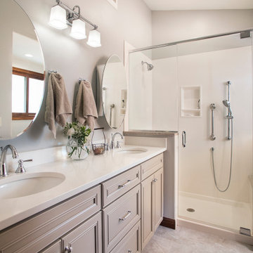
 Roeser Home Remodeling
This Mid-Century home had been updated except for the kitchen and master bath. After a few years of being empty nesters, and with the neighborhood turning over drastically to infill property in the millions, this couple decided the time was right to update the last remaining rooms.
Starting in the Kitchen
Taking a dark, u-shaped kitchen out of the past and updating it for the future, was a dream come true for this family. They knew what they wanted in order to entertain their large extended family, which included their three kids; plus, his family, consisting of nine children, spouses, and now grandchildren. Requirements of an open space to hang out and help out, a banquet for food presentation without obstruction, bright and clean, easy storage, a place for her mother’s china decanters, and an instant hot for tea were all part of the “must haves” for this kitchen. We also needed to work around the homeowners’ existing appliances since many of them were practically new.
Vaulted ceilings, lots of high windows, and large openings to other spaces in the house, were challenges that only a galley style kitchen could address. Blending and lacing the hardwood floor with new flooring required both the new and existing to be sanded down and refinished. This provided a coherent look to the entire first floor of this home. Matching casings, baseboards and base shoe helped to make the updates look fresh, but original to the house.
In the kitchen, choosing the sandstone slate finish on our Wellborn Maple select series cabinets kept the space soft; but really opened it, making the space lighter and brighter. The Harmony style door choice blended with the décor in the rest of the house, while also giving straight clean lines the homeowner desired. Grounding the row of cabinets with their refrigerator and a pantry cabinet, gave symmetry to this side of the kitchen.
On the opposite side, a built-in pantry cabinet mirrors the refrigerator. A row of drawer cabinets expanded the storage and banquet space, to lay out food for entertaining. Also added were some much-needed wall cabinets with glass inserts to mirror the windows and keep the space open. This also allowed the taller canister to be displayed and admired. A few smaller shelves were added above the window space, to house the smaller canisters so loved by the homeowner.
An artist by trade, this homeowner added two narrow cabinets to the side of the pantry and the side of the refrigerator panel to house and create easy access to the various spices her husband loves to use while cooking. She painted them to blend with Wellborn’s Sandstone finish. The Caesarstone countertop with a 3cm eased edge in London Gray has a small pattern that is subtle and interesting. Cutting down the Caesarstone to 2 cm and carrying the same London Gray pattern up the backsplash area, lended to the clean lines and easy cleaning this homeowner requested.
Choosing chrome plumbing fixtures from Moen’s Brantford line is timeless choice. Chrome is always popular and yet in today’s market, also very trendy. The Brantford faucet has a pull-down spray and one side handle, leaving space for the all-important request of a Transcape hot water dispenser, also in chrome.
Scraping away the past included smoothing out the popcorn ceiling. Adding LED slope cans to the vaulted ceilings provided the necessary task lighting to elevate these homeowners’ joy of cooking. Removing the dated “popcorn look” enhanced the clean and spacious feel created by the architecture of the ceiling. Adding Top Knob chrome hardware was the final element that tied the kitchen all together.
Master Bathroom
The original dated Master Bathroom had dark cabinets, a huge Jacuzzi tub and a small shower stall that provided barely enough room for even a child to shower. Removing the Jacuzzi tub that was never used, opened this floor plan to a grand shower that is comfortable and spacious. For easy cleaning, these homeowners opted for a panel system in their shower. Onyx shower walls with a shower seat and recess wide shower caddy were installed in place of the old Jacuzzi style tub.
The large panels were quite a challenge for our team, with an eight foot door and vaulted ceilings; but they were determined not to have a seam. These seamless panels are beautiful and very easy to clean. Keeping with the original floor plan, a double sink vanity from Wellborn’s select line with the Harmony door style in a pebble finish was installed. New Kohler Caxton under mount sinks were installed, along with the Moen Kinsley 8” wide spread faucets in chrome. Matching Kingsley 18” grab bars were added to the shower area, along with the Kohler Brantford fixed shower head and handheld slide bar.
The countertop was a beautiful Caesarstone in Frosty Carrina with an eased edge and 4” back and side splash. Matching Kinsley towel hooks were added, along with mirrors the homeowner purchased and we installed for her. Top Knobs chrome cabinet hardware finished the look along with a beautiful tile floor AO Mira 1224-S Silver Maple laid in a broken joint pattern. Matching marble sills were added on top of the knee walls and threshold in the doorway. A 3/8” frameless custom shower door with fixed panels surrounded the shower creating an open airy feel to the space.
Not shown: Kohler’s Wellworth highline toilet with a slow-close seat replaces the original toilet. The original shower stall became a space used to house a stackable washer and dryer, a top a safety pan and drain to slop sink in the basement. There was even enough room for small shelving to provide storage for laundry essentials. Adding a louver door keeps the laundry area behind the scene and opens the master area to multiple tasks needed.
Master Bedroom Fireplace
This homeowner really missed a bedroom fireplace they had in a previous home. Since we were going to be working on their master bathroom anyway; was there a way to create a fireplace without making it feel too odd in their large bedroom area? They had purchased a ventless gas fireplace and they had their original television as well.
Challenged by windows, a vaulted ceiling and the natural light streaming from the back window; this divided wall was created, keeping the lighting from the other side of the room and providing a dressing area opposite the fireplace. This was a perfect idea since the closets are now in the dressing area and the creative wall houses the fireplace and TV for cold winter nights of snuggling to a movie. Better yet, the fireplace and TV are all on remote control!
 Goggans Architecture & Interiors
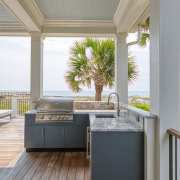
When the Owners approached Goggans Architecture about renovation of a 90’s era oceanfront house, it was clear there would be a lot more to the renovation than mere updates and remedying deferred maintenance. One of the most significant issues was how to integrate an outdoor pool given the pool had to be within the building envelope, and the house was already abutting the setback on its ocean side. A second significant challenge was how to provide a roof top deck over a pitched roof house with an attic, that was functional and attractive. Finally, creating better access from the parking area to the kitchen was a priority.
Goggans Architecture addressed the placement of a pool by creating a walled courtyard at the front, or landward side, of the house. The pool was placed on one side of the entry walkway, while its composition was balanced by a parterre garden on the other side of the walkway. The roof top deck was resolved by adding a new staircase and passageway through former attic space. By using a motorized roof hatch, the Owners could ascend to the roof deck which perched just below the roof ridge, hidden from view from the street. Relocating an underneath stair from one side of the house to a point that was closer to the kitchen resolved the access issue.
These strategic moves created other opportunities, such as expansion of the master bathroom to a portion of the front porch, while allowing an exterior stair from the bath directly to the pool. Other enhancements included placement of a large folding door in the Great room, renovation and expansion of the kitchen and exterior decks, reorganization, and replacement of the fenestration, updating all baths and interior and exterior finishes.
The extensive renovation reflects the holistic approach of Goggans Architecture, marrying landscape architecture, architecture, and interiors.
 Robeson Design
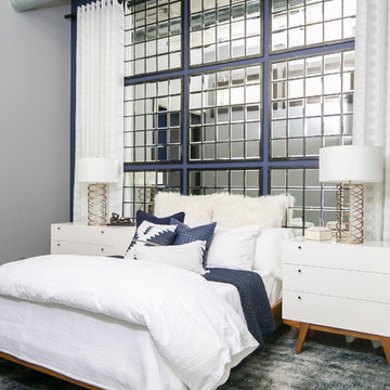
Bedroom in downtown loft with NO windows! This was the challenge Interior Designer Rebecca Robeson faced when beginning this Denver Loft Remodel.
Rebecca began by identifying the focal-point wall and addressing the overall dark feel of the room. She painted 3 walls a soft grey and one wall a dark navy blue. Rebecca applied her creative genius to the space by hanging nine beveled mirrors on the dark wall above the bed as a clever way to fool the eye into thinking the mirrors were windows. To further indulge the concept, Rebecca added crisp white linen panels to mimic window treatments on either side. This design idea created a dramatic symmetrical backdrop for the Bedroom furniture... A spectacular oversized blue and white rug (Aja Rugs) sets a perfect foundation for the queen size bed with two oversize nightstands in crisp white, the Bedroom was complete.
Tech Lighting - Black Whale Lighting
Photos by Ryan Garvin Photography
 Architectural Resource LLC
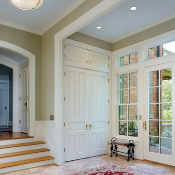
Our Clients, the proud owners of a landmark 1860’s era Italianate home, desired to greatly improve their daily ingress and egress experience. With a growing young family, the lack of a proper entry area and attached garage was something they wanted to address. They also needed a guest suite to accommodate frequent out-of-town guests and visitors. But in the homeowner’s own words, “He didn’t want to be known as the guy who ‘screwed up’ this beautiful old home”. Our design challenge was to provide the needed space of a significant addition, but do so in a manner that would respect the historic home. Our design solution lay in providing a “hyphen”: a multi-functional daily entry breezeway connector linking the main house with a new garage and in-law suite above.
 Southview Design
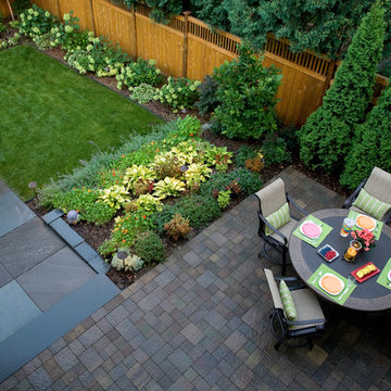
The client wanted patio space for a chair so she could relax in the sun when the mood struck. The only spot in the yard with any sun is near the fence gate. A full-range New York Bluestone patio was added using 30” x 30” slabs. These slabs are dry-set so leveling was a challenge.
 StudioLAB
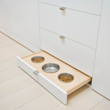
A young couple with three small children purchased this full floor loft in Tribeca in need of a gut renovation. The existing apartment was plagued with awkward spaces, limited natural light and an outdated décor. It was also lacking the required third child’s bedroom desperately needed for their newly expanded family. StudioLAB aimed for a fluid open-plan layout in the larger public spaces while creating smaller, tighter quarters in the rear private spaces to satisfy the family’s programmatic wishes. 3 small children’s bedrooms were carved out of the rear lower level connected by a communal playroom and a shared kid’s bathroom. Upstairs, the master bedroom and master bathroom float above the kid’s rooms on a mezzanine accessed by a newly built staircase. Ample new storage was built underneath the staircase as an extension of the open kitchen and dining areas. A custom pull out drawer containing the food and water bowls was installed for the family’s two dogs to be hidden away out of site when not in use. All wall surfaces, existing and new, were limited to a bright but warm white finish to create a seamless integration in the ceiling and wall structures allowing the spatial progression of the space and sculptural quality of the midcentury modern furniture pieces and colorful original artwork, painted by the wife’s brother, to enhance the space. The existing tin ceiling was left in the living room to maximize ceiling heights and remain a reminder of the historical details of the original construction. A new central AC system was added with an exposed cylindrical duct running along the long living room wall. A small office nook was built next to the elevator tucked away to be out of site.
 Juxtapose Design Build
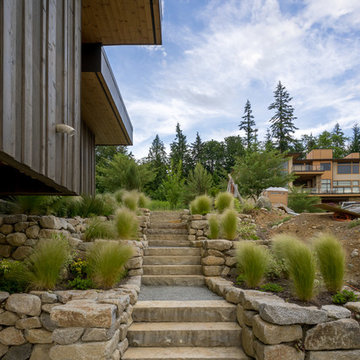
During excavation for this new modern home, large granite boulders rose to the surface from the primordial hillside. Instead of displacing these monoliths from the site from which they were created, they were arranged to define space. A circle of boulders stand guard around a custom built fire pit, providing protection from the wind while offering a place to climb or sit. The extended landscape view from the lawn is kept intact by the introduction of a ha-ha, a traditional landscape feature, that hides the productive garden and keeps it from breaking the view. Native and drought tolerant plantings hug the outer edges of the property for minimal use of irrigation and to visually blend into the surrounding hillside. This project also features a custom ipe bench with integrated lighting, waterjet address numbers with night lighting, and hardscape that complements the form and materiality of the architecture to create a harmonious transition into the horizontal plane.
Photography: Louie Jeon Photography
 Dan Rak Design
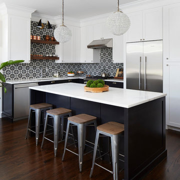
Large professional-grade kitchen with white and black cabinetry and open shelving in a naturally finished walnut wood.
Large transitional l-shaped dark wood floor and brown floor open concept kitchen photo in Chicago with an undermount sink, shaker cabinets, stainless steel appliances, an island, white countertops, black cabinets, quartzite countertops, black backsplash and cement tile backsplash
Large transitional l-shaped dark wood floor and brown floor open concept kitchen photo in Chicago with an undermount sink, shaker cabinets, stainless steel appliances, an island, white countertops, black cabinets, quartzite countertops, black backsplash and cement tile backsplash
2