
Search results for "Address challenges" in Home Design Ideas
 Design Connection, Inc.
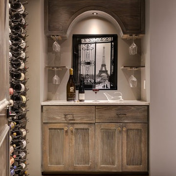
Arlene Ladegaard of Design Connection Inc. had already completed many projects in the client’s homes over the years and was excited for the challenge of designing a wine cellar in the unfinished basement. Wine Cellars come in many forms and styles. Our client’s had studied different styles of designs for many years as well as collecting over 1200 bottles of wine in all shapes and sizes. After living in their new Leawood home for a few years it was time to address an update on the lower level and design and build a wine cellar that was perfect for their use.
 Drury Design
The Setup:
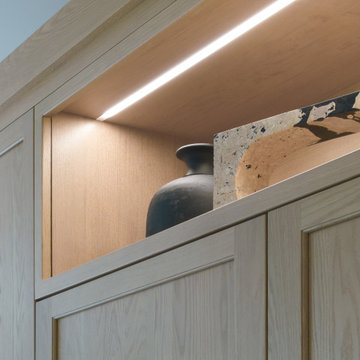
After purchasing this home, the homeowners faced a unique opportunity to reimagine their kitchen and nearby spaces. Water damage from a burst pipe had left much of the home’s interior in need of repair, and while the existing kitchen was functional and in relatively good shape, it didn’t align with the family’s vision for their new home. The layout included a peninsula that wasn’t ideal, and there were some druthers with the nearby pantry.
Since the space needed to be rebuilt anyway, the homeowners saw this as a chance to create a kitchen that was both highly functional for their four young children and timeless in its design. The project also included a refresh of the adjacent message center and dining room — spaces that play key roles in the family’s daily life. The goal was to create a cohesive flow between these areas, balancing modern functionality with the craftsman-inspired character of the rest of the home.
Design Objectives:
- Replace the outdated peninsula with a large island to maximize counter space and create new seating options.
- Open up the space visually by removing soffits and rethinking the cabinetry layout.
Incorporate concealed refrigeration and freezer units to provide significant storage for the family while maintaining a streamlined aesthetic.
- Integrate black cabinetry into the design without making the space feel harsh or heavy.
- Ensure the lighting plan balances functional task lighting with ambient accent lighting.
- Avoid visual clutter in the cabinetry design while still giving a nod to the craftsman aesthetic.
- Incorporate a slab backsplash as a key design feature.
Design Challenges:
- The outdated peninsula left dead space in the kitchen and lacked sufficient seating for the family.
- The cooktop wall was cramped, with small cabinets flanking the hood, limited storage, and soffits that made the space feel closed-in.
- The family needed significant refrigeration space (two refrigerators and a freezer) but wanted to avoid a cluttered look with visible stainless steel appliances.
- Adding black cabinetry risked making the space feel too dark or heavy.
- The original lighting plan was insufficient, particularly over the dining table where a decorative fixture proved too dim.
- The family wanted shaker-style drawer fronts to match the home’s arts-and-crafts design but worried that too much shaker cabinetry might look overly busy.
- Prioritizing a slab backsplash in the wish list priority planning.
The Renewed Space
Design Solutions:
- A functional island: The peninsula was replaced with a large island that provides continuous countertop space for prepping and serving. The island also features seating for four people, creating a central hub for informal meals and activities.
- Streamlined cooktop wall: The soffits were removed, and the upper cabinets on the cooktop wall were eliminated to create a more open, streamlined design. A custom oversized hood became the focal point of the wall, with the blower unit offset inside it to align with the cooktop while maintaining exterior visual symmetry.
- Concealed refrigeration: Two column refrigerators and one freezer were integrated into the cabinetry, concealing them behind wood paneling that blends seamlessly with the overall design.
- Warm black cabinetry: The black cabinetry was crafted from hickory with a visible grain, softening its appearance and adding warmth. The grain detail gives the cabinetry a rich, textured look that avoids feeling stark or overpowering.
- Additional lighting: In the dining area, recessed can lights were added during an additional installation phase to supplement the gorgeous decorative fixture’s dim output. The new lighting plan creates a layered effect, combining functional task lighting with softer ambient lighting.
- Simplified cabinetry details: Slab drawer fronts were used on the upper drawers, while five-piece shaker fronts (with slightly less prominent rail and stile pieces) were reserved for the middle and lower drawers. This approach simplified the overall look while maintaining the craftsman-inspired aesthetic.
- Slab backsplash priority: The slab backsplash was prioritized by making thoughtful adjustments elsewhere, like opting not to extend cabinetry to the ceiling, which also helped visually prioritize the gorgeous slab backsplash. This decision also enhanced the kitchen’s furniture-like feel, aligning with the home’s craftsman character.
- This kitchen perfectly balances practicality with timeless style. By addressing the family’s functional needs — ample seating, smart storage, and effective lighting — while incorporating thoughtful design elements like warm black cabinetry and a striking slab backsplash, Alicia created a space that works beautifully for a busy household. The result is a cohesive, inviting kitchen that honors the home’s craftsman roots and will serve the family well for years to come.
 LA Turf & Paver
Transformed Urban Oasis: Premium Artificial Turf Installation"
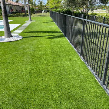
Set in the heart of Palm Beach Gardens, this backyard underwent a comprehensive transformation, turning a previously underutilized space into a lush, evergreen oasis. The aim was clear: to craft an outdoor environment that requires minimal maintenance, provides aesthetic pleasure, and offers functional space for various activities.
Initially, the backyard presented challenges including uneven ground, patchy grass areas, and poor soil conditions. Our team addressed these issues with precision grading and soil stabilization techniques, preparing a perfect base for the upcoming transformation.
We opted for a premium artificial turf, chosen for its realistic texture, durability, and environmental resilience. Spread across [specific square footage/size of the area], the turf exudes a natural charm that rivals the best of lawns. With its soft pile height and UV resistance, it promises year-round greenery without the hassle of watering, mowing, or fertilizing.
Details, such as the seamless integration of the turf with existing patios or garden beds, highlight our team's meticulous attention to detail and commitment to excellence. The results are evident — a green sanctuary ready for sunbathing, children's play, or simply lounging.
Homeowners have praised the transformation, noting the newfound usability of their outdoor space, the reduction in water bills, and the numerous compliments they receive from visitors.
This project isn't just about installing artificial turf; it's about reimagining urban backyards, bringing nature closer to home, and offering sustainable and beautiful solutions for modern living.
Find the right local pro for your project
 Goggans Architecture & Interiors
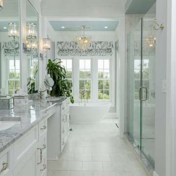
When the Owners approached Goggans Architecture about renovation of a 90’s era oceanfront house, it was clear there would be a lot more to the renovation than mere updates and remedying deferred maintenance. One of the most significant issues was how to integrate an outdoor pool given the pool had to be within the building envelope, and the house was already abutting the setback on its ocean side. A second significant challenge was how to provide a roof top deck over a pitched roof house with an attic, that was functional and attractive. Finally, creating better access from the parking area to the kitchen was a priority.
Goggans Architecture addressed the placement of a pool by creating a walled courtyard at the front, or landward side, of the house. The pool was placed on one side of the entry walkway, while its composition was balanced by a parterre garden on the other side of the walkway. The roof top deck was resolved by adding a new staircase and passageway through former attic space. By using a motorized roof hatch, the Owners could ascend to the roof deck which perched just below the roof ridge, hidden from view from the street. Relocating an underneath stair from one side of the house to a point that was closer to the kitchen resolved the access issue.
These strategic moves created other opportunities, such as expansion of the master bathroom to a portion of the front porch, while allowing an exterior stair from the bath directly to the pool. Other enhancements included placement of a large folding door in the Great room, renovation and expansion of the kitchen and exterior decks, reorganization, and replacement of the fenestration, updating all baths and interior and exterior finishes.
The extensive renovation reflects the holistic approach of Goggans Architecture, marrying landscape architecture, architecture, and interiors.
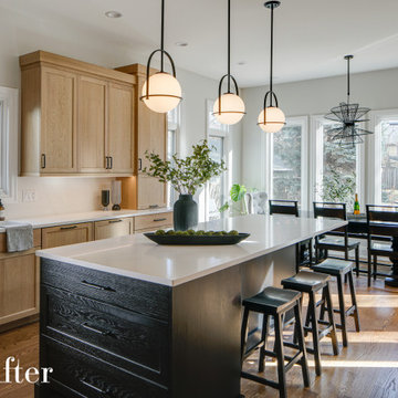 Drury Design
The Setup:
After purchasing this home, the homeowners faced a unique opportunity to reimagine their kitchen and nearby spaces. Water damage from a burst pipe had left much of the home’s interior in need of repair, and while the existing kitchen was functional and in relatively good shape, it didn’t align with the family’s vision for their new home. The layout included a peninsula that wasn’t ideal, and there were some druthers with the nearby pantry.
Since the space needed to be rebuilt anyway, the homeowners saw this as a chance to create a kitchen that was both highly functional for their four young children and timeless in its design. The project also included a refresh of the adjacent message center and dining room — spaces that play key roles in the family’s daily life. The goal was to create a cohesive flow between these areas, balancing modern functionality with the craftsman-inspired character of the rest of the home.
Design Objectives:
- Replace the outdated peninsula with a large island to maximize counter space and create new seating options.
- Open up the space visually by removing soffits and rethinking the cabinetry layout.
Incorporate concealed refrigeration and freezer units to provide significant storage for the family while maintaining a streamlined aesthetic.
- Integrate black cabinetry into the design without making the space feel harsh or heavy.
- Ensure the lighting plan balances functional task lighting with ambient accent lighting.
- Avoid visual clutter in the cabinetry design while still giving a nod to the craftsman aesthetic.
- Incorporate a slab backsplash as a key design feature.
Design Challenges:
- The outdated peninsula left dead space in the kitchen and lacked sufficient seating for the family.
- The cooktop wall was cramped, with small cabinets flanking the hood, limited storage, and soffits that made the space feel closed-in.
- The family needed significant refrigeration space (two refrigerators and a freezer) but wanted to avoid a cluttered look with visible stainless steel appliances.
- Adding black cabinetry risked making the space feel too dark or heavy.
- The original lighting plan was insufficient, particularly over the dining table where a decorative fixture proved too dim.
- The family wanted shaker-style drawer fronts to match the home’s arts-and-crafts design but worried that too much shaker cabinetry might look overly busy.
- Prioritizing a slab backsplash in the wish list priority planning.
The Renewed Space
Design Solutions:
- A functional island: The peninsula was replaced with a large island that provides continuous countertop space for prepping and serving. The island also features seating for four people, creating a central hub for informal meals and activities.
- Streamlined cooktop wall: The soffits were removed, and the upper cabinets on the cooktop wall were eliminated to create a more open, streamlined design. A custom oversized hood became the focal point of the wall, with the blower unit offset inside it to align with the cooktop while maintaining exterior visual symmetry.
- Concealed refrigeration: Two column refrigerators and one freezer were integrated into the cabinetry, concealing them behind wood paneling that blends seamlessly with the overall design.
- Warm black cabinetry: The black cabinetry was crafted from hickory with a visible grain, softening its appearance and adding warmth. The grain detail gives the cabinetry a rich, textured look that avoids feeling stark or overpowering.
- Additional lighting: In the dining area, recessed can lights were added during an additional installation phase to supplement the gorgeous decorative fixture’s dim output. The new lighting plan creates a layered effect, combining functional task lighting with softer ambient lighting.
- Simplified cabinetry details: Slab drawer fronts were used on the upper drawers, while five-piece shaker fronts (with slightly less prominent rail and stile pieces) were reserved for the middle and lower drawers. This approach simplified the overall look while maintaining the craftsman-inspired aesthetic.
- Slab backsplash priority: The slab backsplash was prioritized by making thoughtful adjustments elsewhere, like opting not to extend cabinetry to the ceiling, which also helped visually prioritize the gorgeous slab backsplash. This decision also enhanced the kitchen’s furniture-like feel, aligning with the home’s craftsman character.
- This kitchen perfectly balances practicality with timeless style. By addressing the family’s functional needs — ample seating, smart storage, and effective lighting — while incorporating thoughtful design elements like warm black cabinetry and a striking slab backsplash, Alicia created a space that works beautifully for a busy household. The result is a cohesive, inviting kitchen that honors the home’s craftsman roots and will serve the family well for years to come.
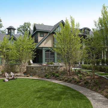
 Ryan Associates Landscape Architecture & Planning
Lawn ramp leads to oval lawn with surrounding peastone path.
By carefully framing views and clearly defining spaces for entertaining and arrival, Ryan Associates achieved a feeling of spaciousness and privacy within the very narrow bounds of this property. Site and circulation challenges were addressed by purposefully delineating paving patterns, planting design, and changes in elevation to define and separate the spaces and their uses. The signature feature, an oval lawn, is set off by a stunning grove of birch trees and a ramped grass path with granite steps – the focal point for an upper bluestone terrace overlooking the space.
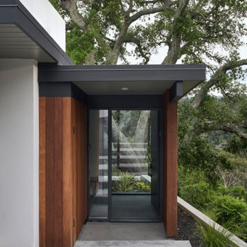
 Klopf Architecture
Set in a quiet neighborhood and framed by mature trees, this residence presented a unique opportunity: to thoughtfully evolve a custom mid-century modern home into a space that supports the everyday rhythms of a growing family. With a deep respect for the home’s original architecture, Klopf Architecture reimagined the house to better meet the needs of its owners—introducing functional improvements while preserving the spirit and character of its mid-century roots.
The clients approached Klopf Architecture with a clear vision: refresh their home while seamlessly integrating new programmatic elements. Key goals included clarifying and enhancing the entry sequence; connecting the detached garage to the main house with a practical yet architecturally intentional intervention; adding functional spaces such as a mudroom and laundry room; expanding and remodeling the primary suite’s bathroom and closet; and creating a more engaging outdoor space that capitalized on the site’s impressive views, featuring a fire pit and outdoor kitchen.
As a couple with distinct yet complementary perspectives—one focused on modern functionality and technology, and the other dedicated to preserving the home’s architectural integrity—their collaboration with Klopf Architecture resulted in a solution that harmonized both ideals. Their shared commitment to improving the livability of their home led to a design dialogue rooted in balance. This dynamic partnership shaped the direction of the renovation, ensuring that every decision honored the spirit of the original home while aligning with the practical needs of their growing family.
Designing within the constraints of the sloped site posed one of the project’s central challenges. The detached garage sat at a higher elevation than the main house, requiring a solution that ensured architectural and geometric compatibility between the two structures. Rather than create a purely utilitarian link, Klopf Architecture introduced an intentional connection that contributes to the overall architectural language. A notable pinch point in the plan—where differing geometries converged—was treated as a hinge point, turning a potentially awkward juncture into an architectural feature. This area now functions as both a transition and a moment of design interest that unifies the overall plan.
The design also addressed the underutilized outdoor area, which was located in a shadowed portion of the site with geometrical limitations. A new connection to the rear deck was created in this same area, making the outdoor space more useful and inviting. Klopf Architecture introduced carefully positioned openings and spatial improvements that forged a strong visual and functional connection between indoor and outdoor spaces. The outdoor area now reads as a deliberate extension of the home, embracing natural light and emphasizing the dramatic views.
Working through multiple design iterations, Klopf Architecture crafted a solution that preserved the architectural language of the original home while supporting the functional needs of modern life. The garage-to-house connection became more than a passage—it evolved into an architectural moment of transition. A new mudroom and laundry space enhanced convenience without compromising the clean lines of the design. The primary suite was expanded to create a private, serene retreat. The reimagined backyard, complete with fire pit and kitchen, now plays a vital role in the family’s daily routine and social life.
Outcomes and Lasting Impact
The result is a home that balances heritage with contemporary design, technical precision with design sensibility. The redesign not only met the clients’ initial goals but also exceeded expectations in its ability to seamlessly blend past and present, function and beauty, making the outdoor kitchen a favorite gathering place.
Beyond aesthetics, the renovation has significantly improved daily life for the family. The newly integrated garage connection has streamlined routines, providing a seamless transition between arriving home, storing belongings, and entering the main living spaces. The expanded primary suite offers a retreat-like atmosphere, creating a private space to unwind at the end of the day. The redesigned outdoor areas have also become an extension of their lifestyle—whether it's casual family dinners around the fire pit, entertaining friends in the outdoor kitchen, or simply enjoying the view from the reimagined backyard.
Through a thoughtful and strategic approach, the house has been successfully evolved into a home that remains true to its mid-century modern roots while enhancing livability, functionality, and the overall quality of life for the modern-day owners.
Klopf Architecture Team: Geoffrey Campen, Fernanda Bernardes
Architectural Interior Design: Klopf Architecture
Structural Engineer: Base Design Inc.
Contractor: Golden Snail Builders
Photography: Mariko Reed
Year Completed:2022


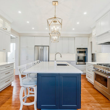
 Reico Kitchen & Bath
Blair Jones from Reico Kitchen & Bath in Woodbridge, VA, designed a transitional kitchen featuring Masterpiece Cabinetry in the Rockwell door style. The perimeter cabinets are a Dove White finish, while the island cabinets are in Midnight, complemented by Cambria Travella quartz countertops.
The clients shared, “Our main goals were to create a more usable space for gatherings and improve the flow between the kitchen and family room for entertaining. We achieved this by adding a large island with counter-level bar stools and widening the opening between the two rooms. We're thrilled with the results and love entertaining in our new kitchen. We had a very positive experience with Reico on our kitchen remodel and would highly recommend them for any project. The team was professional and a pleasure to work with throughout the entire renovation process. Any questions or concerns were addressed promptly.”
Blair added, “The clients had a clear vision but faced a few challenges along the way. We worked together to find the perfect solution, resulting in a kitchen that meets all their needs for hosting, socializing and more.”
Photos courtesy of BTW Images.
 Reader & Swartz Architects, P.C.
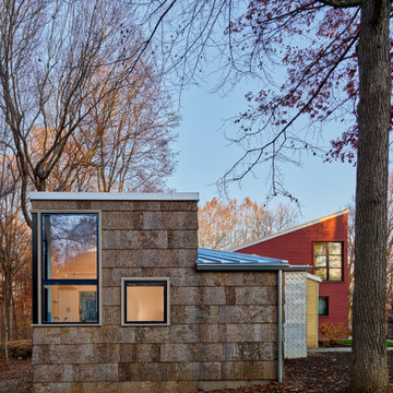
The goal of the project was to address the physical and perceptual challenges of aging in place while preserving and honoring the original design of the compound. The additions were designed to be compatible with the existing guest house, complement its small scale, and clearly read as new construction. The new volumes were purposely clad in contrasting materials, such as poplar bark shingles, thermally modified pine, stamped zinc-coated metal, and Shou Sugi Ban siding, to distinguish between the existing and the new, while still complementing the original materials palette. In consultation with arborists, the additions were designed to jog around and preserve the mature existing trees.
 Phoenix Home Remodeling
Shyla dreamed of transforming her master bathroom into a serene sanctuary with a Turkish feel. She sought a space that would provide a peaceful retreat while addressing outdated features and limited functionality.
The outdated layout presented a challenge, but after a thoughtful design phase, a plan was developed to create a functional and visually stunning space.
A custom walk-in shower became the centerpiece of the design, combining style with functionality. Moroccan Mix in Azure brought vibrant charm to the accent wall, while Smooth White tiles provided a clean and elegant frame.
The Bay View hexagon tiles on the shower floor added character and a fun style, while a built-in bench and a wall niche, finished with the same Azure accent tiles, provided useful storage and a unified look.
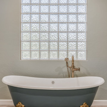
Replacing the old built-in tub, a freestanding tub in slate blue with brass feet became a bold and sophisticated centerpiece. Paired with a champagne bronze floor-mounted tub filler, this area radiates spa-like tranquility.
Sage-painted Waypoint cabinets paired with Calacatta Luccia quartz countertops added charm and elegance. Vessel sinks champagne bronze faucets, framed mirrors, and updated lighting completed the transformation.
Shyla’s master bathroom has been transformed into a serene and luxurious retreat tailored to her needs. The renovated space not only enhances her daily routine but also adds timeless beauty to her home.
 Four Elements Construction
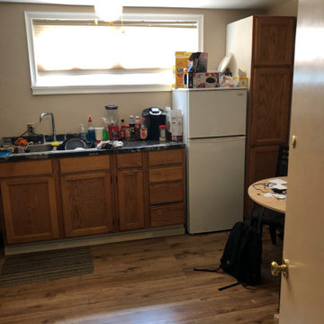
This was the another opportunity to work with one of our favorite clients on one of her projects. This time she wanted to completely revamp a recently purchased make-shift revenue property and convert it to a legal three-suiter maximizing rental income in a prime rental area close to NAIT. The mid-fifties semi-bungalow was in quite poor condition, so it was a challenging opportunity to address the various structural deficiencies while keeping the project at a reasonable budget. We gutted and opened up all three floors, removed a poorly constructed rear addition, and created three comfortable suites on the three separate floors. Compare the before and after pictures - a complete transformation!
 SHELLEY RODNER DESIGN / DDI
DESIGN CHALLENGES ADDRESSED:
To anyone who may be reading this project overview, I do hope you'll have the opportunity to
have a look at the 'before' photo of this space. It's quite a transformation!
Our homeowners purchased their condo at the beach several years ago. As shown in the 'before'
photo, at the time, their family room was a dark and dated space with unsightly paneled walls,
heavy faux ceiling beams and odds and ends for furniture. Everything felt cramped and cluttered
throughout the condo, especially their family room. The client's vision was for an airy and
relaxed coastal vibe for their 'place at the beach'.
DESIGN SOLUTIONS PROVIDED:
The entire condo was taken down to stud. The faux beams were edited out and the ceiling raised.
The heavy out-dated paneling was removed and replaced with fresh clean walls that were painted
in a calming creamy sand tone throughout the entire condo.
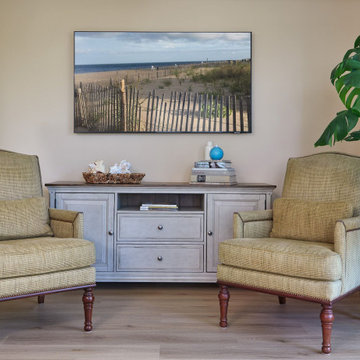
The existing dark and gloomy furniture was replaced with stylish updated pieces. Great thought
was given to the size, scale and textiles used. The sofa and loveseat, done in a softly textured
herring boned pattern, was the perfect choice. It's cremey toned easy care fabric created a 'pet
friendly' environment for the clients. The homeowners have two dogs and a cat who love a visit
to the beach as much as their 'humans'.
Worn out window treatments were replaced with fresh custom draperies in a playful botanical
print featuring tones of kiwi, leaf green and cerulean blue. A special 'solar friendly' lining was
used to tame the harmful rays of direct sun.
A variety of special curated accents were added to the room. The richly textured rug, round
coffee table with an organic feel, comfy pillows and a few special art pieces all helped to
complete this space.
The overall effect of the renovation was quite dramatic and the clients were thrilled with the
results. This family room went from being dark and dated to light and airy and is now a space
that is inviting and relaxing which perfectly suits the homeowner's coastal lifestyle.
RETAIL PROJECT PRICE: $ 9,000.00
Retail price is defined as the total sale you submitted on your sales repor
 Amy Pearson Design
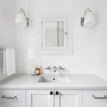
This classic Portland bungalow in the highly desirable Irvington neighborhood has been in the family for generations and lovingly cared for and updated throughout the years. It was now the main floor’s primary bathroom that needed to be addressed. A tight footprint made for some space planning challenges, but what we love so much about this project is that it demonstrates that so much can be done with a small space! Designing a shallower than typical vanity allowed us to extend the cabinetry and countertop as far as the door swing into the room would allow, adding much needed storage to the room. A narrow undermount sink combined with wall mount faucet ensures the vanity remains extremely functional. A tower cabinet at the end frames the sink and mirror, bringing an appreciated moment of symmetry while providing space for electric bathroom products and so much more. Where a two sided tub/shower once lived, now a walk in shower framed in glass makes the space feel, and live, significantly larger than its modest square footage. The use of glass on only the long side, and pony wall with glass above on the short end, visually expands the space allowing the eye to move freely around the room while still providing privacy at the toilet. Marmoleum flooring makes for easy cleaning while mosaic tile on the shower floor ensures traction in the wet environment. A classic penny tile accent around the shower walls, combined with the tile wainscot around the room speak to the classic architecture of the home. The bright and fresh palette is at once lively and calming, youthful and sophisticated, current and timeless!
 LBK Design Build
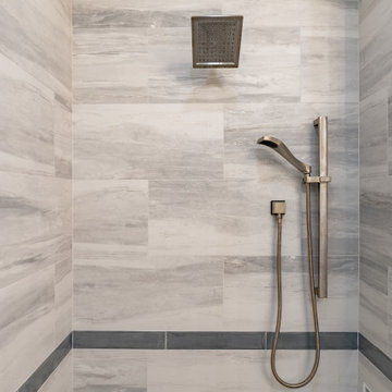
This Primary Suite renovation was designed to enhance both functionality and aesthetics, creating a luxurious yet practical retreat. The original floor plan presented several challenges, including inefficient space utilization, lack of storage, and outdated design elements that no longer met the homeowner’s needs. To address these concerns, the new layout was carefully planned to improve flow, maximize storage, and incorporate modern conveniences while maintaining a timeless appeal.
 Reader & Swartz Architects, P.C.
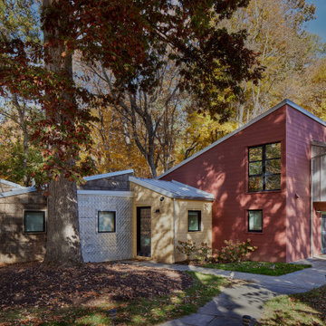
The goal of the project was to address the physical and perceptual challenges of aging in place while preserving and honoring the original design of the compound. The additions were designed to be compatible with the existing guest house, complement its small scale, and clearly read as new construction. The new volumes were purposely clad in contrasting materials, such as poplar bark shingles, thermally modified pine, stamped zinc-coated metal, and Shou Sugi Ban siding, to distinguish between the existing and the new, while still complementing the original materials palette. In consultation with arborists, the additions were designed to jog around and preserve the mature existing trees.
 Elegance Kitchen & Bath
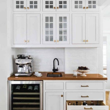
White Kitchen Cabinets: Timeless Elegance for Modern Homes
White kitchen cabinets are more than just a design choice; they're a testament to timeless elegance and adaptability in the heart of any home. As homeowners continue to seek spaces that feel airy, clean, and spacious, white cabinets have emerged as a top choice for both modern and traditional kitchens alike.
Why Choose White Kitchen Cabinets?
Versatility: The neutral hue of white allows these cabinets to blend seamlessly with any color palette or kitchen design. Whether you're aiming for a sleek modern look or a cozy cottage vibe, white cabinets can be the perfect canvas to achieve your desired aesthetic.
Brightness and Space: White reflects light beautifully, making your kitchen appear larger and more open. It's especially beneficial for smaller spaces, where creating an illusion of a more expansive area is crucial.
Timeless Appeal: While trends come and go, white has an enduring appeal. It exudes a sense of cleanliness and simplicity, making it a long-lasting choice for homeowners.
Resale Value: If you ever consider selling your home, white kitchen cabinets can boost your property's appeal to potential buyers, ensuring that your kitchen remains stylish and up-to-date.
Pairing with Other Elements
The adaptability of white kitchen cabinets means you can play with various colors and textures. Whether it's a vibrant backsplash, granite countertops, or wooden flooring, the neutrality of white ensures that everything comes together harmoniously.
Maintenance and Durability
A common misconception is that white cabinets can be challenging to maintain. However, with today's advancements in paint and finishes, white kitchen cabinets are resistant to stains and easy to clean. Furthermore, any marks or stains are quickly spotted, ensuring that you can address them promptly, keeping your cabinets in pristine condition.
Conclusion
White kitchen cabinets are not just a fleeting trend. Their unmatched versatility, the spacious feel they bring to any kitchen, and their timeless beauty make them an excellent choice for homeowners. Whether you're renovating your kitchen or designing a new one, consider the elegance and adaptability that white cabinets can bring to your space. With proper care and the right design elements, your white kitchen can be a showstopper for years to come.

 Modulor
Located in the heart of Montreal, Binôme is an architectural urban densification project built by Modulor. Composed of two distinct buildings connected by an inner courtyard, this new five-unit development stands out through its unique layout, architecture, and exceptional attention to detail. The construction required rigorous planning and precise technical execution, particularly due to major excavation work and underpinning of adjacent buildings. Such interventions in a dense urban environment demand specialized expertise and tight project management at every phase of the build.
Conceived as an income-generating property, the clients benefited from our strategic support to ensure the profitability, efficiency, and optimization of their investment. Modulor worked closely with the team at Appareil Architecture to bring to life a project of high architectural integrity.
Binôme’s architecture draws inspiration from the area's industrial past: clean volumes, red brick, generous openings reminiscent of former workshops, and elegant brick colonnades form a refined and cohesive ensemble. The central courtyard, designed as a luminous and welcoming shared space, becomes the vibrant heart of the project. A colorful metal staircase, crafted by Atomic Soudure, connects both buildings and adds a distinctive, curated touch.
As a finalist for the 2025 Ordre des architectes du Québec Awards of Excellence, Binôme stands as a model of successful urban revitalization. It illustrates how thoughtful, well-executed construction can elevate Montreal’s built environment while addressing today’s densification challenges.
 Crystal Kitchen + Bath
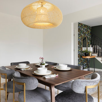
The Plymouth clients faced a dilemma with a non-functioning dishwasher, ovens, and cooktop, an awkward layout, and dated arches straight from the ’80s. Despite the challenges, their love for the school district, neighborhood, and home prevailed.
We undertook a transformative journey, turning their first floor into an entertainer’s haven with a stunning kitchen, a chic dining room, an enchanting powder bath, and a practical mudroom.
Breaking down barriers, we removed the wall between the kitchen and living room, widening entrances to the dining room. Faux beams and a window in the family room were eliminated, and the old Chicago fireplace brick received a sleek black makeover crowned with a live edge mantel. A pop of terracotta paint and floating shelves in the new record player niche set the stage for nostalgic LPs.
Considering the family’s love for baking and grilling, we prioritized ample storage. Pull-out spice racks, a charging drawer, built-in knife block, trash & recycle pull-out, built-in tray dividers, corner storage, large drawers, and roll-out shelves now keep everything organized and easily accessible.
Embracing a Scandifornian design style, favored by the clients, infused the space with color and natural materials. A woven grass light fixture in the dining room, light wood-look luxury vinyl floors, and a vibrant green herringbone tile backsplash all contributed to the refreshing aesthetic. Throughout the home, terracotta and green hues with accents of black added depth and interest, while the redesigned layout now bathes the entire space in natural light.
In addressing practical needs, we removed an exterior door from the mudroom to create a closet and a built-in bench with hooks. The main entry and powder bath now share playful floral wallpaper, complemented by a walnut vanity and gold fixtures in the powder room, offering a sophisticated touch amidst vibrant botanicals.
 CairnsCraft Design & Remodel
Rustic-Modern Finnish Kitchen
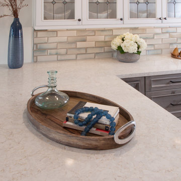
Our client was inclined to transform this kitchen into a functional, Finnish inspired space. Finnish interior design can simply be described in 3 words: simplicity, innovation, and functionalism. Finnish design addresses the tough climate, unique nature, and limited sunlight, which inspired designers to create solutions, that would meet the everyday life challenges. The combination of the knotty, blue-gray alder base cabinets combined with the clean white wall cabinets reveal mixing these rustic Finnish touches with the modern. The leaded glass on the upper cabinetry was selected so our client can display their personal collection from Finland.
Mixing black modern hardware and fixtures with the handmade, light, and bright backsplash tile make this kitchen a timeless show stopper.
This project was done in collaboration with Susan O'Brian from EcoLux Interiors.
 Elegance Kitchen & Bath
White Kitchen Cabinets: Timeless Elegance for Modern Homes
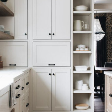
White kitchen cabinets are more than just a design choice; they're a testament to timeless elegance and adaptability in the heart of any home. As homeowners continue to seek spaces that feel airy, clean, and spacious, white cabinets have emerged as a top choice for both modern and traditional kitchens alike.
Why Choose White Kitchen Cabinets?
Versatility: The neutral hue of white allows these cabinets to blend seamlessly with any color palette or kitchen design. Whether you're aiming for a sleek modern look or a cozy cottage vibe, white cabinets can be the perfect canvas to achieve your desired aesthetic.
Brightness and Space: White reflects light beautifully, making your kitchen appear larger and more open. It's especially beneficial for smaller spaces, where creating an illusion of a more expansive area is crucial.
Timeless Appeal: While trends come and go, white has an enduring appeal. It exudes a sense of cleanliness and simplicity, making it a long-lasting choice for homeowners.
Resale Value: If you ever consider selling your home, white kitchen cabinets can boost your property's appeal to potential buyers, ensuring that your kitchen remains stylish and up-to-date.
Pairing with Other Elements
The adaptability of white kitchen cabinets means you can play with various colors and textures. Whether it's a vibrant backsplash, granite countertops, or wooden flooring, the neutrality of white ensures that everything comes together harmoniously.
Maintenance and Durability
A common misconception is that white cabinets can be challenging to maintain. However, with today's advancements in paint and finishes, white kitchen cabinets are resistant to stains and easy to clean. Furthermore, any marks or stains are quickly spotted, ensuring that you can address them promptly, keeping your cabinets in pristine condition.
Conclusion
White kitchen cabinets are not just a fleeting trend. Their unmatched versatility, the spacious feel they bring to any kitchen, and their timeless beauty make them an excellent choice for homeowners. Whether you're renovating your kitchen or designing a new one, consider the elegance and adaptability that white cabinets can bring to your space. With proper care and the right design elements, your white kitchen can be a showstopper for years to come.
37