
Search results for "Address challenges" in Home Design Ideas
 Amy Pearson Design
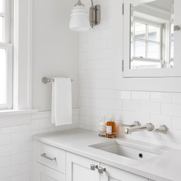
This classic Portland bungalow in the highly desirable Irvington neighborhood has been in the family for generations and lovingly cared for and updated throughout the years. It was now the main floor’s primary bathroom that needed to be addressed. A tight footprint made for some space planning challenges, but what we love so much about this project is that it demonstrates that so much can be done with a small space! Designing a shallower than typical vanity allowed us to extend the cabinetry and countertop as far as the door swing into the room would allow, adding much needed storage to the room. A narrow undermount sink combined with wall mount faucet ensures the vanity remains extremely functional. A tower cabinet at the end frames the sink and mirror, bringing an appreciated moment of symmetry while providing space for electric bathroom products and so much more. Where a two sided tub/shower once lived, now a walk in shower framed in glass makes the space feel, and live, significantly larger than its modest square footage. The use of glass on only the long side, and pony wall with glass above on the short end, visually expands the space allowing the eye to move freely around the room while still providing privacy at the toilet. Marmoleum flooring makes for easy cleaning while mosaic tile on the shower floor ensures traction in the wet environment. A classic penny tile accent around the shower walls, combined with the tile wainscot around the room speak to the classic architecture of the home. The bright and fresh palette is at once lively and calming, youthful and sophisticated, current and timeless!
 Reader & Swartz Architects, P.C.
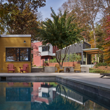
The goal of the project was to address the physical and perceptual challenges of aging in place while preserving and honoring the original design of the compound. The additions were designed to be compatible with the existing guest house, complement its small scale, and clearly read as new construction. The new volumes were purposely clad in contrasting materials, such as poplar bark shingles, thermally modified pine, stamped zinc-coated metal, and Shou Sugi Ban siding, to distinguish between the existing and the new, while still complementing the original materials palette. In consultation with arborists, the additions were designed to jog around and preserve the mature existing trees.
 Four Elements Construction
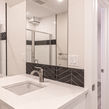
This was the another opportunity to work with one of our favorite clients on one of her projects. This time she wanted to completely revamp a recently purchased make-shift revenue property and convert it to a legal three-suiter maximizing rental income in a prime rental area close to NAIT. The mid-fifties semi-bungalow was in quite poor condition, so it was a challenging opportunity to address the various structural deficiencies while keeping the project at a reasonable budget. We gutted and opened up all three floors, removed a poorly constructed rear addition, and created three comfortable suites on the three separate floors. Compare the before and after pictures - a complete transformation!
Find the right local pro for your project
 Interlocking Concrete Pavement Institute
HNA Hardscape Project Award Winner
Mahaz Project
Sand Point, Michigan
Esch Landscaping LLC
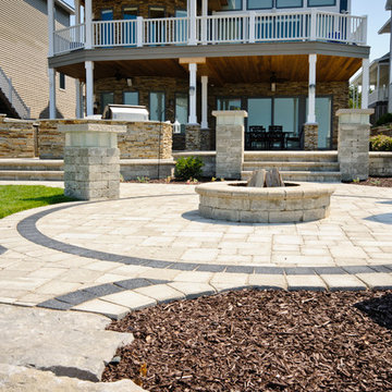
This 3,300 square feet project was constructed on the beach of Lake Huron in Michigan. The house and landscape began on an empty lot between two homes using interlocking concrete pavers.
The designer addressed elevations, proximity regulations with neighboring homes, and construction deadlines while working with clients living in another state. The owners required an outdoor kitchen, firepit, shower and sun bathing area, shade for comfort when entertaining guests and easy access to the beach.
The hardscape team met challenges by coordinating and sharing space with the home construction crews. This project began in March so the wind and weather caused difficult working conditions with site facing the open water.
 Braen Supply
Building a Dream Backyard
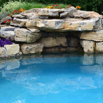
When this homeowner started the design process of a new backyard, Braen Supply was immediately there to supply all the stone materials. The home was part of a new development, so the challenge was to make the home stand out while still addressing specific areas of the existing backyard, such as the steep grade.
Working With the Experts
Taking the steep grade into consideration, moss rock boulders were selected to create stairs down to the lower area of the backyard where the fire pit sits. The grade of the backyard also allowed for the infinity pool, full color bluestone pattern was selected as the veneer for the back wall of the infinity pool.
Braen Supply chose Tennessee gray and bluestone to create a seamless transition from the front of the house to the back of the house. Although they are two different stones, they work nicely together to complete the overall design and tone of the home. It all came together and made the perfect backyard.
Materials Used:
Belgium Blocks
Full Color Bluestone Pattern
Bluestone Caps
Tennessee Gray Irregular
Moss Rock Boulders
Full Color Bluestone Irregular
Kearney Stone Steps
Granite Mosaic Veneer
Completed Areas:
Front Walkway & Porch
Driveway Edging
Backyard Walkways
Pool Patio & Coping
Pool Water Features
Fireplace Hearth & Mantal
Wading Pool
Raised Hot Tub
 Reico Kitchen & Bath
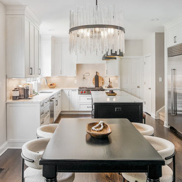
Designed by Lauren Hunt of Reico Kitchen & Bath in Charlotte NC, this transitional style inspired kitchen design with small bar area features Ultracraft Cabinetry in the Avon door style with two finishes. The perimeter kitchen design is in the Simply White finish with the finish Black on the kitchen island. The kitchen countertops are MSI Q Calacatta Laza. The kitchen also features a Best Tile Soho Rumba Diamond Gris 4x8 tile backsplash.
“Remodeling a kitchen during COVID was certainly a challenge given the delays in the supply chain and while this did extend our timeline, the finished result was well worth it,” said the client. “Lauren had so many great suggestions to make the kitchen work better for us, such as making the most of the lower cabinet areas by adding drawers and selecting a frameless cabinet line that provided more additional space. Cooking and entertaining have never been so much fun! Lauren and our Project Manager Eric are both such great people to work with. I really appreciated their patience as we were trying to make decisions and for their efforts in ensuring all details were addressed.
“The clients were so great to work with and incredibly patient,” said Lauren. “We didn't make any significant layout changes from their existing floor plan, so our goal was to maximize functionality using accessories like a lazy susan, spice pullout, and knife/utensil pullout, and to update the cabinetry to match the rest of their beautiful home. We wanted to keep everything very clean and streamlined, so the appliances were flush installed and we tried to minimize the number of stiles and rails on the cabinetry so the kitchen didn't look too busy. The outcome is truly stunning.”
Photos courtesy of Six Cents Media.
 Modulor
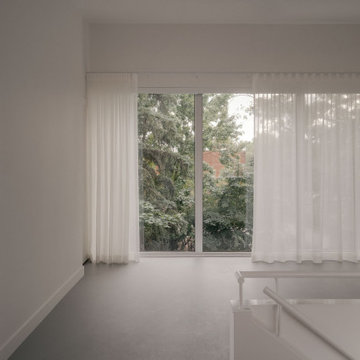
Located in the heart of Montreal, Binôme is an architectural urban densification project built by Modulor. Composed of two distinct buildings connected by an inner courtyard, this new five-unit development stands out through its unique layout, architecture, and exceptional attention to detail. The construction required rigorous planning and precise technical execution, particularly due to major excavation work and underpinning of adjacent buildings. Such interventions in a dense urban environment demand specialized expertise and tight project management at every phase of the build.
Conceived as an income-generating property, the clients benefited from our strategic support to ensure the profitability, efficiency, and optimization of their investment. Modulor worked closely with the team at Appareil Architecture to bring to life a project of high architectural integrity.
Binôme’s architecture draws inspiration from the area's industrial past: clean volumes, red brick, generous openings reminiscent of former workshops, and elegant brick colonnades form a refined and cohesive ensemble. The central courtyard, designed as a luminous and welcoming shared space, becomes the vibrant heart of the project. A colorful metal staircase, crafted by Atomic Soudure, connects both buildings and adds a distinctive, curated touch.
As a finalist for the 2025 Ordre des architectes du Québec Awards of Excellence, Binôme stands as a model of successful urban revitalization. It illustrates how thoughtful, well-executed construction can elevate Montreal’s built environment while addressing today’s densification challenges.


 KC Interior Design Inc.
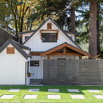
The old cabin was long overdue for a facelift. The lower level's painted masonry block and top-heavy gable needed attention, while dated glass block around the front door and small windows posed some recladding challenges. To address these issues, we introduced a new covered area at the front entrance, providing added protection from the elements and seamlessly connecting the lower level to the upper window. Additionally, we installed a new matching shed, offering ample storage space for patio furniture and incorporating a convenient EV charger for the client. New pavers and artificial turf finish off the parking spots.
 Braen Supply
Building a Dream Backyard
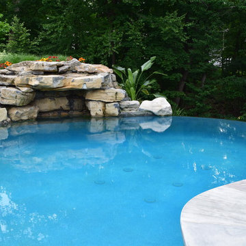
When this homeowner started the design process of a new backyard, Braen Supply was immediately there to supply all the stone materials. The home was part of a new development, so the challenge was to make the home stand out while still addressing specific areas of the existing backyard, such as the steep grade.
Working With the Experts
Taking the steep grade into consideration, moss rock boulders were selected to create stairs down to the lower area of the backyard where the fire pit sits. The grade of the backyard also allowed for the infinity pool, full color bluestone pattern was selected as the veneer for the back wall of the infinity pool.
Braen Supply chose Tennessee gray and bluestone to create a seamless transition from the front of the house to the back of the house. Although they are two different stones, they work nicely together to complete the overall design and tone of the home. It all came together and made the perfect backyard.
Materials Used:
Belgium Blocks
Full Color Bluestone Pattern
Bluestone Caps
Tennessee Gray Irregular
Moss Rock Boulders
Full Color Bluestone Irregular
Kearney Stone Steps
Granite Mosaic Veneer
Completed Areas:
Front Walkway & Porch
Driveway Edging
Backyard Walkways
Pool Patio & Coping
Pool Water Features
Fireplace Hearth & Mantal
Wading Pool
Raised Hot Tub
 LifeStyle Saint Veronica Brooks ASID Design
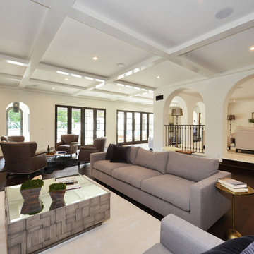
Hancock Homes Realty - Hancock Homes Realty - The challenge of addressing this really grand space was to separate the spaces to give transition. I attacked this remodel by designing the ceiling plan. lighting, creating intimacy and purpose in each space and through colors in furnishings. I created the curved ceiling design to mimic that of a family crest. - Hancock Homes Realty - Home sold for $10 Million in Historic Hancock Park
 Architectural Resource LLC
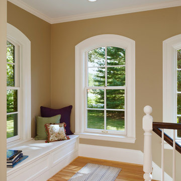
Our Clients, the proud owners of a landmark 1860’s era Italianate home, desired to greatly improve their daily ingress and egress experience. With a growing young family, the lack of a proper entry area and attached garage was something they wanted to address. They also needed a guest suite to accommodate frequent out-of-town guests and visitors. But in the homeowner’s own words, “He didn’t want to be known as the guy who ‘screwed up’ this beautiful old home”. Our design challenge was to provide the needed space of a significant addition, but do so in a manner that would respect the historic home. Our design solution lay in providing a “hyphen”: a multi-functional daily entry breezeway connector linking the main house with a new garage and in-law suite above.
 Alair Homes Chilliwack
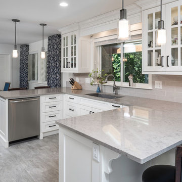
This was a challenging project for very discerning clients. The home was originally owned by the client’s father, and she inherited it when he passed. Care was taken to preserve the history in the home while upgrading it for the current owners. This home exceeds current energy codes, and all mechanical and electrical systems have been completely replaced. The clients remained in the home for the duration of the reno, so it was completed in two phases. Phase 1 involved gutting the basement, removing all asbestos containing materials (flooring, plaster), and replacing all mechanical and electrical systems, new spray foam insulation, and complete new finishing.
The clients lived upstairs while we did the basement, and in the basement while we did the main floor. They left on a vacation while we did the asbestos work.
Phase 2 involved a rock retaining wall on the rear of the property that required a lengthy approval process including municipal, fisheries, First Nations, and environmental authorities. The home had a new rear covered deck, garage, new roofline, all new interior and exterior finishing, new mechanical and electrical systems, new insulation and drywall. Phase 2 also involved an extensive asbestos abatement to remove Asbestos-containing materials in the flooring, plaster, insulation, and mastics.
Photography by Carsten Arnold Photography.
 Irene Designs
Home Remodeling Project Overview
This extensive home remodeling project transformed a dated and inefficient layout into a functional, open, and aesthetically cohesive living space. The original layout had several challenges:
• A kitchen with limited storage, no cabinets on the window side, a sink facing the wall, and a range crammed into the corner. The pantry closet was too deep and impractical.
• A living room that couldn’t accommodate furniture without interfering with traffic flow.
• A front foyer with wasted space.
• A claustrophobic hallway toilet room without a sink, located near the laundry room.
The Remodeling Concept
The scope of this project extended well beyond the kitchen. We proposed several layout options to address issues in all adjacent spaces, ultimately implementing a plan that:
• Removed two walls and moved doorways.
• Replaced the kitchen window.
• Converted the hallway toilet room into a storage space.
• Installed pocket doors to separate the laundry hallway from the living room.
Kitchen Transformation
• Open Concept: By removing the wall between the kitchen and dining room, the two spaces became a seamless open area.
• New Layout: Cabinets were relocated to the window side for more storage and natural light. A central island with storage and seating was added, and a coffee bar was installed in the dining room.
• Updated Pantry: The deep pantry closet was converted into a pullout pantry with a cabinet front for better accessibility.
• Design Details: Off-white kitchen cabinets pair beautifully with a light green island. Warm white quartz counters and an artisan tile backsplash complete the look.
Dining Room
• Expanded Space: Most of the wall separating the dining room and foyer was removed, creating a more spacious area while still accommodating all furniture thanks to careful measurements.
Living Room Improvements
• Optimized Layout: Moving doorways and installing pocket doors allowed for better furniture placement, including a sofa that doesn’t interfere with traffic flow.
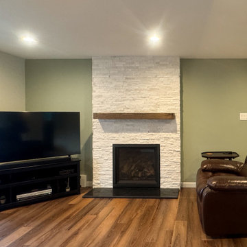
• Fireplace Upgrade: The brick fireplace was updated with a three-dimensional staggered stone veneer in a color matching the kitchen cabinets, creating a cohesive look. A TV was installed above the fireplace at a comfortable viewing angle.
Additional Updates
• New Flooring: All remodeled rooms now feature updated flooring.
• Ceilings: Popcorn ceilings were replaced with smooth, flat finishes, complemented by recessed lighting.
• Walls: Fresh paint throughout the space, with an accent wall in the living room matching the light green of the kitchen island.
• Lighting: Stylish sconces were added for a touch of elegance.
The Result
The homeowners are thrilled with the transformation, marveling at how their once cramped and inefficient home now feels spacious, functional, and beautifully cohesive. They can’t believe their house could ever look like this!
 Elegance Kitchen & Bath
White Kitchen Cabinets: Timeless Elegance for Modern Homes
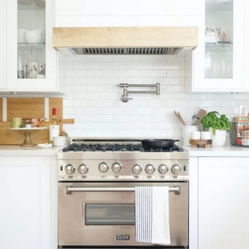
White kitchen cabinets are more than just a design choice; they're a testament to timeless elegance and adaptability in the heart of any home. As homeowners continue to seek spaces that feel airy, clean, and spacious, white cabinets have emerged as a top choice for both modern and traditional kitchens alike.
Why Choose White Kitchen Cabinets?
Versatility: The neutral hue of white allows these cabinets to blend seamlessly with any color palette or kitchen design. Whether you're aiming for a sleek modern look or a cozy cottage vibe, white cabinets can be the perfect canvas to achieve your desired aesthetic.
Brightness and Space: White reflects light beautifully, making your kitchen appear larger and more open. It's especially beneficial for smaller spaces, where creating an illusion of a more expansive area is crucial.
Timeless Appeal: While trends come and go, white has an enduring appeal. It exudes a sense of cleanliness and simplicity, making it a long-lasting choice for homeowners.
Resale Value: If you ever consider selling your home, white kitchen cabinets can boost your property's appeal to potential buyers, ensuring that your kitchen remains stylish and up-to-date.
Pairing with Other Elements
The adaptability of white kitchen cabinets means you can play with various colors and textures. Whether it's a vibrant backsplash, granite countertops, or wooden flooring, the neutrality of white ensures that everything comes together harmoniously.
Maintenance and Durability
A common misconception is that white cabinets can be challenging to maintain. However, with today's advancements in paint and finishes, white kitchen cabinets are resistant to stains and easy to clean. Furthermore, any marks or stains are quickly spotted, ensuring that you can address them promptly, keeping your cabinets in pristine condition.
Conclusion
White kitchen cabinets are not just a fleeting trend. Their unmatched versatility, the spacious feel they bring to any kitchen, and their timeless beauty make them an excellent choice for homeowners. Whether you're renovating your kitchen or designing a new one, consider the elegance and adaptability that white cabinets can bring to your space. With proper care and the right design elements, your white kitchen can be a showstopper for years to come.
 Jordan Design Build Group
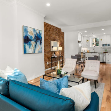
Built in 1910, this charming DC row house is located in the historic Bloomingdale neighborhood. At some point, the home had been converted into two separate apartments and, in doing so, the previous owners had removed the connecting stairs and made some other problematic design decisions. When our clients purchased the home in 2017, it required a full gut renovation in order to bring it up to code and return it to a single family residence. One of the initial challenges was to address the excessive bulkheads, soffits and ceiling height changes that made the rooms feel off kilter. Reconfiguring the HVAC system and ductwork allowed us to minimize bulkheads and raise the ceilings which, in turn made the spaces feel larger and more open. In the kitchen, the extra height meant we could install taller upper cabinets which provided much needed storage. By expanding the kitchen we were able to reconfigure the layout and create additional prep space and a more functional location for the range.
 Crystal Kitchen + Bath
The Plymouth clients faced a dilemma with a non-functioning dishwasher, ovens, and cooktop, an awkward layout, and dated arches straight from the ’80s. Despite the challenges, their love for the school district, neighborhood, and home prevailed.
We undertook a transformative journey, turning their first floor into an entertainer’s haven with a stunning kitchen, a chic dining room, an enchanting powder bath, and a practical mudroom.
Breaking down barriers, we removed the wall between the kitchen and living room, widening entrances to the dining room. Faux beams and a window in the family room were eliminated, and the old Chicago fireplace brick received a sleek black makeover crowned with a live edge mantel. A pop of terracotta paint and floating shelves in the new record player niche set the stage for nostalgic LPs.
Considering the family’s love for baking and grilling, we prioritized ample storage. Pull-out spice racks, a charging drawer, built-in knife block, trash & recycle pull-out, built-in tray dividers, corner storage, large drawers, and roll-out shelves now keep everything organized and easily accessible.
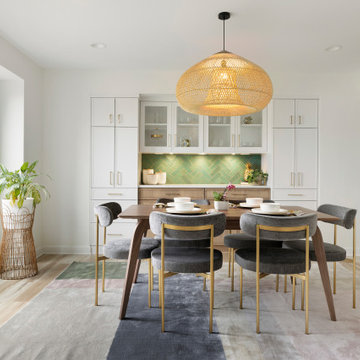
Embracing a Scandifornian design style, favored by the clients, infused the space with color and natural materials. A woven grass light fixture in the dining room, light wood-look luxury vinyl floors, and a vibrant green herringbone tile backsplash all contributed to the refreshing aesthetic. Throughout the home, terracotta and green hues with accents of black added depth and interest, while the redesigned layout now bathes the entire space in natural light.
In addressing practical needs, we removed an exterior door from the mudroom to create a closet and a built-in bench with hooks. The main entry and powder bath now share playful floral wallpaper, complemented by a walnut vanity and gold fixtures in the powder room, offering a sophisticated touch amidst vibrant botanicals.
 Sosna Inc
Our clients approached us to renovate their loved family home. The Main Floor needed a fresh update, and better functionality and storage to fit the needs of their growing family.
The existing Kitchen felt closed off from the rest of the Main Floor, and the layout did not allow for enough countertop or storage space. Each of their Bathrooms also needed an update and better storage.
Due to a previously bad experience with another contractor previously, it was important for our clients to work with a contractor who they could build trust with, and feel respected by and comfortable with.
Using space from an extra stairway in the side entry of the house, we were able to create a spacious mudroom, perfect for taking a seat to put on or take off coats and boots, and unique, hidden storage for seasonal and outdoor items.
We were able to create a more open concept Main Floor, by removing the walls between the Kitchen and Family Room. This allowed for a larger, more functional Kitchen. The new Kitchen is bright and welcoming with white quartz countertops that run seamlessly into a matching backsplash. Beautiful white cabinetry is complemented by brushed bronze pulls and faucets, and durable, contemporary flooring.
We transformed the Kitchen and Family Room areas with a vaulted ceiling, and a repaired and modernized Kitchen skylight. We also integrated a patio door entrance, which combined with both sloped and flat sections of the vaulted ceiling, proved to be quite a challenge!
This project involved skilled welding, roofing, and structural work, and it was important to maintain the structural integrity of the ceiling. As any mistakes could result in serious issues, communication between everyone involved was key! Regular team meetings, updates on progress, and addressing concerns promptly kept everyone on the same page and avoided misunderstandings. In the end, the raised ceiling, skylight, and patio door were well worth the work, as together they enhanced the airiness and visual spaciousness of the space.
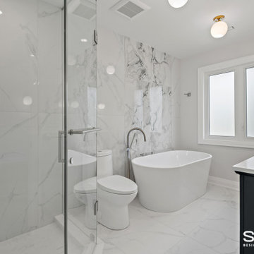
On the Second Floor, we created a larger Master Ensuite by borrowing room from existing closet space. This allowed for a spacious walk-in shower, and separate bathtub. A prefabricated stylish vanity not only adds a pop of colour, but also provides plenty of useful storage. New marble tiling on the floor extends to the wall behind the bathtub, creating a luxurious accent wall.
The Shared Bathroom was updated to include a new walk-in shower, and a separate bathtub, surrounded by modern geometric wall tiles.
The removal of popcorn ceilings, an updated the Front Door, and a refinished Main Staircase with metal railings completed tying the home together, creating a fresh, updated space that this family can enjoy for years to come.
 Michelle Helms Lecinski
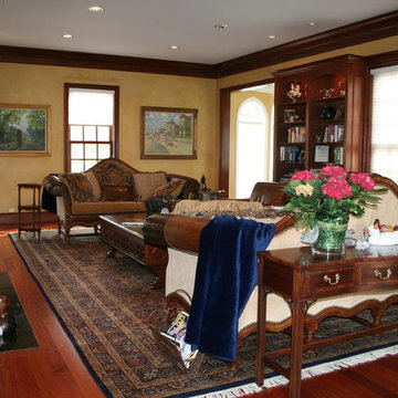
 The challenge in this great room was to select pieces that could float in the middle of the space while honoring access to the bookcase wall, the view of the lake and the function of the TV angle. The existing area rug was the inspiration for the color story.
The symmetry of the pair of camel-back sofas anchors the arrangement around
the huge wood inlay coffee table from Art Italia. Blending end tables from the existing collection was a snap.
Photo taken by Michelle Lecinski
 Castle Building & Remodeling
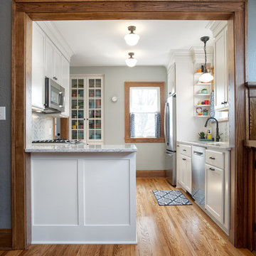
This 1929 Tudor kitchen and porch in St. Paul’s Macalester-Groveland neighborhood was ready for a remodel. The existing back porch was falling off the home and the kitchen was a challenge for the family.
A new kitchen was designed that opened up to the dining room, to create more light and sense of space.
A small back addition was completed to extend the mudroom space and storage. Castle designed and constructed a new open back porch with Azek composite decking, new railing, and stunning arch detail on the roof to coordinate with the home’s existing sweeping lines.
Inside the kitchen, Crystal cabinetry, Silestone quartz countertops, Blanco composite sink, Kohler faucet, new appliances from Warners’ Stellian, chevron tile backsplash from Ceramic Tileworks, and new hardwoods, laced in to match the existing, fully update the space.
One of our favorite details is the glass-doored pantry for the homeowners to showcase their Fiestaware!
Tour this project in person, September 28 – 29, during the 2019 Castle Home Tour!
 Amy Pearson Design
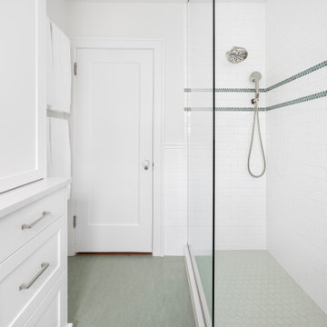
This classic Portland bungalow in the highly desirable Irvington neighborhood has been in the family for generations and lovingly cared for and updated throughout the years. It was now the main floor’s primary bathroom that needed to be addressed. A tight footprint made for some space planning challenges, but what we love so much about this project is that it demonstrates that so much can be done with a small space! Designing a shallower than typical vanity allowed us to extend the cabinetry and countertop as far as the door swing into the room would allow, adding much needed storage to the room. A narrow undermount sink combined with wall mount faucet ensures the vanity remains extremely functional. A tower cabinet at the end frames the sink and mirror, bringing an appreciated moment of symmetry while providing space for electric bathroom products and so much more. Where a two sided tub/shower once lived, now a walk in shower framed in glass makes the space feel, and live, significantly larger than its modest square footage. The use of glass on only the long side, and pony wall with glass above on the short end, visually expands the space allowing the eye to move freely around the room while still providing privacy at the toilet. Marmoleum flooring makes for easy cleaning while mosaic tile on the shower floor ensures traction in the wet environment. A classic penny tile accent around the shower walls, combined with the tile wainscot around the room speak to the classic architecture of the home. The bright and fresh palette is at once lively and calming, youthful and sophisticated, current and timeless!
41