
Search results for "Addressing" in Home Design Ideas
 Goggans Architecture & Interiors
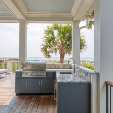
When the Owners approached Goggans Architecture about renovation of a 90’s era oceanfront house, it was clear there would be a lot more to the renovation than mere updates and remedying deferred maintenance. One of the most significant issues was how to integrate an outdoor pool given the pool had to be within the building envelope, and the house was already abutting the setback on its ocean side. A second significant challenge was how to provide a roof top deck over a pitched roof house with an attic, that was functional and attractive. Finally, creating better access from the parking area to the kitchen was a priority.
Goggans Architecture addressed the placement of a pool by creating a walled courtyard at the front, or landward side, of the house. The pool was placed on one side of the entry walkway, while its composition was balanced by a parterre garden on the other side of the walkway. The roof top deck was resolved by adding a new staircase and passageway through former attic space. By using a motorized roof hatch, the Owners could ascend to the roof deck which perched just below the roof ridge, hidden from view from the street. Relocating an underneath stair from one side of the house to a point that was closer to the kitchen resolved the access issue.
These strategic moves created other opportunities, such as expansion of the master bathroom to a portion of the front porch, while allowing an exterior stair from the bath directly to the pool. Other enhancements included placement of a large folding door in the Great room, renovation and expansion of the kitchen and exterior decks, reorganization, and replacement of the fenestration, updating all baths and interior and exterior finishes.
The extensive renovation reflects the holistic approach of Goggans Architecture, marrying landscape architecture, architecture, and interiors.

 Goggans Architecture & Interiors
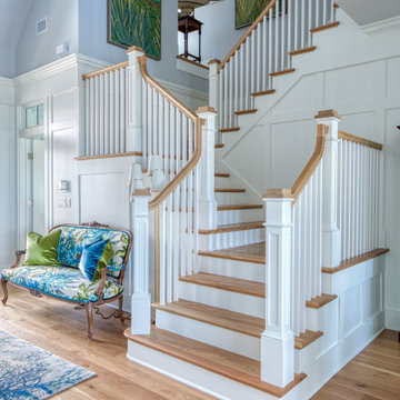
When the Owners approached Goggans Architecture about renovation of a 90’s era oceanfront house, it was clear there would be a lot more to the renovation than mere updates and remedying deferred maintenance. One of the most significant issues was how to integrate an outdoor pool given the pool had to be within the building envelope, and the house was already abutting the setback on its ocean side. A second significant challenge was how to provide a roof top deck over a pitched roof house with an attic, that was functional and attractive. Finally, creating better access from the parking area to the kitchen was a priority.
Goggans Architecture addressed the placement of a pool by creating a walled courtyard at the front, or landward side, of the house. The pool was placed on one side of the entry walkway, while its composition was balanced by a parterre garden on the other side of the walkway. The roof top deck was resolved by adding a new staircase and passageway through former attic space. By using a motorized roof hatch, the Owners could ascend to the roof deck which perched just below the roof ridge, hidden from view from the street. Relocating an underneath stair from one side of the house to a point that was closer to the kitchen resolved the access issue.
These strategic moves created other opportunities, such as expansion of the master bathroom to a portion of the front porch, while allowing an exterior stair from the bath directly to the pool. Other enhancements included placement of a large folding door in the Great room, renovation and expansion of the kitchen and exterior decks, reorganization, and replacement of the fenestration, updating all baths and interior and exterior finishes.
The extensive renovation reflects the holistic approach of Goggans Architecture, marrying landscape architecture, architecture, and interiors.
Find the right local pro for your project
 Bilotta Kitchen & Home
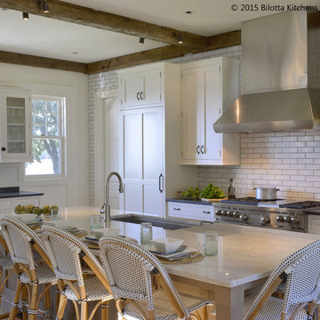
This kitchen was designed by two Bilotta designers, Randy O’Kane and Danielle Florie in concert with Murphy Brothers Contracting and Tim Button of Stedila Design Inc. It is in an existing home which was renovated with an eye to the original structure and neighborhood in Rye. The kitchen itself was an addition, as well as the family room adjacent to the kitchen. The interior wall of the kitchen was the exterior brick of the existing structure. The Waterworks Grove Brickworks tile gives the appearance of the “old” existing brick but painted. The concept was to create a new kitchen with all the up-to-date technology and accessories, but with the feel of an old scullery. We used 1” thick shaker-style Bilotta Collection cabinetry in a custom paint on the perimeter and a custom stain and texture on rift cut white oak for the island. The tall pantry larders cap off the runs of countertop allowing for work tops at each vignette. By using a column refrigerator and freezer in different sizes, we could address refrigeration needs while also addressing symmetry. The Wolf range and the fireplace in the family room are centered on each other which you can see by peeking through to each room. Reclaimed floor and beams help to give this new room that “lived-in” look. Although this kitchen is big enough for catering a large party, it still has a warm family feel with a layout that will serve both functions.
Designer: Randy O’Kane & Danielle Florie, Bilotta Kitchens Photo Credit: Peter Krupenye


 Juxtapose Design Build
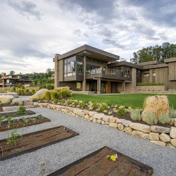
During excavation for this new modern home, large granite boulders rose to the surface from the primordial hillside. Instead of displacing these monoliths from the site from which they were created, they were arranged to define space. A circle of boulders stand guard around a custom built fire pit, providing protection from the wind while offering a place to climb or sit. The extended landscape view from the lawn is kept intact by the introduction of a ha-ha, a traditional landscape feature, that hides the productive garden and keeps it from breaking the view. Native and drought tolerant plantings hug the outer edges of the property for minimal use of irrigation and to visually blend into the surrounding hillside. This project also features a custom ipe bench with integrated lighting, waterjet address numbers with night lighting, and hardscape that complements the form and materiality of the architecture to create a harmonious transition into the horizontal plane.
Photography: Louie Jeon Photography
 Jessica Koltun Home
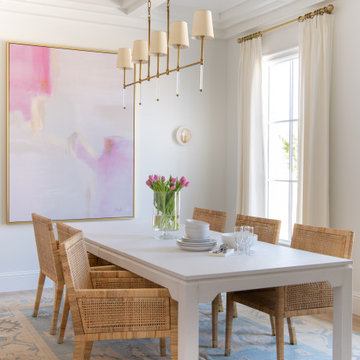
Classic, timeless and ideally positioned on a sprawling corner lot set high above the street, discover this designer dream home by Jessica Koltun. The blend of traditional architecture and contemporary finishes evokes feelings of warmth while understated elegance remains constant throughout this Midway Hollow masterpiece unlike no other. This extraordinary home is at the pinnacle of prestige and lifestyle with a convenient address to all that Dallas has to offer.
 Exciting Windows by Apollo
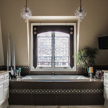
This is a custom design that we won a National window treatment award for designing. Our Client had the stained- glass made from a vase that had broke that was once her mothers. She had the stain glass mounted in front of her window. Later she had issues with privacy that she didn't know how to address. We designed this treatment to keep use of her beautiful stain-glass but still address her privacy concern.
 River Valley Landscapes
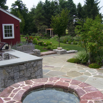
The property is one of the original farm houses located on the main street of a small town. It has been in the family for many years and our client just inherited the property. They were trying to have balance of preserving the old while realizing modern day living has its benefits too. The house had a large addition added using mostly old style materials, but designed with function and modern day luxuries. Our goal was to carry that theme to the outside.
Our first problem we had to address was how to transition between the first floor elevation changes. The lower room was the husband’s office. He stated in the future he may have clients over and it would be nice to have an area to sit outside. The wife’s main concern was to renew the four corner garden. She also felt it was very important to be able to see it from the kitchen area. Finally there was an old wishing well stuck right outside the kitchen. They both felt it would be neat to be able to incorporate this in some how. They wanted a patio area with a built in grill to accommodate there family and friends. They also wanted to keep a large play area for the kids.
We were able to pull this off successfully. We addressed the first issue by having a small lower level flagstone area. This area is large enough for 1 to 2 people to sit comfortably. It also provides a transition from his office to the larger patio area. We installed a simple small gravel sitting area opposite of the main patio. This provides our client a secluded place to relax or do business. Mrs.... told me she is amazed how much her and her husband enjoys this area. It is so peaceful looking at the small creek over a glass of wine.
We built a natural limestone retaining wall to create the patio terrace. The stone was chosen to extend the houses architectural elements into the landscape. Irregular broken flagstone was used to give it a more casual feel. We installed three Serviceberries into the patio terrace to replace some trees that were taken down during the remodeling. She was very concern that they would block the view of the four corner garden. We new they were crucial to nestle in the terrace, so we placed them for a couple days for her to decide. Fortunately she agreed they not only kept the view open, but helped frame the garden.
The four corner garden was designed to be viewed from afar and experienced up close. We wanted the space to have some formal structure while keeping with the casual farm house feel. Another natural limestone retaining wall was created. This leveled the garden terrace and helped associate it with the rest of the property. The four corner garden is nestled into the existing woods edge. This provides three distinct experiences to entering the garden; a more formal from the driveway, an open feel from the lower lawn, and a more natural / casual experience from the wooded area. The Plymouth brown gravel was used for the center of the garden. This helped highlight the stone post that was found during construction. The gravel also brings the sense of sound into the garden space. Lamb’s ear was chosen as a fun way to get kids interest in horticulture.
The balance of using the new to create the old feel is what makes this project a success. The property has already hosted a local historical society event and won an award for its preservation efforts. When Mrs.... can’t find her husband, she knows he is either reading the newspaper by the grill or resting in the hammock along the wood’s path.
 Serenity Creek Design & Landscaping
Serenity Creek Design & Landscaping
Inspiration for an exterior home remodel in Chicago
Inspiration for an exterior home remodel in Chicago
 Workaday Design
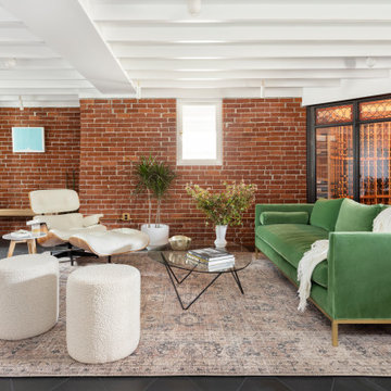
1950s black floor, exposed beam and brick wall basement photo in Portland with red walls
 Level Studio
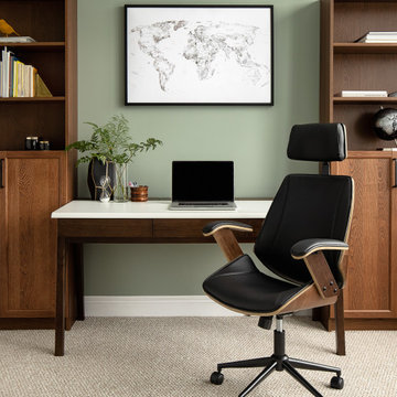
This modern townhome in Vaughan received some mid-century modern flair and some really fun wallpaper.
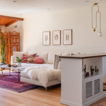
The large open concept living room was challenging in terms of creating a successful layout and we addressed it by bringing a large sectional closer to the center of the room rather than anchoring it against walls. Plenty of circulation space for a sideboard with a beautiful vinyl player, a collection of tall architectural prints and an eight foot tall floor lamp bring the eye up a double story living space.
Fun wallpaper creates a long feature wall in the living and dining area with a geometric pattern that brings some movement to the room and is also mirrored in the kitchen backsplash and sideboard veneer.
We designed a bedroom with the perfect shade of blue that will age nicely with our client’s young son along with a calming study perfect for getting some work done.
 SV Design
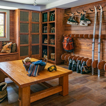
When an expanding family outgrew its beloved A frame vacation home, chaos followed. Outdoor gear multiplied exponentially, while any organized spot to stow it did not. Expected amenities were non-existent for needs of the crowd of outdoor enthusiasts. SV Design addressed the lacking elements and added practicality, with style: the multigenerational family members and friends can now appreciate space for the variety of hobbies and interests they pursue. Having worked with Siemasko + Verbridge in the past, the family turned to SV once again knowing we would design solution to address the growing list of concerns.
SV’s design of a three-story addition with a relatively small footprint was just what the home needed. A covered entry now provides the option of entering the main house or stopping off in the mud room to remove boots, drop off skis, and hang up wet clothes. Regardless of the way you enter the main house you will be greeted with a naturally lit, welcoming staircase of reclaimed white oak timber treads and steel stringers and rails. Each newel post is capped off with a polished granite sphere to pay homage to the Granite State in which the house resides.
The open stair invites you up to a spacious family space for playing board games, listening to music, gazing at the stars, or just lounging about in the warm comfort of the home. Traveling downstairs from the main level is a new, kid friendly media room for popcorn and movies, or a little video game sibling competition.
Perhaps the most striking new feature of the home is the custom designed Adirondack style bar built of varying tones of willow branches and bank. Topped off with a contrasting aged zinc counter, backsplash and shelf the bar is the perfect spot for the resident bar tender to mix up a tasty concoction for sitting by the crackling fire just steps away.
This home will provide comfort and ease for the family to relax and enjoy their getaway for years to come.
 Drury Design
THE SETUP
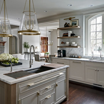
Once these empty nest homeowners decided to stay put, they knew a new kitchen was in order. Passionate about cooking, entertaining, and hosting holiday gatherings, they found their existing kitchen inadequate. The space, with its traditional style and outdated layout, was far from ideal. They longed for an elegant, timeless kitchen that was not only show-stopping but also functional, seamlessly catering to both their daily routines and special occasions with friends and family. Another key factor was its future appeal to potential buyers, as they’re ready to enjoy their new kitchen while also considering downsizing in the future.
Design Objectives:
Create a more streamlined, open space
Eliminate traditional elements
Improve flow for entertaining and everyday use
Omit dated posts and soffits
Include storage for small appliances to keep counters clutter-free
Address mail organization and phone charging concerns
THE REMODEL
Design Challenges:
Compensate for lost storage from omitted wall cabinets
Revise floorplan to feature a single, spacious island
Enhance island seating proximity for a more engaging atmosphere
Address awkward space above existing built-ins
Improve natural light blocked by wall cabinet near the window
Create a highly functional space tailored for entertaining
Design Solutions:
Tall cabinetry and pull-outs maximize storage efficiency
A generous single island promotes seamless flow and ample prep space
Strategic island seating arrangement fosters easy conversation
New built-ins fill arched openings, ensuring a custom, clutter-free look
Replace wall cabinet with lighted open shelves for an airy feel
Galley Dresser and Workstation offer impeccable organization and versatility, creating the perfect setup for entertaining with everything easily accessible.
THE RENEWED SPACE
The new kitchen exceeded every expectation, thrilling the clients with its revitalized, expansive design and thoughtful functionality. The transformation brought to life an open space adorned with marble accents, a state-of-the-art steam oven, and the seamless integration of the Galley Dresser, crafting a kitchen not just to be used, but to be cherished. This is more than a culinary space; it’s a new heart of their home, ready to host countless memories and culinary adventures.
 ODS Architecture
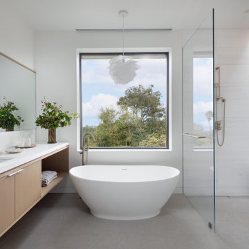
Example of a large trendy master white tile and marble tile porcelain tile and gray floor bathroom design in San Francisco with flat-panel cabinets, medium tone wood cabinets, a wall-mount toilet, white walls, an undermount sink, marble countertops, a hinged shower door, white countertops and a floating vanity
 Drury Design
THE SETUP
Once these empty nest homeowners decided to stay put, they knew a new kitchen was in order. Passionate about cooking, entertaining, and hosting holiday gatherings, they found their existing kitchen inadequate. The space, with its traditional style and outdated layout, was far from ideal. They longed for an elegant, timeless kitchen that was not only show-stopping but also functional, seamlessly catering to both their daily routines and special occasions with friends and family. Another key factor was its future appeal to potential buyers, as they’re ready to enjoy their new kitchen while also considering downsizing in the future.
Design Objectives:
Create a more streamlined, open space
Eliminate traditional elements
Improve flow for entertaining and everyday use
Omit dated posts and soffits
Include storage for small appliances to keep counters clutter-free
Address mail organization and phone charging concerns
THE REMODEL
Design Challenges:
Compensate for lost storage from omitted wall cabinets
Revise floorplan to feature a single, spacious island
Enhance island seating proximity for a more engaging atmosphere
Address awkward space above existing built-ins
Improve natural light blocked by wall cabinet near the window
Create a highly functional space tailored for entertaining
Design Solutions:
Tall cabinetry and pull-outs maximize storage efficiency
A generous single island promotes seamless flow and ample prep space
Strategic island seating arrangement fosters easy conversation
New built-ins fill arched openings, ensuring a custom, clutter-free look
Replace wall cabinet with lighted open shelves for an airy feel
Galley Dresser and Workstation offer impeccable organization and versatility, creating the perfect setup for entertaining with everything easily accessible.
THE RENEWED SPACE
The new kitchen exceeded every expectation, thrilling the clients with its revitalized, expansive design and thoughtful functionality. The transformation brought to life an open space adorned with marble accents, a state-of-the-art steam oven, and the seamless integration of the Galley Dresser, crafting a kitchen not just to be used, but to be cherished. This is more than a culinary space; it’s a new heart of their home, ready to host countless memories and culinary adventures.
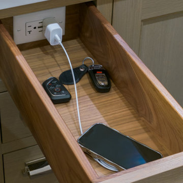
This photo features a maple interior drawer with the docking drawer outlet power attached for easy charging, key drawer, etc.
 Tomecek Studio Architecture
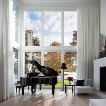
Pianoforte is a musical term referring to the variations in volume or loudness. Inspired by our clients’ love of all things with keys, the residence interprets the masculine form as ‘loud’ and the play of light as ‘soft’. The site required a strong response to the very active 1st Avenue to the south while transparency and perforations soften the form along Oneida Street. The L-shaped plan addresses the active corner while providing protection to the rear outdoor landscape. The entry becomes a gateway into this secret garden. Light breathes life into the living space in the morning and pours into the kitchen from the southern clerestory above. Our client, who currently plays the organ at weekly services, has working organ pipes that surround the fireplace enclosure. The pattern of the organ pipes is reflected in the perforated panels that screen the entry and filter light into the residence. Featured in Modern In Denver. (Photos by Chris Reilmann)
 Rosen Kelly Conway Architecture & Design
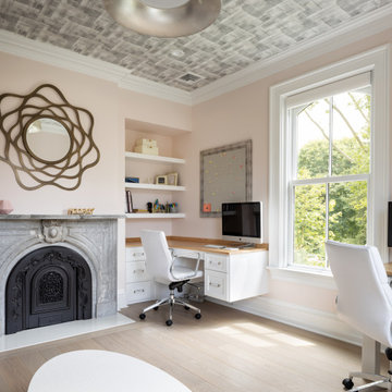
Architecture: Rosen Kelly Conway Architecture & Design
Interior Design: CWI Design
Kitchen Design & Cabinetry: Heidi Piron Design & Cabinetry
Contractor: Richcraft Contracting
Photography: Mike Van Tassell

111