
Search results for "Admitted" in Home Design Ideas

 Pink Olive Designs
Photo: Janet Neumann © 2015 Houzz
Inspiration for an eclectic dining room remodel in Vancouver
Inspiration for an eclectic dining room remodel in Vancouver
 Tile Doctor Ltd
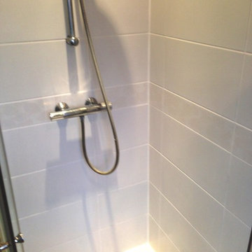
Shower cubicles can be the most difficult of tiled features to keep clean. Most are exposed to various acid-based soaps and shampoos on a daily basis, allowing mould and general muck to quickly build up along the grout lines and silicone. This leaves the entire area looking quite unappealing. In some cases, the grout lines become stained beyond a point where they can be restored to their original condition, so property owners will typically request to have the grout cut out and replaced however a faster and cheaper method is to have the grout completely recoloured.
Such was the case with this Ceramic tiled shower cubicle at a house in Wigan. It would take a lot to get the cubicle looking great again, having not been cleaned properly for a long time. The property owner decided to contact me for a professional refresh, including cleaning, new silicone sealer and recolouring of the grout.
I started the refresh by applying Tile Doctor Mould Away spray to the tiles and grout, and leaving it to dwell for an hour. As the name of the product suggests, Mould Away is a fast and effective cleaner for the removal of mould from silicone and grout, making it ideal for use on shower cubicles similar to this one. I then rinsed the entire area down with water before scrubbing the grout lines and tiles with a stiff grout brush to remove any remaining mould and lime scale, leaving them looking a lot cleaner.
The cleaning process made a big improvement however the grout was still too stained so after removing the silicone strip from around the base of the shower I proceeded to recolour with our white Grout Colourant. The colourant is painted onto the grout and any excess is wiped of the tile before it dries which both improves the appearance of the grout and seals it in to protect it from further staining. The last step was to apply fresh white silicone along the base of the shower.
The customer was very pleased with the refreshed appearance of their shower and you must admit it looks much more inviting now.
Steve Keary
Greater Manchester Tile Doctor

 Jarrett Design
Our clients are always teaching us. In this case, our clients had a vision that changed the direction of the design process midstream. Often our clients tell us they have trouble visualizing. This time, we must admit, we had a little trouble visualizing how their big idea was better than what we were planning. And then, it clicked!
This young family of five had outgrown their dark and dated kitchen. Food prep, cooking and baking play a large daily role in this home. Pantry storage was overflowing to the point where bulk ingredients, small appliances and other daily necessities were stored in a nearby closet and the laundry room at the end of the house. Counter space was scarce. The kitchen also served as an office area for the husband, who works from home, and a study area for the three school age children. Given some constraints and a fixed budget, our inclination was to work with the existing kitchen to design a much more efficient space, keeping it close to the laundry room/pantry, which could be maximized for convenient storage and access. We would create an organized work area within the kitchen as well. Our clients were happy with the design. Then, out of the blue, they announced that they would like to move the kitchen into the family room space! Our first reaction was to question how this could work being so far from the pantry storage areas, and the other living spaces of the home. The flow seemed as though it would be odd, but we heard them out and allowed some time for the idea to blossom. And blossom, it did. The existing kitchen and eating space became the new study and family room with enlarged windows and an added sliding door bringing their beautiful gardens into clear sight. The pantry dilemma was solved by adding a full wall of tall cabinetry with roll out storage flanking a beautiful fireplace. A large island with waterfall sides provides copious counter space and seating for the whole family. Dark, dated traditional styling of the past kitchen gave way to contemporary high gloss white and warm rosewood elements. The dramatic Dekton Aura backsplash is the icing on the cake!
Matt Villano Photography
Find the right local pro for your project

 Kitchen Design Concepts
We must admit, we’ve got yet another show-stopping transformation! With keeping the cabinetry boxes (though few had to be replaced), swapping out drawer and drawer fronts with new ones, and updating all the finishes – we managed to give this space a renovation that could be confused for a full remodel! The combination of a vibrant new backsplash, a light painted cabinetry finish, and new fixtures, these cosmetic changes really made the kitchen become “brand new”. Want to learn more about this space and see how we went from “drab” to “fab” then keep reading!
Cabinetry
The cabinets boxes that needed to be replaced are from WW Woods Shiloh, Homestead door style, in maple wood. These cabinets were unfinished, as we finished the entire kitchen on-site with the rest of the new drawer and drawer fronts for a seamless look. The cabinet fronts that were replaced were from Woodmont cabinetry, in a paint grade maple, and a recessed panel profile door-style. As a result, the perimeter cabinets were painted in Sherwin Williams Tinsmith, the island in Sherwin Williams Sea Serpent, and a few interiors of the cabinets were painted in a Sherwin Williams Tinsmith.
Countertop
The countertops feature a 3 cm Caesarstone Vivid White quartz
Backsplash
The backsplash installed from countertops to the bottom of the furrdown are from Glazzio in the Oceania Herringbone Series, in Cobalt Sea, and are a 1×2 size. We love how vibrant it is!
Fixtures and Fittings
From Blanco, we have a Meridian semi-professional faucet in Satin Nickel, and a granite composite Precis 1-3/4 bowl sink in a finish of Cinder. The floating shelves are from Danver and are a stainless steel finish.
Flooring
The flooring is a cork material from Harris Cork in the Napa Collection, in a Fawn finish.
 Jarrett Design
Our clients are always teaching us. In this case, our clients had a vision that changed the direction of the design process midstream. Often our clients tell us they have trouble visualizing. This time, we must admit, we had a little trouble visualizing how their big idea was better than what we were planning. And then, it clicked!
This young family of five had outgrown their dark and dated kitchen. Food prep, cooking and baking play a large daily role in this home. Pantry storage was overflowing to the point where bulk ingredients, small appliances and other daily necessities were stored in a nearby closet and the laundry room at the end of the house. Counter space was scarce. The kitchen also served as an office area for the husband, who works from home, and a study area for the three school age children. Given some constraints and a fixed budget, our inclination was to work with the existing kitchen to design a much more efficient space, keeping it close to the laundry room/pantry, which could be maximized for convenient storage and access. We would create an organized work area within the kitchen as well. Our clients were happy with the design. Then, out of the blue, they announced that they would like to move the kitchen into the family room space! Our first reaction was to question how this could work being so far from the pantry storage areas, and the other living spaces of the home. The flow seemed as though it would be odd, but we heard them out and allowed some time for the idea to blossom. And blossom, it did. The existing kitchen and eating space became the new study and family room with enlarged windows and an added sliding door bringing their beautiful gardens into clear sight. The pantry dilemma was solved by adding a full wall of tall cabinetry with roll out storage flanking a beautiful fireplace. A large island with waterfall sides provides copious counter space and seating for the whole family. Dark, dated traditional styling of the past kitchen gave way to contemporary high gloss white and warm rosewood elements. The dramatic Dekton Aura backsplash is the icing on the cake!
Matt Villano Photography

 Eppright Homes, LLC
Located in the Exemplary Lake Travis ISD and the new Signal Hill Estates at Bee Cave features One Acre minimum homesites with ease of access to the heart of Bee Cave and TX HWY 71. Neighborhood amenities—Gated access to 61 homes on over 80 acres. 10 acre private park including hike and bike trails, and community playscape.
 Jarrett Design
Our clients are always teaching us. In this case, our clients had a vision that changed the direction of the design process midstream. Often our clients tell us they have trouble visualizing. This time, we must admit, we had a little trouble visualizing how their big idea was better than what we were planning. And then, it clicked!
This young family of five had outgrown their dark and dated kitchen. Food prep, cooking and baking play a large daily role in this home. Pantry storage was overflowing to the point where bulk ingredients, small appliances and other daily necessities were stored in a nearby closet and the laundry room at the end of the house. Counter space was scarce. The kitchen also served as an office area for the husband, who works from home, and a study area for the three school age children. Given some constraints and a fixed budget, our inclination was to work with the existing kitchen to design a much more efficient space, keeping it close to the laundry room/pantry, which could be maximized for convenient storage and access. We would create an organized work area within the kitchen as well. Our clients were happy with the design. Then, out of the blue, they announced that they would like to move the kitchen into the family room space! Our first reaction was to question how this could work being so far from the pantry storage areas, and the other living spaces of the home. The flow seemed as though it would be odd, but we heard them out and allowed some time for the idea to blossom. And blossom, it did. The existing kitchen and eating space became the new study and family room with enlarged windows and an added sliding door bringing their beautiful gardens into clear sight. The pantry dilemma was solved by adding a full wall of tall cabinetry with roll out storage flanking a beautiful fireplace. A large island with waterfall sides provides copious counter space and seating for the whole family. Dark, dated traditional styling of the past kitchen gave way to contemporary high gloss white and warm rosewood elements. The dramatic Dekton Aura backsplash is the icing on the cake!
Matt Villano Photography
 Kitchen Design Concepts
We must admit, we’ve got yet another show-stopping transformation! With keeping the cabinetry boxes (though few had to be replaced), swapping out drawer and drawer fronts with new ones, and updating all the finishes – we managed to give this space a renovation that could be confused for a full remodel! The combination of a vibrant new backsplash, a light painted cabinetry finish, and new fixtures, these cosmetic changes really made the kitchen become “brand new”. Want to learn more about this space and see how we went from “drab” to “fab” then keep reading!
Cabinetry
The cabinets boxes that needed to be replaced are from WW Woods Shiloh, Homestead door style, in maple wood. These cabinets were unfinished, as we finished the entire kitchen on-site with the rest of the new drawer and drawer fronts for a seamless look. The cabinet fronts that were replaced were from Woodmont cabinetry, in a paint grade maple, and a recessed panel profile door-style. As a result, the perimeter cabinets were painted in Sherwin Williams Tinsmith, the island in Sherwin Williams Sea Serpent, and a few interiors of the cabinets were painted in a Sherwin Williams Tinsmith.
Countertop
The countertops feature a 3 cm Caesarstone Vivid White quartz
Backsplash
The backsplash installed from countertops to the bottom of the furrdown are from Glazzio in the Oceania Herringbone Series, in Cobalt Sea, and are a 1×2 size. We love how vibrant it is!
Fixtures and Fittings
From Blanco, we have a Meridian semi-professional faucet in Satin Nickel, and a granite composite Precis 1-3/4 bowl sink in a finish of Cinder. The floating shelves are from Danver and are a stainless steel finish.
Flooring
The flooring is a cork material from Harris Cork in the Napa Collection, in a Fawn finish.
 Jarrett Design
Our clients are always teaching us. In this case, our clients had a vision that changed the direction of the design process midstream. Often our clients tell us they have trouble visualizing. This time, we must admit, we had a little trouble visualizing how their big idea was better than what we were planning. And then, it clicked!
This young family of five had outgrown their dark and dated kitchen. Food prep, cooking and baking play a large daily role in this home. Pantry storage was overflowing to the point where bulk ingredients, small appliances and other daily necessities were stored in a nearby closet and the laundry room at the end of the house. Counter space was scarce. The kitchen also served as an office area for the husband, who works from home, and a study area for the three school age children. Given some constraints and a fixed budget, our inclination was to work with the existing kitchen to design a much more efficient space, keeping it close to the laundry room/pantry, which could be maximized for convenient storage and access. We would create an organized work area within the kitchen as well. Our clients were happy with the design. Then, out of the blue, they announced that they would like to move the kitchen into the family room space! Our first reaction was to question how this could work being so far from the pantry storage areas, and the other living spaces of the home. The flow seemed as though it would be odd, but we heard them out and allowed some time for the idea to blossom. And blossom, it did. The existing kitchen and eating space became the new study and family room with enlarged windows and an added sliding door bringing their beautiful gardens into clear sight. The pantry dilemma was solved by adding a full wall of tall cabinetry with roll out storage flanking a beautiful fireplace. A large island with waterfall sides provides copious counter space and seating for the whole family. Dark, dated traditional styling of the past kitchen gave way to contemporary high gloss white and warm rosewood elements. The dramatic Dekton Aura backsplash is the icing on the cake!
Matt Villano Photography
 Kitchen Design Concepts
We must admit, we’ve got yet another show-stopping transformation! With keeping the cabinetry boxes (though few had to be replaced), swapping out drawer and drawer fronts with new ones, and updating all the finishes – we managed to give this space a renovation that could be confused for a full remodel! The combination of a vibrant new backsplash, a light painted cabinetry finish, and new fixtures, these cosmetic changes really made the kitchen become “brand new”. Want to learn more about this space and see how we went from “drab” to “fab” then keep reading!
Cabinetry
The cabinets boxes that needed to be replaced are from WW Woods Shiloh, Homestead door style, in maple wood. These cabinets were unfinished, as we finished the entire kitchen on-site with the rest of the new drawer and drawer fronts for a seamless look. The cabinet fronts that were replaced were from Woodmont cabinetry, in a paint grade maple, and a recessed panel profile door-style. As a result, the perimeter cabinets were painted in Sherwin Williams Tinsmith, the island in Sherwin Williams Sea Serpent, and a few interiors of the cabinets were painted in a Sherwin Williams Tinsmith.
Countertop
The countertops feature a 3 cm Caesarstone Vivid White quartz
Backsplash
The backsplash installed from countertops to the bottom of the furrdown are from Glazzio in the Oceania Herringbone Series, in Cobalt Sea, and are a 1×2 size. We love how vibrant it is!
Fixtures and Fittings
From Blanco, we have a Meridian semi-professional faucet in Satin Nickel, and a granite composite Precis 1-3/4 bowl sink in a finish of Cinder. The floating shelves are from Danver and are a stainless steel finish.
Flooring
The flooring is a cork material from Harris Cork in the Napa Collection, in a Fawn finish.
 Jarrett Design
Our clients are always teaching us. In this case, our clients had a vision that changed the direction of the design process midstream. Often our clients tell us they have trouble visualizing. This time, we must admit, we had a little trouble visualizing how their big idea was better than what we were planning. And then, it clicked!
This young family of five had outgrown their dark and dated kitchen. Food prep, cooking and baking play a large daily role in this home. Pantry storage was overflowing to the point where bulk ingredients, small appliances and other daily necessities were stored in a nearby closet and the laundry room at the end of the house. Counter space was scarce. The kitchen also served as an office area for the husband, who works from home, and a study area for the three school age children. Given some constraints and a fixed budget, our inclination was to work with the existing kitchen to design a much more efficient space, keeping it close to the laundry room/pantry, which could be maximized for convenient storage and access. We would create an organized work area within the kitchen as well. Our clients were happy with the design. Then, out of the blue, they announced that they would like to move the kitchen into the family room space! Our first reaction was to question how this could work being so far from the pantry storage areas, and the other living spaces of the home. The flow seemed as though it would be odd, but we heard them out and allowed some time for the idea to blossom. And blossom, it did. The existing kitchen and eating space became the new study and family room with enlarged windows and an added sliding door bringing their beautiful gardens into clear sight. The pantry dilemma was solved by adding a full wall of tall cabinetry with roll out storage flanking a beautiful fireplace. A large island with waterfall sides provides copious counter space and seating for the whole family. Dark, dated traditional styling of the past kitchen gave way to contemporary high gloss white and warm rosewood elements. The dramatic Dekton Aura backsplash is the icing on the cake!
Matt Villano Photography
 Jarrett Design
Our clients are always teaching us. In this case, our clients had a vision that changed the direction of the design process midstream. Often our clients tell us they have trouble visualizing. This time, we must admit, we had a little trouble visualizing how their big idea was better than what we were planning. And then, it clicked!
This young family of five had outgrown their dark and dated kitchen. Food prep, cooking and baking play a large daily role in this home. Pantry storage was overflowing to the point where bulk ingredients, small appliances and other daily necessities were stored in a nearby closet and the laundry room at the end of the house. Counter space was scarce. The kitchen also served as an office area for the husband, who works from home, and a study area for the three school age children. Given some constraints and a fixed budget, our inclination was to work with the existing kitchen to design a much more efficient space, keeping it close to the laundry room/pantry, which could be maximized for convenient storage and access. We would create an organized work area within the kitchen as well. Our clients were happy with the design. Then, out of the blue, they announced that they would like to move the kitchen into the family room space! Our first reaction was to question how this could work being so far from the pantry storage areas, and the other living spaces of the home. The flow seemed as though it would be odd, but we heard them out and allowed some time for the idea to blossom. And blossom, it did. The existing kitchen and eating space became the new study and family room with enlarged windows and an added sliding door bringing their beautiful gardens into clear sight. The pantry dilemma was solved by adding a full wall of tall cabinetry with roll out storage flanking a beautiful fireplace. A large island with waterfall sides provides copious counter space and seating for the whole family. Dark, dated traditional styling of the past kitchen gave way to contemporary high gloss white and warm rosewood elements. The dramatic Dekton Aura backsplash is the icing on the cake!
Matt Villano Photography
 Jarrett Design
Our clients are always teaching us. In this case, our clients had a vision that changed the direction of the design process midstream. Often our clients tell us they have trouble visualizing. This time, we must admit, we had a little trouble visualizing how their big idea was better than what we were planning. And then, it clicked!
This young family of five had outgrown their dark and dated kitchen. Food prep, cooking and baking play a large daily role in this home. Pantry storage was overflowing to the point where bulk ingredients, small appliances and other daily necessities were stored in a nearby closet and the laundry room at the end of the house. Counter space was scarce. The kitchen also served as an office area for the husband, who works from home, and a study area for the three school age children. Given some constraints and a fixed budget, our inclination was to work with the existing kitchen to design a much more efficient space, keeping it close to the laundry room/pantry, which could be maximized for convenient storage and access. We would create an organized work area within the kitchen as well. Our clients were happy with the design. Then, out of the blue, they announced that they would like to move the kitchen into the family room space! Our first reaction was to question how this could work being so far from the pantry storage areas, and the other living spaces of the home. The flow seemed as though it would be odd, but we heard them out and allowed some time for the idea to blossom. And blossom, it did. The existing kitchen and eating space became the new study and family room with enlarged windows and an added sliding door bringing their beautiful gardens into clear sight. The pantry dilemma was solved by adding a full wall of tall cabinetry with roll out storage flanking a beautiful fireplace. A large island with waterfall sides provides copious counter space and seating for the whole family. Dark, dated traditional styling of the past kitchen gave way to contemporary high gloss white and warm rosewood elements. The dramatic Dekton Aura backsplash is the icing on the cake!
Matt Villano Photography

 Your Favorite Room By Cathy Zaeske
For 6 years we lived with an ugly, out of scale builders grade mantel that I couldn't wait to tear out! Turns out it made the perfect support for my new custom, one of a kind mantel. I conceived, designed and had this piece built onsite by my favorite carpenter. I wanted it to look like a continuous piece of wood that wrapped around on the edges, like I had seen done on benches, but with a live edge on the bottom not the top. When brainstorming it I couldn't find ONE image of anything close to my vision (let alone be able to simply purchase a ready made one). This is a hand chosen, stunning Bubinga plank and it's feature is the variegated wood tones - it "goes with" everything!
I also had the floating picture frame custom made to make my favorite tree canvas art more in scale with the fireplace and wall. This tree stands next to our fire pit in Door County, WI and is a favorite view we wanted to bring home. The two trunks are antique indonesian pieces. The one on the left holds my firewood in the winter and the one on the right is the perfect place to store all of the media components.
Cathy Zaeske

 Alair Homes Milwaukee
Elegant combination of white cabinetry with sleek and hard-working black quartz countertops at the perimeter, with accenting granite on the multi-functional island.
James Meyer Photography

 Randy Angell Designs
Our clients wish list was fairly simple: a small, traditional pool with a raised spa. They wanted enough deck space for light entertaining around the pool, but due to their generous covered veranda, they did not require much more than that. Oh--and a little yard space for the dog!
The entire design was really driven by a very strong central sight line through the house, all the way from the front door. Using this as the center-line for the pool, we pushed the pool as far toward the rear property line as code would allow and then created the main focal feature of the project: a seven-foot-tall limestone and cast stone wall, with a laser-cut steel sculpture, created the project designer. The cast stone columns and center arch echo the architecture of the home and create the perfect backdrop for the raised spa. The same wrought-iron gas lanterns used at the front entry of the home are repeated on columns here.
The color palette is subtle and classic, much like the interior of the home and the decor within the grand veranda directly adjacent the pool. 18"x30" blocks of limestone were used to create the wall at the rear of the property, and harmonizing with the veneer on the home. The pool is finished with Pennsylvania Premier coping, with a bull-nosed edge, shadowed by a 2" band of black granite. The surrounding decks are Travertine pavers in a 'Versailles' pattern, bordered by a 12" band of Pennsylvania stone. The pool utilizes three different glass tiles for a highly customized style. The glass mosaic on the wet deck and in the spa is a custom blend created by the homeowner and the designer. A grey/green Diamondbrite interior finish completes the soft hues that make this project aesthetically soothing to the eye.
The homeowner had been through 4 different home builders during the construction of their dream home. Understandably, when it came to the pool, they wanted to be certain they didn't go through the same difficulties and sought out a company with the reputation and the creativity that would exceed their expectations. After seeing our detailed design study for their admittedly "compact space", they knew they had found just the right company.
 Jarrett Design
Our clients are always teaching us. In this case, our clients had a vision that changed the direction of the design process midstream. Often our clients tell us they have trouble visualizing. This time, we must admit, we had a little trouble visualizing how their big idea was better than what we were planning. And then, it clicked!
This young family of five had outgrown their dark and dated kitchen. Food prep, cooking and baking play a large daily role in this home. Pantry storage was overflowing to the point where bulk ingredients, small appliances and other daily necessities were stored in a nearby closet and the laundry room at the end of the house. Counter space was scarce. The kitchen also served as an office area for the husband, who works from home, and a study area for the three school age children. Given some constraints and a fixed budget, our inclination was to work with the existing kitchen to design a much more efficient space, keeping it close to the laundry room/pantry, which could be maximized for convenient storage and access. We would create an organized work area within the kitchen as well. Our clients were happy with the design. Then, out of the blue, they announced that they would like to move the kitchen into the family room space! Our first reaction was to question how this could work being so far from the pantry storage areas, and the other living spaces of the home. The flow seemed as though it would be odd, but we heard them out and allowed some time for the idea to blossom. And blossom, it did. The existing kitchen and eating space became the new study and family room with enlarged windows and an added sliding door bringing their beautiful gardens into clear sight. The pantry dilemma was solved by adding a full wall of tall cabinetry with roll out storage flanking a beautiful fireplace. A large island with waterfall sides provides copious counter space and seating for the whole family. Dark, dated traditional styling of the past kitchen gave way to contemporary high gloss white and warm rosewood elements. The dramatic Dekton Aura backsplash is the icing on the cake!
Matt Villano Photography

 ROAM Architecture
Detail of LED wall sconce with white glass tile background
Inspiration for a small contemporary kids' white tile and glass tile porcelain tile and gray floor alcove bathtub remodel in New York with flat-panel cabinets, dark wood cabinets, a two-piece toilet, green walls and an integrated sink
Inspiration for a small contemporary kids' white tile and glass tile porcelain tile and gray floor alcove bathtub remodel in New York with flat-panel cabinets, dark wood cabinets, a two-piece toilet, green walls and an integrated sink

 Housetrends Magazine
Since moving into her Dublin home two and a half years ago, Nancy Sanford has been peeling off the decades—quite literally. Built in the 1980s, the home was “very well-maintained, but very little had been done to it” in terms of updating the finishes or style, Sanford says. Plush white carpet ran from wall-to-wall-to-wall, almond-colored laminate coated the kitchen cabinets and wallpaper ran rampant—even covering some ceilings.
Despite her efforts, Sanford knew it was going to take more than cosmetic editing to shake the ‘80s and make the home her own. Although she lives in the traditional-leaning Muirfield community, Sanford adores a minimalist, contemporary style—and admits to devouring design magazines “ad nauseam.”
To implement her thoroughly modern vision, Sanford turned to Brigid Norton, an interior designer and family friend, and Kristi Youles, a kitchen designer with The JAE Company. Working together, the trio created a carefully considered contemporary design that’s easy on the eyes, and the body.
In addition to improving the flow of the kitchen—by removing a V-shaped peninsula that angled out into the room—and adding appliances like a stainless steel refrigerator, Sanford’s short list of must-haves included clean, uncluttered lines and no wall cabinets over the countertops. “I’ve found as I’ve aged, I’ve gotten shorter and just don’t use the upper cabinets,” Sanford explains.
Easy-access, smooth-slide drawers with clean slab fronts were the answer—resulting in strong visual lines, an open, airy feel and enhanced ergonomics. Starting with a “needs assessment,” Youles and Norton designed the space quite literally around Nancy. By looking at factors such as her height and which items she uses most frequently, they were able to determine the optimum placement for everything from canned goods in the pantry to cutlery, pans and plates in the customized drawers, all of which helped to achieve the ultimate kitchen organization.
But there’s more to the kitchen cabinets smooth façade than clean-lined storage. Walnut drawer fronts—found on the oven and the base of the island—are book-matched, allowing the grain to continue from drawer to drawer. And even in spaces where drawers weren’t feasible, beneath the sink and in a desk area, the designers continued the look with cabinet doors crafted to resemble drawers.
The visual continuity of these lines might not be as impactful if it weren’t for the careful selection of contrasting finishes. The designers filled the space with pure, glossy white—using a specific type of quartz, White Cliff by Cambria, to accent the bold rectangular design of the island. Then, to break up the expanse of accompanying white painted drawers, walnut was selected to bring the contrasting warmth and grain of wood without red undertones. It is commonly found in modern furniture design, as well as current productions of mid-century designs like the iconic Eames Lounge Chair from Herman Miller, Youles says.

 Design Group Three
Firm: Design Group Three
Designer: Alan Freysinger
Cabinetry: Greenfield Cabinetry
Photography: Jim Tschetter IC360 Images
Veteran kitchen designer Alan Freysinger worked closely with the Fox Point, WI homeowners on this kitchen. Admittedly, not afraid of color, the homeowner loved Alan's suggestion of adding the wood veneer to the mix of cabinetry, adding an additional layer of interest and the addition of texture.
Design Group Three, together with custom Greenfield Cabinetry, stepped up the living pleasure of this Fox Point family's home.
When this kitchen remodel was first underway, the homeowner envisioned a blue kitchen (orange was her 2nd choice!). She went to the paint store & found blues she liked, taped those color samples to the kitchen wall & one by one she and her husband whittled down their choices to the color blue you see now!
From Milwaukee to Chicago, clean lines are much desired in today's kitchen designs. Design Group Three hears many requests for Transitionally styled kitchens such as this one.
Want a pop of orange? blue? red? in your kitchen? Milwaukee's Design Group Three can custom match any color in paint (or stain!) for cabinetry in your home, as we did in for this blue kitchen in Fox Point, WI.
Not sure if you are up for this much color in your kitchen? Begin with remodeling a bathroom vanity with a pop of color, live with it for a while & then, if you decide it's for you too, call in Design Group Three & we'll work with you to uncover your perfect color palette.
Can you imagine this same kitchen in orange? This Fox Point, WI homeowners preliminary vision for her kitchen remodel walked the line between orange & blue!
Blue kitchens are completely on trend in today's kitchens!
According to the National Kitchen & Bath Association, Transitionally styled kitchens, such as this blue one, are the most commonly requested design genre. In fact, in 2012, for the first time ever since the NKBA started keeping track, Transitional beat out Traditional as the most requested style by homeowners.
What exactly is affordably luxury? You are witnessing it in these photos. Discover it via Milwaukee's Design Group Three & Greenfield Cabinetry.
Transitional Style (also known as "updated classic", "classic with a contemporary twist", "new takes on old classics") in interior design & furniture design refers to a blend of traditional and contemporary styles, midway between old world traditional & the world of chrome & glass contemporary; incorporating lines which are less ornate than traditional designs, but not as severely basic as contemporary lines. As a result transitional designs are classic, timeless, and clean.
Lucky, lucky kitchen. Greenfield Cabinetry's interpretation of Midwestern Modern.
Seasoned Design Group Three designer & owner, Alan Freysinger's design details take their cues from your lifestyle, as reflected in this transitionally styled kitchen.
"The general color trend is a move toward bolder, crisper colors as a reflection of the 'anything goes' culture we live in now." - Jonathan Adler, Designer
56