
Search results for "Admitted" in Home Design Ideas

 TVL Creative Ltd.
This project was such an incredible design opportunity, and instilled inspiration and excitement at every turn! Our amazing clients came to us with the challenge of converting their beloved family home into a welcoming haven for all members of the family. At the time that we met our clients, they were struggling with the difficult personal decision of the fate of the home. Their father/father-in-law had passed away and their mother/mother-in-law had recently been admitted into a nursing facility and was fighting Alzheimer’s. Resistant to loss of the home now that both parents were out of it, our clients purchased the home to keep in in the family. Despite their permanent home currently being in New Jersey, these clients dedicated themselves to keeping and revitalizing the house. We were moved by the story and became immediately passionate about bringing this dream to life.
The home was built by the parents of our clients and was only ever owned by them, making this a truly special space to the family. Our goal was to revitalize the home and to bring new energy into every room without losing the special characteristics that were original to the home when it was built. In this way, we were able to develop a house that maintains its own unique personality while offering a space of welcoming neutrality for all members of the family to enjoy over time.
The renovation touched every part of the home: the exterior, foyer, kitchen, living room, sun room, garage, six bedrooms, three bathrooms, the laundry room, and everything in between. The focus was to develop a style that carried consistently from space to space, but allowed for unique expression in the small details in every room.
Starting at the entry, we renovated the front door and entry point to offer more presence and to bring more of the mid-century vibe to the home’s exterior. We integrated a new modern front door, cedar shingle accents, new exterior paint, and gorgeous contemporary house numbers that really allow the home to stand out. Just inside the entry, we renovated the foyer to create a playful entry point worthy of attention. Cement look tile adorns the foyer floor, and we’ve added new lighting and upgraded the entry coat storage.
Upon entering the home, one will immediately be captivated by the stunning kitchen just off the entry. We transformed this space in just about every way. While the footprint of the home ultimately remained almost identical, the aesthetics were completely turned on their head. We re-worked the kitchen to maximize storage and to create an informal dining area that is great for casual hosting or morning coffee.
We removed the entry to the garage that was once in the informal dining, and created a peninsula in its place that offers a unique division between the kitchen/informal dining and the formal dining and living areas. The simple light warm light gray cabinetry offers a bit of traditional elegance, along with the marble backsplash and quartz countertops. We extended the original wood flooring into the kitchen and stained all floors to match for a warmth that truly resonates through all spaces. We upgraded appliances, added lighting everywhere, and finished the space with some gorgeous mid century furniture pieces.
In the formal dining and living room, we really focused on maintaining the original marble fireplace as a focal point. We cleaned the marble, repaired the mortar, and refinished the original fireplace screen to give a new sleek look in black. We then integrated a new gas insert for modern heating and painted the upper portion in a rich navy blue; an accent that is carried through the home consistently as a nod to our client’s love of the color.
The former entry into the old covered porch is now an elegant glass door leading to a stunning finished sunroom. This room was completely upgraded as well. We wrapped the entire space in cozy white shiplap to keep a casual feel with brightness. We tiled the floor with large format concrete look tile, and painted the old brick fireplace a bright white. We installed a new gas burning unit, and integrated transitional style lighting to bring warmth and elegance into the space. The new black-frame windows are adorned with decorative shades that feature hand-sketched bird prints, and we’ve created a dedicated garden-ware “nook” for our client who loves to work in the yard. The far end of this space is completed with two oversized chaise loungers and overhead lights…the most perfect little reading nook!
Just off the dining room, we created an entirely new space to the home: a mudroom. The clients lacked this space and desperately needed a landing spot upon entering the home from the garage. We uniquely planned existing space in the garage to utilize for this purpose, and were able to create a small but functional entry point without losing the ability to park cars in the garage. This new space features cement-look tile, gorgeous deep brown cabinetry, and plenty of storage for all the small items one might need to store while moving in and out of the home.
The remainder of the upstairs level includes massive renovations to the guest hall bathroom and guest bedroom, upstairs master bed/bath suite, and a third bedroom that we converted into a home office for the client.
Some of the largest transformations were made in the basement, where unfinished space and lack of light were converted into gloriously lit, cozy, finished spaces. Our first task was to convert the massive basement living room into the new master bedroom for our clients. We removed existing built-ins, created an entirely new walk-in closet, painted the old brick fireplace, installed a new gas unit, added carpet, introduced new lighting, replaced windows, and upgraded every part of the aesthetic appearance. One of the most incredible features of this space is the custom double sliding barn door made by a Denver artisan. This space is truly a retreat for our clients!
We also completely transformed the laundry room, back storage room, basement master bathroom, and two bedrooms.
This home’s massive scope and ever-evolving challenges were thrilling and exciting to work with, and the result is absolutely amazing. At the end of the day, this home offers a look and feel that the clients love. Above all, though, the clients feel the spirit of their family home and have a welcoming environment for all members of the family to enjoy for years to come.
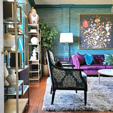
 Lauren Maroney for Ethan Allen Sterling, VA
“Tropical. Victorian. Gothic.”
This is the vibe my client wanted for the living room in their 1800’s farmhouse, and this is what I delivered. Admittedly though, I had to do a deep dive into inspiration pictures for a general direction, because, what an unusual ask in terms of concept! Ultimately, my goal for this project was a very moody, overly saturated space that evoked emotion and started a conversation.
To start, I specified a heavily textured grasscloth wallcovering in teal and contrasted that with high gloss fuchsia and teal paint to trim out the entire room. This included the doors, fireplace, all window and door casings, and the wall area below the chair rail. Covering the shelter-armed, dramatic tufted sofa in a matching shade of fuchsia velvet is the centerpiece of the whole room and a true “wow” feature. The two French-inspired chairs are covered in a “drippy” teal damask with a contrasting black painted frame, giving a gothic vibe, while the crock embossed leather on the bench is exotic, playing to the tropical element of the space.
Finishing off the space is the eclectic mix of lighting, pillows, and decorative accents used throughout. Although all elements seem to be pulled from different eras and genres, they all speak to each other through finish and scale, adding to the Victorian, eclectic, and collected design of the room.
The color-drenched walls, lush textures, and eclectic accents are dramatic and a little over the top… but what else would you expect in a project that is tropical, Victorian, and gothic?
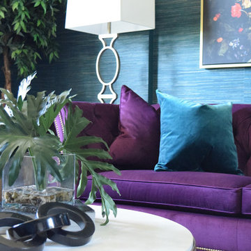 Lauren Maroney for Ethan Allen Sterling, VA
“Tropical. Victorian. Gothic.”
This is the vibe my client wanted for the living room in their 1800’s farmhouse, and this is what I delivered. Admittedly though, I had to do a deep dive into inspiration pictures for a general direction, because, what an unusual ask in terms of concept! Ultimately, my goal for this project was a very moody, overly saturated space that evoked emotion and started a conversation.
To start, I specified a heavily textured grasscloth wallcovering in teal and contrasted that with high gloss fuchsia and teal paint to trim out the entire room. This included the doors, fireplace, all window and door casings, and the wall area below the chair rail. Covering the shelter-armed, dramatic tufted sofa in a matching shade of fuchsia velvet is the centerpiece of the whole room and a true “wow” feature. The two French-inspired chairs are covered in a “drippy” teal damask with a contrasting black painted frame, giving a gothic vibe, while the crock embossed leather on the bench is exotic, playing to the tropical element of the space.
Finishing off the space is the eclectic mix of lighting, pillows, and decorative accents used throughout. Although all elements seem to be pulled from different eras and genres, they all speak to each other through finish and scale, adding to the Victorian, eclectic, and collected design of the room.
The color-drenched walls, lush textures, and eclectic accents are dramatic and a little over the top… but what else would you expect in a project that is tropical, Victorian, and gothic?
Find the right local pro for your project
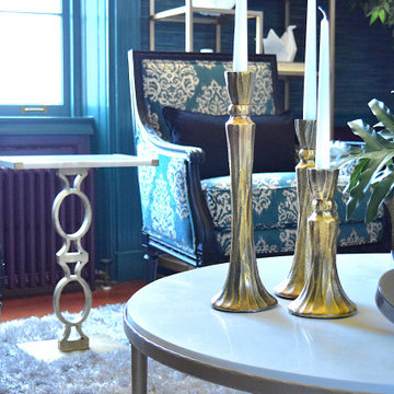 Lauren Maroney for Ethan Allen Sterling, VA
“Tropical. Victorian. Gothic.”
This is the vibe my client wanted for the living room in their 1800’s farmhouse, and this is what I delivered. Admittedly though, I had to do a deep dive into inspiration pictures for a general direction, because, what an unusual ask in terms of concept! Ultimately, my goal for this project was a very moody, overly saturated space that evoked emotion and started a conversation.
To start, I specified a heavily textured grasscloth wallcovering in teal and contrasted that with high gloss fuchsia and teal paint to trim out the entire room. This included the doors, fireplace, all window and door casings, and the wall area below the chair rail. Covering the shelter-armed, dramatic tufted sofa in a matching shade of fuchsia velvet is the centerpiece of the whole room and a true “wow” feature. The two French-inspired chairs are covered in a “drippy” teal damask with a contrasting black painted frame, giving a gothic vibe, while the crock embossed leather on the bench is exotic, playing to the tropical element of the space.
Finishing off the space is the eclectic mix of lighting, pillows, and decorative accents used throughout. Although all elements seem to be pulled from different eras and genres, they all speak to each other through finish and scale, adding to the Victorian, eclectic, and collected design of the room.
The color-drenched walls, lush textures, and eclectic accents are dramatic and a little over the top… but what else would you expect in a project that is tropical, Victorian, and gothic?

 Crystal Kitchen + Bath
After 11 years on the Gull Lake chain in Nisswa, this couple decided to sell their cabin. Their current home has the lake view, pine trees and “up north” feel right here in Plymouth. The goal of this remodel was to incorporate some of the Nisswa cabin features into an “urban cabin”.
The first step was, large windows were installed to take in the view of the lake. Some features borrowed from the cabin are the interior wood tongue & groove siding, ledge stone fireplace and scraped hickory flooring. Designer, Carol Kornak, reconfigured the appliance locations and reoriented the kitchen by added an island with eating space. And, a subtle but rewarding change occurred in the back hall. Often a bottleneck, the hallway to the garage was a catch-all for coats, boots, mail, etc. With a little design magic (by removing a wall, reducing pantry depth) and adding a boot bench and hooks for coats, the narrow hallway feels more spacious. To keep them organized there is a mail sorting and charging station hidden behind closed doors.
Admittedly, the couple isn’t roughing it with their Wolf/Sub-Zero appliance package including refrigerator, wine cooler, cooktop, steam oven and warming drawer. The new cabinetry from Crystal Cabinet Works in rustic hickory and painted finish pairs beautifully with the two Cambria countertops and completes the transformation into the “Urban Cabin”. The only thing missing is the 2 ½ hour drive and the dock & boat. Luckily, Lake Minnetonka is only a short drive away.
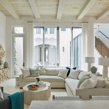
 E. F. San Juan
Published in Coastal Lifestyle Magazine, March 2021
www.coastallifestylemagazine.com/alys-beach-home
Photography by Colleen Duffley
When Marianne Temple and Robyn Prince, the principals of Home Design Group of Atlanta and Santa Rosa Beach, were brought in to work their magic on a home in Alys Beach, the design phase and much of the construction was complete. They welcomed the opportunity to get involved in the important final stage and to bring fun and whimsy along with casual elegance to the project. The owners – a young family with children and dogs – knew what they were looking for in a long-term vacation destination. They had engaged the services of Domin Bock Architects of Rosemary Beach and general contractor Hufham Farris Construction of Santa Rosa Beach to design and build a home that is child-friendly and low maintenance, but timeless and welcoming at the same time. When Temple and Prince came aboard, their mission was to make the Alys Beach home a reflection of the owners’ personality and lifestyle. “I like to think we were successful,” says Temple. “We were able to source all the bedding, draperies, and other soft goods, and to assist in selecting lighting, art, and accessories throughout the home.”
The home is located on the south side of 30A and enjoys access to all of the Alys Beach amenities. In addition, it has a pool, which quite literally seems to be the center – and the heart – of the home. The square pool can be accessed directly by steps from the private courtyard patio and is anchored by a stunning water wall and oversize stepping stones along one side. The expansive great room has unobstructed views of the pool through floor-to-ceiling glass panels. The room is furnished with low, plush upholstered pieces with rich blue accents, and an oval dining table with a stunning chandelier above. The bleached pecky cypress ceilings by E.F. San Juan are punctuated with substantial white-painted beams. Set apart by a sleek oversized island with a farmhouse sink, the open kitchen provides plenty of room for gathering or dining and is topped off by three matching gold-trimmed white pendant lights. The restaurant-quality six-burner cooktop in the arched wall opposite is flanked by tall cabinets and topped by four clerestory windows that admit wonderful light to the entire space. There is one guest bedroom on the main level, with a full bath, spacious closet, and a private sitting area.
E. F. San Juan of Youngstown, Florida, supplied all the woodwork details that provide finishing touches to the residence’s crisp white canvas in this quintessential courtyard home. Like many of the community’s buildings, this private residence contains minimal woodwork, maintaining the clean, elegant Alys Beach vision; still, the interior and exterior trim and brackets offer a sleek yet natural feel reflecting the beaches that are steps away from the front door. Their team worked with Weather Shield to provide stunning and functional custom impact-rated windows and Loewen to create custom doors that protect the house from the Gulf Coast elements.
“We have had the privilege of creating wood parts and custom doors, railings, and gates for many of the gorgeous homes in Alys Beach,” says E. F. San Juan president Edward A. San Juan. “This home’s minimal trim makes the other wood elements stand out, like the pecky cypress ceilings. The windows and doors are often-overlooked elements that we love collaborating on with our vendors like Loewen and Weather Shield because they make such good-looking products. They open up this home to the beautiful natural light, the courtyard pool, and the stunning views of the town just outside while also protecting from high winds, rain, and U.V. rays.”
The broad wooden staircase with open metal handrails leads to the sleeping quarters. The second floor houses the master suite with custom barn doors, also by E.F. San Juan, leading into the master bathroom with its luxurious bath and unique freestanding tub. A second guest room with a king-size bed and full bath also occupy the second floor. “The master bath is definitely my favorite feature of the home,” says Temple. “It is beyond all expectation – a true luxury.” The adult bedrooms are serene and sophisticated, with sleek lines and restful blue hues throughout. Cathedral ceilings, arched openings for the beds, sun-drenched sitting areas, plenty of natural light, and luxurious baths contribute to the feeling of peaceful elegance.
The children’s areas are in direct and happy contrast to the adults’ retreats. The bunk room, also on the second level, is just plain fun, with two sets of custom-built marine blue bunks piled high with pillows and whimsical stuffed animals, flanking a tall set of shelves full of toys and books. Oversize baskets provide storage for more toys, and colorful throw rugs provide plenty of sitting space for floor playtime. This kid-friendly space can grow and change with the children who occupy it – it will work well for tweens, teens, and beyond. “We designed the bunk room,” says Prince, “and I think it is a huge success. It may be my favorite feature of the home.”
The top floor is dedicated to the children’s den/playroom/media room and the dramatic rooftop lounge. The children’s space is furnished with beanbag chairs, a low game table, a big-screen television mounted on a custom-fabricated aqua wall, and arched French doors leading to the rooftop lounge area. “This area is, quite literally, the icing on the cake,” says Temple. “It boasts a view of the Gulf and great views down South Charles Street.” This secluded deck features a gas fireplace and comfy furnishings for enjoying beautiful evenings year-round.
HOME DESIGN GROUP
(229) 347-6052
homedesigngrp.com
E.F. SAN JUAN
(850) 722-4830
efsanjuan.com

 BeeTree Homes
Eat-in kitchen - large transitional porcelain tile eat-in kitchen idea in Jacksonville with a farmhouse sink, shaker cabinets, medium tone wood cabinets, quartz countertops, multicolored backsplash, mosaic tile backsplash, stainless steel appliances and two islands
 Neumann & Rudy Architecture
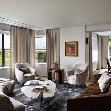
This is a quintessentially urban prewar-into-modern hybrid: a broad, laterally organized reception room whose principal architectural gesture is the corner glazing that dissolves two walls into a panoramic register of treetops and distant skyline. The plan reads as a series of soft, overlapping conversational precincts rather than a single axial arrangement — a pair of swivel-capable lounge chairs anchoring the window wall, a facing pair of high-backed tub chairs, and a deep tuxedo-profile sofa closing the composition toward the viewer — all orbiting an organically contoured cocktail table that performs as the room's centrifugal keystone. The ceiling is treated with a recessed reveal and shallow soffit that traces the perimeter, a device that both conceals drapery hardware and lifts the plane visually, granting the low-slung modern floor plate an unexpected sense of loft. A blade wall carrying a single framed canvas performs critical spatial work, terminating the living volume while permitting an enfilade sightline through to a secondary dining zone beyond, where a glazed wall of ivy-clad courtyard reads as a green tapestry. The geometry throughout is deliberately curvilinear — barrel-backed seating, amoeboid tabletops, splayed tapered legs — set against the orthogonal discipline of window mullions, drapery pleats, and rectilinear millwork, producing a productive tension between architectural rigor and furnishings that behave sculpturally.
**II. Materiality, Color & Texture**
The palette is a study in tonal restraint calibrated for maximum textural incident. Walls are finished in a matte, faintly striated plaster or grasscloth with a warm ecru undertone that absorbs rather than reflects light, establishing a neutral field against which every surface differential registers. Seating is upholstered in a lustrous chenille or crushed velvet of pale greige, whose short pile catches raking daylight and reads almost pearlescent, while the foreground sofa introduces a coarser boucle in an oatmeal register and the opposing sofa shifts decisively into a saturated tobacco-and-umber channel-tufted chenille, its French-polished rosewood or macassar ebony frame supplying the room's darkest, most reflective note. Stone is deployed with connoisseurial precision: the cocktail tables are honed alabaster or backlit-quality onyx, their translucent creamy strata and honey veining offering a warm mineral counterpoint to the cool, ink-washed abstraction of the hand-knotted area rug, which functions as a painterly ground — a gestural silver-and-charcoal wash pooling beneath the furniture. Bronze, patinated brass, and stainless accents appear in table bases, the vessel-form vase, and the sconce, providing metallic punctuation without gleam. Drapery in a heavy sand-toned linen, edged in a beaded or embroidered tape, softens the glazing perimeter and reinforces the room's tactile vocabulary of nap, weave, slub, and polish.
**III. Lighting, Atmosphere & Style Profile**
Natural light is the dominant luminous strategy: the corner glazing admits a soft, diffuse northern wash under overcast conditions, which the designer has intelligently accepted rather than resisted — the flat, shadowless quality flatters the velvet piles and plaster walls, and the drapery is stacked to admit maximum daylight while modulating glare at the jambs. Artificial sources are almost entirely concealed or decorative: a slim architectural sconce on the blade wall, a sculptural biomorphic table lamp in white lacquer or ceramic in the dining zone, and an extraordinary petal-form pendant in patinated metal that reads as an art object first and a fixture second. The resulting atmosphere is hushed, cerebral, and quietly patrician — a room of low chroma and high material intelligence, where drama is supplied by silhouette and surface rather than by color or ornament. Stylistically, the project synthesizes into what might best be termed **Modernist Salon** or **Warm Continental Minimalism**: the DNA of mid-century French decorative arts — Royère, Frank, Adnet — filtered through a contemporary sensibility of tonal layering and soft geometry, with an Art Deco undertow in the ebonized woods and channel tufting. It is a scheme of curatorial discipline: nothing is decorative for its own sake, the view is treated as the primary artwork, and every material is selected for how it behaves in light.

 Housetrends Magazine
Since moving into her Dublin home two and a half years ago, Nancy Sanford has been peeling off the decades—quite literally. Built in the 1980s, the home was “very well-maintained, but very little had been done to it” in terms of updating the finishes or style, Sanford says. Plush white carpet ran from wall-to-wall-to-wall, almond-colored laminate coated the kitchen cabinets and wallpaper ran rampant—even covering some ceilings.
Despite her efforts, Sanford knew it was going to take more than cosmetic editing to shake the ‘80s and make the home her own. Although she lives in the traditional-leaning Muirfield community, Sanford adores a minimalist, contemporary style—and admits to devouring design magazines “ad nauseam.”
To implement her thoroughly modern vision, Sanford turned to Brigid Norton, an interior designer and family friend, and Kristi Youles, a kitchen designer with The JAE Company. Working together, the trio created a carefully considered contemporary design that’s easy on the eyes, and the body.
In addition to improving the flow of the kitchen—by removing a V-shaped peninsula that angled out into the room—and adding appliances like a stainless steel refrigerator, Sanford’s short list of must-haves included clean, uncluttered lines and no wall cabinets over the countertops. “I’ve found as I’ve aged, I’ve gotten shorter and just don’t use the upper cabinets,” Sanford explains.
Easy-access, smooth-slide drawers with clean slab fronts were the answer—resulting in strong visual lines, an open, airy feel and enhanced ergonomics. Starting with a “needs assessment,” Youles and Norton designed the space quite literally around Nancy. By looking at factors such as her height and which items she uses most frequently, they were able to determine the optimum placement for everything from canned goods in the pantry to cutlery, pans and plates in the customized drawers, all of which helped to achieve the ultimate kitchen organization.
But there’s more to the kitchen cabinets smooth façade than clean-lined storage. Walnut drawer fronts—found on the oven and the base of the island—are book-matched, allowing the grain to continue from drawer to drawer. And even in spaces where drawers weren’t feasible, beneath the sink and in a desk area, the designers continued the look with cabinet doors crafted to resemble drawers.
The visual continuity of these lines might not be as impactful if it weren’t for the careful selection of contrasting finishes. The designers filled the space with pure, glossy white—using a specific type of quartz, White Cliff by Cambria, to accent the bold rectangular design of the island. Then, to break up the expanse of accompanying white painted drawers, walnut was selected to bring the contrasting warmth and grain of wood without red undertones. It is commonly found in modern furniture design, as well as current productions of mid-century designs like the iconic Eames Lounge Chair from Herman Miller, Youles says.


 Kitchen Design Concepts
We must admit, we’ve got yet another show-stopping transformation! With keeping the cabinetry boxes (though few had to be replaced), swapping out drawer and drawer fronts with new ones, and updating all the finishes – we managed to give this space a renovation that could be confused for a full remodel! The combination of a vibrant new backsplash, a light painted cabinetry finish, and new fixtures, these cosmetic changes really made the kitchen become “brand new”. Want to learn more about this space and see how we went from “drab” to “fab” then keep reading!
Cabinetry
The cabinets boxes that needed to be replaced are from WW Woods Shiloh, Homestead door style, in maple wood. These cabinets were unfinished, as we finished the entire kitchen on-site with the rest of the new drawer and drawer fronts for a seamless look. The cabinet fronts that were replaced were from Woodmont cabinetry, in a paint grade maple, and a recessed panel profile door-style. As a result, the perimeter cabinets were painted in Sherwin Williams Tinsmith, the island in Sherwin Williams Sea Serpent, and a few interiors of the cabinets were painted in a Sherwin Williams Tinsmith.
Countertop
The countertops feature a 3 cm Caesarstone Vivid White quartz
Backsplash
The backsplash installed from countertops to the bottom of the furrdown are from Glazzio in the Oceania Herringbone Series, in Cobalt Sea, and are a 1×2 size. We love how vibrant it is!
Fixtures and Fittings
From Blanco, we have a Meridian semi-professional faucet in Satin Nickel, and a granite composite Precis 1-3/4 bowl sink in a finish of Cinder. The floating shelves are from Danver and are a stainless steel finish.
Flooring
The flooring is a cork material from Harris Cork in the Napa Collection, in a Fawn finish.

 InnovationLand
This Houston outdoor kitchen and entertaining area offers a modern take on Mediterranean style.
Designed and built by Outdoor Homescapes of Houston, this fully loaded family and entertaining space echoes the stucco, travertine tile patio and Mediterranean style of the existing home while exuding a more modern, transitional style.
“This was a high-profile client – both VPs of different oil and gas companies who entertain affluent guests on a regular basis – so they wanted to make sure they had high-end appliances and all the latest amenities they could order,” says Lisha Maxey, senior designer for Outdoor Homescapes and owner of LGH Design Services in Houston. “They also have two kids, ages 7 and 10, and wanted a family gathering space that better accompanied their new, luxurious pool.”
What really sets apart this outside kitchen design idea, however, is the way the elements are used throughout the space.
“Usually, outdoor kitchen designs for a backyard are grouped into one island or cabinet,” explains Outdoor Homescapes of Houston owner Wayne Franks. “But here, the patio, roof and fireplace were all in place, separated by stucco columns, and the outdoor kitchen elements had to work around them.”
A 14-foot-long cooking island houses a built-in Fire Magic grill with a Magic View Window (allows the chef to check on food without lifting the lid and losing valuable heat). The island, the countertop of which is "Carnaval" granite from Lackstone, also features a Fire Magic power burner, warming drawer and trash drawer. On one side of the fireplace, forming an “L” with the cooking island, sits a built-in Primo ceramic grill.
On the other side of the fireplace is a 3-foot-long cabinet housing a bar with a wine cooler, ice maker and upper cabinet. And finally, just outside the patio door is a 7-foot-long cabinet with a modern Kohler sink with a high-arc Moen faucet (sink and faucet from Faucets Direct), a trash drawer and another upper cabinet.
Outdoor Homescapes of Houston, by the way, outfitted both cabinets with glass inserts, custom pulls and three-way sensor lighting.
“At the beginning, this was basically a blank space with a fireplace in the middle,” says Maxey. So Outdoor Homescapes upgraded the fireplace with Austin Stack Stone in white (No. 401) from Colorstonescreenshot vickers mosaic tile rectangle. "The stone added that pop,” notes Maxey.
The fireplace’s espresso-colored, distressed wood mantel (from Mantels.com) and upper wood cabinets were both stained with the Minwax color Jacobean. The ceiling fans were also updated with ones featuring similarly espresso-colored, wooden fan blades, to match.
The table in the middle - a cast-iron, Mediterranean style gem with hand-forged scrollwork designs from Patio 1 in Houston – seats 10.
“We wanted this kind of Mediterranean feel,” says Maxey. “We wanted rustic, but the appliance package was so new, with all its stainless steel, so we kept a the cabinets and the columns stucco instead of stone for a more clean, modern look and then did the custom tile backsplash and mosaic in more of a rustic, Mediterranean look."
The backsplash is a 1-inch travertine tile background with 4-inch square metallic insets, both from Floor & Decor. The tile for the 18-by-24-inch rectangle mosaic came from Great Britain Tile Co. and included a Dianno Reale tumbled border and background. The bronze, diamond-shaped insets are tumbled Dark Emperdor tile and the scrolls are tumbled Noce tile.
The client, who admits they have high standards, was more than pleased with the project – especially browsing through Outdoor Homescapes’ vast library of patio kitchen design ideas, the 3D virtual video tour that let them preview the project from every angle before construction. They also liked the personalized design consultation.
"OH provides a very neat service where one of their designers will either shop/buy for you or shop with you for the more detailed pieces that will finish your home," reads the client's review on Houzz. "This was a very positive, personalized feature ... Lisha helped narrow down an enormous marketplace of materials and finishes to a few we could choose from."
 Kitchen Design Concepts
We must admit, we’ve got yet another show-stopping transformation! With keeping the cabinetry boxes (though few had to be replaced), swapping out drawer and drawer fronts with new ones, and updating all the finishes – we managed to give this space a renovation that could be confused for a full remodel! The combination of a vibrant new backsplash, a light painted cabinetry finish, and new fixtures, these cosmetic changes really made the kitchen become “brand new”. Want to learn more about this space and see how we went from “drab” to “fab” then keep reading!
Cabinetry
The cabinets boxes that needed to be replaced are from WW Woods Shiloh, Homestead door style, in maple wood. These cabinets were unfinished, as we finished the entire kitchen on-site with the rest of the new drawer and drawer fronts for a seamless look. The cabinet fronts that were replaced were from Woodmont cabinetry, in a paint grade maple, and a recessed panel profile door-style. As a result, the perimeter cabinets were painted in Sherwin Williams Tinsmith, the island in Sherwin Williams Sea Serpent, and a few interiors of the cabinets were painted in a Sherwin Williams Tinsmith.
Countertop
The countertops feature a 3 cm Caesarstone Vivid White quartz
Backsplash
The backsplash installed from countertops to the bottom of the furrdown are from Glazzio in the Oceania Herringbone Series, in Cobalt Sea, and are a 1×2 size. We love how vibrant it is!
Fixtures and Fittings
From Blanco, we have a Meridian semi-professional faucet in Satin Nickel, and a granite composite Precis 1-3/4 bowl sink in a finish of Cinder. The floating shelves are from Danver and are a stainless steel finish.
Flooring
The flooring is a cork material from Harris Cork in the Napa Collection, in a Fawn finish.

 Jarrett Design
Our clients are always teaching us. In this case, our clients had a vision that changed the direction of the design process midstream. Often our clients tell us they have trouble visualizing. This time, we must admit, we had a little trouble visualizing how their big idea was better than what we were planning. And then, it clicked!
This young family of five had outgrown their dark and dated kitchen. Food prep, cooking and baking play a large daily role in this home. Pantry storage was overflowing to the point where bulk ingredients, small appliances and other daily necessities were stored in a nearby closet and the laundry room at the end of the house. Counter space was scarce. The kitchen also served as an office area for the husband, who works from home, and a study area for the three school age children. Given some constraints and a fixed budget, our inclination was to work with the existing kitchen to design a much more efficient space, keeping it close to the laundry room/pantry, which could be maximized for convenient storage and access. We would create an organized work area within the kitchen as well. Our clients were happy with the design. Then, out of the blue, they announced that they would like to move the kitchen into the family room space! Our first reaction was to question how this could work being so far from the pantry storage areas, and the other living spaces of the home. The flow seemed as though it would be odd, but we heard them out and allowed some time for the idea to blossom. And blossom, it did. The existing kitchen and eating space became the new study and family room with enlarged windows and an added sliding door bringing their beautiful gardens into clear sight. The pantry dilemma was solved by adding a full wall of tall cabinetry with roll out storage flanking a beautiful fireplace. A large island with waterfall sides provides copious counter space and seating for the whole family. Dark, dated traditional styling of the past kitchen gave way to contemporary high gloss white and warm rosewood elements. The dramatic Dekton Aura backsplash is the icing on the cake!
Matt Villano Photography

 Cascade West Development
The Aerius - Modern American Craftsman on Acreage in Ridgefield Washington by Cascade West Development Inc.
The upstairs rests mainly on the Western half of the home. It’s composed of a laundry room, 2 bedrooms, including a future princess suite, and a large Game Room. Every space is of generous proportion and easily accessible through a single hall. The windows of each room are filled with natural scenery and warm light. This upper level boasts amenities enough for residents to play, reflect, and recharge all while remaining up and away from formal occasions, when necessary.
Cascade West Facebook: https://goo.gl/MCD2U1
Cascade West Website: https://goo.gl/XHm7Un
These photos, like many of ours, were taken by the good people of ExposioHDR - Portland, Or
Exposio Facebook: https://goo.gl/SpSvyo
Exposio Website: https://goo.gl/Cbm8Ya
 Kitchen Design Concepts
We must admit, we’ve got yet another show-stopping transformation! With keeping the cabinetry boxes (though few had to be replaced), swapping out drawer and drawer fronts with new ones, and updating all the finishes – we managed to give this space a renovation that could be confused for a full remodel! The combination of a vibrant new backsplash, a light painted cabinetry finish, and new fixtures, these cosmetic changes really made the kitchen become “brand new”. Want to learn more about this space and see how we went from “drab” to “fab” then keep reading!
Cabinetry
The cabinets boxes that needed to be replaced are from WW Woods Shiloh, Homestead door style, in maple wood. These cabinets were unfinished, as we finished the entire kitchen on-site with the rest of the new drawer and drawer fronts for a seamless look. The cabinet fronts that were replaced were from Woodmont cabinetry, in a paint grade maple, and a recessed panel profile door-style. As a result, the perimeter cabinets were painted in Sherwin Williams Tinsmith, the island in Sherwin Williams Sea Serpent, and a few interiors of the cabinets were painted in a Sherwin Williams Tinsmith.
Countertop
The countertops feature a 3 cm Caesarstone Vivid White quartz
Backsplash
The backsplash installed from countertops to the bottom of the furrdown are from Glazzio in the Oceania Herringbone Series, in Cobalt Sea, and are a 1×2 size. We love how vibrant it is!
Fixtures and Fittings
From Blanco, we have a Meridian semi-professional faucet in Satin Nickel, and a granite composite Precis 1-3/4 bowl sink in a finish of Cinder. The floating shelves are from Danver and are a stainless steel finish.
Flooring
The flooring is a cork material from Harris Cork in the Napa Collection, in a Fawn finish.
 Catrina's Ranch Interiors
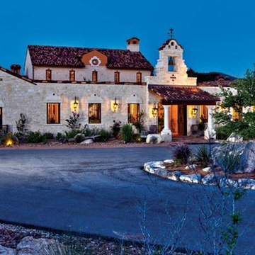
It was in every way, Ramsey says, a once-in-a-lifetime professional and personal experience. “My favorite part of this project was the glow on John and Betty’s faces upon the completion of the hacienda,” she says. “They became not only satisfied clients, but friends for life. It was very challenging but so rewarding.” Helping her and the Martins embrace the home’s challenges was Kendrick, who has been in the design business for more than 40 years. Despite her long career, Kendrick admits to being speechless when she first viewed the ranch’s blueprints and renderings. “The central courtyard had a bell tower over the front entrance gate — a real one,” she says. “The main house had an observation tower that overlooked the dammed-up river and a picturesque view of heaven on earth. There was a magnificent outdoor kitchen off of an enormous porch. This home was to have all the bells and whistles, with unimaginable details, while sparing no expense.”
All three women embraced the challenges of creating the Kemosabe Ranch abode, including designing and building 58 chandeliers and sconces, dozens of custom doors and cabinets, two fully tricked-out kitchens — one inside, one out — and myriad accessories such as candle holders. Regardless of a proposed element’s complexity, like the hammered copper panels in the cabinet doors, Kendrick’s response was the same: “No problem.”
Betty Martin is as apt to talk reverently about all of the craftsmen, contractors and suppliers who worked on her home’s features, from the 10-foot Mexican limestone fountain in the courtyard to the outdoor fossil art wall, as she is to want to bask in the grandeur of the finished project. That’s not surprising, given its scope to rival that of the Taj Mahal. But having been so intimately involved in the process has given her an even greater sense of pride in ownership of her dazzling dwelling. “It’s hard for me to pick out the part of the project that I love the most,” she says.
 Kitchen Design Concepts
We must admit, we’ve got yet another show-stopping transformation! With keeping the cabinetry boxes (though few had to be replaced), swapping out drawer and drawer fronts with new ones, and updating all the finishes – we managed to give this space a renovation that could be confused for a full remodel! The combination of a vibrant new backsplash, a light painted cabinetry finish, and new fixtures, these cosmetic changes really made the kitchen become “brand new”. Want to learn more about this space and see how we went from “drab” to “fab” then keep reading!
Cabinetry
The cabinets boxes that needed to be replaced are from WW Woods Shiloh, Homestead door style, in maple wood. These cabinets were unfinished, as we finished the entire kitchen on-site with the rest of the new drawer and drawer fronts for a seamless look. The cabinet fronts that were replaced were from Woodmont cabinetry, in a paint grade maple, and a recessed panel profile door-style. As a result, the perimeter cabinets were painted in Sherwin Williams Tinsmith, the island in Sherwin Williams Sea Serpent, and a few interiors of the cabinets were painted in a Sherwin Williams Tinsmith.
Countertop
The countertops feature a 3 cm Caesarstone Vivid White quartz
Backsplash
The backsplash installed from countertops to the bottom of the furrdown are from Glazzio in the Oceania Herringbone Series, in Cobalt Sea, and are a 1×2 size. We love how vibrant it is!
Fixtures and Fittings
From Blanco, we have a Meridian semi-professional faucet in Satin Nickel, and a granite composite Precis 1-3/4 bowl sink in a finish of Cinder. The floating shelves are from Danver and are a stainless steel finish.
Flooring
The flooring is a cork material from Harris Cork in the Napa Collection, in a Fawn finish.
 Jarrett Design
Our clients are always teaching us. In this case, our clients had a vision that changed the direction of the design process midstream. Often our clients tell us they have trouble visualizing. This time, we must admit, we had a little trouble visualizing how their big idea was better than what we were planning. And then, it clicked!
This young family of five had outgrown their dark and dated kitchen. Food prep, cooking and baking play a large daily role in this home. Pantry storage was overflowing to the point where bulk ingredients, small appliances and other daily necessities were stored in a nearby closet and the laundry room at the end of the house. Counter space was scarce. The kitchen also served as an office area for the husband, who works from home, and a study area for the three school age children. Given some constraints and a fixed budget, our inclination was to work with the existing kitchen to design a much more efficient space, keeping it close to the laundry room/pantry, which could be maximized for convenient storage and access. We would create an organized work area within the kitchen as well. Our clients were happy with the design. Then, out of the blue, they announced that they would like to move the kitchen into the family room space! Our first reaction was to question how this could work being so far from the pantry storage areas, and the other living spaces of the home. The flow seemed as though it would be odd, but we heard them out and allowed some time for the idea to blossom. And blossom, it did. The existing kitchen and eating space became the new study and family room with enlarged windows and an added sliding door bringing their beautiful gardens into clear sight. The pantry dilemma was solved by adding a full wall of tall cabinetry with roll out storage flanking a beautiful fireplace. A large island with waterfall sides provides copious counter space and seating for the whole family. Dark, dated traditional styling of the past kitchen gave way to contemporary high gloss white and warm rosewood elements. The dramatic Dekton Aura backsplash is the icing on the cake!
Matt Villano Photography

55