
Search results for "Allow" in Home Design Ideas
 Metropolis Drafting and Construction Inc
Master suite addition to an existing 20's Spanish home in the heart of Sherman Oaks, approx. 300+ sq. added to this 1300sq. home to provide the needed master bedroom suite. the large 14' by 14' bedroom has a 1 lite French door to the back yard and a large window allowing much needed natural light, the new hardwood floors were matched to the existing wood flooring of the house, a Spanish style arch was done at the entrance to the master bedroom to conform with the rest of the architectural style of the home.
The master bathroom on the other hand was designed with a Scandinavian style mixed with Modern wall mounted toilet to preserve space and to allow a clean look, an amazing gloss finish freestanding vanity unit boasting wall mounted faucets and a whole wall tiled with 2x10 subway tile in a herringbone pattern.
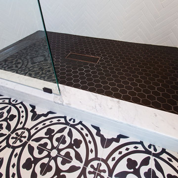
For the floor tile we used 8x8 hand painted cement tile laid in a pattern pre determined prior to installation.
The wall mounted toilet has a huge open niche above it with a marble shelf to be used for decoration.
The huge shower boasts 2x10 herringbone pattern subway tile, a side to side niche with a marble shelf, the same marble material was also used for the shower step to give a clean look and act as a trim between the 8x8 cement tiles and the bark hex tile in the shower pan.
Notice the hidden drain in the center with tile inserts and the great modern plumbing fixtures in an old work antique bronze finish.
A walk-in closet was constructed as well to allow the much needed storage space.
 DISC Interiors
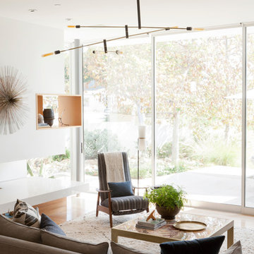
Example of a minimalist medium tone wood floor living room design in Los Angeles with white walls
 Rehkamp Larson Architects, Inc.
Contractor: Kevin F. Russo
Interiors: Anne McDonald Design
Photo: Scott Amundson
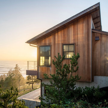
Inspiration for a coastal brown wood house exterior remodel in Portland with a black roof
Inspiration for a coastal brown wood house exterior remodel in Portland with a black roof
Find the right local pro for your project
 Plain & Posh
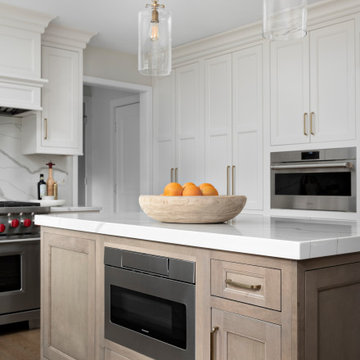
Thse clients came to me for a kitchen refresh. Keeping the existing floor plan but updating as much as possible. After explaining my thoughts, they chose to go with a much larger project. The wall to the garage wash pushed bach 12" to allow for the island to happen. This almost couldn't happen as there is a support post in the garage we had to keep. I designed the last pantry area as on 10" deep, allowing us to conceal that behind the cabinets. Then, we opend up the wall to the dining room to make the rooms one large space. The wall to the family room was also openend up, leaving the half wall to allow for the kitchen eating area. They wanted to incorporate a bar area, without it feeling like a "bar" The fabulous tall custom unit houses their wine collection and then half of the dining room buffet area holds glassware and other bar items. I helped the clients with all of the design choices.We all wanted to keep the space classic, war, functional and with mixed materials. I chose to use the same countertop material for the backsplash, to keep the space feeling as large as possible.


 TKS Design Group
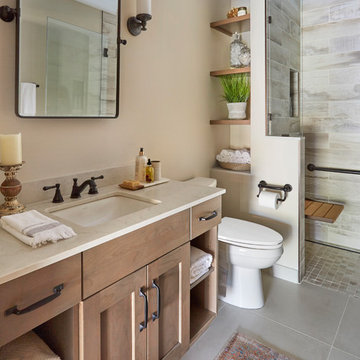
This project was completed for clients who wanted a comfortable, accessible 1ST floor bathroom for their grown daughter to use during visits to their home as well as a nicely-appointed space for any guest. Their daughter has some accessibility challenges so the bathroom was also designed with that in mind.
The original space worked fairly well in some ways, but we were able to tweak a few features to make the space even easier to maneuver through. We started by making the entry to the shower flush so that there is no curb to step over. In addition, although there was an existing oversized seat in the shower, it was way too deep and not comfortable to sit on and just wasted space. We made the shower a little smaller and then provided a fold down teak seat that is slip resistant, warm and comfortable to sit on and can flip down only when needed. Thus we were able to create some additional storage by way of open shelving to the left of the shower area. The open shelving matches the wood vanity and allows a spot for the homeowners to display heirlooms as well as practical storage for things like towels and other bath necessities.
We carefully measured all the existing heights and locations of countertops, toilet seat, and grab bars to make sure that we did not undo the things that were already working well. We added some additional hidden grab bars or “grabcessories” at the toilet paper holder and shower shelf for an extra layer of assurance. Large format, slip-resistant floor tile was added eliminating as many grout lines as possible making the surface less prone to tripping. We used a wood look tile as an accent on the walls, and open storage in the vanity allowing for easy access for clean towels. Bronze fixtures and frameless glass shower doors add an elegant yet homey feel that was important for the homeowner. A pivot mirror allows adjustability for different users.
If you are interested in designing a bathroom featuring “Living In Place” or accessibility features, give us a call to find out more. Susan Klimala, CKBD, is a Certified Aging In Place Specialist (CAPS) and particularly enjoys helping her clients with unique needs in the context of beautifully designed spaces.
Designed by: Susan Klimala, CKD, CBD
Photography by: Michael Alan Kaskel
 TKS Design Group
Free ebook, Creating the Ideal Kitchen. DOWNLOAD NOW
This project started out as a kitchen remodel but ended up as so much more. As the original plan started to take shape, some water damage provided the impetus to remodel a small upstairs hall bath. Once this bath was complete, the homeowners enjoyed the result so much that they decided to set aside the kitchen and complete a large master bath remodel. Once that was completed, we started planning for the kitchen!
Doing the bump out also allowed the opportunity for a small mudroom and powder room right off the kitchen as well as re-arranging some openings to allow for better traffic flow throughout the entire first floor. The result is a comfortable up-to-date home that feels both steeped in history yet allows for today’s style of living.
Designed by: Susan Klimala, CKD, CBD
Photography by: Mike Kaskel
For more information on kitchen and bath design ideas go to: www.kitchenstudio-ge.com
 Dave Fox Design Build Remodelers
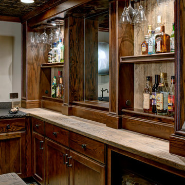
This project involved converting a partially finished basement into an ultimate media room with an English pub. The family is big on entertaining and enjoys watching movies and college football. It was important to combine the media area with the pub to create options for guests within the same space. Although the home has a full sized basement the staircase was centrally located, which made it difficult for special configuration. As a result, we were able to work with the existing plan be designing a media area large enough for a sectional sofa and additional seating with the English pub at the far end of the room.
The home owner had a projection screen on a bare wall with the electrical components stacked on boxes. The new plan involved installing new cabinets to accommodate components and surround the screen to give it a built-in finish. Open shelving also allows the homeowner to feature some of their collectible sports memorabilia. As if the 130 inch projection screen wasn’t large enough, the surround sound system makes you feel like you are part of the action. It is as close to the I MAX viewing experience as you are going to get in a home. Sound-deadening insulation was installed in the ceiling and walls to prevent noise from penetrating the second floor.
The design of the pub was inspired by the home owner’s favorite local pub, Brazenhead. The bar countertop with lift-top entrance was custom built by our carpenters to simulate aged wood. The finish looks rough, but it is smooth enough to wipe down easily. The top encloses the bar and provides seating for guests. A TV at the bar allows guest to follow along with the game on the big screen or tune into another game. The game table provides even another option for entertainment in the media room. Stacked stone with thick mortar joints was installed on the face of the bar and to an opposite wall containing the entrance to a wine room. Hand scrapped hardwood floors were installed in the pub portion of the media room to provide yet another touch to “Brazenhead” their own pub.
The wet bar is under a soffit area that continues into the media area due to existing duct work. We wanted to creatively find a way to separate the two spaces. Adding trim on the ceiling and front of soffit at the bar defined the area and made a great transition from the drywall soffit to the wet bar. A tin ceiling was installed which added to the ambience of the pub wet bar and further aided in defining the soffit as an intentional part of the design. Custom built wainscoting borders the perimeter of the media room. The end result allows the client to comfortably entertain in a space designed just for them.
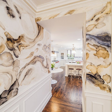
 House of L
A 1927 colonial home in Shaker Heights, Ohio, received a breathtaking renovation that required extensive work, transforming it from a tucked away, utilitarian space, to an all-purpose gathering room, a role that most kitchens embrace in a home today. The scope of work changed over the course of the project, starting more minimalistically and then quickly becoming the main focus of the house's remodeling, resulting in a staircase being relocated and walls being torn down to create an inviting focal point to the home where family and friends could connect. The focus of the functionality was to allow for multiple prep areas with the inclusion of two islands and sinks, two eating areas (one for impromptu snacking and small meals of younger family members and friends on island no. two and a built-in bench seat for everyday meals in the immediate family). The kitchen was equipped with all Subzero and Wolf appliances, including a 48" range top with a 12" griddle, two double ovens, a 42" built-in side by side refrigerator and freezer, a microwave drawer on island no. one and a beverage center and icemaker in island no. two. The aesthetic feeling embraces the architectural feel of the home while adding a modern sensibility with the revamped layout and graphic elements that tie the color palette of whites, chocolate and charcoal. The cabinets were custom made and outfitted with beaded inset doors with a Shaker panel frame and finished in Benjamin Moore's OC-17 White Dove, a soft white that allowed for the kitchen to feel warm while still maintaining its brightness. Accents of walnut were added to create a sense of warmth, including a custom premium grade walnut countertop on island no. one from Brooks Custom and a TV cabinet with a doggie feeding station beneath. Bringing the cabinet line to the 8'6" ceiling height helps the room feel taller and bold light fixtures at the islands and eating area add detail to an otherwise simpler ceiling detail. The 1 1/4" countertops feature Calacatta Gold Marble with an ogee edge detail. Special touches on the interiors include secret storage panels, an appliance garage, breadbox, pull-out drawers behind the cabinet doors and all soft-close hinges and drawer glides. A kneading area was made as a part of island no. one for the homeowners' love of baking, complete with a stone top allowing for dough to stay cool. Baskets beneath store kitchen essentials that need air circulation. The room adjacent to the kitchen was converted to a hearth room (from a formal dining room) to extend the kitchen's living space and allow for a natural spillover for family and guests to spill into.
Jason Miller, Pixelate
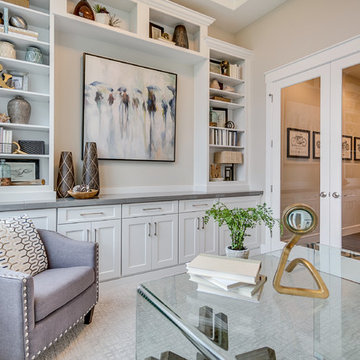
 Cascade West Development
The Aerius - Modern Craftsman in Ridgefield Washington by Cascade West Development Inc.
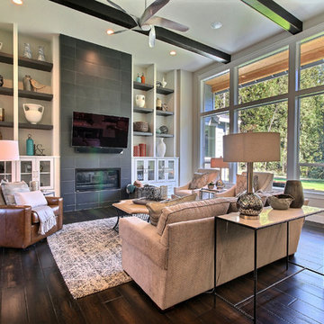
Upon opening the 8ft tall door and entering the foyer an immediate display of light, color and energy is presented to us in the form of 13ft coffered ceilings, abundant natural lighting and an ornate glass chandelier. Beckoning across the hall an entrance to the Great Room is beset by the Master Suite, the Den, a central stairway to the Upper Level and a passageway to the 4-bay Garage and Guest Bedroom with attached bath. Advancement to the Great Room reveals massive, built-in vertical storage, a vast area for all manner of social interactions and a bountiful showcase of the forest scenery that allows the natural splendor of the outside in. The sleek corner-kitchen is composed with elevated countertops. These additional 4in create the perfect fit for our larger-than-life homeowner and make stooping and drooping a distant memory. The comfortable kitchen creates no spatial divide and easily transitions to the sun-drenched dining nook, complete with overhead coffered-beam ceiling. This trifecta of function, form and flow accommodates all shapes and sizes and allows any number of events to be hosted here. On the rare occasion more room is needed, the sliding glass doors can be opened allowing an out-pour of activity. Almost doubling the square-footage and extending the Great Room into the arboreous locale is sure to guarantee long nights out under the stars.
Cascade West Facebook: https://goo.gl/MCD2U1
Cascade West Website: https://goo.gl/XHm7Un
These photos, like many of ours, were taken by the good people of ExposioHDR - Portland, Or
Exposio Facebook: https://goo.gl/SpSvyo
Exposio Website: https://goo.gl/Cbm8Ya
 Adrienne DeRosa
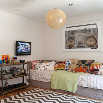
Holleder and FIve, the couple's 9-year-old twin boys, share a room as do the other four children. "We knew we wanted our kids to share rooms, so that was a huge design element", says Cortney. "We think it is important that they learn how to work with others, so even our boys share a big dormitory style bathroom."
In order to keep the center of the room open, Robert and Cortney placed the boys' beds toe-to-toe along one wall. In true Novogratz fashion, the beds are inexpensive frames from IKEA that received a treatment of custom upholstery.
Photo: Adrienne DeRosa Photography © 2014 Houzz
Design: Cortney and Robert Novogratz
 User
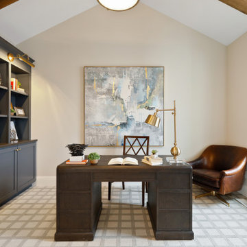
UserInspiration for a transitional freestanding desk carpeted, exposed beam and vaulted ceiling study room remodel in Minneapolis with beige walls
 Cascade West Development
The Aerius - Modern Craftsman in Ridgefield Washington by Cascade West Development Inc.
Upon opening the 8ft tall door and entering the foyer an immediate display of light, color and energy is presented to us in the form of 13ft coffered ceilings, abundant natural lighting and an ornate glass chandelier. Beckoning across the hall an entrance to the Great Room is beset by the Master Suite, the Den, a central stairway to the Upper Level and a passageway to the 4-bay Garage and Guest Bedroom with attached bath. Advancement to the Great Room reveals massive, built-in vertical storage, a vast area for all manner of social interactions and a bountiful showcase of the forest scenery that allows the natural splendor of the outside in. The sleek corner-kitchen is composed with elevated countertops. These additional 4in create the perfect fit for our larger-than-life homeowner and make stooping and drooping a distant memory. The comfortable kitchen creates no spatial divide and easily transitions to the sun-drenched dining nook, complete with overhead coffered-beam ceiling. This trifecta of function, form and flow accommodates all shapes and sizes and allows any number of events to be hosted here. On the rare occasion more room is needed, the sliding glass doors can be opened allowing an out-pour of activity. Almost doubling the square-footage and extending the Great Room into the arboreous locale is sure to guarantee long nights out under the stars.
Cascade West Facebook: https://goo.gl/MCD2U1
Cascade West Website: https://goo.gl/XHm7Un
These photos, like many of ours, were taken by the good people of ExposioHDR - Portland, Or
Exposio Facebook: https://goo.gl/SpSvyo
Exposio Website: https://goo.gl/Cbm8Ya

 Zieba Builders, Inc.
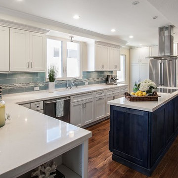
Our clients loved the location of their duplex home with its peak-a-boo ocean view, but their existing kitchen was not suited for their growing family. They wanted a kitchen with a coastal vibe, plenty of storage space, and an eat-in area.
We started by bringing the far wall into the kitchen space to accommodate a large panty and communication center for the family. Doing this allowed us to move the refrigerator out of the main traffic area and doubled the amount of storage space. Several new windows were added to bring in natural light. A half wall was moved to allow more countertop area and open up sight lines. The previously awkwardly shaped island was slimmed down to create better flow.
There were a few venting challenges to overcome; gas lines and plumbing had to be re-routed without disturbing the unit below. To open up sight lines, soffits were eliminated which allowed the extension of cabinets to the ceiling. To stay within the homeowner’s budget, we match existing scraped flooring by lacing in and repairing patches.
The old dining area was too small for table, so we designed and built a custom banquette to maximize the space and take advantage of the outdoor views. The overall space works for family meals as well as entertaining.
A light summer palette was used to reflect the shades of the sand, sea and sky. Even though the new kitchen is actually smaller than the original space, its now far more functional and open.
 User
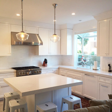
UserA vacation home in Southern California. The original configuration was a U-shaped kitchen. I opened it up for high traffic & added seating for casual meals.
 Luca Andrisani Architect
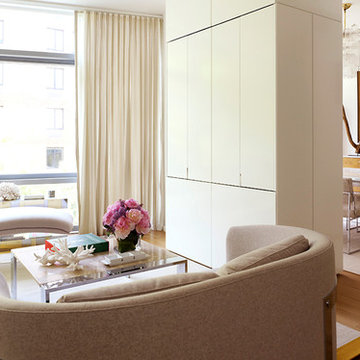
In this renovation, a spare bedroom was removed to expand the living and dining space. A central built-in separates the living from the dining area and provides ample storage while serving as a media center.
Featured in Interior Design, Sept. 2014, p. 216 and Serendipity, Oct. 2014, p. 30.
Renovation, Interior Design, and Furnishing: Luca Andrisani Architect.
Photo: Peter Murdock
 Metropolis Drafting and Construction Inc
Master suite addition to an existing 20's Spanish home in the heart of Sherman Oaks, approx. 300+ sq. added to this 1300sq. home to provide the needed master bedroom suite. the large 14' by 14' bedroom has a 1 lite French door to the back yard and a large window allowing much needed natural light, the new hardwood floors were matched to the existing wood flooring of the house, a Spanish style arch was done at the entrance to the master bedroom to conform with the rest of the architectural style of the home.
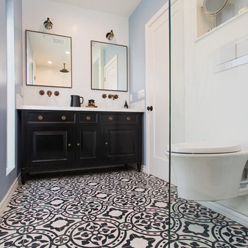
The master bathroom on the other hand was designed with a Scandinavian style mixed with Modern wall mounted toilet to preserve space and to allow a clean look, an amazing gloss finish freestanding vanity unit boasting wall mounted faucets and a whole wall tiled with 2x10 subway tile in a herringbone pattern.
For the floor tile we used 8x8 hand painted cement tile laid in a pattern pre determined prior to installation.
The wall mounted toilet has a huge open niche above it with a marble shelf to be used for decoration.
The huge shower boasts 2x10 herringbone pattern subway tile, a side to side niche with a marble shelf, the same marble material was also used for the shower step to give a clean look and act as a trim between the 8x8 cement tiles and the bark hex tile in the shower pan.
Notice the hidden drain in the center with tile inserts and the great modern plumbing fixtures in an old work antique bronze finish.
A walk-in closet was constructed as well to allow the much needed storage space.
62