
Search results for "Allow" in Home Design Ideas
 Plain & Posh
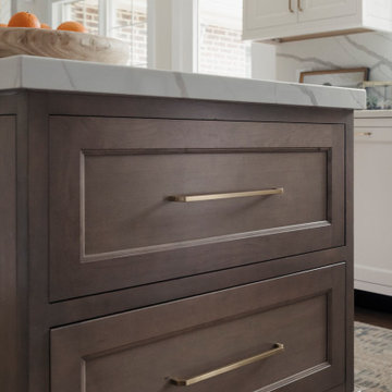
Thse clients came to me for a kitchen refresh. Keeping the existing floor plan but updating as much as possible. After explaining my thoughts, they chose to go with a much larger project. The wall to the garage wash pushed bach 12" to allow for the island to happen. This almost couldn't happen as there is a support post in the garage we had to keep. I designed the last pantry area as on 10" deep, allowing us to conceal that behind the cabinets. Then, we opend up the wall to the dining room to make the rooms one large space. The wall to the family room was also openend up, leaving the half wall to allow for the kitchen eating area. They wanted to incorporate a bar area, without it feeling like a "bar" The fabulous tall custom unit houses their wine collection and then half of the dining room buffet area holds glassware and other bar items. I helped the clients with all of the design choices.We all wanted to keep the space classic, war, functional and with mixed materials. I chose to use the same countertop material for the backsplash, to keep the space feeling as large as possible.
 Dave Fox Design Build Remodelers
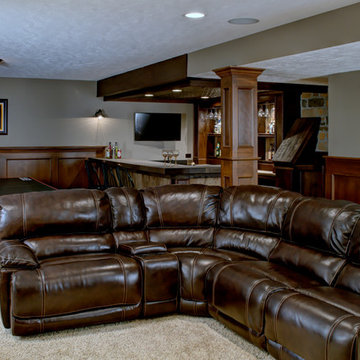
This project involved converting a partially finished basement into an ultimate media room with an English pub. The family is big on entertaining and enjoys watching movies and college football. It was important to combine the media area with the pub to create options for guests within the same space. Although the home has a full sized basement the staircase was centrally located, which made it difficult for special configuration. As a result, we were able to work with the existing plan be designing a media area large enough for a sectional sofa and additional seating with the English pub at the far end of the room.
The home owner had a projection screen on a bare wall with the electrical components stacked on boxes. The new plan involved installing new cabinets to accommodate components and surround the screen to give it a built-in finish. Open shelving also allows the homeowner to feature some of their collectible sports memorabilia. As if the 130 inch projection screen wasn’t large enough, the surround sound system makes you feel like you are part of the action. It is as close to the I MAX viewing experience as you are going to get in a home. Sound-deadening insulation was installed in the ceiling and walls to prevent noise from penetrating the second floor.
The design of the pub was inspired by the home owner’s favorite local pub, Brazenhead. The bar countertop with lift-top entrance was custom built by our carpenters to simulate aged wood. The finish looks rough, but it is smooth enough to wipe down easily. The top encloses the bar and provides seating for guests. A TV at the bar allows guest to follow along with the game on the big screen or tune into another game. The game table provides even another option for entertainment in the media room. Stacked stone with thick mortar joints was installed on the face of the bar and to an opposite wall containing the entrance to a wine room. Hand scrapped hardwood floors were installed in the pub portion of the media room to provide yet another touch to “Brazenhead” their own pub.
The wet bar is under a soffit area that continues into the media area due to existing duct work. We wanted to creatively find a way to separate the two spaces. Adding trim on the ceiling and front of soffit at the bar defined the area and made a great transition from the drywall soffit to the wet bar. A tin ceiling was installed which added to the ambience of the pub wet bar and further aided in defining the soffit as an intentional part of the design. Custom built wainscoting borders the perimeter of the media room. The end result allows the client to comfortably entertain in a space designed just for them.
 Paradise Tiny Homes LLC
This tiny home has a very unique and spacious bathroom. The triangular cut mango slab with the vessel sink conserves space while looking sleek and elegant, and the shower has not been stuck in a corner but instead is constructed as a whole new corner to the room! Yes, this bathroom has five right angles. Sunlight from the sunroof above fills the whole room. A curved glass shower door, as well as a frosted glass bathroom door, allows natural light to pass from one room to another.
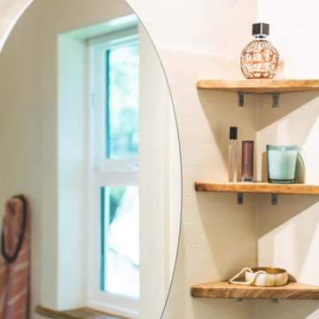
This tiny home has utilized space-saving design and put the bathroom vanity in the corner of the bathroom. Natural light in addition to track lighting makes this vanity perfect for getting ready in the morning. Triangle corner shelves give an added space for personal items to keep from cluttering the wood counter. This contemporary, costal Tiny Home features a bathroom with a shower built out over the tongue of the trailer it sits on saving space and creating space in the bathroom. This shower has it's own clear roofing giving the shower a skylight. This allows tons of light to shine in on the beautiful blue tiles that shape this corner shower. Stainless steel planters hold ferns giving the shower an outdoor feel. With sunlight, plants, and a rain shower head above the shower, it is just like an outdoor shower only with more convenience and privacy. The curved glass shower door gives the whole tiny home bathroom a bigger feel while letting light shine through to the rest of the bathroom. The blue tile shower has niches; built-in shower shelves to save space making your shower experience even better. The bathroom door is a pocket door, saving space in both the bathroom and kitchen to the other side. The frosted glass pocket door also allows light to shine through.
Find the right local pro for your project
 Plain & Posh
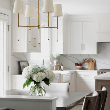
Thse clients came to me for a kitchen refresh. Keeping the existing floor plan but updating as much as possible. After explaining my thoughts, they chose to go with a much larger project. The wall to the garage wash pushed bach 12" to allow for the island to happen. This almost couldn't happen as there is a support post in the garage we had to keep. I designed the last pantry area as on 10" deep, allowing us to conceal that behind the cabinets. Then, we opend up the wall to the dining room to make the rooms one large space. The wall to the family room was also openend up, leaving the half wall to allow for the kitchen eating area. They wanted to incorporate a bar area, without it feeling like a "bar" The fabulous tall custom unit houses their wine collection and then half of the dining room buffet area holds glassware and other bar items. I helped the clients with all of the design choices.We all wanted to keep the space classic, war, functional and with mixed materials. I chose to use the same countertop material for the backsplash, to keep the space feeling as large as possible.

 KBG Design
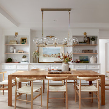
Example of a transitional light wood floor, beige floor and tray ceiling dining room design in San Francisco with white walls
 Zieba Builders, Inc.
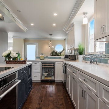
Our clients loved the location of their duplex home with its peak-a-boo ocean view, but their existing kitchen was not suited for their growing family. They wanted a kitchen with a coastal vibe, plenty of storage space, and an eat-in area.
We started by bringing the far wall into the kitchen space to accommodate a large panty and communication center for the family. Doing this allowed us to move the refrigerator out of the main traffic area and doubled the amount of storage space. Several new windows were added to bring in natural light. A half wall was moved to allow more countertop area and open up sight lines. The previously awkwardly shaped island was slimmed down to create better flow.
There were a few venting challenges to overcome; gas lines and plumbing had to be re-routed without disturbing the unit below. To open up sight lines, soffits were eliminated which allowed the extension of cabinets to the ceiling. To stay within the homeowner’s budget, we match existing scraped flooring by lacing in and repairing patches.
The old dining area was too small for table, so we designed and built a custom banquette to maximize the space and take advantage of the outdoor views. The overall space works for family meals as well as entertaining.
A light summer palette was used to reflect the shades of the sand, sea and sky. Even though the new kitchen is actually smaller than the original space, its now far more functional and open.
 Edgewater Design Group
We love it when a home becomes a family compound with wonderful history. That is exactly what this home on Mullet Lake is. The original cottage was built by our client’s father and enjoyed by the family for years. It finally came to the point that there was simply not enough room and it lacked some of the efficiencies and luxuries enjoyed in permanent residences. The cottage is utilized by several families and space was needed to allow for summer and holiday enjoyment. The focus was on creating additional space on the second level, increasing views of the lake, moving interior spaces and the need to increase the ceiling heights on the main level. All these changes led for the need to start over or at least keep what we could and add to it. The home had an excellent foundation, in more ways than one, so we started from there.
It was important to our client to create a northern Michigan cottage using low maintenance exterior finishes. The interior look and feel moved to more timber beam with pine paneling to keep the warmth and appeal of our area. The home features 2 master suites, one on the main level and one on the 2nd level with a balcony. There are 4 additional bedrooms with one also serving as an office. The bunkroom provides plenty of sleeping space for the grandchildren. The great room has vaulted ceilings, plenty of seating and a stone fireplace with vast windows toward the lake. The kitchen and dining are open to each other and enjoy the view.
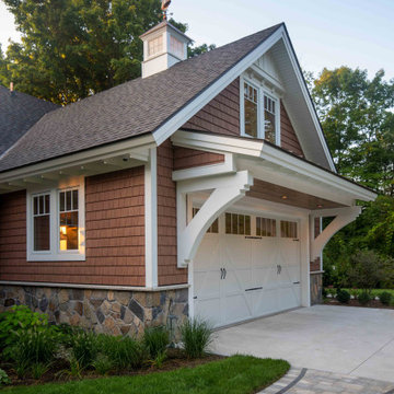
The beach entry provides access to storage, the 3/4 bath, and laundry. The sunroom off the dining area is a great extension of the home with 180 degrees of view. This allows a wonderful morning escape to enjoy your coffee. The covered timber entry porch provides a direct view of the lake upon entering the home. The garage also features a timber bracketed shed roof system which adds wonderful detail to garage doors.
The home’s footprint was extended in a few areas to allow for the interior spaces to work with the needs of the family. Plenty of living spaces for all to enjoy as well as bedrooms to rest their heads after a busy day on the lake. This will be enjoyed by generations to come.
 ZeroEnergy Design
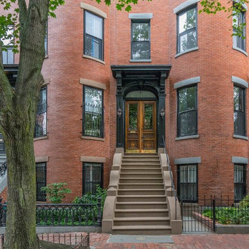
This renovated brick rowhome in Boston’s South End offers a modern aesthetic within a historic structure, creative use of space, exceptional thermal comfort, a reduced carbon footprint, and a passive stream of income.
DESIGN PRIORITIES. The goals for the project were clear - design the primary unit to accommodate the family’s modern lifestyle, rework the layout to create a desirable rental unit, improve thermal comfort and introduce a modern aesthetic. We designed the street-level entry as a shared entrance for both the primary and rental unit. The family uses it as their everyday entrance - we planned for bike storage and an open mudroom with bench and shoe storage to facilitate the change from shoes to slippers or bare feet as they enter their home. On the main level, we expanded the kitchen into the dining room to create an eat-in space with generous counter space and storage, as well as a comfortable connection to the living space. The second floor serves as master suite for the couple - a bedroom with a walk-in-closet and ensuite bathroom, and an adjacent study, with refinished original pumpkin pine floors. The upper floor, aside from a guest bedroom, is the child's domain with interconnected spaces for sleeping, work and play. In the play space, which can be separated from the work space with new translucent sliding doors, we incorporated recreational features inspired by adventurous and competitive television shows, at their son’s request.
MODERN MEETS TRADITIONAL. We left the historic front facade of the building largely unchanged - the security bars were removed from the windows and the single pane windows were replaced with higher performing historic replicas. We designed the interior and rear facade with a vision of warm modernism, weaving in the notable period features. Each element was either restored or reinterpreted to blend with the modern aesthetic. The detailed ceiling in the living space, for example, has a new matte monochromatic finish, and the wood stairs are covered in a dark grey floor paint, whereas the mahogany doors were simply refinished. New wide plank wood flooring with a neutral finish, floor-to-ceiling casework, and bold splashes of color in wall paint and tile, and oversized high-performance windows (on the rear facade) round out the modern aesthetic.
RENTAL INCOME. The existing rowhome was zoned for a 2-family dwelling but included an undesirable, single-floor studio apartment at the garden level with low ceiling heights and questionable emergency egress. In order to increase the quality and quantity of space in the rental unit, we reimagined it as a two-floor, 1 or 2 bedroom, 2 bathroom apartment with a modern aesthetic, increased ceiling height on the lowest level and provided an in-unit washer/dryer. The apartment was listed with Jackie O'Connor Real Estate and rented immediately, providing the owners with a source of passive income.
ENCLOSURE WITH BENEFITS. The homeowners sought a minimal carbon footprint, enabled by their urban location and lifestyle decisions, paired with the benefits of a high-performance home. The extent of the renovation allowed us to implement a deep energy retrofit (DER) to address air tightness, insulation, and high-performance windows. The historic front facade is insulated from the interior, while the rear facade is insulated on the exterior. Together with these building enclosure improvements, we designed an HVAC system comprised of continuous fresh air ventilation, and an efficient, all-electric heating and cooling system to decouple the house from natural gas. This strategy provides optimal thermal comfort and indoor air quality, improved acoustic isolation from street noise and neighbors, as well as a further reduced carbon footprint. We also took measures to prepare the roof for future solar panels, for when the South End neighborhood’s aging electrical infrastructure is upgraded to allow them.
URBAN LIVING. The desirable neighborhood location allows the both the homeowners and tenant to walk, bike, and use public transportation to access the city, while each charging their respective plug-in electric cars behind the building to travel greater distances.
OVERALL. The understated rowhouse is now ready for another century of urban living, offering the owners comfort and convenience as they live life as an expression of their values.
 Paradise Tiny Homes LLC
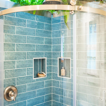
This tiny home has a very unique and spacious bathroom with an indoor shower that feels like an outdoor shower. The triangular cut mango slab with the vessel sink conserves space while looking sleek and elegant, and the shower has not been stuck in a corner but instead is constructed as a whole new corner to the room! Yes, this bathroom has five right angles. Sunlight from the sunroof above fills the whole room. A curved glass shower door, as well as a frosted glass bathroom door, allows natural light to pass from one room to another. Ferns grow happily in the moisture and light from the shower.
This contemporary, costal Tiny Home features a bathroom with a shower built out over the tongue of the trailer it sits on saving space and creating space in the bathroom. This shower has it's own clear roofing giving the shower a skylight. This allows tons of light to shine in on the beautiful blue tiles that shape this corner shower. Stainless steel planters hold ferns giving the shower an outdoor feel. With sunlight, plants, and a rain shower head above the shower, it is just like an outdoor shower only with more convenience and privacy. The curved glass shower door gives the whole tiny home bathroom a bigger feel while letting light shine through to the rest of the bathroom. The blue tile shower has niches; built-in shower shelves to save space making your shower experience even better. The frosted glass pocket door also allows light to shine through.
 Plain & Posh
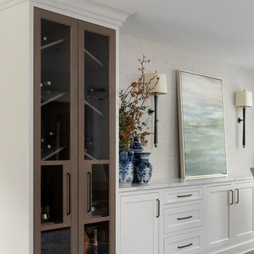
Thse clients came to me for a kitchen refresh. Keeping the existing floor plan but updating as much as possible. After explaining my thoughts, they chose to go with a much larger project. The wall to the garage wash pushed bach 12" to allow for the island to happen. This almost couldn't happen as there is a support post in the garage we had to keep. I designed the last pantry area as on 10" deep, allowing us to conceal that behind the cabinets. Then, we opend up the wall to the dining room to make the rooms one large space. The wall to the family room was also openend up, leaving the half wall to allow for the kitchen eating area. They wanted to incorporate a bar area, without it feeling like a "bar" The fabulous tall custom unit houses their wine collection and then half of the dining room buffet area holds glassware and other bar items. I helped the clients with all of the design choices.We all wanted to keep the space classic, war, functional and with mixed materials. I chose to use the same countertop material for the backsplash, to keep the space feeling as large as possible.
 Plain & Posh
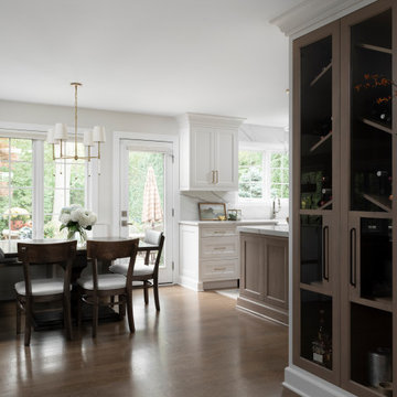
Thse clients came to me for a kitchen refresh. Keeping the existing floor plan but updating as much as possible. After explaining my thoughts, they chose to go with a much larger project. The wall to the garage wash pushed bach 12" to allow for the island to happen. This almost couldn't happen as there is a support post in the garage we had to keep. I designed the last pantry area as on 10" deep, allowing us to conceal that behind the cabinets. Then, we opend up the wall to the dining room to make the rooms one large space. The wall to the family room was also openend up, leaving the half wall to allow for the kitchen eating area. They wanted to incorporate a bar area, without it feeling like a "bar" The fabulous tall custom unit houses their wine collection and then half of the dining room buffet area holds glassware and other bar items. I helped the clients with all of the design choices.We all wanted to keep the space classic, war, functional and with mixed materials. I chose to use the same countertop material for the backsplash, to keep the space feeling as large as possible.
 Studio Wills + Architects
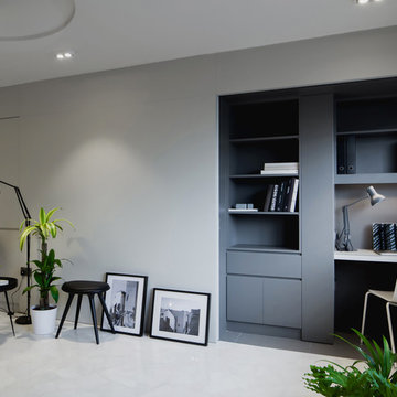
...a Study Nook deep in shadows. (Photography by Beton Brut).
Trendy living room photo in Singapore
Trendy living room photo in Singapore
 Amiano & Son Construction, LLC
Steve Shilling
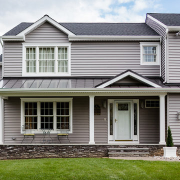
Mid-sized transitional stamped concrete front porch photo in New York with a roof extension
Mid-sized transitional stamped concrete front porch photo in New York with a roof extension
 Plain & Posh
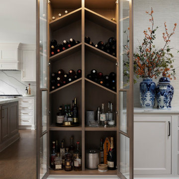
Thse clients came to me for a kitchen refresh. Keeping the existing floor plan but updating as much as possible. After explaining my thoughts, they chose to go with a much larger project. The wall to the garage wash pushed bach 12" to allow for the island to happen. This almost couldn't happen as there is a support post in the garage we had to keep. I designed the last pantry area as on 10" deep, allowing us to conceal that behind the cabinets. Then, we opend up the wall to the dining room to make the rooms one large space. The wall to the family room was also openend up, leaving the half wall to allow for the kitchen eating area. They wanted to incorporate a bar area, without it feeling like a "bar" The fabulous tall custom unit houses their wine collection and then half of the dining room buffet area holds glassware and other bar items. I helped the clients with all of the design choices.We all wanted to keep the space classic, war, functional and with mixed materials. I chose to use the same countertop material for the backsplash, to keep the space feeling as large as possible.

 Ellie K Design
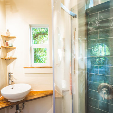
This tiny home has utilized space-saving design and put the bathroom vanity in the corner of the bathroom. Natural light in addition to track lighting makes this vanity perfect for getting ready in the morning. Triangle corner shelves give an added space for personal items to keep from cluttering the wood counter. This contemporary, costal Tiny Home features a bathroom with a shower built out over the tongue of the trailer it sits on saving space and creating space in the bathroom. This shower has it's own clear roofing giving the shower a skylight. This allows tons of light to shine in on the beautiful blue tiles that shape this corner shower. Stainless steel planters hold ferns giving the shower an outdoor feel. With sunlight, plants, and a rain shower head above the shower, it is just like an outdoor shower only with more convenience and privacy. The curved glass shower door gives the whole tiny home bathroom a bigger feel while letting light shine through to the rest of the bathroom. The blue tile shower has niches; built-in shower shelves to save space making your shower experience even better. The bathroom door is a pocket door, saving space in both the bathroom and kitchen to the other side. The frosted glass pocket door also allows light to shine through.
This Tiny Home has a unique shower structure that points out over the tongue of the tiny house trailer. This provides much more room to the entire bathroom and centers the beautiful shower so that it is what you see looking through the bathroom door. The gorgeous blue tile is hit with natural sunlight from above allowed in to nurture the ferns by way of clear roofing. Yes, there is a skylight in the shower and plants making this shower conveniently located in your bathroom feel like an outdoor shower. It has a large rounded sliding glass door that lets the space feel open and well lit. There is even a frosted sliding pocket door that also lets light pass back and forth. There are built-in shelves to conserve space making the shower, bathroom, and thus the tiny house, feel larger, open and airy.
 Michael Nash Design, Build & Homes
For this couple, planning to move back to their rambler home in Arlington after living overseas for few years, they were ready to get rid of clutter, clean up their grown-up kids’ boxes, and transform their home into their dream home for their golden years.
The old home included a box-like 8 feet x 10 feet kitchen, no family room, three small bedrooms and two back to back small bathrooms. The laundry room was located in a small dark space of the unfinished basement.
This home is located in a cul-de-sac, on an uphill lot, of a very secluded neighborhood with lots of new homes just being built around them.
The couple consulted an architectural firm in past but never were satisfied with the final plans. They approached Michael Nash Custom Kitchens hoping for fresh ideas.
The backyard and side yard are wooded and the existing structure was too close to building restriction lines. We developed design plans and applied for special permits to achieve our client’s goals.
The remodel includes a family room, sunroom, breakfast area, home office, large master bedroom suite, large walk-in closet, main level laundry room, lots of windows, front porch, back deck, and most important than all an elevator from lower to upper level given them and their close relative a necessary easier access.
The new plan added extra dimensions to this rambler on all four sides. Starting from the front, we excavated to allow a first level entrance, storage, and elevator room. Building just above it, is a 12 feet x 30 feet covered porch with a leading brick staircase. A contemporary cedar rail with horizontal stainless steel cable rail system on both the front porch and the back deck sets off this project from any others in area. A new foyer with double frosted stainless-steel door was added which contains the elevator.
The garage door was widened and a solid cedar door was installed to compliment the cedar siding.
The left side of this rambler was excavated to allow a storage off the garage and extension of one of the old bedrooms to be converted to a large master bedroom suite, master bathroom suite and walk-in closet.
We installed matching brick for a seam-less exterior look.
The entire house was furnished with new Italian imported highly custom stainless-steel windows and doors. We removed several brick and block structure walls to put doors and floor to ceiling windows.
A full walk in shower with barn style frameless glass doors, double vanities covered with selective stone, floor to ceiling porcelain tile make the master bathroom highly accessible.
The other two bedrooms were reconfigured with new closets, wider doorways, new wood floors and wider windows. Just outside of the bedroom, a new laundry room closet was a major upgrade.
A second HVAC system was added in the attic for all new areas.
The back side of the master bedroom was covered with floor to ceiling windows and a door to step into a new deck covered in trex and cable railing. This addition provides a view to wooded area of the home.
By excavating and leveling the backyard, we constructed a two story 15’x 40’ addition that provided the tall ceiling for the family room just adjacent to new deck, a breakfast area a few steps away from the remodeled kitchen. Upscale stainless-steel appliances, floor to ceiling white custom cabinetry and quartz counter top, and fun lighting improved this back section of the house with its increased lighting and available work space. Just below this addition, there is extra space for exercise and storage room. This room has a pair of sliding doors allowing more light inside.
The right elevation has a trapezoid shape addition with floor to ceiling windows and space used as a sunroom/in-home office. Wide plank wood floors were installed throughout the main level for continuity.
The hall bathroom was gutted and expanded to allow a new soaking tub and large vanity. The basement half bathroom was converted to a full bathroom, new flooring and lighting in the entire basement changed the purpose of the basement for entertainment and spending time with grandkids.
Off white and soft tone were used inside and out as the color schemes to make this rambler spacious and illuminated.
Final grade and landscaping, by adding a few trees, trimming the old cherry and walnut trees in backyard, saddling the yard, and a new concrete driveway and walkway made this home a unique and charming gem in the neighborhood.
 TKS Design Group
Download our free ebook, Creating the Ideal Kitchen. DOWNLOAD NOW
This master bath remodel is the cat's meow for more than one reason! The materials in the room are soothing and give a nice vintage vibe in keeping with the rest of the home. We completed a kitchen remodel for this client a few years’ ago and were delighted when she contacted us for help with her master bath!
The bathroom was fine but was lacking in interesting design elements, and the shower was very small. We started by eliminating the shower curb which allowed us to enlarge the footprint of the shower all the way to the edge of the bathtub, creating a modified wet room. The shower is pitched toward a linear drain so the water stays in the shower. A glass divider allows for the light from the window to expand into the room, while a freestanding tub adds a spa like feel.
The radiator was removed and both heated flooring and a towel warmer were added to provide heat. Since the unit is on the top floor in a multi-unit building it shares some of the heat from the floors below, so this was a great solution for the space.
The custom vanity includes a spot for storing styling tools and a new built in linen cabinet provides plenty of the storage. The doors at the top of the linen cabinet open to stow away towels and other personal care products, and are lighted to ensure everything is easy to find. The doors below are false doors that disguise a hidden storage area. The hidden storage area features a custom litterbox pull out for the homeowner’s cat! Her kitty enters through the cutout, and the pull out drawer allows for easy clean ups.
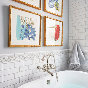
The materials in the room – white and gray marble, charcoal blue cabinetry and gold accents – have a vintage vibe in keeping with the rest of the home. Polished nickel fixtures and hardware add sparkle, while colorful artwork adds some life to the space.

68