
Search results for "Allow" in Home Design Ideas

 ZeroEnergy Design
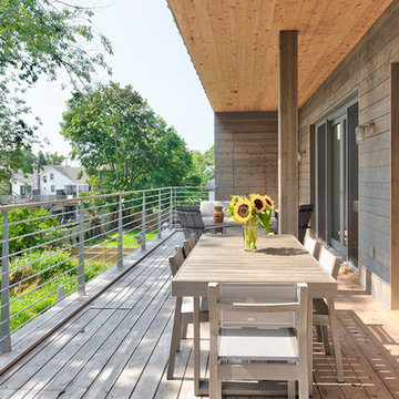
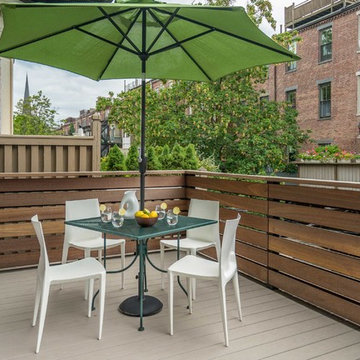
This renovated brick rowhome in Boston’s South End offers a modern aesthetic within a historic structure, creative use of space, exceptional thermal comfort, a reduced carbon footprint, and a passive stream of income.
DESIGN PRIORITIES. The goals for the project were clear - design the primary unit to accommodate the family’s modern lifestyle, rework the layout to create a desirable rental unit, improve thermal comfort and introduce a modern aesthetic. We designed the street-level entry as a shared entrance for both the primary and rental unit. The family uses it as their everyday entrance - we planned for bike storage and an open mudroom with bench and shoe storage to facilitate the change from shoes to slippers or bare feet as they enter their home. On the main level, we expanded the kitchen into the dining room to create an eat-in space with generous counter space and storage, as well as a comfortable connection to the living space. The second floor serves as master suite for the couple - a bedroom with a walk-in-closet and ensuite bathroom, and an adjacent study, with refinished original pumpkin pine floors. The upper floor, aside from a guest bedroom, is the child's domain with interconnected spaces for sleeping, work and play. In the play space, which can be separated from the work space with new translucent sliding doors, we incorporated recreational features inspired by adventurous and competitive television shows, at their son’s request.
MODERN MEETS TRADITIONAL. We left the historic front facade of the building largely unchanged - the security bars were removed from the windows and the single pane windows were replaced with higher performing historic replicas. We designed the interior and rear facade with a vision of warm modernism, weaving in the notable period features. Each element was either restored or reinterpreted to blend with the modern aesthetic. The detailed ceiling in the living space, for example, has a new matte monochromatic finish, and the wood stairs are covered in a dark grey floor paint, whereas the mahogany doors were simply refinished. New wide plank wood flooring with a neutral finish, floor-to-ceiling casework, and bold splashes of color in wall paint and tile, and oversized high-performance windows (on the rear facade) round out the modern aesthetic.
RENTAL INCOME. The existing rowhome was zoned for a 2-family dwelling but included an undesirable, single-floor studio apartment at the garden level with low ceiling heights and questionable emergency egress. In order to increase the quality and quantity of space in the rental unit, we reimagined it as a two-floor, 1 or 2 bedroom, 2 bathroom apartment with a modern aesthetic, increased ceiling height on the lowest level and provided an in-unit washer/dryer. The apartment was listed with Jackie O'Connor Real Estate and rented immediately, providing the owners with a source of passive income.
ENCLOSURE WITH BENEFITS. The homeowners sought a minimal carbon footprint, enabled by their urban location and lifestyle decisions, paired with the benefits of a high-performance home. The extent of the renovation allowed us to implement a deep energy retrofit (DER) to address air tightness, insulation, and high-performance windows. The historic front facade is insulated from the interior, while the rear facade is insulated on the exterior. Together with these building enclosure improvements, we designed an HVAC system comprised of continuous fresh air ventilation, and an efficient, all-electric heating and cooling system to decouple the house from natural gas. This strategy provides optimal thermal comfort and indoor air quality, improved acoustic isolation from street noise and neighbors, as well as a further reduced carbon footprint. We also took measures to prepare the roof for future solar panels, for when the South End neighborhood’s aging electrical infrastructure is upgraded to allow them.
URBAN LIVING. The desirable neighborhood location allows the both the homeowners and tenant to walk, bike, and use public transportation to access the city, while each charging their respective plug-in electric cars behind the building to travel greater distances.
OVERALL. The understated rowhouse is now ready for another century of urban living, offering the owners comfort and convenience as they live life as an expression of their values.
Photography: Eric Roth Photo
 La Roche Architecture Inc.
file group
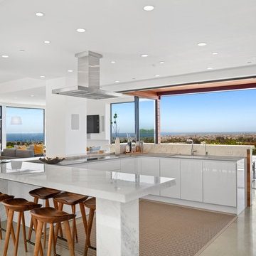
Trendy u-shaped beige floor eat-in kitchen photo in Orange County with an undermount sink, flat-panel cabinets, white cabinets, paneled appliances, a peninsula and white countertops
Trendy u-shaped beige floor eat-in kitchen photo in Orange County with an undermount sink, flat-panel cabinets, white cabinets, paneled appliances, a peninsula and white countertops
Find the right local pro for your project
 Plain & Posh
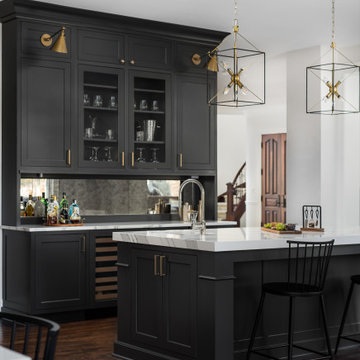
This stunning home is a combination of the best of traditional styling with clean and modern design, creating a look that will be as fresh tomorrow as it is today. Traditional white painted cabinetry in the kitchen, combined with the slab backsplash, a simpler door style and crown moldings with straight lines add a sleek, non-fussy style. An architectural hood with polished brass accents and stainless steel appliances dress up this painted kitchen for upscale, contemporary appeal. The kitchen islands offers a notable color contrast with their rich, dark, gray finish.
The stunning bar area is the entertaining hub of the home. The second bar allows the homeowners an area for their guests to hang out and keeps them out of the main work zone.
The family room used to be shut off from the kitchen. Opening up the wall between the two rooms allows for the function of modern living. The room was full of built ins that were removed to give the clean esthetic the homeowners wanted. It was a joy to redesign the fireplace to give it the contemporary feel they longed for.
Their used to be a large angled wall in the kitchen (the wall the double oven and refrigerator are on) by straightening that out, the homeowners gained better function in the kitchen as well as allowing for the first floor laundry to now double as a much needed mudroom room as well.
 Swift Decor
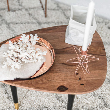
Mary Ellen’s collection is a minimalistic and romantic inspired set. It has a touch of classic charm while maintaining a modern European aesthetic.
Mary Ellen’s collection features five perfectly matched accent pieces. A stylish copper vase with the dark patina finish is flawless for placing fresh flowers giving this piece a classic and timeless style. One of the freshest trends in home décor is Gold Rose accent pieces. This collection features a candle holder with a twist on a 12-point star sculpture. The Stainless Steel Tray it’s a sleek, hand-finished tray with a copper inside and black exterior.
Dutch designer Kiki Van Eijk originally designed the Paper Bag Porcelain Vase. His vision was to exude a visual illusion with the wrinkled ceramic and perfect detail resembling the texture of paper; this vase is one of kind and perfect for any table. One of the most unique pieces in this collection is a Brown Stem Coral. It is delicate and impressive with gorgeous white stems and rust colored base, it is an exquisite eye-catching piece. The coral includes a soft fabric to be placed underneath so it can be properly displayed in any surface.
 Dave VanAm Inc.
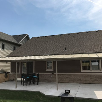
Clean simple lines giving you protection from the heat of the summer. This patio cover blocks all UV rays while allowing the light to shine through. Low maintenance.
 TYM Smart Homes & Home Theaters
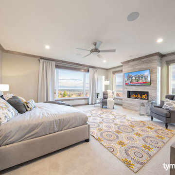
TruAudio. This whole-home audio system allows for up to 8 different streams to be played to 8 different zones at the same time. Savant video distribution, which allows for up to 8 video feeds to be switched to 6 different TVs. Lutron wireless lighting control brings scene control to various rooms.
Whole-home control is also by Savant, which allows users to control the home’s systems, in-home or remotely, from any mobile device including iPad, iPhone, Apple Watch, or Android devices. TYM’s work allows all of the smart home technology and entertainment systems to be integrated and controlled by a single app.
Interior design by Lindsey Walker, lwdesign1016@gmail.com
Photo by: Brad Montgomery
 TKS Design Group
Download our free ebook, Creating the Ideal Kitchen. DOWNLOAD NOW
Lakefront property in the northwest suburbs of Chicago is hard to come by, so when we were hired by this young family with exactly that, we were immediately inspired by not just the unusually large footprint of this 1950’s colonial revival but also the lovely views of the manmade lake it was sited on. The large 5-bedroom home was solidly stuck in the 1980’s, but we saw tons of potential. We started out by updating the existing staircase with a fresh coat of paint and adding new herringbone slate to the entry hall.
The powder room off the entryway also got a refresh - new flooring, new cabinets and fixtures. We ran the new slate right through into this space for some consistency. A fun wallpaper and shiplap trim add a welcoming feel and set the tone for the home.
Next, we tackled the kitchen. Located away from the rest of the first floor, the kitchen felt a little isolated, so we immediately began planning for how to better connect it to the rest of the first floor. We landed on removing the wall between the kitchen and dining room and designed a modified galley style space with separate cooking and clean up zones. The cooking zone consists of the refrigerator, prep sink and cooktop, along with a nice long run of prep space at the island. The cleanup side of the kitchen consists of the main sink and dishwasher. Both areas are situated so that the user can view the lake during prep work and cleanup!
One of the home’s main puzzles was how to incorporate the mudroom and area in front of the patio doors at the back of the house. We already had a breakfast table area, so the space by the patio doors was a bit of a no man’s land. We decided to separate the kitchen proper from what became the new mudroom with a large set of barn doors. That way you can quickly hide any mudroom messes but have easy access to the light coming in through the patio doors as well as the outdoor grilling station. We also love the impact the barn doors add to the overall space.
The homeowners’ first words to us were “it’s time to ditch the brown,” so we did! We chose a lovely blue pallet that reflects the home’s location on the lake which is also vibrant yet easy on the eye. Countertops are white quartz, and the natural oak floor works well with the other honey accents. The breakfast table was given a refresh with new chairs, chandelier and window treatments that frame the gorgeous views of the lake out the back.
We coordinated the slate mudroom flooring with that used in the home’s main entrance for a consistent feel. The storage area consists of open and closed storage to allow for some clutter control as needed.
Next on our “to do” list was revamping the dated brown bar area in the neighboring dining room. We eliminated the clutter by adding some closed cabinets and did some easy updates to help the space feel more current. One snag we ran into here was the discovery of a beam above the existing open shelving that had to be modified with a smaller structural beam to allow for our new design to work. This was an unexpected surprise, but in the end we think it was well worth it!
We kept the colors here a bit more muted to blend with the homeowner’s existing furnishings. Open shelving and polished nickel hardware add some simple detail to the new entertainment zone which also looks out onto the lake!
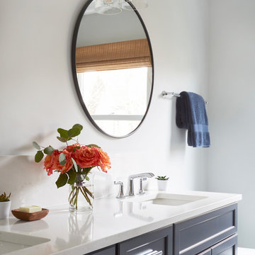
Next we tackled the upstairs starting with the homeowner’s son’s bath. The bath originally had both a tub shower and a separate shower, so we decided to swap out the shower for a new laundry area. This freed up some space downstairs in what used to be the mudroom/laundry room and is much more convenient for daily laundry needs.
We continued the blue palette here with navy cabinetry and the navy tile in the shower. Porcelain floor tile and chrome fixtures keep maintenance to a minimum while matte black mirrors and lighting add some depth the design. A low maintenance runner adds some warmth underfoot and ties the whole space together.
We added a pocket door to the bathroom to minimize interference with the door swings. The left door of the laundry closet is on a 180 degree hinge to allow for easy full access to the machines. Next we tackled the master bath which is an en suite arrangement. The original was typical of the 1980’s with the vanity outside of the bathroom, situated near the master closet. And the brown theme continued here with multiple shades of brown.
Our first move was to segment off the bath and the closet from the master bedroom. We created a short hall from the bedroom to the bathroom with his and hers walk-in closets on the left and right as well as a separate toilet closet outside of the main bathroom for privacy and flexibility.
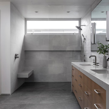
The original bathroom had a giant soaking tub with steps (dangerous!) as well as a small shower that did not work well for our homeowner who is 6’3”. With other bathtubs in the home, they decided to eliminate the tub and create an oversized shower which takes up the space where the old tub was located. The double vanity is on the opposite wall and a bench is located under the window for morning conversations and a place to set a couple of towels.
The pallet in here is light and airy with a mix of blond wood, creamy porcelain and marble tile, and brass accents. A simple roman shade adds some texture and it’s top-down mechanism allows for light and privacy.
This large whole house remodel gave our homeowners not only the ability to maximize the potential of their home but also created a lovely new frame from which to view their fabulous lake views.
Designed by: Susan Klimala, CKD, CBD
Photography by: Michael Kaskel
For more information on kitchen and bath design ideas go to: www.kitchenstudio-ge.com
 Eyoh Design
Louisa, San Clemente Coastal Modern Architecture
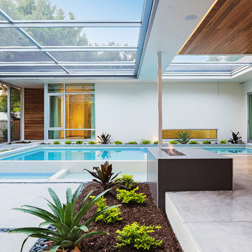
The brief for this modern coastal home was to create a place where the clients and their children and their families could gather to enjoy all the beauty of living in Southern California. Maximizing the lot was key to unlocking the potential of this property so the decision was made to excavate the entire property to allow natural light and ventilation to circulate through the lower level of the home.
A courtyard with a green wall and olive tree act as the lung for the building as the coastal breeze brings fresh air in and circulates out the old through the courtyard.
The concept for the home was to be living on a deck, so the large expanse of glass doors fold away to allow a seamless connection between the indoor and outdoors and feeling of being out on the deck is felt on the interior. A huge cantilevered beam in the roof allows for corner to completely disappear as the home looks to a beautiful ocean view and Dana Point harbor in the distance. All of the spaces throughout the home have a connection to the outdoors and this creates a light, bright and healthy environment.
Passive design principles were employed to ensure the building is as energy efficient as possible. Solar panels keep the building off the grid and and deep overhangs help in reducing the solar heat gains of the building. Ultimately this home has become a place that the families can all enjoy together as the grand kids create those memories of spending time at the beach.
Images and Video by Aandid Media.

 TKS Design Group
Free ebook, Creating the Ideal Kitchen. DOWNLOAD NOW
This project started out as a kitchen remodel but ended up as so much more. As the original plan started to take shape, some water damage provided the impetus to remodel a small upstairs hall bath. Once this bath was complete, the homeowners enjoyed the result so much that they decided to set aside the kitchen and complete a large master bath remodel. Once that was completed, we started planning for the kitchen!
The original kitchen was just large enough to accommodate an island and a separate pantry but felt a little cramped, especially during the weekends when the couple likes to entertain. The primary goal was to maintain the functionality of the current space, but to add some breathing room as well as to provide a view to the homeowner’s side yard and substantial Hosta garden.
The solution was to bump out the space about 10 feet which provided ample room for large pro appliances, a large island for gathering and an upgraded pantry space. It was important to the homeowners to create a space that felt like it belonged in their historic 1866 home. Details such as matching new trim to the existing large custom profiles in the original home and re-purposing an existing door to be used for the new pantry, provided these touches. A large window at the main sink provides that view into the yard and a beautiful focal point for the room.
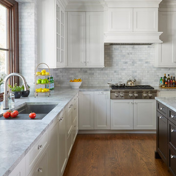
A mix of painted wood and stained cabinetry gives the new kitchen a sense of belonging in the older home, as do the Super White quartzite that has the look of marble, subway tile backsplash, polished nickel lanterns and glass and mirrored doors. The large pantry, filled with custom shelving built to the homeowner’s specifications, stainless steel appliances and the two Galley Workstations – sinks that do double duty as prep space – ensure that not only does the kitchen look great, but also functions in a personalized manner that works perfectly for the occupants.
Doing the bump out also allowed the opportunity for a small mudroom and powder room right off the kitchen as well as re-arranging some openings to allow for better traffic flow throughout the entire first floor. The result is a comfortable up-to-date home that feels both steeped in history yet allows for today’s style of living.
Designed by: Susan Klimala, CKD, CBD
Photography by: Michael Alan Kaskel
For more information on kitchen and bath design ideas go to: www.kitchenstudio-ge.com

 Thorndike Development
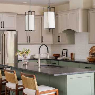
Kitchen in the Birch model home at Larkwood in Raynham, MA — Larkwood's largest floor plan at 2,830 sq ft with 3 bedrooms + den, 2.5 baths, and an oversized two-car garage. Fireplace with custom built-in shelving and hardwood floors throughout the main living area. Every buyer works one-on-one with Thorndike's in-house interior designer Nikkie Gaitan on every finish selection — countertops, cabinetry, flooring, tile, and fixtures
 Design Studio West
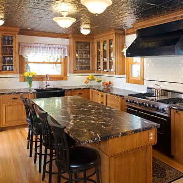
When it was time to remodel this Victorian home’s kitchen, I knew it needed to be in keeping with the architecture, allow for the latest in appliances, and to be expanded.
In order to improve the traffic flow of the entire first floor and allow for a larger kitchen, the homeowners and I decided to move the laundry from the back end of the house into the bathroom. Next all the doors & windows in the construction zone were changed, and casing was added that matched the rest of the house.
The simplicity of the rich quarter sawn White Oak cabinetry speaks to the Victorian’s love of natural finishes while the limited number of embellishments such as dentil molding, egg and dart molding, and hand-carved corbels highlight the love of artistic craftsmanship. The fanciful Michelangelo marble adds depth and richness to the kitchen. The counter top acts as a bridge between the oak floor, oak cabinetry, black appliances and white backsplash. The simple black liner in the backsplash visually connects the backsplash to the counter.
Finally, the layout of the new kitchen allows for multiple cooks to be in the space at the same time by breaking up the kitchen into zones for prep, cooking, clean-up, non-food storage and refrigerated food storage. There are cutting edge storage gadgets such as super half-susans, and base pullouts. In addition, the new design creates a sitting area at the island for family and friends to congregate.
Design and remodel by Design Studio West
Brady Architectural Photography

 Plain & Posh
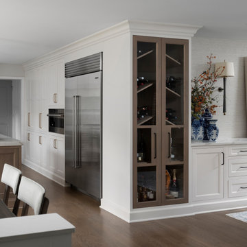
Thse clients came to me for a kitchen refresh. Keeping the existing floor plan but updating as much as possible. After explaining my thoughts, they chose to go with a much larger project. The wall to the garage wash pushed bach 12" to allow for the island to happen. This almost couldn't happen as there is a support post in the garage we had to keep. I designed the last pantry area as on 10" deep, allowing us to conceal that behind the cabinets. Then, we opend up the wall to the dining room to make the rooms one large space. The wall to the family room was also openend up, leaving the half wall to allow for the kitchen eating area. They wanted to incorporate a bar area, without it feeling like a "bar" The fabulous tall custom unit houses their wine collection and then half of the dining room buffet area holds glassware and other bar items. I helped the clients with all of the design choices.We all wanted to keep the space classic, war, functional and with mixed materials. I chose to use the same countertop material for the backsplash, to keep the space feeling as large as possible.
 Cascade West Development
The Aerius - Modern American Craftsman in Ridgefield Washington by Cascade West Development Inc.
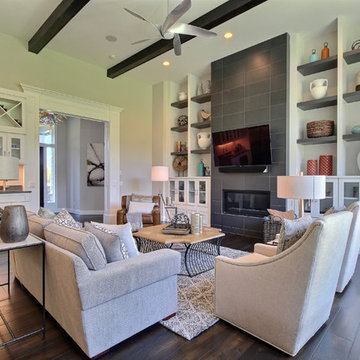
Upon opening the 8ft tall door and entering the foyer an immediate display of light, color and energy is presented to us in the form of 13ft coffered ceilings, abundant natural lighting and an ornate glass chandelier. Beckoning across the hall an entrance to the Great Room is beset by the Master Suite, the Den, a central stairway to the Upper Level and a passageway to the 4-bay Garage and Guest Bedroom with attached bath. Advancement to the Great Room reveals massive, built-in vertical storage, a vast area for all manner of social interactions and a bountiful showcase of the forest scenery that allows the natural splendor of the outside in. The sleek corner-kitchen is composed with elevated countertops. These additional 4in create the perfect fit for our larger-than-life homeowner and make stooping and drooping a distant memory. The comfortable kitchen creates no spatial divide and easily transitions to the sun-drenched dining nook, complete with overhead coffered-beam ceiling. This trifecta of function, form and flow accommodates all shapes and sizes and allows any number of events to be hosted here. On the rare occasion more room is needed, the sliding glass doors can be opened allowing an out-pour of activity. Almost doubling the square-footage and extending the Great Room into the arboreous locale is sure to guarantee long nights out under the stars.
Cascade West Facebook: https://goo.gl/MCD2U1
Cascade West Website: https://goo.gl/XHm7Un
These photos, like many of ours, were taken by the good people of ExposioHDR - Portland, Or
Exposio Facebook: https://goo.gl/SpSvyo
Exposio Website: https://goo.gl/Cbm8Ya
 Metropolis Drafting and Construction Inc
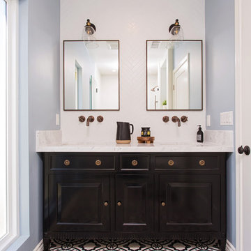
Master suite addition to an existing 20's Spanish home in the heart of Sherman Oaks, approx. 300+ sq. added to this 1300sq. home to provide the needed master bedroom suite. the large 14' by 14' bedroom has a 1 lite French door to the back yard and a large window allowing much needed natural light, the new hardwood floors were matched to the existing wood flooring of the house, a Spanish style arch was done at the entrance to the master bedroom to conform with the rest of the architectural style of the home.
The master bathroom on the other hand was designed with a Scandinavian style mixed with Modern wall mounted toilet to preserve space and to allow a clean look, an amazing gloss finish freestanding vanity unit boasting wall mounted faucets and a whole wall tiled with 2x10 subway tile in a herringbone pattern.
For the floor tile we used 8x8 hand painted cement tile laid in a pattern pre determined prior to installation.
The wall mounted toilet has a huge open niche above it with a marble shelf to be used for decoration.
The huge shower boasts 2x10 herringbone pattern subway tile, a side to side niche with a marble shelf, the same marble material was also used for the shower step to give a clean look and act as a trim between the 8x8 cement tiles and the bark hex tile in the shower pan.
Notice the hidden drain in the center with tile inserts and the great modern plumbing fixtures in an old work antique bronze finish.
A walk-in closet was constructed as well to allow the much needed storage space.
 Pillar Homes
Built by Pillar Homes
Landmark Photography
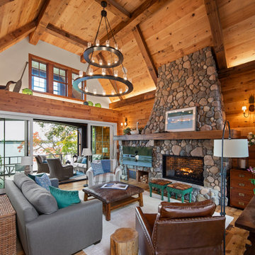
Mountain style living room photo in Minneapolis
Mountain style living room photo in Minneapolis
 Hamilton Park Interiors
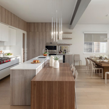
Example of a large trendy light wood floor and beige floor eat-in kitchen design in Salt Lake City with flat-panel cabinets, white cabinets, white backsplash, stainless steel appliances, two islands and white countertops
69