
Search results for "Allowable" in Home Design Ideas
 Michael Nash Design, Build & Homes
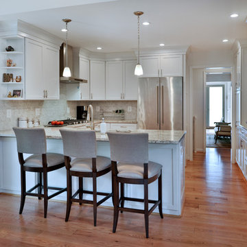
For this couple, planning to move back to their rambler home in Arlington after living overseas for few years, they were ready to get rid of clutter, clean up their grown-up kids’ boxes, and transform their home into their dream home for their golden years.
The old home included a box-like 8 feet x 10 feet kitchen, no family room, three small bedrooms and two back to back small bathrooms. The laundry room was located in a small dark space of the unfinished basement.
This home is located in a cul-de-sac, on an uphill lot, of a very secluded neighborhood with lots of new homes just being built around them.
The couple consulted an architectural firm in past but never were satisfied with the final plans. They approached Michael Nash Custom Kitchens hoping for fresh ideas.
The backyard and side yard are wooded and the existing structure was too close to building restriction lines. We developed design plans and applied for special permits to achieve our client’s goals.
The remodel includes a family room, sunroom, breakfast area, home office, large master bedroom suite, large walk-in closet, main level laundry room, lots of windows, front porch, back deck, and most important than all an elevator from lower to upper level given them and their close relative a necessary easier access.
The new plan added extra dimensions to this rambler on all four sides. Starting from the front, we excavated to allow a first level entrance, storage, and elevator room. Building just above it, is a 12 feet x 30 feet covered porch with a leading brick staircase. A contemporary cedar rail with horizontal stainless steel cable rail system on both the front porch and the back deck sets off this project from any others in area. A new foyer with double frosted stainless-steel door was added which contains the elevator.
The garage door was widened and a solid cedar door was installed to compliment the cedar siding.
The left side of this rambler was excavated to allow a storage off the garage and extension of one of the old bedrooms to be converted to a large master bedroom suite, master bathroom suite and walk-in closet.
We installed matching brick for a seam-less exterior look.
The entire house was furnished with new Italian imported highly custom stainless-steel windows and doors. We removed several brick and block structure walls to put doors and floor to ceiling windows.
A full walk in shower with barn style frameless glass doors, double vanities covered with selective stone, floor to ceiling porcelain tile make the master bathroom highly accessible.
The other two bedrooms were reconfigured with new closets, wider doorways, new wood floors and wider windows. Just outside of the bedroom, a new laundry room closet was a major upgrade.
A second HVAC system was added in the attic for all new areas.
The back side of the master bedroom was covered with floor to ceiling windows and a door to step into a new deck covered in trex and cable railing. This addition provides a view to wooded area of the home.
By excavating and leveling the backyard, we constructed a two story 15’x 40’ addition that provided the tall ceiling for the family room just adjacent to new deck, a breakfast area a few steps away from the remodeled kitchen. Upscale stainless-steel appliances, floor to ceiling white custom cabinetry and quartz counter top, and fun lighting improved this back section of the house with its increased lighting and available work space. Just below this addition, there is extra space for exercise and storage room. This room has a pair of sliding doors allowing more light inside.
The right elevation has a trapezoid shape addition with floor to ceiling windows and space used as a sunroom/in-home office. Wide plank wood floors were installed throughout the main level for continuity.
The hall bathroom was gutted and expanded to allow a new soaking tub and large vanity. The basement half bathroom was converted to a full bathroom, new flooring and lighting in the entire basement changed the purpose of the basement for entertainment and spending time with grandkids.
Off white and soft tone were used inside and out as the color schemes to make this rambler spacious and illuminated.
Final grade and landscaping, by adding a few trees, trimming the old cherry and walnut trees in backyard, saddling the yard, and a new concrete driveway and walkway made this home a unique and charming gem in the neighborhood.
 CAV Integrated Home
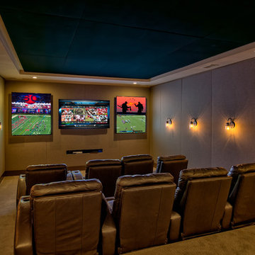
The theater scope included both a projection system and a multi-TV video wall. The projection system is an Epson 1080p projector on a Stewart Cima motorized screen. To achieve the homeowner’s requirement to switch between one large video program and five smaller displays for sports viewing. The smaller displays are comprised of a 75” Samsung 4K smart TV flanked by two 50” Samsung 4K displays on each side for a total of 5 possible independent video programs. These smart TVs and the projection system video are managed through a Control4 touchscreen and video routing is achieved through an Atlona 4K HDMI switching system.
Unlike the client’s 7.1 theater at his primary residence, the hunting lodge theater was to be a Dolby Atmos 7.1.2 system. The speaker system was to be a Bowers & Wilkins CT7 system for the main speakers and use CI600 series for surround and Atmos speakers. CT7 15” subwoofers with matched amplifier were selected to bring a level of bass response to the room that the client had not experienced in his primary residence. The CT speaker system and subwoofers were concealed with a false front wall and concealed behind acoustically transparent cloth.
Some degree of wall treatment was required but the budget would not allow for a typical snap-track track installation or acoustical analysis. A one-inch absorption panel system was designed for the room and custom trim and room design allowed for stock size panels to be used with minimum custom cuts, allowing for a room to get some treatment in a budget that would normally afford none.
Both the equipment rack and the projector are concealed in a storage room at the back of the theater. The projector is installed into a custom enclosure with a CAV designed and built port-glass window into the theater.
 Michael Nash Design, Build & Homes
2011 CAPITAL COTY AWARD HONORABLE MENTION AWARD WINNER
Built circa 1980, a young couple with three children originally purchased this home for their growing family. After four years of karate, soccer, piano and other activities, however, the home was becoming too small to meet their needs.
Problems started upon entering the front foyer. A 25-foot long dark hallway separated the family room and the kitchen, ending in a tiny powder room stuck in the middle of the layout. The kitchen was especially isolated, a cramped L-shaped design with a box bay breakfast bump out that was literally falling apart.
The new design started with the core of the problem—the maze and separation created by the long hallways.
First, the 25’ load bearing wall separating the foyer from family room was totally taken out and replaced with a long supporting beam. A French door replaced a small door and window leading to a screen porch . This action allowed lots of light to get into family and foyer. Then, the powder room was removed and the partition wall between the kitchen and family room was taken down. This created a large open concept design and greatly increased the size of the kitchen.
The box bay was demolished and replaced with new walls and a large window. The plumbing for main sink and dishwasher got relocated into this box bay allowing a total transformation of the space. Now there are cabinets and counters on all sides.
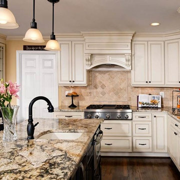
The doorway to the dining room was reconfigured to allow a butler area on its left. While the right side was occupied with new 36” gas range top with a decorative wood hood above it. The refrigerator, microwave/oven and pantries—the space’s tall elements—occupy one wall..
A large Island with a prep sink and beverage center for the kids occupies the center of the layout. Capable of seating up to four, family and friends can now keep the cook company. A large built-in desk area lets the kids do their homework so the parents can supervise while they prepare meals.
Light cabinetry with a touch of caramel glazing and exotic granite countertops by our designers contributed to this kitchen’s elegant design. The contrasting distressed island’s darker finish matches the dinette set and other furnishings.
New hardwood floors were installed throughout the first floor for a seamless look, while recess, pendant and task lighting make the space even brighter. Importantly, there’s plenty of space for parents and kids to hang out together. The kitchen is truly the heart of their home.
Find the right local pro for your project
 Cascade West Development
The Aerius - Modern Craftsman in Ridgefield Washington by Cascade West Development Inc.
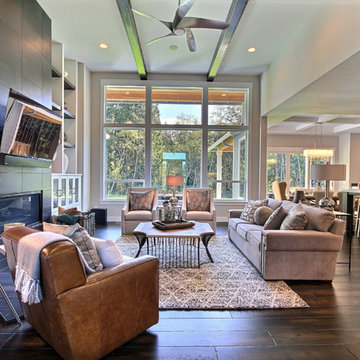
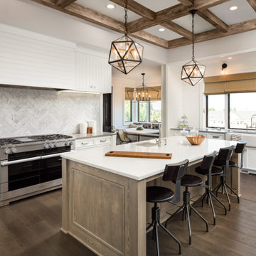
Upon opening the 8ft tall door and entering the foyer an immediate display of light, color and energy is presented to us in the form of 13ft coffered ceilings, abundant natural lighting and an ornate glass chandelier. Beckoning across the hall an entrance to the Great Room is beset by the Master Suite, the Den, a central stairway to the Upper Level and a passageway to the 4-bay Garage and Guest Bedroom with attached bath. Advancement to the Great Room reveals massive, built-in vertical storage, a vast area for all manner of social interactions and a bountiful showcase of the forest scenery that allows the natural splendor of the outside in. The sleek corner-kitchen is composed with elevated countertops. These additional 4in create the perfect fit for our larger-than-life homeowner and make stooping and drooping a distant memory. The comfortable kitchen creates no spatial divide and easily transitions to the sun-drenched dining nook, complete with overhead coffered-beam ceiling. This trifecta of function, form and flow accommodates all shapes and sizes and allows any number of events to be hosted here. On the rare occasion more room is needed, the sliding glass doors can be opened allowing an out-pour of activity. Almost doubling the square-footage and extending the Great Room into the arboreous locale is sure to guarantee long nights out under the stars.
Cascade West Facebook: https://goo.gl/MCD2U1
Cascade West Website: https://goo.gl/XHm7Un
These photos, like many of ours, were taken by the good people of ExposioHDR - Portland, Or
Exposio Facebook: https://goo.gl/SpSvyo
Exposio Website: https://goo.gl/Cbm8Ya
 DHD Architecture and Interior Design
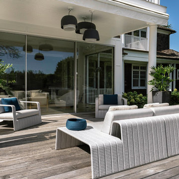
The Watermill House is a beautiful example of a classic Hamptons wood shingle style home. The design and renovation would maintain the character of the exterior while transforming the interiors to create an open and airy getaway for a busy and active family. The house comfortably sits within its one acre lot surrounded by tall hedges, old growth trees, and beautiful hydrangeas. The landscape influenced the design approach of the main floor interiors. Walls were removed and the kitchen was relocated to the front of the house to create an open plan for better flow and views to both the front and rear yards. The kitchen was designed to be both practical and beautiful. The u-shape design features modern appliances, white cabinetry and Corian countertops, and is anchored by a beautiful island with a knife-edge marble countertop. The island and the dining room table create a strong axis to the living room at the rear of the house. To further strengthen the connection to the outdoor decks and pool area of the rear yard, a full height sliding glass window system was installed. The clean lines and modern profiles of the window frames create unobstructed views and virtually remove the barrier between the interior and exterior spaces. The open plan allowed a new sitting area to be created between the dining room and stair. A screen, comprised of vertical fins, allows for a degree of openness, while creating enough separation to make the sitting area feel comfortable and nestled in its own area. The stair at the entry of the house was redesigned to match the new elegant and sophisticated spaces connected to it. New treads were installed to articulate and contrast the soft palette of finishes of the floors, walls, and ceilings. The new metal and glass handrail was intended to reduce visual noise and create subtle reflections of light.
Photo by Guillaume Gaudet
 Metropolis Drafting and Construction Inc
Master suite addition to an existing 20's Spanish home in the heart of Sherman Oaks, approx. 300+ sq. added to this 1300sq. home to provide the needed master bedroom suite. the large 14' by 14' bedroom has a 1 lite French door to the back yard and a large window allowing much needed natural light, the new hardwood floors were matched to the existing wood flooring of the house, a Spanish style arch was done at the entrance to the master bedroom to conform with the rest of the architectural style of the home.
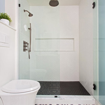
The master bathroom on the other hand was designed with a Scandinavian style mixed with Modern wall mounted toilet to preserve space and to allow a clean look, an amazing gloss finish freestanding vanity unit boasting wall mounted faucets and a whole wall tiled with 2x10 subway tile in a herringbone pattern.
For the floor tile we used 8x8 hand painted cement tile laid in a pattern pre determined prior to installation.
The wall mounted toilet has a huge open niche above it with a marble shelf to be used for decoration.
The huge shower boasts 2x10 herringbone pattern subway tile, a side to side niche with a marble shelf, the same marble material was also used for the shower step to give a clean look and act as a trim between the 8x8 cement tiles and the bark hex tile in the shower pan.
Notice the hidden drain in the center with tile inserts and the great modern plumbing fixtures in an old work antique bronze finish.
A walk-in closet was constructed as well to allow the much needed storage space.
 Karla Trincanello, CID, Interior Decisions, Inc.
This well used but dreary bathroom was ready for an update but this time, materials were selected that not only looked great but would stand the test of time. The large steam shower (6x6') was like a dark cave with one glass door allowing light. To create a brighter shower space and the feel of an even larger shower, the wall was removed and full glass panels now allowed full sunlight streaming into the shower which avoids the growth of mold and mildew in this newly brighter space which also expands the bathroom by showing all the spaces. Originally the dark shower was permeated with cracks in the marble marble material and bench seat so mold and mildew had a home. The designer specified Porcelain slabs for a carefree un-penetrable material that had fewer grouted seams and added luxury to the new bath. Although Quartz is a hard material and fine to use in a shower, it is not suggested for steam showers because there is some porosity. A free standing bench was fabricated from quartz which works well. A new free
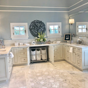
standing, hydrotherapy tub was installed allowing more free space around the tub area and instilling luxury with the use of beautiful marble for the walls and flooring. A lovely crystal chandelier emphasizes the height of the room and the lovely tall window.. Two smaller vanities were replaced by a larger U shaped vanity allotting two corner lazy susan cabinets for storing larger items. The center cabinet was used to store 3 laundry bins that roll out, one for towels and one for his and one for her delicates. Normally this space would be a makeup dressing table but since we were able to design a large one in her closet, she felt laundry bins were more needed in this bathroom. Instead of constructing a closet in the bathroom, the designer suggested an elegant glass front French Armoire to not encumber the space with a wall for the closet.The new bathroom is stunning and stops the heart on entering with all the luxurious amenities.

 TKS Design Group
Download our free ebook, Creating the Ideal Kitchen. DOWNLOAD NOW
Lakefront property in the northwest suburbs of Chicago is hard to come by, so when we were hired by this young family with exactly that, we were immediately inspired by not just the unusually large footprint of this 1950’s colonial revival but also the lovely views of the manmade lake it was sited on. The large 5-bedroom home was solidly stuck in the 1980’s, but we saw tons of potential. We started out by updating the existing staircase with a fresh coat of paint and adding new herringbone slate to the entry hall.
The powder room off the entryway also got a refresh - new flooring, new cabinets and fixtures. We ran the new slate right through into this space for some consistency. A fun wallpaper and shiplap trim add a welcoming feel and set the tone for the home.
Next, we tackled the kitchen. Located away from the rest of the first floor, the kitchen felt a little isolated, so we immediately began planning for how to better connect it to the rest of the first floor. We landed on removing the wall between the kitchen and dining room and designed a modified galley style space with separate cooking and clean up zones. The cooking zone consists of the refrigerator, prep sink and cooktop, along with a nice long run of prep space at the island. The cleanup side of the kitchen consists of the main sink and dishwasher. Both areas are situated so that the user can view the lake during prep work and cleanup!
One of the home’s main puzzles was how to incorporate the mudroom and area in front of the patio doors at the back of the house. We already had a breakfast table area, so the space by the patio doors was a bit of a no man’s land. We decided to separate the kitchen proper from what became the new mudroom with a large set of barn doors. That way you can quickly hide any mudroom messes but have easy access to the light coming in through the patio doors as well as the outdoor grilling station. We also love the impact the barn doors add to the overall space.
The homeowners’ first words to us were “it’s time to ditch the brown,” so we did! We chose a lovely blue pallet that reflects the home’s location on the lake which is also vibrant yet easy on the eye. Countertops are white quartz, and the natural oak floor works well with the other honey accents. The breakfast table was given a refresh with new chairs, chandelier and window treatments that frame the gorgeous views of the lake out the back.
We coordinated the slate mudroom flooring with that used in the home’s main entrance for a consistent feel. The storage area consists of open and closed storage to allow for some clutter control as needed.
Next on our “to do” list was revamping the dated brown bar area in the neighboring dining room. We eliminated the clutter by adding some closed cabinets and did some easy updates to help the space feel more current. One snag we ran into here was the discovery of a beam above the existing open shelving that had to be modified with a smaller structural beam to allow for our new design to work. This was an unexpected surprise, but in the end we think it was well worth it!
We kept the colors here a bit more muted to blend with the homeowner’s existing furnishings. Open shelving and polished nickel hardware add some simple detail to the new entertainment zone which also looks out onto the lake!
Next we tackled the upstairs starting with the homeowner’s son’s bath. The bath originally had both a tub shower and a separate shower, so we decided to swap out the shower for a new laundry area. This freed up some space downstairs in what used to be the mudroom/laundry room and is much more convenient for daily laundry needs.
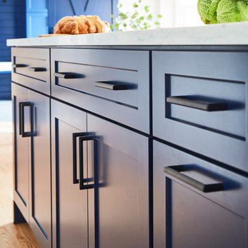
We continued the blue palette here with navy cabinetry and the navy tile in the shower. Porcelain floor tile and chrome fixtures keep maintenance to a minimum while matte black mirrors and lighting add some depth the design. A low maintenance runner adds some warmth underfoot and ties the whole space together.
We added a pocket door to the bathroom to minimize interference with the door swings. The left door of the laundry closet is on a 180 degree hinge to allow for easy full access to the machines. Next we tackled the master bath which is an en suite arrangement. The original was typical of the 1980’s with the vanity outside of the bathroom, situated near the master closet. And the brown theme continued here with multiple shades of brown.
Our first move was to segment off the bath and the closet from the master bedroom. We created a short hall from the bedroom to the bathroom with his and hers walk-in closets on the left and right as well as a separate toilet closet outside of the main bathroom for privacy and flexibility.
The original bathroom had a giant soaking tub with steps (dangerous!) as well as a small shower that did not work well for our homeowner who is 6’3”. With other bathtubs in the home, they decided to eliminate the tub and create an oversized shower which takes up the space where the old tub was located. The double vanity is on the opposite wall and a bench is located under the window for morning conversations and a place to set a couple of towels.
The pallet in here is light and airy with a mix of blond wood, creamy porcelain and marble tile, and brass accents. A simple roman shade adds some texture and it’s top-down mechanism allows for light and privacy.
This large whole house remodel gave our homeowners not only the ability to maximize the potential of their home but also created a lovely new frame from which to view their fabulous lake views.
Designed by: Susan Klimala, CKD, CBD
Photography by: Michael Kaskel
For more information on kitchen and bath design ideas go to: www.kitchenstudio-ge.com
 Legendary Escapes Pools
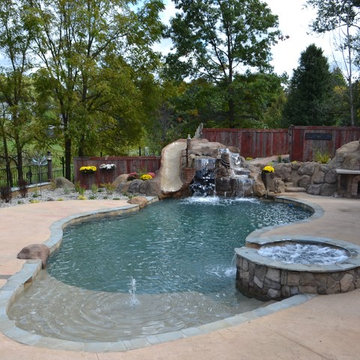
Nautical-themed hybrid swimming pool with raised spa, sunshelf, slide, grotto, and pizza oven
(September 2013) – Ask the Pool Guy and his team at Legendary Escapes recently unveiled the newest Legendary Escape, a stunning nautical-themed hybrid swimming pool. The hand-carved concrete waterfall, rock slide, and grotto are the focal point of this incredible project, and designer and builder Al Curtis has truly outdone himself this time. Behind the waterfall sits a grotto that seats 8-10 people comfortably. The waterfall, slide, and grotto area come complete with intricate details and additions that perfectly play into the project’s theme. An immense amount of creativity, talent, and skill is required to take ordinary materials like vinyl and concrete and turn them into the outstanding backyards that Curtis creates, but these details allow his creativity to shine in a different light. Curtis immerses himself completely in just one or two projects at a time, which allows him the opportunity to add those intricate details that take his extraordinary projects to the next level. Some of the details in the grotto area of this hybrid project include real ship portholes that open and close, as well as carvings and lanterns to add visual interest inside of the grotto.
The project also includes a raised spillover spa and a sunshelf with a bubbling water feature. The sunshelf has steps leading into the main body of the pool, giving swimmers an easy entry point if they don’t feel the urge to jump off the top of the waterfall or take a ride down the hand-carved, hand-tiled slide. The shelf has just enough water to allow shallow wading or lounging, and the pebbled finish provides a perfect place to set a lounge chair without worrying about damaging the vinyl liner. With the spa nearby, this whole end of the pool is perfect for relaxing, talking, or watching the kids while they swim.
This incredible hybrid swimming pool also includes a poolside pizza oven, so fresh, stone-fired pizza is never far away. The brick oven can cook a pizza in about 90 seconds, and produces authentic, outstanding pizzas. The homeowners have spent years perfecting their pizza crust and sauce recipes, as well as growing their own tomatoes and basil. The pizza oven adds another element of their own personality, and makes this project even more perfect for them. With a built-in countertop, it’s easy to get a couple of pies going at one time, or to prep ingredients for personal pizzas.
The homeowners are very family-oriented and love to have friends and family over to their home. During the construction process, the Legendary Escapes crew met several friends and family members who stopped in for some quality time and to check out the progress of the pool. The finished product is a perfect place for entertaining, and it feels very comfortable and welcoming. With the sunshelf, spa, grotto, poolside seating, and the pool itself, there are plenty of different places to sit or soak and have conversations or splash around.
Curtis is incredibly proud of this project, and he has high hopes for it. He was recently named a Master of Design by Pool & Spa News for a hybrid swimming pool he built in Brighton, MI. This new, nautical hybrid pool fits in beautifully with his portfolio, but also stands out as extraordinary. The team at Legendary Escapes anticipates positive feedback and recognition for this project, and looks forward to building more swimming pools that push the envelope and wow clients and fans.
 Studio IAAD
Studio IAAD | Hines Conscient Elevate, Gurugram
A tranquil retreat from city-life
Located in the plush suburbs of Gurugram in NCR, Elevate is a co-venture housing project marking the collaboration of Hines and Conscient, two major league developers in the Indian real estate sector. Spread across an area of about 10,000 sq.ft., the design scope comprised architecture, interiors, landscaping and FFE, skillfully realized by Studio IAAD.
The holistic design brief allowed for a versatile and flexible intervention; the idea was to 'elevate' the person entering the condominiums from the chaos of the noisy world's frantic pace to a quieter, peaceful space where they can relax and take a breath of fresh air. The biophilic approach, a signature of Studio IAAD's brand, nurtures an intimate connection of the user with nature without foregoing modern comforts, whilst employing greenery as a buffer to mute the clangour of the cosmopolitan city, enabling well-being.
Nestled in a forest-like setting, the approach to the house evokes tranquility. The visitor is greeted with a narrow pathway on entry, wrapped in an enclosing thicket of overarching trees. It trails up to a circular courtyard with a sculpture at its nucleus, that embodies the aesthetics of grace, harmony and serenity. This courtyard connects to the building through a dynamic walkway peppered with abundant tropical trees and blossoming petunia flower beds on either side, activating the pedestrian experience and crafting a blissful forest-like environment. Encompassed within green canopies, the building seems to emerge from the verdant landscape, akin to the trees that surround it.
Steeped in a contemporary theme, the design also nods to rustic simplicity and examples of European aesthetics in the interiors. The structure metaphorically manifests itself as a glass box at the ground level, wrapped in transparent ribbons of glazing and holding up the levitating opaque mass that houses the private enclosed spaces on top. The expansive glass walls offer unhindered views of the scenic splendour around, enriching the visual experience. A sleek metal skeleton supports the structure, framing the glass facade and giving it a modern edge, thereby reducing the need for boxy columns. An open courtyard that forms the nexus of the project creates a niche in the building mass, dividing it into two distinct parts that remain visually connected. A conscious intervention places multiple human-form sculptures by Mukul Goyal to adorn the courtyard space with their faces directed towards the sky, representing the notion of being liberated and 'elevated'.
Within the main dwelling, the ground floor accommodates the experience centre, a lounge, a café and the audio-visual room leading up to the show apartment, kids’ room, a lounge and meeting rooms at the top level. The seating spaces of the reception, outdoor deck, café and lounge are stitched together around the central courtyard in an unceasing dialogue with each other and the infinite open sky. The spaces flow into one another and unfold as one moves along, enabling a gradual unwinding of the sensory experience instead of making a colossal impact instantly. Careful planning allows the optimization of spaces and an easy concourse of commodious rooms. The audio-visual room is a theatrical experience that allows the visitors to watch a movie when the screen is down and reveals the model room as the screen lifts, unravelling an added dimension. For experience centres, it is imperative to hold the visitor's attention, so the spaces have been designed cohesively in tandem with this intent. A specially designed kids’ room allows young families to explore the building in uninterrupted peace while their kids indulge in recreational activities. The staircase is designed using opulent chandeliers to usher the visitors from the lifts towards the stairs in order to make the ascent a part of the enchanting experience.
The three-bedroom show apartment is finished in inconspicuous, neutral tones and materials, allowing potential home-buyers to layer their personalities onto the house. Each user can relate to their own space, making it a unique selling point for the apartment. Taking a cue from the natural surroundings, a soothing play of textures by ribbed wooden cladding and mirror panelling in subdued browns forms the highlight of the living room, accentuated by flooring and furniture in pristine white. A wrap-around balcony ties two bedrooms and a corner of the living room, creating a sizable spill-out space for relaxation and recreation, enabling transcendence into the enveloping quietude. A juxtaposition of course, with the fine, awe-inspiring artworks adorn the walls of the house, leaving a solid and lingering impression on the minds of the visitor with a recall factor long after they have left. The artistry conjoined with carpets and lighting accessories in fresh and vibrant hues comes together and serenades the space with a warm, welcoming vibe- constituting a harmonious whole that exceeds the sum of its parts. A view gallery outside the apartment frames the sylvan panoramic vistas beneath the blue banner of the sky, acting as the epitome of the experience of 'Elevate' housing.
Many accessories, including lighting fixtures and furniture, have been reused from a previous project, facilitating a sustainable approach to waste management. The sculptures will also become a part of the landscape in the housing project. Concentric cut-outs in the ceiling are designed to achieve a minimal yet elegant look, integrating both HVAC and lighting services into one. The structure is designed with metal, glass and wood as principal materials for quick construction, deconstruction and reuse.
The design corroborates a dialogue between the experience centre and the show apartments through a similar theme and vocabulary. Envisioned as a boutique hotel, the building is averse to the prevailing treatment of experience centres as an afterthought to housing developments. The ethereal slow-burn experience compels the visitor to sit and ponder, escaping in the forest's therapeutic solitude, away from the outer world, becoming a placid haven that people want to connect to, engage with and inhabit.
 Precision Homecrafters, LLC
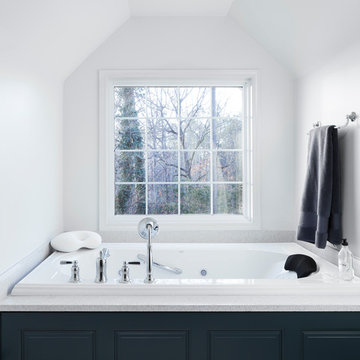
The Inverness Bathroom remodel had these goals: to complete the work while allowing the owner to continue to use their workshop below the project's construction, to provide a high-end quality product that was low-maintenance to the owners, to allow for future accessibility, more natural light and to better meet the daily needs of both the husband's and wife's lifestyles.
The first challenge was providing the required structural support to continue to clear span the two cargarage below which housed a workshop. The sheetrock removal, framing and sheetrock repairs and painting were completed first so the owner could continue to use his workshop, as requested. The HVAC supply line was originally an 8" duct that barely fit in the roof triangle between the ridge pole and ceiling. In order to provide the required air flow to additional supply vents in ceiling, a triangular duct was fabricated allowing us to use every square inch of available space. Since every exterior wall in the space adjoined a sloped ceiling, we installed ventilation baffles between each rafter and installed spray foam insulation.This project more than doubled the square footage of usable space. The new area houses a spaciousshower, large bathtub and dressing area. The addition of a window provides natural light. Instead of a small double vanity, they now have a his-and-hers vanity area. We wanted to provide a practical and comfortable space for the wife to get ready for her day and were able to incorporate a sit down make up station for her. The honed white marble looking tile is not only low maintenance but creates a clean bright spa appearance. The custom color vanities and built in linen press provide the perfect contrast of boldness to create the WOW factor. The sloped ceilings allowed us to maximize the amount of usable space plus provided the opportunity for the built in linen press with drawers at the bottom for additional storage. We were also able to combine two closets and add built in shelves for her. This created a dream space for our client that craved organization and functionality. A separate closet on opposite side of entrance provided suitable and comfortable closet space for him. In the end, these clients now have a large, bright and inviting master bath that will allow for complete accessibility in the future.
 S Squared Design, LLC
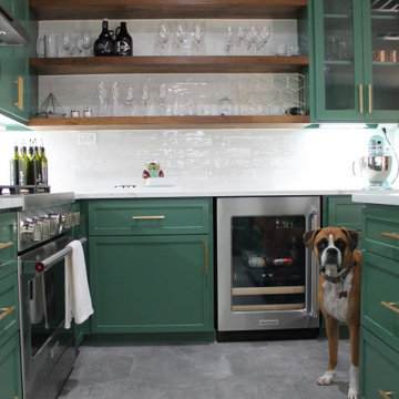
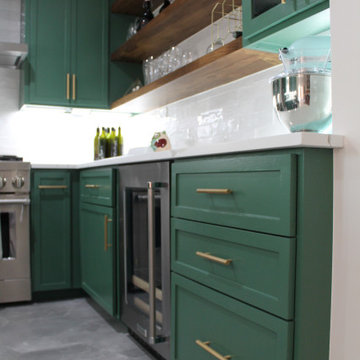
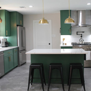
This remodel was one worth waiting for! Clients had a need for more storage, more counter and more room for entertaining friends and family. They love color and low maintenance materials so we went with a lovely happy green cabinet color, quartz counters, fun large hex porcelain floor tile and easy to clean backsplash. The original kitchen was lacking good flow, ample storage for this family.
We started in the laundry room but re configuring the layout so now the W/D and fridge could be on one wall which opened up space for a drop area. We removed the old small closet that was the pantry and replaced the old water heater with a tank-less one to allow more place where they needed it the most. Drop area has outlets for charging and one in the broom cabinet as well. We removed the door to allow for us to relocate the garage entry door which now sits in the mud room instead of right in the middle of the kitchen. We added an actual walk in pantry which is equipped with drawers and plenty of shelf storage, we put the small appliances in here to allow for more counter space in the kitchen. To access the kitchen is now through a pocket door which is a big space saver and allows a more open feel.
Let's get to this kitchen design! This was a odd layout before, now we have the fridge tucked away in it's proper home instead of sticking out. We relocated the garage entry door to the mud room to allow for this 36" range in its place featuring a pot filler as well. To maximize the kitchen footprint we closed up the door that went to the office and now we have a full L corner with plenty of storage and added some wood shelves for a sense of warmth and displace space in a beverage bar area, which also features an under-counter beverage fridge. Under-cabinet lighting, island fixture , a pendant above the sink and relocated the recessed lights to work better with the new kitchen layout. The island was a new addition which replaced the peninsula that used to cut off the kitchen from the rest of the home. We also removed a built in bookshelf and relocated the return air to the ceiling to free up even more floor space to truly transform this kitchen into the heart of the home.
 S Squared Design, LLC
This remodel was one worth waiting for! Clients had a need for more storage, more counter and more room for entertaining friends and family. They love color and low maintenance materials so we went with a lovely happy green cabinet color, quartz counters, fun large hex porcelain floor tile and easy to clean backsplash. The original kitchen was lacking good flow, ample storage for this family.
We started in the laundry room but re configuring the layout so now the W/D and fridge could be on one wall which opened up space for a drop area. We removed the old small closet that was the pantry and replaced the old water heater with a tank-less one to allow more place where they needed it the most. Drop area has outlets for charging and one in the broom cabinet as well. We removed the door to allow for us to relocate the garage entry door which now sits in the mud room instead of right in the middle of the kitchen. We added an actual walk in pantry which is equipped with drawers and plenty of shelf storage, we put the small appliances in here to allow for more counter space in the kitchen. To access the kitchen is now through a pocket door which is a big space saver and allows a more open feel.
Let's get to this kitchen design! This was a odd layout before, now we have the fridge tucked away in it's proper home instead of sticking out. We relocated the garage entry door to the mud room to allow for this 36" range in its place featuring a pot filler as well. To maximize the kitchen footprint we closed up the door that went to the office and now we have a full L corner with plenty of storage and added some wood shelves for a sense of warmth and displace space in a beverage bar area, which also features an under-counter beverage fridge. Under-cabinet lighting, island fixture , a pendant above the sink and relocated the recessed lights to work better with the new kitchen layout. The island was a new addition which replaced the peninsula that used to cut off the kitchen from the rest of the home. We also removed a built in bookshelf and relocated the return air to the ceiling to free up even more floor space to truly transform this kitchen into the heart of the home.
 S Squared Design, LLC
This remodel was one worth waiting for! Clients had a need for more storage, more counter and more room for entertaining friends and family. They love color and low maintenance materials so we went with a lovely happy green cabinet color, quartz counters, fun large hex porcelain floor tile and easy to clean backsplash. The original kitchen was lacking good flow, ample storage for this family.
We started in the laundry room but re configuring the layout so now the W/D and fridge could be on one wall which opened up space for a drop area. We removed the old small closet that was the pantry and replaced the old water heater with a tank-less one to allow more place where they needed it the most. Drop area has outlets for charging and one in the broom cabinet as well. We removed the door to allow for us to relocate the garage entry door which now sits in the mud room instead of right in the middle of the kitchen. We added an actual walk in pantry which is equipped with drawers and plenty of shelf storage, we put the small appliances in here to allow for more counter space in the kitchen. To access the kitchen is now through a pocket door which is a big space saver and allows a more open feel.
Let's get to this kitchen design! This was a odd layout before, now we have the fridge tucked away in it's proper home instead of sticking out. We relocated the garage entry door to the mud room to allow for this 36" range in its place featuring a pot filler as well. To maximize the kitchen footprint we closed up the door that went to the office and now we have a full L corner with plenty of storage and added some wood shelves for a sense of warmth and displace space in a beverage bar area, which also features an under-counter beverage fridge. Under-cabinet lighting, island fixture , a pendant above the sink and relocated the recessed lights to work better with the new kitchen layout. The island was a new addition which replaced the peninsula that used to cut off the kitchen from the rest of the home. We also removed a built in bookshelf and relocated the return air to the ceiling to free up even more floor space to truly transform this kitchen into the heart of the home.
 LineBox Studio
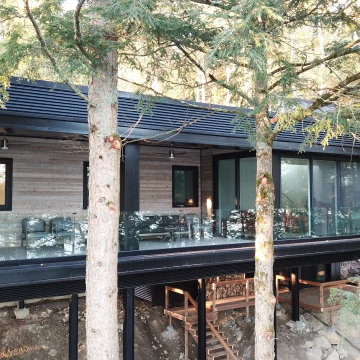
This modern cottage outside Mont-Tremblant blends harmoniously with its natural lakeside surroundings. The design will focus on simplicity and elegance, with a structure elevated above ground level to allow for undisturbed views of the landscape and to create minimal environmental impact. This design should foster a seamless connection with nature, providing panoramic views from all interior spaces while ensuring privacy and tranquility.
Clean, unembellished lines and open spaces.
Emphasis on simplicity and functionality, with a restrained color palette inspired by natural surroundings.
Use of natural materials that blend with the environment, like wood, stone, and glass.
Connection to Nature:
Large, floor-to-ceiling windows that frame the lake, forest, and mountain views.
Biophilic elements that make occupants feel as though they’re part of the landscape even while inside.
Design allows for natural light to flow in while maintaining interior privacy where needed.
Sustainable, Elevated Design:
Building on stilts to minimize ground disturbance, allowing nature to thrive underneath.
Materials should be locally sourced where possible and sustainable.
Energy-efficient systems integrated into the cottage for heating, cooling, and waste management.
Functional Spaces
Open-Concept Living and Dining Area: Designed to maximize the lake views, with comfortable, modular furniture to allow for versatile use of space.
Kitchen: Functional and simple, with hidden storage and high-quality, low-profile appliances.
Bedrooms: Positioned to ensure privacy while offering serene views, with minimalist décor and high-quality bedding.
Outdoor Decks and Balcony: Wraparound or strategically placed decks for morning sunlight and evening relaxation, with minimal visual interruption of the lake views.
Materials and Color Palette
Primary Materials: Glass, reclaimed wood, stone, concrete.
Color Palette: Neutral tones that blend with the surroundings—earthy beiges, soft whites, muted greens, and greys inspired by the forest and lake.
Unique Features
Stilt Elevation: Allows wildlife and water flow underneath the structure, adding to the harmonious integration with the site.
Panoramic Windows: Floor-to-ceiling glass that serves as walls in primary areas.
Natural Landscaping: Using native plants and wild grasses to blend with the natural surroundings rather than traditional landscaping.
This cottage should be a tranquil retreat, inviting guests to immerse themselves in nature without leaving the comforts of modern, minimalist living.
 Christensen Design Management
History:
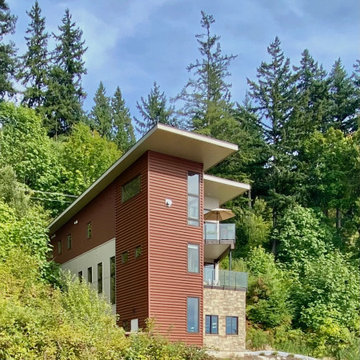
Client was given a property, that was extremely difficult to build on, with a very steep, 25-30' drop. They tried to sell the property for many years, with no luck. They finally decided that they should build something on it, for themselves, to prove it could be done. No access was allowed at the top of the steep incline. Client assumed it would be an expensive foundation built parallel to the hillside, somehow.
Program:
The program involved a level for one floor living, (LR/DR/KIT/MBR/UTILITY) as an age-in-place for this recently retired couple. Any other levels should have additional bedrooms that could also feel like a separate AirBnB space, or allow for a future caretaker. There was also a desire for a garage with a recreational vehicle and regular car. The main floor should take advantage of the primary views to the southwest, even though the lot faces due west. Also a desire for easy access to an upper level trail and low maintenance materials with easy maintenance access to roof. The preferred style was a fresher, contemporary feel.
Solution:
A concept design was presented, initially desired by the client, parallel to the hillside, as they had originally envisioned.
An alternate idea was also presented, that was perpendicular to the steep hillside. This avoided having difficult foundations on the steep hillside, by spanning... over it. It also allowed the top, main floor to be farther out on the west end of the site to avoid neighboring view blockage & to better see the primary southwest view. Savings in foundation costs allowed the installation of a residential elevator to get from the garage to the top, main living level. Stairs were also available for regular exercise. An exterior deck was angled towards the primary SW view to the San Juan Islands. The roof was originally desired to be a hip style on all sides, but a better solution allowed for a simple slope back to the 10' high east side for easier maintenance & access, since the west side was almost 50' high!
The clients undertook this home as a speculative, temporary project, intending for it to add value, to sell. However, the unexpected solution, and experience in living here, has them wanting to stay forever.
 Christensen Design Management
History:
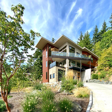
Client was given a property, that was extremely difficult to build on, with a very steep, 25-30' drop. They tried to sell the property for many years, with no luck. They finally decided that they should build something on it, for themselves, to prove it could be done. No access was allowed at the top of the steep incline. Client assumed it would be an expensive foundation built parallel to the hillside, somehow.
Program:
The program involved a level for one floor living, (LR/DR/KIT/MBR/UTILITY) as an age-in-place for this recently retired couple. Any other levels should have additional bedrooms that could also feel like a separate AirBnB space, or allow for a future caretaker. There was also a desire for a garage with a recreational vehicle and regular car. The main floor should take advantage of the primary views to the southwest, even though the lot faces due west. Also a desire for easy access to an upper level trail and low maintenance materials with easy maintenance access to roof. The preferred style was a fresher, contemporary feel.
Solution:
A concept design was presented, initially desired by the client, parallel to the hillside, as they had originally envisioned.
An alternate idea was also presented, that was perpendicular to the steep hillside. This avoided having difficult foundations on the steep hillside, by spanning... over it. It also allowed the top, main floor to be farther out on the west end of the site to avoid neighboring view blockage & to better see the primary southwest view. Savings in foundation costs allowed the installation of a residential elevator to get from the garage to the top, main living level. Stairs were also available for regular exercise. An exterior deck was angled towards the primary SW view to the San Juan Islands. The roof was originally desired to be a hip style on all sides, but a better solution allowed for a simple slope back to the 10' high east side for easier maintenance & access, since the west side was almost 50' high!
The clients undertook this home as a speculative, temporary project, intending for it to add value, to sell. However, the unexpected solution, and experience in living here, has them wanting to stay forever.
 S Squared Design, LLC
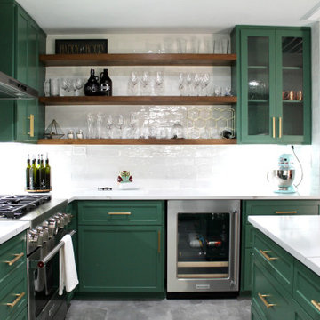
This remodel was one worth waiting for! Clients had a need for more storage, more counter and more room for entertaining friends and family. They love color and low maintenance materials so we went with a lovely happy green cabinet color, quartz counters, fun large hex porcelain floor tile and easy to clean backsplash. The original kitchen was lacking good flow, ample storage for this family.
We started in the laundry room but re configuring the layout so now the W/D and fridge could be on one wall which opened up space for a drop area. We removed the old small closet that was the pantry and replaced the old water heater with a tank-less one to allow more place where they needed it the most. Drop area has outlets for charging and one in the broom cabinet as well. We removed the door to allow for us to relocate the garage entry door which now sits in the mud room instead of right in the middle of the kitchen. We added an actual walk in pantry which is equipped with drawers and plenty of shelf storage, we put the small appliances in here to allow for more counter space in the kitchen. To access the kitchen is now through a pocket door which is a big space saver and allows a more open feel.
Let's get to this kitchen design! This was a odd layout before, now we have the fridge tucked away in it's proper home instead of sticking out. We relocated the garage entry door to the mud room to allow for this 36" range in its place featuring a pot filler as well. To maximize the kitchen footprint we closed up the door that went to the office and now we have a full L corner with plenty of storage and added some wood shelves for a sense of warmth and displace space in a beverage bar area, which also features an under-counter beverage fridge. Under-cabinet lighting, island fixture , a pendant above the sink and relocated the recessed lights to work better with the new kitchen layout. The island was a new addition which replaced the peninsula that used to cut off the kitchen from the rest of the home. We also removed a built in bookshelf and relocated the return air to the ceiling to free up even more floor space to truly transform this kitchen into the heart of the home.
70