
Search results for "Amateurs" in Home Design Ideas

 Complete Flooring
Chris Golden
Inspiration for a transitional carpeted living room remodel in Phoenix with beige walls, a standard fireplace and a tile fireplace
Inspiration for a transitional carpeted living room remodel in Phoenix with beige walls, a standard fireplace and a tile fireplace
 Byggmeister Inc
Photo by Jim Raycroft
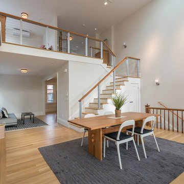
Our client for this project, an amateur pianist, wanted to create a music room for a nice new piano he was planning to purchase. The project scope would also include a new kitchen, bathroom, bedroom and living space, but the new piano was the priority.
LIFTING THE CEILING
The client was moving into a row house, and hoped to accommodate occasional gatherings of musician friends for informal recitals. Because acoustics were important we asked sound engineers from Acentech to visit the site. They noted that the ideal space would have higher ceilings and would be more like a cube than the “half a cube” we were dealing with. “How can we raise the ceiling and make the space a cube?” our client asked.
Designer Josy Raycroft started to explore the possibility of combining the second and third floor units by removing the front half of second floor ceiling, thereby opening up a 2-story music space in the shape of a nearly perfect cube. Thus, the project turned from a straightforward floor plan modification into a complete reimagining of the whole row house, with the client’s new Steinway D as the focal point. Josy and the client started with the piano and created the space around it.
ADDRESSING EVERYDAY NEEDS
For the client’s more mundane needs, Josy switched the location of the bathroom and kitchen—moving the bathroom towards the middle of the second floor where it would be convenient to the rest of the spaces, and placing the kitchen towards the back. The remainder of the third floor was transformed into bedroom and office space open to the music room below.
Products and finishes coordinator Karin Mahdavi worked with the client to select understated finishes for the living spaces so that they would support the piano room without competing with it. As a result the living spaces flow seamlessly into the piano space, creating a coherent whole out of the different parts, kind of like a Schubert piano sonata.
 Byggmeister Inc
Photo by Jim Raycroft
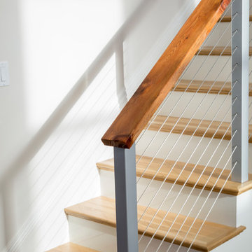
Our client for this project, an amateur pianist, wanted to create a music room for a nice new piano he was planning to purchase. The project scope would also include a new kitchen, bathroom, bedroom and living space, but the new piano was the priority.
LIFTING THE CEILING
The client was moving into a row house, and hoped to accommodate occasional gatherings of musician friends for informal recitals. Because acoustics were important we asked sound engineers from Acentech to visit the site. They noted that the ideal space would have higher ceilings and would be more like a cube than the “half a cube” we were dealing with. “How can we raise the ceiling and make the space a cube?” our client asked.
Designer Josy Raycroft started to explore the possibility of combining the second and third floor units by removing the front half of second floor ceiling, thereby opening up a 2-story music space in the shape of a nearly perfect cube. Thus, the project turned from a straightforward floor plan modification into a complete reimagining of the whole row house, with the client’s new Steinway D as the focal point. Josy and the client started with the piano and created the space around it.
ADDRESSING EVERYDAY NEEDS
For the client’s more mundane needs, Josy switched the location of the bathroom and kitchen—moving the bathroom towards the middle of the second floor where it would be convenient to the rest of the spaces, and placing the kitchen towards the back. The remainder of the third floor was transformed into bedroom and office space open to the music room below.
Products and finishes coordinator Karin Mahdavi worked with the client to select understated finishes for the living spaces so that they would support the piano room without competing with it. As a result the living spaces flow seamlessly into the piano space, creating a coherent whole out of the different parts, kind of like a Schubert piano sonata.
Find the right local pro for your project
 Byggmeister Inc
Photo by Jim Raycroft
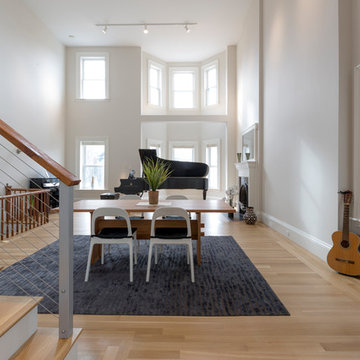
Our client for this project, an amateur pianist, wanted to create a music room for a nice new piano he was planning to purchase. The project scope would also include a new kitchen, bathroom, bedroom and living space, but the new piano was the priority.
LIFTING THE CEILING
The client was moving into a row house, and hoped to accommodate occasional gatherings of musician friends for informal recitals. Because acoustics were important we asked sound engineers from Acentech to visit the site. They noted that the ideal space would have higher ceilings and would be more like a cube than the “half a cube” we were dealing with. “How can we raise the ceiling and make the space a cube?” our client asked.
Designer Josy Raycroft started to explore the possibility of combining the second and third floor units by removing the front half of second floor ceiling, thereby opening up a 2-story music space in the shape of a nearly perfect cube. Thus, the project turned from a straightforward floor plan modification into a complete reimagining of the whole row house, with the client’s new Steinway D as the focal point. Josy and the client started with the piano and created the space around it.
ADDRESSING EVERYDAY NEEDS
For the client’s more mundane needs, Josy switched the location of the bathroom and kitchen—moving the bathroom towards the middle of the second floor where it would be convenient to the rest of the spaces, and placing the kitchen towards the back. The remainder of the third floor was transformed into bedroom and office space open to the music room below.
Products and finishes coordinator Karin Mahdavi worked with the client to select understated finishes for the living spaces so that they would support the piano room without competing with it. As a result the living spaces flow seamlessly into the piano space, creating a coherent whole out of the different parts, kind of like a Schubert piano sonata.
 Studio Steidley
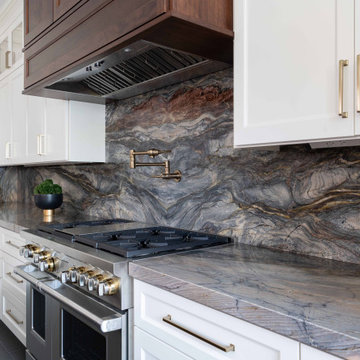
This kitchen was very 1980s and the homeowners were ready for a change. As amateur chefs, they had a lot of requests and appliances to accommodate but we were up for the challenge. Taking the kitchen back down to the studs, we began to open up their kitchen while providing them plenty of storage to conceal their bulk storage and many small appliances. Replacing their existing refrigerator with a panel-ready column refrigerator and freezer, helped keep the sleek look of the cabinets without being disrupted by appliances. The vacuum sealer drawer is an integrated part as well, hidden by the matching cabinet drawer front. Even the beverage cooler has a door that matches the cabinetry of the island. The stainless, professional-grade gas range stands out amongst the white cabinets and its brass touches match the cabinet hardware, faucet, pot-filler, and veining through the quartzite. The show-stopper of this kitchen is this amazing book-matched quartzite with its deep blues and brass veining and this incredible sink that was created out of it as well, to continue the continuity of this kitchen. The enormous island is covered with the same stone but with the dark wood, it provides a dramatic flair. The mercury glass pendants, do not distract but complete the look.
Photographer: Michael Hunter Photography
 Byggmeister Inc
Photo by Jim Raycroft
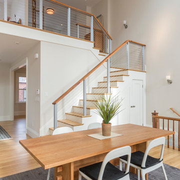
Our client for this project, an amateur pianist, wanted to create a music room for a nice new piano he was planning to purchase. The project scope would also include a new kitchen, bathroom, bedroom and living space, but the new piano was the priority.
LIFTING THE CEILING
The client was moving into a row house, and hoped to accommodate occasional gatherings of musician friends for informal recitals. Because acoustics were important we asked sound engineers from Acentech to visit the site. They noted that the ideal space would have higher ceilings and would be more like a cube than the “half a cube” we were dealing with. “How can we raise the ceiling and make the space a cube?” our client asked.
Designer Josy Raycroft started to explore the possibility of combining the second and third floor units by removing the front half of second floor ceiling, thereby opening up a 2-story music space in the shape of a nearly perfect cube. Thus, the project turned from a straightforward floor plan modification into a complete reimagining of the whole row house, with the client’s new Steinway D as the focal point. Josy and the client started with the piano and created the space around it.
ADDRESSING EVERYDAY NEEDS
For the client’s more mundane needs, Josy switched the location of the bathroom and kitchen—moving the bathroom towards the middle of the second floor where it would be convenient to the rest of the spaces, and placing the kitchen towards the back. The remainder of the third floor was transformed into bedroom and office space open to the music room below.
Products and finishes coordinator Karin Mahdavi worked with the client to select understated finishes for the living spaces so that they would support the piano room without competing with it. As a result the living spaces flow seamlessly into the piano space, creating a coherent whole out of the different parts, kind of like a Schubert piano sonata.

 Revealing Redesign
This farmhouse, with it's original foundation dating back to 1778, had a lot of charm--but with its bad carpeting, dark paint colors, and confusing layout, it was hard to see at first just how welcoming, charming, and cozy it could be.
The first focus of our renovation was creating a master bedroom suite--since there wasn't one, and one was needed for the modern family that was living here day-in and day-out.
To do this, a collection of small rooms (some of them previously without heat or electrical outlets) were combined to create a gorgeous, serene space in the eaves of the oldest part of the house, complete with master bath containing a double vanity, and spacious shower. Even though these rooms are new, it is hard to see that they weren't original to the farmhouse from day one.
In the rest of the house we removed walls that were added in the 1970's that made spaces seem smaller and more choppy, added a second upstairs bathroom for the family's two children, reconfigured the kitchen using existing cabinets to cut costs ( & making sure to keep the old sink with all of its character & charm) and create a more workable layout with dedicated eating area.
Also added was an outdoor living space with a deck sheltered by a pergola--a spot that the family spends tons of time enjoying during the warmer months.
A family room addition had been added to the house by the previous owner in the 80's, so to make this space feel less like it was tacked on, we installed historically accurate new windows to tie it in visually with the original house, and replaced carpeting with hardwood floors to make a more seamless transition from the historic to the new.
To complete the project, we refinished the original hardwoods throughout the rest of the house, and brightened the outlook of the whole home with a fresh, bright, updated color scheme.
Photos by Laura Kicey

 Jack Calderone
This bedroom and full bathroom are part of an adventuresome project my wife and I embarked upon to create a complete apartment in the basement of our townhouse. We designed a floor plan that creatively and efficiently used all of the 385-square-foot-space, without sacrificing beauty, comfort or function – and all without breaking the bank! To maximize our budget, we did the work ourselves and added everything from thrift store finds to DIY wall art to bring it all together.
A partial double closet bar adds a little extra space while still leaving room for longer hanging clothes.
 Byggmeister Inc
Photo by Jim Raycroft
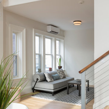
Our client for this project, an amateur pianist, wanted to create a music room for a nice new piano he was planning to purchase. The project scope would also include a new kitchen, bathroom, bedroom and living space, but the new piano was the priority.
LIFTING THE CEILING
The client was moving into a row house, and hoped to accommodate occasional gatherings of musician friends for informal recitals. Because acoustics were important we asked sound engineers from Acentech to visit the site. They noted that the ideal space would have higher ceilings and would be more like a cube than the “half a cube” we were dealing with. “How can we raise the ceiling and make the space a cube?” our client asked.
Designer Josy Raycroft started to explore the possibility of combining the second and third floor units by removing the front half of second floor ceiling, thereby opening up a 2-story music space in the shape of a nearly perfect cube. Thus, the project turned from a straightforward floor plan modification into a complete reimagining of the whole row house, with the client’s new Steinway D as the focal point. Josy and the client started with the piano and created the space around it.
ADDRESSING EVERYDAY NEEDS
For the client’s more mundane needs, Josy switched the location of the bathroom and kitchen—moving the bathroom towards the middle of the second floor where it would be convenient to the rest of the spaces, and placing the kitchen towards the back. The remainder of the third floor was transformed into bedroom and office space open to the music room below.
Products and finishes coordinator Karin Mahdavi worked with the client to select understated finishes for the living spaces so that they would support the piano room without competing with it. As a result the living spaces flow seamlessly into the piano space, creating a coherent whole out of the different parts, kind of like a Schubert piano sonata.
 Byggmeister Inc
Photo by Jim Raycroft
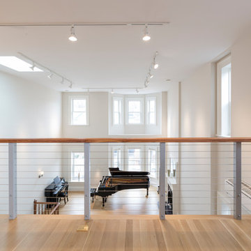
Our client for this project, an amateur pianist, wanted to create a music room for a nice new piano he was planning to purchase. The project scope would also include a new kitchen, bathroom, bedroom and living space, but the new piano was the priority.
LIFTING THE CEILING
The client was moving into a row house, and hoped to accommodate occasional gatherings of musician friends for informal recitals. Because acoustics were important we asked sound engineers from Acentech to visit the site. They noted that the ideal space would have higher ceilings and would be more like a cube than the “half a cube” we were dealing with. “How can we raise the ceiling and make the space a cube?” our client asked.
Designer Josy Raycroft started to explore the possibility of combining the second and third floor units by removing the front half of second floor ceiling, thereby opening up a 2-story music space in the shape of a nearly perfect cube. Thus, the project turned from a straightforward floor plan modification into a complete reimagining of the whole row house, with the client’s new Steinway D as the focal point. Josy and the client started with the piano and created the space around it.
ADDRESSING EVERYDAY NEEDS
For the client’s more mundane needs, Josy switched the location of the bathroom and kitchen—moving the bathroom towards the middle of the second floor where it would be convenient to the rest of the spaces, and placing the kitchen towards the back. The remainder of the third floor was transformed into bedroom and office space open to the music room below.
Products and finishes coordinator Karin Mahdavi worked with the client to select understated finishes for the living spaces so that they would support the piano room without competing with it. As a result the living spaces flow seamlessly into the piano space, creating a coherent whole out of the different parts, kind of like a Schubert piano sonata.
 Byggmeister Inc
Photo by Jim Raycroft
Our client for this project, an amateur pianist, wanted to create a music room for a nice new piano he was planning to purchase. The project scope would also include a new kitchen, bathroom, bedroom and living space, but the new piano was the priority.
LIFTING THE CEILING
The client was moving into a row house, and hoped to accommodate occasional gatherings of musician friends for informal recitals. Because acoustics were important we asked sound engineers from Acentech to visit the site. They noted that the ideal space would have higher ceilings and would be more like a cube than the “half a cube” we were dealing with. “How can we raise the ceiling and make the space a cube?” our client asked.
Designer Josy Raycroft started to explore the possibility of combining the second and third floor units by removing the front half of second floor ceiling, thereby opening up a 2-story music space in the shape of a nearly perfect cube. Thus, the project turned from a straightforward floor plan modification into a complete reimagining of the whole row house, with the client’s new Steinway D as the focal point. Josy and the client started with the piano and created the space around it.
ADDRESSING EVERYDAY NEEDS
For the client’s more mundane needs, Josy switched the location of the bathroom and kitchen—moving the bathroom towards the middle of the second floor where it would be convenient to the rest of the spaces, and placing the kitchen towards the back. The remainder of the third floor was transformed into bedroom and office space open to the music room below.
Products and finishes coordinator Karin Mahdavi worked with the client to select understated finishes for the living spaces so that they would support the piano room without competing with it. As a result the living spaces flow seamlessly into the piano space, creating a coherent whole out of the different parts, kind of like a Schubert piano sonata.
 Byggmeister Inc
Photo by Jim Raycroft
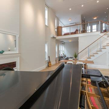
Our client for this project, an amateur pianist, wanted to create a music room for a nice new piano he was planning to purchase. The project scope would also include a new kitchen, bathroom, bedroom and living space, but the new piano was the priority.
LIFTING THE CEILING
The client was moving into a row house, and hoped to accommodate occasional gatherings of musician friends for informal recitals. Because acoustics were important we asked sound engineers from Acentech to visit the site. They noted that the ideal space would have higher ceilings and would be more like a cube than the “half a cube” we were dealing with. “How can we raise the ceiling and make the space a cube?” our client asked.
Designer Josy Raycroft started to explore the possibility of combining the second and third floor units by removing the front half of second floor ceiling, thereby opening up a 2-story music space in the shape of a nearly perfect cube. Thus, the project turned from a straightforward floor plan modification into a complete reimagining of the whole row house, with the client’s new Steinway D as the focal point. Josy and the client started with the piano and created the space around it.
ADDRESSING EVERYDAY NEEDS
For the client’s more mundane needs, Josy switched the location of the bathroom and kitchen—moving the bathroom towards the middle of the second floor where it would be convenient to the rest of the spaces, and placing the kitchen towards the back. The remainder of the third floor was transformed into bedroom and office space open to the music room below.
Products and finishes coordinator Karin Mahdavi worked with the client to select understated finishes for the living spaces so that they would support the piano room without competing with it. As a result the living spaces flow seamlessly into the piano space, creating a coherent whole out of the different parts, kind of like a Schubert piano sonata.

 Hadley-Irvine General Contracting LTD
Staircase - mid-sized traditional carpeted and underground carpeted and gray floor staircase idea in Toronto with wooden risers, gray walls and no fireplace

 Barbara Brickell Designs
Example of a mid-sized mountain style 3/4 bathroom design in Manchester with raised-panel cabinets, white cabinets, a two-piece toilet, beige walls and a pedestal sink

 Care Free Homes, Inc.
This beautiful colonial in Marion, Massachusetts is even more gorgeous with its new GAF Timberline HD roof!
There is more to a roof than shingles – in fact there are several components to a professionally installed GAF Lifetime Roofing System. Here is the anatomy of our Marion homeowner’s roof:
GAF Timberline HD Shingles Marion, MAGAF Timberline HD Roof Shingles: A beautiful architectural shingle at an affordable price! This is our most popular roof shingle here at Care Free Homes! Our Marion customer selected the classic color, Charcoal. This high performance shingle features a 130 mph wind rating and highest possible fire rating.
Underlayment: A felt/paper product that is installed over the entire roof deck, underlayment provides an additional layer of protection between the roof deck and the roof shingles.
Ice Dam and Water Shield: After a brutal winter and unprecedented snow fall, many New England homes suffered damage from ice dams. Ice Dam and Water Shield provides added protection for eves, rakes, valleys as well as flashed areas around vent pipes, chimneys, dormers, and skylights. Whether it’s a winter wonderland or a hurricane, this homeowner will not have to worry about ice dams or driving rain.
GAF Timberline HD, Marion, MA Dormers
Premium Aluminum Drip Edge: Installed along the rakes, drip edge serves several purposes. It improves the efficiency of water shedding, prevents leaking from a wind-driven rain as well as movement between the deck and fascia boards. Drip edge also keeps pesky insects from infiltrating the space between the roof deck and the fascia boards. With a choice of three colors, white, brown and gray, it provides a finished look for a roof.
GAF Pro-Start Eave/Rake Starter Strip: Every story has a beginning and every roof should have a starter strip. Here in New England we’ve got to have our roof be tougher than mother nature. To prevent shingle blow off, an ultra-adhered starter strip properly secures shingles in place during a storm. In contrast, the amateur roofer will often use cut-up shingles as a starter course. This weakened “starter course” lowers the wind resistance of a roof and makes it more susceptible to both wind and water damage. With straighter edges, Dura-Grip adhesive, and outstanding warranties – starter strip will provide beauty, performance and peace of mind.
GAF Cobra Ridge Vent: Ridge vents provide necessary airflow to remove excess heat and moisture in an attic. It inhibits the growth of mold and protects the health of the homeowners as well as their stored possessions. A properly vented attic will also protect homes in harsh winter climates from ice damming.
Why wait? Contact us today and make your house a Care Free home!
 Care Free Homes, Inc.
This beautiful colonial in Marion, Massachusetts is even more gorgeous with its new GAF Timberline HD roof!
There is more to a roof than shingles – in fact there are several components to a professionally installed GAF Lifetime Roofing System. Here is the anatomy of our Marion homeowner’s roof:
GAF Timberline HD Shingles Marion, MAGAF Timberline HD Roof Shingles: A beautiful architectural shingle at an affordable price! This is our most popular roof shingle here at Care Free Homes! Our Marion customer selected the classic color, Charcoal. This high performance shingle features a 130 mph wind rating and highest possible fire rating.
Underlayment: A felt/paper product that is installed over the entire roof deck, underlayment provides an additional layer of protection between the roof deck and the roof shingles.
Ice Dam and Water Shield: After a brutal winter and unprecedented snow fall, many New England homes suffered damage from ice dams. Ice Dam and Water Shield provides added protection for eves, rakes, valleys as well as flashed areas around vent pipes, chimneys, dormers, and skylights. Whether it’s a winter wonderland or a hurricane, this homeowner will not have to worry about ice dams or driving rain.
GAF Timberline HD, Marion, MA Dormers
Premium Aluminum Drip Edge: Installed along the rakes, drip edge serves several purposes. It improves the efficiency of water shedding, prevents leaking from a wind-driven rain as well as movement between the deck and fascia boards. Drip edge also keeps pesky insects from infiltrating the space between the roof deck and the fascia boards. With a choice of three colors, white, brown and gray, it provides a finished look for a roof.
GAF Pro-Start Eave/Rake Starter Strip: Every story has a beginning and every roof should have a starter strip. Here in New England we’ve got to have our roof be tougher than mother nature. To prevent shingle blow off, an ultra-adhered starter strip properly secures shingles in place during a storm. In contrast, the amateur roofer will often use cut-up shingles as a starter course. This weakened “starter course” lowers the wind resistance of a roof and makes it more susceptible to both wind and water damage. With straighter edges, Dura-Grip adhesive, and outstanding warranties – starter strip will provide beauty, performance and peace of mind.
GAF Cobra Ridge Vent: Ridge vents provide necessary airflow to remove excess heat and moisture in an attic. It inhibits the growth of mold and protects the health of the homeowners as well as their stored possessions. A properly vented attic will also protect homes in harsh winter climates from ice damming.
Why wait? Contact us today and make your house a Care Free home!
 Byggmeister Inc
Photo by Jim Raycroft
Our client for this project, an amateur pianist, wanted to create a music room for a nice new piano he was planning to purchase. The project scope would also include a new kitchen, bathroom, bedroom and living space, but the new piano was the priority.
LIFTING THE CEILING
The client was moving into a row house, and hoped to accommodate occasional gatherings of musician friends for informal recitals. Because acoustics were important we asked sound engineers from Acentech to visit the site. They noted that the ideal space would have higher ceilings and would be more like a cube than the “half a cube” we were dealing with. “How can we raise the ceiling and make the space a cube?” our client asked.
Designer Josy Raycroft started to explore the possibility of combining the second and third floor units by removing the front half of second floor ceiling, thereby opening up a 2-story music space in the shape of a nearly perfect cube. Thus, the project turned from a straightforward floor plan modification into a complete reimagining of the whole row house, with the client’s new Steinway D as the focal point. Josy and the client started with the piano and created the space around it.
ADDRESSING EVERYDAY NEEDS
For the client’s more mundane needs, Josy switched the location of the bathroom and kitchen—moving the bathroom towards the middle of the second floor where it would be convenient to the rest of the spaces, and placing the kitchen towards the back. The remainder of the third floor was transformed into bedroom and office space open to the music room below.
Products and finishes coordinator Karin Mahdavi worked with the client to select understated finishes for the living spaces so that they would support the piano room without competing with it. As a result the living spaces flow seamlessly into the piano space, creating a coherent whole out of the different parts, kind of like a Schubert piano sonata.

 Village Home Stores
Full-overlay Rustic Beech cabinets in the "Charleston" door style and "Briarwood" finish.
Village Home Stores
Example of a large mountain style kitchen design in Chicago
Example of a large mountain style kitchen design in Chicago
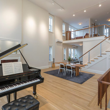 Byggmeister Inc
Photo by Jim Raycroft
Our client for this project, an amateur pianist, wanted to create a music room for a nice new piano he was planning to purchase. The project scope would also include a new kitchen, bathroom, bedroom and living space, but the new piano was the priority.
LIFTING THE CEILING
The client was moving into a row house, and hoped to accommodate occasional gatherings of musician friends for informal recitals. Because acoustics were important we asked sound engineers from Acentech to visit the site. They noted that the ideal space would have higher ceilings and would be more like a cube than the “half a cube” we were dealing with. “How can we raise the ceiling and make the space a cube?” our client asked.
Designer Josy Raycroft started to explore the possibility of combining the second and third floor units by removing the front half of second floor ceiling, thereby opening up a 2-story music space in the shape of a nearly perfect cube. Thus, the project turned from a straightforward floor plan modification into a complete reimagining of the whole row house, with the client’s new Steinway D as the focal point. Josy and the client started with the piano and created the space around it.
ADDRESSING EVERYDAY NEEDS
For the client’s more mundane needs, Josy switched the location of the bathroom and kitchen—moving the bathroom towards the middle of the second floor where it would be convenient to the rest of the spaces, and placing the kitchen towards the back. The remainder of the third floor was transformed into bedroom and office space open to the music room below.
Products and finishes coordinator Karin Mahdavi worked with the client to select understated finishes for the living spaces so that they would support the piano room without competing with it. As a result the living spaces flow seamlessly into the piano space, creating a coherent whole out of the different parts, kind of like a Schubert piano sonata.
 Revealing Redesign
This farmhouse, with it's original foundation dating back to 1778, had a lot of charm--but with its bad carpeting, dark paint colors, and confusing layout, it was hard to see at first just how welcoming, charming, and cozy it could be.
The first focus of our renovation was creating a master bedroom suite--since there wasn't one, and one was needed for the modern family that was living here day-in and day-out.
To do this, a collection of small rooms (some of them previously without heat or electrical outlets) were combined to create a gorgeous, serene space in the eaves of the oldest part of the house, complete with master bath containing a double vanity, and spacious shower. Even though these rooms are new, it is hard to see that they weren't original to the farmhouse from day one.
In the rest of the house we removed walls that were added in the 1970's that made spaces seem smaller and more choppy, added a second upstairs bathroom for the family's two children, reconfigured the kitchen using existing cabinets to cut costs ( & making sure to keep the old sink with all of its character & charm) and create a more workable layout with dedicated eating area.
Also added was an outdoor living space with a deck sheltered by a pergola--a spot that the family spends tons of time enjoying during the warmer months.
A family room addition had been added to the house by the previous owner in the 80's, so to make this space feel less like it was tacked on, we installed historically accurate new windows to tie it in visually with the original house, and replaced carpeting with hardwood floors to make a more seamless transition from the historic to the new.
To complete the project, we refinished the original hardwoods throughout the rest of the house, and brightened the outlook of the whole home with a fresh, bright, updated color scheme.
Photos by Laura Kicey
9