
Search results for "Analyses" in Home Design Ideas
 Pamela Wilmoth, ASID Interior Design
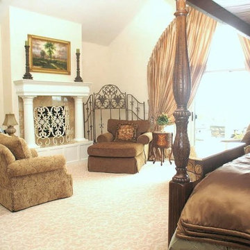
Over the years, my jobs have involved collaborating with homeowners, business owners, architects and contractors analyzing and designing plans for new construction and remodels, renovating kitchens, designing fireplaces, cabinetry, lighting, window treatments and furnishings.
But even more important than the design, I believe the ability to communicate all the ideas and concepts of the design to the various trades people involved is critical to achieving the end results my clients and I envision.
My 35 years in the business as well as my academic background in design have given me the ability to confidently provide this service. Give me a call, I'd love to hear from you and discuss your project.
 Packard Cabinetry of Sea Cliff
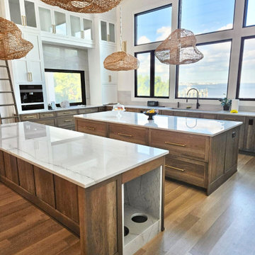
Description of Waterfront Home Design
Challenge: The task was to fill a vast space with 14-foot walls soaring to a peak of 30 feet, using cabinetry that would not appear undervalued or insubstantial. The main question was determining the appropriate height for the cabinetry, considering the scale and proportion of the space, the walk-through to adjoining rooms, window heights, and the height of the refrigerator.
Solution: By carefully analyzing these factors, we were able to create cabinetry that perfectly scaled to the grand dimensions of the room. The floor plan featured two islands that effectively filled the space. Key elements included #TheGalley workstations, drop-down televisions, #MouserCabinetry, and secret doors leading to a hidden scullery, all contributing to an extraordinary project.
 Kitchen Design Concepts
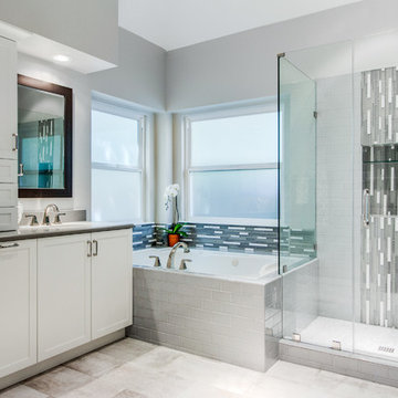
The moment we stepped in, we analyzed the space, listened to our client’s needs, and consequently gave this space the love and care it needed. As a result, this room did a complete 180 from a space that no one wanted to be in, to a space that is now bright and inviting! Since the remodel was completed, the transitional design still stands as one of our favorite remodels. Before we spill all the details, check out the BEFORE photos below:
Cabinetry
The vanity cabinets in this bathroom space are from Kitchen Craft with a Salem door-style in an Alabaster finish. The cabinets from Kitchen Craft are frameless, which gives great access and storage within. The addition of the counter-sitting cabinet also gives great storage space with its drawers for smaller items. Disclaimer: In most cases, we either refinish or reface existing cabinetry; however, in this particular case the clients needed new cabinet boxes.
Countertops
The countertops are a great contrast from the white cabinets and also adds a contemporary element. The quartz countertops are a 3cm Caesarstone in a Pebble Honed finish. We love the balance between the white and grey finishes! Also, quartz is a great low-maintenance material, it’s a win-win!
Tile
Now, while the cabinets and countertops play a huge role in this design, the tile is the one that really stands out. Let’s break it down, from Arizona Tile: the shower walls and tub face are a 3×6 H-Line ceramic tile in Denim, the accent on the shower wall and above the tub are a Soho glass and stone stack in Cloud, and the shower floor is a Bianco Carrera 1×1 penny round. Lastly, from Daltile: the flooring in a 12×24 Cotto Contempo with a finish in Pennsylvania Avenue.
Plumbing Fixtures
Without plumbing fixtures, we wouldn’t have a bathroom now would we? The plumbing finishes and style all complement the design on the bathroom and gives the overall space a designer look. From Toto: Two Rendezvous® lavatories in a Cotton finish. From Delta in the Dryden collection: one robe hook, two towel rings, one toilet paper holder and one double towel bar all in a Polished Nickel finish.
Find the right local pro for your project
 Schwartz and Architecture
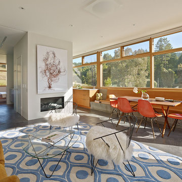
The proposal analyzes the site as a series of existing flows or “routes” across the landscape. The negotiation of both constructed and natural systems establishes the logic of the site plan and the orientation and organization of the new home. Conceptually, the project becomes a highly choreographed knot at the center of these routes, drawing strands in, engaging them with others, and propelling them back out again. The project’s intent is to capture and harness the physical and ephemeral sense of these latent natural movements as a way to promote in the architecture the wanderlust the surrounding landscape inspires. At heart, the client’s initial family agenda--a home as antidote to the city and basecamp for exploration--establishes the ethos and design objectives of the work.
Photography - Bruce Damonte
 HIGOLD Outdoor Furniture
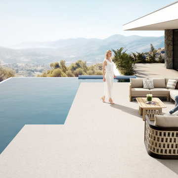
The RIVA collection - design by CLAUDIO BELLINI.
CLAUDIO BELLINI® is a Milan based multidisciplinary design studio founded by Claudio Bellini is built on an open-minded and innovative perspective, respectful to design heritage, specialized in product, furniture, and interior design since 1996. Integrating different disciplines gives the studio the privilege to provide long-term consultancy to clients by advising on graphic design, architecture, CMF, and brand identity.Studio’s capability of analyzing the complex dynamics of foreign markets has led CLAUDIO BELLINI® design studio to be recognized all around the world as one of the most influential European design practices.
Today, the studio continues evolving by enhancing the creativity with the support of a talented multinational team through their complementary skills.
In a game of solids and voids, of lights and shadows, the RIVA collection is born. It takes inspiration from the Moorish style of Andalusian architecture and it is characterised by its severe and essential lines. The empty spaces, created by the particular making of the yarn, bring to mind the arches of the Palace of Carlos V in Granada. A touch of Spain in your house.
 Packard Cabinetry of Sea Cliff
Description of Waterfront Home Design
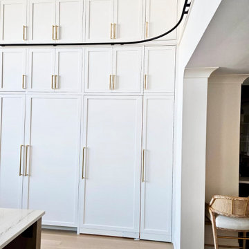
Challenge: The task was to fill a vast space with 14-foot walls soaring to a peak of 30 feet, using cabinetry that would not appear undervalued or insubstantial. The main question was determining the appropriate height for the cabinetry, considering the scale and proportion of the space, the walk-through to adjoining rooms, window heights, and the height of the refrigerator.
Solution: By carefully analyzing these factors, we were able to create cabinetry that perfectly scaled to the grand dimensions of the room. The floor plan featured two islands that effectively filled the space. Key elements included #TheGalley workstations, drop-down televisions, #MouserCabinetry, and secret doors leading to a hidden scullery, all contributing to an extraordinary project.
 Kitchen Design Concepts
The moment we stepped in, we analyzed the space, listened to our client’s needs, and consequently gave this space the love and care it needed. As a result, this room did a complete 180 from a space that no one wanted to be in, to a space that is now bright and inviting! Since the remodel was completed, the transitional design still stands as one of our favorite remodels. Before we spill all the details, check out the BEFORE photos below:
Cabinetry
The vanity cabinets in this bathroom space are from Kitchen Craft with a Salem door-style in an Alabaster finish. The cabinets from Kitchen Craft are frameless, which gives great access and storage within. The addition of the counter-sitting cabinet also gives great storage space with its drawers for smaller items. Disclaimer: In most cases, we either refinish or reface existing cabinetry; however, in this particular case the clients needed new cabinet boxes.
Countertops
The countertops are a great contrast from the white cabinets and also adds a contemporary element. The quartz countertops are a 3cm Caesarstone in a Pebble Honed finish. We love the balance between the white and grey finishes! Also, quartz is a great low-maintenance material, it’s a win-win!
Tile
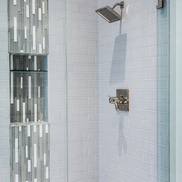
Now, while the cabinets and countertops play a huge role in this design, the tile is the one that really stands out. Let’s break it down, from Arizona Tile: the shower walls and tub face are a 3×6 H-Line ceramic tile in Denim, the accent on the shower wall and above the tub are a Soho glass and stone stack in Cloud, and the shower floor is a Bianco Carrera 1×1 penny round. Lastly, from Daltile: the flooring in a 12×24 Cotto Contempo with a finish in Pennsylvania Avenue.
Plumbing Fixtures
Without plumbing fixtures, we wouldn’t have a bathroom now would we? The plumbing finishes and style all complement the design on the bathroom and gives the overall space a designer look. From Toto: Two Rendezvous® lavatories in a Cotton finish. From Delta in the Dryden collection: one robe hook, two towel rings, one toilet paper holder and one double towel bar all in a Polished Nickel finish.
 Schwartz and Architecture
The proposal analyzes the site as a series of existing flows or “routes” across the landscape. The negotiation of both constructed and natural systems establishes the logic of the site plan and the orientation and organization of the new home. Conceptually, the project becomes a highly choreographed knot at the center of these routes, drawing strands in, engaging them with others, and propelling them back out again. The project’s intent is to capture and harness the physical and ephemeral sense of these latent natural movements as a way to promote in the architecture the wanderlust the surrounding landscape inspires. At heart, the client’s initial family agenda--a home as antidote to the city and basecamp for exploration--establishes the ethos and design objectives of the work.
Photography - Bruce Damonte
 Chapter Renovation
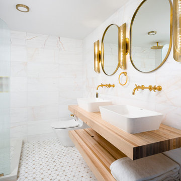
This apartment stands out for its high-end finishes such as marble, brass fixtures, and smart appliances. Private outdoor space is a rare and valuable amenity in a city like Brooklyn. A well-designed backyard can be a tranquil oasis, perfect for relaxation and entertainment. All these characteristics were carefully analyzed by The Chapter team, which took this apartment renovation to the next level.
 Pro-Roofing
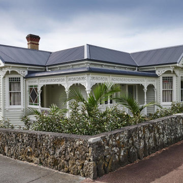
The commercial roofing services, offered by this particular firm have been highly appreciated. This commercial roofing venture is backed up with great source of workers, who are capable enough to serve their clients with the first class services. The house roofing Auckland company facilitates re-roofing of the commercial properties as well. In addition to this, the firm caters residential roofing, roof repair and Cedar roofing services with equal flair. The most important fact is that, the staffs of this company also facilitate the clients with inspection services of the residential properties as well. The roof inspectors of the company usher a number of facilities starting from checking poor attic condition, corrosion, structural damage, weather damage, water leaking problem and many more. This storm damage roof inspection firm assures quality and energy efficient roofing service to the esteemed clients. The company is resourced with highly skilled employees, who are enriched with yearlong experience. All of the workers are capable of analyzing the problems of the roofs of the clients and serve accordingly. Quality of the products, used by the team is something they never compromise with. Hence, house roofing Auckland is guaranteed by the right company. People can also experience the dedicated customer service of the company. They are on desk throughput the day, in order to answer each and every query of people. The company maintains a long term relation with its customers. For more info, visit our website:- https://www.proroofing.co.nz/
 Packard Cabinetry of Sea Cliff
Description of Waterfront Home Design
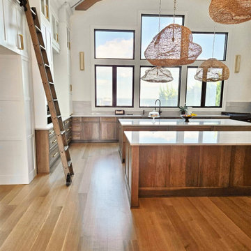
Challenge: The task was to fill a vast space with 14-foot walls soaring to a peak of 30 feet, using cabinetry that would not appear undervalued or insubstantial. The main question was determining the appropriate height for the cabinetry, considering the scale and proportion of the space, the walk-through to adjoining rooms, window heights, and the height of the refrigerator.
Solution: By carefully analyzing these factors, we were able to create cabinetry that perfectly scaled to the grand dimensions of the room. The floor plan featured two islands that effectively filled the space. Key elements included #TheGalley workstations, drop-down televisions, #MouserCabinetry, and secret doors leading to a hidden scullery, all contributing to an extraordinary project.
 Ketti Kupper Conscious Life Design
Photo by Ketti Kupper
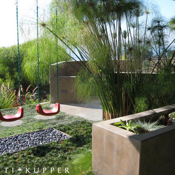
Design ideas for a mid-sized contemporary backyard landscaping in Los Angeles.
Design ideas for a mid-sized contemporary backyard landscaping in Los Angeles.
 HU-235072162
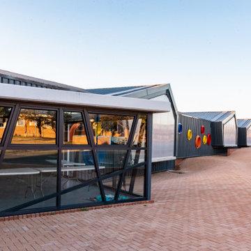
The site is located on the Mitchell House preparatory school campus in Polokwane. The client's brief
called for an early childhood development centre which would accommodate 122 learners and
requested that the building be evident of it's young and playful users.
Curiosity, wonder and intrigue would become defining criteria in an attempt to create a conducive
learning environment for young learners to grow, a building where children would be encouraged to
interact with their environment. The construction methodology of the building would remain apparent,
allowing its users to analyse the assembly of components.
Due to the age group of the users, the building would need to function semi-autonomously from the
rest of the school, while allowing for controlled interaction and inclusivity as is the norm for Mitchell
House. A linear plan which coincides with the developmental progress of the learners was identified
as the appropriate building typology. The spatial constraints of the site required this plan to be
moulded into the available space between the existing infrastructure, however the linear process was
maintained.
From the access-controlled reception and administration area one would move past the creative arts
and exhibition space towards the Northern wing where the youngest learners are taught. These would
share connected ablutions and storerooms between classes to enable fluid movement and
assistance throughout the teaching and service spaces. The East wing of the centre would house the
elder learners who would be in the process of being integrated with the fabric of the main school
campus. These classrooms include storage areas, however, have separate ablution facilities. The two
wings of the building surround a courtyard where play and interaction are in abundance.
 Packard Cabinetry of Sea Cliff
Description of Waterfront Home Design
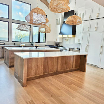
Challenge: The task was to fill a vast space with 14-foot walls soaring to a peak of 30 feet, using cabinetry that would not appear undervalued or insubstantial. The main question was determining the appropriate height for the cabinetry, considering the scale and proportion of the space, the walk-through to adjoining rooms, window heights, and the height of the refrigerator.
Solution: By carefully analyzing these factors, we were able to create cabinetry that perfectly scaled to the grand dimensions of the room. The floor plan featured two islands that effectively filled the space. Key elements included #TheGalley workstations, drop-down televisions, #MouserCabinetry, and secret doors leading to a hidden scullery, all contributing to an extraordinary project.
 John R. Schroeder, AIA
Photo by Jody Dole
John R. Schroeder, AIA is a professional design firm specializing in architecture, interiors, and planning. We have over 30 years experience with projects of all types, sizes, and levels of complexity. Because we love what we do, we approach our work with enthusiasm and dedication. We are committed to the highest level of design and service on each and every project. We engage our clients in positive and rewarding collaborations. We strive to exceed expectations through our attention to detail, our understanding of the “big picture”, and our ability to effectively manage a team of design professionals, industry representatives, and building contractors. We carefully analyze budgets and project objectives to assist clients with wise fund allocation.
We continually monitor and research advances in technology, materials, and construction methods, both sustainable and otherwise, to provide a responsible, well-suited, and cost effective product. Our design solutions are highly functional using both innovative and traditional approaches. Our aesthetic style is flexible and open, blending cues from client desires, building function, site context, and material properties, making each project unique, personalized, and enduring.
 Kitchen Design Concepts
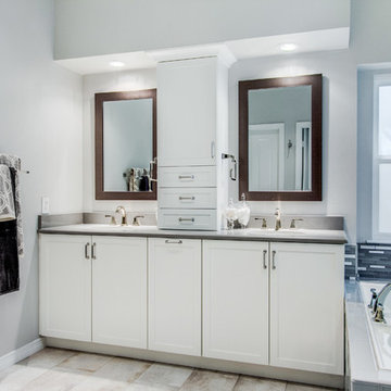
The moment we stepped in, we analyzed the space, listened to our client’s needs, and consequently gave this space the love and care it needed. As a result, this room did a complete 180 from a space that no one wanted to be in, to a space that is now bright and inviting! Since the remodel was completed, the transitional design still stands as one of our favorite remodels. Before we spill all the details, check out the BEFORE photos below:
Cabinetry
The vanity cabinets in this bathroom space are from Kitchen Craft with a Salem door-style in an Alabaster finish. The cabinets from Kitchen Craft are frameless, which gives great access and storage within. The addition of the counter-sitting cabinet also gives great storage space with its drawers for smaller items. Disclaimer: In most cases, we either refinish or reface existing cabinetry; however, in this particular case the clients needed new cabinet boxes.
Countertops
The countertops are a great contrast from the white cabinets and also adds a contemporary element. The quartz countertops are a 3cm Caesarstone in a Pebble Honed finish. We love the balance between the white and grey finishes! Also, quartz is a great low-maintenance material, it’s a win-win!
Tile
Now, while the cabinets and countertops play a huge role in this design, the tile is the one that really stands out. Let’s break it down, from Arizona Tile: the shower walls and tub face are a 3×6 H-Line ceramic tile in Denim, the accent on the shower wall and above the tub are a Soho glass and stone stack in Cloud, and the shower floor is a Bianco Carrera 1×1 penny round. Lastly, from Daltile: the flooring in a 12×24 Cotto Contempo with a finish in Pennsylvania Avenue.
Plumbing Fixtures
Without plumbing fixtures, we wouldn’t have a bathroom now would we? The plumbing finishes and style all complement the design on the bathroom and gives the overall space a designer look. From Toto: Two Rendezvous® lavatories in a Cotton finish. From Delta in the Dryden collection: one robe hook, two towel rings, one toilet paper holder and one double towel bar all in a Polished Nickel finish.
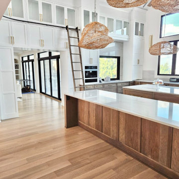 Packard Cabinetry of Sea Cliff
Description of Waterfront Home Design
Challenge: The task was to fill a vast space with 14-foot walls soaring to a peak of 30 feet, using cabinetry that would not appear undervalued or insubstantial. The main question was determining the appropriate height for the cabinetry, considering the scale and proportion of the space, the walk-through to adjoining rooms, window heights, and the height of the refrigerator.
Solution: By carefully analyzing these factors, we were able to create cabinetry that perfectly scaled to the grand dimensions of the room. The floor plan featured two islands that effectively filled the space. Key elements included #TheGalley workstations, drop-down televisions, #MouserCabinetry, and secret doors leading to a hidden scullery, all contributing to an extraordinary project.
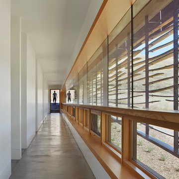 Schwartz and Architecture
The proposal analyzes the site as a series of existing flows or “routes” across the landscape. The negotiation of both constructed and natural systems establishes the logic of the site plan and the orientation and organization of the new home. Conceptually, the project becomes a highly choreographed knot at the center of these routes, drawing strands in, engaging them with others, and propelling them back out again. The project’s intent is to capture and harness the physical and ephemeral sense of these latent natural movements as a way to promote in the architecture the wanderlust the surrounding landscape inspires. At heart, the client’s initial family agenda--a home as antidote to the city and basecamp for exploration--establishes the ethos and design objectives of the work.
Photography - Bruce Damonte
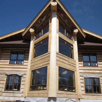
 Hay Design Furnishings & Decor
Hay Design Incorporated was retained to Study and Analyze the Space Requirement and provide complete Interior Design Services related to 294 m2 of residential space. The primary objective was to examine ways to present interior finishes and preliminary layout, meeting Client requirements and staying within their space envelope. Hay design presented services including functional programming (information gathering, inventory and assessment, equipment usage chart and electrical load requirements, and test plans), schematic design (schematic concept plans and colour boards), and design development (partition layout and finishes plan, and finishes presentation boards).
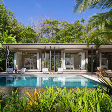
 Studio Saxe
Studio Saxe was commissioned to design a beachfront house in the beautiful town of Santa Teresa in Costa Rica. We decided to integrate the jungle experience into the house and also frame the views of the ocean whilst blending with nature.
Concept
Studio Saxe decomposed the mass of the building into a series of pavilions with overlapping roofs that create interesting circulation spaces between the volumes. By dematerializing the volumes, we integrated the home into its lush surroundings.
Design
Studio Saxe used the decomposition of volumes to house the different programs of the project. Pavilions are divided into bedrooms, living spaces, service areas, and together they create a harmony that is weaved together through the circulation of indoor/outdoor spaces. This in turn allows the inhabitant to experience the intense natural surrounding every time they have to move from one place to the other.
Sustainability
The project was conceived as a decomposition of the volumes and this allowed for cross-ventilation due to the exposure of every space to at least 2 or 3 walls to the outside. The extended rooflines are carefully placed to protect from the sun and the rain through a process of bioclimatic design which analyzes the sun patterns, winds, and precipitation to create comfort without the use of energy. An array of sustainable systems such as rainwater catchment, water recycling systems, energy generation, and clever design makes this project a pioneer in sustainable tropical architecture that has passive design at its core.
Construction
Studio Saxe was interested in creating the sensation of floating rooflines, thus a series of thin columns support the roof planes in a way that they seem as they are floating A combination of steel and wood construction with concrete foundations allowed for the lightness of space, and this bleeding of boundaries between the structure and the outside.
15