
Search results for "Anticipated" in Home Design Ideas
 Byggmeister Inc
Photo by Jim Raycroft
When these homeowners first came to us in 2011, they had a list of major projects to adapt their Victorian home to the needs of their growing family. The first phase of work was a basement renovation to provide informal hang out space. The second was a garage. Finally they turned their attention to the master bedroom and bathroom.
FROM BALCONY TO BATHROOM
At one end of the suite was a cramped and outdated bathroom. At the other end was an underutilized, high-maintenance, exterior balcony. A leaky door to the balcony, as well as inadequate insulation and air-sealing and a poorly designed heating system, made the bedroom difficult to keep comfortable in the winter.
We chose to capture the old balcony as indoor space and relocate the bathroom to that end of the master suite. This strategy not only gave us the opportunity to install much better insulation and good, tight windows, it created enough new floor area that we were able to include a large walk-in shower, separate vanities, a toilet room, and a make-up counter in the new master bathroom.
ADAPTING AND UPDATING
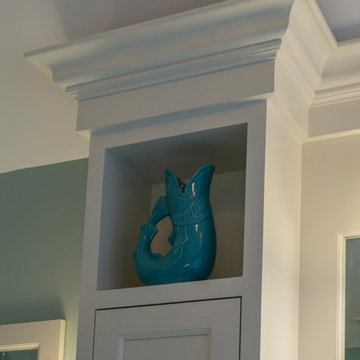
The project allowed us to find a prominent place for an old leaded glass window sash that the homeowners had been hanging onto for several years in anticipation of this project.
The flow and layout of the master suite are now much better suited to a 21st century lifestyle. But best of all (to us, anyway), the homeowners report that the bathroom—where the old balcony had been—is now the most comfortable room in the house.
 ODS Architecture
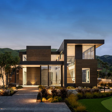
A 6,000 square foot 2-story new home complex in Milpitas was designed to facilitate the owners’ large business parties and gatherings, to have rooms for the kids to come back to upstairs, and a ground floor master suite with a huge walk-in closet. Several separate structures make up the dwelling: The main house, 3-car garage with carport for overflow parking, and a separate entertainment and recreation building separated by a courtyard from the main house.
The business activities include gatherings in the hundreds of people, so parking was maximized and guests can flow in through a separate gate to party in the courtyard and recreation building. Inside this structure is a wet bar, billiard room, workout gym and home theater. The main house ground floor has formal and informal living rooms, open kitchen and master suite with views and expansive windows in every direction. The house is sited on the crestline of a hill with views of the San Francisco Bay and private golf course below. The indoor-outdoor aspect of the house is further accentuated with outside living and dining areas.
High ceilings and expansive glass walls dissolve the sense of enclosure taking advantage of the site’s openness and privacy. The owner’s suite is downstairs in anticipation of aging-in-place, and upstairs there are three bedrooms and four bathrooms plus a sitting area lounge and casual TV loft area.
The house sits on one acre at the top of a low hill range overlooking Milpitas. The city was very cognizant of the importance of keeping a low profile at this crestline and required extensive story poles and photo evidence of the proper height and siting so as not to be seen from certain selected vantage points.
GENERAL CONTRACTOR: JCD Builders Inc.
LANDSCAPE DESIGN: Morf Chang Landscape Architecture / ODS Architecture
PHOTOGRAPHS: Paul Dyer Photography

 DeVere Architecture
Our design for the expansion and gut renovation of a small 1200 square foot house in a residential neighborhood triples is size, and reworks the living arrangement. The rear addition takes advantage of southern exposure with a "greenhouse" room that provides solar heat gain in winter, shading in summer, and a vast connection to the rear yard.
Architecturally, we used an approach we call "willful practicality." The new soaring ceiling ties together first and second floors in a dramatic volumetric expansion of space, while providing increased ventilation and daylighting from greenhouse to operable windows and skylights at the peak. Exterior pockets of space are created from curved forces pushing in from outside to form cedar clad porch and stoop.
Sustainable design is employed throughout all materials, energy systems and insulation. Masonry exterior walls and concrete floors provide thermal mass for the interior by insulating the exterior. An ERV system facilitates increased air changes and minimizes changes to the interior air temperature. Energy and water saving features and renewable, non-toxic materal selections are important aspects of the house design. Environmental community issues are addressed with a drywell in the side yard to mitigate rain runoff into the town sewer system. The long sloping south facing roof is in anticipation of future solar panels, with the standing seam metal roof providing anchoring opportunities for the panels.
The exterior walls are clad in stucco, cedar, and cement-fiber panels defining different areas of the house. Closed cell spray insulation is applied to exterior walls and roof, giving the house an "air-tight" seal against air infiltration and a high R-value. The ERV system provides the ventilation needed with this tight envelope. The interior comfort level and economizing are the beneficial results of the building methods and systems employed in the house.
Photographer: Peter Kubilus
Find the right local pro for your project
 ODS Architecture
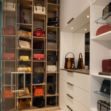
A 6,000 square foot 2-story new home complex in Milpitas was designed to facilitate the owners’ large business parties and gatherings, to have rooms for the kids to come back to upstairs, and a ground floor master suite with a huge walk-in closet. Several separate structures make up the dwelling: The main house, 3-car garage with carport for overflow parking, and a separate entertainment and recreation building separated by a courtyard from the main house.
The business activities include gatherings in the hundreds of people, so parking was maximized and guests can flow in through a separate gate to party in the courtyard and recreation building. Inside this structure is a wet bar, billiard room, workout gym and home theater. The main house ground floor has formal and informal living rooms, open kitchen and master suite with views and expansive windows in every direction. The house is sited on the crestline of a hill with views of the San Francisco Bay and private golf course below. The indoor-outdoor aspect of the house is further accentuated with outside living and dining areas.
High ceilings and expansive glass walls dissolve the sense of enclosure taking advantage of the site’s openness and privacy. The owner’s suite is downstairs in anticipation of aging-in-place, and upstairs there are three bedrooms and four bathrooms plus a sitting area lounge and casual TV loft area.
The house sits on one acre at the top of a low hill range overlooking Milpitas. The city was very cognizant of the importance of keeping a low profile at this crestline and required extensive story poles and photo evidence of the proper height and siting so as not to be seen from certain selected vantage points.
GENERAL CONTRACTOR: JCD Builders Inc.
LANDSCAPE DESIGN: Morf Chang Landscape Architecture / ODS Architecture
PHOTOGRAPHS: Paul Dyer Photography
 ODS Architecture
A 6,000 square foot 2-story new home complex in Milpitas was designed to facilitate the owners’ large business parties and gatherings, to have rooms for the kids to come back to upstairs, and a ground floor master suite with a huge walk-in closet. Several separate structures make up the dwelling: The main house, 3-car garage with carport for overflow parking, and a separate entertainment and recreation building separated by a courtyard from the main house.
The business activities include gatherings in the hundreds of people, so parking was maximized and guests can flow in through a separate gate to party in the courtyard and recreation building. Inside this structure is a wet bar, billiard room, workout gym and home theater. The main house ground floor has formal and informal living rooms, open kitchen and master suite with views and expansive windows in every direction. The house is sited on the crestline of a hill with views of the San Francisco Bay and private golf course below. The indoor-outdoor aspect of the house is further accentuated with outside living and dining areas.
High ceilings and expansive glass walls dissolve the sense of enclosure taking advantage of the site’s openness and privacy. The owner’s suite is downstairs in anticipation of aging-in-place, and upstairs there are three bedrooms and four bathrooms plus a sitting area lounge and casual TV loft area.
The house sits on one acre at the top of a low hill range overlooking Milpitas. The city was very cognizant of the importance of keeping a low profile at this crestline and required extensive story poles and photo evidence of the proper height and siting so as not to be seen from certain selected vantage points.
GENERAL CONTRACTOR: JCD Builders Inc.
LANDSCAPE DESIGN: Morf Chang Landscape Architecture / ODS Architecture
PHOTOGRAPHS: Paul Dyer Photography
 DeVere Architecture
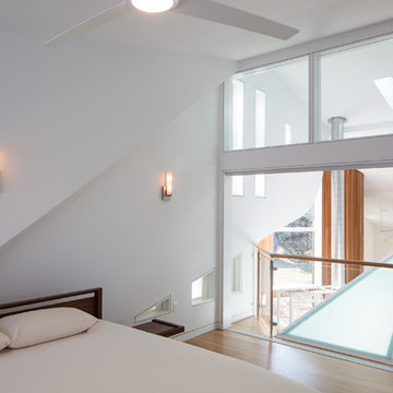
Our design for the expansion and gut renovation of a small 1200 square foot house in a residential neighborhood triples is size, and reworks the living arrangement. The rear addition takes advantage of southern exposure with a "greenhouse" room that provides solar heat gain in winter, shading in summer, and a vast connection to the rear yard.
Architecturally, we used an approach we call "willful practicality." The new soaring ceiling ties together first and second floors in a dramatic volumetric expansion of space, while providing increased ventilation and daylighting from greenhouse to operable windows and skylights at the peak. Exterior pockets of space are created from curved forces pushing in from outside to form cedar clad porch and stoop.
Sustainable design is employed throughout all materials, energy systems and insulation. Masonry exterior walls and concrete floors provide thermal mass for the interior by insulating the exterior. An ERV system facilitates increased air changes and minimizes changes to the interior air temperature. Energy and water saving features and renewable, non-toxic materal selections are important aspects of the house design. Environmental community issues are addressed with a drywell in the side yard to mitigate rain runoff into the town sewer system. The long sloping south facing roof is in anticipation of future solar panels, with the standing seam metal roof providing anchoring opportunities for the panels.
The exterior walls are clad in stucco, cedar, and cement-fiber panels defining different areas of the house. Closed cell spray insulation is applied to exterior walls and roof, giving the house an "air-tight" seal against air infiltration and a high R-value. The ERV system provides the ventilation needed with this tight envelope. The interior comfort level and economizing are the beneficial results of the building methods and systems employed in the house.
Photographer: Peter Kubilus
 DeVere Architecture
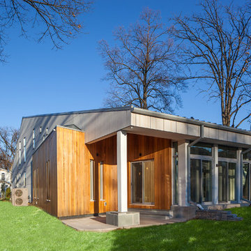
Our design for the expansion and gut renovation of a small 1200 square foot house in a residential neighborhood triples is size, and reworks the living arrangement. The rear addition takes advantage of southern exposure with a "greenhouse" room that provides solar heat gain in winter, shading in summer, and a vast connection to the rear yard.
Architecturally, we used an approach we call "willful practicality." The new soaring ceiling ties together first and second floors in a dramatic volumetric expansion of space, while providing increased ventilation and daylighting from greenhouse to operable windows and skylights at the peak. Exterior pockets of space are created from curved forces pushing in from outside to form cedar clad porch and stoop.
Sustainable design is employed throughout all materials, energy systems and insulation. Masonry exterior walls and concrete floors provide thermal mass for the interior by insulating the exterior. An ERV system facilitates increased air changes and minimizes changes to the interior air temperature. Energy and water saving features and renewable, non-toxic materal selections are important aspects of the house design. Environmental community issues are addressed with a drywell in the side yard to mitigate rain runoff into the town sewer system. The long sloping south facing roof is in anticipation of future solar panels, with the standing seam metal roof providing anchoring opportunities for the panels.
The exterior walls are clad in stucco, cedar, and cement-fiber panels defining different areas of the house. Closed cell spray insulation is applied to exterior walls and roof, giving the house an "air-tight" seal against air infiltration and a high R-value. The ERV system provides the ventilation needed with this tight envelope. The interior comfort level and economizing are the beneficial results of the building methods and systems employed in the house.
Photographer: Peter Kubilus
 DeVere Architecture
Our design for the expansion and gut renovation of a small 1200 square foot house in a residential neighborhood triples is size, and reworks the living arrangement. The rear addition takes advantage of southern exposure with a "greenhouse" room that provides solar heat gain in winter, shading in summer, and a vast connection to the rear yard.
Architecturally, we used an approach we call "willful practicality." The new soaring ceiling ties together first and second floors in a dramatic volumetric expansion of space, while providing increased ventilation and daylighting from greenhouse to operable windows and skylights at the peak. Exterior pockets of space are created from curved forces pushing in from outside to form cedar clad porch and stoop.
Sustainable design is employed throughout all materials, energy systems and insulation. Masonry exterior walls and concrete floors provide thermal mass for the interior by insulating the exterior. An ERV system facilitates increased air changes and minimizes changes to the interior air temperature. Energy and water saving features and renewable, non-toxic materal selections are important aspects of the house design. Environmental community issues are addressed with a drywell in the side yard to mitigate rain runoff into the town sewer system. The long sloping south facing roof is in anticipation of future solar panels, with the standing seam metal roof providing anchoring opportunities for the panels.
The exterior walls are clad in stucco, cedar, and cement-fiber panels defining different areas of the house. Closed cell spray insulation is applied to exterior walls and roof, giving the house an "air-tight" seal against air infiltration and a high R-value. The ERV system provides the ventilation needed with this tight envelope. The interior comfort level and economizing are the beneficial results of the building methods and systems employed in the house.
Photographer: Peter Kubilus
 Savvy Interiors
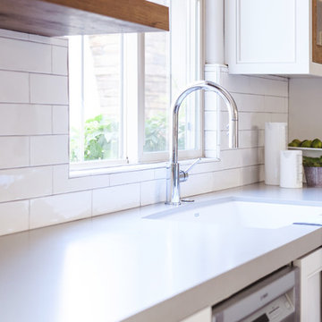
Inspiration for a mid-sized transitional l-shaped light wood floor and beige floor open concept kitchen remodel in San Diego with an undermount sink, recessed-panel cabinets, white cabinets, quartzite countertops, multicolored backsplash, cement tile backsplash, stainless steel appliances and an island
 ODS Architecture
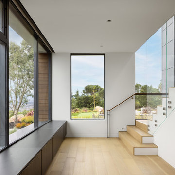
A 6,000 square foot 2-story new home complex in Milpitas was designed to facilitate the owners’ large business parties and gatherings, to have rooms for the kids to come back to upstairs, and a ground floor master suite with a huge walk-in closet. Several separate structures make up the dwelling: The main house, 3-car garage with carport for overflow parking, and a separate entertainment and recreation building separated by a courtyard from the main house.
The business activities include gatherings in the hundreds of people, so parking was maximized and guests can flow in through a separate gate to party in the courtyard and recreation building. Inside this structure is a wet bar, billiard room, workout gym and home theater. The main house ground floor has formal and informal living rooms, open kitchen and master suite with views and expansive windows in every direction. The house is sited on the crestline of a hill with views of the San Francisco Bay and private golf course below. The indoor-outdoor aspect of the house is further accentuated with outside living and dining areas.
High ceilings and expansive glass walls dissolve the sense of enclosure taking advantage of the site’s openness and privacy. The owner’s suite is downstairs in anticipation of aging-in-place, and upstairs there are three bedrooms and four bathrooms plus a sitting area lounge and casual TV loft area.
The house sits on one acre at the top of a low hill range overlooking Milpitas. The city was very cognizant of the importance of keeping a low profile at this crestline and required extensive story poles and photo evidence of the proper height and siting so as not to be seen from certain selected vantage points.
GENERAL CONTRACTOR: JCD Builders Inc.
LANDSCAPE DESIGN: Morf Chang Landscape Architecture / ODS Architecture
PHOTOGRAPHS: Paul Dyer Photography
 ODS Architecture
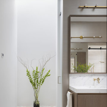
A 6,000 square foot 2-story new home complex in Milpitas was designed to facilitate the owners’ large business parties and gatherings, to have rooms for the kids to come back to upstairs, and a ground floor master suite with a huge walk-in closet. Several separate structures make up the dwelling: The main house, 3-car garage with carport for overflow parking, and a separate entertainment and recreation building separated by a courtyard from the main house.
The business activities include gatherings in the hundreds of people, so parking was maximized and guests can flow in through a separate gate to party in the courtyard and recreation building. Inside this structure is a wet bar, billiard room, workout gym and home theater. The main house ground floor has formal and informal living rooms, open kitchen and master suite with views and expansive windows in every direction. The house is sited on the crestline of a hill with views of the San Francisco Bay and private golf course below. The indoor-outdoor aspect of the house is further accentuated with outside living and dining areas.
High ceilings and expansive glass walls dissolve the sense of enclosure taking advantage of the site’s openness and privacy. The owner’s suite is downstairs in anticipation of aging-in-place, and upstairs there are three bedrooms and four bathrooms plus a sitting area lounge and casual TV loft area.
The house sits on one acre at the top of a low hill range overlooking Milpitas. The city was very cognizant of the importance of keeping a low profile at this crestline and required extensive story poles and photo evidence of the proper height and siting so as not to be seen from certain selected vantage points.
GENERAL CONTRACTOR: JCD Builders Inc.
LANDSCAPE DESIGN: Morf Chang Landscape Architecture / ODS Architecture
PHOTOGRAPHS: Paul Dyer Photography
 TKS Design Group
Download our free ebook, Creating the Ideal Kitchen. DOWNLOAD NOW
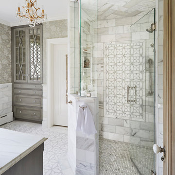
This homeowner’s daughter originally contacted us on behalf of her parents who were reluctant to begin the remodeling process in their home due to the inconvenience and dust. Once we met and they dipped their toes into the process, we were off to the races. The existing bathroom in this beautiful historical 1920’s home, had not been updated since the 70’/80’s as evidenced by the blue carpeting, mirrored walls and dropped ceilings. In addition, there was very little storage, and some health setbacks had made the bathroom difficult to maneuver with its tub shower.
Once we demoed, we discovered everything we expected to find in a home that had not been updated for many years. We got to work bringing all the electrical and plumbing up to code, and it was just as dusty and dirty as the homeowner’s anticipated! Once the space was demoed, we got to work building our new plan. We eliminated the existing tub and created a large walk-in curb-less shower.
An existing closet was eliminated and in its place, we planned a custom built in with spots for linens, jewelry and general storage. Because of the small space, we had to be very creative with the shower footprint, so we clipped one of the walls for more clearance behind the sink. The bathroom features a beautiful custom mosaic floor tile as well as tiled walls throughout the space. This required lots of coordination between the carpenter and tile setter to make sure that the framing and tile design were all properly aligned. We worked around an existing radiator and a unique original leaded window that was architecturally significant to the façade of the home. We had a lot of extra depth behind the original toilet location, so we built the wall out a bit, moved the toilet forward and then created some extra storage space behind the commode. We settled on mirrored mullioned doors to bounce lots of light around the smaller space.
We also went back and forth on deciding between a single and double vanity, and in the end decided the single vanity allowed for more counter space, more storage below and for the design to breath a bit in the smaller space. I’m so happy with this decision! To build on the luxurious feel of the space, we added a heated towel bar and heated flooring.
One of the concerns the homeowners had was having a comfortable floor to walk on. They realized that carpet was not a very practical solution but liked the comfort it had provided. Heated floors are the perfect solution. The room is decidedly traditional from its intricate mosaic marble floor to the calacutta marble clad walls. Elegant gold chandelier style fixtures, marble countertops and Morris & Co. beaded wallpaper provide an opulent feel to the space.
The gray monochromatic pallet keeps it feeling fresh and up-to-date. The beautiful leaded glass window is an important architectural feature at the front of the house. In the summertime, the homeowners love having the window open for fresh air and ventilation. We love it too!
The curb-less shower features a small fold down bench that can be used if needed and folded up when not. The shower also features a custom niche for storing shampoo and other hair products. The linear drain is built into the tilework and is barely visible. A frameless glass door that swings both in and out completes the luxurious feel.
Designed by: Susan Klimala, CKD, CBD
Photography by: Michael Kaskel
For more information on kitchen and bath design ideas go to: www.kitchenstudio-ge.com

 DeVere Architecture
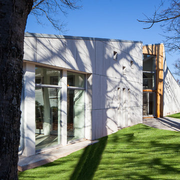
Our design for the expansion and gut renovation of a small 1200 square foot house in a residential neighborhood triples is size, and reworks the living arrangement. The rear addition takes advantage of southern exposure with a "greenhouse" room that provides solar heat gain in winter, shading in summer, and a vast connection to the rear yard.
Architecturally, we used an approach we call "willful practicality." The new soaring ceiling ties together first and second floors in a dramatic volumetric expansion of space, while providing increased ventilation and daylighting from greenhouse to operable windows and skylights at the peak. Exterior pockets of space are created from curved forces pushing in from outside to form cedar clad porch and stoop.
Sustainable design is employed throughout all materials, energy systems and insulation. Masonry exterior walls and concrete floors provide thermal mass for the interior by insulating the exterior. An ERV system facilitates increased air changes and minimizes changes to the interior air temperature. Energy and water saving features and renewable, non-toxic materal selections are important aspects of the house design. Environmental community issues are addressed with a drywell in the side yard to mitigate rain runoff into the town sewer system. The long sloping south facing roof is in anticipation of future solar panels, with the standing seam metal roof providing anchoring opportunities for the panels.
The exterior walls are clad in stucco, cedar, and cement-fiber panels defining different areas of the house. Closed cell spray insulation is applied to exterior walls and roof, giving the house an "air-tight" seal against air infiltration and a high R-value. The ERV system provides the ventilation needed with this tight envelope. The interior comfort level and economizing are the beneficial results of the building methods and systems employed in the house.
Photographer: Peter Kubilus
 Advance Design Studio, Ltd.
Jennifer and Dan have lived in their Deer Park Illinois home for 15 years, slowly making minor fixes like painting and decorating; but they had a new plan for their kitchen the entire time. An awkwardly placed garage door, and an island cooktop with a terrible downdraft made a full-scale kitchen remodel an absolute must. Jennifer had many ideas in mind and wanted to work with a company that could provide high-end work, while partnering with a designer that would tailor the kitchen to her ideas.
She was intrigued by the phrase “Common Sense Remodeling” in Advance Design’s feature she discovered while perusing an issue of the community’s Quintessential Barrington Magazine. Doing further research on the company’s website, as she looked through project profiles and read about Advance Design’s “Common Sense Remodeling” philosophy, she promptly scheduled an appointment to see if the people and ideas she read about were truly who they said they were. The more she read, the more she knew that the “Common Sense” approach to remodeling they described was exactly the type of company she was looking for.
The partnership was sealed after an initial consultation with Owner Todd Jurs and Project Designer Michelle Lecinski. They displayed a combination of friendliness, professionalism and respect that was unmatched by any of the other companies Jennifer talked to. She knew that with Advance Design, she would be able to retain the vision that she had in mind with high-quality craftsmanship.
“I reached out to Advance Design because of the ‘Common Sense Remodeling’ tagline,” Jennifer said. “That’s what lingered for me”. “Advance Design was the most respectful- of the house and of my design ideas, and the most professional of the handful of companies that looked at my project”.
Soon after the meeting Jennifer began working with Michelle on the project design. They quickly developed chemistry. Jennifer loved how Michelle researched and located every detail that Jennifer wanted for the kitchen. Between the two of them, every concept and idea was worked through and perfected. “Jennifer had definite ideas about what she wanted the new kitchen to look like, she just didn’t know how to bring it all together. We worked together really well to make her ideas into the practical reality necessary for a well-functioning kitchen, with the look and feel that she had envisioned”, says Michelle.
“Michelle was wonderful in using the CAD system she would show me new drawings every time we changed the layout while working through the design,” Jennifer said. “She was a really wonderful partner in execution, she made sure everything happened quickly and easily.”
The finished design drew out elements of Jennifer’s style and personality. The pair call the look “sophisticated farmhouse” to describe the kitchen renovation to family and friends. The result was a beautifully crafted, authentic-feeling space that satisfied Jennifer’s dreams 15 years in the making. The whole project consisted of a kitchen remodel, mudroom upgrade with powder room, and garage entry relocation. “The projects I personally like the best, are the ones that put the client’s dreams on display,” Project Designer Michelle said. “And this is one of those projects.”
The main focal point of the kitchen is custom zinc and brass ventilation hood with a vintage sheen, which was hand made to order by a small company in Indiana named Vogler Metalworking. “It’s like sculpture, a true work of art”, says Jennifer. Your eye is immediately drawn towards this elegant yet practical hood that eliminated the home’s downdraft problem and added a striking conversation piece at the same time. The carpenters had to use special gloves when transporting and installing it, so they didn’t smudge it with fingerprints. The beautiful hood centers proudly over the stunning black enamel and brass LaCornue Range. “I had a friend who had a LaCornue range and after learning how easy it was to cook perfect meals, I was convinced I wanted to have one”, says Jennifer. This unique, breathtaking combination anchors the entire kitchen and is apparent immediately as you walk into the great room the surrounds the space.
DuraSupreme Crestwood cabinets with a Kendall Panel add function and sophistication. A custom gray paint color paired with a storm blue was developed so that the new kitchen looked like it belonged to the existing space. Unlacquered brass faucets and hardware were important to Jennifer because she wanted the living finishes to age over time. Remarkable brass diamond mesh cabinet door inserts imported from the UK continue to add this one-of-a-kind kitchen renovation; giving it a “you won’t see this everywhere” quality. The use of old railcar flooring for the coffee bar countertop and reclaimed oak for the open shelving gives an authenticity to the space uncommon in kitchens today.
Jennifer and Michelle fell in love with the Limestone Grey Stone while they were investigating unique island countertop ideas. They liked the fact that the limestone as a living finish will age and change over time. Calcutta Miel Quartz countertops made for an excellent pairing around the perimeter, as it’s durable and perfect for cooking preparations. A textured white subway tile backsplash that runs to the ceiling keeps your eye moving towards the open shelving, and to the main focal point of the stunning range hood combination.
“The kitchen functions beautifully, and it’s gorgeous,” beams Jennifer as she gestures with both hands while smiling ear to ear. “The most important thing was I wanted a kitchen that had a wonderful flow, cooked beautiful meals and was a great gathering place for family and friends, and this space does that perfectly! Beauty wise, it turned out exactly how I had envisioned. I felt the function part was the hardest part, and that was nailed”!
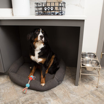
Relocating the garage entry to the new mudroom was a huge priority and has finally separated the family’s arriving home functions from their kitchen. Now coats and shoes and bags have their own area for dropping once members arrive home. Matching gray DuraSupreme cabinetry helped create gorgeous, purposeful lockers for the family. A reclaimed vintage sink and custom wall paper were added to the tiny powder room to beautify the once previously only functional space. Advance Design was even able to create a custom space for their dog to sleep while the family is away.
“It was unbelievable that a project of this size was completed in such a short time, and I think that’s because of the large amount of planning and preparation that went into it,” Jennifer marveled, “When we started, we were ready, and everything was prepared”.
When it came to execution, Project Manager Justin Davis and his crew were quick, accessible, and organized. Projects like this kitchen are typically completed in as little as 8-10 weeks. Jennifer’s kitchen however despite the relocation of some challenging HVAC in a soffit and moving of an exterior door was completed remarkably fast in part because the team was working with an existing tile floor that ran throughout the first floor that the client really loved.
“You get to know these people really well because they’re living in your house while you’re living in your house. They were so fast and really good, it didn’t take as long as even planned” reported Jennifer. “I would text Justin and he always responded almost immediately. I got to know all the guys who were working in our house and they were all wonderful people”.
Details in a customized kitchen like this one require skill and care from the people who install it. “All the guys on the job were skilled at what the did. I wanted small details like little feet to look like furniture, that is where their carpentry skill came in to make these all perfect”, said Jennifer. “The tile guys were wonderful. They even let me determine how I wanted the texture with the grout to appear for a salt and pepper look; now that is a very skilled trade person making it custom”.
In Jennifer’s interview, she continued to reference Advance Design’s “Common Sense Remodeling”, so I took a minute to ask her exactly what that phrase meant to her and how it played out in her experience with her project and the Advance Design team. Here is what she said: “I was intrigued about Common Sense Remodeling and in my head that there would be clear costs and prices, great communication between the design team, the execution team and me”, said Jennifer. They did deliver on that, it was so clear about the cost breakdown, what I could expect from everyone who came to my house, and everything that we had ordered. That to me is the Common Sense”!
It’s great to see a client take literally our assertion that a well-planned remodeling project is simply “Common Sense”! She anticipated each step of the way would be clear, concise, and predictable, all the while protecting the outcome due to the careful upfront planning. “Advance Design delivered on their ‘Common Sense Remodeling’ promise,” Jennifer said. “From the design team, to the execution team - everything was straight forward like I imagined. The project turned out exactly how I envisioned, I enjoyed this process and absolutely would recommend Advance Design Studio to anyone.”
 DeVere Architecture
Our design for the expansion and gut renovation of a small 1200 square foot house in a residential neighborhood triples is size, and reworks the living arrangement. The rear addition takes advantage of southern exposure with a "greenhouse" room that provides solar heat gain in winter, shading in summer, and a vast connection to the rear yard.
Architecturally, we used an approach we call "willful practicality." The new soaring ceiling ties together first and second floors in a dramatic volumetric expansion of space, while providing increased ventilation and daylighting from greenhouse to operable windows and skylights at the peak. Exterior pockets of space are created from curved forces pushing in from outside to form cedar clad porch and stoop.
Sustainable design is employed throughout all materials, energy systems and insulation. Masonry exterior walls and concrete floors provide thermal mass for the interior by insulating the exterior. An ERV system facilitates increased air changes and minimizes changes to the interior air temperature. Energy and water saving features and renewable, non-toxic materal selections are important aspects of the house design. Environmental community issues are addressed with a drywell in the side yard to mitigate rain runoff into the town sewer system. The long sloping south facing roof is in anticipation of future solar panels, with the standing seam metal roof providing anchoring opportunities for the panels.
The exterior walls are clad in stucco, cedar, and cement-fiber panels defining different areas of the house. Closed cell spray insulation is applied to exterior walls and roof, giving the house an "air-tight" seal against air infiltration and a high R-value. The ERV system provides the ventilation needed with this tight envelope. The interior comfort level and economizing are the beneficial results of the building methods and systems employed in the house.
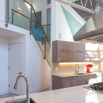
Photographer: Peter Kubilus
 Byggmeister Inc
Photo by Jim Raycroft
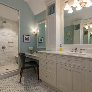
When these homeowners first came to us in 2011, they had a list of major projects to adapt their Victorian home to the needs of their growing family. The first phase of work was a basement renovation to provide informal hang out space. The second was a garage. Finally they turned their attention to the master bedroom and bathroom.
FROM BALCONY TO BATHROOM
At one end of the suite was a cramped and outdated bathroom. At the other end was an underutilized, high-maintenance, exterior balcony. A leaky door to the balcony, as well as inadequate insulation and air-sealing and a poorly designed heating system, made the bedroom difficult to keep comfortable in the winter.
We chose to capture the old balcony as indoor space and relocate the bathroom to that end of the master suite. This strategy not only gave us the opportunity to install much better insulation and good, tight windows, it created enough new floor area that we were able to include a large walk-in shower, separate vanities, a toilet room, and a make-up counter in the new master bathroom.
ADAPTING AND UPDATING
The project allowed us to find a prominent place for an old leaded glass window sash that the homeowners had been hanging onto for several years in anticipation of this project.
The flow and layout of the master suite are now much better suited to a 21st century lifestyle. But best of all (to us, anyway), the homeowners report that the bathroom—where the old balcony had been—is now the most comfortable room in the house.
 Flourish Interiors by Vanessa C Smith
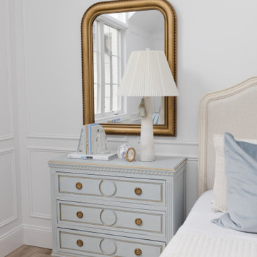
Step into the primary suite of my beloved home, The French Chateau. Designing bedrooms is always a very personal endeavor, and designing our own bedroom was no exception. The space must serve as a sanctuary, providing solace at the end of each day, while also uplifting and inspiring us each morning. However, the task always becomes more complex when we are designing a primary suite for two individuals who may not always share the same vision or aesthetic preferences; my husband and I are no different.
⠀⠀⠀⠀⠀⠀⠀⠀⠀
In crafting this space, I desired a room that would bring a smile to our faces whether we were entering or leaving. It needed to encompass beauty that resonated with my love for French, feminine design while also providing comfort for my husband, who has a preference for a richer, more masculine palette.
⠀⠀⠀⠀⠀⠀⠀⠀⠀
The design of this primary suite revolves around neutral colors, with a touch of blue—a hue that both of us appreciate—as an accent color. The indulgence of luxurious linens eagerly welcomes us, creating an anticipation for rest after long and bustling days. Throughout the room, you'll notice various cherished family photos adorning our dressers, capturing precious memories. Additionally, a captivating original painting graces a sidewall, showcasing our favorite place, the Jardin des Tuileries at the Louvre in Paris. These personal touches imbue the space with a profound sense of home, rejuvenating our souls and infusing the atmosphere with a unique warmth.

 Paxton Place Design
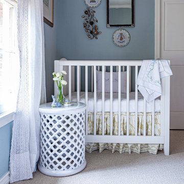
Ooh baby our client is excited and so are we! New room, new kiddo, new accessories, new adventure! Little cutie Carter needs a crib to crash… (so the parents can try to get some sleep)
There’s nothing quite like preparing for one’s first child. From the crazy anticipation to the silliest worries, adding a plus one to the family can be a lot (not to mention the hormones and why do pickles sound SOOO good?!?) Luckily, Paxton Place is more than happy to help! We can’t bring ice cream at 2am (sorry) but we can design a cute and cozy space for you and the baby to bond together.
Our client wanted a modern twist on the classics for little Carter. We chose various blues and whites for our boy; but notice the fun patterns on the ceiling and sheets. There’s a refined minimalist design with the furniture that feels timeless but looks 21st century. Transitioning, a new baby isn’t just for the parents; grandparents have to make room, also. They opted for a more traditional approach for grandbaby number 1. To accommodate, we installed soft lacy curtains and blankets for our special man. There’s also antique plates and mirrors to reflect a more mature design that matches the rest of their home. We loved creating two unique environments, connecting generations to come.
39