
Search results for "Approach challenges" in Home Design Ideas
 Drury Design
THE SETUP
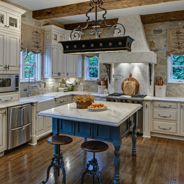
Imagine how thrilled Diana was when she was approached about designing a kitchen for a client who is an avid traveler and Francophile. ‘French-country’ is a very specific category of traditional design that combines French provincial elegance with rustic comforts. The look draws on soothing hues, antique accents and a wonderful fusion of polished and relic’d finishes.
Her client wanted to feel like she was in the south of France every time she walked into her kitchen. She wanted real honed marble counters, vintage finishes and authentic heavy stone walls like you’d find in a 400-year old château in Les Baux-de-Provence.
Diana’s mission: capture the client’s vision, design it and utilize Drury Design’s sourcing and building expertise to bring it to life.
Design Objectives:
Create the feel of an authentic vintage French-country kitchen
Include natural materials that would have been used in an old French château
Add a second oven
Omit an unused desk area in favor of a large, tall pantry armoire
THE REMODEL
Design Challenges:
Finding real stone for the walls, and the craftsmen to install it
Accommodate for the thickness of the stones
Replicating château beam architecture
Replicating authentic French-country finishes
Find a spot for a new steam oven
Design Solutions:
Source and sort true stone. Utilize veteran craftsmen to apply to the walls using old-world techniques
Furr out interior window casings to adjust for the thicker stone walls
Source true reclaimed beams
Utilize veteran craftsmen for authentic finishes and distressing for the island, tall pantry armoire and stucco hood
Modify the butler’s pantry base cabinet to accommodate the new steam oven
THE RENEWED SPACE
Before we started work on her new French-country kitchen, the homeowner told us the kitchen that came with the house was “not my kitchen.”
“I felt like a stranger,” she told us during the photoshoot. “It wasn’t my color, it wasn’t my texture. It wasn’t my style… I didn’t have my stamp on it.”
And now?
“I love the fact that my family can come in here, wrap their arms around it and feel comfortable,” she said. “It’s like a big hug.”
 Klopf Architecture
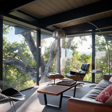
Set in a quiet neighborhood and framed by mature trees, this residence presented a unique opportunity: to thoughtfully evolve a custom mid-century modern home into a space that supports the everyday rhythms of a growing family. With a deep respect for the home’s original architecture, Klopf Architecture reimagined the house to better meet the needs of its owners—introducing functional improvements while preserving the spirit and character of its mid-century roots.
The clients approached Klopf Architecture with a clear vision: refresh their home while seamlessly integrating new programmatic elements. Key goals included clarifying and enhancing the entry sequence; connecting the detached garage to the main house with a practical yet architecturally intentional intervention; adding functional spaces such as a mudroom and laundry room; expanding and remodeling the primary suite’s bathroom and closet; and creating a more engaging outdoor space that capitalized on the site’s impressive views, featuring a fire pit and outdoor kitchen.
As a couple with distinct yet complementary perspectives—one focused on modern functionality and technology, and the other dedicated to preserving the home’s architectural integrity—their collaboration with Klopf Architecture resulted in a solution that harmonized both ideals. Their shared commitment to improving the livability of their home led to a design dialogue rooted in balance. This dynamic partnership shaped the direction of the renovation, ensuring that every decision honored the spirit of the original home while aligning with the practical needs of their growing family.
Designing within the constraints of the sloped site posed one of the project’s central challenges. The detached garage sat at a higher elevation than the main house, requiring a solution that ensured architectural and geometric compatibility between the two structures. Rather than create a purely utilitarian link, Klopf Architecture introduced an intentional connection that contributes to the overall architectural language. A notable pinch point in the plan—where differing geometries converged—was treated as a hinge point, turning a potentially awkward juncture into an architectural feature. This area now functions as both a transition and a moment of design interest that unifies the overall plan.
The design also addressed the underutilized outdoor area, which was located in a shadowed portion of the site with geometrical limitations. A new connection to the rear deck was created in this same area, making the outdoor space more useful and inviting. Klopf Architecture introduced carefully positioned openings and spatial improvements that forged a strong visual and functional connection between indoor and outdoor spaces. The outdoor area now reads as a deliberate extension of the home, embracing natural light and emphasizing the dramatic views.
Working through multiple design iterations, Klopf Architecture crafted a solution that preserved the architectural language of the original home while supporting the functional needs of modern life. The garage-to-house connection became more than a passage—it evolved into an architectural moment of transition. A new mudroom and laundry space enhanced convenience without compromising the clean lines of the design. The primary suite was expanded to create a private, serene retreat. The reimagined backyard, complete with fire pit and kitchen, now plays a vital role in the family’s daily routine and social life.
Outcomes and Lasting Impact
The result is a home that balances heritage with contemporary design, technical precision with design sensibility. The redesign not only met the clients’ initial goals but also exceeded expectations in its ability to seamlessly blend past and present, function and beauty, making the outdoor kitchen a favorite gathering place.
Beyond aesthetics, the renovation has significantly improved daily life for the family. The newly integrated garage connection has streamlined routines, providing a seamless transition between arriving home, storing belongings, and entering the main living spaces. The expanded primary suite offers a retreat-like atmosphere, creating a private space to unwind at the end of the day. The redesigned outdoor areas have also become an extension of their lifestyle—whether it's casual family dinners around the fire pit, entertaining friends in the outdoor kitchen, or simply enjoying the view from the reimagined backyard.
Through a thoughtful and strategic approach, the house has been successfully evolved into a home that remains true to its mid-century modern roots while enhancing livability, functionality, and the overall quality of life for the modern-day owners.
Klopf Architecture Team: Geoffrey Campen, Fernanda Bernardes
Architectural Interior Design: Klopf Architecture
Structural Engineer: Base Design Inc.
Contractor: Golden Snail Builders
Photography: Mariko Reed
Year Completed:2022
 Drury Design
The Setup
The homeowners of this Barrington Hills residence approached Drury Design with a clear vision: transform their existing kitchen into a space that would better serve their active family of four. With two young children who are homeschooled and love to bake with their mom, plus two dogs, this kitchen needed to function as the true heart of the home.
The existing kitchen was functional but didn’t maximize the potential of the beautiful natural light and scenic views available through the floor-to-ceiling windows. The space was locked between the dining room and family room, which limited structural modifications, but the homeowners wanted to create a more family-friendly environment that would complement the warm walnut built-ins and furnishings in the adjacent dining room while staying true to the home’s overall aesthetic.
Design Objectives:
Create a highly functional workspace that accommodates multiple family members cooking and gathering simultaneously
Maximize the connection to the beautiful outdoor scenery and natural light through thoughtful design choices
Establish a cohesive color palette that complements the existing walnut elements in the adjacent dining room without becoming too tone-on-tone (aka “matchy matchy”)
Improve the seating arrangement to take advantage of the stunning views (rather than facing away from the windows)
Work within the existing architectural constraints, including a curved soffit that could not be removed
Increase storage capacity while maintaining clean, uncluttered sightlines throughout the space
Design Challenges:
The curved soffit presented a design dilemma of whether to echo the curve throughout the kitchen or work with it in a more subtle way
The relatively low ceiling height required careful consideration to avoid making the space feel cramped or cave-like
The existing hardwood floor could not be refinished, which meant the new kitchen footprint had to match or exceed the original layout exactly
Finding the right balance of warm and neutral tones to complement both the existing walnut elements nearby and the natural outdoor views proved challenging
The refrigerator placement was constrained by door swing requirements, which affected the entire layout and prevented centering the sink on the back wall
Rethinking the original seating, which faced inward toward the kitchen (turning backs to the beautiful windows and outdoor views)
Pendant lighting from the previous kitchen obstructed views to the outdoors despite the abundant natural light available
The Renewed Space
Design Solutions:
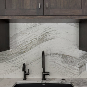
The curved soffit was embraced subtly through the full slab backsplash, which echoes the curve without requiring curved cabinetry or architectural elements that might feel forced
Low ceiling challenges were addressed by using lighter painted cabinets for some tall elements, including the double oven, pantries, and refrigerator area, creating an airy feel while reserving the darker stained walnut for the center section and island
The floor constraint was managed by designing the new layout to cover all previously unfinished areas while maintaining the exact footprint, with only minor touch-ups needed in a few areas
The color palette balances warm walnut stain (harmonizing with the dining room built-ins) with soft, neutral painted cabinets – avoiding stark white that wouldn’t complement the home’s warm aesthetic
Refrigerator placement was optimized with a slim pullout pantry to the left, allowing proper door clearance while maintaining the desired layout flow and enabling the main pantry to be positioned adjacently
The seating was completely reimagined with a built-in banquette facing the windows, allowing diners to enjoy the outdoor views while providing flexible seating for two to four people
Decorative pendant lighting was eliminated in favor of recessed can lights, preserving the unobstructed views to the beautiful outdoor scenery
This kitchen transformation demonstrates how thoughtful design can dramatically improve functionality for a busy family while honoring existing architectural elements. The children immediately began cooking and baking with their mother in the new space, and the window-facing banquette has become a favorite gathering spot where the family can enjoy both meals and the beautiful outdoor views.
Find the right local pro for your project
 Drury Design
The Setup
The homeowners of this Barrington Hills residence approached Drury Design with a clear vision: transform their existing kitchen into a space that would better serve their active family of four. With two young children who are homeschooled and love to bake with their mom, plus two dogs, this kitchen needed to function as the true heart of the home.
The existing kitchen was functional but didn’t maximize the potential of the beautiful natural light and scenic views available through the floor-to-ceiling windows. The space was locked between the dining room and family room, which limited structural modifications, but the homeowners wanted to create a more family-friendly environment that would complement the warm walnut built-ins and furnishings in the adjacent dining room while staying true to the home’s overall aesthetic.
Design Objectives:
Create a highly functional workspace that accommodates multiple family members cooking and gathering simultaneously
Maximize the connection to the beautiful outdoor scenery and natural light through thoughtful design choices
Establish a cohesive color palette that complements the existing walnut elements in the adjacent dining room without becoming too tone-on-tone (aka “matchy matchy”)
Improve the seating arrangement to take advantage of the stunning views (rather than facing away from the windows)
Work within the existing architectural constraints, including a curved soffit that could not be removed
Increase storage capacity while maintaining clean, uncluttered sightlines throughout the space
Design Challenges:
The curved soffit presented a design dilemma of whether to echo the curve throughout the kitchen or work with it in a more subtle way
The relatively low ceiling height required careful consideration to avoid making the space feel cramped or cave-like
The existing hardwood floor could not be refinished, which meant the new kitchen footprint had to match or exceed the original layout exactly
Finding the right balance of warm and neutral tones to complement both the existing walnut elements nearby and the natural outdoor views proved challenging
The refrigerator placement was constrained by door swing requirements, which affected the entire layout and prevented centering the sink on the back wall
Rethinking the original seating, which faced inward toward the kitchen (turning backs to the beautiful windows and outdoor views)
Pendant lighting from the previous kitchen obstructed views to the outdoors despite the abundant natural light available
The Renewed Space
Design Solutions:
The curved soffit was embraced subtly through the full slab backsplash, which echoes the curve without requiring curved cabinetry or architectural elements that might feel forced
Low ceiling challenges were addressed by using lighter painted cabinets for some tall elements, including the double oven, pantries, and refrigerator area, creating an airy feel while reserving the darker stained walnut for the center section and island
The floor constraint was managed by designing the new layout to cover all previously unfinished areas while maintaining the exact footprint, with only minor touch-ups needed in a few areas
The color palette balances warm walnut stain (harmonizing with the dining room built-ins) with soft, neutral painted cabinets – avoiding stark white that wouldn’t complement the home’s warm aesthetic
Refrigerator placement was optimized with a slim pullout pantry to the left, allowing proper door clearance while maintaining the desired layout flow and enabling the main pantry to be positioned adjacently
The seating was completely reimagined with a built-in banquette facing the windows, allowing diners to enjoy the outdoor views while providing flexible seating for two to four people
Decorative pendant lighting was eliminated in favor of recessed can lights, preserving the unobstructed views to the beautiful outdoor scenery
This kitchen transformation demonstrates how thoughtful design can dramatically improve functionality for a busy family while honoring existing architectural elements. The children immediately began cooking and baking with their mother in the new space, and the window-facing banquette has become a favorite gathering spot where the family can enjoy both meals and the beautiful outdoor views.
 Drury Design
The Setup
The homeowners of this Barrington Hills residence approached Drury Design with a clear vision: transform their existing kitchen into a space that would better serve their active family of four. With two young children who are homeschooled and love to bake with their mom, plus two dogs, this kitchen needed to function as the true heart of the home.
The existing kitchen was functional but didn’t maximize the potential of the beautiful natural light and scenic views available through the floor-to-ceiling windows. The space was locked between the dining room and family room, which limited structural modifications, but the homeowners wanted to create a more family-friendly environment that would complement the warm walnut built-ins and furnishings in the adjacent dining room while staying true to the home’s overall aesthetic.
Design Objectives:
Create a highly functional workspace that accommodates multiple family members cooking and gathering simultaneously
Maximize the connection to the beautiful outdoor scenery and natural light through thoughtful design choices
Establish a cohesive color palette that complements the existing walnut elements in the adjacent dining room without becoming too tone-on-tone (aka “matchy matchy”)
Improve the seating arrangement to take advantage of the stunning views (rather than facing away from the windows)
Work within the existing architectural constraints, including a curved soffit that could not be removed
Increase storage capacity while maintaining clean, uncluttered sightlines throughout the space
Design Challenges:
The curved soffit presented a design dilemma of whether to echo the curve throughout the kitchen or work with it in a more subtle way
The relatively low ceiling height required careful consideration to avoid making the space feel cramped or cave-like
The existing hardwood floor could not be refinished, which meant the new kitchen footprint had to match or exceed the original layout exactly
Finding the right balance of warm and neutral tones to complement both the existing walnut elements nearby and the natural outdoor views proved challenging
The refrigerator placement was constrained by door swing requirements, which affected the entire layout and prevented centering the sink on the back wall
Rethinking the original seating, which faced inward toward the kitchen (turning backs to the beautiful windows and outdoor views)
Pendant lighting from the previous kitchen obstructed views to the outdoors despite the abundant natural light available
The Renewed Space
Design Solutions:
The curved soffit was embraced subtly through the full slab backsplash, which echoes the curve without requiring curved cabinetry or architectural elements that might feel forced
Low ceiling challenges were addressed by using lighter painted cabinets for some tall elements, including the double oven, pantries, and refrigerator area, creating an airy feel while reserving the darker stained walnut for the center section and island
The floor constraint was managed by designing the new layout to cover all previously unfinished areas while maintaining the exact footprint, with only minor touch-ups needed in a few areas
The color palette balances warm walnut stain (harmonizing with the dining room built-ins) with soft, neutral painted cabinets – avoiding stark white that wouldn’t complement the home’s warm aesthetic
Refrigerator placement was optimized with a slim pullout pantry to the left, allowing proper door clearance while maintaining the desired layout flow and enabling the main pantry to be positioned adjacently
The seating was completely reimagined with a built-in banquette facing the windows, allowing diners to enjoy the outdoor views while providing flexible seating for two to four people
Decorative pendant lighting was eliminated in favor of recessed can lights, preserving the unobstructed views to the beautiful outdoor scenery
This kitchen transformation demonstrates how thoughtful design can dramatically improve functionality for a busy family while honoring existing architectural elements. The children immediately began cooking and baking with their mother in the new space, and the window-facing banquette has become a favorite gathering spot where the family can enjoy both meals and the beautiful outdoor views.

 Brooks + Scarpa Architects
Description: In early 1994, the architects began work on the project and while in construction (demolition, grading and foundations) the owner, due to circumstances beyond his control, halted all construction of the project. Seven years later the owner returned to the architects and asked them to complete the partially constructed house. Due to code changes, city ordinances and a wide variety of obstacles it was determined that the house was unable to be completed as originally designed.
After much consideration the client asked the architect if it were possible to alter/remodel the partially constructed house, which was a remodel/addition to a 1970’s ranch style house, into a project that fit into current zoning and structural codes. The owner also requested that the house’s footprint and partially constructed foundations remain to avoid the need for further entitlements and delays on an already long overdue and difficult hillside site.
The architects’ main challenge was how to alter the design that reflected an outdated philosophical approach to architecture that was nearly a decade old. How could the house be re-conceived reflecting the architect and client’s maturity on a ten-year-old footprint?
The answer was to remove almost all of the previously proposed existing interior walls and transform the existing footprint into a pavilion-like structure that allows the site to in a sense “pass through the house”. This allowed the client to take better advantage of a limited and restricted building area while capturing extraordinary panoramic views of the San Fernando Valley and Hollywood Hills. Large 22-foot high custom sliding glass doors allow the interior and exterior to become one. Even the studio is separated from the house and connected only by an exterior bridge. Private spaces are treated as loft-like spaces capturing volume and views while maintaining privacy.
Limestone floors extend from inside to outside and into the lap pool that runs the entire length of the house creating a horizon line at the edge of the view. Other natural materials such as board formed concrete, copper, steel and cherry provides softness to the objects that seem to float within the interior volume. By placing objects and materials "outside the frame," a new frame of reference deepens our sense of perception. Art does not reproduce what we see; rather it makes us see.
 Advance Design Studio, Ltd.
Richard and Monica of Huntley, IL, needed to make better use of their kitchen as well as more storage for pots, pans, and countertop appliances. Their space was laid out unconventionally, making cooking a challenge. A triangular nook held their refrigerator, hard-to-reach cabinets, and a cramped pantry. They needed to find a solution, so they searched Facebook for home remodeling companies in their area. Soon they found Advance Design Studio’s profile and were immediately impressed.
“Advance Design was the first and last studio I contacted,” Richard said.
Richard called Advance Design and felt an immediate connection with Project Designer Nicole. She was knowledgeable and thorough and offered many unique solutions to their kitchen layout problem.
A week later, Nicole came out to their home to meet the couple. They talked about their kitchen remodeling project and told Nicole what they wanted in their dream kitchen. Nicole saw that the kitchen had weird angles that hindered the cabinets you could use. She knew that designing a space that met both the client’s needs and dreams would be challenging.
Nicole worked with Richard and Monica to create an innovative design. When the couple came out to Advance Design Studio in Gilberts, they were blown away by the 3D illustrations Nicole showed them.
“I incorporated a hidden pantry cabinet to not only be a cool feature but also allowed me to square off the walls to gain more cabinet space,” Nicole said.
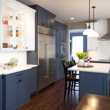
The hidden pantry added storage and squared off the strange triangular nook, creating a more traditional and functional kitchen layout. With the layout problems solved, they worked together to select materials. Richard and Monica wanted something brighter than their previous dark brown kitchen. They chose a combination of blue and white cabinetry with a white subway tile backsplash and white quartz countertops. The design was finalized, the materials were selected. It was time to begin construction.
One fear most homeowners have when beginning a home remodel is dust. Advance Design uses BuildClean HEPA filters to eliminate dust throughout the house while construction is going on. Project Manager Jason and his crew created temporary walls and cleaned up after every day of work.
“We were very impressed with how clean and organized the crew kept things while the remodeling process was underway,” Richard said.
The result is just what Richard and Monica envisioned when they began the process. Richard’s love for cooking can be explored through all-new Thermador appliances, featuring an easy-to-use induction cooktop, built-in double oven, and spacious refrigerator. Matte black hardware contrasts the bright white backsplash, countertops, and cabinets, while the stunning blue cabinets complement the dark hardwood floor and stainless-steel appliances. The dual pendant light fixtures over the reconfigured island are eye-catching and add necessary lighting.
This Huntley kitchen renovation turned out better than Richard and Monica hoped. Their experience with Advance Design’s Common Sense Remodeling process has them thinking about other projects they could do in the future.
Our award-winning design team would love to create a beautiful, functional, and spacious place for you and your family. With our “Common Sense Remodeling” approach, the process of renovating your home has never been easier. Contact us today at 847-665-1711 or schedule an appointment.

 Advance Design Studio, Ltd.
Richard and Monica of Huntley, IL, needed to make better use of their kitchen as well as more storage for pots, pans, and countertop appliances. Their space was laid out unconventionally, making cooking a challenge. A triangular nook held their refrigerator, hard-to-reach cabinets, and a cramped pantry. They needed to find a solution, so they searched Facebook for home remodeling companies in their area. Soon they found Advance Design Studio’s profile and were immediately impressed.
“Advance Design was the first and last studio I contacted,” Richard said.
Richard called Advance Design and felt an immediate connection with Project Designer Nicole. She was knowledgeable and thorough and offered many unique solutions to their kitchen layout problem.
A week later, Nicole came out to their home to meet the couple. They talked about their kitchen remodeling project and told Nicole what they wanted in their dream kitchen. Nicole saw that the kitchen had weird angles that hindered the cabinets you could use. She knew that designing a space that met both the client’s needs and dreams would be challenging.
Nicole worked with Richard and Monica to create an innovative design. When the couple came out to Advance Design Studio in Gilberts, they were blown away by the 3D illustrations Nicole showed them.
“I incorporated a hidden pantry cabinet to not only be a cool feature but also allowed me to square off the walls to gain more cabinet space,” Nicole said.
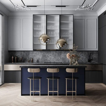
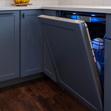
The hidden pantry added storage and squared off the strange triangular nook, creating a more traditional and functional kitchen layout. With the layout problems solved, they worked together to select materials. Richard and Monica wanted something brighter than their previous dark brown kitchen. They chose a combination of blue and white cabinetry with a white subway tile backsplash and white quartz countertops. The design was finalized, the materials were selected. It was time to begin construction.
One fear most homeowners have when beginning a home remodel is dust. Advance Design uses BuildClean HEPA filters to eliminate dust throughout the house while construction is going on. Project Manager Jason and his crew created temporary walls and cleaned up after every day of work.
“We were very impressed with how clean and organized the crew kept things while the remodeling process was underway,” Richard said.
The result is just what Richard and Monica envisioned when they began the process. Richard’s love for cooking can be explored through all-new Thermador appliances, featuring an easy-to-use induction cooktop, built-in double oven, and spacious refrigerator. Matte black hardware contrasts the bright white backsplash, countertops, and cabinets, while the stunning blue cabinets complement the dark hardwood floor and stainless-steel appliances. The dual pendant light fixtures over the reconfigured island are eye-catching and add necessary lighting.
This Huntley kitchen renovation turned out better than Richard and Monica hoped. Their experience with Advance Design’s Common Sense Remodeling process has them thinking about other projects they could do in the future.
Our award-winning design team would love to create a beautiful, functional, and spacious place for you and your family. With our “Common Sense Remodeling” approach, the process of renovating your home has never been easier. Contact us today at 847-665-1711 or schedule an appointment.

 Staging Beautifully
Kim Roberts, owner of Staging Beautifully, has a passion for creating beautiful spaces. From home staging to redecorating, Kim’s relaxed and friendly approach make even the most challenging project fun and enjoyable.
For those interested in refreshing their space, Staging Beautifully can assist a homeowner in decorating their home with the items they already own and love. Like staging, redesign may include color selection, rearranging furniture, hanging art and placing accessories. It is a cost effective design alternative which will give your home a facelift without the cost of an Interior Designer. Utilizing your furnishings and treasures, we will shop your home to find new and creative ways to display your family’s possessions. This will result in a complete interior transformation which will reflect your personality, style, comfort and functionality to your living space without having to buy anything.
Looking to sell your home, consider home staging to target a higher selling price. Home Staging aims to de-personalize your home and make it appealing to virtually all prospective buyers. The way you live in your home and the way you market your home are two very different things. Your home is competing with every other home on the market. A home that looks like it needs work or isn't move-in ready prompts buyers to low-ball their offers, or eliminate your home from consideration all together. Those homes that are staged to reflect current trends attract and appeal to more buyers, resulting in more offers, faster sales, and higher sale prices. Sometimes, an agent may even recommend your price be increased once your home is staged! A well-staged home can even start a bidding war with multiple offers!
 Staging Beautifully
Kim Roberts, owner of Staging Beautifully, has a passion for creating beautiful spaces. From home staging to redecorating, Kim’s relaxed and friendly approach make even the most challenging project fun and enjoyable.
For those interested in refreshing their space, Staging Beautifully can assist a homeowner in decorating their home with the items they already own and love. Like staging, redesign may include color selection, rearranging furniture, hanging art and placing accessories. It is a cost effective design alternative which will give your home a facelift without the cost of an Interior Designer. Utilizing your furnishings and treasures, we will shop your home to find new and creative ways to display your family’s possessions. This will result in a complete interior transformation which will reflect your personality, style, comfort and functionality to your living space without having to buy anything.
Looking to sell your home, consider home staging to target a higher selling price. Home Staging aims to de-personalize your home and make it appealing to virtually all prospective buyers. The way you live in your home and the way you market your home are two very different things. Your home is competing with every other home on the market. A home that looks like it needs work or isn't move-in ready prompts buyers to low-ball their offers, or eliminate your home from consideration all together. Those homes that are staged to reflect current trends attract and appeal to more buyers, resulting in more offers, faster sales, and higher sale prices. Sometimes, an agent may even recommend your price be increased once your home is staged! A well-staged home can even start a bidding war with multiple offers!

 Renovisions
This master bath ‘Renovision’ came with three main requests from the homeowner: more storage, a larger shower and a luxurious look that feels like being at an upscale hotel. The Renovisions team accomplished these wishes and exceeded the clients expectations.
Request number 1: more storage. The existing closet was reconfigured to accommodate better storage for towels and bath supplies making it both functional and attractive. The custom built pull-out hamper was perfect. The long vanity and center tower offers much more cabinet space and drawer storage compared to what they had, especially with the increased vanity height.
Request number 2: A larger shower. Working within the existing footprint we were able to build a shower that is nearly a foot deeper as space was available. Creating a large rectangular cubby provides plenty of space for shampoos and soaps. The frameless sliding glass shower enclosure keeps the space open and airy while allowing the beautiful Carrera-look porcelain wall tiles to be the focus of this master bath.
Request number 3: a luxurious look. Turning their once boring, builder grade bathroom into an upscale hotel-like space was challenging, however, not a problem for the Renovisions team and their creative ways of resolving design snags along the way. Re-locating the doorway to the bathroom was one way to create a more spacious flow in and out of the space. Having the right design to start was half the battle – installing the beautiful products right the first time to ensure a proper fit and finish worthy of the upscale feel is the other half. The delicate tile detail in the shower cubby is the ‘jewelry’ in the room – the soft curves of this 2-tone wave design tile adds a dramatic feel and enlightened mood this client loves.
Overall, the homeowner was happy with every solution-based approach to all requests – their once dated builders bath is now bright, open and airy with a soft grey wall color adding to the soothing feel of this master bath.
 Sosna Inc
Our clients approached us to renovate their loved family home. The Main Floor needed a fresh update, and better functionality and storage to fit the needs of their growing family.
The existing Kitchen felt closed off from the rest of the Main Floor, and the layout did not allow for enough countertop or storage space. Each of their Bathrooms also needed an update and better storage.
Due to a previously bad experience with another contractor previously, it was important for our clients to work with a contractor who they could build trust with, and feel respected by and comfortable with.
Using space from an extra stairway in the side entry of the house, we were able to create a spacious mudroom, perfect for taking a seat to put on or take off coats and boots, and unique, hidden storage for seasonal and outdoor items.
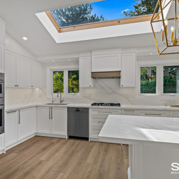
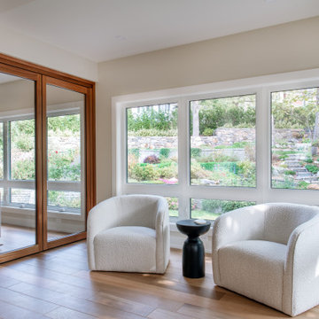
We were able to create a more open concept Main Floor, by removing the walls between the Kitchen and Family Room. This allowed for a larger, more functional Kitchen. The new Kitchen is bright and welcoming with white quartz countertops that run seamlessly into a matching backsplash. Beautiful white cabinetry is complemented by brushed bronze pulls and faucets, and durable, contemporary flooring.
We transformed the Kitchen and Family Room areas with a vaulted ceiling, and a repaired and modernized Kitchen skylight. We also integrated a patio door entrance, which combined with both sloped and flat sections of the vaulted ceiling, proved to be quite a challenge!
This project involved skilled welding, roofing, and structural work, and it was important to maintain the structural integrity of the ceiling. As any mistakes could result in serious issues, communication between everyone involved was key! Regular team meetings, updates on progress, and addressing concerns promptly kept everyone on the same page and avoided misunderstandings. In the end, the raised ceiling, skylight, and patio door were well worth the work, as together they enhanced the airiness and visual spaciousness of the space.
On the Second Floor, we created a larger Master Ensuite by borrowing room from existing closet space. This allowed for a spacious walk-in shower, and separate bathtub. A prefabricated stylish vanity not only adds a pop of colour, but also provides plenty of useful storage. New marble tiling on the floor extends to the wall behind the bathtub, creating a luxurious accent wall.
The Shared Bathroom was updated to include a new walk-in shower, and a separate bathtub, surrounded by modern geometric wall tiles.
The removal of popcorn ceilings, an updated the Front Door, and a refinished Main Staircase with metal railings completed tying the home together, creating a fresh, updated space that this family can enjoy for years to come.
 Lagois Design Build Renovate
After moving into the home in the 80s, the homeowners had not invested much in upgrading their home, rather focusing on their careers and family. Now both retired and their family well established, it was time to invest in themselves and modernize their home into one that aligns with today’s goals as well as the future. A home that adapts with their life, a forever home.
Our clients’ goals included creating a home that was functional, comfortable, and accessible while integrating the indoor/outdoor environments.
Overall, the existing layout functioned well, but each area in the home had specific design goals to allow them to stay living in the home for years to come. Reimagining the arrangements of interior walls and removing sunken rooms accomplished single-level living that was accessible, comfortable, functional and cohesive.
A more spacious and efficient kitchen and ensuite layout, wider interior doors, and expansive windows are just a few of the design elements that were incorporated to accomplish accessible living for aging in place. Expansive windows accomplished integrating the indoor with the outdoors while promoting natural light throughout the interior spaces.
While the existing home was very well built for its time, the insulation, windows, and mechanical systems were due for an upgrade to help create a more comfortable space throughout.
Our goal for this project is to accomplish Ottawa’s first Net-Zero Ready Renovation. In order for Lagois Design-Build-Renovate to accomplish this, we had to take a holistic approach, renovating a home for today while creating a home for the future. Insulation, windows, mechanical systems, and ventilation upgrades are for the most part simple to accomplish. The biggest challenge was creating an air-tight build with the existing envelope.
A Net Zero home is a home that can generate as much energy as it is going to consume, typically meaning little-to-no expenses for utilities for the homeowner. While this is fantastic, the true value is the comfort created in the home.
 Staging Beautifully
Kim Roberts, owner of Staging Beautifully, has a passion for creating beautiful spaces. From home staging to redecorating, Kim’s relaxed and friendly approach make even the most challenging project fun and enjoyable.
For those interested in refreshing their space, Staging Beautifully can assist a homeowner in decorating their home with the items they already own and love. Like staging, redesign may include color selection, rearranging furniture, hanging art and placing accessories. It is a cost effective design alternative which will give your home a facelift without the cost of an Interior Designer. Utilizing your furnishings and treasures, we will shop your home to find new and creative ways to display your family’s possessions. This will result in a complete interior transformation which will reflect your personality, style, comfort and functionality to your living space without having to buy anything.
Looking to sell your home, consider home staging to target a higher selling price. Home Staging aims to de-personalize your home and make it appealing to virtually all prospective buyers. The way you live in your home and the way you market your home are two very different things. Your home is competing with every other home on the market. A home that looks like it needs work or isn't move-in ready prompts buyers to low-ball their offers, or eliminate your home from consideration all together. Those homes that are staged to reflect current trends attract and appeal to more buyers, resulting in more offers, faster sales, and higher sale prices. Sometimes, an agent may even recommend your price be increased once your home is staged! A well-staged home can even start a bidding war with multiple offers!

 Mottram Architecture
Timber frame homes offer unique challenges during a remodel. What often makes them beautiful and attractive to most homeowners, also makes them challenging for space requirements.
Context: The lovely couple that owned this home were struggling with some interesting floor plan challenges that just didn't work for their family. The loved the beautiful timbers and woodwork of their home, but the dramatically sloping ceilings on the second floor, particularly in the bathroom, just didn't work for this 1 1/2 bath home. Needing to use the skylight to approach the toilet was a less then ideal scenario. Although the bathroom footprint was more then adequate, the sloped ceiling only made half of the space useable. Check out the Before/After post on our blog to see the photos of the house pre-renovation. As much as they loved all the wood features in their home, another challenge they had was light. The wood ceiling made everything inside the house darker, even with a fantastic array of south facing windows, there were spaces in the home that felt dark and small. When they contacted us they wanted to know how could they make their brighter and more inviting, were there solutions to the 2nd floor sloped ceiling issues, and if they were going to do all of this work, how could they make their home more comfortable and efficient. A nagging water leak in the upstairs bathroom spurred them into action and here is how we solved their dilemma.
Conclusion: First, we added a little dormer to the rear of the house so we could get full headroom in nearly all of the upstairs bathroom! Then we decided to extend that dormer one more timber bay over to create a walk in closet with natural light and plenty of space. Since we were contemplating energy efficiency, we resolved a nagging issue that is present in a lot of timber frame construction, air tightness. Commonly found in timber frame construction, fiberglass insulation is installed in the rafter bays and board ceilings are installed over top. Unfortunately, board ceilings are anything but air tight, and fiberglass insulation needs to be in an airtight cavity for maximum effectiveness. So we were able to solve two issues at the same time for this homeowner. We removed the board ceiling and fiberglass insulation, we dense packed the rafter bays with cellulose insulation, and installed sheetrock in place of the boards. The boards were salvaged for re-use by the homeowner, and the space and light quality was dramatically improved. Some may think that losing the board ceiling took something away from the space, but what you'll see in the pictures is that it highly accentuates the heavy timbers and really makes them stand out in a beautiful way. Now with this added airtightness, better insulation, and brighter space, the homeowner hardly runs their wood stove, and it's so quiet in the space, an added bonus from changing the insulation. It became necessary to also add a sheetrock ceiling to the living room to hide the plumbing from the new bathroom layout above. Changing this ceiling gave the homeowner some real quality lighting that was lacking in the living room before. The brighter ceiling and new lighting layout completely transforms the living room into a space you want to hang out, even though the layout didn't change at all. When the homeowner saw the finished spaces she said "I can't believe this is my house, I want to live in this house"
Energy Efficiency: I touched a little on the efficiency above, but like all projects done with Mottram Architecture, we always want to leave you with a little extra. Timber frame construction with board ceilings and fiberglass insulation are notoriously leaky! If you want to know what we think about fiberglass insulation, check our our blog post on Why Fiberglass Insulation Sucks. By installing cellulose insulation and covering it with sheetrock we were able to greatly reduce the heat flowing out of this home. It not only improves cashflow it improves the comfort level in the space. Who wants to sit in their living room and feel a draft? Let us remind you, we are not saying cellulose insulation is an air barrier, we use the sheetrock to help with that, but it does significantly reduce the air flow over fiberglass insulation. And when we reduce the airflow, we reduce the heat flow. And when we reduce the heat flow, we reduce the need to re-heat that drafty air from outside. When it comes to energy efficiency the first and best place to start is air infiltration. We greatly reduced the air infiltration with the new insulation, but we also added a hat and warm boots. What I mean by that is, we improved the insulation in the roof, and we installed insulation in the basement. Maybe it's a silly analogy, but when you think about keeping warm, we always start with the hat and boots! With sustainability in mind, the next project will be to add a deck to the front of this house with rain catchment barrels from the metal roof. They are planning to plant a garden in the spring and the rain catchment system will help to irrigate the new garden.
Builder: East Shore Builders
Photographer: Michael Eric Berube
 Staging Beautifully
Kim Roberts, owner of Staging Beautifully, has a passion for creating beautiful spaces. From home staging to redecorating, Kim’s relaxed and friendly approach make even the most challenging project fun and enjoyable.
For those interested in refreshing their space, Staging Beautifully can assist a homeowner in decorating their home with the items they already own and love. Like staging, redesign may include color selection, rearranging furniture, hanging art and placing accessories. It is a cost effective design alternative which will give your home a facelift without the cost of an Interior Designer. Utilizing your furnishings and treasures, we will shop your home to find new and creative ways to display your family’s possessions. This will result in a complete interior transformation which will reflect your personality, style, comfort and functionality to your living space without having to buy anything.
Looking to sell your home, consider home staging to target a higher selling price. Home Staging aims to de-personalize your home and make it appealing to virtually all prospective buyers. The way you live in your home and the way you market your home are two very different things. Your home is competing with every other home on the market. A home that looks like it needs work or isn't move-in ready prompts buyers to low-ball their offers, or eliminate your home from consideration all together. Those homes that are staged to reflect current trends attract and appeal to more buyers, resulting in more offers, faster sales, and higher sale prices. Sometimes, an agent may even recommend your price be increased once your home is staged! A well-staged home can even start a bidding war with multiple offers!
 Staging Beautifully
Kim Roberts, owner of Staging Beautifully, has a passion for creating beautiful spaces. From home staging to redecorating, Kim’s relaxed and friendly approach make even the most challenging project fun and enjoyable.
For those interested in refreshing their space, Staging Beautifully can assist a homeowner in decorating their home with the items they already own and love. Like staging, redesign may include color selection, rearranging furniture, hanging art and placing accessories. It is a cost effective design alternative which will give your home a facelift without the cost of an Interior Designer. Utilizing your furnishings and treasures, we will shop your home to find new and creative ways to display your family’s possessions. This will result in a complete interior transformation which will reflect your personality, style, comfort and functionality to your living space without having to buy anything.
Looking to sell your home, consider home staging to target a higher selling price. Home Staging aims to de-personalize your home and make it appealing to virtually all prospective buyers. The way you live in your home and the way you market your home are two very different things. Your home is competing with every other home on the market. A home that looks like it needs work or isn't move-in ready prompts buyers to low-ball their offers, or eliminate your home from consideration all together. Those homes that are staged to reflect current trends attract and appeal to more buyers, resulting in more offers, faster sales, and higher sale prices. Sometimes, an agent may even recommend your price be increased once your home is staged! A well-staged home can even start a bidding war with multiple offers!
 Staging Beautifully
Kim Roberts, owner of Staging Beautifully, has a passion for creating beautiful spaces. From home staging to redecorating, Kim’s relaxed and friendly approach make even the most challenging project fun and enjoyable.
For those interested in refreshing their space, Staging Beautifully can assist a homeowner in decorating their home with the items they already own and love. Like staging, redesign may include color selection, rearranging furniture, hanging art and placing accessories. It is a cost effective design alternative which will give your home a facelift without the cost of an Interior Designer. Utilizing your furnishings and treasures, we will shop your home to find new and creative ways to display your family’s possessions. This will result in a complete interior transformation which will reflect your personality, style, comfort and functionality to your living space without having to buy anything.
Looking to sell your home, consider home staging to target a higher selling price. Home Staging aims to de-personalize your home and make it appealing to virtually all prospective buyers. The way you live in your home and the way you market your home are two very different things. Your home is competing with every other home on the market. A home that looks like it needs work or isn't move-in ready prompts buyers to low-ball their offers, or eliminate your home from consideration all together. Those homes that are staged to reflect current trends attract and appeal to more buyers, resulting in more offers, faster sales, and higher sale prices. Sometimes, an agent may even recommend your price be increased once your home is staged! A well-staged home can even start a bidding war with multiple offers!
 Staging Beautifully
Kim Roberts, owner of Staging Beautifully, has a passion for creating beautiful spaces. From home staging to redecorating, Kim’s relaxed and friendly approach make even the most challenging project fun and enjoyable.
For those interested in refreshing their space, Staging Beautifully can assist a homeowner in decorating their home with the items they already own and love. Like staging, redesign may include color selection, rearranging furniture, hanging art and placing accessories. It is a cost effective design alternative which will give your home a facelift without the cost of an Interior Designer. Utilizing your furnishings and treasures, we will shop your home to find new and creative ways to display your family’s possessions. This will result in a complete interior transformation which will reflect your personality, style, comfort and functionality to your living space without having to buy anything.
Looking to sell your home, consider home staging to target a higher selling price. Home Staging aims to de-personalize your home and make it appealing to virtually all prospective buyers. The way you live in your home and the way you market your home are two very different things. Your home is competing with every other home on the market. A home that looks like it needs work or isn't move-in ready prompts buyers to low-ball their offers, or eliminate your home from consideration all together. Those homes that are staged to reflect current trends attract and appeal to more buyers, resulting in more offers, faster sales, and higher sale prices. Sometimes, an agent may even recommend your price be increased once your home is staged! A well-staged home can even start a bidding war with multiple offers!
 Sosna Inc
Our clients approached us to renovate their loved family home. The Main Floor needed a fresh update, and better functionality and storage to fit the needs of their growing family.
The existing Kitchen felt closed off from the rest of the Main Floor, and the layout did not allow for enough countertop or storage space. Each of their Bathrooms also needed an update and better storage.
Due to a previously bad experience with another contractor previously, it was important for our clients to work with a contractor who they could build trust with, and feel respected by and comfortable with.
Using space from an extra stairway in the side entry of the house, we were able to create a spacious mudroom, perfect for taking a seat to put on or take off coats and boots, and unique, hidden storage for seasonal and outdoor items.
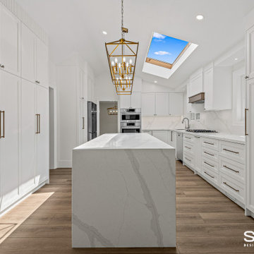
We were able to create a more open concept Main Floor, by removing the walls between the Kitchen and Family Room. This allowed for a larger, more functional Kitchen. The new Kitchen is bright and welcoming with white quartz countertops that run seamlessly into a matching backsplash. Beautiful white cabinetry is complemented by brushed bronze pulls and faucets, and durable, contemporary flooring.
We transformed the Kitchen and Family Room areas with a vaulted ceiling, and a repaired and modernized Kitchen skylight. We also integrated a patio door entrance, which combined with both sloped and flat sections of the vaulted ceiling, proved to be quite a challenge!
This project involved skilled welding, roofing, and structural work, and it was important to maintain the structural integrity of the ceiling. As any mistakes could result in serious issues, communication between everyone involved was key! Regular team meetings, updates on progress, and addressing concerns promptly kept everyone on the same page and avoided misunderstandings. In the end, the raised ceiling, skylight, and patio door were well worth the work, as together they enhanced the airiness and visual spaciousness of the space.
On the Second Floor, we created a larger Master Ensuite by borrowing room from existing closet space. This allowed for a spacious walk-in shower, and separate bathtub. A prefabricated stylish vanity not only adds a pop of colour, but also provides plenty of useful storage. New marble tiling on the floor extends to the wall behind the bathtub, creating a luxurious accent wall.
The Shared Bathroom was updated to include a new walk-in shower, and a separate bathtub, surrounded by modern geometric wall tiles.
The removal of popcorn ceilings, an updated the Front Door, and a refinished Main Staircase with metal railings completed tying the home together, creating a fresh, updated space that this family can enjoy for years to come.
73