
Search results for "Approach challenges" in Home Design Ideas
 Kimberlee Marie Interiors
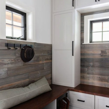
When our clients approached us about this project, they had a large vacant lot and a set of architectural plans in hand, and they needed our help to envision the interior of their dream home. As a busy family with young kids, they relied on KMI to help identify a design style that suited both of them and served their family's needs and lifestyle. One of the biggest challenges of the project was finding ways to blend their varying aesthetic desires, striking just the right balance between bright and cheery and rustic and moody. We also helped develop the exterior color scheme and material selections to ensure the interior and exterior of the home were cohesive and spoke to each other. With this project being a new build, there was not a square inch of the interior that KMI didn't touch.
In our material selections throughout the home, we sought to draw on the surrounding nature as an inspiration. The home is situated on a large lot with many large pine trees towering above. The goal was to bring some natural elements inside and make the house feel like it fits in its rustic setting. It was also a goal to create a home that felt inviting, warm, and durable enough to withstand all the life a busy family would throw at it. Slate tile floors, quartz countertops made to look like cement, rustic wood accent walls, and ceramic tiles in earthy tones are a few of the ways this was achieved.
There are so many things to love about this home, but we're especially proud of the way it all came together. The mix of materials, like iron, stone, and wood, helps give the home character and depth and adds warmth to some high-contrast black and white designs throughout the home. Anytime we do something truly unique and custom for a client, we also get a bit giddy, and the light fixture above the dining room table is a perfect example of that. A labor of love and the collaboration of design ideas between our client and us produced the one-of-a-kind fixture that perfectly fits this home. Bringing our client's dreams and visions to life is what we love most about being designers, and this project allowed us to do just that.
 Beroli Construction, LLC
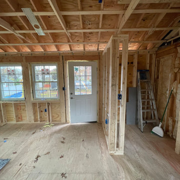
We had the pleasure of working with the Vigliotti family to create a beautiful new 4-season room addition.
This project began with the careful demolition of existing structures to make way for a space designed to be enjoyed year-round. From the outset, we focused on maintaining transparency and open communication, ensuring the Vigliottis were involved and informed at every step. Despite the challenges posed by large rocks and ledges in the ground, our team expertly navigated the terrain to ensure a solid foundation, remaining committed to delivering a space that not only met but exceeded their expectations.
Key features of this addition include:
• Energy Efficiency: High-efficiency windows and spray foam insulation were installed throughout to maximize energy savings.
• Mudroom: A practical and welcoming mudroom area was created, perfect for managing the transition from outdoors to indoors.
• Composite Deck: The new composite deck, complete with all required flashing and solid PVC skirts, promises durability and low maintenance for years to come.
• Modern Lighting: We installed all-new electrical systems, featuring recessed LED ceiling lights that provide a sleek and modern touch.
• Exposed Beams & Cathedral Ceiling: The room’s exposed finished beams and cathedral ceiling add a sense of grandeur and spaciousness, making the space feel open and airy.
• Integrated HVAC: The addition was seamlessly connected to the existing central air system, ensuring consistent comfort throughout the home.
• Patio Finish: A beautifully finished patio area was added to complement the inviting backyard, creating a perfect space for the family to enjoy outdoor gatherings.
The Vigliottis were highly engaged throughout the project, and their kind words about our honesty, trustworthiness, and customer-focused approach mean the world to us.
In their review, they mentioned that they’ve worked with several contractors over the years, but Beroli stands out as the best. We are incredibly proud to have earned such high praise and to have delivered a home addition that the Vigliotti family can enjoy for years to come.
 Kimberlee Marie Interiors
When our clients approached us about this project, they had a large vacant lot and a set of architectural plans in hand, and they needed our help to envision the interior of their dream home. As a busy family with young kids, they relied on KMI to help identify a design style that suited both of them and served their family's needs and lifestyle. One of the biggest challenges of the project was finding ways to blend their varying aesthetic desires, striking just the right balance between bright and cheery and rustic and moody. We also helped develop the exterior color scheme and material selections to ensure the interior and exterior of the home were cohesive and spoke to each other. With this project being a new build, there was not a square inch of the interior that KMI didn't touch.
In our material selections throughout the home, we sought to draw on the surrounding nature as an inspiration. The home is situated on a large lot with many large pine trees towering above. The goal was to bring some natural elements inside and make the house feel like it fits in its rustic setting. It was also a goal to create a home that felt inviting, warm, and durable enough to withstand all the life a busy family would throw at it. Slate tile floors, quartz countertops made to look like cement, rustic wood accent walls, and ceramic tiles in earthy tones are a few of the ways this was achieved.
There are so many things to love about this home, but we're especially proud of the way it all came together. The mix of materials, like iron, stone, and wood, helps give the home character and depth and adds warmth to some high-contrast black and white designs throughout the home. Anytime we do something truly unique and custom for a client, we also get a bit giddy, and the light fixture above the dining room table is a perfect example of that. A labor of love and the collaboration of design ideas between our client and us produced the one-of-a-kind fixture that perfectly fits this home. Bringing our client's dreams and visions to life is what we love most about being designers, and this project allowed us to do just that.
Find the right local pro for your project

 AV Architects + Builders
Location: Tysons, VA, USA
The Home for Life project was customized around our client’s lifestyle so that he could enjoy the home for many years to come. Designed with empty nesters and baby boomers in mind, our custom design used a different approach to the disparity of square footage on each floor.
The main level measures out at 2,300 square feet while the lower and upper levels of the home measure out at 1000 square feet each, respectively. The open floor plan of the main level features a master suite and master bath, personal office, kitchen and dining areas, and a two-car garage that opens to a mudroom and laundry room. The upper level features two generously sized en-suite bedrooms while the lower level features an extra guest room with a full bath and an exercise/rec room. The backyard offers 800 square feet of travertine patio with an elegant outdoor kitchen, while the front entry has a covered 300 square foot porch with custom landscape lighting.
The biggest challenge of the project was dealing with the size of the lot, measuring only a ¼ acre. Because the majority of square footage was dedicated to the main floor, we had to make sure that the main rooms had plenty of natural lighting. Our solution was to place the public spaces (Great room and outdoor patio) facing south, and the more private spaces (Bedrooms) facing north.
The common misconception with small homes is that they cannot factor in everything the homeowner wants. With our custom design, we created an open concept space that features all the amenities of a luxury lifestyle in a home measuring a total of 4300 square feet.
Jim Tetro Architectural Photography

 Renovisions
Perectly balanced, this dramatic black and white bathroom is a stunner. Thoughtful design was top of mind for these clients as they approached the Renovisions team to help narrow down their choices and bring it to life. Finding balance while mixing darker, heavier black finishes and lighter, white finishes was the task at hand and the goal was to create a modern look with an industrial/rustic feel.
The challenge on this project was incorporating all the desired elements and products in a tight spatial constraint of 9’ x 7.5’. The clients biggest concern in the old bathroom was inadequate storage, tired and under-utilized bathtub and they also needed an additional sink for their two daughters who often share this space. Renovisions recommended removing the wall between the shower and closet to gain additional floor space as you enter the bath, while providing wall space for the three towel bars.
Collaborating with the clients and searching to find the right fixtures paid off nicely. This newly remodeled Renovision accommodated two rectangular sinks, a walk-in shower with hand-held shower, wall-mounted shower head and two soft spray body jets. The oil-rubbed bronze fixtures not only provided a luxurious spa experience, but also added warmth and softness to the vintage feel. The glass shower enclosure is trimmed in a matte black grid that boasts an industrial aesthetic with retro feel while delivering modernistic function. It’s unique in appearance while allowing the chic white subway and black and white diamond tile to peek through.
The beautifully designed cabinetry in a matte black painted finish provides plenty of storage. This smart configuration included two banks of three drawers for toiletries and accessories, two towers with adjustable shelves for towels and two ‘garage’ doors for hair dryers.
Another unique design detail to capture attention was the black and white curvy geometric floor tile which plays off the straight lines of the cabinets and square grids of the shower enclosure.
The clients are thrilled with the results and their modern, high-contrast styled digs – a true customized relaxation sanctuary for the entire family.
 Renovisions
Perectly balanced, this dramatic black and white bathroom is a stunner. Thoughtful design was top of mind for these clients as they approached the Renovisions team to help narrow down their choices and bring it to life. Finding balance while mixing darker, heavier black finishes and lighter, white finishes was the task at hand and the goal was to create a modern look with an industrial/rustic feel.
The challenge on this project was incorporating all the desired elements and products in a tight spatial constraint of 9’ x 7.5’. The clients biggest concern in the old bathroom was inadequate storage, tired and under-utilized bathtub and they also needed an additional sink for their two daughters who often share this space. Renovisions recommended removing the wall between the shower and closet to gain additional floor space as you enter the bath, while providing wall space for the three towel bars.
Collaborating with the clients and searching to find the right fixtures paid off nicely. This newly remodeled Renovision accommodated two rectangular sinks, a walk-in shower with hand-held shower, wall-mounted shower head and two soft spray body jets. The oil-rubbed bronze fixtures not only provided a luxurious spa experience, but also added warmth and softness to the vintage feel. The glass shower enclosure is trimmed in a matte black grid that boasts an industrial aesthetic with retro feel while delivering modernistic function. It’s unique in appearance while allowing the chic white subway and black and white diamond tile to peek through.
The beautifully designed cabinetry in a matte black painted finish provides plenty of storage. This smart configuration included two banks of three drawers for toiletries and accessories, two towers with adjustable shelves for towels and two ‘garage’ doors for hair dryers.
Another unique design detail to capture attention was the black and white curvy geometric floor tile which plays off the straight lines of the cabinets and square grids of the shower enclosure.
The clients are thrilled with the results and their modern, high-contrast styled digs – a true customized relaxation sanctuary for the entire family.
 Renovisions
Perectly balanced, this dramatic black and white bathroom is a stunner. Thoughtful design was top of mind for these clients as they approached the Renovisions team to help narrow down their choices and bring it to life. Finding balance while mixing darker, heavier black finishes and lighter, white finishes was the task at hand and the goal was to create a modern look with an industrial/rustic feel.
The challenge on this project was incorporating all the desired elements and products in a tight spatial constraint of 9’ x 7.5’. The clients biggest concern in the old bathroom was inadequate storage, tired and under-utilized bathtub and they also needed an additional sink for their two daughters who often share this space. Renovisions recommended removing the wall between the shower and closet to gain additional floor space as you enter the bath, while providing wall space for the three towel bars.
Collaborating with the clients and searching to find the right fixtures paid off nicely. This newly remodeled Renovision accommodated two rectangular sinks, a walk-in shower with hand-held shower, wall-mounted shower head and two soft spray body jets. The oil-rubbed bronze fixtures not only provided a luxurious spa experience, but also added warmth and softness to the vintage feel. The glass shower enclosure is trimmed in a matte black grid that boasts an industrial aesthetic with retro feel while delivering modernistic function. It’s unique in appearance while allowing the chic white subway and black and white diamond tile to peek through.
The beautifully designed cabinetry in a matte black painted finish provides plenty of storage. This smart configuration included two banks of three drawers for toiletries and accessories, two towers with adjustable shelves for towels and two ‘garage’ doors for hair dryers.
Another unique design detail to capture attention was the black and white curvy geometric floor tile which plays off the straight lines of the cabinets and square grids of the shower enclosure.
The clients are thrilled with the results and their modern, high-contrast styled digs – a true customized relaxation sanctuary for the entire family.

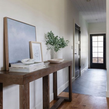 Kimberlee Marie Interiors
When our clients approached us about this project, they had a large vacant lot and a set of architectural plans in hand, and they needed our help to envision the interior of their dream home. As a busy family with young kids, they relied on KMI to help identify a design style that suited both of them and served their family's needs and lifestyle. One of the biggest challenges of the project was finding ways to blend their varying aesthetic desires, striking just the right balance between bright and cheery and rustic and moody. We also helped develop the exterior color scheme and material selections to ensure the interior and exterior of the home were cohesive and spoke to each other. With this project being a new build, there was not a square inch of the interior that KMI didn't touch.
In our material selections throughout the home, we sought to draw on the surrounding nature as an inspiration. The home is situated on a large lot with many large pine trees towering above. The goal was to bring some natural elements inside and make the house feel like it fits in its rustic setting. It was also a goal to create a home that felt inviting, warm, and durable enough to withstand all the life a busy family would throw at it. Slate tile floors, quartz countertops made to look like cement, rustic wood accent walls, and ceramic tiles in earthy tones are a few of the ways this was achieved.
There are so many things to love about this home, but we're especially proud of the way it all came together. The mix of materials, like iron, stone, and wood, helps give the home character and depth and adds warmth to some high-contrast black and white designs throughout the home. Anytime we do something truly unique and custom for a client, we also get a bit giddy, and the light fixture above the dining room table is a perfect example of that. A labor of love and the collaboration of design ideas between our client and us produced the one-of-a-kind fixture that perfectly fits this home. Bringing our client's dreams and visions to life is what we love most about being designers, and this project allowed us to do just that.

 Mottram Architecture
Timber frame homes offer unique challenges during a remodel. What often makes them beautiful and attractive to most homeowners, also makes them challenging for space requirements.
Context: The lovely couple that owned this home were struggling with some interesting floor plan challenges that just didn't work for their family. The loved the beautiful timbers and woodwork of their home, but the dramatically sloping ceilings on the second floor, particularly in the bathroom, just didn't work for this 1 1/2 bath home. Needing to use the skylight to approach the toilet was a less then ideal scenario. Although the bathroom footprint was more then adequate, the sloped ceiling only made half of the space useable. Check out the Before/After post on our blog to see the photos of the house pre-renovation. As much as they loved all the wood features in their home, another challenge they had was light. The wood ceiling made everything inside the house darker, even with a fantastic array of south facing windows, there were spaces in the home that felt dark and small. When they contacted us they wanted to know how could they make their brighter and more inviting, were there solutions to the 2nd floor sloped ceiling issues, and if they were going to do all of this work, how could they make their home more comfortable and efficient. A nagging water leak in the upstairs bathroom spurred them into action and here is how we solved their dilemma.
Conclusion: First, we added a little dormer to the rear of the house so we could get full headroom in nearly all of the upstairs bathroom! Then we decided to extend that dormer one more timber bay over to create a walk in closet with natural light and plenty of space. Since we were contemplating energy efficiency, we resolved a nagging issue that is present in a lot of timber frame construction, air tightness. Commonly found in timber frame construction, fiberglass insulation is installed in the rafter bays and board ceilings are installed over top. Unfortunately, board ceilings are anything but air tight, and fiberglass insulation needs to be in an airtight cavity for maximum effectiveness. So we were able to solve two issues at the same time for this homeowner. We removed the board ceiling and fiberglass insulation, we dense packed the rafter bays with cellulose insulation, and installed sheetrock in place of the boards. The boards were salvaged for re-use by the homeowner, and the space and light quality was dramatically improved. Some may think that losing the board ceiling took something away from the space, but what you'll see in the pictures is that it highly accentuates the heavy timbers and really makes them stand out in a beautiful way. Now with this added airtightness, better insulation, and brighter space, the homeowner hardly runs their wood stove, and it's so quiet in the space, an added bonus from changing the insulation. It became necessary to also add a sheetrock ceiling to the living room to hide the plumbing from the new bathroom layout above. Changing this ceiling gave the homeowner some real quality lighting that was lacking in the living room before. The brighter ceiling and new lighting layout completely transforms the living room into a space you want to hang out, even though the layout didn't change at all. When the homeowner saw the finished spaces she said "I can't believe this is my house, I want to live in this house"
Energy Efficiency: I touched a little on the efficiency above, but like all projects done with Mottram Architecture, we always want to leave you with a little extra. Timber frame construction with board ceilings and fiberglass insulation are notoriously leaky! If you want to know what we think about fiberglass insulation, check our our blog post on Why Fiberglass Insulation Sucks. By installing cellulose insulation and covering it with sheetrock we were able to greatly reduce the heat flowing out of this home. It not only improves cashflow it improves the comfort level in the space. Who wants to sit in their living room and feel a draft? Let us remind you, we are not saying cellulose insulation is an air barrier, we use the sheetrock to help with that, but it does significantly reduce the air flow over fiberglass insulation. And when we reduce the airflow, we reduce the heat flow. And when we reduce the heat flow, we reduce the need to re-heat that drafty air from outside. When it comes to energy efficiency the first and best place to start is air infiltration. We greatly reduced the air infiltration with the new insulation, but we also added a hat and warm boots. What I mean by that is, we improved the insulation in the roof, and we installed insulation in the basement. Maybe it's a silly analogy, but when you think about keeping warm, we always start with the hat and boots! With sustainability in mind, the next project will be to add a deck to the front of this house with rain catchment barrels from the metal roof. They are planning to plant a garden in the spring and the rain catchment system will help to irrigate the new garden.
Builder: East Shore Builders
Photographer: Michael Eric Berube
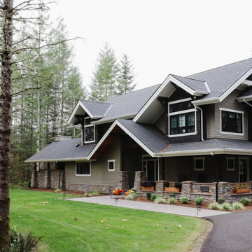 Kimberlee Marie Interiors
When our clients approached us about this project, they had a large vacant lot and a set of architectural plans in hand, and they needed our help to envision the interior of their dream home. As a busy family with young kids, they relied on KMI to help identify a design style that suited both of them and served their family's needs and lifestyle. One of the biggest challenges of the project was finding ways to blend their varying aesthetic desires, striking just the right balance between bright and cheery and rustic and moody. We also helped develop the exterior color scheme and material selections to ensure the interior and exterior of the home were cohesive and spoke to each other. With this project being a new build, there was not a square inch of the interior that KMI didn't touch.
In our material selections throughout the home, we sought to draw on the surrounding nature as an inspiration. The home is situated on a large lot with many large pine trees towering above. The goal was to bring some natural elements inside and make the house feel like it fits in its rustic setting. It was also a goal to create a home that felt inviting, warm, and durable enough to withstand all the life a busy family would throw at it. Slate tile floors, quartz countertops made to look like cement, rustic wood accent walls, and ceramic tiles in earthy tones are a few of the ways this was achieved.
There are so many things to love about this home, but we're especially proud of the way it all came together. The mix of materials, like iron, stone, and wood, helps give the home character and depth and adds warmth to some high-contrast black and white designs throughout the home. Anytime we do something truly unique and custom for a client, we also get a bit giddy, and the light fixture above the dining room table is a perfect example of that. A labor of love and the collaboration of design ideas between our client and us produced the one-of-a-kind fixture that perfectly fits this home. Bringing our client's dreams and visions to life is what we love most about being designers, and this project allowed us to do just that.
 Advance Design Studio, Ltd.
Richard and Monica of Huntley, IL, needed to make better use of their kitchen as well as more storage for pots, pans, and countertop appliances. Their space was laid out unconventionally, making cooking a challenge. A triangular nook held their refrigerator, hard-to-reach cabinets, and a cramped pantry. They needed to find a solution, so they searched Facebook for home remodeling companies in their area. Soon they found Advance Design Studio’s profile and were immediately impressed.
“Advance Design was the first and last studio I contacted,” Richard said.
Richard called Advance Design and felt an immediate connection with Project Designer Nicole. She was knowledgeable and thorough and offered many unique solutions to their kitchen layout problem.
A week later, Nicole came out to their home to meet the couple. They talked about their kitchen remodeling project and told Nicole what they wanted in their dream kitchen. Nicole saw that the kitchen had weird angles that hindered the cabinets you could use. She knew that designing a space that met both the client’s needs and dreams would be challenging.
Nicole worked with Richard and Monica to create an innovative design. When the couple came out to Advance Design Studio in Gilberts, they were blown away by the 3D illustrations Nicole showed them.
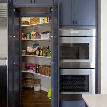
“I incorporated a hidden pantry cabinet to not only be a cool feature but also allowed me to square off the walls to gain more cabinet space,” Nicole said.
The hidden pantry added storage and squared off the strange triangular nook, creating a more traditional and functional kitchen layout. With the layout problems solved, they worked together to select materials. Richard and Monica wanted something brighter than their previous dark brown kitchen. They chose a combination of blue and white cabinetry with a white subway tile backsplash and white quartz countertops. The design was finalized, the materials were selected. It was time to begin construction.
One fear most homeowners have when beginning a home remodel is dust. Advance Design uses BuildClean HEPA filters to eliminate dust throughout the house while construction is going on. Project Manager Jason and his crew created temporary walls and cleaned up after every day of work.
“We were very impressed with how clean and organized the crew kept things while the remodeling process was underway,” Richard said.
The result is just what Richard and Monica envisioned when they began the process. Richard’s love for cooking can be explored through all-new Thermador appliances, featuring an easy-to-use induction cooktop, built-in double oven, and spacious refrigerator. Matte black hardware contrasts the bright white backsplash, countertops, and cabinets, while the stunning blue cabinets complement the dark hardwood floor and stainless-steel appliances. The dual pendant light fixtures over the reconfigured island are eye-catching and add necessary lighting.
This Huntley kitchen renovation turned out better than Richard and Monica hoped. Their experience with Advance Design’s Common Sense Remodeling process has them thinking about other projects they could do in the future.
Our award-winning design team would love to create a beautiful, functional, and spacious place for you and your family. With our “Common Sense Remodeling” approach, the process of renovating your home has never been easier. Contact us today at 847-665-1711 or schedule an appointment.
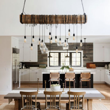 Kimberlee Marie Interiors
When our clients approached us about this project, they had a large vacant lot and a set of architectural plans in hand, and they needed our help to envision the interior of their dream home. As a busy family with young kids, they relied on KMI to help identify a design style that suited both of them and served their family's needs and lifestyle. One of the biggest challenges of the project was finding ways to blend their varying aesthetic desires, striking just the right balance between bright and cheery and rustic and moody. We also helped develop the exterior color scheme and material selections to ensure the interior and exterior of the home were cohesive and spoke to each other. With this project being a new build, there was not a square inch of the interior that KMI didn't touch.
In our material selections throughout the home, we sought to draw on the surrounding nature as an inspiration. The home is situated on a large lot with many large pine trees towering above. The goal was to bring some natural elements inside and make the house feel like it fits in its rustic setting. It was also a goal to create a home that felt inviting, warm, and durable enough to withstand all the life a busy family would throw at it. Slate tile floors, quartz countertops made to look like cement, rustic wood accent walls, and ceramic tiles in earthy tones are a few of the ways this was achieved.
There are so many things to love about this home, but we're especially proud of the way it all came together. The mix of materials, like iron, stone, and wood, helps give the home character and depth and adds warmth to some high-contrast black and white designs throughout the home. Anytime we do something truly unique and custom for a client, we also get a bit giddy, and the light fixture above the dining room table is a perfect example of that. A labor of love and the collaboration of design ideas between our client and us produced the one-of-a-kind fixture that perfectly fits this home. Bringing our client's dreams and visions to life is what we love most about being designers, and this project allowed us to do just that.
 Renovisions
Perectly balanced, this dramatic black and white bathroom is a stunner. Thoughtful design was top of mind for these clients as they approached the Renovisions team to help narrow down their choices and bring it to life. Finding balance while mixing darker, heavier black finishes and lighter, white finishes was the task at hand and the goal was to create a modern look with an industrial/rustic feel.
The challenge on this project was incorporating all the desired elements and products in a tight spatial constraint of 9’ x 7.5’. The clients biggest concern in the old bathroom was inadequate storage, tired and under-utilized bathtub and they also needed an additional sink for their two daughters who often share this space. Renovisions recommended removing the wall between the shower and closet to gain additional floor space as you enter the bath, while providing wall space for the three towel bars.
Collaborating with the clients and searching to find the right fixtures paid off nicely. This newly remodeled Renovision accommodated two rectangular sinks, a walk-in shower with hand-held shower, wall-mounted shower head and two soft spray body jets. The oil-rubbed bronze fixtures not only provided a luxurious spa experience, but also added warmth and softness to the vintage feel. The glass shower enclosure is trimmed in a matte black grid that boasts an industrial aesthetic with retro feel while delivering modernistic function. It’s unique in appearance while allowing the chic white subway and black and white diamond tile to peek through.
The beautifully designed cabinetry in a matte black painted finish provides plenty of storage. This smart configuration included two banks of three drawers for toiletries and accessories, two towers with adjustable shelves for towels and two ‘garage’ doors for hair dryers.
Another unique design detail to capture attention was the black and white curvy geometric floor tile which plays off the straight lines of the cabinets and square grids of the shower enclosure.
The clients are thrilled with the results and their modern, high-contrast styled digs – a true customized relaxation sanctuary for the entire family.
 Renovisions
Perectly balanced, this dramatic black and white bathroom is a stunner. Thoughtful design was top of mind for these clients as they approached the Renovisions team to help narrow down their choices and bring it to life. Finding balance while mixing darker, heavier black finishes and lighter, white finishes was the task at hand and the goal was to create a modern look with an industrial/rustic feel.
The challenge on this project was incorporating all the desired elements and products in a tight spatial constraint of 9’ x 7.5’. The clients biggest concern in the old bathroom was inadequate storage, tired and under-utilized bathtub and they also needed an additional sink for their two daughters who often share this space. Renovisions recommended removing the wall between the shower and closet to gain additional floor space as you enter the bath, while providing wall space for the three towel bars.
Collaborating with the clients and searching to find the right fixtures paid off nicely. This newly remodeled Renovision accommodated two rectangular sinks, a walk-in shower with hand-held shower, wall-mounted shower head and two soft spray body jets. The oil-rubbed bronze fixtures not only provided a luxurious spa experience, but also added warmth and softness to the vintage feel. The glass shower enclosure is trimmed in a matte black grid that boasts an industrial aesthetic with retro feel while delivering modernistic function. It’s unique in appearance while allowing the chic white subway and black and white diamond tile to peek through.
The beautifully designed cabinetry in a matte black painted finish provides plenty of storage. This smart configuration included two banks of three drawers for toiletries and accessories, two towers with adjustable shelves for towels and two ‘garage’ doors for hair dryers.
Another unique design detail to capture attention was the black and white curvy geometric floor tile which plays off the straight lines of the cabinets and square grids of the shower enclosure.
The clients are thrilled with the results and their modern, high-contrast styled digs – a true customized relaxation sanctuary for the entire family.
 Luxury Antonovich Design AE
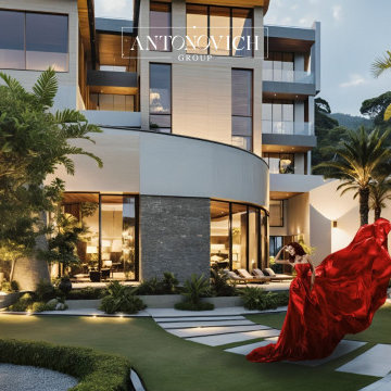
Contemporary luxury villa design has reached new heights of sophistication, and Antonovich Group stands at the forefront of this architectural evolution. Their modern approach to villa exterior and landscape design creates harmonious living environments that seamlessly blend indoor comfort with outdoor elegance, establishing new benchmarks for luxury residential architecture.
Architectural Excellence Through Modern Design
Antonovich Group's modern villa exteriors showcase a masterful understanding of contemporary aesthetics while maintaining timeless appeal. Their designs feature bold, clean lines and expansive glazing that create striking visual statements against carefully curated landscapes. Each project demonstrates how modern architecture can enhance rather than compete with its natural surroundings.
The key to their success lies in the thoughtful balance between dramatic architectural elements and refined details. Expansive terraces, geometric pools, and sculptural outdoor features create outdoor rooms that feel as luxurious and well-appointed as any interior space, establishing a new standard for modern luxury living.
Innovative Exterior Cladding Solutions
The sophistication of Antonovich Group's villa designs is particularly evident in their exterior cladding solutions, which combine premium materials with cutting-edge installation techniques. Their material palette includes natural stone, contemporary metals, and high-performance composites that not only create stunning visual impact but also ensure long-term durability in challenging climates.
These exterior cladding solutions go beyond mere aesthetics, incorporating thermal performance, weather resistance, and maintenance considerations into every selection. The result is facades that maintain their beauty while providing superior protection and energy efficiency. From sleek metal panels that create dramatic shadow play to warm natural stone that grounds the structure in its environment, each material choice serves both form and function.
Garden Landscape Design: Creating Outdoor Sanctuaries
The garden landscape design component of Antonovich Group's projects transforms outdoor spaces into sophisticated extensions of the villa's interior. Their approach to landscaping embraces both the architectural language of the building and the natural characteristics of the site, creating gardens that feel both designed and organic.
Strategic plantings create privacy screens and focal points while maintaining sight lines to key architectural features. Water elements, from reflecting pools to dynamic fountains, add movement and sound that enhance the sensory experience of the outdoor spaces. The garden landscape design incorporates both formal and naturalistic elements, creating varied experiences throughout the property while maintaining visual cohesion.
Sustainable Modern Luxury
Modern luxury doesn't mean abandoning environmental responsibility. Antonovich Group's designs incorporate sustainable practices throughout their exterior and landscape elements, from water-efficient irrigation systems to locally sourced materials that reduce environmental impact while supporting regional craftspeople and suppliers.
Their plant selections prioritize native and adaptive species that thrive with minimal intervention, while hardscape materials are chosen for longevity and low maintenance requirements. This approach ensures that these stunning properties remain beautiful and functional for decades while minimizing their environmental footprint.
The Complete Modern Lifestyle
What distinguishes Antonovich Group's work is their understanding that modern luxury villa design must address the complete lifestyle of their clients. Their exteriors and landscapes aren't just beautiful backdrops—they're functional spaces designed for entertaining, relaxation, and daily living.
From outdoor kitchens that rival their indoor counterparts to wellness areas that promote health and relaxation, every element is designed to enhance the quality of life for residents. The integration of technology, sustainable systems, and artistic elements creates properties that are as smart as they are beautiful, representing the pinnacle of modern luxury villa design.
 Renovisions
Perectly balanced, this dramatic black and white bathroom is a stunner. Thoughtful design was top of mind for these clients as they approached the Renovisions team to help narrow down their choices and bring it to life. Finding balance while mixing darker, heavier black finishes and lighter, white finishes was the task at hand and the goal was to create a modern look with an industrial/rustic feel.
The challenge on this project was incorporating all the desired elements and products in a tight spatial constraint of 9’ x 7.5’. The clients biggest concern in the old bathroom was inadequate storage, tired and under-utilized bathtub and they also needed an additional sink for their two daughters who often share this space. Renovisions recommended removing the wall between the shower and closet to gain additional floor space as you enter the bath, while providing wall space for the three towel bars.
Collaborating with the clients and searching to find the right fixtures paid off nicely. This newly remodeled Renovision accommodated two rectangular sinks, a walk-in shower with hand-held shower, wall-mounted shower head and two soft spray body jets. The oil-rubbed bronze fixtures not only provided a luxurious spa experience, but also added warmth and softness to the vintage feel. The glass shower enclosure is trimmed in a matte black grid that boasts an industrial aesthetic with retro feel while delivering modernistic function. It’s unique in appearance while allowing the chic white subway and black and white diamond tile to peek through.
The beautifully designed cabinetry in a matte black painted finish provides plenty of storage. This smart configuration included two banks of three drawers for toiletries and accessories, two towers with adjustable shelves for towels and two ‘garage’ doors for hair dryers.
Another unique design detail to capture attention was the black and white curvy geometric floor tile which plays off the straight lines of the cabinets and square grids of the shower enclosure.
The clients are thrilled with the results and their modern, high-contrast styled digs – a true customized relaxation sanctuary for the entire family.
 Renovisions
Perectly balanced, this dramatic black and white bathroom is a stunner. Thoughtful design was top of mind for these clients as they approached the Renovisions team to help narrow down their choices and bring it to life. Finding balance while mixing darker, heavier black finishes and lighter, white finishes was the task at hand and the goal was to create a modern look with an industrial/rustic feel.
The challenge on this project was incorporating all the desired elements and products in a tight spatial constraint of 9’ x 7.5’. The clients biggest concern in the old bathroom was inadequate storage, tired and under-utilized bathtub and they also needed an additional sink for their two daughters who often share this space. Renovisions recommended removing the wall between the shower and closet to gain additional floor space as you enter the bath, while providing wall space for the three towel bars.
Collaborating with the clients and searching to find the right fixtures paid off nicely. This newly remodeled Renovision accommodated two rectangular sinks, a walk-in shower with hand-held shower, wall-mounted shower head and two soft spray body jets. The oil-rubbed bronze fixtures not only provided a luxurious spa experience, but also added warmth and softness to the vintage feel. The glass shower enclosure is trimmed in a matte black grid that boasts an industrial aesthetic with retro feel while delivering modernistic function. It’s unique in appearance while allowing the chic white subway and black and white diamond tile to peek through.
The beautifully designed cabinetry in a matte black painted finish provides plenty of storage. This smart configuration included two banks of three drawers for toiletries and accessories, two towers with adjustable shelves for towels and two ‘garage’ doors for hair dryers.
Another unique design detail to capture attention was the black and white curvy geometric floor tile which plays off the straight lines of the cabinets and square grids of the shower enclosure.
The clients are thrilled with the results and their modern, high-contrast styled digs – a true customized relaxation sanctuary for the entire family.
 TKS Design Group
Download our free ebook, Creating the Ideal Kitchen. DOWNLOAD NOW
For many, extra time at home during COVID left them wanting more from their homes. Whether you realized the shortcomings of your space or simply wanted to combat boredom, a well-designed and functional home was no longer a want, it became a need. Tina found herself wanting more from her Old Irving Park home and reached out to The Kitchen Studio about adding function to her kitchen to make the most of the available real estate.
At the end of the day, there is nothing better than returning home to a bright and happy space you love. And this kitchen wasn’t that for Tina. Dark and dated, with a palette from the past and features that didn’t make the most of the available square footage, this remodel required vision and a fresh approach to the space. Lead designer, Stephanie Cole’s main design goal was better flow, while adding greater functionality with organized storage, accessible open shelving, and an overall sense of cohesion with the adjoining family room.
The original kitchen featured a large pizza oven, which was rarely used, yet its footprint limited storage space. The nearby pantry had become a catch-all, lacking the organization needed in the home. The initial plan was to keep the pizza oven, but eventually Tina realized she preferred the design possibilities that came from removing this cumbersome feature, with the goal of adding function throughout the upgraded and elevated space. Eliminating the pantry added square footage and length to the kitchen for greater function and more storage. This redesigned space reflects how she lives and uses her home, as well as her love for entertaining.
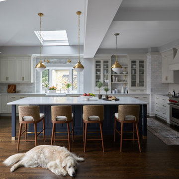
The kitchen features a classic, clean, and timeless palette. White cabinetry, with brass and bronze finishes, contrasts with rich wood flooring, and lets the large, deep blue island in Woodland’s custom color Harbor – a neutral, yet statement color – draw your eye.
The kitchen was the main priority. In addition to updating and elevating this space, Tina wanted to maximize what her home had to offer. From moving the location of the patio door and eliminating a window to removing an existing closet in the mudroom and the cluttered pantry, the kitchen footprint grew. Once the floorplan was set, it was time to bring cohesion to her home, creating connection between the kitchen and surrounding spaces.
The color palette carries into the mudroom, where we added beautiful new cabinetry, practical bench seating, and accessible hooks, perfect for guests and everyday living. The nearby bar continues the aesthetic, with stunning Carrara marble subway tile, hints of brass and bronze, and a design that further captures the vibe of the kitchen.
Every home has its unique design challenges. But with a fresh perspective and a bit of creativity, there is always a way to give the client exactly what they want [and need]. In this particular kitchen, the existing soffits and high slanted ceilings added a layer of complexity to the lighting layout and upper perimeter cabinets.
While a space needs to look good, it also needs to function well. This meant making the most of the height of the room and accounting for the varied ceiling features, while also giving Tina everything she wanted and more. Pendants and task lighting paired with an abundance of natural light amplify the bright aesthetic. The cabinetry layout and design compliments the soffits with subtle profile details that bring everything together. The tile selections add visual interest, drawing the eye to the focal area above the range. Glass-doored cabinets further customize the space and give the illusion of even more height within the room.
While her family may be grown and out of the house, Tina was focused on adding function without sacrificing a stunning aesthetic and dreamy finishes that make the kitchen the gathering place of any home. It was time to love her kitchen again, and if you’re wondering what she loves most, it’s the niche with glass door cabinetry and open shelving for display paired with the marble mosaic backsplash over the range and complimenting hood. Each of these features is a stunning point of interest within the kitchen – both brag-worthy additions to a perimeter layout that previously felt limited and lacking.
Whether your remodel is the result of special needs in your home or simply the excitement of focusing your energy on creating a fun new aesthetic, we are here for it. We love a good challenge because there is always a way to make a space better – adding function and beauty simultaneously.
 Renovisions
This master bath ‘Renovision’ came with three main requests from the homeowner: more storage, a larger shower and a luxurious look that feels like being at an upscale hotel. The Renovisions team accomplished these wishes and exceeded the clients expectations.
Request number 1: more storage. The existing closet was reconfigured to accommodate better storage for towels and bath supplies making it both functional and attractive. The custom built pull-out hamper was perfect. The long vanity and center tower offers much more cabinet space and drawer storage compared to what they had, especially with the increased vanity height.
Request number 2: A larger shower. Working within the existing footprint we were able to build a shower that is nearly a foot deeper as space was available. Creating a large rectangular cubby provides plenty of space for shampoos and soaps. The frameless sliding glass shower enclosure keeps the space open and airy while allowing the beautiful Carrera-look porcelain wall tiles to be the focus of this master bath.
Request number 3: a luxurious look. Turning their once boring, builder grade bathroom into an upscale hotel-like space was challenging, however, not a problem for the Renovisions team and their creative ways of resolving design snags along the way. Re-locating the doorway to the bathroom was one way to create a more spacious flow in and out of the space. Having the right design to start was half the battle – installing the beautiful products right the first time to ensure a proper fit and finish worthy of the upscale feel is the other half. The delicate tile detail in the shower cubby is the ‘jewelry’ in the room – the soft curves of this 2-tone wave design tile adds a dramatic feel and enlightened mood this client loves.
Overall, the homeowner was happy with every solution-based approach to all requests – their once dated builders bath is now bright, open and airy with a soft grey wall color adding to the soothing feel of this master bath.
 Kimberlee Marie Interiors
When our clients approached us about this project, they had a large vacant lot and a set of architectural plans in hand, and they needed our help to envision the interior of their dream home. As a busy family with young kids, they relied on KMI to help identify a design style that suited both of them and served their family's needs and lifestyle. One of the biggest challenges of the project was finding ways to blend their varying aesthetic desires, striking just the right balance between bright and cheery and rustic and moody. We also helped develop the exterior color scheme and material selections to ensure the interior and exterior of the home were cohesive and spoke to each other. With this project being a new build, there was not a square inch of the interior that KMI didn't touch.
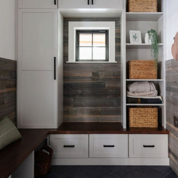
In our material selections throughout the home, we sought to draw on the surrounding nature as an inspiration. The home is situated on a large lot with many large pine trees towering above. The goal was to bring some natural elements inside and make the house feel like it fits in its rustic setting. It was also a goal to create a home that felt inviting, warm, and durable enough to withstand all the life a busy family would throw at it. Slate tile floors, quartz countertops made to look like cement, rustic wood accent walls, and ceramic tiles in earthy tones are a few of the ways this was achieved.
There are so many things to love about this home, but we're especially proud of the way it all came together. The mix of materials, like iron, stone, and wood, helps give the home character and depth and adds warmth to some high-contrast black and white designs throughout the home. Anytime we do something truly unique and custom for a client, we also get a bit giddy, and the light fixture above the dining room table is a perfect example of that. A labor of love and the collaboration of design ideas between our client and us produced the one-of-a-kind fixture that perfectly fits this home. Bringing our client's dreams and visions to life is what we love most about being designers, and this project allowed us to do just that.
69