
Search results for "Approach challenges" in Home Design Ideas

 Renovisions
This master bath ‘Renovision’ came with three main requests from the homeowner: more storage, a larger shower and a luxurious look that feels like being at an upscale hotel. The Renovisions team accomplished these wishes and exceeded the clients expectations.
Request number 1: more storage. The existing closet was reconfigured to accommodate better storage for towels and bath supplies making it both functional and attractive. The custom built pull-out hamper was perfect. The long vanity and center tower offers much more cabinet space and drawer storage compared to what they had, especially with the increased vanity height.
Request number 2: A larger shower. Working within the existing footprint we were able to build a shower that is nearly a foot deeper as space was available. Creating a large rectangular cubby provides plenty of space for shampoos and soaps. The frameless sliding glass shower enclosure keeps the space open and airy while allowing the beautiful Carrera-look porcelain wall tiles to be the focus of this master bath.
Request number 3: a luxurious look. Turning their once boring, builder grade bathroom into an upscale hotel-like space was challenging, however, not a problem for the Renovisions team and their creative ways of resolving design snags along the way. Re-locating the doorway to the bathroom was one way to create a more spacious flow in and out of the space. Having the right design to start was half the battle – installing the beautiful products right the first time to ensure a proper fit and finish worthy of the upscale feel is the other half. The delicate tile detail in the shower cubby is the ‘jewelry’ in the room – the soft curves of this 2-tone wave design tile adds a dramatic feel and enlightened mood this client loves.
Overall, the homeowner was happy with every solution-based approach to all requests – their once dated builders bath is now bright, open and airy with a soft grey wall color adding to the soothing feel of this master bath.
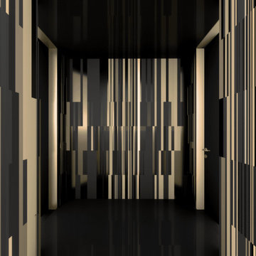
 KURV Architecture DPC (Alex Hughes Architects)
Located in the heart of Manhattan’s Lower East Side, the building was erected on a shallow commercial lot between two 120 year old masonry buildings and a new residential rental building. 330 Grand Street is a mix of 725 SF 1BRs and 1050 SF 2BR apartments. It also contains a 1100 SF two story duplex as well as private and public rooftop space, large private balconies for most units and two large private terraces for the ground floor units.
330 Grand Street was originally designed and approved at the NYC DOB as a prefabricated modular building. During the pandemic, as shipping costs skyrocketed putting the project at risk, we suggested redesigning the building as a reinforced cast-in-place concrete structure. Concrete was readily available and prices had not been affected by the demand increase that many other materials suffered in the pandemic. We took this opportunity to raise floor to ceiling heights, enlarge high performance windows and redistribute the buildings MEPFS and Structural Systems to create very open floor plans.
The challenge was to create a luxurious sensorial living experience with very limited means. In a city with very high construction costs, low cost residential buildings in the area are usually devoid of good quality, design and character. Our approach was to aim high for the end user, prioritizing natural light, open space with long visual perspectives, high ceilings and as always, rejecting the use of predefined building templates.
Our biggest challenge was to ensure that the small spaces feel as clean cut, large and bright as possible. Several unique design decisions were made to ensure low cost and high quality;
Floor plans were laid out so that spaces were wide open and free of clutter from mechanical or structural interruptions. Therefore all infrastructure was placed in lateral demising walls, which in turn act as the unit’s storage and kitchen. The apartments feel wide open, are super quiet and have more storage space than any other comparable apartment in the city.
To solve the problem of the site’s shallow commercial lot which is typically prone to dark interior spaces we focused our attention on the building’s envelope. Instead of the usual small punched window openings, oversized high performance windows were designed to ensure that light penetrated as far as possible into the units. In the smaller 1BR units, the full 50’ depth of the lot is perceived by partitioning spaces with sliding pocket doors that can be retracted to allow deep visual perspectives, making the sight lines in the space feel longer, larger, more ample than normal. In addition to the full height glazing, each unit above the 2nd floor receives a 7 foot covered balcony, adding 120 to 240 sf to each apartment, something unusual in New York City buildings. The space is large enough for a full size dining table, when the weather permits being outside.
We also worked hard to ensure modularity. For example, all kitchen units are all identical throughout the building. The idea of modularity and the economy of the repetitive unit is exercised to the maximum through the building.
Hardware, appliances, flooring, wall coverings and material finishes are all carefully selected to feel bespoke, high quality and unique.
It was important to KURV that the result of this work manifest into something that would deeply connect with the end user and sustain relationships with the consumers of this space.
All images by KURV Architecture ©

 Staging Beautifully
Kim Roberts, owner of Staging Beautifully, has a passion for creating beautiful spaces. From home staging to redecorating, Kim’s relaxed and friendly approach make even the most challenging project fun and enjoyable.
For those interested in refreshing their space, Staging Beautifully can assist a homeowner in decorating their home with the items they already own and love. Like staging, redesign may include color selection, rearranging furniture, hanging art and placing accessories. It is a cost effective design alternative which will give your home a facelift without the cost of an Interior Designer. Utilizing your furnishings and treasures, we will shop your home to find new and creative ways to display your family’s possessions. This will result in a complete interior transformation which will reflect your personality, style, comfort and functionality to your living space without having to buy anything.
Looking to sell your home, consider home staging to target a higher selling price. Home Staging aims to de-personalize your home and make it appealing to virtually all prospective buyers. The way you live in your home and the way you market your home are two very different things. Your home is competing with every other home on the market. A home that looks like it needs work or isn't move-in ready prompts buyers to low-ball their offers, or eliminate your home from consideration all together. Those homes that are staged to reflect current trends attract and appeal to more buyers, resulting in more offers, faster sales, and higher sale prices. Sometimes, an agent may even recommend your price be increased once your home is staged! A well-staged home can even start a bidding war with multiple offers!
Find the right local pro for your project

 Regenesis Ecological Design
Clematis armandii 'Evergreen Clematis' (foreground) arches over a custom-built cedar arbor, modeled to accentuate the home's Craftsman-style architecture. Welded mild-steel panel fills create a scaffold for Akebia quinata 'Five-leaf Akebia Vine' (background), lending seasonal privacy and afternoon shade along this narrow sideyard access walkway.
 Drury Design
THE SETUP
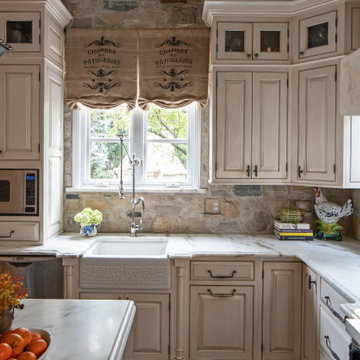
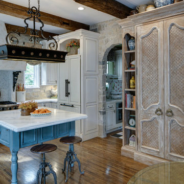
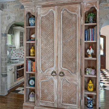
Imagine how thrilled Diana was when she was approached about designing a kitchen for a client who is an avid traveler and Francophile. ‘French-country’ is a very specific category of traditional design that combines French provincial elegance with rustic comforts. The look draws on soothing hues, antique accents and a wonderful fusion of polished and relic’d finishes.
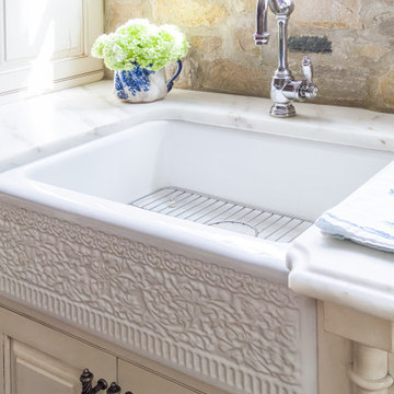
Her client wanted to feel like she was in the south of France every time she walked into her kitchen. She wanted real honed marble counters, vintage finishes and authentic heavy stone walls like you’d find in a 400-year old château in Les Baux-de-Provence.
Diana’s mission: capture the client’s vision, design it and utilize Drury Design’s sourcing and building expertise to bring it to life.
Design Objectives:
Create the feel of an authentic vintage French-country kitchen
Include natural materials that would have been used in an old French château
Add a second oven
Omit an unused desk area in favor of a large, tall pantry armoire
THE REMODEL
Design Challenges:
Finding real stone for the walls, and the craftsmen to install it
Accommodate for the thickness of the stones
Replicating château beam architecture
Replicating authentic French-country finishes
Find a spot for a new steam oven
Design Solutions:
Source and sort true stone. Utilize veteran craftsmen to apply to the walls using old-world techniques
Furr out interior window casings to adjust for the thicker stone walls
Source true reclaimed beams
Utilize veteran craftsmen for authentic finishes and distressing for the island, tall pantry armoire and stucco hood
Modify the butler’s pantry base cabinet to accommodate the new steam oven
THE RENEWED SPACE
Before we started work on her new French-country kitchen, the homeowner told us the kitchen that came with the house was “not my kitchen.”
“I felt like a stranger,” she told us during the photoshoot. “It wasn’t my color, it wasn’t my texture. It wasn’t my style… I didn’t have my stamp on it.”
And now?
“I love the fact that my family can come in here, wrap their arms around it and feel comfortable,” she said. “It’s like a big hug.”
 Drury Design
THE SETUP
Imagine how thrilled Diana was when she was approached about designing a kitchen for a client who is an avid traveler and Francophile. ‘French-country’ is a very specific category of traditional design that combines French provincial elegance with rustic comforts. The look draws on soothing hues, antique accents and a wonderful fusion of polished and relic’d finishes.
Her client wanted to feel like she was in the south of France every time she walked into her kitchen. She wanted real honed marble counters, vintage finishes and authentic heavy stone walls like you’d find in a 400-year old château in Les Baux-de-Provence.
Diana’s mission: capture the client’s vision, design it and utilize Drury Design’s sourcing and building expertise to bring it to life.
Design Objectives:
Create the feel of an authentic vintage French-country kitchen
Include natural materials that would have been used in an old French château
Add a second oven
Omit an unused desk area in favor of a large, tall pantry armoire
THE REMODEL
Design Challenges:
Finding real stone for the walls, and the craftsmen to install it
Accommodate for the thickness of the stones
Replicating château beam architecture
Replicating authentic French-country finishes
Find a spot for a new steam oven
Design Solutions:
Source and sort true stone. Utilize veteran craftsmen to apply to the walls using old-world techniques
Furr out interior window casings to adjust for the thicker stone walls
Source true reclaimed beams
Utilize veteran craftsmen for authentic finishes and distressing for the island, tall pantry armoire and stucco hood
Modify the butler’s pantry base cabinet to accommodate the new steam oven
THE RENEWED SPACE
Before we started work on her new French-country kitchen, the homeowner told us the kitchen that came with the house was “not my kitchen.”
“I felt like a stranger,” she told us during the photoshoot. “It wasn’t my color, it wasn’t my texture. It wasn’t my style… I didn’t have my stamp on it.”
And now?
“I love the fact that my family can come in here, wrap their arms around it and feel comfortable,” she said. “It’s like a big hug.”

 Brooks + Scarpa Architects
Description: In early 1994, the architects began work on the project and while in construction (demolition, grading and foundations) the owner, due to circumstances beyond his control, halted all construction of the project. Seven years later the owner returned to the architects and asked them to complete the partially constructed house. Due to code changes, city ordinances and a wide variety of obstacles it was determined that the house was unable to be completed as originally designed.
After much consideration the client asked the architect if it were possible to alter/remodel the partially constructed house, which was a remodel/addition to a 1970’s ranch style house, into a project that fit into current zoning and structural codes. The owner also requested that the house’s footprint and partially constructed foundations remain to avoid the need for further entitlements and delays on an already long overdue and difficult hillside site.
The architects’ main challenge was how to alter the design that reflected an outdated philosophical approach to architecture that was nearly a decade old. How could the house be re-conceived reflecting the architect and client’s maturity on a ten-year-old footprint?
The answer was to remove almost all of the previously proposed existing interior walls and transform the existing footprint into a pavilion-like structure that allows the site to in a sense “pass through the house”. This allowed the client to take better advantage of a limited and restricted building area while capturing extraordinary panoramic views of the San Fernando Valley and Hollywood Hills. Large 22-foot high custom sliding glass doors allow the interior and exterior to become one. Even the studio is separated from the house and connected only by an exterior bridge. Private spaces are treated as loft-like spaces capturing volume and views while maintaining privacy.
Limestone floors extend from inside to outside and into the lap pool that runs the entire length of the house creating a horizon line at the edge of the view. Other natural materials such as board formed concrete, copper, steel and cherry provides softness to the objects that seem to float within the interior volume. By placing objects and materials "outside the frame," a new frame of reference deepens our sense of perception. Art does not reproduce what we see; rather it makes us see.

 Renovisions
This master bath ‘Renovision’ came with three main requests from the homeowner: more storage, a larger shower and a luxurious look that feels like being at an upscale hotel. The Renovisions team accomplished these wishes and exceeded the clients expectations.
Request number 1: more storage. The existing closet was reconfigured to accommodate better storage for towels and bath supplies making it both functional and attractive. The custom built pull-out hamper was perfect. The long vanity and center tower offers much more cabinet space and drawer storage compared to what they had, especially with the increased vanity height.
Request number 2: A larger shower. Working within the existing footprint we were able to build a shower that is nearly a foot deeper as space was available. Creating a large rectangular cubby provides plenty of space for shampoos and soaps. The frameless sliding glass shower enclosure keeps the space open and airy while allowing the beautiful Carrera-look porcelain wall tiles to be the focus of this master bath.
Request number 3: a luxurious look. Turning their once boring, builder grade bathroom into an upscale hotel-like space was challenging, however, not a problem for the Renovisions team and their creative ways of resolving design snags along the way. Re-locating the doorway to the bathroom was one way to create a more spacious flow in and out of the space. Having the right design to start was half the battle – installing the beautiful products right the first time to ensure a proper fit and finish worthy of the upscale feel is the other half. The delicate tile detail in the shower cubby is the ‘jewelry’ in the room – the soft curves of this 2-tone wave design tile adds a dramatic feel and enlightened mood this client loves.
Overall, the homeowner was happy with every solution-based approach to all requests – their once dated builders bath is now bright, open and airy with a soft grey wall color adding to the soothing feel of this master bath.
 Brooks + Scarpa Architects
Description: In early 1994, the architects began work on the project and while in construction (demolition, grading and foundations) the owner, due to circumstances beyond his control, halted all construction of the project. Seven years later the owner returned to the architects and asked them to complete the partially constructed house. Due to code changes, city ordinances and a wide variety of obstacles it was determined that the house was unable to be completed as originally designed.
After much consideration the client asked the architect if it were possible to alter/remodel the partially constructed house, which was a remodel/addition to a 1970’s ranch style house, into a project that fit into current zoning and structural codes. The owner also requested that the house’s footprint and partially constructed foundations remain to avoid the need for further entitlements and delays on an already long overdue and difficult hillside site.
The architects’ main challenge was how to alter the design that reflected an outdated philosophical approach to architecture that was nearly a decade old. How could the house be re-conceived reflecting the architect and client’s maturity on a ten-year-old footprint?
The answer was to remove almost all of the previously proposed existing interior walls and transform the existing footprint into a pavilion-like structure that allows the site to in a sense “pass through the house”. This allowed the client to take better advantage of a limited and restricted building area while capturing extraordinary panoramic views of the San Fernando Valley and Hollywood Hills. Large 22-foot high custom sliding glass doors allow the interior and exterior to become one. Even the studio is separated from the house and connected only by an exterior bridge. Private spaces are treated as loft-like spaces capturing volume and views while maintaining privacy.
Limestone floors extend from inside to outside and into the lap pool that runs the entire length of the house creating a horizon line at the edge of the view. Other natural materials such as board formed concrete, copper, steel and cherry provides softness to the objects that seem to float within the interior volume. By placing objects and materials "outside the frame," a new frame of reference deepens our sense of perception. Art does not reproduce what we see; rather it makes us see.
 Advance Design Studio, Ltd.
Richard and Monica of Huntley, IL, needed to make better use of their kitchen as well as more storage for pots, pans, and countertop appliances. Their space was laid out unconventionally, making cooking a challenge. A triangular nook held their refrigerator, hard-to-reach cabinets, and a cramped pantry. They needed to find a solution, so they searched Facebook for home remodeling companies in their area. Soon they found Advance Design Studio’s profile and were immediately impressed.
“Advance Design was the first and last studio I contacted,” Richard said.
Richard called Advance Design and felt an immediate connection with Project Designer Nicole. She was knowledgeable and thorough and offered many unique solutions to their kitchen layout problem.
A week later, Nicole came out to their home to meet the couple. They talked about their kitchen remodeling project and told Nicole what they wanted in their dream kitchen. Nicole saw that the kitchen had weird angles that hindered the cabinets you could use. She knew that designing a space that met both the client’s needs and dreams would be challenging.
Nicole worked with Richard and Monica to create an innovative design. When the couple came out to Advance Design Studio in Gilberts, they were blown away by the 3D illustrations Nicole showed them.
“I incorporated a hidden pantry cabinet to not only be a cool feature but also allowed me to square off the walls to gain more cabinet space,” Nicole said.
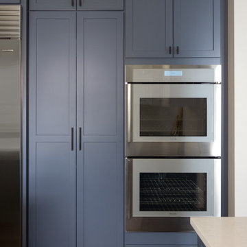
The hidden pantry added storage and squared off the strange triangular nook, creating a more traditional and functional kitchen layout. With the layout problems solved, they worked together to select materials. Richard and Monica wanted something brighter than their previous dark brown kitchen. They chose a combination of blue and white cabinetry with a white subway tile backsplash and white quartz countertops. The design was finalized, the materials were selected. It was time to begin construction.
One fear most homeowners have when beginning a home remodel is dust. Advance Design uses BuildClean HEPA filters to eliminate dust throughout the house while construction is going on. Project Manager Jason and his crew created temporary walls and cleaned up after every day of work.
“We were very impressed with how clean and organized the crew kept things while the remodeling process was underway,” Richard said.
The result is just what Richard and Monica envisioned when they began the process. Richard’s love for cooking can be explored through all-new Thermador appliances, featuring an easy-to-use induction cooktop, built-in double oven, and spacious refrigerator. Matte black hardware contrasts the bright white backsplash, countertops, and cabinets, while the stunning blue cabinets complement the dark hardwood floor and stainless-steel appliances. The dual pendant light fixtures over the reconfigured island are eye-catching and add necessary lighting.
This Huntley kitchen renovation turned out better than Richard and Monica hoped. Their experience with Advance Design’s Common Sense Remodeling process has them thinking about other projects they could do in the future.
Our award-winning design team would love to create a beautiful, functional, and spacious place for you and your family. With our “Common Sense Remodeling” approach, the process of renovating your home has never been easier. Contact us today at 847-665-1711 or schedule an appointment.
 TKS Design Group
Download our free ebook, Creating the Ideal Kitchen. DOWNLOAD NOW
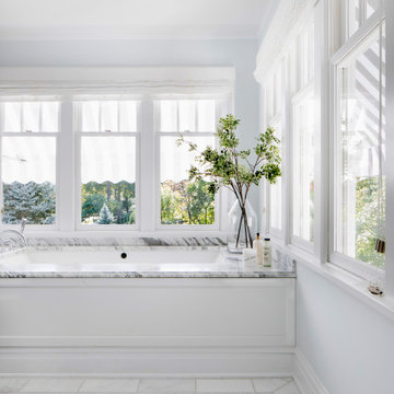
Bathrooms come in all shapes and sizes and each project has its unique challenges. This master bath remodel was no different. The room had been remodeled about 20 years ago as part of a large addition and consists of three separate zones – 1) tub zone, 2) vanity/storage zone and 3) shower and water closet zone. The room layout and zones had to remain the same, but the goal was to make each area more functional. In addition, having comfortable access to the tub and seating in the tub area was also high on the list, as the tub serves as an important part of the daily routine for the homeowners and their special needs son.
We started out in the tub room and determined that an undermount tub and flush deck would be much more functional and comfortable for entering and exiting the tub than the existing drop in tub with its protruding lip. A redundant radiator was eliminated from this room allowing room for a large comfortable chair that can be used as part of the daily bathing routine.
In the vanity and storage zone, the existing vanities size neither optimized the space nor provided much real storage. A few tweaks netted a much better storage solution that now includes cabinets, drawers, pull outs and a large custom built-in hutch that houses towels and other bathroom necessities. A framed custom mirror opens the space and bounces light around the room from the large existing bank of windows.
We transformed the shower and water closet room into a large walk in shower with a trench drain, making for both ease of access and a seamless look. Next, we added a niche for shampoo storage to the back wall, and updated shower fixtures to give the space new life.
The star of the bathroom is the custom marble mosaic floor tile. All the other materials take a simpler approach giving permission to the beautiful circular pattern of the mosaic to shine. White shaker cabinetry is topped with elegant Calacatta marble countertops, which also lines the shower walls. Polished nickel fixtures and sophisticated crystal lighting are simple yet sophisticated, allowing the beauty of the materials shines through.
Designed by: Susan Klimala, CKD, CBD
For more information on kitchen and bath design ideas go to: www.kitchenstudio-ge.com
 Renovisions
This master bath ‘Renovision’ came with three main requests from the homeowner: more storage, a larger shower and a luxurious look that feels like being at an upscale hotel. The Renovisions team accomplished these wishes and exceeded the clients expectations.
Request number 1: more storage. The existing closet was reconfigured to accommodate better storage for towels and bath supplies making it both functional and attractive. The custom built pull-out hamper was perfect. The long vanity and center tower offers much more cabinet space and drawer storage compared to what they had, especially with the increased vanity height.
Request number 2: A larger shower. Working within the existing footprint we were able to build a shower that is nearly a foot deeper as space was available. Creating a large rectangular cubby provides plenty of space for shampoos and soaps. The frameless sliding glass shower enclosure keeps the space open and airy while allowing the beautiful Carrera-look porcelain wall tiles to be the focus of this master bath.
Request number 3: a luxurious look. Turning their once boring, builder grade bathroom into an upscale hotel-like space was challenging, however, not a problem for the Renovisions team and their creative ways of resolving design snags along the way. Re-locating the doorway to the bathroom was one way to create a more spacious flow in and out of the space. Having the right design to start was half the battle – installing the beautiful products right the first time to ensure a proper fit and finish worthy of the upscale feel is the other half. The delicate tile detail in the shower cubby is the ‘jewelry’ in the room – the soft curves of this 2-tone wave design tile adds a dramatic feel and enlightened mood this client loves.
Overall, the homeowner was happy with every solution-based approach to all requests – their once dated builders bath is now bright, open and airy with a soft grey wall color adding to the soothing feel of this master bath.
 Drury Design
THE SETUP
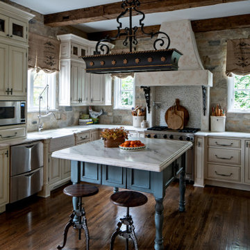
Imagine how thrilled Diana was when she was approached about designing a kitchen for a client who is an avid traveler and Francophile. ‘French-country’ is a very specific category of traditional design that combines French provincial elegance with rustic comforts. The look draws on soothing hues, antique accents and a wonderful fusion of polished and relic’d finishes.
Her client wanted to feel like she was in the south of France every time she walked into her kitchen. She wanted real honed marble counters, vintage finishes and authentic heavy stone walls like you’d find in a 400-year old château in Les Baux-de-Provence.
Diana’s mission: capture the client’s vision, design it and utilize Drury Design’s sourcing and building expertise to bring it to life.
Design Objectives:
Create the feel of an authentic vintage French-country kitchen
Include natural materials that would have been used in an old French château
Add a second oven
Omit an unused desk area in favor of a large, tall pantry armoire
THE REMODEL
Design Challenges:
Finding real stone for the walls, and the craftsmen to install it
Accommodate for the thickness of the stones
Replicating château beam architecture
Replicating authentic French-country finishes
Find a spot for a new steam oven
Design Solutions:
Source and sort true stone. Utilize veteran craftsmen to apply to the walls using old-world techniques
Furr out interior window casings to adjust for the thicker stone walls
Source true reclaimed beams
Utilize veteran craftsmen for authentic finishes and distressing for the island, tall pantry armoire and stucco hood
Modify the butler’s pantry base cabinet to accommodate the new steam oven
THE RENEWED SPACE
Before we started work on her new French-country kitchen, the homeowner told us the kitchen that came with the house was “not my kitchen.”
“I felt like a stranger,” she told us during the photoshoot. “It wasn’t my color, it wasn’t my texture. It wasn’t my style… I didn’t have my stamp on it.”
And now?
“I love the fact that my family can come in here, wrap their arms around it and feel comfortable,” she said. “It’s like a big hug.”
 Advance Design Studio, Ltd.
Jennifer and Dan have lived in their Deer Park Illinois home for 15 years, slowly making minor fixes like painting and decorating; but they had a new plan for their kitchen the entire time. An awkwardly placed garage door, and an island cooktop with a terrible downdraft made a full-scale kitchen remodel an absolute must. Jennifer had many ideas in mind and wanted to work with a company that could provide high-end work, while partnering with a designer that would tailor the kitchen to her ideas.
She was intrigued by the phrase “Common Sense Remodeling” in Advance Design’s feature she discovered while perusing an issue of the community’s Quintessential Barrington Magazine. Doing further research on the company’s website, as she looked through project profiles and read about Advance Design’s “Common Sense Remodeling” philosophy, she promptly scheduled an appointment to see if the people and ideas she read about were truly who they said they were. The more she read, the more she knew that the “Common Sense” approach to remodeling they described was exactly the type of company she was looking for.
The partnership was sealed after an initial consultation with Owner Todd Jurs and Project Designer Michelle Lecinski. They displayed a combination of friendliness, professionalism and respect that was unmatched by any of the other companies Jennifer talked to. She knew that with Advance Design, she would be able to retain the vision that she had in mind with high-quality craftsmanship.
“I reached out to Advance Design because of the ‘Common Sense Remodeling’ tagline,” Jennifer said. “That’s what lingered for me”. “Advance Design was the most respectful- of the house and of my design ideas, and the most professional of the handful of companies that looked at my project”.
Soon after the meeting Jennifer began working with Michelle on the project design. They quickly developed chemistry. Jennifer loved how Michelle researched and located every detail that Jennifer wanted for the kitchen. Between the two of them, every concept and idea was worked through and perfected. “Jennifer had definite ideas about what she wanted the new kitchen to look like, she just didn’t know how to bring it all together. We worked together really well to make her ideas into the practical reality necessary for a well-functioning kitchen, with the look and feel that she had envisioned”, says Michelle.
“Michelle was wonderful in using the CAD system she would show me new drawings every time we changed the layout while working through the design,” Jennifer said. “She was a really wonderful partner in execution, she made sure everything happened quickly and easily.”
The finished design drew out elements of Jennifer’s style and personality. The pair call the look “sophisticated farmhouse” to describe the kitchen renovation to family and friends. The result was a beautifully crafted, authentic-feeling space that satisfied Jennifer’s dreams 15 years in the making. The whole project consisted of a kitchen remodel, mudroom upgrade with powder room, and garage entry relocation. “The projects I personally like the best, are the ones that put the client’s dreams on display,” Project Designer Michelle said. “And this is one of those projects.”
The main focal point of the kitchen is custom zinc and brass ventilation hood with a vintage sheen, which was hand made to order by a small company in Indiana named Vogler Metalworking. “It’s like sculpture, a true work of art”, says Jennifer. Your eye is immediately drawn towards this elegant yet practical hood that eliminated the home’s downdraft problem and added a striking conversation piece at the same time. The carpenters had to use special gloves when transporting and installing it, so they didn’t smudge it with fingerprints. The beautiful hood centers proudly over the stunning black enamel and brass LaCornue Range. “I had a friend who had a LaCornue range and after learning how easy it was to cook perfect meals, I was convinced I wanted to have one”, says Jennifer. This unique, breathtaking combination anchors the entire kitchen and is apparent immediately as you walk into the great room the surrounds the space.
DuraSupreme Crestwood cabinets with a Kendall Panel add function and sophistication. A custom gray paint color paired with a storm blue was developed so that the new kitchen looked like it belonged to the existing space. Unlacquered brass faucets and hardware were important to Jennifer because she wanted the living finishes to age over time. Remarkable brass diamond mesh cabinet door inserts imported from the UK continue to add this one-of-a-kind kitchen renovation; giving it a “you won’t see this everywhere” quality. The use of old railcar flooring for the coffee bar countertop and reclaimed oak for the open shelving gives an authenticity to the space uncommon in kitchens today.
Jennifer and Michelle fell in love with the Limestone Grey Stone while they were investigating unique island countertop ideas. They liked the fact that the limestone as a living finish will age and change over time. Calcutta Miel Quartz countertops made for an excellent pairing around the perimeter, as it’s durable and perfect for cooking preparations. A textured white subway tile backsplash that runs to the ceiling keeps your eye moving towards the open shelving, and to the main focal point of the stunning range hood combination.
“The kitchen functions beautifully, and it’s gorgeous,” beams Jennifer as she gestures with both hands while smiling ear to ear. “The most important thing was I wanted a kitchen that had a wonderful flow, cooked beautiful meals and was a great gathering place for family and friends, and this space does that perfectly! Beauty wise, it turned out exactly how I had envisioned. I felt the function part was the hardest part, and that was nailed”!
Relocating the garage entry to the new mudroom was a huge priority and has finally separated the family’s arriving home functions from their kitchen. Now coats and shoes and bags have their own area for dropping once members arrive home. Matching gray DuraSupreme cabinetry helped create gorgeous, purposeful lockers for the family. A reclaimed vintage sink and custom wall paper were added to the tiny powder room to beautify the once previously only functional space. Advance Design was even able to create a custom space for their dog to sleep while the family is away.
“It was unbelievable that a project of this size was completed in such a short time, and I think that’s because of the large amount of planning and preparation that went into it,” Jennifer marveled, “When we started, we were ready, and everything was prepared”.
When it came to execution, Project Manager Justin Davis and his crew were quick, accessible, and organized. Projects like this kitchen are typically completed in as little as 8-10 weeks. Jennifer’s kitchen however despite the relocation of some challenging HVAC in a soffit and moving of an exterior door was completed remarkably fast in part because the team was working with an existing tile floor that ran throughout the first floor that the client really loved.
“You get to know these people really well because they’re living in your house while you’re living in your house. They were so fast and really good, it didn’t take as long as even planned” reported Jennifer. “I would text Justin and he always responded almost immediately. I got to know all the guys who were working in our house and they were all wonderful people”.
Details in a customized kitchen like this one require skill and care from the people who install it. “All the guys on the job were skilled at what the did. I wanted small details like little feet to look like furniture, that is where their carpentry skill came in to make these all perfect”, said Jennifer. “The tile guys were wonderful. They even let me determine how I wanted the texture with the grout to appear for a salt and pepper look; now that is a very skilled trade person making it custom”.
In Jennifer’s interview, she continued to reference Advance Design’s “Common Sense Remodeling”, so I took a minute to ask her exactly what that phrase meant to her and how it played out in her experience with her project and the Advance Design team. Here is what she said: “I was intrigued about Common Sense Remodeling and in my head that there would be clear costs and prices, great communication between the design team, the execution team and me”, said Jennifer. They did deliver on that, it was so clear about the cost breakdown, what I could expect from everyone who came to my house, and everything that we had ordered. That to me is the Common Sense”!
It’s great to see a client take literally our assertion that a well-planned remodeling project is simply “Common Sense”! She anticipated each step of the way would be clear, concise, and predictable, all the while protecting the outcome due to the careful upfront planning. “Advance Design delivered on their ‘Common Sense Remodeling’ promise,” Jennifer said. “From the design team, to the execution team - everything was straight forward like I imagined. The project turned out exactly how I envisioned, I enjoyed this process and absolutely would recommend Advance Design Studio to anyone.”
 Staging Beautifully
Kim Roberts, owner of Staging Beautifully, has a passion for creating beautiful spaces. From home staging to redecorating, Kim’s relaxed and friendly approach make even the most challenging project fun and enjoyable.
For those interested in refreshing their space, Staging Beautifully can assist a homeowner in decorating their home with the items they already own and love. Like staging, redesign may include color selection, rearranging furniture, hanging art and placing accessories. It is a cost effective design alternative which will give your home a facelift without the cost of an Interior Designer. Utilizing your furnishings and treasures, we will shop your home to find new and creative ways to display your family’s possessions. This will result in a complete interior transformation which will reflect your personality, style, comfort and functionality to your living space without having to buy anything.
Looking to sell your home, consider home staging to target a higher selling price. Home Staging aims to de-personalize your home and make it appealing to virtually all prospective buyers. The way you live in your home and the way you market your home are two very different things. Your home is competing with every other home on the market. A home that looks like it needs work or isn't move-in ready prompts buyers to low-ball their offers, or eliminate your home from consideration all together. Those homes that are staged to reflect current trends attract and appeal to more buyers, resulting in more offers, faster sales, and higher sale prices. Sometimes, an agent may even recommend your price be increased once your home is staged! A well-staged home can even start a bidding war with multiple offers!
 Drury Design
THE SETUP
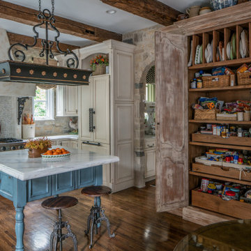
Imagine how thrilled Diana was when she was approached about designing a kitchen for a client who is an avid traveler and Francophile. ‘French-country’ is a very specific category of traditional design that combines French provincial elegance with rustic comforts. The look draws on soothing hues, antique accents and a wonderful fusion of polished and relic’d finishes.
Her client wanted to feel like she was in the south of France every time she walked into her kitchen. She wanted real honed marble counters, vintage finishes and authentic heavy stone walls like you’d find in a 400-year old château in Les Baux-de-Provence.
Diana’s mission: capture the client’s vision, design it and utilize Drury Design’s sourcing and building expertise to bring it to life.
Design Objectives:
Create the feel of an authentic vintage French-country kitchen
Include natural materials that would have been used in an old French château
Add a second oven
Omit an unused desk area in favor of a large, tall pantry armoire
THE REMODEL
Design Challenges:
Finding real stone for the walls, and the craftsmen to install it
Accommodate for the thickness of the stones
Replicating château beam architecture
Replicating authentic French-country finishes
Find a spot for a new steam oven
Design Solutions:
Source and sort true stone. Utilize veteran craftsmen to apply to the walls using old-world techniques
Furr out interior window casings to adjust for the thicker stone walls
Source true reclaimed beams
Utilize veteran craftsmen for authentic finishes and distressing for the island, tall pantry armoire and stucco hood
Modify the butler’s pantry base cabinet to accommodate the new steam oven
THE RENEWED SPACE
Before we started work on her new French-country kitchen, the homeowner told us the kitchen that came with the house was “not my kitchen.”
“I felt like a stranger,” she told us during the photoshoot. “It wasn’t my color, it wasn’t my texture. It wasn’t my style… I didn’t have my stamp on it.”
And now?
“I love the fact that my family can come in here, wrap their arms around it and feel comfortable,” she said. “It’s like a big hug.”
 Drury Design
THE SETUP
Imagine how thrilled Diana was when she was approached about designing a kitchen for a client who is an avid traveler and Francophile. ‘French-country’ is a very specific category of traditional design that combines French provincial elegance with rustic comforts. The look draws on soothing hues, antique accents and a wonderful fusion of polished and relic’d finishes.
Her client wanted to feel like she was in the south of France every time she walked into her kitchen. She wanted real honed marble counters, vintage finishes and authentic heavy stone walls like you’d find in a 400-year old château in Les Baux-de-Provence.
Diana’s mission: capture the client’s vision, design it and utilize Drury Design’s sourcing and building expertise to bring it to life.
Design Objectives:
Create the feel of an authentic vintage French-country kitchen
Include natural materials that would have been used in an old French château
Add a second oven
Omit an unused desk area in favor of a large, tall pantry armoire
THE REMODEL
Design Challenges:
Finding real stone for the walls, and the craftsmen to install it
Accommodate for the thickness of the stones
Replicating château beam architecture
Replicating authentic French-country finishes
Find a spot for a new steam oven
Design Solutions:
Source and sort true stone. Utilize veteran craftsmen to apply to the walls using old-world techniques
Furr out interior window casings to adjust for the thicker stone walls
Source true reclaimed beams
Utilize veteran craftsmen for authentic finishes and distressing for the island, tall pantry armoire and stucco hood
Modify the butler’s pantry base cabinet to accommodate the new steam oven
THE RENEWED SPACE
Before we started work on her new French-country kitchen, the homeowner told us the kitchen that came with the house was “not my kitchen.”
“I felt like a stranger,” she told us during the photoshoot. “It wasn’t my color, it wasn’t my texture. It wasn’t my style… I didn’t have my stamp on it.”
And now?
“I love the fact that my family can come in here, wrap their arms around it and feel comfortable,” she said. “It’s like a big hug.”
 Architect
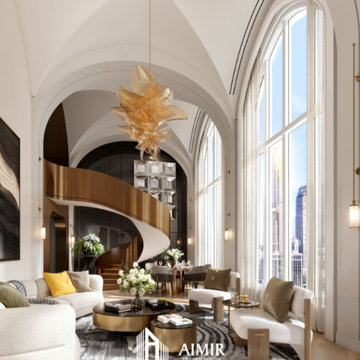
Not all architectural imagery is created equal. Some renderings look obviously computer-generated, with flat lighting and plastic-looking materials that fail to convince viewers. Others are so precise that they are indistinguishable from photographs. That second category, realistic architectural visualization rendering, has become the standard expectation for architects, developers, and marketers who need imagery capable of withstanding close scrutiny from investors, buyers, and planning authorities. As audiences grow more visually literate, the tolerance for obviously artificial, video-game-like imagery in professional presentations continues to shrink.
What Sets Realistic Visualization Apart
Realistic architectural visualization goes beyond simply modeling a building in three dimensions. It requires physically accurate lighting simulation, true-to-life material properties, and careful attention to the small imperfections that make real-world photography convincing, such as subtle reflections, ambient occlusion in corners, and natural depth of field. The goal is an image that a viewer would believe was captured by a camera on-site rather than generated by software. Achieving that level of believability typically means dozens of small adjustments layered on top of one another rather than any single dramatic setting.
Realistic Versus Stylized Rendering Approaches
Stylized or conceptual renderings still have their place, particularly in early design phases when a looser, more artistic representation helps convey mood without locking in every detail. But once a project moves toward marketing, investment, or permitting, stakeholders need to see exactly what they are getting. Realistic visualization removes ambiguity, showing true material colors, accurate proportions, and honest lighting conditions rather than idealized abstractions. Understanding which approach a project actually needs at each stage helps clients avoid paying for a level of polish that a given milestone does not yet require.
Why Realism Builds Client and Buyer Confidence
Buyers and investors are understandably skeptical of overly polished or unrealistic marketing images. When a rendering looks convincingly real, it builds trust rather than raising doubts about what the finished project will actually look like. This is especially important in real estate presales, where buyers are committing significant sums based largely on visual material rather than a finished physical space. A rendering that later turns out to have misrepresented the finished product can also create legal and reputational exposure for developers, making accuracy a genuine business risk rather than just an aesthetic preference.
The Technical Pillars Behind Every Realistic Scene
Achieving true realism depends on several technical disciplines working together: physically based rendering engines that simulate how light actually behaves, high-resolution texture libraries that replicate real materials like stone, wood, and glass, and careful camera work that mimics real photographic lenses and exposure. Post-production adds a final layer of color grading and atmospheric effects that ties everything together into a cohesive, believable image. Each of these pillars depends on the others; even flawless material work can be undermined by lighting that behaves in a physically implausible way.
Applications Across Residential, Commercial, and Institutional Projects
Realistic visualization serves a wide range of building types, from single-family homes and luxury condominiums to office towers, hotels, schools, and healthcare facilities. Each typology has its own material palette and lighting expectations, and an experienced studio adjusts its approach accordingly, whether that means warm, inviting tones for a residential lobby or crisp, professional lighting for a corporate headquarters. Institutional clients such as universities and hospitals often have additional requirements around accessibility signage and wayfinding, which need to be represented accurately alongside the architecture itself.
How AIMIR CG Delivers Photorealistic Accuracy
Our studio specializes in realistic architectural visualization rendering that holds up under close inspection. Every project moves through a disciplined pipeline of modeling, texturing, lighting, and post-production review, with artists cross-checking material references and lighting studies against real-world photography. This attention to detail is why clients consistently describe our end product as impressive and our process as easy to work with. A dedicated quality review stage before delivery catches inconsistencies that might otherwise slip through a faster, less structured pipeline.
Common Challenges in Achieving True Realism
Realistic rendering is technically demanding. Common obstacles include accurately simulating how light bounces between surfaces, matching material reflectivity to real product specifications, and avoiding the uncanny, slightly artificial look that comes from over-processed images. Overcoming these challenges requires experienced artists who understand both the science of light and the craft of photography, not just software proficiency. Rushed production schedules are often the real culprit behind unconvincing renderings, since realism typically requires several iterative passes rather than a single render.
What to Look for in a Realism-Focused Rendering Studio
When evaluating a rendering partner, review their portfolio critically. Do the images include convincing shadow detail and material variation, or do surfaces look uniformly smooth and artificial? Ask about their revision process and how closely they work with architects to source accurate material and lighting references, since realism is ultimately the product of disciplined collaboration, not a single software setting. It also helps to ask for examples of past projects in a similar building type, since a studio's strengths can vary across typologies.
Ready for Renderings That Look Real
If your project deserves imagery that can stand up to the scrutiny of investors, buyers, and planning boards, AIMIR CG is ready to help. Our team combines technical precision with artistic judgment to deliver visualization that looks and feels genuinely real. Contact us to discuss how photorealistic rendering can strengthen your next presentation or marketing campaign, and let us show you examples from projects similar to your own.
 Charter Custom Homes
The phone rings early in the morning, and it’s a long-time client who treats our team of skilled craftsmen like family, continually lauding our work. It’s these types of clients we all have and all love and, of course, will drop anything to help.
As I navigate my usual morning commute, I’m greeted by a forlorn sigh and the description of the freak-fire which destroyed their beloved outdoor living area (along with the home’s family room, kitchen, and master bedroom). Getting past the initial shock, we had to act quickly to ensure their safety. Quite the start to the morning.
Challenges with this project run deeper than just the build: security of the entire affected area, good and sensitive communication, and navigating a pandemic lockdown can cause even the strongest-willed person to throw their hands up and call it quits.
When the fire broke out, it took out the entire backyard and portions of the home, making the structure unlivable. We needed to mitigate the fire damage and make sure the house was secure against break-ins, but also, no damage existed that could cause harm to the neighbors.
It’s these moments where relationships matter. The client needed a trusted and established partner to begin the rebuilding process. Professional knowledge is only one part of the puzzle. It’s here an empathetic ear, and extra solace goes far to remind the client all can be rebuilt.
Lastly, none of us saw the difficulties a pandemic would bring. At a time when a person was about to use every square foot of their home to shelter-in-place, our client would be in the middle of a rebuild with no use of their beautiful outdoor living area to get through the day. Luckily, we were able to work with the city of Clyde Hill and continue through an emergency services waiver.
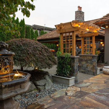
What was done? The outdoor living area included a complete rebuild of the gazebo, including a large sitting area and fire pit. Stone patios were replaced, and additional stone was chosen to create a secondary, uncovered living area with a fire pit to enjoy during the summer months.
The build is a testament to superb craftsmanship and design. However, we believe excellence also includes the holistic approach to listen deeply, empathize and understand a client’s history, external pressures of the world, and build community and relationship.
 Drury Design
THE SETUP
Imagine how thrilled Diana was when she was approached about designing a kitchen for a client who is an avid traveler and Francophile. ‘French-country’ is a very specific category of traditional design that combines French provincial elegance with rustic comforts. The look draws on soothing hues, antique accents and a wonderful fusion of polished and relic’d finishes.
Her client wanted to feel like she was in the south of France every time she walked into her kitchen. She wanted real honed marble counters, vintage finishes and authentic heavy stone walls like you’d find in a 400-year old château in Les Baux-de-Provence.
Diana’s mission: capture the client’s vision, design it and utilize Drury Design’s sourcing and building expertise to bring it to life.
Design Objectives:
Create the feel of an authentic vintage French-country kitchen
Include natural materials that would have been used in an old French château
Add a second oven
Omit an unused desk area in favor of a large, tall pantry armoire
THE REMODEL
Design Challenges:
Finding real stone for the walls, and the craftsmen to install it
Accommodate for the thickness of the stones
Replicating château beam architecture
Replicating authentic French-country finishes
Find a spot for a new steam oven
Design Solutions:
Source and sort true stone. Utilize veteran craftsmen to apply to the walls using old-world techniques
Furr out interior window casings to adjust for the thicker stone walls
Source true reclaimed beams
Utilize veteran craftsmen for authentic finishes and distressing for the island, tall pantry armoire and stucco hood
Modify the butler’s pantry base cabinet to accommodate the new steam oven
THE RENEWED SPACE
Before we started work on her new French-country kitchen, the homeowner told us the kitchen that came with the house was “not my kitchen.”
“I felt like a stranger,” she told us during the photoshoot. “It wasn’t my color, it wasn’t my texture. It wasn’t my style… I didn’t have my stamp on it.”
And now?
“I love the fact that my family can come in here, wrap their arms around it and feel comfortable,” she said. “It’s like a big hug.”
71