
Search results for "Assessed" in Home Design Ideas
 Tomco Company Inc.
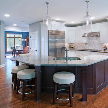
By removing a portion of the long Peninsula we created an island that was much more efficient to navigate to the various surrounding rooms. This also allowed for more cabinet space on the "L" shape and a MW/Oven was incorporated.
 Housetrends Magazine
Since moving into her Dublin home two and a half years ago, Nancy Sanford has been peeling off the decades—quite literally. Built in the 1980s, the home was “very well-maintained, but very little had been done to it” in terms of updating the finishes or style, Sanford says. Plush white carpet ran from wall-to-wall-to-wall, almond-colored laminate coated the kitchen cabinets and wallpaper ran rampant—even covering some ceilings.
Despite her efforts, Sanford knew it was going to take more than cosmetic editing to shake the ‘80s and make the home her own. Although she lives in the traditional-leaning Muirfield community, Sanford adores a minimalist, contemporary style—and admits to devouring design magazines “ad nauseam.”
To implement her thoroughly modern vision, Sanford turned to Brigid Norton, an interior designer and family friend, and Kristi Youles, a kitchen designer with The JAE Company. Working together, the trio created a carefully considered contemporary design that’s easy on the eyes, and the body.
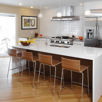
In addition to improving the flow of the kitchen—by removing a V-shaped peninsula that angled out into the room—and adding appliances like a stainless steel refrigerator, Sanford’s short list of must-haves included clean, uncluttered lines and no wall cabinets over the countertops. “I’ve found as I’ve aged, I’ve gotten shorter and just don’t use the upper cabinets,” Sanford explains.
Easy-access, smooth-slide drawers with clean slab fronts were the answer—resulting in strong visual lines, an open, airy feel and enhanced ergonomics. Starting with a “needs assessment,” Youles and Norton designed the space quite literally around Nancy. By looking at factors such as her height and which items she uses most frequently, they were able to determine the optimum placement for everything from canned goods in the pantry to cutlery, pans and plates in the customized drawers, all of which helped to achieve the ultimate kitchen organization.
But there’s more to the kitchen cabinets smooth façade than clean-lined storage. Walnut drawer fronts—found on the oven and the base of the island—are book-matched, allowing the grain to continue from drawer to drawer. And even in spaces where drawers weren’t feasible, beneath the sink and in a desk area, the designers continued the look with cabinet doors crafted to resemble drawers.
The visual continuity of these lines might not be as impactful if it weren’t for the careful selection of contrasting finishes. The designers filled the space with pure, glossy white—using a specific type of quartz, White Cliff by Cambria, to accent the bold rectangular design of the island. Then, to break up the expanse of accompanying white painted drawers, walnut was selected to bring the contrasting warmth and grain of wood without red undertones. It is commonly found in modern furniture design, as well as current productions of mid-century designs like the iconic Eames Lounge Chair from Herman Miller, Youles says.
 Sense of Space
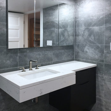
Example of a large trendy gray tile and porcelain tile porcelain tile doorless shower design in New York with dark wood cabinets, a two-piece toilet, gray walls, an undermount sink and quartz countertops
Find the right local pro for your project

 JRussell Interior Design
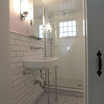
This was the first room to be remodeled in this Cape Cod Cottage.
Installation of materials such as tile and stone, required us to shore up the framing in the crawl space. Without the proper structural assessment and restructuring, a beautiful installation can become an eyesore.
Budget is almost always a concern for homeowners. We saved several thousand dollars by using economical subway tile on the walls, and combining with timeless Carrera Marble mosaic tile and slab materials.
 Custom Design & Construction
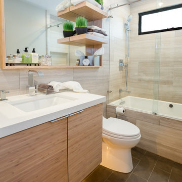
Our client approached us while he was in the process of purchasing his ½ lot detached unit in Hermosa Beach. He was drawn to a design / build approach because although he has great design taste, as a busy professional he didn’t have the time or energy to manage every detail involved in a home remodel. The property had been used as a rental unit and was in need of TLC. By bringing us onto the project during the purchase we were able to help assess the true condition of the home. Built in 1976, the 894 sq. ft. home had extensive termite and dry rot damage from years of neglect. The project required us to reframe the home from the inside out.
To design a space that your client will love you really need to spend time getting to know them. Our client enjoys entertaining small groups. He has a custom turntable and considers himself a mixologist. We opened up the space, space-planning for his custom turntable, to make it ideal for entertaining. The wood floor is reclaimed wood from manufacturing facilities. The reframing work also allowed us to make the roof a deck with an ocean view. The home is now a blend of the latest design trends and vintage elements and our client couldn’t be happier!
View the 'before' and 'after' images of this project at:
http://www.houzz.com/discussions/4189186/bachelors-whole-house-remodel-in-hermosa-beach-ca-part-1
http://www.houzz.com/discussions/4203075/m=23/bachelors-whole-house-remodel-in-hermosa-beach-ca-part-2
http://www.houzz.com/discussions/4216693/m=23/bachelors-whole-house-remodel-in-hermosa-beach-ca-part-3
Features: subway tile, reclaimed wood floors, quartz countertops, bamboo wood cabinetry, Ebony finish cabinets in kitchen
 Envision Web
Stuart Wade, Envision Virtual Tours
The design goal was to produce a corporate or family retreat that could best utilize the uniqueness and seclusion as the only private residence, deep-water hammock directly assessable via concrete bridge in the Southeastern United States.
Little Hawkins Island was seven years in the making from design and permitting through construction and punch out.
The multiple award winning design was inspired by Spanish Colonial architecture with California Mission influences and developed for the corporation or family who entertains. With 5 custom fireplaces, 75+ palm trees, fountain, courtyards, and extensive use of covered outdoor spaces; Little Hawkins Island is truly a Resort Residence that will easily accommodate parties of 250 or more people.
The concept of a “village” was used to promote movement among 4 independent buildings for residents and guests alike to enjoy the year round natural beauty and climate of the Golden Isles.
The architectural scale and attention to detail throughout the campus is exemplary.
From the heavy mud set Spanish barrel tile roof to the monolithic solid concrete portico with its’ custom carved cartouche at the entrance, every opportunity was seized to match the style and grace of the best properties built in a bygone era.


 The Container Store Custom Closets
The Pull Out Mirror to assess the outfit of the day. It's retractable and tucks neatly away inside the closet when not in use.
A custom TCS Closet in Aspen, a neutral palette that felt timeless which lets a wardrobe shine.
 Sunspace Design, Inc.
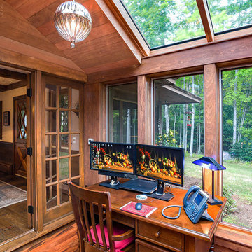
This project’s owner originally contacted Sunspace because they needed to replace an outdated, leaking sunroom on their North Hampton, New Hampshire property. The aging sunroom was set on a fieldstone foundation that was beginning to show signs of wear in the uppermost layer. The client’s vision involved repurposing the ten foot by ten foot area taken up by the original sunroom structure in order to create the perfect space for a new home office. Sunspace Design stepped in to help make that vision a reality.
We began the design process by carefully assessing what the client hoped to achieve. Working together, we soon realized that a glass conservatory would be the perfect replacement. Our custom conservatory design would allow great natural light into the home while providing structure for the desired office space.
Because the client’s beautiful home featured a truly unique style, the principal challenge we faced was ensuring that the new conservatory would seamlessly blend with the surrounding architectural elements on the interior and exterior. We utilized large, Marvin casement windows and a hip design for the glass roof. The interior of the home featured an abundance of wood, so the conservatory design featured a wood interior stained to match.
The end result of this collaborative process was a beautiful conservatory featured at the front of the client’s home. The new space authentically matches the original construction, the leaky sunroom is no longer a problem, and our client was left with a home office space that’s bright and airy. The large casements provide a great view of the exterior landscape and let in incredible levels of natural light. And because the space was outfitted with energy efficient glass, spray foam insulation, and radiant heating, this conservatory is a true four season glass space that our client will be able to enjoy throughout the year.
 Housetrends Magazine
Since moving into her Dublin home two and a half years ago, Nancy Sanford has been peeling off the decades—quite literally. Built in the 1980s, the home was “very well-maintained, but very little had been done to it” in terms of updating the finishes or style, Sanford says. Plush white carpet ran from wall-to-wall-to-wall, almond-colored laminate coated the kitchen cabinets and wallpaper ran rampant—even covering some ceilings.
Despite her efforts, Sanford knew it was going to take more than cosmetic editing to shake the ‘80s and make the home her own. Although she lives in the traditional-leaning Muirfield community, Sanford adores a minimalist, contemporary style—and admits to devouring design magazines “ad nauseam.”
To implement her thoroughly modern vision, Sanford turned to Brigid Norton, an interior designer and family friend, and Kristi Youles, a kitchen designer with The JAE Company. Working together, the trio created a carefully considered contemporary design that’s easy on the eyes, and the body.
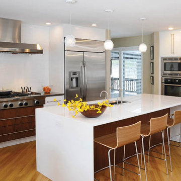
In addition to improving the flow of the kitchen—by removing a V-shaped peninsula that angled out into the room—and adding appliances like a stainless steel refrigerator, Sanford’s short list of must-haves included clean, uncluttered lines and no wall cabinets over the countertops. “I’ve found as I’ve aged, I’ve gotten shorter and just don’t use the upper cabinets,” Sanford explains.
Easy-access, smooth-slide drawers with clean slab fronts were the answer—resulting in strong visual lines, an open, airy feel and enhanced ergonomics. Starting with a “needs assessment,” Youles and Norton designed the space quite literally around Nancy. By looking at factors such as her height and which items she uses most frequently, they were able to determine the optimum placement for everything from canned goods in the pantry to cutlery, pans and plates in the customized drawers, all of which helped to achieve the ultimate kitchen organization.
But there’s more to the kitchen cabinets smooth façade than clean-lined storage. Walnut drawer fronts—found on the oven and the base of the island—are book-matched, allowing the grain to continue from drawer to drawer. And even in spaces where drawers weren’t feasible, beneath the sink and in a desk area, the designers continued the look with cabinet doors crafted to resemble drawers.
The visual continuity of these lines might not be as impactful if it weren’t for the careful selection of contrasting finishes. The designers filled the space with pure, glossy white—using a specific type of quartz, White Cliff by Cambria, to accent the bold rectangular design of the island. Then, to break up the expanse of accompanying white painted drawers, walnut was selected to bring the contrasting warmth and grain of wood without red undertones. It is commonly found in modern furniture design, as well as current productions of mid-century designs like the iconic Eames Lounge Chair from Herman Miller, Youles says.
 MONN Cabinetry & Design
Cabinets designed by MONN and constructed by Cabinetry by Karman
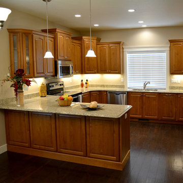
Inspiration for a timeless u-shaped dark wood floor eat-in kitchen remodel in Salt Lake City with an undermount sink, raised-panel cabinets, medium tone wood cabinets, granite countertops, stainless steel appliances, beige backsplash and no island
Inspiration for a timeless u-shaped dark wood floor eat-in kitchen remodel in Salt Lake City with an undermount sink, raised-panel cabinets, medium tone wood cabinets, granite countertops, stainless steel appliances, beige backsplash and no island


 Aladdin Remodelers
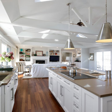
Inspiration for a large transitional l-shaped medium tone wood floor eat-in kitchen remodel in New York with an undermount sink, recessed-panel cabinets, white cabinets, quartz countertops, white backsplash, ceramic backsplash, stainless steel appliances and an island
 Kathleen Jennison
An Arts & Crafts Bungalow is one of my favorite styles of homes. We have quite a few of them in our Stockton Mid-Town area. And when C&L called us to help them remodel their 1923 American Bungalow, I was beyond thrilled.
As per usual, when we get a new inquiry, we quickly Google the project location while we are talking to you on the phone. My excitement escalated when I saw the Google Earth Image of the sweet Sage Green bungalow in Mid-Town Stockton. "Yes, we would be interested in working with you," I said trying to keep my cool.
But what made it even better was meeting C&L and touring their home, because they are the nicest young couple, eager to make their home period perfect. Unfortunately, it had been slightly molested by some bad house-flippers, and we needed to bring the bathroom back to it "roots."
We knew we had to banish the hideous brown tile and cheap vanity quickly. But C&L complained about the condensation problems and the constant fight with mold. This immediately told me that improper remodeling had occurred and we needed to remedy that right away.
The Before: Frustrations with a Botched Remodel
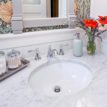
The bathroom needed to be brought back to period appropriate design with all the functionality of a modern bathroom. We thought of things like marble countertop, white mosaic floor tiles, white subway tile, board and batten molding, and of course a fabulous wallpaper.
This small (and only) bathroom on a tight budget required a little bit of design sleuthing to figure out how we could get the proper look and feel. Our goal was to determine where to splurge and where to economize and how to complete the remodel as quickly as possible because C&L would have to move out while construction was going on.
The Process: Hard Work to Remedy Design and Function
During our initial design study, (which included 2 hours in the owners’ home), we noticed framed images of William Morris Arts and Crafts textile patterns and knew this would be our design inspiration. We presented C&L with three options and they quickly selected the Pimpernel Design Concept.
We had originally selected the Black and Olive colors with a black vanity, mirror, and black and white floor tile. C&L liked it but weren’t quite sure about the black, We went back to the drawing board and decided the William & Co Pimpernel Wallpaper in Bayleaf and Manilla color with a softer gray painted vanity and mirror and white floor tile was more to their liking.
After the Design Concept was approved, we went to work securing the building permit, procuring all the elements, and scheduling our trusted tradesmen to perform the work.
We did uncover some shoddy work by the flippers such as live electrical wires hidden behind the wall, plumbing venting cut-off and buried in the walls (hence the constant dampness), the tub barely balancing on two fence boards across the floor joist, and no insulation on the exterior wall.
All of the previous blunders were fixed and the bathroom put back to its previous glory. We could feel the house thanking us for making it pretty again.
The After Reveal: Cohesive Design Decisions
We selected a simple white subway tile for the tub/shower. This is always classic and in keeping with the style of the house.
We selected a pre-fab vanity and mirror, but they look rich with the quartz countertop. There is much more storage in this small vanity than you would think.
The Transformation: A Period Perfect Refresh
We began the remodel just as the pandemic reared and stay-in-place orders went into effect. As C&L were already moved out and living with relatives, we got the go-ahead from city officials to get the work done (after all, how can you shelter in place without a bathroom?).
All our tradesmen were scheduled to work so that only one crew was on the job site at a time. We stayed on the original schedule with only a one week delay.
The end result is the sweetest little bathroom I've ever seen (and I can't wait to start work on C&L's kitchen next).
Thank you for joining me in this project transformation. I hope this inspired you to think about being creative with your design projects, determining what works best in keeping with the architecture of your space, and carefully assessing how you can have the best life in your home.
 US Cellar Systems
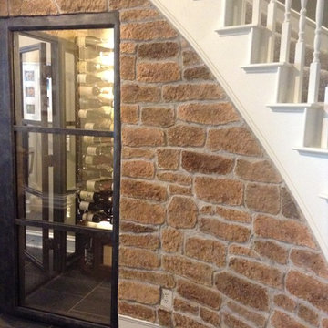
To age gracefully, wine requires a high-grade wine cellar cooling unit manufactured by a Dallas expert. On this project, we supplied the wine refrigeration system.
All of our products are designed to provide maximum cooling efficiency to every wine cellar. We make a careful assessment to determine the most ideal unit for each client.
Follow us on Facebook: https://www.facebook.com/USCellarSystems/
US Cellar Systems
2470 Brayton Ave.
Signal Hill, California 90755
(562) 513-3017
dan@uscellarsystems.com
 Sunspace Design, Inc.
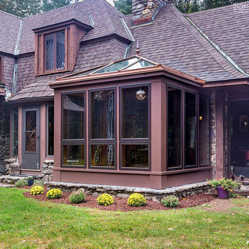
This project’s owner originally contacted Sunspace because they needed to replace an outdated, leaking sunroom on their North Hampton, New Hampshire property. The aging sunroom was set on a fieldstone foundation that was beginning to show signs of wear in the uppermost layer. The client’s vision involved repurposing the ten foot by ten foot area taken up by the original sunroom structure in order to create the perfect space for a new home office. Sunspace Design stepped in to help make that vision a reality.
We began the design process by carefully assessing what the client hoped to achieve. Working together, we soon realized that a glass conservatory would be the perfect replacement. Our custom conservatory design would allow great natural light into the home while providing structure for the desired office space.
Because the client’s beautiful home featured a truly unique style, the principal challenge we faced was ensuring that the new conservatory would seamlessly blend with the surrounding architectural elements on the interior and exterior. We utilized large, Marvin casement windows and a hip design for the glass roof. The interior of the home featured an abundance of wood, so the conservatory design featured a wood interior stained to match.
The end result of this collaborative process was a beautiful conservatory featured at the front of the client’s home. The new space authentically matches the original construction, the leaky sunroom is no longer a problem, and our client was left with a home office space that’s bright and airy. The large casements provide a great view of the exterior landscape and let in incredible levels of natural light. And because the space was outfitted with energy efficient glass, spray foam insulation, and radiant heating, this conservatory is a true four season glass space that our client will be able to enjoy throughout the year.
 Design Studio West
Committing to a kosher kitchen is quite a daunting undertaking and when you are also taking on a complete remodel, it can be overwhelming. It does not, however, have to be insurmountable. There are many resources to help guide you through the experience. Check out the internet and magazines to guide you. Once you have done the initial research, contact your Rabi with questions and for clarification on a kosher kitchen. Kosher requirements can vary differently between Orthodox, Conservatism, Ultra Orthodox and Reform Judaism. Your Rabi most likely will have a list of rules and guidelines. Also, hire a professional kitchen designer. They will not only be able to design the needs of a kosher kitchen but also make it personal to your needs and beautiful too.
If the space and the budget allow, two distinct kitchens within one space is a possibility. A kosher kitchen requires stringent separation of meat and dairy items. Depending on the sect of Judaism you practice ------
Storage:
The Storage areas need space for two sets of dishes, pots and pans, flatware, cups and utensils. You can combine the storage areas as long as there is a separation and that you do not mix service ware. A good recommendation is to color code your plates, flatware, table linen, pots. For example, red plates, gold-colored flatware, copper pots for meat items while dairy items have white plates, stainless flatware, stainless pots. You may want to label each area so when you have your new sister-in-law help in the kitchen; everything stays in the correct place.
Appliances:
When selecting appliances look for the STAR-K logo. This will help you determine to what extent an appliance is Kosher. Some ovens will have Sabbath modes where they will turn on automatically at a predetermined time. Once the oven is open, the oven turns off. Some refrigerators also have Sabbath modes where the ice maker turns off on the Sabbath and back on the following day. One refrigerator is usually sufficient provided all foods stay on the proper container in the proper section of the refrigerator. Having an immaculately clean refrigerator is a must if this is the case. You do not want spills from one food source contaminating food from the other. If you decide on two refrigerators, one can be full size while the other is smaller. A good kitchen designer can help assess your family’s needs to determine which is best for you.
Dishwashers cannot be Kosher in most cases. You either need two dishwashers, separate compartment dishwashers as in dishwasher drawers or wash by hand. Look at Fisher Pikel or Kitchen Aid for dishwasher drawers. Each drawer is on separate controls. You can dedicate the top drawer for dairy while the bottom drawer is for meat service ware.
If you have space and decide to have two dishwashers, you can get two 24” wide dishwashers. Another option is to have one full size dishwasher and supplement it with a small 18” wide dishwasher. Miele makes an 18” wide dishwasher that is super quiet and cleans dishes very well. You may also opt for a single dishwasher drawer in addition to a full sized dishwasher.
A single Microwave oven can be used for milk and meat provided that a complete cover is used around the food. You will also need separate plastic plate’s places on the bottom or glass turn table. Keeping the unit clean is very important.
Counter tops:
Counter tops may or may not be able to be koshered depending on your sect. Simply having sets of trivets for dairy, meat and pareve (not meat or dairy) will provide adequate separation of foods.
Sinks:
If you can’t have two separate sinks, include three separate tubs to be places in the sink. Color code the tubs for meat, dairy and pareve. If you have one sink or a single divided sink, you will need to be cautious about splashing, to keep the meat and dairy particulates apart. You will also need space for separate dish cloths or sponges and dish towels. Again, color coding is extremely helpful and highly suggested.
Must Haves:
~Storage space for two sets of dishes, flatware, pans bowls
~Color Code and label where appropriate
~Separate burners dedicate for either meat or dairy
~Separate clean up areas
~Clean environment to avoid contamination between meat and dairy
~A space that functions for how you cook
~A space that reflects you
Design and remodel by Design Studio West
Brady Architectural Photography

 Swati Goorha Designs
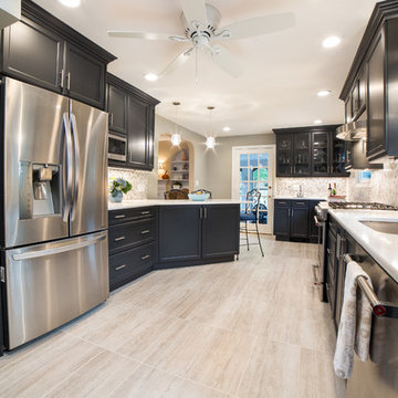
The client hired Swati Goorha Designs after they downsized from a 5 bedroom house to a smaller fixer-upper in Scotch Plains NJ. The main pain point of the house was an awkward circulation flow and a tiny dated kitchen. Our clients love cooking and entertain often. The small kitchen was crowded with just two people in it, lacked ample prep space and storage. Additionally, there was no direct access to the kitchen from the main entrance. In order to get to the “Sitting room” the clients had to circulate through a tiny powder room off of the entry. The client had to circulate through the Living room, the formal Dining Room, to finally arrive at the Kitchen. The entire space was awkward, choppy and dark.
We assessed the existing space, our clients needs and wants, and designed a utilitarian kitchen to fit the client’s lifestyle, their entertaining habits, and their aesthetic sensibilities. We knocked down the wall between the kitchen and the family room to open the area, and made the entire space into one large kitchen. We designed an unusual custom angled island to maximize the use of space without infringing the circulation or the usability of the kitchen. The island can now accommodate 3-4 people for an intimate dinner or function as a food setup area for larger parties. The island also provides extra storage. We used dark kitchen cabinets with light backsplash, countertops, and floor to brighten the space and hide the inevitable pet hair from clients four dogs.
We moved the Dining Room into the earlier Sitting room. In order to improve the circulation in the home, we closed the entry through the powder room and knocked out a coat closet. This allowed direct access to the kitchen and created a more open and easy flowing space. Now the entire house is a bright, light-filled space, with natural light and open circulation. Our client’s needs and wants have been satisfied!
21