
Search results for "Atrium" in Home Design Ideas
 Susan Yeley Homes
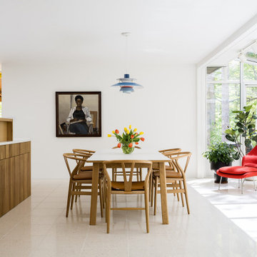
Nearly two decades ago now, Susan and her husband put a letter in the mailbox of this eastside home: "If you have any interest in selling, please reach out." But really, who would give up a Flansburgh House?
Fast forward to 2020, when the house went on the market! By then it was clear that three children and a busy home design studio couldn't be crammed into this efficient footprint. But what's second best to moving into your dream home? Being asked to redesign the functional core for the family that was.
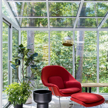
In this classic Flansburgh layout, all the rooms align tidily in a square around a central hall and open air atrium. As such, all the spaces are both connected to one another and also private; and all allow for visual access to the outdoors in two directions—toward the atrium and toward the exterior. All except, in this case, the utilitarian galley kitchen. That space, oft-relegated to second class in midcentury architecture, got the shaft, with narrow doorways on two ends and no good visual access to the atrium or the outside. Who spends time in the kitchen anyway?
As is often the case with even the very best midcentury architecture, the kitchen at the Flansburgh House needed to be modernized; appliances and cabinetry have come a long way since 1970, but our culture has evolved too, becoming more casual and open in ways we at SYH believe are here to stay. People (gasp!) do spend time—lots of time!—in their kitchens! Nonetheless, our goal was to make this kitchen look as if it had been designed this way by Earl Flansburgh himself.
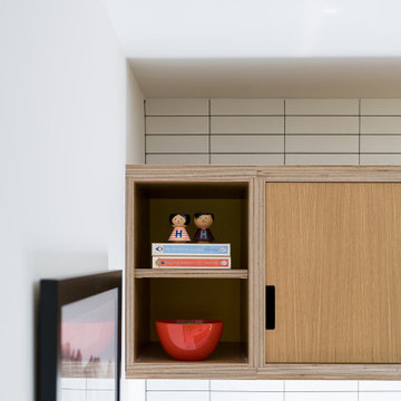
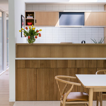
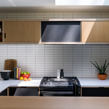
The house came to us full of bold, bright color. We edited out some of it (along with the walls it was on) but kept and built upon the stunning red, orange and yellow closet doors in the family room adjacent to the kitchen. That pop was balanced by a few colorful midcentury pieces that our clients already owned, and the stunning light and verdant green coming in from both the atrium and the perimeter of the house, not to mention the many skylights. Thus, the rest of the space just needed to quiet down and be a beautiful, if neutral, foil. White terrazzo tile grounds custom plywood and black cabinetry, offset by a half wall that offers both camouflage for the cooking mess and also storage below, hidden behind seamless oak tambour.
Contractor: Rusty Peterson
Cabinetry: Stoll's Woodworking
Photographer: Sarah Shields
 Design Line Construction, Inc.
Great article on the Buena Vista Residence featured on Inhabitat.com http://inhabitat.com/george-bradleys-art-filled-buena-vista-house-is-wrapped-in-reclaimed-redwood/
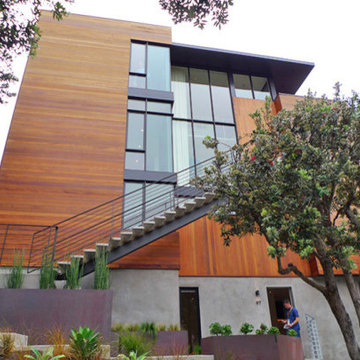
Longtime art collectors George Bradley and Eddie Baba collaborated on the ‘Buena Vista’ house in San Francisco’s Upper Castro neighborhood. The home is situated on a steep triangular lot with breathtaking views towards Sutro Tower and Bernal Heights. The original house on the site was used as a bomb shelter in 1941, and architect George Bradley subtly carried on this theme with reclaimed old growth Redwood siding sourced nearby from Hanger One at Moffett Field, and decorative WWII era steel buoys placed within the landscaping. We had a chance to tour this beautiful home during last month's AIA SF House Tours
The lower level of the house remains bunker-like, emerging from the site like a pedestal for the main upper level that is reached by an exterior steel and concrete staircase leading to the large-scale Redwood front door.
An au pair unit with a separate entrance is located at the lowest level, still high above the street. On top the concrete plinth foundation, two solid wood-clad volumes are connected by a tall glass atrium at the center of the house. The two solid sides brace the house on what is a somewhat dizzyingly steep and sharp angled site.
Inside the home, quiet bedrooms and a library are tucked below the kitchen, entry lobby and living room on the main level. The top level holds the master suite and outdoor roof deck, connected by a catwalk along the central atrium that cantilevers over the main entry. The south-facing central atrium also passively heats the house, along with radiant flooring. Expansive walls lining the side masses provide ample space for the homeowners’ carefully curated art collection amassed over the past 14 years.
The artwork – playful, architectural, and delightful products of known designers and somewhat unknown local artisans – can be found throughout the home. A Zeppelin chandelier lamp by Flos hangs over the main door, illuminating the atrium at night. Locally sourced tile from Heath Ceramics lines the fireplace and kitchen backsplash. Several works came from Creativity Explored, a local nonprofit that provides artists with developmental disabilities the means to create, exhibit, and sell their art.
A Jens Quistgaard Safari chair sits in the main living room and a collection of his colored pots accent the kitchen. Local glass artist Jonah Ward has two major works in the home – a three panel molten glass / burnt wood piece and a nine panel glass sculpture series. Several vintage Eames and Dansk furniture pieces were also spotted in the home.
Perhaps the most entertaining works were the models of famous architecture, such as Le Corbusier’s Villa Savoye, constructed from LEGO bricks. We look forward to seeing more works, in LEGO and in full scale, by architect George Bradley.
George Bradley’s Art-Filled Buena Vista House is Wrapped in Reclaimed Redwood Buena Vista Residence by George Bradley Architecture + Design – Inhabitat - Sustainable Design Innovation, Eco Architecture, Green Building

Find the right local pro for your project
 Susan Yeley Homes
Nearly two decades ago now, Susan and her husband put a letter in the mailbox of this eastside home: "If you have any interest in selling, please reach out." But really, who would give up a Flansburgh House?
Fast forward to 2020, when the house went on the market! By then it was clear that three children and a busy home design studio couldn't be crammed into this efficient footprint. But what's second best to moving into your dream home? Being asked to redesign the functional core for the family that was.
In this classic Flansburgh layout, all the rooms align tidily in a square around a central hall and open air atrium. As such, all the spaces are both connected to one another and also private; and all allow for visual access to the outdoors in two directions—toward the atrium and toward the exterior. All except, in this case, the utilitarian galley kitchen. That space, oft-relegated to second class in midcentury architecture, got the shaft, with narrow doorways on two ends and no good visual access to the atrium or the outside. Who spends time in the kitchen anyway?
As is often the case with even the very best midcentury architecture, the kitchen at the Flansburgh House needed to be modernized; appliances and cabinetry have come a long way since 1970, but our culture has evolved too, becoming more casual and open in ways we at SYH believe are here to stay. People (gasp!) do spend time—lots of time!—in their kitchens! Nonetheless, our goal was to make this kitchen look as if it had been designed this way by Earl Flansburgh himself.
The house came to us full of bold, bright color. We edited out some of it (along with the walls it was on) but kept and built upon the stunning red, orange and yellow closet doors in the family room adjacent to the kitchen. That pop was balanced by a few colorful midcentury pieces that our clients already owned, and the stunning light and verdant green coming in from both the atrium and the perimeter of the house, not to mention the many skylights. Thus, the rest of the space just needed to quiet down and be a beautiful, if neutral, foil. White terrazzo tile grounds custom plywood and black cabinetry, offset by a half wall that offers both camouflage for the cooking mess and also storage below, hidden behind seamless oak tambour.
Contractor: Rusty Peterson
Cabinetry: Stoll's Woodworking
Photographer: Sarah Shields
 Susan Yeley Homes
Nearly two decades ago now, Susan and her husband put a letter in the mailbox of this eastside home: "If you have any interest in selling, please reach out." But really, who would give up a Flansburgh House?
Fast forward to 2020, when the house went on the market! By then it was clear that three children and a busy home design studio couldn't be crammed into this efficient footprint. But what's second best to moving into your dream home? Being asked to redesign the functional core for the family that was.
In this classic Flansburgh layout, all the rooms align tidily in a square around a central hall and open air atrium. As such, all the spaces are both connected to one another and also private; and all allow for visual access to the outdoors in two directions—toward the atrium and toward the exterior. All except, in this case, the utilitarian galley kitchen. That space, oft-relegated to second class in midcentury architecture, got the shaft, with narrow doorways on two ends and no good visual access to the atrium or the outside. Who spends time in the kitchen anyway?
As is often the case with even the very best midcentury architecture, the kitchen at the Flansburgh House needed to be modernized; appliances and cabinetry have come a long way since 1970, but our culture has evolved too, becoming more casual and open in ways we at SYH believe are here to stay. People (gasp!) do spend time—lots of time!—in their kitchens! Nonetheless, our goal was to make this kitchen look as if it had been designed this way by Earl Flansburgh himself.
The house came to us full of bold, bright color. We edited out some of it (along with the walls it was on) but kept and built upon the stunning red, orange and yellow closet doors in the family room adjacent to the kitchen. That pop was balanced by a few colorful midcentury pieces that our clients already owned, and the stunning light and verdant green coming in from both the atrium and the perimeter of the house, not to mention the many skylights. Thus, the rest of the space just needed to quiet down and be a beautiful, if neutral, foil. White terrazzo tile grounds custom plywood and black cabinetry, offset by a half wall that offers both camouflage for the cooking mess and also storage below, hidden behind seamless oak tambour.
Contractor: Rusty Peterson
Cabinetry: Stoll's Woodworking
Photographer: Sarah Shields
 Susan Yeley Homes
Nearly two decades ago now, Susan and her husband put a letter in the mailbox of this eastside home: "If you have any interest in selling, please reach out." But really, who would give up a Flansburgh House?
Fast forward to 2020, when the house went on the market! By then it was clear that three children and a busy home design studio couldn't be crammed into this efficient footprint. But what's second best to moving into your dream home? Being asked to redesign the functional core for the family that was.
In this classic Flansburgh layout, all the rooms align tidily in a square around a central hall and open air atrium. As such, all the spaces are both connected to one another and also private; and all allow for visual access to the outdoors in two directions—toward the atrium and toward the exterior. All except, in this case, the utilitarian galley kitchen. That space, oft-relegated to second class in midcentury architecture, got the shaft, with narrow doorways on two ends and no good visual access to the atrium or the outside. Who spends time in the kitchen anyway?
As is often the case with even the very best midcentury architecture, the kitchen at the Flansburgh House needed to be modernized; appliances and cabinetry have come a long way since 1970, but our culture has evolved too, becoming more casual and open in ways we at SYH believe are here to stay. People (gasp!) do spend time—lots of time!—in their kitchens! Nonetheless, our goal was to make this kitchen look as if it had been designed this way by Earl Flansburgh himself.
The house came to us full of bold, bright color. We edited out some of it (along with the walls it was on) but kept and built upon the stunning red, orange and yellow closet doors in the family room adjacent to the kitchen. That pop was balanced by a few colorful midcentury pieces that our clients already owned, and the stunning light and verdant green coming in from both the atrium and the perimeter of the house, not to mention the many skylights. Thus, the rest of the space just needed to quiet down and be a beautiful, if neutral, foil. White terrazzo tile grounds custom plywood and black cabinetry, offset by a half wall that offers both camouflage for the cooking mess and also storage below, hidden behind seamless oak tambour.
Contractor: Rusty Peterson
Cabinetry: Stoll's Woodworking
Photographer: Sarah Shields
 Outsider Interior
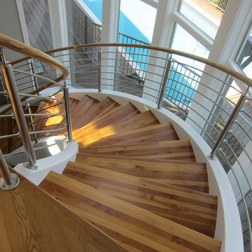
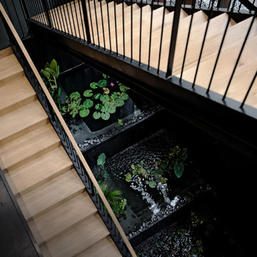
A stunning 3-pool fountain and metal staircase sits inside a 40-ft atrium, with large bay windows that fill the living spaces with natural light.
Example of a huge trendy metal metal railing and wood wall staircase design in Los Angeles with wooden risers
Example of a huge trendy metal metal railing and wood wall staircase design in Los Angeles with wooden risers
 Susan Yeley Homes
Nearly two decades ago now, Susan and her husband put a letter in the mailbox of this eastside home: "If you have any interest in selling, please reach out." But really, who would give up a Flansburgh House?
Fast forward to 2020, when the house went on the market! By then it was clear that three children and a busy home design studio couldn't be crammed into this efficient footprint. But what's second best to moving into your dream home? Being asked to redesign the functional core for the family that was.
In this classic Flansburgh layout, all the rooms align tidily in a square around a central hall and open air atrium. As such, all the spaces are both connected to one another and also private; and all allow for visual access to the outdoors in two directions—toward the atrium and toward the exterior. All except, in this case, the utilitarian galley kitchen. That space, oft-relegated to second class in midcentury architecture, got the shaft, with narrow doorways on two ends and no good visual access to the atrium or the outside. Who spends time in the kitchen anyway?
As is often the case with even the very best midcentury architecture, the kitchen at the Flansburgh House needed to be modernized; appliances and cabinetry have come a long way since 1970, but our culture has evolved too, becoming more casual and open in ways we at SYH believe are here to stay. People (gasp!) do spend time—lots of time!—in their kitchens! Nonetheless, our goal was to make this kitchen look as if it had been designed this way by Earl Flansburgh himself.
The house came to us full of bold, bright color. We edited out some of it (along with the walls it was on) but kept and built upon the stunning red, orange and yellow closet doors in the family room adjacent to the kitchen. That pop was balanced by a few colorful midcentury pieces that our clients already owned, and the stunning light and verdant green coming in from both the atrium and the perimeter of the house, not to mention the many skylights. Thus, the rest of the space just needed to quiet down and be a beautiful, if neutral, foil. White terrazzo tile grounds custom plywood and black cabinetry, offset by a half wall that offers both camouflage for the cooking mess and also storage below, hidden behind seamless oak tambour.
Contractor: Rusty Peterson
Cabinetry: Stoll's Woodworking
Photographer: Sarah Shields
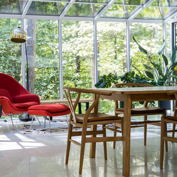 Susan Yeley Homes
Nearly two decades ago now, Susan and her husband put a letter in the mailbox of this eastside home: "If you have any interest in selling, please reach out." But really, who would give up a Flansburgh House?
Fast forward to 2020, when the house went on the market! By then it was clear that three children and a busy home design studio couldn't be crammed into this efficient footprint. But what's second best to moving into your dream home? Being asked to redesign the functional core for the family that was.
In this classic Flansburgh layout, all the rooms align tidily in a square around a central hall and open air atrium. As such, all the spaces are both connected to one another and also private; and all allow for visual access to the outdoors in two directions—toward the atrium and toward the exterior. All except, in this case, the utilitarian galley kitchen. That space, oft-relegated to second class in midcentury architecture, got the shaft, with narrow doorways on two ends and no good visual access to the atrium or the outside. Who spends time in the kitchen anyway?
As is often the case with even the very best midcentury architecture, the kitchen at the Flansburgh House needed to be modernized; appliances and cabinetry have come a long way since 1970, but our culture has evolved too, becoming more casual and open in ways we at SYH believe are here to stay. People (gasp!) do spend time—lots of time!—in their kitchens! Nonetheless, our goal was to make this kitchen look as if it had been designed this way by Earl Flansburgh himself.
The house came to us full of bold, bright color. We edited out some of it (along with the walls it was on) but kept and built upon the stunning red, orange and yellow closet doors in the family room adjacent to the kitchen. That pop was balanced by a few colorful midcentury pieces that our clients already owned, and the stunning light and verdant green coming in from both the atrium and the perimeter of the house, not to mention the many skylights. Thus, the rest of the space just needed to quiet down and be a beautiful, if neutral, foil. White terrazzo tile grounds custom plywood and black cabinetry, offset by a half wall that offers both camouflage for the cooking mess and also storage below, hidden behind seamless oak tambour.
Contractor: Rusty Peterson
Cabinetry: Stoll's Woodworking
Photographer: Sarah Shields
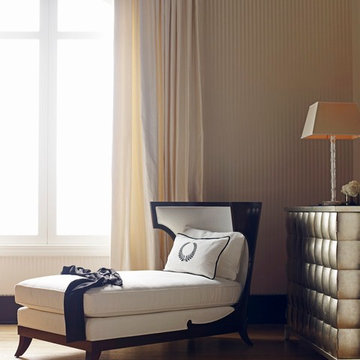
 Baker Furniture
Jacques Garcia designed the Atrium to showcase Baker's skill. With countless details in wood and upholstery, an equally bespoke chaise would rarely be seen outside an atelier in Paris. Surpassing in geometry, joinery, veneering, and tailoring, the Atrium is an icon in the making.
See the Atrium: http://bit.ly/1uF6eYo
Find it near you: http://bit.ly/11tLAW1
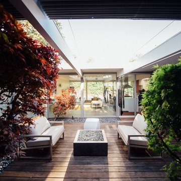
 Urbanism Designs
Photo credit: Encarnacion Photography
Example of a 1960s deck design in San Francisco
Example of a 1960s deck design in San Francisco
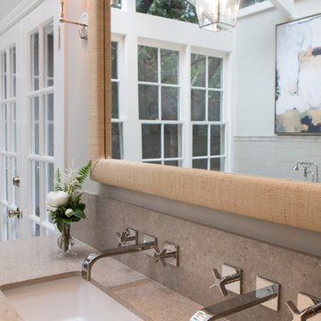
 Charmean Neithart Interiors
Full master bathroom re-model featuring glass, atrium-inspiredd ceiling, stand alone tub and no dam shower.
Erika Bierman Photography www.erikabiermanphotography.com
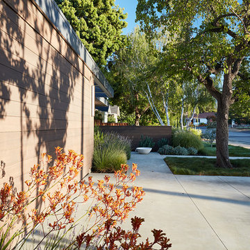
 Klopf Architecture
Klopf Architecture and Outer space Landscape Architects designed a new warm, modern, open, indoor-outdoor home in Los Altos, California. Inspired by mid-century modern homes but looking for something completely new and custom, the owners, a couple with two children, bought an older ranch style home with the intention of replacing it.
Created on a grid, the house is designed to be at rest with differentiated spaces for activities; living, playing, cooking, dining and a piano space. The low-sloping gable roof over the great room brings a grand feeling to the space. The clerestory windows at the high sloping roof make the grand space light and airy.
Upon entering the house, an open atrium entry in the middle of the house provides light and nature to the great room. The Heath tile wall at the back of the atrium blocks direct view of the rear yard from the entry door for privacy.
The bedrooms, bathrooms, play room and the sitting room are under flat wing-like roofs that balance on either side of the low sloping gable roof of the main space. Large sliding glass panels and pocketing glass doors foster openness to the front and back yards. In the front there is a fenced-in play space connected to the play room, creating an indoor-outdoor play space that could change in use over the years. The play room can also be closed off from the great room with a large pocketing door. In the rear, everything opens up to a deck overlooking a pool where the family can come together outdoors.
Wood siding travels from exterior to interior, accentuating the indoor-outdoor nature of the house. Where the exterior siding doesn’t come inside, a palette of white oak floors, white walls, walnut cabinetry, and dark window frames ties all the spaces together to create a uniform feeling and flow throughout the house. The custom cabinetry matches the minimal joinery of the rest of the house, a trim-less, minimal appearance. Wood siding was mitered in the corners, including where siding meets the interior drywall. Wall materials were held up off the floor with a minimal reveal. This tight detailing gives a sense of cleanliness to the house.
The garage door of the house is completely flush and of the same material as the garage wall, de-emphasizing the garage door and making the street presentation of the house kinder to the neighborhood.
The house is akin to a custom, modern-day Eichler home in many ways. Inspired by mid-century modern homes with today’s materials, approaches, standards, and technologies. The goals were to create an indoor-outdoor home that was energy-efficient, light and flexible for young children to grow. This 3,000 square foot, 3 bedroom, 2.5 bathroom new house is located in Los Altos in the heart of the Silicon Valley.
Klopf Architecture Project Team: John Klopf, AIA, and Chuang-Ming Liu
Landscape Architect: Outer space Landscape Architects
Structural Engineer: ZFA Structural Engineers
Staging: Da Lusso Design
Photography ©2018 Mariko Reed
Location: Los Altos, CA
Year completed: 2017
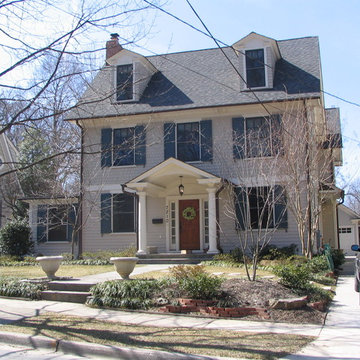
 Atrium Design Group
Major renovations and additions to a two-story house including raising the height of the attic to accommodate two new bedrooms and a new bath.
Large craftsman gray three-story concrete fiberboard exterior home idea in DC Metro with a shingle roof
Large craftsman gray three-story concrete fiberboard exterior home idea in DC Metro with a shingle roof
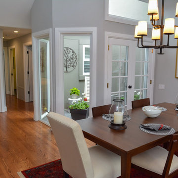
 Gayler Design Build
A newly remodeled beautiful atrium adds abundant natural light for the dining space.
Example of a transitional medium tone wood floor and vaulted ceiling great room design in San Francisco with gray walls
Example of a transitional medium tone wood floor and vaulted ceiling great room design in San Francisco with gray walls
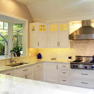 Atrium Design Group
New Kitchen Addition looking toward sink with bay window and range.
Example of a mid-sized trendy u-shaped brown floor and porcelain tile eat-in kitchen design in DC Metro with an undermount sink, white cabinets, granite countertops, beige backsplash, ceramic backsplash, stainless steel appliances and no island
Example of a mid-sized trendy u-shaped brown floor and porcelain tile eat-in kitchen design in DC Metro with an undermount sink, white cabinets, granite countertops, beige backsplash, ceramic backsplash, stainless steel appliances and no island
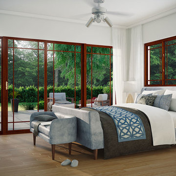
 Inspire Design Center
Inspiration for a large craftsman master light wood floor and beige floor bedroom remodel in Indianapolis with white walls and no fireplace
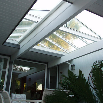
 Rollamatic Retractable Roofs
This Eichler's atrium has been covered by a ridge-type skylight, rather than a typical flat skylight. In this picture, the skylight is partially retracted. Look closer, and you'll see that the closer of the two beams has been built up. That's one of the advantages of Eichlers: they have thick beams running the depth of the house that are perfectly suited to support the weight of a retractable skylight. In the image, the close beam is load-bearing, as is the beam inside the wall on the right side.
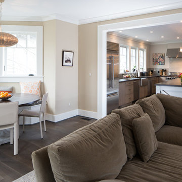 Atrium Design Group
New Family Room looking toward new Kitchen that was part of a complete renovation of and existing two-story frame house in Chevy Chase, MD.
Family room - mid-sized contemporary open concept carpeted and beige floor family room idea in DC Metro with beige walls
Family room - mid-sized contemporary open concept carpeted and beige floor family room idea in DC Metro with beige walls
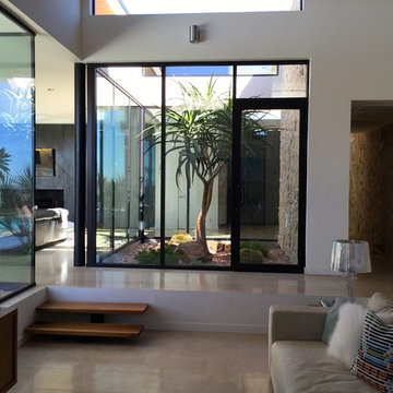
 Carson Douglas Landscape Architecture
Michael Brennan
Living room - 1960s living room idea in San Diego
Living room - 1960s living room idea in San Diego
17