
Search results for "Attempt creating" in Home Design Ideas
 User
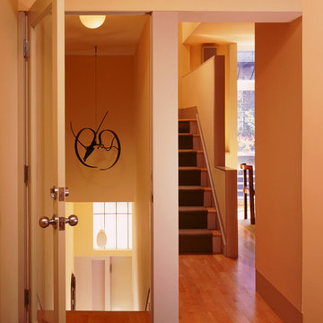
User"To design a house with a garage, an office, three bedrooms and three bathrooms in a 16-foot-wide space was a challenge. The result is a great way to live downtown." Cecil Baker, Philadelphia Style Magazine
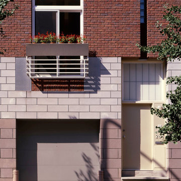
11th Street Residence is one of a series of three townhouses built in the Washington Square West neighborhood of Philadelphia. Once a vacant lot owned by the redevelopment authority, the project was seen as an opportunity to infuse new residential life onto 11th Street. The design of the three 16-foot homes was based on maximum flexibility. The 'residence' is encompassed within the second and third floors; the rear portion of the first floor and the entirety of the fourth floor were offered for customization - either as two office suites, as a standalone rental opportunity (in the case of the first floor), or as expansions of the basic residence.
The design resolution of the 11th Street facades attempts to echo the rhythms and materials of the eclectic streetscape without lapsing into historical repetition. Brick, Arriscraft Renaissance masonry units, and Kalwall combine at the exterior to create a thoroughly modern façade in the city.
Tom Crane Photography
 Shuler Architecture
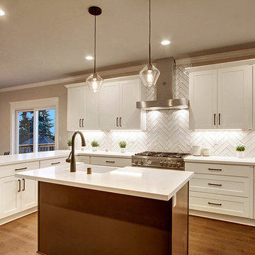
This urban infill project is a make-over of a decrepit structure that had been used as a student rental for close to 50 years. Situated on an elevated, 3300 sf lot, nothing in the original house was salvageable and the entire house was stripped down to the studs. Our challenge with this project was to then open up the original interiors, flood them with natural light while creating a design that appealed to the broadest buyer pool possible.
We solved this problem by organizing a compact floor plan that resulted in a 4 bedroom, 4 bath residence organized around a great room on the main level, a family room on the basement level and an additional 2 bedrooms with city views on the upper. By minimizing circulation space, we were able to re-purpose every square foot of floor area while creating a dramatic, light-filled staircase that tied all 3 levels of the house together into a unified living scheme. Clean lines and clean details, this is another of our attempts at a 'Not So Big House.'
Marketing of the final product lasted less than 10 days and resulted in 3 full priced offers that netted the developer a tidy profit.
 User
User"To design a house with a garage, an office, three bedrooms and three bathrooms in a 16-foot-wide space was a challenge. The result is a great way to live downtown." Cecil Baker, Philadelphia Style Magazine
11th Street Residence is one of a series of three townhouses built in the Washington Square West neighborhood of Philadelphia. Once a vacant lot owned by the redevelopment authority, the project was seen as an opportunity to infuse new residential life onto 11th Street. The design of the three 16-foot homes was based on maximum flexibility. The 'residence' is encompassed within the second and third floors; the rear portion of the first floor and the entirety of the fourth floor were offered for customization - either as two office suites, as a standalone rental opportunity (in the case of the first floor), or as expansions of the basic residence.
The design resolution of the 11th Street facades attempts to echo the rhythms and materials of the eclectic streetscape without lapsing into historical repetition. Brick, Arriscraft Renaissance masonry units, and Kalwall combine at the exterior to create a thoroughly modern façade in the city.
Tom Crane Photography
Find the right local pro for your project
 Shuler Architecture
This urban infill project is a make-over of a decrepit structure that had been used as a student rental for close to 50 years. Situated on an elevated, 3300 sf lot, nothing in the original house was salvageable and the entire house was stripped down to the studs. Our challenge with this project was to then open up the original interiors, flood them with natural light while creating a design that appealed to the broadest buyer pool possible.
We solved this problem by organizing a compact floor plan that resulted in a 4 bedroom, 4 bath residence organized around a great room on the main level, a family room on the basement level and an additional 2 bedrooms with city views on the upper. By minimizing circulation space, we were able to re-purpose every square foot of floor area while creating a dramatic, light-filled staircase that tied all 3 levels of the house together into a unified living scheme. Clean lines and clean details, this is another of our attempts at a 'Not So Big House.'
Marketing of the final product lasted less than 10 days and resulted in 3 full priced offers that netted the developer a tidy profit.
 User
User"To design a house with a garage, an office, three bedrooms and three bathrooms in a 16-foot-wide space was a challenge. The result is a great way to live downtown." Cecil Baker, Philadelphia Style Magazine
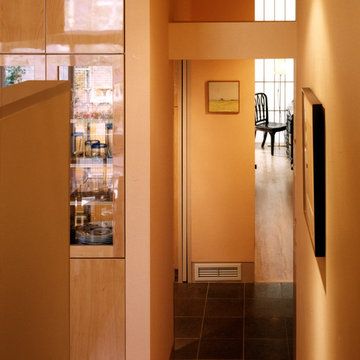
11th Street Residence is one of a series of three townhouses built in the Washington Square West neighborhood of Philadelphia. Once a vacant lot owned by the redevelopment authority, the project was seen as an opportunity to infuse new residential life onto 11th Street. The design of the three 16-foot homes was based on maximum flexibility. The 'residence' is encompassed within the second and third floors; the rear portion of the first floor and the entirety of the fourth floor were offered for customization - either as two office suites, as a standalone rental opportunity (in the case of the first floor), or as expansions of the basic residence.
The design resolution of the 11th Street facades attempts to echo the rhythms and materials of the eclectic streetscape without lapsing into historical repetition. Brick, Arriscraft Renaissance masonry units, and Kalwall combine at the exterior to create a thoroughly modern façade in the city.
Tom Crane Photography
 Progressive Design Build
It was in 2012 when Mike Spreckelmeier first met Roy and Patti. They had been despondent after meeting with multiple contractors in an attempt to start their kitchen remodel. The contractors lacked follow through, came tardy to meetings and even failed to show up at others.
Determined to leave nothing to chance in the pursuit of their dream, Roy and Patti followed up on a recommendation after overhearing a conversation that was taking place while they were standing in a gallingly long line waiting to cast a vote on Election Day.
With a solid recommendation to pursue, Roy and Patti contacted Progressive Design Build. The rest is history.
Mike showed up on time. For a small retainer, he provided preliminary sketches, ideas for maximizing space and storage, and solutions for a sunken family room that created a safety hazard and a problem with traffic flow. More importantly, he designed the project to the homeowners’ budget.
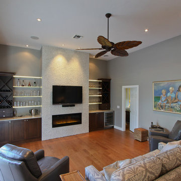
Progressive Design Build shot some different elevations and designed a plan to raise the floor, allowing all finished floors to be on the same level. Upon completion, the kitchen was stunning. Features included LED backlit fire glass shelving, white recessed panel cabinets, a subway tile backsplash, Granite countertop, integrated refrigerator, undermount sink, and more.
The living room was designed with complimentary finishes and included a natural stone fireplace wall with open cabinets flanked on both sides. The 12’ fireplace was made with a floor-to-ceiling white pebble finish.
This Bonita Bay project completed on time and on budget—allowing this fabulous family a wonderful opportunity to create lasting memories for many years to come.
 Shuler Architecture
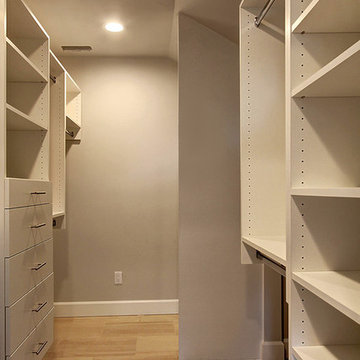
This urban infill project is a make-over of a decrepit structure that had been used as a student rental for close to 50 years. Situated on an elevated, 3300 sf lot, nothing in the original house was salvageable and the entire house was stripped down to the studs. Our challenge with this project was to then open up the original interiors, flood them with natural light while creating a design that appealed to the broadest buyer pool possible.
We solved this problem by organizing a compact floor plan that resulted in a 4 bedroom, 4 bath residence organized around a great room on the main level, a family room on the basement level and an additional 2 bedrooms with city views on the upper. By minimizing circulation space, we were able to re-purpose every square foot of floor area while creating a dramatic, light-filled staircase that tied all 3 levels of the house together into a unified living scheme. Clean lines and clean details, this is another of our attempts at a 'Not So Big House.'
Marketing of the final product lasted less than 10 days and resulted in 3 full priced offers that netted the developer a tidy profit.

Sponsored
Delaware, OH

Buckeye Basements, Inc.
Central Ohio's Basement Finishing ExpertsBest Of Houzz '13-'21
 Shuler Architecture
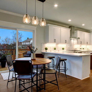
This urban infill project is a make-over of a decrepit structure that had been used as a student rental for close to 50 years. Situated on an elevated, 3300 sf lot, nothing in the original house was salvageable and the entire house was stripped down to the studs. Our challenge with this project was to then open up the original interiors, flood them with natural light while creating a design that appealed to the broadest buyer pool possible.
We solved this problem by organizing a compact floor plan that resulted in a 4 bedroom, 4 bath residence organized around a great room on the main level, a family room on the basement level and an additional 2 bedrooms with city views on the upper. By minimizing circulation space, we were able to re-purpose every square foot of floor area while creating a dramatic, light-filled staircase that tied all 3 levels of the house together into a unified living scheme. Clean lines and clean details, this is another of our attempts at a 'Not So Big House.'
Marketing of the final product lasted less than 10 days and resulted in 3 full priced offers that netted the developer a tidy profit.
 User
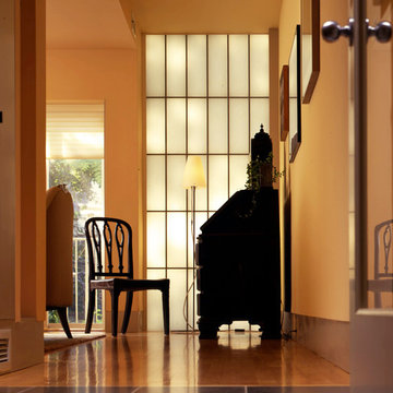
User"To design a house with a garage, an office, three bedrooms and three bathrooms in a 16-foot-wide space was a challenge. The result is a great way to live downtown." Cecil Baker, Philadelphia Style Magazine
11th Street Residence is one of a series of three townhouses built in the Washington Square West neighborhood of Philadelphia. Once a vacant lot owned by the redevelopment authority, the project was seen as an opportunity to infuse new residential life onto 11th Street. The design of the three 16-foot homes was based on maximum flexibility. The 'residence' is encompassed within the second and third floors; the rear portion of the first floor and the entirety of the fourth floor were offered for customization - either as two office suites, as a standalone rental opportunity (in the case of the first floor), or as expansions of the basic residence.
The design resolution of the 11th Street facades attempts to echo the rhythms and materials of the eclectic streetscape without lapsing into historical repetition. Brick, Arriscraft Renaissance masonry units, and Kalwall combine at the exterior to create a thoroughly modern façade in the city.
Tom Crane Photography
 Harris Landscape & Design LLC
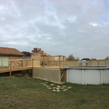
Previn consisted of scraping grass down to dirt with a bobcat then work began on the deck. Posts were set, frame was built, and decking was put into place. After the deck was finished, a pergola was built on top of the structure, everything was pressure washed, then later stained. After the deck was stained, we dug out the rest of the area around the pool (not shown), all the way to the front in attempts to make a circle around the pool. A square was dug out of the ground, and butter sticks were put into place, barrier was put into place, and the fire pit constructed. Liner was placed down throughout the entire project site, and mulch was placed in both the back of the pool (not shown) from the back and side fence, circling the pool, and up to the deck. Cypress trees were planted around the pool, and various bushes along the mulch edge up against the deck by the ramp. Pavers were set into place to create a path around the patio and shadow rock was brought in, and spread all throughout remaining project area.
In short: Demoed job site, added deck, added fire pit, added butter sticks, placed down liner, added metal edging, created borders, planted cypress trees, planted bushes, added mulch, added pavers, added shadow rock.
 Shuler Architecture
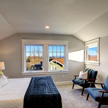
This urban infill project is a make-over of a decrepit structure that had been used as a student rental for close to 50 years. Situated on an elevated, 3300 sf lot, nothing in the original house was salvageable and the entire house was stripped down to the studs. Our challenge with this project was to then open up the original interiors, flood them with natural light while creating a design that appealed to the broadest buyer pool possible.
We solved this problem by organizing a compact floor plan that resulted in a 4 bedroom, 4 bath residence organized around a great room on the main level, a family room on the basement level and an additional 2 bedrooms with city views on the upper. By minimizing circulation space, we were able to re-purpose every square foot of floor area while creating a dramatic, light-filled staircase that tied all 3 levels of the house together into a unified living scheme. Clean lines and clean details, this is another of our attempts at a 'Not So Big House.'
Marketing of the final product lasted less than 10 days and resulted in 3 full priced offers that netted the developer a tidy profit.
 User
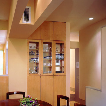
User"To design a house with a garage, an office, three bedrooms and three bathrooms in a 16-foot-wide space was a challenge. The result is a great way to live downtown." Cecil Baker, Philadelphia Style Magazine
11th Street Residence is one of a series of three townhouses built in the Washington Square West neighborhood of Philadelphia. Once a vacant lot owned by the redevelopment authority, the project was seen as an opportunity to infuse new residential life onto 11th Street. The design of the three 16-foot homes was based on maximum flexibility. The 'residence' is encompassed within the second and third floors; the rear portion of the first floor and the entirety of the fourth floor were offered for customization - either as two office suites, as a standalone rental opportunity (in the case of the first floor), or as expansions of the basic residence.
The design resolution of the 11th Street facades attempts to echo the rhythms and materials of the eclectic streetscape without lapsing into historical repetition. Brick, Arriscraft Renaissance masonry units, and Kalwall combine at the exterior to create a thoroughly modern façade in the city.
Barry Halkin and Todd Mason Photography
 Shuler Architecture
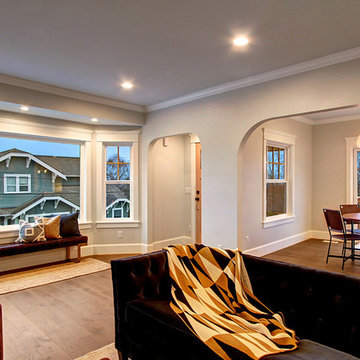
This urban infill project is a make-over of a decrepit structure that had been used as a student rental for close to 50 years. Situated on an elevated, 3300 sf lot, nothing in the original house was salvageable and the entire house was stripped down to the studs. Our challenge with this project was to then open up the original interiors, flood them with natural light while creating a design that appealed to the broadest buyer pool possible.
We solved this problem by organizing a compact floor plan that resulted in a 4 bedroom, 4 bath residence organized around a great room on the main level, a family room on the basement level and an additional 2 bedrooms with city views on the upper. By minimizing circulation space, we were able to re-purpose every square foot of floor area while creating a dramatic, light-filled staircase that tied all 3 levels of the house together into a unified living scheme. Clean lines and clean details, this is another of our attempts at a 'Not So Big House.'
Marketing of the final product lasted less than 10 days and resulted in 3 full priced offers that netted the developer a tidy profit.

Sponsored
Columbus, OH

Hope Restoration & General Contracting
Columbus Design-Build, Kitchen & Bath Remodeling, Historic Renovations
 Shuler Architecture
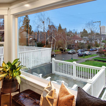
This urban infill project is a make-over of a decrepit structure that had been used as a student rental for close to 50 years. Situated on an elevated, 3300 sf lot, nothing in the original house was salvageable and the entire house was stripped down to the studs. Our challenge with this project was to then open up the original interiors, flood them with natural light while creating a design that appealed to the broadest buyer pool possible.
We solved this problem by organizing a compact floor plan that resulted in a 4 bedroom, 4 bath residence organized around a great room on the main level, a family room on the basement level and an additional 2 bedrooms with city views on the upper. By minimizing circulation space, we were able to re-purpose every square foot of floor area while creating a dramatic, light-filled staircase that tied all 3 levels of the house together into a unified living scheme. Clean lines and clean details, this is another of our attempts at a 'Not So Big House.'
Marketing of the final product lasted less than 10 days and resulted in 3 full priced offers that netted the developer a tidy profit.
 Shuler Architecture
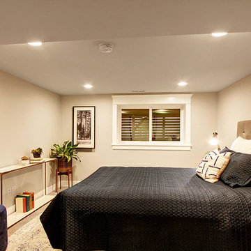
This urban infill project is a make-over of a decrepit structure that had been used as a student rental for close to 50 years. Situated on an elevated, 3300 sf lot, nothing in the original house was salvageable and the entire house was stripped down to the studs. Our challenge with this project was to then open up the original interiors, flood them with natural light while creating a design that appealed to the broadest buyer pool possible.
We solved this problem by organizing a compact floor plan that resulted in a 4 bedroom, 4 bath residence organized around a great room on the main level, a family room on the basement level and an additional 2 bedrooms with city views on the upper. By minimizing circulation space, we were able to re-purpose every square foot of floor area while creating a dramatic, light-filled staircase that tied all 3 levels of the house together into a unified living scheme. Clean lines and clean details, this is another of our attempts at a 'Not So Big House.'
Marketing of the final product lasted less than 10 days and resulted in 3 full priced offers that netted the developer a tidy profit.
 HU-235072162
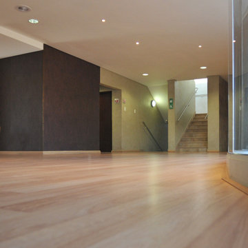
The Dental Studio is a highly intricate building that uniquely links two separate stands of two neighbourhoods and straddling a four metre broad municipal
servitude. The western part of the neighbourhood is an office precinct consisting of low scaled office buildings set around a communal access street and
parking. It was designed for a leading dental practice with state of the art equipment and progressive philosophy of service.
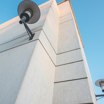
It presents itself as an uncomplicated rectangular structural mass that elegantly characterise an intersection of a major neighbourhood boulevard and is
notable along the eastern end with an upright circulation tower. The western end on the other hand, is characterised with vertical solar control screens
which serve a dual purpose, that is, sifting low down western sun rays as well as giving a serene appeal to the mass. The daring spotless form of the
building is a truthful reflection of the nature of the sterile dental environment that is housed within. This houses the central vestibule and reception with a
visual interface as well as pedestrian movements along the edge of the building.
Healing and healthcare is a paradox that requires architectural intervention. It is this same paradox that informed measures taken towards developing this
project as a revised prototype. Exacerbated by the need to research a building type that can promote healing environment, the Dental Studio attempts
to create a closer harmony with nature through views, landscape and daylight.
 HU-235072162
The Dental Studio is a highly intricate building that uniquely links two separate stands of two neighbourhoods and straddling a four metre broad municipal
servitude. The western part of the neighbourhood is an office precinct consisting of low scaled office buildings set around a communal access street and
parking. It was designed for a leading dental practice with state of the art equipment and progressive philosophy of service.
It presents itself as an uncomplicated rectangular structural mass that elegantly characterise an intersection of a major neighbourhood boulevard and is
notable along the eastern end with an upright circulation tower. The western end on the other hand, is characterised with vertical solar control screens
which serve a dual purpose, that is, sifting low down western sun rays as well as giving a serene appeal to the mass. The daring spotless form of the
building is a truthful reflection of the nature of the sterile dental environment that is housed within. This houses the central vestibule and reception with a
visual interface as well as pedestrian movements along the edge of the building.
Healing and healthcare is a paradox that requires architectural intervention. It is this same paradox that informed measures taken towards developing this
project as a revised prototype. Exacerbated by the need to research a building type that can promote healing environment, the Dental Studio attempts
to create a closer harmony with nature through views, landscape and daylight.
Sponsored
Columbus, OH
Hope Restoration & General Contracting
Columbus Design-Build, Kitchen & Bath Remodeling, Historic Renovations
 User
User"To design a house with a garage, an office, three bedrooms and three bathrooms in a 16-foot-wide space was a challenge. The result is a great way to live downtown." Cecil Baker, Philadelphia Style Magazine
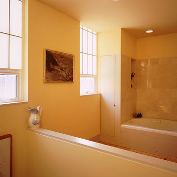
11th Street Residence is one of a series of three townhouses built in the Washington Square West neighborhood of Philadelphia. Once a vacant lot owned by the redevelopment authority, the project was seen as an opportunity to infuse new residential life onto 11th Street. The design of the three 16-foot homes was based on maximum flexibility. The 'residence' is encompassed within the second and third floors; the rear portion of the first floor and the entirety of the fourth floor were offered for customization - either as two office suites, as a standalone rental opportunity (in the case of the first floor), or as expansions of the basic residence.
The design resolution of the 11th Street facades attempts to echo the rhythms and materials of the eclectic streetscape without lapsing into historical repetition. Brick, Arriscraft Renaissance masonry units, and Kalwall combine at the exterior to create a thoroughly modern façade in the city.
Rob Ikeler Photography
 HU-235072162
The Dental Studio is a highly intricate building that uniquely links two separate stands of two neighbourhoods and straddling a four metre broad municipal
servitude. The western part of the neighbourhood is an office precinct consisting of low scaled office buildings set around a communal access street and
parking. It was designed for a leading dental practice with state of the art equipment and progressive philosophy of service.
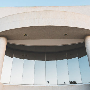
It presents itself as an uncomplicated rectangular structural mass that elegantly characterise an intersection of a major neighbourhood boulevard and is
notable along the eastern end with an upright circulation tower. The western end on the other hand, is characterised with vertical solar control screens
which serve a dual purpose, that is, sifting low down western sun rays as well as giving a serene appeal to the mass. The daring spotless form of the
building is a truthful reflection of the nature of the sterile dental environment that is housed within. This houses the central vestibule and reception with a
visual interface as well as pedestrian movements along the edge of the building.
Healing and healthcare is a paradox that requires architectural intervention. It is this same paradox that informed measures taken towards developing this
project as a revised prototype. Exacerbated by the need to research a building type that can promote healing environment, the Dental Studio attempts
to create a closer harmony with nature through views, landscape and daylight.
 Amazing Spaces
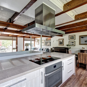
The existing kitchen was separated from the family room by a 17’ long bookcase. It was the first thing you saw upon entering and it hid much of the light and views to the backyard making the space feel claustrophobic. The laundry room was part of the kitchen space without any attempt to conceal the washer and dryer. Removing the long bookcase opened the opportunity to add counter stools in the kitchen and decided to align a target wall opposite the front door to help maintain some division within the main space while creating a space for the refrigerator. This also allowed us to create an open laundry room concept that would be hidden from view from all other areas.
We kept the industrial feel of the exposed building materials, which we complimented with textured melamine slab doors for the new kitchen cabinets. We maintained the galley set up but defined the kitchen from the utility area by changing both thickness and color of the countertop materials. Because the back of the house is mainly windows, there was very little wall space for upper cabinets and everyday dish storage. We designed a custom ceiling hung shelf system that floats in front of the windows, and is mostly out of view from the sitting area. Tall cabinets are installed along the only available wall to support both kitchen and laundry room functions. We used cable lighting threaded through the beams which really punctuates the industrial aesthetic.
8