
Search results for "Attempt" in Home Design Ideas

 Envision Web
Stuart Wade, Envision Virtual Tours
The second-largest and most developed of Georgia's barrier islands, St. Simons is approximately twelve miles long and nearly three miles wide at its widest stretch (roughly the size of Manhattan Island in New York). The island is located in Glynn County on Georgia's coast and lies east of Brunswick (the seat of Glynn County), south of Little St. Simons Island and the Hampton River, and north of Jekyll Island. The resort community of Sea Island is separated from St. Simons on the east by the Black Banks River. Known for its oak tree canopies and historic landmarks, St. Simons is both a tourist destination and, according to the 2010 U.S. census, home to 12,743 residents.
Early History
The earliest
St. Simons Island Village
record of human habitation on the island dates to the Late Archaic Period, about 5,000 to 3,000 years ago. Remnants of shell rings left behind by Native Americans from this era survive on many of the barrier islands, including St. Simons. Centuries later, during the period known by historians as the chiefdom era, the Guale Indians established a chiefdom centered on St. Catherines Island and used St. Simons as their hunting and fishing grounds. By 1500 the Guale had established a permanent village of about 200 people on St. Simons, which they called Guadalquini.
Beginning in 1568, the Spanish attempted to create missions along the Georgia coast. Catholic missions were the primary means by which Georgia's indigenous Native American chiefdoms were assimilated into the Spanish colonial system along the northern frontier of greater Spanish Florida. In the 1600s St. Simons became home to two Spanish missions: San Buenaventura de Guadalquini, on the southern tip of the island, and Santo Domingo de Asao (or Asajo), on the northern tip. Located on the inland side of the island were the pagan refugee villages of San Simón, the island's namesake, and Ocotonico. In 1684 pirate raids left the missions and villages largely abandoned.
Colonial History
As
Fort Frederica
early as 1670, with Great Britain's establishment of the colony of Carolina and its expansion into Georgia territory, Spanish rule was threatened by the English. The Georgia coast was considered "debatable land" by England and Spain, even though Spain had fully retreated from St. Simons by 1702. Thirty-one years later General James Edward Oglethorpe founded the English settlement of Savannah. In 1736 he established Fort Frederica, named after the heir to the British throne, Frederick Louis, prince of Wales, on the west side of St. Simons Island to protect Savannah and the Carolinas from the Spanish threat.
Between 1736 and 1749 Fort Frederica was the hub of British military operations along the Georgia frontier. A town of the same name grew up around the fort and was of great importance to the new colony. By 1740 Frederica's population was 1,000. In 1736 the congregation of what would become Christ Church was organized within Fort Frederica as a mission of the Church of England. Charles Wesley led the first services. In 1742 Britain's decisive victory over Spain in the Battle of Bloody Marsh, during the War of Jenkins' Ear, ended the Spanish threat to the Georgia coast. When the British regimen disbanded in 1749, most of the townspeople relocated to the mainland. Fort Frederica went into decline and, except for a short time of prosperity during the 1760s and 1770s under the leadership of merchant James Spalding, never fully recovered. Today the historic citadel's tabby ruins are maintained by the National Park Service.
Plantation Era
By the start of the American Revolution (1775-83), Fort Frederica was obsolete, and St. Simons was left largely uninhabited as most of its residents joined the patriot army. Besides hosting a small Georgia naval victory on the Fort Frederica River, providing guns from its famous fort for use at Fort Morris in Sunbury, and serving as an arena for pillaging by privateers and British soldiers, the island played almost no role in the war.
Following the war, many of the townspeople, their businesses destroyed, turned to agriculture. The island was transformed into fourteen cotton plantations after acres of live oak trees were cleared for farm land and used for building American warships, including the famous USS Constitution, or "Old Ironsides." Although rice was the predominant crop along the neighboring Altamaha River, St. Simons was known for its production of long-staple cotton, which soon came to be known as Sea Island cotton.
Between
Ebos Landing
the 1780s and the outbreak of the Civil War (1861-65), St. Simons's plantation culture flourished. The saline atmosphere and the availability of cheap slave labor proved an ideal combination for the cultivation of Sea Island cotton. In 1803 a group of Ebo slaves who survived the Middle Passage and arrived on the west side of St. Simons staged a rebellion and drowned themselves. The sacred site is known today as Ebos Landing.
One of the largest owners of land and slaves on St. Simons was Pierce Butler, master of Hampton Point Plantation, located on the northern end of the island. By 1793 Butler owned more than 500 slaves, who cultivated 800 acres of cotton on St. Simons and 300 acres of rice on Butler's Island in the Altamaha River delta. Butler's grandson, Pierce Mease Butler, who at the age of sixteen inherited a share of his grandfather's estate in 1826, was responsible for the largest sale of human beings in the history of the United States: in 1859, to restore his squandered fortune, he sold 429 slaves in Savannah for more than $300,000. The British actress and writer Fanny Kemble, whose tumultuous marriage to Pierce ended in divorce in 1849, published an eyewitness account of the evils of slavery on St. Simons in her book Journal of a Residence on a Georgian Plantation in 1838-1839 (1863).
Another
Retreat Plantation
large owner of land and slaves on St. Simons was Major William Page, a friend and employee of Pierce Butler Sr. Before purchasing Retreat Plantation on the southwestern tip of the island in 1804, Page managed the Hampton plantation and Butler's Island. Upon Page's death in 1827, Thomas Butler King inherited the land together with his wife, Page's daughter, Anna Matilda Page King. King expanded his father-in-law's planting empire on St. Simons as well as on the mainland, and by 1835 Retreat Plantation alone was home to as many as 355 slaves.
The center of life during the island's plantation era was Christ Church, Frederica. Organized in 1807 by a group of island planters, the Episcopal church is the second oldest in the Diocese of Georgia. Embargoes imposed by the War of 1812 (1812-15) prevented the parishioners from building a church structure, so they worshiped in the home of John Beck, which stood on the site of Oglethorpe's only St. Simons residence, Orange Hall.
The first Christ Church building, finished on the present site in 1820, was ruined by occupying Union troops during the Civil War. In 1884 the Reverend Anson Dodge Jr. rebuilt the church as a memorial to his first wife, Ellen. The cruciform building with a trussed gothic roof and stained-glass windows remains active today as Christ Church.
Civil War and Beyond
The
St. Simons Island Lighthouse
outbreak of the Civil War in 1861 put a sudden end to St. Simons's lucrative plantation era. In January of that year, Confederate troops were stationed at the south end of the island to guard the entrance to Brunswick Harbor. Slaves from Retreat Plantation, owned by Thomas Butler King, built earthworks and batteries. Plantation residents were scattered—the men joined the Confederate army and their families moved to the mainland. Cannon fire was heard on the island in December 1861, and Confederate troops retreated in February 1862, after dynamiting the lighthouse to keep its beacon from aiding Union troops. Soon thereafter, Union troops occupied the island, which was used as a camp for freed slaves. By August 1862 more than 500 former slaves lived on St. Simons, including Susie King Taylor, who organized a school for freed slave children. But in November the ex-slaves were taken to Hilton Head, South Carolina, and Fernandina, Florida, leaving the island abandoned.
After the Civil War the island never returned to its status as an agricultural community. The plantations lay dormant because there were no slaves to work the fields. After Union general William T. Sherman's January 1865 Special Field Order No. 15 —a demand that former plantations be divided and distributed to former slaves—was overturned by U.S. president Andrew Johnson less than a year later, freedmen and women were forced to work as sharecroppers on the small farms that dotted the land previously occupied by the sprawling plantations.
By
St. Simons Lumber Mills
1870 real economic recovery began with the reestablishment of the timber industry. Norman Dodge and Titus G. Meigs of New York set up lumber mill operations at Gascoigne Bluff, formerly Hamilton Plantation. The lumber mills provided welcome employment for both blacks and whites and also provided mail and passenger boats to the mainland. Such water traffic, together with the construction of a new lighthouse in 1872, designed by architect Charles B. Cluskey, marked the beginning of St. Simons's tourism industry. The keeper of the lighthouse created a small amusement park, which drew many visitors, as did the seemingly miraculous light that traveled from the top of the lighthouse tower to the bottom. The island became a summer retreat for families from the mainland, particularly from Baxley, Brunswick, and Waycross.
The island's resort industry was thriving by the 1880s. Beachfront structures, such as a new pier and grand hotel, were built on the southeastern end of the island and could be accessed by ferry. Around this time wealthy northerners began vacationing on the island.
Twentieth Century
The
St. Simons Island Pier and Village
opening in 1924 of the Brunswick–St. Simons Highway, today known as the Torras Causeway, was a milestone in the development of resorts in the area. St. Simons's beaches were now easily accessible to locals and tourists alike. More than 5,000 automobiles took the short drive from Brunswick to St. Simons via the causeway on its opening day, paving the way for convenient residential and resort development.
In 1926 automotive pioneer Howard Coffin of Detroit, Michigan, bought large tracts of land on St. Simons, including the former Retreat Plantation, and constructed a golf course, yacht club, paved roads, and a residential subdivision. Although the causeway had brought large numbers of summer people to the island, St. Simons remained a small community with only a few hundred permanent residents until the 1940s.
The
St. Simons Island
outbreak of World War II (1941-45) brought more visitors and residents to St. Simons. Troops stationed at Jacksonville, Florida; Savannah; and nearby Camp Stewart took weekend vacations on the island, and a new naval air base and radar school became home to even more officers and soldiers. The increased wartime population brought the island its first public school. With a major shipyard for the production of Liberty ships in nearby Brunswick, the waters of St. Simons became active with German U-boats. In April 1942, just off the coast, the Texas Company oil tanker S. S. Oklahoma and the S. S. Esso Baton Rouge were torpedoed by the Germans, bringing the war very close to home for island residents.
Due in large part to the military's improvement of the island's infrastructure during the war, development on the island boomed in the 1950s and 1960s. More permanent homes and subdivisions were built, and the island was no longer just a summer resort but also a thriving community. In 1950 the Methodist conference and retreat center Epworth by the Sea opened on Gascoigne Bluff. In 1961 novelist Eugenia Price visited St. Simons and began work on her first works of fiction, known as the St. Simons Trilogy. Inspired by real events on the island, Price's trilogy renewed interest in the history of Georgia's coast, and the novelist herself relocated to the island in 1965 and lived there for thirty-one years. St. Simons is also home to contemporary Georgia writer Tina McElroy Ansa.
Since
Epworth by the Sea
1980 St. Simons's population has doubled. The island's continued status as a vacation destination and its ongoing development boom have put historic landmarks and natural areas at risk. While such landmarks as the Fort Frederica ruins and the Battle of Bloody Marsh site are preserved and maintained by the National Park Service, and while the historic lighthouse is maintained by the Coastal Georgia Historical Society, historic Ebos Landing has been taken over by a sewage treatment plant.
Several coastal organizations have formed in recent years to save natural areas on the island. The St. Simons Land Trust, for example, has received donations of large tracts of land and plans to protect property in the island's three traditional African American neighborhoods. Despite its rapid growth and development, St. Simons remains one of the most beautiful and important islands on the Georgia coast.

 CITYDESKSTUDIO, Inc.
A family that spends a lot of time in and around their beautiful saltwater pool, did not have a place in their home that provided them a visual or physical connection. They also lacked any storage for all their pool “stuff”. With small children and a love for entertaining, they needed a room that served and supported their watery lifestyle. We took over an empty and unused notch along the back of the house adjacent to the pool patio to create a new bright and airy pool house.
The new out building attempts to unify 4 areas; an existing deck, an upper master bedroom balcony, a lower lawn, and the pool itself, and provide the missing storage. By locating the pool house at the juxtaposition of these areas, the new room was able to provide a new expanded rooftop balcony for the master, anchor and define the dining and barbeque deck, extend and connect to the pool and patio, and create a new access to integrate the lower lawn – and carve out the much needed storage for the variety of pool toys and equipment.
The building itself is 400 sf with bath, laundry, storage, mechanical, kitchen, and living. A single new secure connection is made into the house through the existing mudroom. Clad with crisply detailed ship lap cedar, it draws on the existing material palate of the house and nods to the boat aesthetic in expression and efficiency. With pocketing glass walls the pool house is both the utility building needed, and an expansion of the vibrant pool scene itself, inside and outside, along the poolside.
Photographer: Brandon Stengelwww.farmkidstudios.com
Location: Edina, MN
Completed: 2013
Project Team:
Ben Awes AIA, Principal-In-Charge
Bob Ganser AIA
Christian Dean AIA
Nate Dodge
 Architecture Office
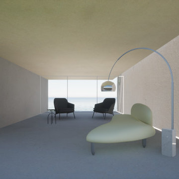
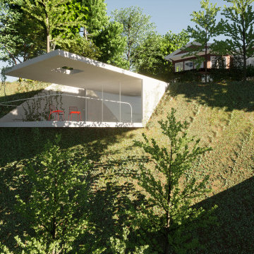
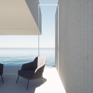
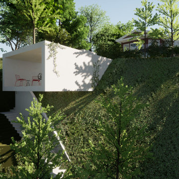
The project consists of three primary additions, one a workshop and garage, the second a basement expansion that juts out over the lake, and a third, which expands the existing living areas with a wall of glass. This third addition, originally not part of the project, was a recommendation by Architecture Office well received by the client because of how it transformed the existing living areas.
The existing architecture consists of a historic neo-classical house with a less purist addition that attempts to mimic the original. We took the approach of contrasting the existing to avoid having two additions lacking the craft and integrity of the original. This contrast is a welcoming change to previously dark interiors. The concept opens up opportunities for capturing lake views, creating modern living areas that flow from one to the next.
The rear garage and second floor workshop compliment the owners entrepreneurial spirit, a person who enjoys the act of a making. The form is simple but clearly delineates itself form the brick construction with black metal siding and a glass walkway connecting the two. The structure draws from old factory buildings that gather daylight from above, synthesized through a milky polycarbonate portion of roof.
The basement addition expands on an existing subterranean space used for storage and utilities. This room is converted into a living space with sleeping quarters, wet bar, and restroom facilities. This living room is a mini oasis from the rest of the house with views secluded to the water and sky. The openness of the balcony expand the view in all directions, with the sun blocked under a cantilevered shade cover.
Find the right local pro for your project
 Brendan McHugh, Architect, Manasquan, NJ
VISION AND NEEDS:
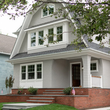
Our client came to us with a vision for their dream house for their growing family with three young children. This was their second attempt at getting the right design. The first time around, after working with an out-of-state online architect, they could not achieve the level of quality they wanted. McHugh delivered a home with higher quality design.
MCHUGH SOLUTION:
The Shingle/Dutch Colonial Design was our client's dream home style. Their priorities were to have a home office for both parents. Ample living space for kids and friends, along with outdoor space and a pool. Double sink bathroom for the kids and a master bedroom with bath for the parents. Despite being close a flood zone, clients could have a fully finished basement with 9ft ceilings and a full attic. Because of the higher water table, the first floor was considerably above grade. To soften the ascent of the front walkway, we designed planters around the stairs, leading up to the porch.

 Eldorado Stone
After an unsuccessful attempt at finding the original brick for this home, we were excited to present Eldorado Stone to our homeowners for its very natural look, high quality, and reputation. We chose the Cambria Cliffstone for its elegance and rich color tones.
The residents wanted to expand the kitchen into a large open space where they could entertain family and friends, so the design goal was to create a comfortable outdoor space that complimented the home’s existing exterior. Additionally, large windows were installed in an effort to bring the outdoors in as well as compliment their landscaping. Eldorado Stone proved to be a perfect fit for the exterior of this addition, as it blends in with the greenery around the home in addition to the neighborhood as a whole.
Eldorado Stone Profile Featured: Cambria Cliffstone installed with a Standard Grout
Eldorado Stone Profile Featured: Cambria Cliffstone installed with a Standard Grout
Architect: Brock Eustice
Builder: RJK Construction, Inc.
Website: www.rjkconstructioninc.com
Designer: Designs by Skill, LLC
Website: www.designsbyskill.com
Mason: Ricky Webster
Phone: 540-446-3661
Photography: Greg Hadley
Website:www.greghadleyphotography.com
 Architecture Office
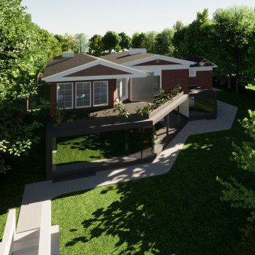
The project consists of three primary additions, one a workshop and garage, the second a basement expansion that juts out over the lake, and a third, which expands the existing living areas with a wall of glass. This third addition, originally not part of the project, was a recommendation by Architecture Office well received by the client because of how it transformed the existing living areas.
The existing architecture consists of a historic neo-classical house with a less purist addition that attempts to mimic the original. We took the approach of contrasting the existing to avoid having two additions lacking the craft and integrity of the original. This contrast is a welcoming change to previously dark interiors. The concept opens up opportunities for capturing lake views, creating modern living areas that flow from one to the next.
The rear garage and second floor workshop compliment the owners entrepreneurial spirit, a person who enjoys the act of a making. The form is simple but clearly delineates itself form the brick construction with black metal siding and a glass walkway connecting the two. The structure draws from old factory buildings that gather daylight from above, synthesized through a milky polycarbonate portion of roof.
The basement addition expands on an existing subterranean space used for storage and utilities. This room is converted into a living space with sleeping quarters, wet bar, and restroom facilities. This living room is a mini oasis from the rest of the house with views secluded to the water and sky. The openness of the balcony expand the view in all directions, with the sun blocked under a cantilevered shade cover.
 Architecture Office
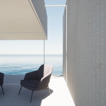
The project consists of three primary additions, one a workshop and garage, the second a basement expansion that juts out over the lake, and a third, which expands the existing living areas with a wall of glass. This third addition, originally not part of the project, was a recommendation by Architecture Office well received by the client because of how it transformed the existing living areas.
The existing architecture consists of a historic neo-classical house with a less purist addition that attempts to mimic the original. We took the approach of contrasting the existing to avoid having two additions lacking the craft and integrity of the original. This contrast is a welcoming change to previously dark interiors. The concept opens up opportunities for capturing lake views, creating modern living areas that flow from one to the next.
The rear garage and second floor workshop compliment the owners entrepreneurial spirit, a person who enjoys the act of a making. The form is simple but clearly delineates itself form the brick construction with black metal siding and a glass walkway connecting the two. The structure draws from old factory buildings that gather daylight from above, synthesized through a milky polycarbonate portion of roof.
The basement addition expands on an existing subterranean space used for storage and utilities. This room is converted into a living space with sleeping quarters, wet bar, and restroom facilities. This living room is a mini oasis from the rest of the house with views secluded to the water and sky. The openness of the balcony expand the view in all directions, with the sun blocked under a cantilevered shade cover.
 User
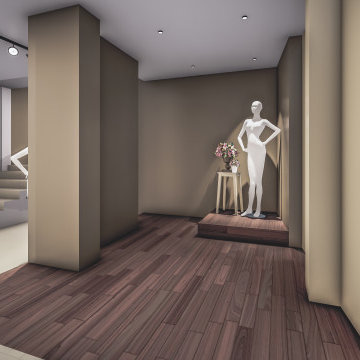
UserProject: Kandula Clothing Store
Location: Padiyapelella Town
Area: 3500 Sqft
Type: Interior Renovation Project
Budget: 8 Million
We have for a long time been endowed with unique and sustainable designs that have penetrated the various landscapes of the island. Our creations are testifying to this by further beautifying nature, further appeasing human needs, and shining with pride day by day. Combined with our experience, hard work, and the hope of paving the way for an innovative lifestyle for the people, this modern shopping center has been given to the historic town of Padiyapelella. This is not just construction on a piece of land, but an attempt to recall the pride of a historical land mixed with the values of modernity. This is likely to be the first step in making Padiyapella modern shopping hub. We hope that this mall, nurtured by the convenience of our design, will become a part of the lives of the people by meeting their modern needs.
We are ready to give you this kind of sophistication to build your dream construction too. Contact us today and get a 10% discount on your first project.
Learn more about our latest projects from www.royalkandyan.com
https://royalkandyan.com/.../kandula-clothing-store-at.../
P: (77) 719 8825
P: (81) 207 3825
E: Info@royalkandyan.com
©️The Royal Kandyan Design & Engineering (PVT) LTD
#Architecture #InteriorDesign #Design #ModernDesign #KandyArchitect #LuxuryLifestyle #Construction #KandyArchitect #KandyArchitecture #ConstructionCompanyInSriLanka #SriLanka
#DulajJayasinghe
 Architecture Office
The project consists of three primary additions, one a workshop and garage, the second a basement expansion that juts out over the lake, and a third, which expands the existing living areas with a wall of glass. This third addition, originally not part of the project, was a recommendation by Architecture Office well received by the client because of how it transformed the existing living areas.
The existing architecture consists of a historic neo-classical house with a less purist addition that attempts to mimic the original. We took the approach of contrasting the existing to avoid having two additions lacking the craft and integrity of the original. This contrast is a welcoming change to previously dark interiors. The concept opens up opportunities for capturing lake views, creating modern living areas that flow from one to the next.
The rear garage and second floor workshop compliment the owners entrepreneurial spirit, a person who enjoys the act of a making. The form is simple but clearly delineates itself form the brick construction with black metal siding and a glass walkway connecting the two. The structure draws from old factory buildings that gather daylight from above, synthesized through a milky polycarbonate portion of roof.
The basement addition expands on an existing subterranean space used for storage and utilities. This room is converted into a living space with sleeping quarters, wet bar, and restroom facilities. This living room is a mini oasis from the rest of the house with views secluded to the water and sky. The openness of the balcony expand the view in all directions, with the sun blocked under a cantilevered shade cover.

 DesignARC
LOS ANGELES, CA / SINGLE FAMILY RESIDENTIAL
The commission for this 4,300-square-foot residence came with significant challenges for the architects – a house had once existed on the lot but had burned down and the attempt to replace the house had stalled, leading to an abatement order and a lapse of permits.
Our first challenge was to revive the lapsed construction permit by proposing to “modify” the existing structure. The practical effect this had was to fix the footprint of the new home to the existing structure’s plan outline. Having thereby inherited the large, dense block of the original house, the new strategy became one of substituting selective areas of indoor space for outdoor courtyard.
This strategy of trading indoor space for outdoor courtyard allowed an erosion of the formerly monolithic structure into a series of distinct volumetric elements, and further suggested that the architectural pieces could cohere as a “village.” The main level is further eroded by large, glazed planes, merging indoor with outdoor, and virtually stretching the landscape across interior space. Moving the detached garage from the rear yard to beneath the new living space allowed for a 75-meter lap pool and a shaded olive garden.
The gardens include built-in seating, extensive use of ornamental grasses and Zen-like interior courtyards. A material palette of fossilized stone, bonderized-galvanized metal, and natural Douglas fir allows for the warmth desired by the wife, while providing the modernity required by the husband. Programmatically, her music room borrows from the calm and protected olive court in the rear, while his office becomes a pavilion set in the landscape, which both addresses the street and acts as a sheltering monument for the terraced entry garden.
 Brendan McHugh, Architect, Manasquan, NJ
VISION AND NEEDS:
Our client came to us with a vision for their dream house for their growing family with three young children. This was their second attempt at getting the right design. The first time around, after working with an out-of-state online architect, they could not achieve the level of quality they wanted. McHugh delivered a home with higher quality design.
MCHUGH SOLUTION:
The Shingle/Dutch Colonial Design was our client's dream home style. Their priorities were to have a home office for both parents. Ample living space for kids and friends, along with outdoor space and a pool. Double sink bathroom for the kids and a master bedroom with bath for the parents. Despite being close a flood zone, clients could have a fully finished basement with 9ft ceilings and a full attic. Because of the higher water table, the first floor was considerably above grade. To soften the ascent of the front walkway, we designed planters around the stairs, leading up to the porch.

 Murphy Bros. Design | Build | Remodel
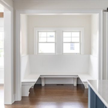
These Excelsior homeowners bought this property primarily for the lakeshore view. All was well until they realized that the floor plan didn’t leave adequate room for a larger kitchen remodel and a dining room. Their first attempt to design a large enough dining addition with another remodeler failed. So, they lived in frustration without the dining room view for years.
Fortunately, for all of us, their next-door neighbors had just finished a deck/sauna remodel with Murphy Bros. and gladly made the referral to us.
Now they have a 9 x 12 foot dining room addition, with an 8 x 12 foot deck extension off the dining room, all seamlessly integrated into their existing structure. To stay within budget, we re-used the decking to extend the deck off the new addition. We also designed a slanted pergola over the existing deck for added visual interest.
 Architecture Office
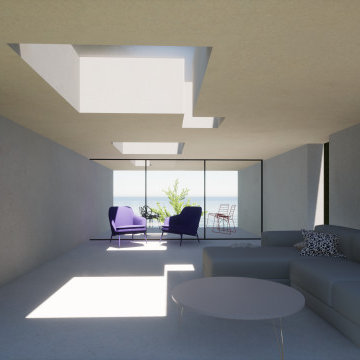
The project consists of three primary additions, one a workshop and garage, the second a basement expansion that juts out over the lake, and a third, which expands the existing living areas with a wall of glass. This third addition, originally not part of the project, was a recommendation by Architecture Office well received by the client because of how it transformed the existing living areas.
The existing architecture consists of a historic neo-classical house with a less purist addition that attempts to mimic the original. We took the approach of contrasting the existing to avoid having two additions lacking the craft and integrity of the original. This contrast is a welcoming change to previously dark interiors. The concept opens up opportunities for capturing lake views, creating modern living areas that flow from one to the next.
The rear garage and second floor workshop compliment the owners entrepreneurial spirit, a person who enjoys the act of a making. The form is simple but clearly delineates itself form the brick construction with black metal siding and a glass walkway connecting the two. The structure draws from old factory buildings that gather daylight from above, synthesized through a milky polycarbonate portion of roof.
The basement addition expands on an existing subterranean space used for storage and utilities. This room is converted into a living space with sleeping quarters, wet bar, and restroom facilities. This living room is a mini oasis from the rest of the house with views secluded to the water and sky. The openness of the balcony expand the view in all directions, with the sun blocked under a cantilevered shade cover.
 User
UserProject: Kandula Clothing Store
Location: Padiyapelella Town
Area: 3500 Sqft
Type: Interior Renovation Project
Budget: 8 Million
We have for a long time been endowed with unique and sustainable designs that have penetrated the various landscapes of the island. Our creations are testifying to this by further beautifying nature, further appeasing human needs, and shining with pride day by day. Combined with our experience, hard work, and the hope of paving the way for an innovative lifestyle for the people, this modern shopping center has been given to the historic town of Padiyapelella. This is not just construction on a piece of land, but an attempt to recall the pride of a historical land mixed with the values of modernity. This is likely to be the first step in making Padiyapella modern shopping hub. We hope that this mall, nurtured by the convenience of our design, will become a part of the lives of the people by meeting their modern needs.
We are ready to give you this kind of sophistication to build your dream construction too. Contact us today and get a 10% discount on your first project.
Learn more about our latest projects from www.royalkandyan.com
https://royalkandyan.com/.../kandula-clothing-store-at.../
P: (77) 719 8825
P: (81) 207 3825
E: Info@royalkandyan.com
©️The Royal Kandyan Design & Engineering (PVT) LTD
#Architecture #InteriorDesign #Design #ModernDesign #KandyArchitect #LuxuryLifestyle #Construction #KandyArchitect #KandyArchitecture #ConstructionCompanyInSriLanka #SriLanka
#DulajJayasinghe
 Architecture Office
The project consists of three primary additions, one a workshop and garage, the second a basement expansion that juts out over the lake, and a third, which expands the existing living areas with a wall of glass. This third addition, originally not part of the project, was a recommendation by Architecture Office well received by the client because of how it transformed the existing living areas.
The existing architecture consists of a historic neo-classical house with a less purist addition that attempts to mimic the original. We took the approach of contrasting the existing to avoid having two additions lacking the craft and integrity of the original. This contrast is a welcoming change to previously dark interiors. The concept opens up opportunities for capturing lake views, creating modern living areas that flow from one to the next.
The rear garage and second floor workshop compliment the owners entrepreneurial spirit, a person who enjoys the act of a making. The form is simple but clearly delineates itself form the brick construction with black metal siding and a glass walkway connecting the two. The structure draws from old factory buildings that gather daylight from above, synthesized through a milky polycarbonate portion of roof.
The basement addition expands on an existing subterranean space used for storage and utilities. This room is converted into a living space with sleeping quarters, wet bar, and restroom facilities. This living room is a mini oasis from the rest of the house with views secluded to the water and sky. The openness of the balcony expand the view in all directions, with the sun blocked under a cantilevered shade cover.
 User
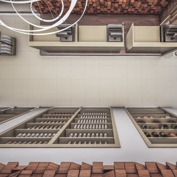
UserProject: Kandula Clothing Store
Location: Padiyapelella Town
Area: 3500 Sqft
Type: Interior Renovation Project
Budget: 8 Million
We have for a long time been endowed with unique and sustainable designs that have penetrated the various landscapes of the island. Our creations are testifying to this by further beautifying nature, further appeasing human needs, and shining with pride day by day. Combined with our experience, hard work, and the hope of paving the way for an innovative lifestyle for the people, this modern shopping center has been given to the historic town of Padiyapelella. This is not just construction on a piece of land, but an attempt to recall the pride of a historical land mixed with the values of modernity. This is likely to be the first step in making Padiyapella modern shopping hub. We hope that this mall, nurtured by the convenience of our design, will become a part of the lives of the people by meeting their modern needs.
We are ready to give you this kind of sophistication to build your dream construction too. Contact us today and get a 10% discount on your first project.
Learn more about our latest projects from www.royalkandyan.com
https://royalkandyan.com/.../kandula-clothing-store-at.../
P: (77) 719 8825
P: (81) 207 3825
E: Info@royalkandyan.com
©️The Royal Kandyan Design & Engineering (PVT) LTD
#Architecture #InteriorDesign #Design #ModernDesign #KandyArchitect #LuxuryLifestyle #Construction #KandyArchitect #KandyArchitecture #ConstructionCompanyInSriLanka #SriLanka
#DulajJayasinghe
 Architecture Office
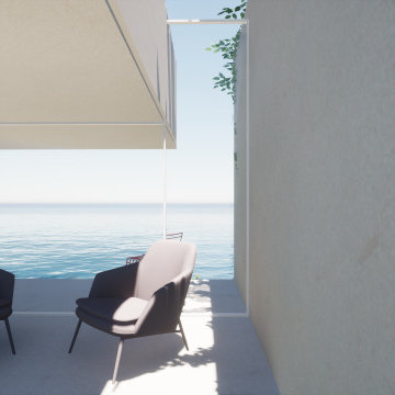
The project consists of three primary additions, one a workshop and garage, the second a basement expansion that juts out over the lake, and a third, which expands the existing living areas with a wall of glass. This third addition, originally not part of the project, was a recommendation by Architecture Office well received by the client because of how it transformed the existing living areas.
The existing architecture consists of a historic neo-classical house with a less purist addition that attempts to mimic the original. We took the approach of contrasting the existing to avoid having two additions lacking the craft and integrity of the original. This contrast is a welcoming change to previously dark interiors. The concept opens up opportunities for capturing lake views, creating modern living areas that flow from one to the next.
The rear garage and second floor workshop compliment the owners entrepreneurial spirit, a person who enjoys the act of a making. The form is simple but clearly delineates itself form the brick construction with black metal siding and a glass walkway connecting the two. The structure draws from old factory buildings that gather daylight from above, synthesized through a milky polycarbonate portion of roof.
The basement addition expands on an existing subterranean space used for storage and utilities. This room is converted into a living space with sleeping quarters, wet bar, and restroom facilities. This living room is a mini oasis from the rest of the house with views secluded to the water and sky. The openness of the balcony expand the view in all directions, with the sun blocked under a cantilevered shade cover.
 Architecture Office
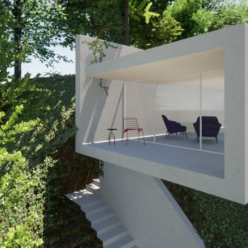
The project consists of three primary additions, one a workshop and garage, the second a basement expansion that juts out over the lake, and a third, which expands the existing living areas with a wall of glass. This third addition, originally not part of the project, was a recommendation by Architecture Office well received by the client because of how it transformed the existing living areas.
The existing architecture consists of a historic neo-classical house with a less purist addition that attempts to mimic the original. We took the approach of contrasting the existing to avoid having two additions lacking the craft and integrity of the original. This contrast is a welcoming change to previously dark interiors. The concept opens up opportunities for capturing lake views, creating modern living areas that flow from one to the next.
The rear garage and second floor workshop compliment the owners entrepreneurial spirit, a person who enjoys the act of a making. The form is simple but clearly delineates itself form the brick construction with black metal siding and a glass walkway connecting the two. The structure draws from old factory buildings that gather daylight from above, synthesized through a milky polycarbonate portion of roof.
The basement addition expands on an existing subterranean space used for storage and utilities. This room is converted into a living space with sleeping quarters, wet bar, and restroom facilities. This living room is a mini oasis from the rest of the house with views secluded to the water and sky. The openness of the balcony expand the view in all directions, with the sun blocked under a cantilevered shade cover.
 Architecture Office
The project consists of three primary additions, one a workshop and garage, the second a basement expansion that juts out over the lake, and a third, which expands the existing living areas with a wall of glass. This third addition, originally not part of the project, was a recommendation by Architecture Office well received by the client because of how it transformed the existing living areas.
The existing architecture consists of a historic neo-classical house with a less purist addition that attempts to mimic the original. We took the approach of contrasting the existing to avoid having two additions lacking the craft and integrity of the original. This contrast is a welcoming change to previously dark interiors. The concept opens up opportunities for capturing lake views, creating modern living areas that flow from one to the next.
The rear garage and second floor workshop compliment the owners entrepreneurial spirit, a person who enjoys the act of a making. The form is simple but clearly delineates itself form the brick construction with black metal siding and a glass walkway connecting the two. The structure draws from old factory buildings that gather daylight from above, synthesized through a milky polycarbonate portion of roof.
The basement addition expands on an existing subterranean space used for storage and utilities. This room is converted into a living space with sleeping quarters, wet bar, and restroom facilities. This living room is a mini oasis from the rest of the house with views secluded to the water and sky. The openness of the balcony expand the view in all directions, with the sun blocked under a cantilevered shade cover.

 HU-235072162
The site is located on the Mitchell House preparatory school campus in Polokwane. The client's brief
called for an early childhood development centre which would accommodate 122 learners and
requested that the building be evident of it's young and playful users.
Curiosity, wonder and intrigue would become defining criteria in an attempt to create a conducive
learning environment for young learners to grow, a building where children would be encouraged to
interact with their environment. The construction methodology of the building would remain apparent,
allowing its users to analyse the assembly of components.
Due to the age group of the users, the building would need to function semi-autonomously from the
rest of the school, while allowing for controlled interaction and inclusivity as is the norm for Mitchell
House. A linear plan which coincides with the developmental progress of the learners was identified
as the appropriate building typology. The spatial constraints of the site required this plan to be
moulded into the available space between the existing infrastructure, however the linear process was
maintained.
From the access-controlled reception and administration area one would move past the creative arts
and exhibition space towards the Northern wing where the youngest learners are taught. These would
share connected ablutions and storerooms between classes to enable fluid movement and
assistance throughout the teaching and service spaces. The East wing of the centre would house the
elder learners who would be in the process of being integrated with the fabric of the main school
campus. These classrooms include storage areas, however, have separate ablution facilities. The two
wings of the building surround a courtyard where play and interaction are in abundance.
33