
Search results for "Attempt" in Home Design Ideas
 Amazing Spaces
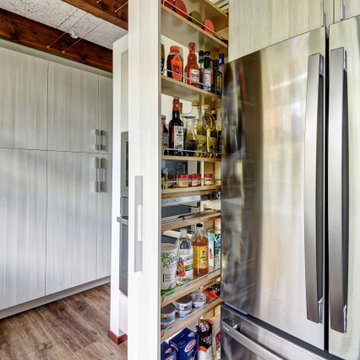
The existing kitchen was separated from the family room by a 17’ long bookcase. It was the first thing you saw upon entering and it hid much of the light and views to the backyard making the space feel claustrophobic. The laundry room was part of the kitchen space without any attempt to conceal the washer and dryer. Removing the long bookcase opened the opportunity to add counter stools in the kitchen and decided to align a target wall opposite the front door to help maintain some division within the main space while creating a space for the refrigerator. This also allowed us to create an open laundry room concept that would be hidden from view from all other areas.
We kept the industrial feel of the exposed building materials, which we complimented with textured melamine slab doors for the new kitchen cabinets. We maintained the galley set up but defined the kitchen from the utility area by changing both thickness and color of the countertop materials. Because the back of the house is mainly windows, there was very little wall space for upper cabinets and everyday dish storage. We designed a custom ceiling hung shelf system that floats in front of the windows, and is mostly out of view from the sitting area. Tall cabinets are installed along the only available wall to support both kitchen and laundry room functions. We used cable lighting threaded through the beams which really punctuates the industrial aesthetic.

 Melissa Clark Interiors
This client contacted us to help her pull her house together. She wanted a modern feel to her home. Before we worked together the kitchen backsplash was blue, green, gray, with gray walls and dark gray trim. The result was a home with two styles that were fighting one another.
Melissa Clark Interiors changed the kitchen backsplash to something that complemented the home's current design. We changed the wall color to a soft creamy white and painted all of the doors in the home black. We also changed all of the lighting in the home to suit the new look and feel. The home now looks and feels as though it was always meant to be. Changing the color of all of the doors in the home to reflect the same color of the beautiful Canterra front doors streamlines the look. The new entry light is elegant and a perfect compliment to the front doors. And the fresh paint color looks as though it was a custom color meant to make those beams shine.
Here is what our client is saying: "Melissa did an amazing job bringing the right mix of traditional and contemporary to my home. She is so great to work with and her perfectionism in sizing lighting made all the difference over attempting to decorate on my own."
 User
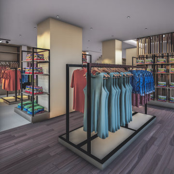
UserProject: Kandula Clothing Store
Location: Padiyapelella Town
Area: 3500 Sqft
Type: Interior Renovation Project
Budget: 8 Million
We have for a long time been endowed with unique and sustainable designs that have penetrated the various landscapes of the island. Our creations are testifying to this by further beautifying nature, further appeasing human needs, and shining with pride day by day. Combined with our experience, hard work, and the hope of paving the way for an innovative lifestyle for the people, this modern shopping center has been given to the historic town of Padiyapelella. This is not just construction on a piece of land, but an attempt to recall the pride of a historical land mixed with the values of modernity. This is likely to be the first step in making Padiyapella modern shopping hub. We hope that this mall, nurtured by the convenience of our design, will become a part of the lives of the people by meeting their modern needs.
We are ready to give you this kind of sophistication to build your dream construction too. Contact us today and get a 10% discount on your first project.
Learn more about our latest projects from www.royalkandyan.com
https://royalkandyan.com/.../kandula-clothing-store-at.../
P: (77) 719 8825
P: (81) 207 3825
E: Info@royalkandyan.com
©️The Royal Kandyan Design & Engineering (PVT) LTD
#Architecture #InteriorDesign #Design #ModernDesign #KandyArchitect #LuxuryLifestyle #Construction #KandyArchitect #KandyArchitecture #ConstructionCompanyInSriLanka #SriLanka
#DulajJayasinghe
Find the right local pro for your project

 Eldorado Stone
After an unsuccessful attempt at finding the original brick for this home, we were excited to present Eldorado Stone to our homeowners for its very natural look, high quality, and reputation. We chose the Cambria Cliffstone for its elegance and rich color tones.
The residents wanted to expand the kitchen into a large open space where they could entertain family and friends, so the design goal was to create a comfortable outdoor space that complimented the home’s existing exterior. Additionally, large windows were installed in an effort to bring the outdoors in as well as compliment their landscaping. Eldorado Stone proved to be a perfect fit for the exterior of this addition, as it blends in with the greenery around the home in addition to the neighborhood as a whole.
Eldorado Stone Profile Featured: Cambria Cliffstone installed with a Standard Grout
Eldorado Stone Profile Featured: Cambria Cliffstone installed with a Standard Grout
Architect: Brock Eustice
Builder: RJK Construction, Inc.
Website: www.rjkconstructioninc.com
Designer: Designs by Skill, LLC
Website: www.designsbyskill.com
Mason: Ricky Webster
Phone: 540-446-3661
Photography: Greg Hadley
Website:www.greghadleyphotography.com

 Ziegler Doors Inc.
Laguna Beach, Ca Renovated Industrial design with laminated steel & powder coated frame. Gives this Ziegler Doors, Inc a futuristic as well as modernistic look. Ziegler Garage Door has lead the way for others to attempt an unachievable level of creativity, style and architectural glamor that we achieve through our innovative garage door designs. Custom garage doors in a contemporary style can be found throughout Orange County and the rest of the state of California. We do ship, we have a large variety of garage door styles to other states and abroad as well. If you're looking for a unique garage door that you have envisioned or would like us to collaborate one for you please contact us at (714) 437-0870 or visit are Design studio at 1323 East Saint Gertrude Place Ste A, Santa Ana CA. Ziegler Garage Door will design, build and install your modern garage door complete with custom color stain finish, full perimeter weather seal and an automated garage door opening device that work with the click of a button. Our garage doors come custom built in almost any size. Prices vary depending on design and materials used.
URL http://www.zieglerdoorsinc.com

 CITYDESKSTUDIO, Inc.
A family that spends a lot of time in and around their beautiful saltwater pool, did not have a place in their home that provided them a visual or physical connection. They also lacked any storage for all their pool “stuff”. With small children and a love for entertaining, they needed a room that served and supported their watery lifestyle. We took over an empty and unused notch along the back of the house adjacent to the pool patio to create a new bright and airy pool house.
The new out building attempts to unify 4 areas; an existing deck, an upper master bedroom balcony, a lower lawn, and the pool itself, and provide the missing storage. By locating the pool house at the juxtaposition of these areas, the new room was able to provide a new expanded rooftop balcony for the master, anchor and define the dining and barbeque deck, extend and connect to the pool and patio, and create a new access to integrate the lower lawn – and carve out the much needed storage for the variety of pool toys and equipment.
The building itself is 400 sf with bath, laundry, storage, mechanical, kitchen, and living. A single new secure connection is made into the house through the existing mudroom. Clad with crisply detailed ship lap cedar, it draws on the existing material palate of the house and nods to the boat aesthetic in expression and efficiency. With pocketing glass walls the pool house is both the utility building needed, and an expansion of the vibrant pool scene itself, inside and outside, along the poolside.
Photographer: Brandon Stengelwww.farmkidstudios.com
Location: Edina, MN
Completed: 2013
Project Team:
Ben Awes AIA, Principal-In-Charge
Bob Ganser AIA
Christian Dean AIA
Nate Dodge
 Eldorado Stone
After an unsuccessful attempt at finding the original brick for this home, we were excited to present Eldorado Stone to our homeowners for its very natural look, high quality, and reputation. We chose the Cambria Cliffstone for its elegance and rich color tones.
The residents wanted to expand the kitchen into a large open space where they could entertain family and friends, so the design goal was to create a comfortable outdoor space that complimented the home’s existing exterior. Additionally, large windows were installed in an effort to bring the outdoors in as well as compliment their landscaping. Eldorado Stone proved to be a perfect fit for the exterior of this addition, as it blends in with the greenery around the home in addition to the neighborhood as a whole.
Eldorado Stone Profile Featured: Cambria Cliffstone installed with a Standard Grout
Eldorado Stone Profile Featured: Cambria Cliffstone installed with a Standard Grout
Architect: Brock Eustice
Builder: RJK Construction, Inc.
Website: www.rjkconstructioninc.com
Designer: Designs by Skill, LLC
Website: www.designsbyskill.com
Mason: Ricky Webster
Phone: 540-446-3661
Photography: Greg Hadley
Website:www.greghadleyphotography.com
 LDa Architecture & Interiors
TEAM
Architect: LDa Architecture & Interiors
Interior Design: LDa Architecture & Interiors
Photographer: Greg Premru Photography
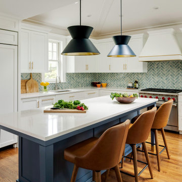
Enclosed kitchen - mid-sized transitional u-shaped medium tone wood floor, vaulted ceiling and brown floor enclosed kitchen idea in Boston with recessed-panel cabinets, white cabinets, quartzite countertops, blue backsplash, glass tile backsplash, stainless steel appliances, an island and an undermount sink
Enclosed kitchen - mid-sized transitional u-shaped medium tone wood floor, vaulted ceiling and brown floor enclosed kitchen idea in Boston with recessed-panel cabinets, white cabinets, quartzite countertops, blue backsplash, glass tile backsplash, stainless steel appliances, an island and an undermount sink
 HU-235072162
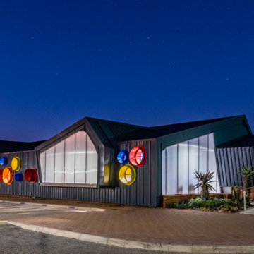
The site is located on the Mitchell House preparatory school campus in Polokwane. The client's brief
called for an early childhood development centre which would accommodate 122 learners and
requested that the building be evident of it's young and playful users.
Curiosity, wonder and intrigue would become defining criteria in an attempt to create a conducive
learning environment for young learners to grow, a building where children would be encouraged to
interact with their environment. The construction methodology of the building would remain apparent,
allowing its users to analyse the assembly of components.
Due to the age group of the users, the building would need to function semi-autonomously from the
rest of the school, while allowing for controlled interaction and inclusivity as is the norm for Mitchell
House. A linear plan which coincides with the developmental progress of the learners was identified
as the appropriate building typology. The spatial constraints of the site required this plan to be
moulded into the available space between the existing infrastructure, however the linear process was
maintained.
From the access-controlled reception and administration area one would move past the creative arts
and exhibition space towards the Northern wing where the youngest learners are taught. These would
share connected ablutions and storerooms between classes to enable fluid movement and
assistance throughout the teaching and service spaces. The East wing of the centre would house the
elder learners who would be in the process of being integrated with the fabric of the main school
campus. These classrooms include storage areas, however, have separate ablution facilities. The two
wings of the building surround a courtyard where play and interaction are in abundance.
 JUMA architects
Optiek Herpol wanted to move to a better, more central location with plenty of parking space. A property that complied with these conditions was found on the Market in Deinze, and JUMA architects were subsequently asked to design a new interior for the store.
The property in question is very deep and narrow with little natural light entry. JUMA set to work despite these constraints in an attempt to transform these challenges into qualities.
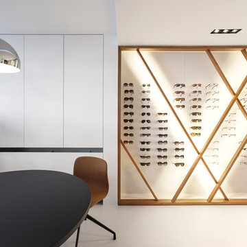
The architects positioned the sales counter right behind the shop window, so as to make optimum use of the available natural light. This also makes store activities visible from the outside, adding an extra element of attraction. At the narrowest section of the store, a large wall mirror was put in to visually double the space. The wall onto which the eyeglasses are displayed is located opposite the mirror and is literally the eye catcher in the store. A wooden lattice makes for an interesting play of diagonal lines behind which the glasses are presented. This unique concept animates the entire store without detracting from the fact that the glasses should remain the main focal point in the store. The workshop is located in the back, separated from the store by a wall in smoked grey glass. In this way, the optician can keep an eye on the store at all times.
The colour palette is predominantly white, to keep the interior as light as possible. As a counterpoint, warm wood accents are added. The chairs at the counter are upholstered in a colour that harmonizes perfectly with the wood.
Pictures © Thomas De Bruyne
 JUMA architects
Optiek Herpol wanted to move to a better, more central location with plenty of parking space. A property that complied with these conditions was found on the Market in Deinze, and JUMA architects were subsequently asked to design a new interior for the store.
The property in question is very deep and narrow with little natural light entry. JUMA set to work despite these constraints in an attempt to transform these challenges into qualities.
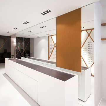
The architects positioned the sales counter right behind the shop window, so as to make optimum use of the available natural light. This also makes store activities visible from the outside, adding an extra element of attraction. At the narrowest section of the store, a large wall mirror was put in to visually double the space. The wall onto which the eyeglasses are displayed is located opposite the mirror and is literally the eye catcher in the store. A wooden lattice makes for an interesting play of diagonal lines behind which the glasses are presented. This unique concept animates the entire store without detracting from the fact that the glasses should remain the main focal point in the store. The workshop is located in the back, separated from the store by a wall in smoked grey glass. In this way, the optician can keep an eye on the store at all times.
The colour palette is predominantly white, to keep the interior as light as possible. As a counterpoint, warm wood accents are added. The chairs at the counter are upholstered in a colour that harmonizes perfectly with the wood.
Pictures © Thomas De Bruyne
 Brendan McHugh, Architect, Manasquan, NJ
VISION AND NEEDS:
Our client came to us with a vision for their dream house for their growing family with three young children. This was their second attempt at getting the right design. The first time around, after working with an out-of-state online architect, they could not achieve the level of quality they wanted. McHugh delivered a home with higher quality design.
MCHUGH SOLUTION:
The Shingle/Dutch Colonial Design was our client's dream home style. Their priorities were to have a home office for both parents. Ample living space for kids and friends, along with outdoor space and a pool. Double sink bathroom for the kids and a master bedroom with bath for the parents. Despite being close a flood zone, clients could have a fully finished basement with 9ft ceilings and a full attic. Because of the higher water table, the first floor was considerably above grade. To soften the ascent of the front walkway, we designed planters around the stairs, leading up to the porch.
 Architecture Office
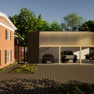
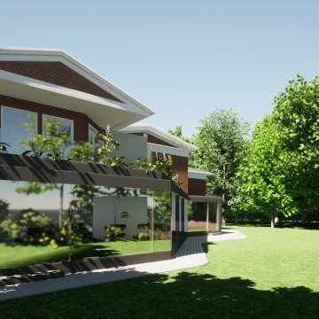
The project consists of three primary additions, one a workshop and garage, the second a basement expansion that juts out over the lake, and a third, which expands the existing living areas with a wall of glass. This third addition, originally not part of the project, was a recommendation by Architecture Office well received by the client because of how it transformed the existing living areas.
The existing architecture consists of a historic neo-classical house with a less purist addition that attempts to mimic the original. We took the approach of contrasting the existing to avoid having two additions lacking the craft and integrity of the original. This contrast is a welcoming change to previously dark interiors. The concept opens up opportunities for capturing lake views, creating modern living areas that flow from one to the next.
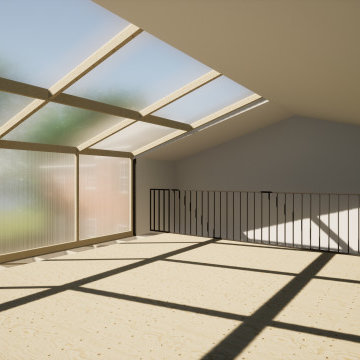
The rear garage and second floor workshop compliment the owners entrepreneurial spirit, a person who enjoys the act of a making. The form is simple but clearly delineates itself form the brick construction with black metal siding and a glass walkway connecting the two. The structure draws from old factory buildings that gather daylight from above, synthesized through a milky polycarbonate portion of roof.
The basement addition expands on an existing subterranean space used for storage and utilities. This room is converted into a living space with sleeping quarters, wet bar, and restroom facilities. This living room is a mini oasis from the rest of the house with views secluded to the water and sky. The openness of the balcony expand the view in all directions, with the sun blocked under a cantilevered shade cover.
 JUMA architects
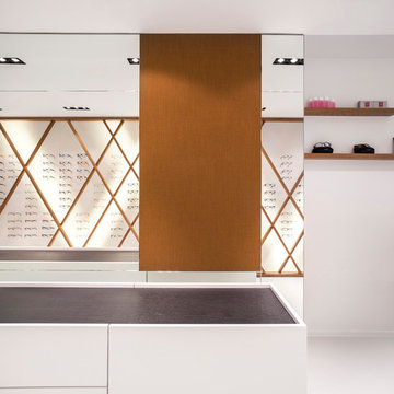
Optiek Herpol wanted to move to a better, more central location with plenty of parking space. A property that complied with these conditions was found on the Market in Deinze, and JUMA architects were subsequently asked to design a new interior for the store.
The property in question is very deep and narrow with little natural light entry. JUMA set to work despite these constraints in an attempt to transform these challenges into qualities.
The architects positioned the sales counter right behind the shop window, so as to make optimum use of the available natural light. This also makes store activities visible from the outside, adding an extra element of attraction. At the narrowest section of the store, a large wall mirror was put in to visually double the space. The wall onto which the eyeglasses are displayed is located opposite the mirror and is literally the eye catcher in the store. A wooden lattice makes for an interesting play of diagonal lines behind which the glasses are presented. This unique concept animates the entire store without detracting from the fact that the glasses should remain the main focal point in the store. The workshop is located in the back, separated from the store by a wall in smoked grey glass. In this way, the optician can keep an eye on the store at all times.
The colour palette is predominantly white, to keep the interior as light as possible. As a counterpoint, warm wood accents are added. The chairs at the counter are upholstered in a colour that harmonizes perfectly with the wood.
Pictures © Thomas De Bruyne
 Brendan McHugh, Architect, Manasquan, NJ
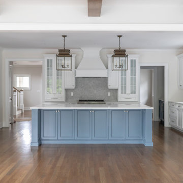
VISION AND NEEDS:
Our client came to us with a vision for their dream house for their growing family with three young children. This was their second attempt at getting the right design. The first time around, after working with an out-of-state online architect, they could not achieve the level of quality they wanted. McHugh delivered a home with higher quality design.
MCHUGH SOLUTION:
The Shingle/Dutch Colonial Design was our client's dream home style. Their priorities were to have a home office for both parents. Ample living space for kids and friends, along with outdoor space and a pool. Double sink bathroom for the kids and a master bedroom with bath for the parents. Despite being close a flood zone, clients could have a fully finished basement with 9ft ceilings and a full attic. Because of the higher water table, the first floor was considerably above grade. To soften the ascent of the front walkway, we designed planters around the stairs, leading up to the porch.

 Progressive Design Build
It was in 2012 when Mike Spreckelmeier first met Roy and Patti. They had been despondent after meeting with multiple contractors in an attempt to start their kitchen remodel. The contractors lacked follow through, came tardy to meetings and even failed to show up at others.
Determined to leave nothing to chance in the pursuit of their dream, Roy and Patti followed up on a recommendation after overhearing a conversation that was taking place while they were standing in a gallingly long line waiting to cast a vote on Election Day.
With a solid recommendation to pursue, Roy and Patti contacted Progressive Design Build. The rest is history.
Mike showed up on time. For a small retainer, he provided preliminary sketches, ideas for maximizing space and storage, and solutions for a sunken family room that created a safety hazard and a problem with traffic flow. More importantly, he designed the project to the homeowners’ budget.
Progressive Design Build shot some different elevations and designed a plan to raise the floor, allowing all finished floors to be on the same level. Upon completion, the kitchen was stunning. Features included LED backlit fire glass shelving, white recessed panel cabinets, a subway tile backsplash, Granite countertop, integrated refrigerator, undermount sink, and more.
The living room was designed with complimentary finishes and included a natural stone fireplace wall with open cabinets flanked on both sides. The 12’ fireplace was made with a floor-to-ceiling white pebble finish.
This Bonita Bay project completed on time and on budget—allowing this fabulous family a wonderful opportunity to create lasting memories for many years to come.
 Siobhan's Outdoor Transformations
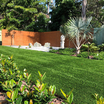
When I asked my client what style he wanted for his transformation he said "Vegas/ Zen". The wife's family roots are Vietnamese and the husband is of Italian descent. Thus the unique style "Vegas/ Zen " was born. A challenging style at first attempt, but this project as you can see is a grand improvement over the clean slate we stared with, manly dirt. This large yard took a hit from Hurricane Irma and the clients took the opportunity to do a major makeover. Check out how the final installation looks a lot like the renderings. This "WowZen" space featuring artificial grass, our first such project with fake green. This is an example of how you doing have to sacrifice style for A truly "Water wise" transformation, this stylish space features draught tolerant plants and large expanses of artificial grass and hardscaping. Shade is an issue, but that will be achieved in Stage 2 with a pergola and large umbrella. We do 3D renderings when a project is multi-layered like this one. See more of our 3D renderings at https://www.houzz.com/projects/2008788/3-d-landscape-renderings
 Architecture Office
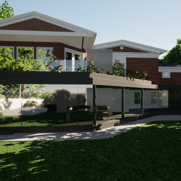
The project consists of three primary additions, one a workshop and garage, the second a basement expansion that juts out over the lake, and a third, which expands the existing living areas with a wall of glass. This third addition, originally not part of the project, was a recommendation by Architecture Office well received by the client because of how it transformed the existing living areas.
The existing architecture consists of a historic neo-classical house with a less purist addition that attempts to mimic the original. We took the approach of contrasting the existing to avoid having two additions lacking the craft and integrity of the original. This contrast is a welcoming change to previously dark interiors. The concept opens up opportunities for capturing lake views, creating modern living areas that flow from one to the next.
The rear garage and second floor workshop compliment the owners entrepreneurial spirit, a person who enjoys the act of a making. The form is simple but clearly delineates itself form the brick construction with black metal siding and a glass walkway connecting the two. The structure draws from old factory buildings that gather daylight from above, synthesized through a milky polycarbonate portion of roof.
The basement addition expands on an existing subterranean space used for storage and utilities. This room is converted into a living space with sleeping quarters, wet bar, and restroom facilities. This living room is a mini oasis from the rest of the house with views secluded to the water and sky. The openness of the balcony expand the view in all directions, with the sun blocked under a cantilevered shade cover.
 Architecture Office
The project consists of three primary additions, one a workshop and garage, the second a basement expansion that juts out over the lake, and a third, which expands the existing living areas with a wall of glass. This third addition, originally not part of the project, was a recommendation by Architecture Office well received by the client because of how it transformed the existing living areas.
The existing architecture consists of a historic neo-classical house with a less purist addition that attempts to mimic the original. We took the approach of contrasting the existing to avoid having two additions lacking the craft and integrity of the original. This contrast is a welcoming change to previously dark interiors. The concept opens up opportunities for capturing lake views, creating modern living areas that flow from one to the next.
The rear garage and second floor workshop compliment the owners entrepreneurial spirit, a person who enjoys the act of a making. The form is simple but clearly delineates itself form the brick construction with black metal siding and a glass walkway connecting the two. The structure draws from old factory buildings that gather daylight from above, synthesized through a milky polycarbonate portion of roof.
The basement addition expands on an existing subterranean space used for storage and utilities. This room is converted into a living space with sleeping quarters, wet bar, and restroom facilities. This living room is a mini oasis from the rest of the house with views secluded to the water and sky. The openness of the balcony expand the view in all directions, with the sun blocked under a cantilevered shade cover.
 Architecture Office
The project consists of three primary additions, one a workshop and garage, the second a basement expansion that juts out over the lake, and a third, which expands the existing living areas with a wall of glass. This third addition, originally not part of the project, was a recommendation by Architecture Office well received by the client because of how it transformed the existing living areas.
The existing architecture consists of a historic neo-classical house with a less purist addition that attempts to mimic the original. We took the approach of contrasting the existing to avoid having two additions lacking the craft and integrity of the original. This contrast is a welcoming change to previously dark interiors. The concept opens up opportunities for capturing lake views, creating modern living areas that flow from one to the next.
The rear garage and second floor workshop compliment the owners entrepreneurial spirit, a person who enjoys the act of a making. The form is simple but clearly delineates itself form the brick construction with black metal siding and a glass walkway connecting the two. The structure draws from old factory buildings that gather daylight from above, synthesized through a milky polycarbonate portion of roof.
The basement addition expands on an existing subterranean space used for storage and utilities. This room is converted into a living space with sleeping quarters, wet bar, and restroom facilities. This living room is a mini oasis from the rest of the house with views secluded to the water and sky. The openness of the balcony expand the view in all directions, with the sun blocked under a cantilevered shade cover.
31