
Search results for "Attempt" in Home Design Ideas
 RG Cowan Design Build
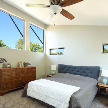
We wanted to give them a design that brought lots of natural light, while attempting to get the best views from downtown. We were careful to add bedroom windows in a way that would avoid a view of roofs, vents and chimneys. We achieved this with the large south facing windows which provide views of trees and sky but are well shaded from direct sunlight in the summer months. We created a master bathroom that included a double vanity, large walk-in shower, private water closet and linen storage closet. We met storage goals by adding a master closet that is almost as large as the original bedrooms in the house.
 Roundwood Interiors
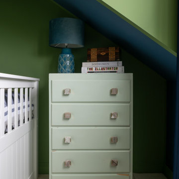
This space was special indeed! When the family moved into their home the daughter of the house immediately laid claim to this room - which included a half-height storage space, full of possibilities!
For the main space we chose a bright, fresh green to keep the space uplifting all through the year. I used a blue stripe to mimic the feel of a canopy and to make a feature of the sloped section of the ceiling rather than attempt to hide it.
The room is filled with storage to accommodate a growing wardrobe and features upcycled furniture to ensure the space is completely bespoke.
Hidden behind a poster is a secret library, painted a dark, moody blue and styled to give hints of Hogwarts. The ceiling is adorned with a navy, celestial print wallpaper and there are cosy touches dotted around to make this the perfect spot to curl up and while away hours with a good book. Floating candles lend a touch of fun and much needed light to the space.
 Roundwood Interiors
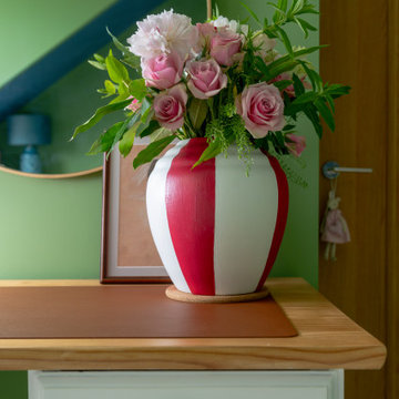
This space was special indeed! When the family moved into their home the daughter of the house immediately laid claim to this room - which included a half-height storage space, full of possibilities!
For the main space we chose a bright, fresh green to keep the space uplifting all through the year. I used a blue stripe to mimic the feel of a canopy and to make a feature of the sloped section of the ceiling rather than attempt to hide it.
The room is filled with storage to accommodate a growing wardrobe and features upcycled furniture to ensure the space is completely bespoke.
Hidden behind a poster is a secret library, painted a dark, moody blue and styled to give hints of Hogwarts. The ceiling is adorned with a navy, celestial print wallpaper and there are cosy touches dotted around to make this the perfect spot to curl up and while away hours with a good book. Floating candles lend a touch of fun and much needed light to the space.
Find the right local pro for your project
 Roundwood Interiors
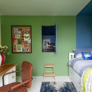
This space was special indeed! When the family moved into their home the daughter of the house immediately laid claim to this room - which included a half-height storage space, full of possibilities!
For the main space we chose a bright, fresh green to keep the space uplifting all through the year. I used a blue stripe to mimic the feel of a canopy and to make a feature of the sloped section of the ceiling rather than attempt to hide it.
The room is filled with storage to accommodate a growing wardrobe and features upcycled furniture to ensure the space is completely bespoke.
Hidden behind a poster is a secret library, painted a dark, moody blue and styled to give hints of Hogwarts. The ceiling is adorned with a navy, celestial print wallpaper and there are cosy touches dotted around to make this the perfect spot to curl up and while away hours with a good book. Floating candles lend a touch of fun and much needed light to the space.
 Roundwood Interiors
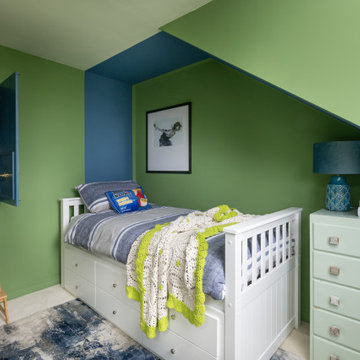
This space was special indeed! When the family moved into their home the daughter of the house immediately laid claim to this room - which included a half-height storage space, full of possibilities!
For the main space we chose a bright, fresh green to keep the space uplifting all through the year. I used a blue stripe to mimic the feel of a canopy and to make a feature of the sloped section of the ceiling rather than attempt to hide it.
The room is filled with storage to accommodate a growing wardrobe and features upcycled furniture to ensure the space is completely bespoke.
Hidden behind a poster is a secret library, painted a dark, moody blue and styled to give hints of Hogwarts. The ceiling is adorned with a navy, celestial print wallpaper and there are cosy touches dotted around to make this the perfect spot to curl up and while away hours with a good book. Floating candles lend a touch of fun and much needed light to the space.
 Roundwood Interiors
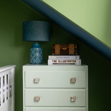
This space was special indeed! When the family moved into their home the daughter of the house immediately laid claim to this room - which included a half-height storage space, full of possibilities!
For the main space we chose a bright, fresh green to keep the space uplifting all through the year. I used a blue stripe to mimic the feel of a canopy and to make a feature of the sloped section of the ceiling rather than attempt to hide it.
The room is filled with storage to accommodate a growing wardrobe and features upcycled furniture to ensure the space is completely bespoke.
Hidden behind a poster is a secret library, painted a dark, moody blue and styled to give hints of Hogwarts. The ceiling is adorned with a navy, celestial print wallpaper and there are cosy touches dotted around to make this the perfect spot to curl up and while away hours with a good book. Floating candles lend a touch of fun and much needed light to the space.
 Roundwood Interiors
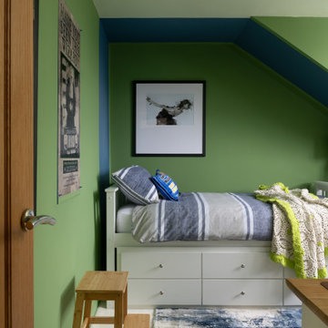
This space was special indeed! When the family moved into their home the daughter of the house immediately laid claim to this room - which included a half-height storage space, full of possibilities!
For the main space we chose a bright, fresh green to keep the space uplifting all through the year. I used a blue stripe to mimic the feel of a canopy and to make a feature of the sloped section of the ceiling rather than attempt to hide it.
The room is filled with storage to accommodate a growing wardrobe and features upcycled furniture to ensure the space is completely bespoke.
Hidden behind a poster is a secret library, painted a dark, moody blue and styled to give hints of Hogwarts. The ceiling is adorned with a navy, celestial print wallpaper and there are cosy touches dotted around to make this the perfect spot to curl up and while away hours with a good book. Floating candles lend a touch of fun and much needed light to the space.

 B R A D J E N K I N S I N C
The Bernardsville project was my first attempt at a hybrid IKEA kitchen; a kitchen that utilizes custom made elements combined with IKEA cabinet frames and interiors. This approach ended up saving the client close to $30k in comparison to a total custom job. The outcome is quite close to the quality level of a custom kitchen save for a few quirky IKEA typical issues. A great option if budget is a big element on the project. We chose to work with the Portland based Kokeena to produce the custom end panels, doors, fronts and custom parts like the wine rack.Photo: ISA AYDIN
 Roundwood Interiors
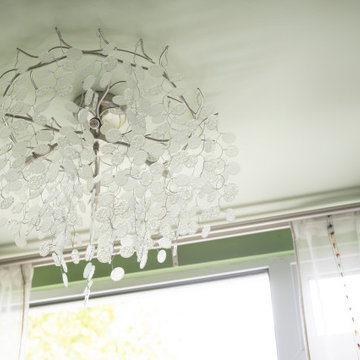
This space was special indeed! When the family moved into their home the daughter of the house immediately laid claim to this room - which included a half-height storage space, full of possibilities!
For the main space we chose a bright, fresh green to keep the space uplifting all through the year. I used a blue stripe to mimic the feel of a canopy and to make a feature of the sloped section of the ceiling rather than attempt to hide it.
The room is filled with storage to accommodate a growing wardrobe and features upcycled furniture to ensure the space is completely bespoke.
Hidden behind a poster is a secret library, painted a dark, moody blue and styled to give hints of Hogwarts. The ceiling is adorned with a navy, celestial print wallpaper and there are cosy touches dotted around to make this the perfect spot to curl up and while away hours with a good book. Floating candles lend a touch of fun and much needed light to the space.
 Roundwood Interiors
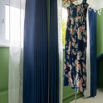
This space was special indeed! When the family moved into their home the daughter of the house immediately laid claim to this room - which included a half-height storage space, full of possibilities!
For the main space we chose a bright, fresh green to keep the space uplifting all through the year. I used a blue stripe to mimic the feel of a canopy and to make a feature of the sloped section of the ceiling rather than attempt to hide it.
The room is filled with storage to accommodate a growing wardrobe and features upcycled furniture to ensure the space is completely bespoke.
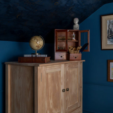
Hidden behind a poster is a secret library, painted a dark, moody blue and styled to give hints of Hogwarts. The ceiling is adorned with a navy, celestial print wallpaper and there are cosy touches dotted around to make this the perfect spot to curl up and while away hours with a good book. Floating candles lend a touch of fun and much needed light to the space.
 Roundwood Interiors
This space was special indeed! When the family moved into their home the daughter of the house immediately laid claim to this room - which included a half-height storage space, full of possibilities!
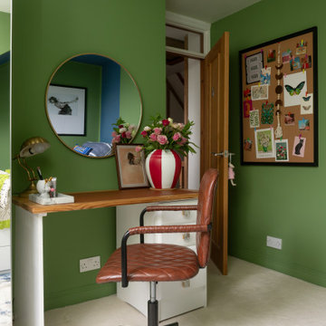
For the main space we chose a bright, fresh green to keep the space uplifting all through the year. I used a blue stripe to mimic the feel of a canopy and to make a feature of the sloped section of the ceiling rather than attempt to hide it.
The room is filled with storage to accommodate a growing wardrobe and features upcycled furniture to ensure the space is completely bespoke.
Hidden behind a poster is a secret library, painted a dark, moody blue and styled to give hints of Hogwarts. The ceiling is adorned with a navy, celestial print wallpaper and there are cosy touches dotted around to make this the perfect spot to curl up and while away hours with a good book. Floating candles lend a touch of fun and much needed light to the space.
 Roundwood Interiors
This space was special indeed! When the family moved into their home the daughter of the house immediately laid claim to this room - which included a half-height storage space, full of possibilities!
For the main space we chose a bright, fresh green to keep the space uplifting all through the year. I used a blue stripe to mimic the feel of a canopy and to make a feature of the sloped section of the ceiling rather than attempt to hide it.
The room is filled with storage to accommodate a growing wardrobe and features upcycled furniture to ensure the space is completely bespoke.
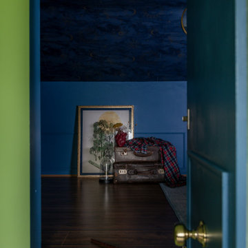
Hidden behind a poster is a secret library, painted a dark, moody blue and styled to give hints of Hogwarts. The ceiling is adorned with a navy, celestial print wallpaper and there are cosy touches dotted around to make this the perfect spot to curl up and while away hours with a good book. Floating candles lend a touch of fun and much needed light to the space.
 Roundwood Interiors
This space was special indeed! When the family moved into their home the daughter of the house immediately laid claim to this room - which included a half-height storage space, full of possibilities!
For the main space we chose a bright, fresh green to keep the space uplifting all through the year. I used a blue stripe to mimic the feel of a canopy and to make a feature of the sloped section of the ceiling rather than attempt to hide it.
The room is filled with storage to accommodate a growing wardrobe and features upcycled furniture to ensure the space is completely bespoke.
Hidden behind a poster is a secret library, painted a dark, moody blue and styled to give hints of Hogwarts. The ceiling is adorned with a navy, celestial print wallpaper and there are cosy touches dotted around to make this the perfect spot to curl up and while away hours with a good book. Floating candles lend a touch of fun and much needed light to the space.
 Roundwood Interiors
This space was special indeed! When the family moved into their home the daughter of the house immediately laid claim to this room - which included a half-height storage space, full of possibilities!
For the main space we chose a bright, fresh green to keep the space uplifting all through the year. I used a blue stripe to mimic the feel of a canopy and to make a feature of the sloped section of the ceiling rather than attempt to hide it.
The room is filled with storage to accommodate a growing wardrobe and features upcycled furniture to ensure the space is completely bespoke.
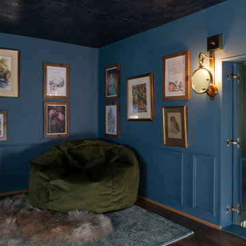
Hidden behind a poster is a secret library, painted a dark, moody blue and styled to give hints of Hogwarts. The ceiling is adorned with a navy, celestial print wallpaper and there are cosy touches dotted around to make this the perfect spot to curl up and while away hours with a good book. Floating candles lend a touch of fun and much needed light to the space.

 Corinthian Fine Homes
This delightful couple purchased this home with renovation in mind. It was situated in an ideal location, but required a serious update bringing modernization while keeping it’s 1940’s period charm. They asked us to design an elegant Master Suite, complete with a bedroom, master closet and elegant bathroom. While we make every attempt to maintain original walls and floors, this renovation required complete gutting of two bedrooms and closets to open the space and allow for all they wanted. In this process we were able to bring uneven floors and walls into level allowing for great end results. The finishing touches on this bathroom included custom white painted vanity and make-up table with White Carrara Marble countertops and a custom tile floor design using Carrara Marble tile. A free-standing tub and bridge faucets/ tub spout upped the game on a modern take on an old-world plumbing fixture. The glass shower completes this sophisticated space, which gives this master bath a modern twist on traditional.
 Roundwood Interiors
This space was special indeed! When the family moved into their home the daughter of the house immediately laid claim to this room - which included a half-height storage space, full of possibilities!
For the main space we chose a bright, fresh green to keep the space uplifting all through the year. I used a blue stripe to mimic the feel of a canopy and to make a feature of the sloped section of the ceiling rather than attempt to hide it.
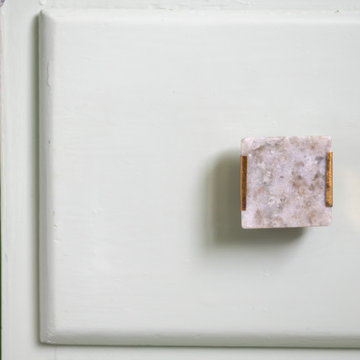
The room is filled with storage to accommodate a growing wardrobe and features upcycled furniture to ensure the space is completely bespoke.
Hidden behind a poster is a secret library, painted a dark, moody blue and styled to give hints of Hogwarts. The ceiling is adorned with a navy, celestial print wallpaper and there are cosy touches dotted around to make this the perfect spot to curl up and while away hours with a good book. Floating candles lend a touch of fun and much needed light to the space.
 Roundwood Interiors
This space was special indeed! When the family moved into their home the daughter of the house immediately laid claim to this room - which included a half-height storage space, full of possibilities!
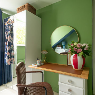
For the main space we chose a bright, fresh green to keep the space uplifting all through the year. I used a blue stripe to mimic the feel of a canopy and to make a feature of the sloped section of the ceiling rather than attempt to hide it.
The room is filled with storage to accommodate a growing wardrobe and features upcycled furniture to ensure the space is completely bespoke.
Hidden behind a poster is a secret library, painted a dark, moody blue and styled to give hints of Hogwarts. The ceiling is adorned with a navy, celestial print wallpaper and there are cosy touches dotted around to make this the perfect spot to curl up and while away hours with a good book. Floating candles lend a touch of fun and much needed light to the space.
 Roundwood Interiors
This space was special indeed! When the family moved into their home the daughter of the house immediately laid claim to this room - which included a half-height storage space, full of possibilities!
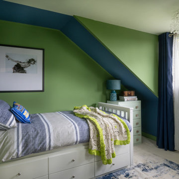
For the main space we chose a bright, fresh green to keep the space uplifting all through the year. I used a blue stripe to mimic the feel of a canopy and to make a feature of the sloped section of the ceiling rather than attempt to hide it.
The room is filled with storage to accommodate a growing wardrobe and features upcycled furniture to ensure the space is completely bespoke.
Hidden behind a poster is a secret library, painted a dark, moody blue and styled to give hints of Hogwarts. The ceiling is adorned with a navy, celestial print wallpaper and there are cosy touches dotted around to make this the perfect spot to curl up and while away hours with a good book. Floating candles lend a touch of fun and much needed light to the space.
 Roundwood Interiors
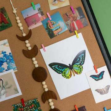
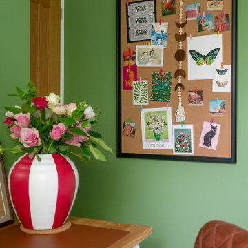
This space was special indeed! When the family moved into their home the daughter of the house immediately laid claim to this room - which included a half-height storage space, full of possibilities!
For the main space we chose a bright, fresh green to keep the space uplifting all through the year. I used a blue stripe to mimic the feel of a canopy and to make a feature of the sloped section of the ceiling rather than attempt to hide it.
The room is filled with storage to accommodate a growing wardrobe and features upcycled furniture to ensure the space is completely bespoke.
Hidden behind a poster is a secret library, painted a dark, moody blue and styled to give hints of Hogwarts. The ceiling is adorned with a navy, celestial print wallpaper and there are cosy touches dotted around to make this the perfect spot to curl up and while away hours with a good book. Floating candles lend a touch of fun and much needed light to the space.
 Roundwood Interiors
This space was special indeed! When the family moved into their home the daughter of the house immediately laid claim to this room - which included a half-height storage space, full of possibilities!
For the main space we chose a bright, fresh green to keep the space uplifting all through the year. I used a blue stripe to mimic the feel of a canopy and to make a feature of the sloped section of the ceiling rather than attempt to hide it.
The room is filled with storage to accommodate a growing wardrobe and features upcycled furniture to ensure the space is completely bespoke.
Hidden behind a poster is a secret library, painted a dark, moody blue and styled to give hints of Hogwarts. The ceiling is adorned with a navy, celestial print wallpaper and there are cosy touches dotted around to make this the perfect spot to curl up and while away hours with a good book. Floating candles lend a touch of fun and much needed light to the space.
29