
Search results for "Attempt" in Home Design Ideas

 threshold interiors
Location: New York, NY, United States
This Loft was tastefully renovated back in the '90s, but was due for an update and an expansion of the kitchen and dining areas to accommodate the client's cooking skills and entertaining needs. EnlargIing the island and adding cabinetry to delineate the office, bar and dining areas was a priority. The bathroom was updated to feel like a tranquil spa with beautiful new tile, plumbing fixtures and cabinets. Our biggest challenge was coordinating the entire renovation while our client was out of town for the Summer!
Photographed by: James Salomon

 Roomscapes Cabinetry and Design Center
Designer: Cameron Snyder, CKD; Photographer: John Ferrarone
Mid-sized cottage eat-in kitchen photo in Boston with a farmhouse sink, beaded inset cabinets, granite countertops, beige backsplash, ceramic backsplash, paneled appliances and no island
Mid-sized cottage eat-in kitchen photo in Boston with a farmhouse sink, beaded inset cabinets, granite countertops, beige backsplash, ceramic backsplash, paneled appliances and no island

Find the right local pro for your project




 Texas Iowa Reclaimed
At Southerleigh Fine Foods & Brewery reclaimed Original Face Oak with patina on every board makes great sense for this brew house. It can be seen on the floors, drop ceilings, walls and even some of the tables! Many compliments already and more good times to come, not only on the food but the gorgeous material selections. Timeless Beauty.
http://tx-reclaimedfloors.com/projects/southerleigh/
 Donald Lococo Architects
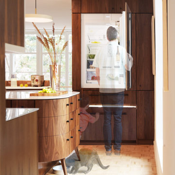
The kitchen was designed two years ago and was then erased and redesigned when the world became a different place a year later. As everyone attempted to flatten the curve, our goal in this regard was to create a kitchen that looked forward to a sharp curve down and of a happier time To that promise for happier times, the redesign, a goal was to make the kitchen brighter and more optimistic. This was done by using simple, primary shapes and circular pendants and emphasizing them in contrast, adding a playful countenance. The selection of a dynamic grain of figured walnut also contributes as this once-living material and its sinuous grain adds motion, rhythm, and scale.
Proud of their 1970s home, one challenge of the design was to balance a 1970's feel and stay current. However, many ‘70s references looked and felt outdated. The first step was a changed mindset. Just like the return of the ‘40s bath and the retro movement a few years ago, every era returns in some way. Chronologically, the '70s will soon be here. Our design looked to era-specific furniture and materials of the decade. Figured walnut was so pervasive in the era: this motif was used on car exteriors such as the 1970 Town and Country Station Wagon, which debuted the same year the existing home was built. We also looked at furniture specific to the decade. The console stereo is referenced not only by high legs on the island but also by the knurled metal cabinet knobs reminiscent of often-used stereo dials. Knurled metalwork is also used on the kitchen faucet. The design references the second piece of '70s furniture in our modern TV tray, which is angled to face the television in the family room. Its round pencil and mug holder cutouts follow the design of walnut consoles and dashboard of the station wagon and other elements of the time.
 Magikflame
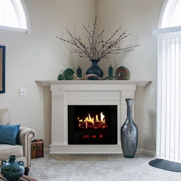
The Churchill corner electric fireplace inspired by MagikFlame is the ideal unit for going into the corner of your home or condo/apartment where two walls come together. Discover our electric fireplaces: https://magikflame.com/product-category/buy-electric-fireplaces/
The triangular shape goes perfectly into the 90 degree angle between your walls, and a TV can be placed above. Clean, beautiful styling is perfect for modern and traditional homes. Built in America with our patented Holographic projection technology. Also includes a heater and can be operated with an iPhone app or built in touch screen. Includes a 5,200 BTU heater to warm 800 sq/ft.
Dimensions: 52"W x 42"T x 40.5"D
At MagikFlame, our goal is to create the most realistic electric fireplaces ever made. We also believe in improving quality of life by providing people with the best possible cozy and relaxing environment every night. Using our patented holoflame technology, we've innovated the electric fireplace to bring you effortless cozy with friends and family. Because quality family time and relaxation after a hard workday or activity is life changing.
Experience 30 Flames. Built-In Heater. Sound.
Subscribe to our channel for tips on how to enhance your interior design, accessories, and focal points. Learn more about fireplace technology and the cozy, relaxation, and family atmosphere improvements to your home. We have everything you need to guide you on a journey to forge the American home and better living atmosphere.
Shop With Us Online: https://magikflame.com
Like MagikFlame on Facebook: https://www.facebook.com/MagikFlame
Follow MagikFlame on Instagram: https://www.instagram.com/magikflamefireplaces/
Tweet With Us: https://twitter.com/MagikFlameFire
Pin With Us: https://www.pinterest.com/MagikFlameElectricFireplaces
We attempt to be as accurate as possible. However, MagikFlame cannot guarantee that product descriptions, images or other content of products or services are 100% accurate, complete, reliable, current, or error-free. Some items may appear slightly larger or smaller than the actual size due to screen defaults and photography techniques. This also includes any momentary stutters or artifacts in frames of the flame video loop. Other items may be represented at a larger than the actual size in order to clearly show details, or smaller than the actual size to show the entire item.
 Magikflame
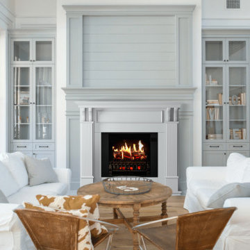
Upgrade your living space with the Trinity electric fireplace inspired by MagikFlame. Its realistic flame effects and easy-to-use controls create a warm and inviting atmosphere in any room, making it perfect for any homeowner. Discover MagikFlame electric fireplaces: https://magikflame.com/product-category/buy-electric-fireplaces/
This featured flame, Pop's Campfire I, is one of 30 realistic flames included with each 28" Insert and Trinity Mantel package.
The Trinity mantel package is a great choice for traditional luxury homes to add sophistication. This mantel is a pure bright white and has beautiful fluted side posts as well as intricately carved triangular corbels with a bull-nose edge adorning both side posts. With this style, the insert sits up off the base 4-inches to give this mantel a grand appearance for larger homes.
State-of-the-Art holographic technology makes for the most realistic flames of any electric fireplace. Theme park attraction technology has been scaled down into a consumer-level fireplace that has the "wow"-factor like none other.
Experience 30 Flames. Built-In Heater. Sound.
Subscribe to our channel for tips on how to enhance your interior design, accessories, and focal points. Learn more about fireplace technology and the cozy, relaxation, and family atmosphere improvements to your home. We have everything you need to guide you on a journey to forge the American home and better living atmosphere.
Shop With Us Online: https://magikflame.com
Like MagikFlame on Facebook: https://www.facebook.com/MagikFlame
Follow MagikFlame on Instagram: https://www.instagram.com/magikflamefireplaces/
Tweet With Us: https://twitter.com/MagikFlameFire
Pin With Us: https://www.pinterest.com/MagikFlameElectricFireplaces
We attempt to be as accurate as possible. However, MagikFlame cannot guarantee that product descriptions, images or other content of products or services are 100% accurate, complete, reliable, current, or error-free. Some items may appear slightly larger or smaller than the actual size due to screen defaults and photography techniques. This also includes any momentary stutters or artifacts in frames of the flame video loop. Other items may be represented at a larger than the actual size in order to clearly show details, or smaller than the actual size to show the entire item.
 Donald Lococo Architects
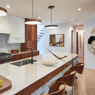
The kitchen was designed two years ago and was then erased and redesigned when the world became a different place a year later. As everyone attempted to flatten the curve, our goal in this regard was to create a kitchen that looked forward to a sharp curve down and of a happier time To that promise for happier times, the redesign, a goal was to make the kitchen brighter and more optimistic. This was done by using simple, primary shapes and circular pendants and emphasizing them in contrast, adding a playful countenance. The selection of a dynamic grain of figured walnut also contributes as this once-living material and its sinuous grain adds motion, rhythm, and scale.
Proud of their 1970s home, one challenge of the design was to balance a 1970's feel and stay current. However, many ‘70s references looked and felt outdated. The first step was a changed mindset. Just like the return of the ‘40s bath and the retro movement a few years ago, every era returns in some way. Chronologically, the '70s will soon be here. Our design looked to era-specific furniture and materials of the decade. Figured walnut was so pervasive in the era: this motif was used on car exteriors such as the 1970 Town and Country Station Wagon, which debuted the same year the existing home was built. We also looked at furniture specific to the decade. The console stereo is referenced not only by high legs on the island but also by the knurled metal cabinet knobs reminiscent of often-used stereo dials. Knurled metalwork is also used on the kitchen faucet. The design references the second piece of '70s furniture in our modern TV tray, which is angled to face the television in the family room. Its round pencil and mug holder cutouts follow the design of walnut consoles and dashboard of the station wagon and other elements of the time.

 Envision Web
Stuart Wade, Envision Virtual Tours
The second-largest and most developed of Georgia's barrier islands, St. Simons is approximately twelve miles long and nearly three miles wide at its widest stretch (roughly the size of Manhattan Island in New York). The island is located in Glynn County on Georgia's coast and lies east of Brunswick (the seat of Glynn County), south of Little St. Simons Island and the Hampton River, and north of Jekyll Island. The resort community of Sea Island is separated from St. Simons on the east by the Black Banks River. Known for its oak tree canopies and historic landmarks, St. Simons is both a tourist destination and, according to the 2010 U.S. census, home to 12,743 residents.
Early History
The earliest
St. Simons Island Village
record of human habitation on the island dates to the Late Archaic Period, about 5,000 to 3,000 years ago. Remnants of shell rings left behind by Native Americans from this era survive on many of the barrier islands, including St. Simons. Centuries later, during the period known by historians as the chiefdom era, the Guale Indians established a chiefdom centered on St. Catherines Island and used St. Simons as their hunting and fishing grounds. By 1500 the Guale had established a permanent village of about 200 people on St. Simons, which they called Guadalquini.
Beginning in 1568, the Spanish attempted to create missions along the Georgia coast. Catholic missions were the primary means by which Georgia's indigenous Native American chiefdoms were assimilated into the Spanish colonial system along the northern frontier of greater Spanish Florida. In the 1600s St. Simons became home to two Spanish missions: San Buenaventura de Guadalquini, on the southern tip of the island, and Santo Domingo de Asao (or Asajo), on the northern tip. Located on the inland side of the island were the pagan refugee villages of San Simón, the island's namesake, and Ocotonico. In 1684 pirate raids left the missions and villages largely abandoned.
Colonial History
As
Fort Frederica
early as 1670, with Great Britain's establishment of the colony of Carolina and its expansion into Georgia territory, Spanish rule was threatened by the English. The Georgia coast was considered "debatable land" by England and Spain, even though Spain had fully retreated from St. Simons by 1702. Thirty-one years later General James Edward Oglethorpe founded the English settlement of Savannah. In 1736 he established Fort Frederica, named after the heir to the British throne, Frederick Louis, prince of Wales, on the west side of St. Simons Island to protect Savannah and the Carolinas from the Spanish threat.
Between 1736 and 1749 Fort Frederica was the hub of British military operations along the Georgia frontier. A town of the same name grew up around the fort and was of great importance to the new colony. By 1740 Frederica's population was 1,000. In 1736 the congregation of what would become Christ Church was organized within Fort Frederica as a mission of the Church of England. Charles Wesley led the first services. In 1742 Britain's decisive victory over Spain in the Battle of Bloody Marsh, during the War of Jenkins' Ear, ended the Spanish threat to the Georgia coast. When the British regimen disbanded in 1749, most of the townspeople relocated to the mainland. Fort Frederica went into decline and, except for a short time of prosperity during the 1760s and 1770s under the leadership of merchant James Spalding, never fully recovered. Today the historic citadel's tabby ruins are maintained by the National Park Service.
Plantation Era
By the start of the American Revolution (1775-83), Fort Frederica was obsolete, and St. Simons was left largely uninhabited as most of its residents joined the patriot army. Besides hosting a small Georgia naval victory on the Fort Frederica River, providing guns from its famous fort for use at Fort Morris in Sunbury, and serving as an arena for pillaging by privateers and British soldiers, the island played almost no role in the war.
Following the war, many of the townspeople, their businesses destroyed, turned to agriculture. The island was transformed into fourteen cotton plantations after acres of live oak trees were cleared for farm land and used for building American warships, including the famous USS Constitution, or "Old Ironsides." Although rice was the predominant crop along the neighboring Altamaha River, St. Simons was known for its production of long-staple cotton, which soon came to be known as Sea Island cotton.
Between
Ebos Landing
the 1780s and the outbreak of the Civil War (1861-65), St. Simons's plantation culture flourished. The saline atmosphere and the availability of cheap slave labor proved an ideal combination for the cultivation of Sea Island cotton. In 1803 a group of Ebo slaves who survived the Middle Passage and arrived on the west side of St. Simons staged a rebellion and drowned themselves. The sacred site is known today as Ebos Landing.
One of the largest owners of land and slaves on St. Simons was Pierce Butler, master of Hampton Point Plantation, located on the northern end of the island. By 1793 Butler owned more than 500 slaves, who cultivated 800 acres of cotton on St. Simons and 300 acres of rice on Butler's Island in the Altamaha River delta. Butler's grandson, Pierce Mease Butler, who at the age of sixteen inherited a share of his grandfather's estate in 1826, was responsible for the largest sale of human beings in the history of the United States: in 1859, to restore his squandered fortune, he sold 429 slaves in Savannah for more than $300,000. The British actress and writer Fanny Kemble, whose tumultuous marriage to Pierce ended in divorce in 1849, published an eyewitness account of the evils of slavery on St. Simons in her book Journal of a Residence on a Georgian Plantation in 1838-1839 (1863).
Another
Retreat Plantation
large owner of land and slaves on St. Simons was Major William Page, a friend and employee of Pierce Butler Sr. Before purchasing Retreat Plantation on the southwestern tip of the island in 1804, Page managed the Hampton plantation and Butler's Island. Upon Page's death in 1827, Thomas Butler King inherited the land together with his wife, Page's daughter, Anna Matilda Page King. King expanded his father-in-law's planting empire on St. Simons as well as on the mainland, and by 1835 Retreat Plantation alone was home to as many as 355 slaves.
The center of life during the island's plantation era was Christ Church, Frederica. Organized in 1807 by a group of island planters, the Episcopal church is the second oldest in the Diocese of Georgia. Embargoes imposed by the War of 1812 (1812-15) prevented the parishioners from building a church structure, so they worshiped in the home of John Beck, which stood on the site of Oglethorpe's only St. Simons residence, Orange Hall.
The first Christ Church building, finished on the present site in 1820, was ruined by occupying Union troops during the Civil War. In 1884 the Reverend Anson Dodge Jr. rebuilt the church as a memorial to his first wife, Ellen. The cruciform building with a trussed gothic roof and stained-glass windows remains active today as Christ Church.
Civil War and Beyond
The
St. Simons Island Lighthouse
outbreak of the Civil War in 1861 put a sudden end to St. Simons's lucrative plantation era. In January of that year, Confederate troops were stationed at the south end of the island to guard the entrance to Brunswick Harbor. Slaves from Retreat Plantation, owned by Thomas Butler King, built earthworks and batteries. Plantation residents were scattered—the men joined the Confederate army and their families moved to the mainland. Cannon fire was heard on the island in December 1861, and Confederate troops retreated in February 1862, after dynamiting the lighthouse to keep its beacon from aiding Union troops. Soon thereafter, Union troops occupied the island, which was used as a camp for freed slaves. By August 1862 more than 500 former slaves lived on St. Simons, including Susie King Taylor, who organized a school for freed slave children. But in November the ex-slaves were taken to Hilton Head, South Carolina, and Fernandina, Florida, leaving the island abandoned.
After the Civil War the island never returned to its status as an agricultural community. The plantations lay dormant because there were no slaves to work the fields. After Union general William T. Sherman's January 1865 Special Field Order No. 15 —a demand that former plantations be divided and distributed to former slaves—was overturned by U.S. president Andrew Johnson less than a year later, freedmen and women were forced to work as sharecroppers on the small farms that dotted the land previously occupied by the sprawling plantations.
By
St. Simons Lumber Mills
1870 real economic recovery began with the reestablishment of the timber industry. Norman Dodge and Titus G. Meigs of New York set up lumber mill operations at Gascoigne Bluff, formerly Hamilton Plantation. The lumber mills provided welcome employment for both blacks and whites and also provided mail and passenger boats to the mainland. Such water traffic, together with the construction of a new lighthouse in 1872, designed by architect Charles B. Cluskey, marked the beginning of St. Simons's tourism industry. The keeper of the lighthouse created a small amusement park, which drew many visitors, as did the seemingly miraculous light that traveled from the top of the lighthouse tower to the bottom. The island became a summer retreat for families from the mainland, particularly from Baxley, Brunswick, and Waycross.
The island's resort industry was thriving by the 1880s. Beachfront structures, such as a new pier and grand hotel, were built on the southeastern end of the island and could be accessed by ferry. Around this time wealthy northerners began vacationing on the island.
Twentieth Century
The
St. Simons Island Pier and Village
opening in 1924 of the Brunswick–St. Simons Highway, today known as the Torras Causeway, was a milestone in the development of resorts in the area. St. Simons's beaches were now easily accessible to locals and tourists alike. More than 5,000 automobiles took the short drive from Brunswick to St. Simons via the causeway on its opening day, paving the way for convenient residential and resort development.
In 1926 automotive pioneer Howard Coffin of Detroit, Michigan, bought large tracts of land on St. Simons, including the former Retreat Plantation, and constructed a golf course, yacht club, paved roads, and a residential subdivision. Although the causeway had brought large numbers of summer people to the island, St. Simons remained a small community with only a few hundred permanent residents until the 1940s.
The
St. Simons Island
outbreak of World War II (1941-45) brought more visitors and residents to St. Simons. Troops stationed at Jacksonville, Florida; Savannah; and nearby Camp Stewart took weekend vacations on the island, and a new naval air base and radar school became home to even more officers and soldiers. The increased wartime population brought the island its first public school. With a major shipyard for the production of Liberty ships in nearby Brunswick, the waters of St. Simons became active with German U-boats. In April 1942, just off the coast, the Texas Company oil tanker S. S. Oklahoma and the S. S. Esso Baton Rouge were torpedoed by the Germans, bringing the war very close to home for island residents.
Due in large part to the military's improvement of the island's infrastructure during the war, development on the island boomed in the 1950s and 1960s. More permanent homes and subdivisions were built, and the island was no longer just a summer resort but also a thriving community. In 1950 the Methodist conference and retreat center Epworth by the Sea opened on Gascoigne Bluff. In 1961 novelist Eugenia Price visited St. Simons and began work on her first works of fiction, known as the St. Simons Trilogy. Inspired by real events on the island, Price's trilogy renewed interest in the history of Georgia's coast, and the novelist herself relocated to the island in 1965 and lived there for thirty-one years. St. Simons is also home to contemporary Georgia writer Tina McElroy Ansa.
Since
Epworth by the Sea
1980 St. Simons's population has doubled. The island's continued status as a vacation destination and its ongoing development boom have put historic landmarks and natural areas at risk. While such landmarks as the Fort Frederica ruins and the Battle of Bloody Marsh site are preserved and maintained by the National Park Service, and while the historic lighthouse is maintained by the Coastal Georgia Historical Society, historic Ebos Landing has been taken over by a sewage treatment plant.
Several coastal organizations have formed in recent years to save natural areas on the island. The St. Simons Land Trust, for example, has received donations of large tracts of land and plans to protect property in the island's three traditional African American neighborhoods. Despite its rapid growth and development, St. Simons remains one of the most beautiful and important islands on the Georgia coast.
 Donald Lococo Architects
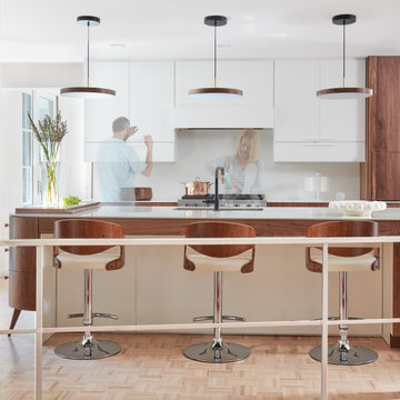
The kitchen was designed two years ago and was then erased and redesigned when the world became a different place a year later. As everyone attempted to flatten the curve, our goal in this regard was to create a kitchen that looked forward to a sharp curve down and of a happier time To that promise for happier times, the redesign, a goal was to make the kitchen brighter and more optimistic. This was done by using simple, primary shapes and circular pendants and emphasizing them in contrast, adding a playful countenance. The selection of a dynamic grain of figured walnut also contributes as this once-living material and its sinuous grain adds motion, rhythm, and scale.
Proud of their 1970s home, one challenge of the design was to balance a 1970's feel and stay current. However, many ‘70s references looked and felt outdated. The first step was a changed mindset. Just like the return of the ‘40s bath and the retro movement a few years ago, every era returns in some way. Chronologically, the '70s will soon be here. Our design looked to era-specific furniture and materials of the decade. Figured walnut was so pervasive in the era: this motif was used on car exteriors such as the 1970 Town and Country Station Wagon, which debuted the same year the existing home was built. We also looked at furniture specific to the decade. The console stereo is referenced not only by high legs on the island but also by the knurled metal cabinet knobs reminiscent of often-used stereo dials. Knurled metalwork is also used on the kitchen faucet. The design references the second piece of '70s furniture in our modern TV tray, which is angled to face the television in the family room. Its round pencil and mug holder cutouts follow the design of walnut consoles and dashboard of the station wagon and other elements of the time.

 CANTILEVER STUDIO
Dan Meinhardt Archival Photography, Chad Cornette Cantilever Studio.
The home exterior turns itself away from the street and toward Southern exposure and to the wood ravine. Passive solar design is acheived with large overhangs and stategic glass coatings where overhangs don't shade.
Green Building materials on the exterior include: Thin stone veneer, Charred wood siding without finish, Galvanized metal roof, steel structure (recyclable), cantilevered structure to reduce building footprint. Corner windows help to bring the Outdoors into the home.

 All Surface Restoration
Exposed aggregate driveway after cleaning & sealing with Paver Gloss Sealer.
Photo of a mid-sized front yard driveway in Detroit.
Photo of a mid-sized front yard driveway in Detroit.

 ODS Architecture
Inspiration for a contemporary black tile and mosaic tile light wood floor and beige floor powder room remodel in San Francisco with flat-panel cabinets, light wood cabinets, a wall-mount toilet, black walls, an integrated sink, solid surface countertops and white countertops
 Sosna Inc
These lovely homeowners, in their late 60s and seasoned by life and travel, wanted a home that truly worked for their lifestyle. Their wish list was simple: comfort, functionality, and a space that felt welcoming for guests.
When Small Annoyances Become Big Dealbreakers
The main floor was no longer working. The kitchen was cramped, the wall between it and the dining room disrupted the flow, and two unused bedrooms wasted valuable space. Even the powder room was tucked away at the back. Upstairs, one shared bathroom, basement laundry, and a primary bedroom that overheated in the afternoon made daily life frustrating.
Facing Renovation Worries
The homeowners were excited but cautious. A previous renovation attempt with another company had fallen through, so trust was key. They also wanted to make sure their vision was achievable without stretching the budget.
The Transformation
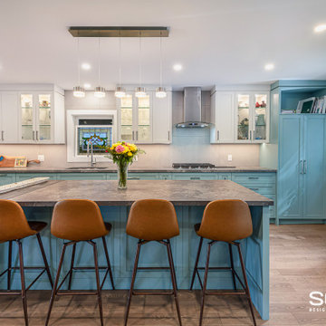
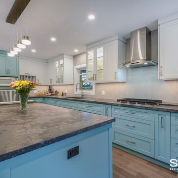
Relocating the stairs completely opened up the main floor. The kitchen, dining, and living areas now flow together beautifully, creating a bright, open, and welcoming space.
Smart Details for Everyday Living
The new kitchen features a large island, ample storage, and a raised dishwasher at standing height for easy loading and unloading. We also moved the powder room to the front and added a coffee and bar station near the dining area, perfect for morning routines or entertaining guests.
Comfort and Flow Upstairs
Upstairs, the primary bedroom was moved to the cooler side of the house and now connects to a spacious walk-in closet and new ensuite. Compact laundry machines were installed upstairs, and the former primary bedroom was converted into a private guest suite with its own en-suite and walk-in closet.
Finishes That Feel Like Home
Beautiful, low-maintenance materials complete the space: custom cabinetry, leather-finish quartz countertops, engineered hardwood on the main floor, and refinished hardwood upstairs. Porcelain tiles, a new gas fireplace, and oak stairs tie everything together.
The Final Takeaway
Life at home has completely transformed. Cooking, entertaining, and everyday living are now effortless and enjoyable. Every space flows, every detail feels intentional, and the home finally fits their lifestyle.
Ready to Love Your Home Again?
If your house no longer suits your lifestyle, we can help. Let’s explore how a thoughtful renovation can make your home work for you.
Contact us today to get started.
 Sosna Inc
These lovely homeowners, in their late 60s and seasoned by life and travel, wanted a home that truly worked for their lifestyle. Their wish list was simple: comfort, functionality, and a space that felt welcoming for guests.
When Small Annoyances Become Big Dealbreakers
The main floor was no longer working. The kitchen was cramped, the wall between it and the dining room disrupted the flow, and two unused bedrooms wasted valuable space. Even the powder room was tucked away at the back. Upstairs, one shared bathroom, basement laundry, and a primary bedroom that overheated in the afternoon made daily life frustrating.
Facing Renovation Worries
The homeowners were excited but cautious. A previous renovation attempt with another company had fallen through, so trust was key. They also wanted to make sure their vision was achievable without stretching the budget.
The Transformation
Relocating the stairs completely opened up the main floor. The kitchen, dining, and living areas now flow together beautifully, creating a bright, open, and welcoming space.
Smart Details for Everyday Living
The new kitchen features a large island, ample storage, and a raised dishwasher at standing height for easy loading and unloading. We also moved the powder room to the front and added a coffee and bar station near the dining area, perfect for morning routines or entertaining guests.
Comfort and Flow Upstairs
Upstairs, the primary bedroom was moved to the cooler side of the house and now connects to a spacious walk-in closet and new ensuite. Compact laundry machines were installed upstairs, and the former primary bedroom was converted into a private guest suite with its own en-suite and walk-in closet.
Finishes That Feel Like Home
Beautiful, low-maintenance materials complete the space: custom cabinetry, leather-finish quartz countertops, engineered hardwood on the main floor, and refinished hardwood upstairs. Porcelain tiles, a new gas fireplace, and oak stairs tie everything together.
The Final Takeaway
Life at home has completely transformed. Cooking, entertaining, and everyday living are now effortless and enjoyable. Every space flows, every detail feels intentional, and the home finally fits their lifestyle.
Ready to Love Your Home Again?
If your house no longer suits your lifestyle, we can help. Let’s explore how a thoughtful renovation can make your home work for you.
Contact us today to get started.
 Nathan Fell Architecture
The owners knew they wanted to create spaces in their backyard that be useful and encourage them to be outside more often, but because their backyard space is so massive the scope and size of the project was initially difficult to define. After a few initial rounds of design, the project ended up creating a series of spaces near their house and pool rather than try to utilize the entirety of their yard.
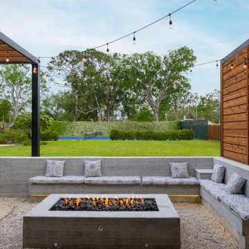
The existing pool was situated in proximity (and almost entirely aligned) to a detached garage. The garage was perfectly useful for parking cars, but nothing special Architecturally and certainly not functionally associated with the pool. The cabana would have been too far away from the main home if it were located on the opposite side of pool and would have been too large and visually obtrusive if arrange to the side of the pool. The design of the cabana was conceived as an addition to the garage that more appropriately capped the end of the pool with an openable space that could be used for cooking, lounging in the shade poolside, or playing games in with the space itself. There wasn’t enough space between the garage and pool to contain all the uses they wanted, so an additional shade structure with a dining space and a fire pit with build-in benches was included to the project, located near their existing living room.
Board formed concrete walls were used as a common element between the shade structure and the cabana. The base used as a planter wall and back to the bench in the shade structure is maintained in the base of cabana to develop aesthetic cohesion between the two spaces. The cabana engages a build in bar to a series of folding glass walls for compact efficient use. The interior of the cabana had to maintain the existing garage roofline for structural stability, but the interior is vaulted to the highest extent possible. The interior of the vault is lined with wood to frame the space for visual clarity enhancing transparency.
A goal of the project was to make a vast backyard more useful at a walkable scale by creating outdoor spaces close to each other and the existing living areas in and around the home. Rather than attempt to encapsulate the entire backyard it creates density around the edges that look onto the backyard. Because the spaces engage with the existing conditions the space has become a much-used outdoor living space.
(Photos of After Construction Conditions by Sara Essex Bradley)

 JHW Properties
Contemporary bathroom inside our Sherman Oaks home remodel. Features Moroccan tile floors and black & white vanity, countertops and cabinetry. Glass sliding door to shower/tub combination with inset soap box featuring continuation of Moroccan tile. White subway tile in shower.
40