
Search results for "Attempt" in Home Design Ideas
 Rimartus
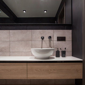
A Young couple appartment in Trakai became black and white loft. The greatest attention we paid to functional multipurpose spaces and architectural context. After new apartment planning was made, second level and roof windows were built. We attempted to create a cozy, artistic and romantic atmosphere including industrial design accents. It was left a lot of free space for clients future needs and self realization.
Photos: www.andstep.com
 Kerbi Urbanowski Stained Glass
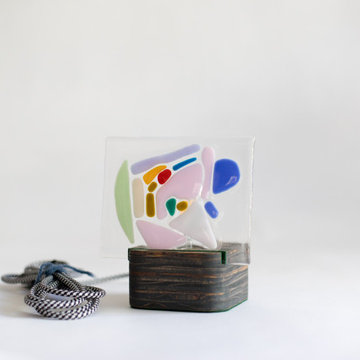
Designed by Kerbi Urbanowski, each piece incorporates shapes sketched, hand-cut, and then fired in a glass kiln at the Bullseye Glass Resource Center in Oakland, California. Its wooden base is a contemporary hybrid of the Edison Lamp X traditional stained glass Fan Lamp. "End of Day Glass" is an old glassmaker tradition, where you attempt to create something beautiful from the remaining broken glass pieces used that day.
Due to the individual nature of each item, please allow up to a 5-week turnaround. Each lamp comes with a naturally finished handmade wood base, cobalt blue cord, white in-line cord switch, cord grip, US standard plug, and one of a kind fused glass faceplate.
"When sketching, I tend to look at each composition as a unique challenge, an abstracted crossword puzzle that I have the enjoyment of solving. They take time, and if you bear with me, I promise to make you something special." - Kerbi
 Tom Ralston Concrete
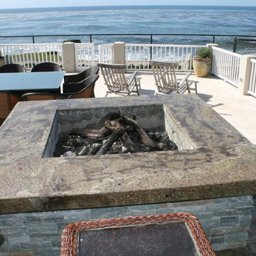
The Ingram job is unique in that it has lots of very interesting ocean shelf shapes and colors as well as a variety of embeds from the Monterey Bay that were placed into the concrete. There were sand dollars, starfish, moonsnails, and Monterey Bay aquarium sand just to name a few. We were going to attempt to use a very stout epoxy to seal one particular starfish but as it lay there the day after in wait…the Ingram's dog ate it. What was left when we pulled out the remains was a perfect impression of a starfish…almost like a petrified starfish. That feature as well as the rest of the patio, stairs, countertop and fire pit are amazing. Being about 30 feet from the ocean doesn't hurt the eyes either.
Find the right local pro for your project
 JUMA architects
Optiek Herpol wanted to move to a better, more central location with plenty of parking space. A property that complied with these conditions was found on the Market in Deinze, and JUMA architects were subsequently asked to design a new interior for the store.
The property in question is very deep and narrow with little natural light entry. JUMA set to work despite these constraints in an attempt to transform these challenges into qualities.
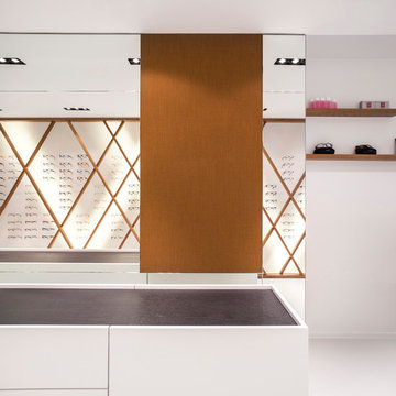
The architects positioned the sales counter right behind the shop window, so as to make optimum use of the available natural light. This also makes store activities visible from the outside, adding an extra element of attraction. At the narrowest section of the store, a large wall mirror was put in to visually double the space. The wall onto which the eyeglasses are displayed is located opposite the mirror and is literally the eye catcher in the store. A wooden lattice makes for an interesting play of diagonal lines behind which the glasses are presented. This unique concept animates the entire store without detracting from the fact that the glasses should remain the main focal point in the store. The workshop is located in the back, separated from the store by a wall in smoked grey glass. In this way, the optician can keep an eye on the store at all times.
The colour palette is predominantly white, to keep the interior as light as possible. As a counterpoint, warm wood accents are added. The chairs at the counter are upholstered in a colour that harmonizes perfectly with the wood.
Pictures © Thomas De Bruyne
 C.E. Pontz Sons
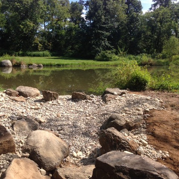
This Farm Pond Renovation in York, PA included removal of the existing land bridge at the back side of the pond that was blocking the stream water flow and also clearing the aquatic weed and other invasive plants from the stream to allow for a better water flow to the ponds edge. We snaked the existing overflow pipe and attempted to clear it of any debris blocking the flow of water. For the new overflow we cleared the existing embankment and excavated a swale at the edge of the pond and created a natural looking stream overflow similar to one we would create in a typical backyard pond or water feature. This was done to prevent and stabilize the eroding bank along the pond edge. Also installed was a large scale pond aerator and aeration system to aide in the overall health and clarity of the pond.
 Progressive Design Build
It was in 2012 when Mike Spreckelmeier first met Roy and Patti. They had been despondent after meeting with multiple contractors in an attempt to start their kitchen remodel. The contractors lacked follow through, came tardy to meetings and even failed to show up at others.
Determined to leave nothing to chance in the pursuit of their dream, Roy and Patti followed up on a recommendation after overhearing a conversation that was taking place while they were standing in a gallingly long line waiting to cast a vote on Election Day.
With a solid recommendation to pursue, Roy and Patti contacted Progressive Design Build. The rest is history.
Mike showed up on time. For a small retainer, he provided preliminary sketches, ideas for maximizing space and storage, and solutions for a sunken family room that created a safety hazard and a problem with traffic flow. More importantly, he designed the project to the homeowners’ budget.
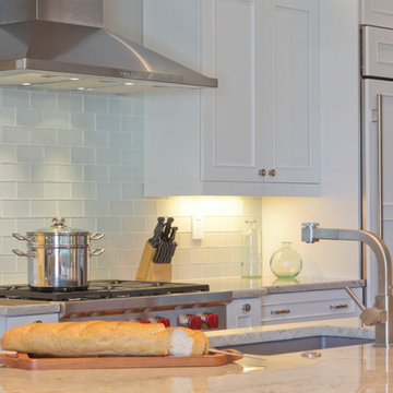
Progressive Design Build shot some different elevations and designed a plan to raise the floor, allowing all finished floors to be on the same level. Upon completion, the kitchen was stunning. Features included LED backlit fire glass shelving, white recessed panel cabinets, a subway tile backsplash, Granite countertop, integrated refrigerator, undermount sink, and more.
The living room was designed with complimentary finishes and included a natural stone fireplace wall with open cabinets flanked on both sides. The 12’ fireplace was made with a floor-to-ceiling white pebble finish.
This Bonita Bay project completed on time and on budget—allowing this fabulous family a wonderful opportunity to create lasting memories for many years to come.
 Kaoud Carpet & Rugs
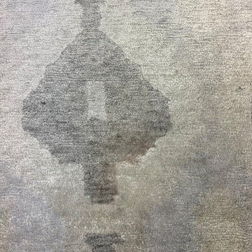
This silk area rug had suffered heavy staining in one section approximately 5 inches in diameter. After several failed attempts by the client to remove the stain with grocery cleaning agents, the client gave us a call. The area rug was an expensive purchase and the client's were clearly distraught about what had happened to their rug. After working with our team of master area rug cleaning experts, we were successful in removing the stain. Take a look at the before and after photos.
 Excelsior Design Group & Danberry Building Corp
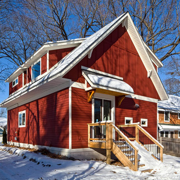
At the end of 2012, Danberry came across what was then a rundown home in the Casco Point neighborhood of Orono, in desperate need of some design help. A failed attempt by the previous owner to remodel it as an investment had left it abandoned for years. But when the Danberry’s got a glimpse of this diamond in the rough, they knew it had potential. The project included a completely remodeled kitchen, bathroom, basement and living room.
 Donald Lococo Architects
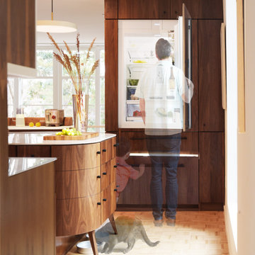
The kitchen was designed two years ago and was then erased and redesigned when the world became a different place a year later. As everyone attempted to flatten the curve, our goal in this regard was to create a kitchen that looked forward to a sharp curve down and of a happier time To that promise for happier times, the redesign, a goal was to make the kitchen brighter and more optimistic. This was done by using simple, primary shapes and circular pendants and emphasizing them in contrast, adding a playful countenance. The selection of a dynamic grain of figured walnut also contributes as this once-living material and its sinuous grain adds motion, rhythm, and scale.
Proud of their 1970s home, one challenge of the design was to balance a 1970's feel and stay current. However, many ‘70s references looked and felt outdated. The first step was a changed mindset. Just like the return of the ‘40s bath and the retro movement a few years ago, every era returns in some way. Chronologically, the '70s will soon be here. Our design looked to era-specific furniture and materials of the decade. Figured walnut was so pervasive in the era: this motif was used on car exteriors such as the 1970 Town and Country Station Wagon, which debuted the same year the existing home was built. We also looked at furniture specific to the decade. The console stereo is referenced not only by high legs on the island but also by the knurled metal cabinet knobs reminiscent of often-used stereo dials. Knurled metalwork is also used on the kitchen faucet. The design references the second piece of '70s furniture in our modern TV tray, which is angled to face the television in the family room. Its round pencil and mug holder cutouts follow the design of walnut consoles and dashboard of the station wagon and other elements of the time.
 Shuler Architecture
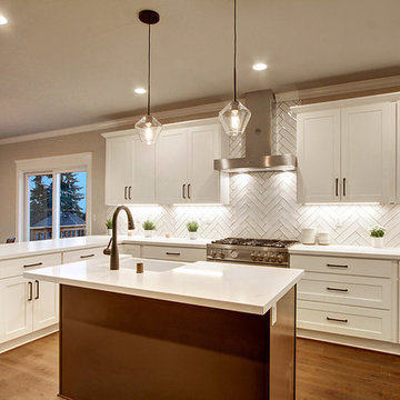
This urban infill project is a make-over of a decrepit structure that had been used as a student rental for close to 50 years. Situated on an elevated, 3300 sf lot, nothing in the original house was salvageable and the entire house was stripped down to the studs. Our challenge with this project was to then open up the original interiors, flood them with natural light while creating a design that appealed to the broadest buyer pool possible.
We solved this problem by organizing a compact floor plan that resulted in a 4 bedroom, 4 bath residence organized around a great room on the main level, a family room on the basement level and an additional 2 bedrooms with city views on the upper. By minimizing circulation space, we were able to re-purpose every square foot of floor area while creating a dramatic, light-filled staircase that tied all 3 levels of the house together into a unified living scheme. Clean lines and clean details, this is another of our attempts at a 'Not So Big House.'
Marketing of the final product lasted less than 10 days and resulted in 3 full priced offers that netted the developer a tidy profit.
 Roundwood Interiors
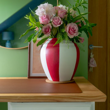
This space was special indeed! When the family moved into their home the daughter of the house immediately laid claim to this room - which included a half-height storage space, full of possibilities!
For the main space we chose a bright, fresh green to keep the space uplifting all through the year. I used a blue stripe to mimic the feel of a canopy and to make a feature of the sloped section of the ceiling rather than attempt to hide it.
The room is filled with storage to accommodate a growing wardrobe and features upcycled furniture to ensure the space is completely bespoke.
Hidden behind a poster is a secret library, painted a dark, moody blue and styled to give hints of Hogwarts. The ceiling is adorned with a navy, celestial print wallpaper and there are cosy touches dotted around to make this the perfect spot to curl up and while away hours with a good book. Floating candles lend a touch of fun and much needed light to the space.
 Architectural Resource LLC
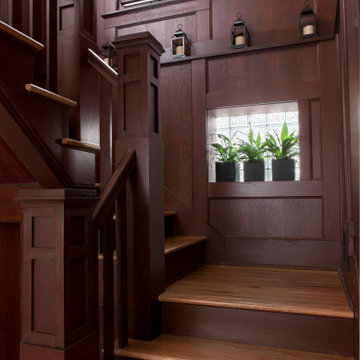
The Brooke Residence ‘Addi- tion by Subtraction’ remodeling project was recognized with numerous regional and national awards and was selected for Fine Homebuilding’s Annual Issue on Houses.
This 1920’s Craftsman Bungalow had been poorly modified in the 70’s in an attempt to address poor energy performance with a scabbed on solarium. The design solution removed the solarium and completely reimagined the floor plan: The kitchen was relocated to the rear; the stairway was relocated to enhance function, and a better connection to the family room was created.
 CK Independent Living Builders
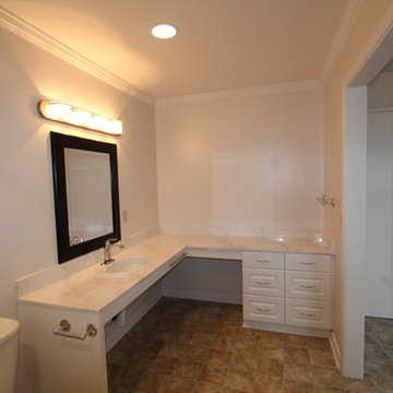
Mid-sized elegant master beige tile, brown tile, gray tile and ceramic tile ceramic tile bathroom photo in Hawaii with raised-panel cabinets, white cabinets, a two-piece toilet, white walls, a drop-in sink and quartz countertops
 CRES Builders Corp.
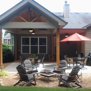
This customer approached us with their ideas for a pavilion and breezeway; however, they were attempting to work within a strict budget and timeline. As promised, we wound up completing the work a week in advance and only surpassed the agreed-upon budget by $200 (due to additional orders desired by the customer). The team for this project consisted of a group of sub-contractors, building officials, vendors, city permit departments, and the neighborhood HOA board, all of which seamlessly worked together to create a successful end-result.
From the beginning, we worked hard to create a clear vision for the work that needed to be done, but we were actually able to make several positive design adaptations as the customer's needs evolved during the project.
 Brendan McHugh, Architect, Manasquan, NJ
VISION AND NEEDS:
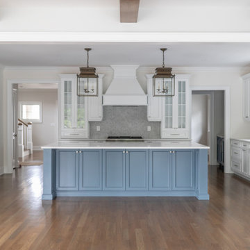
Our client came to us with a vision for their dream house for their growing family with three young children. This was their second attempt at getting the right design. The first time around, after working with an out-of-state online architect, they could not achieve the level of quality they wanted. McHugh delivered a home with higher quality design.
MCHUGH SOLUTION:
The Shingle/Dutch Colonial Design was our client's dream home style. Their priorities were to have a home office for both parents. Ample living space for kids and friends, along with outdoor space and a pool. Double sink bathroom for the kids and a master bedroom with bath for the parents. Despite being close a flood zone, clients could have a fully finished basement with 9ft ceilings and a full attic. Because of the higher water table, the first floor was considerably above grade. To soften the ascent of the front walkway, we designed planters around the stairs, leading up to the porch.

 Brinq Construction
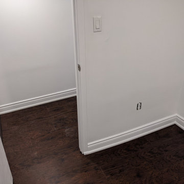
This unfinished basement job was offered to us after an attempt by someone else, it came out beautifully and the client couldn't be more happy with the final results!
 Excelsior Design Group & Danberry Building Corp
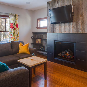
At the end of 2012, Danberry came across what was then a rundown home in the Casco Point neighborhood of Orono, in desperate need of some design help. A failed attempt by the previous owner to remodel it as an investment had left it abandoned for years. But when the Danberry’s got a glimpse of this diamond in the rough, they knew it had potential. The project included a completely remodeled kitchen, bathroom, basement and living room.
 Tile Doctor Ltd
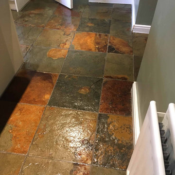
Except for general cleaning this multi-coloured slate floor had not been professionally cleaned since installation eleven years prior. Any sealer that had once been applied to the slate had long since worn off and dirt was now ingrained in the pores of the stone causing it to look dull and un-attractive. The property was in the lovely town of Staines Upon Thames, obviously situated on the banks of the River Thames and a popular place to live for London commuters.
I visited site to take a closer look at the floor and provide the client with an accurate price for renovating the stone. It turns out that the client had used all sorts of different household cleaners in an attempt to get the floor clean. Unfortunately, they were probably making the situation worse as these strong cleaning products would have actually stripped the sealant off the stone leaving it open to dirt. I carried out a test clean for them and they were very pleased to see how the floor could look. We agreed a price for the work and arranged a suitable date to carry out the work.
Cleaning a Multi-Coloured Slate Tiled Kitchen Floor
My first task was to strip off what was left of the old sealer and deep clean the stone using a dilution of Tile Doctor Remove and Go mixed 50:50 with Tile Doctor Pro-Clean. This powerful cocktail was applied to the floor and left to soak in for ten minutes before being scrubbed in using a rotary machine fitted with a black scrubbing pad.
The grout was hand scrubbed using more of the cleaning solution along the grout lines until I was happy the floor was as clean as it possibly could be. The floor was rinsed with water and the soil extracted by using the wet vacuum.
Once the floor was clear the Slate was inspected, and any stubborn areas were spot treated using the same process as before. After a final rinse and extraction, the floor was dried as much as possible using the wet vacuum and left to dry off overnight.
Sealing a Multi-Coloured Slate Tiled Kitchen Floor
I came back the next day and checked the moisture levels of the tiles using a damp meter. The floor had dried well so I had a green light for applying a new sealer. For this I used four Coats of Tile Doctor Seal and Go, allowing each coat to dry before applying the next. This product works really well on Slate and gave the tiles a nice sheen finish, the fresh sealer will also make maintenance cleaning far easier in the future.
The client was very happy with the result, the floor now looks great and the natural colours of the stone is so much more evident. For aftercare I recommended they throw away all those supermarket products and use Tile Doctor Neutral Tile Cleaner which is a pH neutral product that won’t prematurely erode the new sealer with use.
Jonathan Oldham
South Middlesex Tile Doctor
 2north
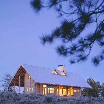
The scale, massing, texture, and use of materials attempted to compliment the natural environment. The use of pole barn post and beam construction methods intentionally reduced the impact of the built form on the indigenous landscape. The use of galvanized steel, rough sawn fir and cedar, concrete block, and industrial hardware shaped the building form to reference the regional vernacular of south central Montana, and were intended to weather and take on the patina similar to built forms found throughout the area built around the turn of the century.
J.K. Lawrence Photography
42