
Search results for "Attempt" in Home Design Ideas

 Art Glass and Metal
Chattering Cardinals Window..... Etched Glass Window ...Privacy Glass
Inspiration for a large timeless enclosed home design remodel in San Diego
Inspiration for a large timeless enclosed home design remodel in San Diego

 The Garage Enhancement Company
This garage in Vero Beach, Florida had our epoxy and polyaspartic flake floor coating installed along with garage cabinets. Now the customer's Vero Beach garage has functional garage storage and a durable floor coating that replaced his old peeling garage floor paint.

 LO STUDIO DEL COLORE
Wallpaper Jannelli & Volpi in vinyl foam on tnt , washable. The rolls are 10:05 mt x 53cm .
You can see all the samples on the site under the heading www.lostudiodelcolore.com Parati>Modern
Shipping costs are calculated extra . Contact the Company by email at: info@lostudiodelcolore.com
Find the right local pro for your project

 Valerie J Johnson Custom Tailored Home Furnishings
Example of a mid-sized transitional porcelain tile hallway design in Kansas City with beige walls

 Melissa Renee
This modern, contemporary, glossy, underwater resin on wood panel is layered with aqua, aquamarine, Aruba blue pigments, white epoxy paste, and hints of sparkle. A cool toned color palette was used to create this multi-layered dimensional seascape.

 HouseHome
Although the Kids Bathroom was reduced in size by a few feet to add additional space in the Master Bathroom, you would never suspect it! Because of the new layout and design selections, it now feels even larger than before. We chose light colors for the walls, flooring, cabinetry, and tiles, as well as a large mirror to reflect more light. A custom linen closet with pull-out drawers and frosted glass elevates the design while remaining functional for this family. For a space created to work for a teenage boy, teen girl, and pre-teen girl, we showcase that you don’t need to sacrifice great design for functionality!
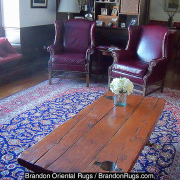
 Brandon Oriental Rugs
Sunday, September 14, 2014
Is Your Interior Design Depressing You?
By Joseph Pubillones
(DailyHerald.com http://www.dailyherald.com/article/20140913/entlife/140919600)
From time to time, someone will corner me and confess to me that they are depressed; they whisper that they believe their decorating is making them sick. They tell me that their interiors are not to their liking because of choices made by their spouse, their designer, or because of their own misguided attempts at decorating.
Is it possible for their environment to make them feel sick? Yes (as I think about it), it is possible for design to alter moods.
In the mid-1950s, Norbett Mintz, a researcher at Brandeis University, and his mentor, the renowned psychologist Abraham Maslow, decided to conduct research about the effects of "beauty" on behavior. Mintz had already conducted experiments about the effects of color on human behavior and concluded that color selection has a palpable effect on personal behavior.
A room's design can have an impact on your mood. Mismatched colors or an
overstuffed room can affect your ability to relax and feel comfortable.
In their experiment about beauty, they designed three rooms. The first was "the ugly room", replete with clashing colors and patterns, disorganization and too much furniture for the size of the space. The second was "the average room", arranged with a monochromatic scheme, basic furniture pieces and subtly colored nondescript art. The third was "the beautiful room", decorated with quality case-goods, and fashionable fabrics and colors. Overwhelmingly, the test group rejected "the ugly room". "The average room" and "the beautiful room" were tied as the preferred room. When asked to describe the rooms, the test group was best able to describe "the beautiful room".
As a designer, this is not news to me. There are rooms, especially those that I like, that I can describe with remarkable detail. Although our notion of what is beautiful varies from person to person, it can be said that beautiful design is more memorable. We can deduce that each person prefers the beautiful.
From the time we are born, there are foods that are preferred -- some love sweets; others prefer more savory flavors. Over time, our taste buds evolve, and what was once a favorite food can become insipid or nauseating. The same is true for interior design. Over time, everyone develops preferences about what makes us feel comfortable and at home.
When I hear that someone's home is depressing, I am concerned. I suggest immediate action to change what is most bothersome. If it is wall color: a painting party is overdue. If it is furniture: I ask them to consider new upholstery; a new furniture arrangement; or substituting new pieces for those that offend. And for those too timid or dismayed to tackle their problems head-on and alone, I suggest hiring a professional interior designer.
( Joseph Pubillones is the owner of Joseph Pubillones Interiors, an award-winning interior design firm based in Palm Beach, Fla. © 2014 Creators.com)
[Comment by Brandon Oriental Rugs: Good quality is evident in the words we use when we appreciate its presence: beauty, harmony, integrity, excellence. These are appealing impressions it makes upon our minds and spirits. It can't be faked. Attempts to put a stamp of "quality" -- as in "good quality" -- upon things which possess or convey "bad quality" doesn't fool anyone who appreciates quality and the benefits it inherently brings.]
Related articles
Is your interior design depressing you?
Why Our Brains Love Colorful Interiors
A Little Spent on a Well Chosen Oriental Rug Can Save You a Lot on the Remaining Furnishings for Your Home
How Can Interior Design Inspire Fashion Design? | L' Essenziale Home Designs
Interior Design Pet Peeves
Hand-Knotted Oriental Rugs Are Best Friends With Leather Furniture And Arts & Crafts (especially Stickley (tm)) Furnishings of Every Kind
Homeowners Select Persian Kashan Rug from Bucks County Oriental Rug Store Brandon Oriental Rugs (www.BrandonRugs.com) for Family Room of Their Upper Montgomery County Farmhouse
There Is Nothing New Under The Sun - Opposites Attract - The Truth Does Not Change - Quality IS Forever Manifesting Itself - REAL Is Now
ShareThisFacebookTweetLinkedInPinterestEmail
Posted by brandon rugs at 6:06 PM No comments: Links to this post
Email This
BlogThis!
Share to Twitter
Share to Facebook
Share to Pinterest
Labels: Brandon, Brandonrugs.com, Bucks County oriental rugs, colorful rugs, designing for mood, environment, interior design, personal expression, rug store Bucks County, rugs and design
Saturday, September 13, 2014
Bucks County Rug Store Helps Bethlehem, PA Homeowners Select Rugs to Complete Newly Furnished Living Room and Dining Room
Our customers purchased new living room and dining room furniture from Hendrixson's Fine Furnishings in Shimersville, PA.
With most of both rooms finished, they asked Brandon Oriental Rugs to help them find two fine quality oriental rugs that would coordinate with each other, and serve as the last puzzle pieces to complete their decorating.
Both rugs are finely detailed, hand-knotted, antique reproduction Persian Tabriz design oriental rugs made in India. The living room rug has a golden-maize color background with an antique gold border that subtly complements the fabrics and floor color in the room. The small scale motifs add color and interest while not defeating the supporting role the rug plays in the room to the customer's collection of fine original artworks.
The dining room rug is an unusual "Hasht-guli" design with berry-red background and golden-maize border that complements the living room rug, the rich mahogany wood-tones of the dining room suite, and the fabrics used in the custom window treatments designed and installed by Hendrixson's.
The wonderful result wrought by our customers expressing their good taste in an unswerving commitment to quality is proof that a modestly sized home can look and feel as elegant and luxurious as any palace.
Related articles
Lehigh Valley: Bucks County Oriental Rug Store, Brandon Oriental Rugs - www.BrandonRugs.com - Finds and Delivers Rugs for Lehigh Valley Home in Bethlehem, PA
New Homeowners in Doylestown, PA (Bucks County) Find Handmade Oriental Rug That Complements Everything in the Entry Hall to Their Home with Help from Brandon Oriental Rugs (www.BrandonRugs.com)
Brandon Oriental Rugs in Bucks County, PA helps Lehigh Valley Homeowner ( Bethlehem, PA ) Find a Fine Quality Oriental Rug to Complete Family Room
Aesthetic pieces
RUG SALE REALITY -- What Kind of Rug Sale Are You Looking For: "Biggest Discount" or "Best Quality at the Best Price"? Bucks County Oriental Rug Store - Brandon Oriental Rugs (BrandonRugs.com) - Helps You Understand the Difference
Brandon Oriental Rugs Helps Newtown, PA Homeowner Prepare for Holiday Entertaining with new Hand-knotted Oriental Rugs for the Living Room and Dining Room
Is That Really an Antique Rug? Antique Rugs Might Not Always Be As Old As You Think.
ShareThisFacebookTweetLinkedInPinterestEmail
Posted by brandon rugs at 2:47 PM No comments: Links to this post
Email This
BlogThis!
Share to Twitter
Share to Facebook
Share to Pinterest
Labels: Bethlehem, Brandon, choosing an area rug, Doylestown, interior design, Lehigh Valley home furnishings, oriental rugs bucks county
Tuesday, September 9, 2014
Oriental Rugs: What More Can You Say?
(BrandonRugs.com) Sometimes when there's a lot to be said, saying it quietly commands more attention.
You almost want to invite the oriental rugs to speak up, but they are always content playing a supporting role.
Related articles
New Homeowners in Doylestown, PA (Bucks County) Find Handmade Oriental Rug That Complements Everything in the Entry Hall to Their Home with Help from Brandon Oriental Rugs (www.BrandonRugs.com)
Bucks County Rug Store and Rug Search Service (Brandon Oriental Rugs - www.BrandonRugs.com) Helps Upper Bucks County Homeowner to Select Living Room Rugs for Old Farmhouse Renovation
A Little Spent on a Well Chosen Oriental Rug Can Save You a Lot on the Remaining Furnishings for Your Home
5 Things That Take a Room from Good to Great
RUG SALE REALITY -- What Kind of Rug Sale Are You Looking For: "Biggest Discount" or "Best Quality at the Best Price"? Bucks County Oriental Rug Store - Brandon Oriental Rugs (BrandonRugs.com) - Helps You Understand the Difference
Rug Shopping in Princeton - Hopewell - Skillman New Jersey Region Made Easier with Help From Bucks County Oriental Rug Store Brandon Oriental Rugs - www.BrandonRugs.com - as Proven by Customer's Experience
Video: All About Persian Rugs from Their Source ( with commentary from Bucks County Oriental Rug Store Brandon Oriental Rugs - www.BrandonRugs.com )
Advice For Maintaining Oriental Rugs
ShareThisFacebookTweetLinkedInPinterestEmail
Posted by brandon rugs at 4:07 PM No comments: Links to this post
Email This
BlogThis!
Share to Twitter
Share to Facebook
Share to Pinterest
Labels: Brandon, Bucks County oriental rugs, choose an oriental rug, Doylestown, Huntingdon Valley, layered rugs, New Hope, Newtown, oriental rug store Bucks County, Pinterest, rug sale, rug size, rugs and decor
Rug Placement Helps Determine Room Function and Where Rooms Begin and End
(BrandonRugs.com) If feel that your decorating is neither here nor there; the appropriate use of handmade oriental rugs will definitely help you to figure out where here is.
http://www.pinterest.com/pin/133348838942090547/
Related articles
New Homeowners in Doylestown, PA (Bucks County) Find Handmade Oriental Rug That Complements Everything in the Entry Hall to Their Home with Help from Brandon Oriental Rugs (www.BrandonRugs.com)
Bucks County Rug Store and Rug Search Service (Brandon Oriental Rugs - www.BrandonRugs.com) Helps Upper Bucks County Homeowner to Select Living Room Rugs for Old Farmhouse Renovation
Homeowners Select Persian Kashan Rug from Bucks County Oriental Rug Store Brandon Oriental Rugs (www.BrandonRugs.com) for Family Room of Their Upper Montgomery County Farmhouse
Oriental Rugs and Rugged Individualism: The World at Your Feet Is An Expression of You
Rug Shopping in Princeton - Hopewell - Skillman New Jersey Region Made Easier with Help From Bucks County Oriental Rug Store Brandon Oriental Rugs - www.BrandonRugs.com - as Proven by Customer's Experience
One-of-a-Kind Oriental Rugs Are Something Special for Those Blazing a Trail of Exquisite Taste That Can Be Admired But Not Duplicated
ShareThisFacebookTweetLinkedInPinterestEmail
Posted by brandon rugs at 3:22 PM No comments: Links to this post
Email This
BlogThis!
Share to Twitter
Share to Facebook
Share to Pinterest
Labels: Brandon, Bucks County oriental rugs, choose an oriental rug, Doylestown, Huntingdon Valley, layered rugs, New Hope, Newtown, oriental rug store Bucks County, Pinterest, rug sale, rug size, rugs and decor
Saturday, September 6, 2014
Why You Should Hire a Professional Interior Designer
by Cindy Beyer — August 27, 2014 at 1:00 pm
( http://www.restonnow.com/2014/08/27/why-you-should-hire-a-professional-interior-designer)
The interior of your home says a lot about you. Your home is your castle. Many of my clients have said they couldn’t imagine the results after their project was completed. They say it was the WOW factor. I say, that is why you hired a professional designer.
There are many situations that warrant the hiring a professional interior designer. This includes something as simple as choosing paint and window covering to full scale renovation work such as a new kitchen, bath or lower level. In addition to achieving that WOW factor, a professional interior designer will save their clients’ money in many ways, most importantly the avoidance of costly mistakes.
Not only will a professional designer understand the context of the project, they will have access to many resources and their trained eye can make a world of difference in the final result. And those final results also will improve the value of your home.
Professional interior designers are able to work closely with architects and contractors and are comfortable with drawing floor plans, as well as understanding the implications of how interiors will be used as it relates to structural and available floor space.
Beyond floor plans, program management, installation and understanding how structural design will be used in a practical setting, a professional interior designer will also be knowledgeable in color and fabric design, space planning, window coverings, furniture design, architecture and much more. So when you see the initials ASID and NCIDQ next to an interior designer’s name, know they have been through significant amount of formal certification.
When hiring a professional interior designer, it is important to have an understanding of the scope of the work to be done. Before my initial meeting with a new client, I ask them to spend some time making a list of their needs as well as any pictures they saved of items or rooms they like. Upon our first meeting, I take photos and measurements. Together,we then develop a detailed itemized list covering all areas of concern. The next step is to draw up and present a floor plan. Depending on the type of project this could include floor plans and furniture placement as well as construction and lighting if needed.
Once the plan is approved appropriate furnishings and finishes are selected. This can be fun - and exhausting as well. I often present my clients with many samples from which to choose. After the furniture choices, I develop a comprehensive budget itemizing all purchases.
I also may call on several of the contractors I work with such as electricians, plumbers, cabinet wholesalers and cabinet makers, painters, as well as drapery workrooms and installers. It has taken many years to compile trusted associates, which is an important part of being a good designer.
Lead times for good furniture and furnishings can take from 6-12 weeks depending on availability. This extra time gives sufficient time to finish the required preparatory work, and allows clients time to dispose of old furniture.
Related articles
Interior Design Pet Peeves
A Little Spent on a Well Chosen Oriental Rug Can Save You a Lot on the Remaining Furnishings for Your Home
Analysis of Initial Reaction to the New Furniture Exhibition 1901 - an 'exceedingly vulgar show' - (Curated by The Victoria and Albert Museum) with Lessons for Today (extending to the use of handmade area rugs) Regarding Evolution of Tastes and Styles
Hand-Knotted Oriental Rugs Are Best Friends With Leather Furniture And Arts & Crafts (especially Stickley (tm)) Furnishings of Every Kind
How Can Interior Design Inspire Fashion Design? | L' Essenziale Home Designs
Brandon Oriental Rugs Helps Homeowner in Doylestown, PA (Bucks County) Find Rug to Complete Newly Furnished Study
Fine Quality Area Rugs - Naturally Including Oriental Rugs - Are A Step In the Right Direction As Designers and Homeowners Plan Improvements: What's Under Foot for 2014? | ASID Icon
Bucks County Interior Designer Able to Find Oriental Rug for Her Project Through Brandon Oriental Rugs (www.BrandonRugs.com)
ShareThisFacebookTweetLinkedInPinterestEmail
Posted by brandon rugs at 11:28 PM No comments: Links to this post
Email This
BlogThis!
Share to Twitter
Share to Facebook
Share to Pinterest
Labels: Brandon, Bucks County oriental rugs, floorplan, home fashion, interior design, lifestyle, oriental rugs, rug store Bucks County
Thursday, September 4, 2014
Homeowners Select Persian Kashan Rug from Bucks County Oriental Rug Store Brandon Oriental Rugs (www.BrandonRugs.com) for Family Room of Their Upper Montgomery County Farmhouse
- See more at: http://brandonrugs.blogspot.com/#sthash.QMFruxxC.dpuf (Pamela Ward/ Brandon Oriental Rugs)

 CLASS DESIGN HOME
Amazing and very decorative led mirror with sanblasted edge and touch switch.
Bright White light.
Designed and manufactured in Spain. Available in stock. Delivery time: 3 to 5 labor days.
Measures: 28 x 28 x 1 : $749.00
36 x 28 x 1: $799.00
Free shipping into USA Continental.
For more information please contact us by pone or by email.

 Shannon Adamson Interior Design
This ski-in, ski-out condo features a strong Arts and Crafts influence. The interiors feature reclaimed oak floors, mortise-and-tenon carpentry, stone, and custom period details.

 Mads Anderson
Original Abstract Painting
60" x 70"
Oil Enamel on Canvas
Trendy living room photo in Omaha
Trendy living room photo in Omaha

 Fackler Construction Company
Example of a large arts and crafts backyard deck design in Portland with decking and a pergola

 North Summit Builders LLC
Example of a mid-sized mountain style light wood floor hallway design in Boston with white walls

 Cedar Creek Fencing
This design works great in any setting - particularly down town contemporary homes. The screen breathes while providing room for light and air allowing a more open concept design.

 Elite Flooring Specialists
Armstrong Alterna 12" x 24" Durango Bleached Sand Floor.
Alterna is a great alternative to tile as it is warmer and softer on your feet.
Eat-in kitchen - small victorian single-wall vinyl floor eat-in kitchen idea in Bridgeport with raised-panel cabinets, beige cabinets and no island
Eat-in kitchen - small victorian single-wall vinyl floor eat-in kitchen idea in Bridgeport with raised-panel cabinets, beige cabinets and no island

 Villa & Mission Imports
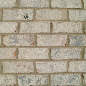
Custom made Red High Fire Paver with Pillow Edges. They have a hand look that will give your space a realistic view but with the quality of a High Fire Tile Paver.

 The Ceramic Tile Warehouse
Example of a classic kitchen design in Jackson with a double-bowl sink, raised-panel cabinets, medium tone wood cabinets, granite countertops, beige backsplash, stone tile backsplash and stainless steel appliances

 Jon Allen Fine Metal Art
Tropics by Jon Allen is an abstract take on a nature inspired painting. It has a vaguely floral undertone but in very unexpected and delightful colors. Jon truly captures the spirit of the tropics with these beautiful, bright colors. Hand-painted on aluminum, this stunning abstract piece will complement any contemporary or modern, decor.
Number of Pieces: 1
Dimensions: 35" x 24" x 2" off the wall
Care & Cleaning: Clean with a soft cloth and plain soap & water
Other Features: Hardware is pre-installed for simple hanging and art will “float” 2” off the wall

 Envision Web
Stuart Wade, Envision Virtual Tours
The second-largest and most developed of Georgia's barrier islands, St. Simons is approximately twelve miles long and nearly three miles wide at its widest stretch (roughly the size of Manhattan Island in New York). The island is located in Glynn County on Georgia's coast and lies east of Brunswick (the seat of Glynn County), south of Little St. Simons Island and the Hampton River, and north of Jekyll Island. The resort community of Sea Island is separated from St. Simons on the east by the Black Banks River. Known for its oak tree canopies and historic landmarks, St. Simons is both a tourist destination and, according to the 2010 U.S. census, home to 12,743 residents.
Early History
The earliest
St. Simons Island Village
record of human habitation on the island dates to the Late Archaic Period, about 5,000 to 3,000 years ago. Remnants of shell rings left behind by Native Americans from this era survive on many of the barrier islands, including St. Simons. Centuries later, during the period known by historians as the chiefdom era, the Guale Indians established a chiefdom centered on St. Catherines Island and used St. Simons as their hunting and fishing grounds. By 1500 the Guale had established a permanent village of about 200 people on St. Simons, which they called Guadalquini.
Beginning in 1568, the Spanish attempted to create missions along the Georgia coast. Catholic missions were the primary means by which Georgia's indigenous Native American chiefdoms were assimilated into the Spanish colonial system along the northern frontier of greater Spanish Florida. In the 1600s St. Simons became home to two Spanish missions: San Buenaventura de Guadalquini, on the southern tip of the island, and Santo Domingo de Asao (or Asajo), on the northern tip. Located on the inland side of the island were the pagan refugee villages of San Simón, the island's namesake, and Ocotonico. In 1684 pirate raids left the missions and villages largely abandoned.
Colonial History
As
Fort Frederica
early as 1670, with Great Britain's establishment of the colony of Carolina and its expansion into Georgia territory, Spanish rule was threatened by the English. The Georgia coast was considered "debatable land" by England and Spain, even though Spain had fully retreated from St. Simons by 1702. Thirty-one years later General James Edward Oglethorpe founded the English settlement of Savannah. In 1736 he established Fort Frederica, named after the heir to the British throne, Frederick Louis, prince of Wales, on the west side of St. Simons Island to protect Savannah and the Carolinas from the Spanish threat.
Between 1736 and 1749 Fort Frederica was the hub of British military operations along the Georgia frontier. A town of the same name grew up around the fort and was of great importance to the new colony. By 1740 Frederica's population was 1,000. In 1736 the congregation of what would become Christ Church was organized within Fort Frederica as a mission of the Church of England. Charles Wesley led the first services. In 1742 Britain's decisive victory over Spain in the Battle of Bloody Marsh, during the War of Jenkins' Ear, ended the Spanish threat to the Georgia coast. When the British regimen disbanded in 1749, most of the townspeople relocated to the mainland. Fort Frederica went into decline and, except for a short time of prosperity during the 1760s and 1770s under the leadership of merchant James Spalding, never fully recovered. Today the historic citadel's tabby ruins are maintained by the National Park Service.
Plantation Era
By the start of the American Revolution (1775-83), Fort Frederica was obsolete, and St. Simons was left largely uninhabited as most of its residents joined the patriot army. Besides hosting a small Georgia naval victory on the Fort Frederica River, providing guns from its famous fort for use at Fort Morris in Sunbury, and serving as an arena for pillaging by privateers and British soldiers, the island played almost no role in the war.
Following the war, many of the townspeople, their businesses destroyed, turned to agriculture. The island was transformed into fourteen cotton plantations after acres of live oak trees were cleared for farm land and used for building American warships, including the famous USS Constitution, or "Old Ironsides." Although rice was the predominant crop along the neighboring Altamaha River, St. Simons was known for its production of long-staple cotton, which soon came to be known as Sea Island cotton.
Between
Ebos Landing
the 1780s and the outbreak of the Civil War (1861-65), St. Simons's plantation culture flourished. The saline atmosphere and the availability of cheap slave labor proved an ideal combination for the cultivation of Sea Island cotton. In 1803 a group of Ebo slaves who survived the Middle Passage and arrived on the west side of St. Simons staged a rebellion and drowned themselves. The sacred site is known today as Ebos Landing.
One of the largest owners of land and slaves on St. Simons was Pierce Butler, master of Hampton Point Plantation, located on the northern end of the island. By 1793 Butler owned more than 500 slaves, who cultivated 800 acres of cotton on St. Simons and 300 acres of rice on Butler's Island in the Altamaha River delta. Butler's grandson, Pierce Mease Butler, who at the age of sixteen inherited a share of his grandfather's estate in 1826, was responsible for the largest sale of human beings in the history of the United States: in 1859, to restore his squandered fortune, he sold 429 slaves in Savannah for more than $300,000. The British actress and writer Fanny Kemble, whose tumultuous marriage to Pierce ended in divorce in 1849, published an eyewitness account of the evils of slavery on St. Simons in her book Journal of a Residence on a Georgian Plantation in 1838-1839 (1863).
Another
Retreat Plantation
large owner of land and slaves on St. Simons was Major William Page, a friend and employee of Pierce Butler Sr. Before purchasing Retreat Plantation on the southwestern tip of the island in 1804, Page managed the Hampton plantation and Butler's Island. Upon Page's death in 1827, Thomas Butler King inherited the land together with his wife, Page's daughter, Anna Matilda Page King. King expanded his father-in-law's planting empire on St. Simons as well as on the mainland, and by 1835 Retreat Plantation alone was home to as many as 355 slaves.
The center of life during the island's plantation era was Christ Church, Frederica. Organized in 1807 by a group of island planters, the Episcopal church is the second oldest in the Diocese of Georgia. Embargoes imposed by the War of 1812 (1812-15) prevented the parishioners from building a church structure, so they worshiped in the home of John Beck, which stood on the site of Oglethorpe's only St. Simons residence, Orange Hall.
The first Christ Church building, finished on the present site in 1820, was ruined by occupying Union troops during the Civil War. In 1884 the Reverend Anson Dodge Jr. rebuilt the church as a memorial to his first wife, Ellen. The cruciform building with a trussed gothic roof and stained-glass windows remains active today as Christ Church.
Civil War and Beyond
The
St. Simons Island Lighthouse
outbreak of the Civil War in 1861 put a sudden end to St. Simons's lucrative plantation era. In January of that year, Confederate troops were stationed at the south end of the island to guard the entrance to Brunswick Harbor. Slaves from Retreat Plantation, owned by Thomas Butler King, built earthworks and batteries. Plantation residents were scattered—the men joined the Confederate army and their families moved to the mainland. Cannon fire was heard on the island in December 1861, and Confederate troops retreated in February 1862, after dynamiting the lighthouse to keep its beacon from aiding Union troops. Soon thereafter, Union troops occupied the island, which was used as a camp for freed slaves. By August 1862 more than 500 former slaves lived on St. Simons, including Susie King Taylor, who organized a school for freed slave children. But in November the ex-slaves were taken to Hilton Head, South Carolina, and Fernandina, Florida, leaving the island abandoned.
After the Civil War the island never returned to its status as an agricultural community. The plantations lay dormant because there were no slaves to work the fields. After Union general William T. Sherman's January 1865 Special Field Order No. 15 —a demand that former plantations be divided and distributed to former slaves—was overturned by U.S. president Andrew Johnson less than a year later, freedmen and women were forced to work as sharecroppers on the small farms that dotted the land previously occupied by the sprawling plantations.
By
St. Simons Lumber Mills
1870 real economic recovery began with the reestablishment of the timber industry. Norman Dodge and Titus G. Meigs of New York set up lumber mill operations at Gascoigne Bluff, formerly Hamilton Plantation. The lumber mills provided welcome employment for both blacks and whites and also provided mail and passenger boats to the mainland. Such water traffic, together with the construction of a new lighthouse in 1872, designed by architect Charles B. Cluskey, marked the beginning of St. Simons's tourism industry. The keeper of the lighthouse created a small amusement park, which drew many visitors, as did the seemingly miraculous light that traveled from the top of the lighthouse tower to the bottom. The island became a summer retreat for families from the mainland, particularly from Baxley, Brunswick, and Waycross.
The island's resort industry was thriving by the 1880s. Beachfront structures, such as a new pier and grand hotel, were built on the southeastern end of the island and could be accessed by ferry. Around this time wealthy northerners began vacationing on the island.
Twentieth Century
The
St. Simons Island Pier and Village
opening in 1924 of the Brunswick–St. Simons Highway, today known as the Torras Causeway, was a milestone in the development of resorts in the area. St. Simons's beaches were now easily accessible to locals and tourists alike. More than 5,000 automobiles took the short drive from Brunswick to St. Simons via the causeway on its opening day, paving the way for convenient residential and resort development.
In 1926 automotive pioneer Howard Coffin of Detroit, Michigan, bought large tracts of land on St. Simons, including the former Retreat Plantation, and constructed a golf course, yacht club, paved roads, and a residential subdivision. Although the causeway had brought large numbers of summer people to the island, St. Simons remained a small community with only a few hundred permanent residents until the 1940s.
The
St. Simons Island
outbreak of World War II (1941-45) brought more visitors and residents to St. Simons. Troops stationed at Jacksonville, Florida; Savannah; and nearby Camp Stewart took weekend vacations on the island, and a new naval air base and radar school became home to even more officers and soldiers. The increased wartime population brought the island its first public school. With a major shipyard for the production of Liberty ships in nearby Brunswick, the waters of St. Simons became active with German U-boats. In April 1942, just off the coast, the Texas Company oil tanker S. S. Oklahoma and the S. S. Esso Baton Rouge were torpedoed by the Germans, bringing the war very close to home for island residents.
Due in large part to the military's improvement of the island's infrastructure during the war, development on the island boomed in the 1950s and 1960s. More permanent homes and subdivisions were built, and the island was no longer just a summer resort but also a thriving community. In 1950 the Methodist conference and retreat center Epworth by the Sea opened on Gascoigne Bluff. In 1961 novelist Eugenia Price visited St. Simons and began work on her first works of fiction, known as the St. Simons Trilogy. Inspired by real events on the island, Price's trilogy renewed interest in the history of Georgia's coast, and the novelist herself relocated to the island in 1965 and lived there for thirty-one years. St. Simons is also home to contemporary Georgia writer Tina McElroy Ansa.
Since
Epworth by the Sea
1980 St. Simons's population has doubled. The island's continued status as a vacation destination and its ongoing development boom have put historic landmarks and natural areas at risk. While such landmarks as the Fort Frederica ruins and the Battle of Bloody Marsh site are preserved and maintained by the National Park Service, and while the historic lighthouse is maintained by the Coastal Georgia Historical Society, historic Ebos Landing has been taken over by a sewage treatment plant.
Several coastal organizations have formed in recent years to save natural areas on the island. The St. Simons Land Trust, for example, has received donations of large tracts of land and plans to protect property in the island's three traditional African American neighborhoods. Despite its rapid growth and development, St. Simons remains one of the most beautiful and important islands on the Georgia coast.

 Gotham Kitchen & Bath
Contemporary bathroom remodel featuring frameless shower doors, shower bench, black and white tile design, and compact vanity
Inspiration for a small contemporary 3/4 white tile and ceramic tile porcelain tile, black floor and single-sink alcove shower remodel in New York with flat-panel cabinets, dark wood cabinets, a one-piece toilet, white walls, a vessel sink, quartz countertops, white countertops and a freestanding vanity
Inspiration for a small contemporary 3/4 white tile and ceramic tile porcelain tile, black floor and single-sink alcove shower remodel in New York with flat-panel cabinets, dark wood cabinets, a one-piece toilet, white walls, a vessel sink, quartz countertops, white countertops and a freestanding vanity
47