
Search results for "Attempts" in Home Design Ideas
 Baird Brothers Fine Hardwoods
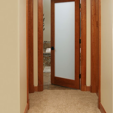
American Cherry 1 Lite frosted glass bathroom door with Contemporary cherry casing.
Example of a trendy bathroom design in Other
Example of a trendy bathroom design in Other
 Robyn Huether Architect Inc.
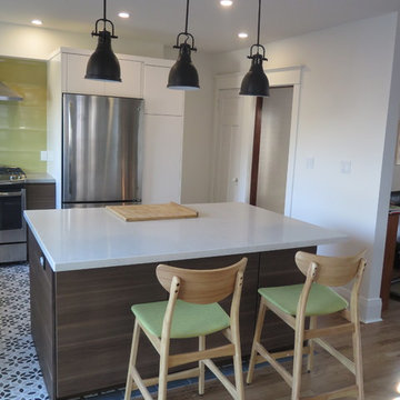
The new kitchen/dining room space. Bringing in more light and providing an enjoyable space to cook and entertain.
Eat-in kitchen - mid-sized 1950s l-shaped ceramic tile and multicolored floor eat-in kitchen idea in Toronto with flat-panel cabinets, dark wood cabinets, quartz countertops, yellow backsplash, glass tile backsplash, stainless steel appliances, an island and an undermount sink
Eat-in kitchen - mid-sized 1950s l-shaped ceramic tile and multicolored floor eat-in kitchen idea in Toronto with flat-panel cabinets, dark wood cabinets, quartz countertops, yellow backsplash, glass tile backsplash, stainless steel appliances, an island and an undermount sink
 MainStreet Design Build
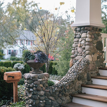
Working around the original stone porch columns, MainStreet Design Build was challenged with integrating them purposefully into the porch, while also correcting several years of failed attempts at remodeling the home to its classic roots.
Alicia Gbur Photography
Find the right local pro for your project
 Brendan McHugh, Architect, Manasquan, NJ
VISION AND NEEDS:
Our client came to us with a vision for their dream house for their growing family with three young children. This was their second attempt at getting the right design. The first time around, after working with an out-of-state online architect, they could not achieve the level of quality they wanted. McHugh delivered a home with higher quality design.
MCHUGH SOLUTION:
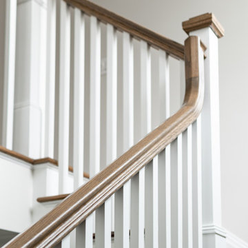
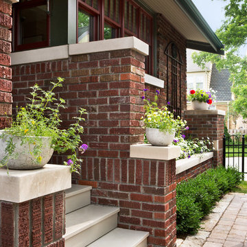
The Shingle/Dutch Colonial Design was our client's dream home style. Their priorities were to have a home office for both parents. Ample living space for kids and friends, along with outdoor space and a pool. Double sink bathroom for the kids and a master bedroom with bath for the parents. Despite being close a flood zone, clients could have a fully finished basement with 9ft ceilings and a full attic. Because of the higher water table, the first floor was considerably above grade. To soften the ascent of the front walkway, we designed planters around the stairs, leading up to the porch.
 Architectural Resource LLC
The Brooke Residence ‘Addi- tion by Subtraction’ remodeling project was recognized with numerous regional and national awards and was selected for Fine Homebuilding’s Annual Issue on Houses.
This 1920’s Craftsman Bungalow had been poorly modified in the 70’s in an attempt to address poor energy performance with a scabbed on solarium. The design solution removed the solarium and completely reimagined the floor plan: The kitchen was relocated to the rear; the stairway was relocated to enhance function, and a better connection to the family room was created.
 Studio 316 Creative, LLC
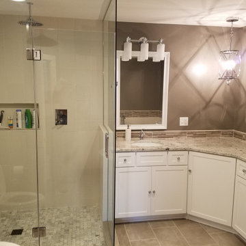
This Mequon master on-suite from the 80's was in serious need of a face lift! While it may be a large bathroom, it certainly was not up to date and did not meet the needs of the client.
We designed a complete gut and re-build including the removal of a window that only looked over the solarium below!
The result is a timeless design that allowed the homeowner to sell his home, after many failed attempts with the old bathroom, and meets the needs of the future buyers!
 Roundwood Interiors
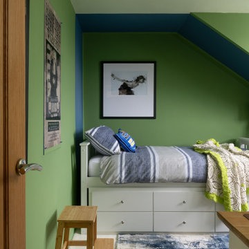
This space was special indeed! When the family moved into their home the daughter of the house immediately laid claim to this room - which included a half-height storage space, full of possibilities!
For the main space we chose a bright, fresh green to keep the space uplifting all through the year. I used a blue stripe to mimic the feel of a canopy and to make a feature of the sloped section of the ceiling rather than attempt to hide it.
The room is filled with storage to accommodate a growing wardrobe and features upcycled furniture to ensure the space is completely bespoke.
Hidden behind a poster is a secret library, painted a dark, moody blue and styled to give hints of Hogwarts. The ceiling is adorned with a navy, celestial print wallpaper and there are cosy touches dotted around to make this the perfect spot to curl up and while away hours with a good book. Floating candles lend a touch of fun and much needed light to the space.
 Studio Wills + Architects
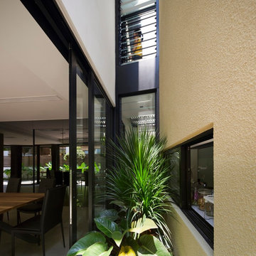
The original house is separated from the new ‘extension’ by a ‘gap’.
Photography by Beton Brut.
Inspiration for a small contemporary two-story exterior home remodel in Singapore
Inspiration for a small contemporary two-story exterior home remodel in Singapore
 Jan Neiges, CMKBD with NKBA
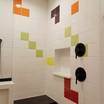
It took several attempts to get the tile pattern right for these walls. The Client wanted the majority of the color on the bottom and interperse the color as it gradually went up the wall.

 C.E. Pontz Sons
This Farm Pond Renovation in York, PA included removal of the existing land bridge at the back side of the pond that was blocking the stream water flow and also clearing the aquatic weed and other invasive plants from the stream to allow for a better water flow to the ponds edge. We snaked the existing overflow pipe and attempted to clear it of any debris blocking the flow of water. For the new overflow we cleared the existing embankment and excavated a swale at the edge of the pond and created a natural looking stream overflow similar to one we would create in a typical backyard pond or water feature. This was done to prevent and stabilize the eroding bank along the pond edge. Also installed was a large scale pond aerator and aeration system to aide in the overall health and clarity of the pond.
 Brinq Construction
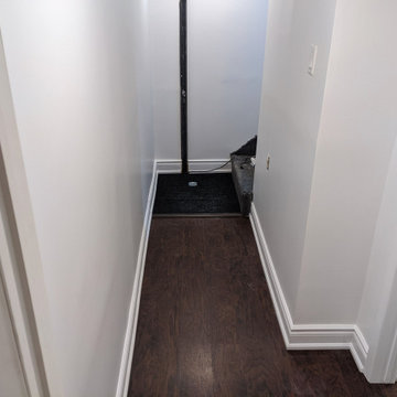
This unfinished basement job was offered to us after an attempt by someone else, it came out beautifully and the client couldn't be more happy with the final results!
 Betz Pools Limited
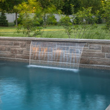
The raised feature wall at the deep end serves as a diving platform over the sheer descent waterfall. A pool ladder on one side and underwater swim out bench on the other are handy for repeat attempts. The wall, constructed from Wiarton Tiger Stripe ledgerock, is a perfect match for the pool’s Gold Pebble vinyl liner.

 Kaoud Carpet & Rugs
This silk area rug had suffered heavy staining in one section approximately 5 inches in diameter. After several failed attempts by the client to remove the stain with grocery cleaning agents, the client gave us a call. The area rug was an expensive purchase and the client's were clearly distraught about what had happened to their rug. After working with our team of master area rug cleaning experts, we were successful in removing the stain. Take a look at the before and after photos.
 California Deluxe Windows
For more information visit http://www.cdwindows.com.com or call (800) 639-9463.
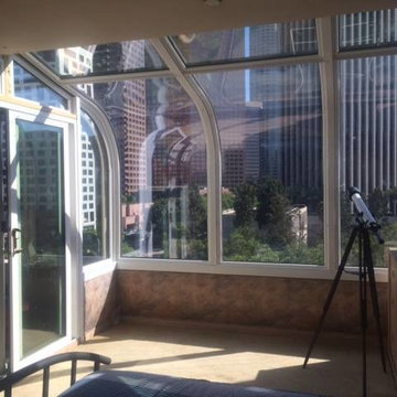
This curved window sunroom we made for our client David E. in Downtown Los Angeles, California was our most challenging and proudest project yet. We had to perfectly design a never-before-attempted template to remove the ugly grids his older, aluminum window frames had made. His majestic view of Los Angeles was replaced by 16 ugly aluminum windows which were deteriorating right before his eyes. His exact comments were, "Thank you for reminding me why I moved in here and purchased this home in the first place. You guys gave me my view back." We could not be happier.
 Excelsior Design Group & Danberry Building Corp
At the end of 2012, Danberry came across what was then a rundown home in the Casco Point neighborhood of Orono, in desperate need of some design help. A failed attempt by the previous owner to remodel it as an investment had left it abandoned for years. But when the Danberry’s got a glimpse of this diamond in the rough, they knew it had potential. The project included a completely remodeled kitchen, bathroom, basement and living room.
 Aanensen’s Designers Builders Craftsmen
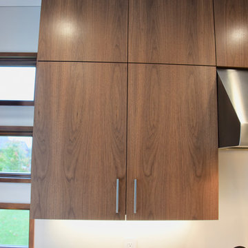
Each cabinet veneer was matched top to bottom and side to side. Adjacent cabinets were attempted to sequence as best possible
Example of a large minimalist u-shaped gray floor and ceramic tile eat-in kitchen design in New York with a double-bowl sink, flat-panel cabinets, medium tone wood cabinets, quartz countertops, white backsplash, stone slab backsplash, stainless steel appliances, an island and white countertops
Example of a large minimalist u-shaped gray floor and ceramic tile eat-in kitchen design in New York with a double-bowl sink, flat-panel cabinets, medium tone wood cabinets, quartz countertops, white backsplash, stone slab backsplash, stainless steel appliances, an island and white countertops
 Roundwood Interiors
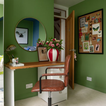
This space was special indeed! When the family moved into their home the daughter of the house immediately laid claim to this room - which included a half-height storage space, full of possibilities!
For the main space we chose a bright, fresh green to keep the space uplifting all through the year. I used a blue stripe to mimic the feel of a canopy and to make a feature of the sloped section of the ceiling rather than attempt to hide it.
The room is filled with storage to accommodate a growing wardrobe and features upcycled furniture to ensure the space is completely bespoke.
Hidden behind a poster is a secret library, painted a dark, moody blue and styled to give hints of Hogwarts. The ceiling is adorned with a navy, celestial print wallpaper and there are cosy touches dotted around to make this the perfect spot to curl up and while away hours with a good book. Floating candles lend a touch of fun and much needed light to the space.
 Roundwood Interiors
This space was special indeed! When the family moved into their home the daughter of the house immediately laid claim to this room - which included a half-height storage space, full of possibilities!
For the main space we chose a bright, fresh green to keep the space uplifting all through the year. I used a blue stripe to mimic the feel of a canopy and to make a feature of the sloped section of the ceiling rather than attempt to hide it.
The room is filled with storage to accommodate a growing wardrobe and features upcycled furniture to ensure the space is completely bespoke.
Hidden behind a poster is a secret library, painted a dark, moody blue and styled to give hints of Hogwarts. The ceiling is adorned with a navy, celestial print wallpaper and there are cosy touches dotted around to make this the perfect spot to curl up and while away hours with a good book. Floating candles lend a touch of fun and much needed light to the space.
 DesignARC
LOS ANGELES, CA / SINGLE FAMILY RESIDENTIAL
The commission for this 4,300-square-foot residence came with significant challenges for the architects – a house had once existed on the lot but had burned down and the attempt to replace the house had stalled, leading to an abatement order and a lapse of permits.
Our first challenge was to revive the lapsed construction permit by proposing to “modify” the existing structure. The practical effect this had was to fix the footprint of the new home to the existing structure’s plan outline. Having thereby inherited the large, dense block of the original house, the new strategy became one of substituting selective areas of indoor space for outdoor courtyard.
This strategy of trading indoor space for outdoor courtyard allowed an erosion of the formerly monolithic structure into a series of distinct volumetric elements, and further suggested that the architectural pieces could cohere as a “village.” The main level is further eroded by large, glazed planes, merging indoor with outdoor, and virtually stretching the landscape across interior space. Moving the detached garage from the rear yard to beneath the new living space allowed for a 75-meter lap pool and a shaded olive garden.
The gardens include built-in seating, extensive use of ornamental grasses and Zen-like interior courtyards. A material palette of fossilized stone, bonderized-galvanized metal, and natural Douglas fir allows for the warmth desired by the wife, while providing the modernity required by the husband. Programmatically, her music room borrows from the calm and protected olive court in the rear, while his office becomes a pavilion set in the landscape, which both addresses the street and acts as a sheltering monument for the terraced entry garden.
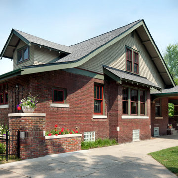 Architectural Resource LLC
The Brooke Residence ‘Addi- tion by Subtraction’ remodeling project was recognized with numerous regional and national awards and was selected for Fine Homebuilding’s Annual Issue on Houses.
This 1920’s Craftsman Bungalow had been poorly modified in the 70’s in an attempt to address poor energy performance with a scabbed on solarium. The design solution removed the solarium and completely reimagined the floor plan: The kitchen was relocated to the rear; the stairway was relocated to enhance function, and a better connection to the family room was created.
23