
Search results for "Attempts" in Home Design Ideas
 Cabinet Discounters, Inc.
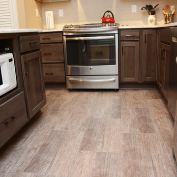
This kitchen features hickory HomeCrest Cabinetry with an Anchor finish and Arbor Hickory door style. The countertops are LG Viatera Aria quartz. The backsplash is a textured porcelain tile from Mediterranea in the Touch series - 3x6" subway tile in the color Summer Breeze.
Dan Krotz, Cabinet Discounters, Inc.
 Studio 316 Creative, LLC
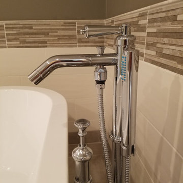
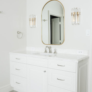
This Mequon master on-suite from the 80's was in serious need of a face lift! While it may be a large bathroom, it certainly was not up to date and did not meet the needs of the client.
We designed a complete gut and re-build including the removal of a window that only looked over the solarium below!
The result is a timeless design that allowed the homeowner to sell his home, after many failed attempts with the old bathroom, and meets the needs of the future buyers!
 Roundwood Interiors
This space was special indeed! When the family moved into their home the daughter of the house immediately laid claim to this room - which included a half-height storage space, full of possibilities!
For the main space we chose a bright, fresh green to keep the space uplifting all through the year. I used a blue stripe to mimic the feel of a canopy and to make a feature of the sloped section of the ceiling rather than attempt to hide it.
The room is filled with storage to accommodate a growing wardrobe and features upcycled furniture to ensure the space is completely bespoke.
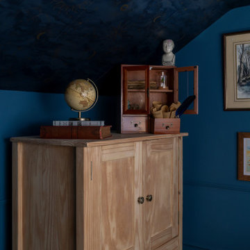
Hidden behind a poster is a secret library, painted a dark, moody blue and styled to give hints of Hogwarts. The ceiling is adorned with a navy, celestial print wallpaper and there are cosy touches dotted around to make this the perfect spot to curl up and while away hours with a good book. Floating candles lend a touch of fun and much needed light to the space.
Find the right local pro for your project
 Harris Landscape & Design LLC
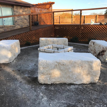
Previn consisted of scraping grass down to dirt with a bobcat then work began on the deck. Posts were set, frame was built, and decking was put into place. After the deck was finished, a pergola was built on top of the structure, everything was pressure washed, then later stained. After the deck was stained, we dug out the rest of the area around the pool (not shown), all the way to the front in attempts to make a circle around the pool. A square was dug out of the ground, and butter sticks were put into place, barrier was put into place, and the fire pit constructed. Liner was placed down throughout the entire project site, and mulch was placed in both the back of the pool (not shown) from the back and side fence, circling the pool, and up to the deck. Cypress trees were planted around the pool, and various bushes along the mulch edge up against the deck by the ramp. Pavers were set into place to create a path around the patio and shadow rock was brought in, and spread all throughout remaining project area.
In short: Demoed job site, added deck, added fire pit, added butter sticks, placed down liner, added metal edging, created borders, planted cypress trees, planted bushes, added mulch, added pavers, added shadow rock.
 Amazing Spaces
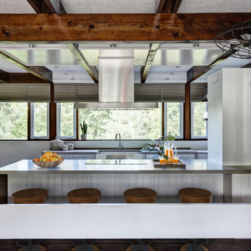
The existing kitchen was separated from the family room by a 17’ long bookcase. It was the first thing you saw upon entering and it hid much of the light and views to the backyard making the space feel claustrophobic. The laundry room was part of the kitchen space without any attempt to conceal the washer and dryer. Removing the long bookcase opened the opportunity to add counter stools in the kitchen and decided to align a target wall opposite the front door to help maintain some division within the main space while creating a space for the refrigerator. This also allowed us to create an open laundry room concept that would be hidden from view from all other areas.
We kept the industrial feel of the exposed building materials, which we complimented with textured melamine slab doors for the new kitchen cabinets. We maintained the galley set up but defined the kitchen from the utility area by changing both thickness and color of the countertop materials. Because the back of the house is mainly windows, there was very little wall space for upper cabinets and everyday dish storage. We designed a custom ceiling hung shelf system that floats in front of the windows, and is mostly out of view from the sitting area. Tall cabinets are installed along the only available wall to support both kitchen and laundry room functions. We used cable lighting threaded through the beams which really punctuates the industrial aesthetic.
 Tile Doctor Ltd
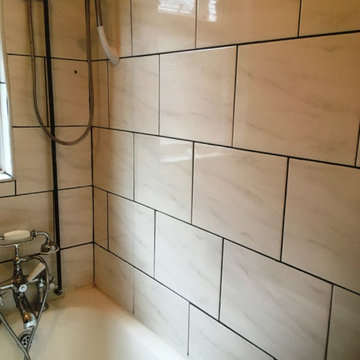
We were contacted by a client from the Levenshulme area of Greater Manchester who had just purchased a property there and hated the state of the grout which despite cleaning did not improve. The owner said she could not use the bathroom in this state as it looked disgusting and unclean and was keen to have it renovated. The rest of the house was being redecorated so whilst that was going on, I was called over to have a proper look at the grout and quote for sorting it out.
It didn’t take long to understand the issue, is seems the previous owner in an attempt to improve the appearance of the grout had touched it up by applying another thin layer of grout on top of the original. Now both the new and old was starting to flake off making a real mess.
I explained to the client we would need to scrape out the new layer, clean the original and then apply a grout colourant to improve the overall appearance. I gave her a price for the work, and she was happy for me to go ahead with the job.
My first task was to scrape off the new layer of grout, so I had a stable grout line to work from. I then started cleaning the grout up using a Tile Doctor Grout Colourant Pre-Treater cleaner, this cleans up the grout and being acidic it etches the surface to provide a better base for the grout colourant to adhere to. The dirt was rinsed off and then the area was dried using a heat gun.
Once dry I used a Tile Doctor Grout Colourant in Charcoal Grey (one bottle was sufficient). This product is equally effective for interior or exterior applications including bathrooms and kitchens and it is available in ten different colours. The client had requested to darken the grout and give it a completely new modern look. The colourant is painted onto the grout with a small brush and any excess which gets onto the tile is removed with a cloth before it dries.
The best thing about the grout colourant is it forms an easy to clean seal over the grout which ensures the grout is protected. Given Ceramic tiles are glazed and therefore don’t need sealing the new combination should ensure the tiles keep their appearance for a very long time with minimal cleaning. The silicone sealant between the bath and the wall tiles looked in good condition and had not discoloured so there was no need for this to be replaced.
The bathroom now looked clean and inviting and I’m pleased to report my client was very happy with the completed renovation and was finally happy to use the bathroom!
I recommended that for on-going cleaning that they use Tile Doctor Aqua-Pro, this is a pH neutral cleaner with a trigger action for easy application. It can be used in the bathroom every day. It helps to keep soap scum and limescale at bay and has a pleasant lemon smell so cleaning should not be too much of a chore.
Alex Logonzy
Greater Manchester Tile Doctor
 US Kitchens & Baths
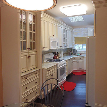
In this galley kitchen we added a standard cabinet and combined to create a custom recessed hutch with mullion beveled glass doors and flanked with pilasters; recessed corner sink, glass tile backsplash. By Rob Rasmussen
 Nathan Fell Architecture
The owners knew they wanted to create spaces in their backyard that be useful and encourage them to be outside more often, but because their backyard space is so massive the scope and size of the project was initially difficult to define. After a few initial rounds of design, the project ended up creating a series of spaces near their house and pool rather than try to utilize the entirety of their yard.
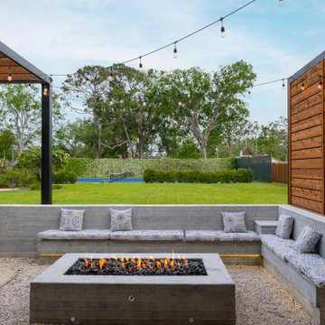
The existing pool was situated in proximity (and almost entirely aligned) to a detached garage. The garage was perfectly useful for parking cars, but nothing special Architecturally and certainly not functionally associated with the pool. The cabana would have been too far away from the main home if it were located on the opposite side of pool and would have been too large and visually obtrusive if arrange to the side of the pool. The design of the cabana was conceived as an addition to the garage that more appropriately capped the end of the pool with an openable space that could be used for cooking, lounging in the shade poolside, or playing games in with the space itself. There wasn’t enough space between the garage and pool to contain all the uses they wanted, so an additional shade structure with a dining space and a fire pit with build-in benches was included to the project, located near their existing living room.
Board formed concrete walls were used as a common element between the shade structure and the cabana. The base used as a planter wall and back to the bench in the shade structure is maintained in the base of cabana to develop aesthetic cohesion between the two spaces. The cabana engages a build in bar to a series of folding glass walls for compact efficient use. The interior of the cabana had to maintain the existing garage roofline for structural stability, but the interior is vaulted to the highest extent possible. The interior of the vault is lined with wood to frame the space for visual clarity enhancing transparency.
A goal of the project was to make a vast backyard more useful at a walkable scale by creating outdoor spaces close to each other and the existing living areas in and around the home. Rather than attempt to encapsulate the entire backyard it creates density around the edges that look onto the backyard. Because the spaces engage with the existing conditions the space has become a much-used outdoor living space.
(Photos of After Construction Conditions by Sara Essex Bradley)
 Fusion Cabinets, Inc.
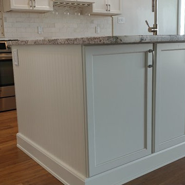
 Under the gorgeous granite top we have added matching storage cabinets with furniture base but opted for beadboard on the sides instead of more panels in an attempt to keep the space more casual for this waterfront home.
 Lustig Custom Cabinets
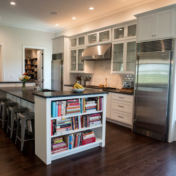
Raised island ends create storage for cookbook display adding a touch of farmhouse charm. At the end of the kitchen is a large walk-in pantry.
Mandi B Photography

 End Vision Visual Design Group
New owners attempting to see how to best fit their cars into the garage with the rest of their equipment. the goal was to spend as little as possible. We came out and measured the space, took note of the exact vehicles and items of note, then developed an outline for the homeowner to use.
 Excelsior Design Group & Danberry Building Corp
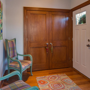
At the end of 2012, Danberry came across what was then a rundown home in the Casco Point neighborhood of Orono, in desperate need of some design help. A failed attempt by the previous owner to remodel it as an investment had left it abandoned for years. But when the Danberry’s got a glimpse of this diamond in the rough, they knew it had potential. The project included a completely remodeled kitchen, bathroom, basement and living room.
 Brinq Construction
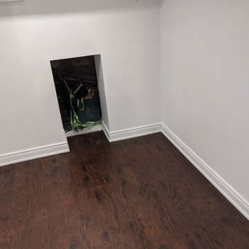
This unfinished basement job was offered to us after an attempt by someone else, it came out beautifully and the client couldn't be more happy with the final results!

 User
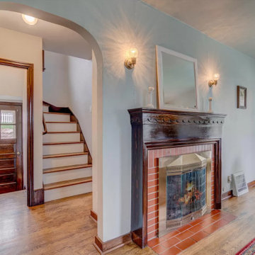
UserThe nearly 90 year old millwork in this home was refreshed along with the original red oak floors being refinished. Once blocked in by a previous DIY attempt to convert the archway into a closed shelving unit the space was brightened up by refurbishing the archway. Careful paint color considerations went into the design of this living room to coordinate with the 100% handwoven New Zealand wool rug, a reproduction canvas art piece special ordered, and the brickwork of the fireplace. The homeowner chose to retain their existing furniture pieces for this area for the time being.
 Donald Lococo Architects
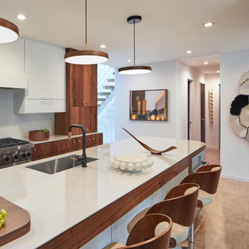
The kitchen was designed two years ago and was then erased and redesigned when the world became a different place a year later. As everyone attempted to flatten the curve, our goal in this regard was to create a kitchen that looked forward to a sharp curve down and of a happier time To that promise for happier times, the redesign, a goal was to make the kitchen brighter and more optimistic. This was done by using simple, primary shapes and circular pendants and emphasizing them in contrast, adding a playful countenance. The selection of a dynamic grain of figured walnut also contributes as this once-living material and its sinuous grain adds motion, rhythm, and scale.
Proud of their 1970s home, one challenge of the design was to balance a 1970's feel and stay current. However, many ‘70s references looked and felt outdated. The first step was a changed mindset. Just like the return of the ‘40s bath and the retro movement a few years ago, every era returns in some way. Chronologically, the '70s will soon be here. Our design looked to era-specific furniture and materials of the decade. Figured walnut was so pervasive in the era: this motif was used on car exteriors such as the 1970 Town and Country Station Wagon, which debuted the same year the existing home was built. We also looked at furniture specific to the decade. The console stereo is referenced not only by high legs on the island but also by the knurled metal cabinet knobs reminiscent of often-used stereo dials. Knurled metalwork is also used on the kitchen faucet. The design references the second piece of '70s furniture in our modern TV tray, which is angled to face the television in the family room. Its round pencil and mug holder cutouts follow the design of walnut consoles and dashboard of the station wagon and other elements of the time.
 Brendan McHugh, Architect, Manasquan, NJ
VISION AND NEEDS:
Our client came to us with a vision for their dream house for their growing family with three young children. This was their second attempt at getting the right design. The first time around, after working with an out-of-state online architect, they could not achieve the level of quality they wanted. McHugh delivered a home with higher quality design.
MCHUGH SOLUTION:
The Shingle/Dutch Colonial Design was our client's dream home style. Their priorities were to have a home office for both parents. Ample living space for kids and friends, along with outdoor space and a pool. Double sink bathroom for the kids and a master bedroom with bath for the parents. Despite being close a flood zone, clients could have a fully finished basement with 9ft ceilings and a full attic. Because of the higher water table, the first floor was considerably above grade. To soften the ascent of the front walkway, we designed planters around the stairs, leading up to the porch.
 Robyn Shapiro Design
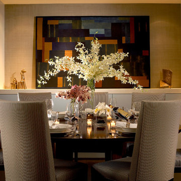
Inspiration for a mid-sized contemporary dark wood floor dining room remodel in Chicago
 Ollin Stone
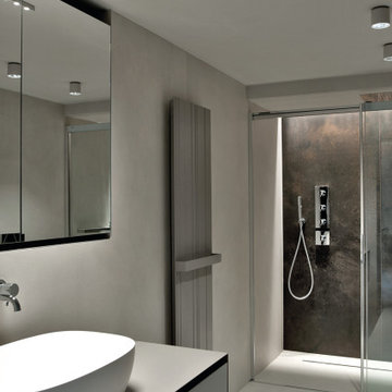
The Ossido line stems from a wager against time, in an attempt to crystallise a material at a specific point in its life and have it stay that way forever. Specifically, it entails the reproduction of a oxidation process on slabs of copper and metal, which generates a very strong and rich colour, yet which inevitably disappears as the oxidation process progresses.
 Eldorado Stone
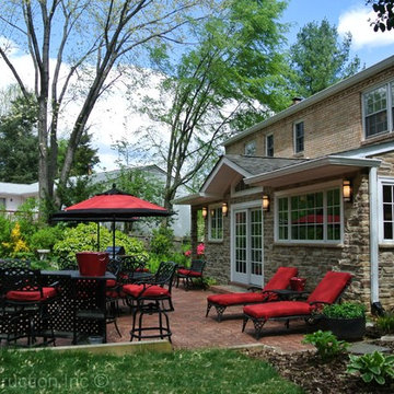
After an unsuccessful attempt at finding the original brick for this home, we were excited to present Eldorado Stone to our homeowners for its very natural look, high quality, and reputation. We chose the Cambria Cliffstone for its elegance and rich color tones.
The residents wanted to expand the kitchen into a large open space where they could entertain family and friends, so the design goal was to create a comfortable outdoor space that complimented the home’s existing exterior. Additionally, large windows were installed in an effort to bring the outdoors in as well as compliment their landscaping. Eldorado Stone proved to be a perfect fit for the exterior of this addition, as it blends in with the greenery around the home in addition to the neighborhood as a whole.
Eldorado Stone Profile Featured: Cambria Cliffstone installed with a Standard Grout
Eldorado Stone Profile Featured: Cambria Cliffstone installed with a Standard Grout
Architect: Brock Eustice
Builder: RJK Construction, Inc.
Website: www.rjkconstructioninc.com
Designer: Designs by Skill, LLC
Website: www.designsbyskill.com
Mason: Ricky Webster
Phone: 540-446-3661
Photography: Greg Hadley
Website:www.greghadleyphotography.com
24