
Search results for "Backing effectively" in Home Design Ideas
 Drake's 7 Dees Landscaping & Garden Center
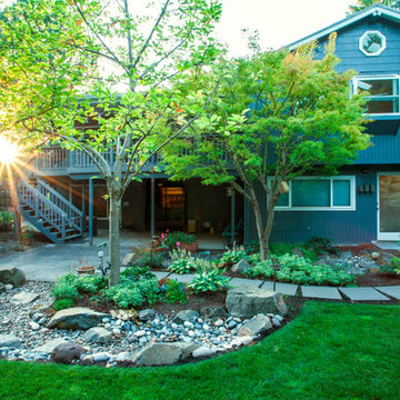
This backyard space used to effectively be half this size. In an earlier stage of the properties ownership... a large garden space was fenced in and lay fallow. Now, this large lawn is well used by a Boxer puppy and its owner. Photography by: Joe Hollowell
 Saikley Architects
Our busy Silicon Valley clients asked us to convert their tight-quartered 1960’s ranch house to a gracious family home that would meet their long term needs. Ease of living was paramount, both in functionality and in ordered design.
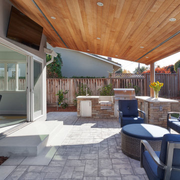
The project was completed on a moderate budget.While retaining most of the structure of the existing house to avoid costly structural changes, we opened walls to improve the sight lines and flow of the house and bring in more light. We made small additions at the front and back bedrooms to gain space for the family and relatives. An existing underused patio area was improved with a simple outdoor kitchen and overhang to extend the living space to the outside. Costs were kept down with choices of modest materials.
Everything was made to be functional. Ample storage has been built into the right places. The details of the kitchen were carefully worked out to accommodate all the wishes of the various cooks in the family. The house is set up to be easy to keep clean. Acoustic walls separate living from bedroom spaces so adults can enjoy time together while children sleep. The outdoor kitchen has easy access to the indoor kitchen and the garage, and its setup promotes socializing while cooking outdoors.
A large part of the narrow back yard was previously unusable space due to a steep slope up to a neighbor’s higher fence. With a new retaining wall and some re-grading we took back more of the yard for the patio and play space on a new lawn.
The remodeled house is a mix of contemporary and traditional elements. Cool colors have a calming effect. Traditional items such as prairie style windows, trellis, mosaic tiles, and Shaker style cabinets, break down the scale in an otherwise streamlined, contemporary design. A new gabled roof with a broad arch at the front of the house marks the entry and resolves a challenging form where the central entry is set back from walls on both sides.
Photography: Kurt Manley
https://saikleyarchitects.com/portfolio/modern-ranch/
 Milgard Windows & Doors
The Kiguchi family moved into their Austin, Texas home in 1994. Built in the 1980’s as part of a neighborhood development, they happily raised their family here but longed for something more contemporary. Once they became empty nesters, they decided it was time for a major remodel. After spending many years visiting Austin AIA Home Tours that highlight contemporary residential architecture, they had a lot of ideas and in 2013 were ready to interview architects and get their renovation underway.
The project turned into a major remodel due to an unstable foundation. Architects Ben Arbib and Ed Hughey, of Arbib Hughey Design were hired to solve the structural issue and look for inspiration in the bones of the house, which sat on top of a hillside and was surrounded by great views.
Unfortunately, with the old floor plan, the beautiful views were hidden by small windows that were poorly placed. In order to bring more natural light into the house the window sizes and configurations had to be addressed, all while keeping in mind the homeowners desire for a modern look and feel.
To achieve a more contemporary and sophisticated front of house, a new entry was designed that included removing a two-story bay window and porch. The entrance of the home also became more integrated with the landscape creating a template for new foliage to be planted. Older exterior materials were updated to incorporate a more muted palette of colors with a metal roof, dark grey siding in the back and white stucco in the front. Deep eaves were added over many of the new large windows for clean lines and sun protection.
“Inside it was about opening up the floor plan, expanding the views throughout the house, and updating the material palette to get a modern look that was also warm and inviting,” said Ben from Arbib Hughey Design. “Prior to the remodel, the house had the typical separation of rooms. We removed the walls between them and changed all of the windows to Milgard Thermally Improved Aluminum to connect the inside with the outside. No matter where you are you get nice views and natural light.”
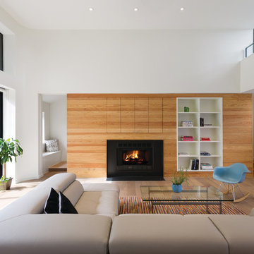
The architects wanted to create some drama, which they accomplished with the window placement and opening up the interior floor plan to an open concept approach. Cabinetry was used to help delineate intimate spaces. To add warmth to an all-white living room, white-washed oak wood floors were installed and pine planks were used around the fireplace. The large windows served as artwork bringing the color of nature into the space.
An octagon shaped, elevated dining room, (named “the turret”), had a big impact on the design of the house. They architects rounded the corners and added larger window openings overlooking a new sunken garden. The great room was also softened by rounding out the corners and that circular theme continued throughout the house, being picked up in skylight wells and kitchen cabinetry. A staircase leading to a catwalk was added and the result was a two-story window wall that flooded the home with natural light.
When asked why Milgard® Thermally Improved Aluminum windows were selected, the architectural team listed many reasons:
1) Aesthetics: “We liked the slim profiles and narrow sightlines. The window frames never get in the way of the view and that was important to us. They also have a very contemporary look that went well with our design.”
2) Options: “We liked that we could get large sliding doors that matched the windows, giving us a very cohesive look and feel throughout the project.”
3) Cost Effective: “Milgard windows are affordable. You get a good product at a good price.”
4) Custom Sizes: “Milgard windows are customizable, which allowed us to get the right window for each location.”
Ready to take on your own traditional to modern home remodeling project? Arbib Hughey Design advises, “Work with a good architect. That means picking a team that is creative, communicative, listens well and is responsive. We think it’s important for an architect to listen to their clients and give them something they want, not something the architect thinks they should have. At the same time you want an architect who is willing and able to think outside the box and offer up design options that you may not have considered. Design is about a lot of back and forth, trying out ideas, getting feedback and trying again.”
The home was completely transformed into a unique, contemporary house perfectly integrated with its site. Internally the home has a natural flow for the occupants and externally it is integrated with the surroundings taking advantage of great natural light. As a side note, it was highly praised as part of the Austin AIA homes tour.
Find the right local pro for your project
 WINN Design+Build
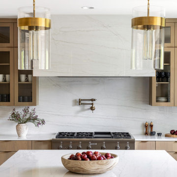
Large trendy u-shaped medium tone wood floor and brown floor open concept kitchen photo in DC Metro with an undermount sink, flat-panel cabinets, medium tone wood cabinets, quartz countertops, white backsplash, quartz backsplash, paneled appliances, an island and white countertops
 HA Architecture
Photo by: Leonid Furmansky
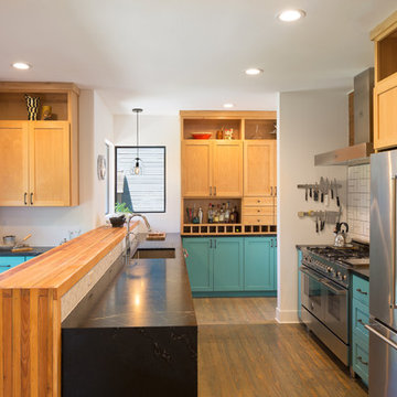
Example of a mid-sized transitional galley medium tone wood floor open concept kitchen design in Austin with an undermount sink, recessed-panel cabinets, turquoise cabinets, soapstone countertops, beige backsplash, ceramic backsplash, stainless steel appliances and a peninsula
Example of a mid-sized transitional galley medium tone wood floor open concept kitchen design in Austin with an undermount sink, recessed-panel cabinets, turquoise cabinets, soapstone countertops, beige backsplash, ceramic backsplash, stainless steel appliances and a peninsula
 Susan Yeley Homes
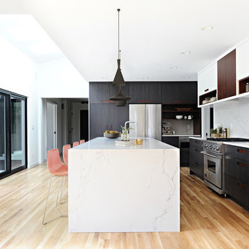
This gem of a house was built in the 1950s, when its neighborhood undoubtedly felt remote. The university footprint has expanded in the 70 years since, however, and today this home sits on prime real estate—easy biking and reasonable walking distance to campus.
When it went up for sale in 2017, it was largely unaltered. Our clients purchased it to renovate and resell, and while we all knew we'd need to add square footage to make it profitable, we also wanted to respect the neighborhood and the house’s own history. Swedes have a word that means “just the right amount”: lagom. It is a guiding philosophy for us at SYH, and especially applied in this renovation. Part of the soul of this house was about living in just the right amount of space. Super sizing wasn’t a thing in 1950s America. So, the solution emerged: keep the original rectangle, but add an L off the back.
With no owner to design with and for, SYH created a layout to appeal to the masses. All public spaces are the back of the home--the new addition that extends into the property’s expansive backyard. A den and four smallish bedrooms are atypically located in the front of the house, in the original 1500 square feet. Lagom is behind that choice: conserve space in the rooms where you spend most of your time with your eyes shut. Put money and square footage toward the spaces in which you mostly have your eyes open.
In the studio, we started calling this project the Mullet Ranch—business up front, party in the back. The front has a sleek but quiet effect, mimicking its original low-profile architecture street-side. It’s very Hoosier of us to keep appearances modest, we think. But get around to the back, and surprise! lofted ceilings and walls of windows. Gorgeous.
 Spacecrafting / Architectural Photography
Builder: City Homes Design and Build - Architectural Designer: Nelson Design - Interior Designer: Jodi Mellin - Photo: Spacecrafting Photography
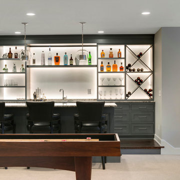
Inspiration for a large transitional single-wall carpeted wet bar remodel in Minneapolis with an undermount sink, recessed-panel cabinets, gray cabinets, granite countertops and white backsplash
Inspiration for a large transitional single-wall carpeted wet bar remodel in Minneapolis with an undermount sink, recessed-panel cabinets, gray cabinets, granite countertops and white backsplash


 Wilsonart
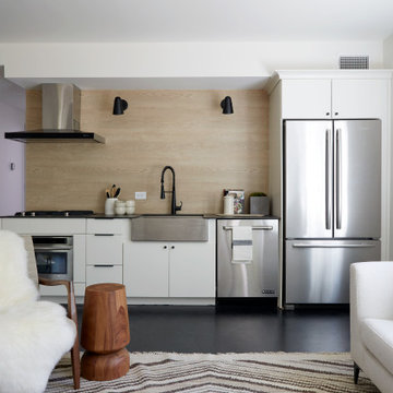
Uncover the modernist style behind our Rugged Steel THINSCAPE™ Performance Top paired with our rich Ruskin Oak backsplash.
Inspiration for a contemporary single-wall black floor open concept kitchen remodel in Austin with flat-panel cabinets, white cabinets, laminate countertops, beige backsplash, wood backsplash, no island, black countertops, a farmhouse sink and stainless steel appliances
Inspiration for a contemporary single-wall black floor open concept kitchen remodel in Austin with flat-panel cabinets, white cabinets, laminate countertops, beige backsplash, wood backsplash, no island, black countertops, a farmhouse sink and stainless steel appliances
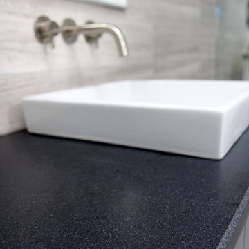
 Change Your Bathroom©
The goal of this project was to upgrade the builder grade finishes and create an ergonomic space that had a contemporary feel. This bathroom transformed from a standard, builder grade bathroom to a contemporary urban oasis. This was one of my favorite projects, I know I say that about most of my projects but this one really took an amazing transformation. By removing the walls surrounding the shower and relocating the toilet it visually opened up the space. Creating a deeper shower allowed for the tub to be incorporated into the wet area. Adding a LED panel in the back of the shower gave the illusion of a depth and created a unique storage ledge. A custom vanity keeps a clean front with different storage options and linear limestone draws the eye towards the stacked stone accent wall.
Houzz Write Up: https://www.houzz.com/magazine/inside-houzz-a-chopped-up-bathroom-goes-streamlined-and-swank-stsetivw-vs~27263720
The layout of this bathroom was opened up to get rid of the hallway effect, being only 7 foot wide, this bathroom needed all the width it could muster. Using light flooring in the form of natural lime stone 12x24 tiles with a linear pattern, it really draws the eye down the length of the room which is what we needed. Then, breaking up the space a little with the stone pebble flooring in the shower, this client enjoyed his time living in Japan and wanted to incorporate some of the elements that he appreciated while living there. The dark stacked stone feature wall behind the tub is the perfect backdrop for the LED panel, giving the illusion of a window and also creates a cool storage shelf for the tub. A narrow, but tasteful, oval freestanding tub fit effortlessly in the back of the shower. With a sloped floor, ensuring no standing water either in the shower floor or behind the tub, every thought went into engineering this Atlanta bathroom to last the test of time. With now adequate space in the shower, there was space for adjacent shower heads controlled by Kohler digital valves. A hand wand was added for use and convenience of cleaning as well. On the vanity are semi-vessel sinks which give the appearance of vessel sinks, but with the added benefit of a deeper, rounded basin to avoid splashing. Wall mounted faucets add sophistication as well as less cleaning maintenance over time. The custom vanity is streamlined with drawers, doors and a pull out for a can or hamper.
A wonderful project and equally wonderful client. I really enjoyed working with this client and the creative direction of this project.
Brushed nickel shower head with digital shower valve, freestanding bathtub, curbless shower with hidden shower drain, flat pebble shower floor, shelf over tub with LED lighting, gray vanity with drawer fronts, white square ceramic sinks, wall mount faucets and lighting under vanity. Hidden Drain shower system. Atlanta Bathroom.
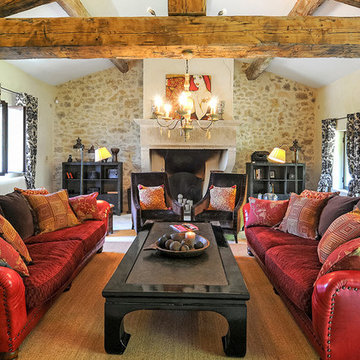
 Ancient Surfaces
Project: Le Petit Hopital in Provence
Limestone Elements by Ancient Surfaces
Project Renovation completed in 2012
Situated in a quiet, bucolic setting surrounded by lush apple and cherry orchards, Petit Hopital is a refurbished eighteenth century Bastide farmhouse.
With manicured gardens and pathways that seem as if they emerged from a fairy tale. Petit Hopital is a quintessential Provencal retreat that merges natural elements of stone, wind, fire and water.
Talking about water, Ancient Surfaces made sure to provide this lovely estate with unique and one of a kind fountains that are simply out of this world.
The villa is in proximity to the magical canal-town of Isle Sur La Sorgue and within comfortable driving distance of Avignon, Carpentras and Orange with all the French culture and history offered along the way.
The grounds at Petit Hopital include a pristine swimming pool with a Romanesque wall fountain full with its thick stone coping surround pieces.
The interior courtyard features another special fountain for an even more romantic effect.
Cozy outdoor furniture allows for splendid moments of alfresco dining and lounging.
The furnishings at Petit Hopital are modern, comfortable and stately, yet rather quaint when juxtaposed against the exposed stone walls.
The plush living room has also been fitted with a fireplace.
Antique Limestone Flooring adorned the entire home giving it a surreal out of time feel to it.
The villa includes a fully equipped kitchen with center island featuring gas hobs and a separate bar counter connecting via open plan to the formal dining area to help keep the flow of the conversation going.
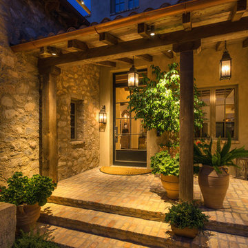
 | SPIRAL ARCHITECTS |
Passing through the entry gates reveals the formal Entry Courtyard, with main and guest casita porches, flagstone and Chicago common brick hardscaping, and antique French limestone fountain basin. The main mass of the home is clad with integrally colored three-coat plaster, while the 1,000 square foot wine cellar, and guest casita are clad in McDowell Mountain stone with mortar wash finish.
Design Principal: Gene Kniaz, Spiral Architects; General Contractor: Eric Linthicum, Linthicum Custom Builders
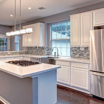

 Glass River Design
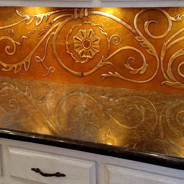
This Custom Glass Wrought Iron Back Splash is hand caved by Artist Melissa Paxton of Glass River Design. The piece is coated with pure copper with slight color variations to achieve this one of a kind effect. Easy to install and maintain, this back splash is a true work of art in glass.
 LEIVARS
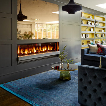
Beautiful contemporary LA cool reception room with gas fire, antique bronzed glass, feature concrete floating shelves, contrast yellow. Rich velvet tones, deep buttoned bespoke chesterfield inspired sofa. Bespoke leather studded bar stools with brass detailing. Antique 1960's Italian chairs in grey velvet. Industrial light fittings.

 Milgard Windows & Doors
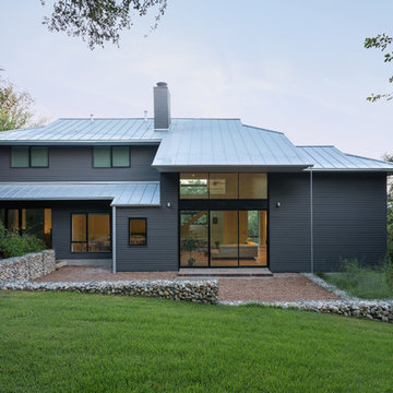
The Kiguchi family moved into their Austin, Texas home in 1994. Built in the 1980’s as part of a neighborhood development, they happily raised their family here but longed for something more contemporary. Once they became empty nesters, they decided it was time for a major remodel. After spending many years visiting Austin AIA Home Tours that highlight contemporary residential architecture, they had a lot of ideas and in 2013 were ready to interview architects and get their renovation underway.
The project turned into a major remodel due to an unstable foundation. Architects Ben Arbib and Ed Hughey, of Arbib Hughey Design were hired to solve the structural issue and look for inspiration in the bones of the house, which sat on top of a hillside and was surrounded by great views.
Unfortunately, with the old floor plan, the beautiful views were hidden by small windows that were poorly placed. In order to bring more natural light into the house the window sizes and configurations had to be addressed, all while keeping in mind the homeowners desire for a modern look and feel.
To achieve a more contemporary and sophisticated front of house, a new entry was designed that included removing a two-story bay window and porch. The entrance of the home also became more integrated with the landscape creating a template for new foliage to be planted. Older exterior materials were updated to incorporate a more muted palette of colors with a metal roof, dark grey siding in the back and white stucco in the front. Deep eaves were added over many of the new large windows for clean lines and sun protection.
“Inside it was about opening up the floor plan, expanding the views throughout the house, and updating the material palette to get a modern look that was also warm and inviting,” said Ben from Arbib Hughey Design. “Prior to the remodel, the house had the typical separation of rooms. We removed the walls between them and changed all of the windows to Milgard Thermally Improved Aluminum to connect the inside with the outside. No matter where you are you get nice views and natural light.”
The architects wanted to create some drama, which they accomplished with the window placement and opening up the interior floor plan to an open concept approach. Cabinetry was used to help delineate intimate spaces. To add warmth to an all-white living room, white-washed oak wood floors were installed and pine planks were used around the fireplace. The large windows served as artwork bringing the color of nature into the space.
An octagon shaped, elevated dining room, (named “the turret”), had a big impact on the design of the house. They architects rounded the corners and added larger window openings overlooking a new sunken garden. The great room was also softened by rounding out the corners and that circular theme continued throughout the house, being picked up in skylight wells and kitchen cabinetry. A staircase leading to a catwalk was added and the result was a two-story window wall that flooded the home with natural light.
When asked why Milgard® Thermally Improved Aluminum windows were selected, the architectural team listed many reasons:
1) Aesthetics: “We liked the slim profiles and narrow sightlines. The window frames never get in the way of the view and that was important to us. They also have a very contemporary look that went well with our design.”
2) Options: “We liked that we could get large sliding doors that matched the windows, giving us a very cohesive look and feel throughout the project.”
3) Cost Effective: “Milgard windows are affordable. You get a good product at a good price.”
4) Custom Sizes: “Milgard windows are customizable, which allowed us to get the right window for each location.”
Ready to take on your own traditional to modern home remodeling project? Arbib Hughey Design advises, “Work with a good architect. That means picking a team that is creative, communicative, listens well and is responsive. We think it’s important for an architect to listen to their clients and give them something they want, not something the architect thinks they should have. At the same time you want an architect who is willing and able to think outside the box and offer up design options that you may not have considered. Design is about a lot of back and forth, trying out ideas, getting feedback and trying again.”
The home was completely transformed into a unique, contemporary house perfectly integrated with its site. Internally the home has a natural flow for the occupants and externally it is integrated with the surroundings taking advantage of great natural light. As a side note, it was highly praised as part of the Austin AIA homes tour.
 Rohleder Borges Architecture
Cynthia Grabau Photography
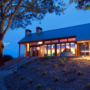
Inspiration for a mid-sized contemporary beige one-story stucco gable roof remodel in San Francisco
Inspiration for a mid-sized contemporary beige one-story stucco gable roof remodel in San Francisco

 Interior Pros - Design Studio
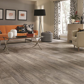
The grey trend has evolved in the last twelve months. Nowadays browns, beige and a touch of grey are in demand. Greige is the new buzzword.
Heavier hand scraped or contoured products, the rage that started around 2005 has taken a back seat in most areas, while a softer wire brushed "ceruse effect" seen mostly on White Oak has been remarkably strong showing no effects of becoming “dated” like the others mentioned.
Ceruse Color Possibilities
There are numerous color combinations to the "cerused" process with the most popular being white or off white. This design trend in hardwood flooring can have darker gray white oak with a mild ceruse off white effect.
There are limitless possibilities in either a prefinished hardwood floor or with what we can create for you in a custom on-site finished hardwood floor.
If something suits your fancy, contact us and we can work on creating just the look and sense of style you are looking for.
 LAND BY DESIGN
mparchphoto, Richard Grenier Builder
Example of a transitional home design design in Denver
Example of a transitional home design design in Denver
 Equilibrium Interior Design Inc
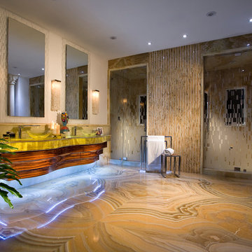
The design of this master bathroom is set to compliment the natural stone slab floor that sets the tone for this room. Because the entire second floor of the house was renovated into a master suite, the client requested an open concept plan for the entire suite.
This allowed Equilibrium to increase the floor area of the bathroom and design an incredible statement piece which is the floor. Honey onyx slabs were cut into oversized tiles to make them more manageable and installed in a diamond pattern preserving continuity of lines from tile to tile, and slab to slab. Furthermore, what otherwise would be waste cut material, it was chiseled, flamed, and fabricated into custom mosaic installed on the back wall of the bathroom and on shower floor.
To ensure Client’s safety, slabs were treated with anti slippage treatment and shower floor was finished with matching mosaic.
Client requested that the shower is oversized and feels like showering under a waterfall. This was accomplished by running four separate water lines to feed the shower plumbing. When the two oversized rain heads, two shower heads, and six water jets are all on, you get the feeling of being under a natural waterfall in the Amazon. Non of this would be possible in today’s water starved world if it wasn’t for harvesting and special filtration system installed on this property that allows recirculation of water.
Variation of lighting types allows for various theme settings, and energy efficient LED lighting further enhance the beauty of this bathroom with minimum energy consumption.
Even edges of slabs were polished to ensure maximum light refraction with beveled seams that create purposeful patterns instead of hiding seams. Shower doors were etched with a pattern that adds dimension and provides privacy while complimenting the mosaic pattern on the back wall.
The double sink vanity was floated off the floor allowing for maximum visibility of this artistic installation. It was made of rosewood and designed with three sections for drawers and storage. The three levels create a scalloping effect allowing each to be illuminated by LED lights which reflect elegantly in the onyx slab floor. Complimented by honey onyx top, and placed against a 42” high onyx wainscot, it is a functional and beautiful millwork.
This master bathroom is a testament to engineering, originality, and beauty seen in every detail.
Interior Design, Decorating & Project Management by Equilibrium Interior Design Inc
Photography by Craig Denis
46